Color Inspiration – Purple, Green and Teal
Lately, I’ve been doing quite a bit of daydreaming about how I’d decorate the house that Matt and I hope to purchase in the near future. One thing I know for sure is that I want to use more neutrals in my decorating, but I can’t go with a completely neutral palette. That’s just not me. I love color way too much to live in a neutral home.
So I’ve just been waiting…waiting for inspiration to hit. Waiting to see that perfect color combo that, without hesitation and without contemplation, would make me say, “That’s IT!! That’s what I want!”
And I think I may have found it right on the cover of the latest issue of House Beautiful.

As soon as I pulled that magazine out of my mailbox and I saw those colors, I fell in love with them! The colors may not be clear in the photo above, but the purple is a beautiful grayed purple, along with teal and bright green.
But purple? I’ve never thought of myself as a “purple” kind of person. In fact, in our very first house, Matt and I decided to paint our upstairs living room purple. Let’s just say that those days were way before I honed my decorating skills, and my misuse of purple in that huge room just ruined any love I ever had for any shade of purple. Since then, any time I hear the word “purple” in regards to decorating, I kind of have this involuntary disgusted-face-scrunch response.
But perhaps that’s wearing off, because as soon as I saw that magazine cover, I had no thoughts of my misguided attempt to decorate with purple nine years ago. Instead, I just wanted to see more of this color combo.
Here are a few inspiration pictures that I found…
This photo from Amoroso Design via Houzz definitely captures the green and deep purple colors beautifully. Just add a bit of teal, and it would be perfect!!
And of course, if it’s color inspiration you’re looking for, Design Seeds is a perfect place to look. These colors are definitely on the right track, but I would make some modifications. I’d like to see the dark purple be a little deeper, lose the lilac color on the far left, and replace the dark greenish gray color with a light and bright neutral, like a natural linen color.

This living room from Lovehome is a bit too purple for my taste, but I do love the purple and green combo. But again, I’m thinking more of a deep purple, like the rug, rather than the light purple on the walls. And I want the dark, saturated colors set against a backdrop of light and bright neutrals with lots of natural textures. Grasscloth, perhaps?

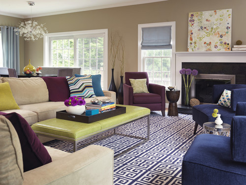
This living room by Rachel Reider Interiors via Houzz is definitely getting closer to the mark…minus the baby blues, and with a lighter, brighter wall color.
I absolutely love the colors used in this dining room by Katie Riddler. The deep purple, dark teal, and green are amazing! But imagine them used more sparingly, and set against a neutral background. Yep…I love it!

And finally, this bedroom from Amanda Nisbet Design is pretty close to perfect for my taste. Lots of texture and neutrals, deep purple, green. Just take out the lilac (or is that pink?) items, substitute teal, and it would be just what I envision!

So what do you think of my color inspiration? I know the teal and green are similar to what I have now (although now I’m using more of an apple green), so it’s not too much of a stretch for me. But the purple is definitely out of my comfort zone. I really like it, though. And in a crazy way, I almost think that if I do decide to stick with these colors, this will be my chance to redeem myself after my gross misuse of purple in our first house. I want a re-do. And this time, I want to do it right!

Addicted 2 Decorating is where I share my DIY and decorating journey as I remodel and decorate the 1948 fixer upper that my husband, Matt, and I bought in 2013. Matt has M.S. and is unable to do physical work, so I do the majority of the work on the house by myself. You can learn more about me here.
Love! I don’t have a blog, but our living room is painted a beautiful teal with purple and red accents. It works because we have a lot of wood furniture to tone it down and we also left the doors/doorframes/window curtains white… those keep the room from being obnoxiously bright or looking too Willy Wonka 🙂
I love this color scheme too!! And I’m right there with you an getting excited to decorate! We’ll hopefully be buying a house next year and I’m SO anxious to get to decorating and painting walls since our rent house now is ALL WHITE!!! yuck!! Thanks for sharing that Design Seeds site too! I’d seen the color palettes used/posted but didn’t know where everyone was getting those from!! lol
Every artist’s vision is unique. I’ve been dreaming of deep purple stain with dark teal and a jewelly emerald…the only pale color I’d pair would be a pale celery or a very pale tea. It’s in my head only at this stage!
I can SO understand your thoutghts on this color scheme. So pretty and with the teal thrown in, would make me happy too. Here’s hoping you buy that house soon so you can use these inspiration photos there.
I think it would be a striking palette with neutrals. I’m not a huge fan of purple paint but the grayish purple is very muted and nice. I’m hoping you will be able to get this home and use the palette that you want.
I love purple even though I don’t currently decorate with it. I had dark purple in my December wedding and then decided to decorate with it and grey. I think I was ahead of my time because I couldn’t find anything grey or purple at the time to decorate with. I think whatever you do will be awesome!
I’ve loved purple & green tones together for years! Had a kitchen that was painted light green in a little place I rented & I made purple gingham cafe curtains for the windows. My “wedding colors” were also purple & green. I love the addition of teal, though – excellent combination!
I love the deep purple & shades of teal combo. I was debating on using this color scheme in my office/bedroom. Initially I wanted the teal with grays, but I think the deep purple works well. Instead of the green, however, those grays will fit in well.
I’ve been looking at purple couches for my living room lately, so I’ve also been bitten by the purple bug. Maybe I’ll be brave enough to take the plunge. My family room is painted in teal zeal by Behr. Lots of color, but broken up by white curtains, woodwork, doors, and furniture, wood, and a natural terra cotta tile floor. We love the room – teal is a happy color.
I love the color combination. I always tend to lean toward those colors when upcycling. I have to stop myself and choose other colors so that there is variety. I have a thing about peacocks that that is their main colors.
I love the color combo, and of course I love the purple especially! Can’t wait to see you in a new house and being able to decorate just the way you want.
I love all the photos and the similar color inspiration that has been showing up the past couple of years in the magazines. But….as lovely as it is….I really prefer to have my cream and red. I think my husband would like it though….purple is his favorite color.
You should go for it if you love it. Absolutely!!!
The color on the walls of that Katie Riddler dining room! I want to paint a room that color, like now! I love any green, especially those yellowy-greens.
I’m casting my vote for a purple that tends toward grey. I think you’ll be able to love with it longer and not tire of it. I’m excited for you and I hope you get into that house soon. Whatever it looks like when you find it, I know you’ll transform it with your unique style and fertile imagination.
I love that color combination! I am definitely a lover of purple though. I like the dark purples more than the lilacs though. The lilacs are too pink for me and I’m not really a pink person. I love the teal and green too! I got married last year and my colors were a deep purple and deep red and (I might be being bias here) it was beautiful! If you do purple accents though you could easily change it out (rather than painting in purple). I love the idea of neutral walls and permanent fixtures/furniture with pops of color and funky-ness throughout. That’s how I want my house to be!
I love this color scheme! I previously had my living room decorated in these colors. First I used a deep plum with red, orange, pink, and gold accents–very exotic! Then I redid the room and used the same colors in the photo with the bird pictures and before, chartreuse, teal & the same purple.
I loved purple because it was so unique. However, that was a downside too unless you customized your decor, because there’s not much purple out there (and I can’t paint my walls).
So I say go for it but consider the mood/energy you want in the room. Purple can be very striking and bold.
My fav’s too. Our bedroom is dark purple, grey & green and we love it, though it seems it’s never done! Trying to incorporate these same colors around the house too.
I’ve been trawling the web for some inspiration for my upcoming living room makeover, you have give me some food for thought as loving this colour combo!
I love the color combination. I always tend to lean toward those colors when upcycling. I have to stop myself and choose other colors so that there is variety. I have a thing about peacocks that that is their main colors.
https://exploreuknow.com/stanwick-lakes-adventures/