Console Table – A Design Change Plus Five Finish Options
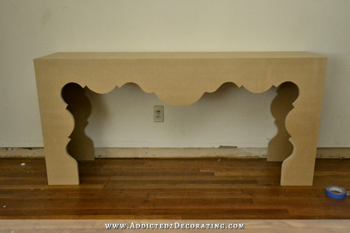
Last night, I made a little design change to my scalloped console table. The “legs” were just looking a bit too bulky and imposing for my taste, so I reworked my pattern, traced the new pattern onto all four legs, and cut it down. So now it looks like this.

I like that lighter look much better than the heavy, imposing look of the legs from yesterday…
Now I just have to decide how I want to paint/finish the table, and I have tons of ideas swarming around in my head. Here are a few of my top contenders.
I could cover it with either fabric or leather (vinyl, really, as leather is way out of my price range), and then add nail head trim, like this fabric-covered table with nail head trim from Drexel Heritage.

Or this Jonathan Adler linen upholstered side table from Zinc Door…

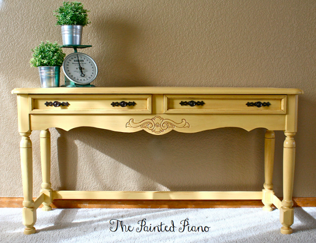
I could just paint it a solid color. If I paint it, I’m leaning either towards a bright but soft yellow, like this sofa table from The Painted Piano…
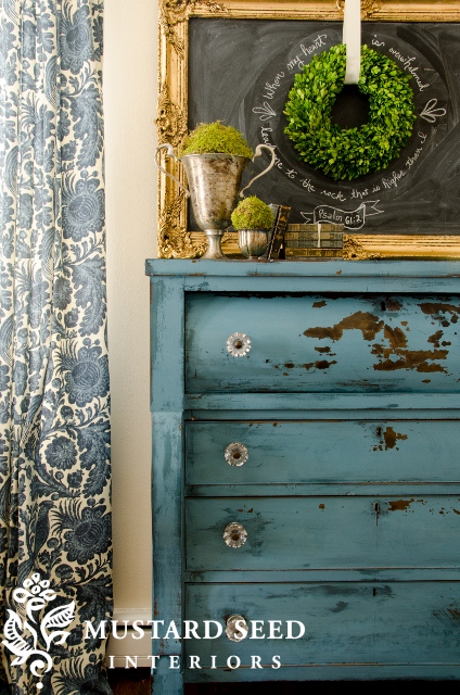
Or a blue like the blue on this dresser from Miss Mustard Seed (without all of the heavy distressing, of course)…
Basically, if I paint, I’d like to pull out some of the lighter colors in my drapery fabric, and then use a brighter version of that color on the console table.
Another idea I’m toying with is doing a geometric painted design, like this diamond night stand from Syndey Barton…

I could even tweak that design just a bit and turn it into argyle, which y’all know I love.
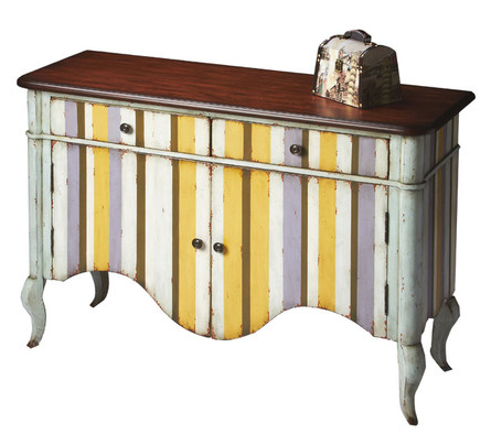
And then, of course, there’s my beloved stripes, like this striped credenza from Joss & Main.
And finally, a few of you suggested painting it and then giving it a lacquer finish. I couldn’t find a good example of that, but of course, a lacquer finish is just a very super shiny finish.
Of course, with any of these ideas, I’ll actually use colors that are in my living room (i.e., colors pulled from my main fabric). I won’t just be sticking random colors onto my console table. 😉
So as of now, those are the ideas I’m considering. The main consideration is whether I want the table itself to be the “artwork” in the entryway, in which case I could use a bold design and then use something more subtle above it, like a nice framed mirror. Or if I want the table to be more of a backdrop to ground whatever fabulous (and colorful, of course!) artwork I put above it. In that case, the finish will need to be more subtle, like a simple painted finish in a solid color.
What would you do with a table like this? Go really, really bold with the painted design? Or tame down the already-bold design of the table with a simple painted finish? Or somewhere in between, with a fabric and nail head trim treatment?
EDIT:
I made yet another change to the table today. This is it. The jigsaw and I need a break from one another now. 🙂


Addicted 2 Decorating is where I share my DIY and decorating journey as I remodel and decorate the 1948 fixer upper that my husband, Matt, and I bought in 2013. Matt has M.S. and is unable to do physical work, so I do the majority of the work on the house by myself. You can learn more about me here.


The one that jumps out to me right away is the beautiful blue fabric with the nailhead trim! That line of contrast really brings out the scallops and makes sure they don’t get lost-looove!
And the new legs are definitely an improvement! I am amazed how you can look at something and see just what you don’t like about it. I do NOT have that ability! 🙂
The Drexel one, I meant. Guess there are 2 blue ones.
I like the Blue Jean fabric one or if you want a light an airy feel….I LOVE the yellowish one 🙂
My vote is a leather look vinyl with nailhead trim!
I love the look of the fabric with nailhead, but with that beautiful scalloped design of yours, not sure about it. I think the argyle or diamond pattern would be a bit busy with the scallop design also. Maybe go with a solid painted look. I kind of like the sound of a laquered finish. But what do I know, you are the designer and I am sure whatever you decide, it will be fabulous. Can’t wait to see your decision. I am so enjoying your journey in decorating your new house. Thank you for sharing. Have a Blessed Day.
At first I thought leather and nail head. After seeing the examples, I think stripes. ( come on, ya know you wanna!) Your work should be showcased- therefore, the credenza itself should be the focus. Ps. Your blog name suits me well because I am sooo addicted to your blog!! 😀
I love the new leg design, a little change made all the difference… another idea, food for thought, is a faux leather design finish, with the nail head trim…I was shocked at how wonderful and rich it looks when completed. Who would have thought that torn crumpled paper bags, wallpaper paste, a little stain and polyurethane would have such a dramatic effect…Looks great on walls too!
The faux leather done with crumpled paper bags is what came to mind for me, too! I think that would look great! And be easier than trying to cover the scalloped edges with fabric.
I would keep the finishing simple because the design is so beautiful. I think a simple paint job with a lacquered finish would be beautiful. And I think the stripes would be a little too much with the stripes on the drawers on the other side of the room. LOVE what you’ve done with the table!
I agree about the simple design; that ‘striped’ credenza is going to be a focal point when you walk in, so what do you want to notice about this new and beautiful table when you walk in that won’t compete? BUT, I’m not the decorator, either!
Wholeheartedly agree, laquered finish (leave the color to you but leaning toward pale yellow). Love the “new” legs!
You’ve put so much work into the rest of the room, I feel that if you go dramatic i.e. stripes or a pattern, the eye will be drawn to that one piece and not see the rest of the room. Not that you want this piece to fade into the background either. I would think a solid yellow or the fabric with nail head would fit best in your room, and make the eye travel around the room rather than get stuck on that one piece. Of course, everyone has opinions …. yours is the one that counts!! Cant wait to see what you decide
Oh my gosh! I love love love the fabric idea!!!! It’s so different! Please choose that so I’ll have a tutorial to follow when I go to make one 😉 You are so creative!
Because of the curvy design of the console I would go with a solid glossy paint color or solid fabric with nail head trim. I agree with some of the others that the stripes would be too much. Can’t wait to see the finished product.
I agree! The curves of this table are what stand out (I love it!) and why not let their beauty shine. It’s easier to add the other elements you’re looking for with artwork, wall hangings, etc, rather than putting it all into one piece.
You’ve already done that beautiful upholstered ottoman, so I wouldn’t want to detract from that by upholstering another piece in blue fabric. I also think the scallop design of the table (which I LOVE, btw) would be taken away from if you choose paint techniques such as stripes, argyle, etc. Painting it that pretty blue from Miss Mustard Seed and gilding the cut edges of the scalloped area would be a nice way to tie it in with your greek key side tables.
Love this idea from Jenn, I think it’s my favorite about painting it blue with gold on the edges to tie in with the table. Nice idea!
I also agree with Jenn- I think blue is my fave as it would complement the rest of your choices in the room- that gilding idea is great. Can’t wait to see what you chose!
I lean towards a more modern clean look so I vote for a lacquer finish. I think it would make it look very high end. Then a really great piece of abstract art above it. I am so jealous that I don’t have a big entry to do this!
I really love the geometric design, or the stripes. But, like you said, it really depends on what accessories you want to go with it, etc.
I agree with those who said something simple with a beautiful artwork above it!! Especially the lacquered look in a beautiful color, like you said, chosen from within the colors in the room. Everything is so great!! What color is the couch, did I miss that? I saw the cording or whatever you call it!! You’ve put so much thought into this room. I do that as well but I’m not talented like you with the sewing, upholstering, etc.!!
Love the Jonathan Adler table and the diamond pattern! I think the upholstery tacks would really add something different :).. All ideas are great though! Can’t wait to see the finished product !!
I adore all of these ideas! BUT, because of the subtle color-on-color shading of the diamond pained one, I think you could get away with *both* a fabulous “artwork” furniture piece AND great artwork above it.
LOVE LOVE LOVE your refinement of your pattern….the curve on the bottom of the legs adds a gracefulness/lightness to the look. I think the argyle (as much as I ADORE your argyle from the condo) would compete with the beautiful leg scallops. I love the leather look….what about leather with a subtle texture, or one color on the legs with another shade for the top? Or two different fabrics…. a bolder print/stripe on top and then a solid on the base/legs. You could use a sealer (mod podge type) on the fabric to give it a nice shiny or matte finish and keep it easy care. I love hear your thought process about your decisions on how to put your different choices together…it really helps me broaden my decorating horizons and refine my style!
I like the leather/vinyl with the nailhead trim as my first choice. My second choice is the cheery yellow paint. It would be a pretty backdrop to whatever artwork/mirror/pretties you would display.
The blue lacquer would be perfect. Also, http://www.grandinroad.com has garden rug in indigo that would give entry area wow look with the table. January 2014 catalogue, page 37. Pattern may be too busy for you, but the idea works.
I like the idea of it being just painted with a lacquered finish, as long as you pull the paint colour (yep, Canadian!) from the colours already in the room. I think the argyle pattern would be just way too busy and would detract from the style of the console, especially those scalloped legs! The leather (vinyl) covering with the nail head design would be a distant second choice, and all the others fall lower than that. My personal taste is rather conservative, so my final opinion would be to go with whatever makes you happy!
I vote for some sort of leather look!
I vote for a bold colour and a lacquer finish, as all trhe other options would in my opinio diestracxt from the lovely (now even more lovely – perfect!!!) design of the table.If it were my house I would use the gorgeous green from the credenza to tie the two pieces and thus rooms together (and because I just love that colour!!). but I can imagine a soft blue, too, esp. with a highly shiny finish – like those traditional Japanese bowls, only not in red obviously 😉 cannot wait to see what you decide – it will be fantastic, I’m sure of that!!
sorry for all the typing errors!!
When I saw your initial design my first thought was that the legs were too thick…much better with the revised legs! I feel like stripes or pretty much any other bold pattern will take away from the scallop shape, so I would go with something more “solid-ish” whether its paint, or vinyl, etc. A bit of embellish or enhancement of the shape would be good but I would vote for no bold pattern all over. Since its the easiest and least expensive, what about the pretty soft yellow or blue paint for now? Can always try the vinyl, etc later.
I accidentally posted this comment on the page with the striped fabric, where I had gone to look at the colors more closely. Sorry, Kristi. I’ve copied it this page where it belongs but it wouldn’t let me remove it from the other page.
Not being a fan of the “everybody is doing it” trend, I’m not huge on nail head trim, but I like the idea of this table being a deep chocolate “leather” with the nail head trim on the inside edges of the scallops, rather than on the surface. Alternately, the soft blue in your striped fabric, also “leather” and if you insist on nail head trim, the same suggestion: inside edges, allowing them to accent those scallops without being on the front and ‘in your face’.
‘Course, it’s not MY house and you do like that sort of trim, so…on the outside edges would work for you.
Stripes, argyle, diamonds…probably too busy and detracting for the scallops to look elegant. The scallops are kind of the focus of the table, right?
My first thought was how hard it would be to upholster those awesome curve details. I love the idea of faux painted leather with nail heads, or painting the entire thing whatever solid color you like and then doing a fun pop of contrasting color inside. A big fun mirror or clock above it with a few gold accents like candle holders to tie into the side tables, and deep aqua candles would be gorgeous. What color are you planning on painting those entry walls? If you are still thinking the white wainscoting, then that will help lead you.
Whatever you chose will be great! Can’t wait to see the table finished.
At first, before I saw the pics I thought to myself “oh, no!! Don’t change it” I loved the way it looked. Then I saw the pics and I loved the new legs!! I only wish I had your talent!!
I like the Jonathan Adler one… Love the blue also but I should add that I am on a blue kick at the moment! Lol.. Your doing a great job! Love it!
I still like the idea of the nail trim look and would add a bit more formality to the area despite the fun curves. However… I LOVE that multi-striped look. Honestly- any one of those that you posted would work. So excited to see what you decide. Geesh- this is like a cliffhanger every.single.day. I love your blog. 😀
Hi kristie
I agree with your decision to make those legs thinner. Much better. Love it. As for the finish I would lean toward solid colour. I think the table design itself it strong enough on its own without embellishment. As for the colour something that would make it pop against the wall. I wish I could do things as fast as you. It takes me forever. Cheers
It feels out of character for me but I actually love the dark leather and nailhead trim!
What about yellow fabric?
The pale yellow table is my fave-so warm, welcoming, versatile, goes with everything!
My vote is for it painted yellow 🙂
I think it would look FANTASTIC in the argyle pattern…!!! You did such a wonderful job in your condo kicthen area. Whatever you do will look great, I’m sure..
Hi, Kristi, Please emphasize the wonderful curves, perhaps with a contrasting color at the edge. I’m going through a redo of my own and whenever I get stuck I read your posts to reassure myself there’s a kindred spirit out there!
I don’t like the idea of stripes, as you have stripes across the room… However i do like all of the other ideas. My suggestion would be to paint it for now. Love the colors you’ve picked out. At some point in the future, you will want a change and then it would be easier to cover it with leather or fabric – than to do the reverse and have to repair the table from the nails used to cover it if you decided you wanted to paint it later.
BTW, I LOVE the change you made to the legs. I didn’t even realize how bulky they were until I saw the aftres – big difference. =) Great job, as always!!
Yaaaaaay, I’m so glad you cut the legs down; I too prefer the lighter look. I like either the soft gold or the soft blue for the console table. With the more elaborate scallops in the design, just a simple glossy finish would look great. If you did want to do nailhead trim, since you only have the nailhead trim in one place in the living room (well, maybe two if you count each chair separately), I think a nailhead trim in a different color or size than that on the chairs would tie the two areas together in a subtle way. But I think that keeping the console table more basic will allow you to really kick it up with the accessories.
You could always just spray paint it with a gloss finish; if you don’t like it, then you could upholster it!
OR paint the table and upholster the stools underneath and use the nailhead trim on them!
OR use the striped fabric on the stools underneath!
Somebody suggested painting the exterior of the table soft blue and the inside a contrasting color. How about blue on the outside and yellow on the inside?
Wow you’re fast! Including the re-do, impressive! My vote would be for a lacquered finish in the blue that is on your ottoman. And I agree with Alta, that nail head and stripes could be reserved for your under the table benches.
Okay it’s me again after reading all the previous posts I’m thinking maybe just put the arglye on just the sides with two tone light colors,and solod on front with the nail head… maybe to much … maybe not.. I think it would look good as your focile point in the entry way against wansscoting…. Can’t wait to see what you decide either way.
Ugh – me again finally completing a thought that I seemed to have wandered away from above. Way back in the beginning, you were debating the mixed metals look in this new house. What about playing off that idea and do this table in a brushed silver or nickel metallic and then add that punch of color on the inside? I think it would look great with a short runner made out of your striped fabric from the couch on top with dramatic tassles hanging down over the open spot in the sides. (Cats may enjoy this far too much though.) A great coat tree is needed between that and the door.
As I scrolled through the comments, had to smile when I saw yours! I can’t get a “cracked” muted gold for this table out of my mind lol! Just has a Moroccan or French vibe to me. With that I also like the idea of contrast color from curtains possibly on “inside”. Kristi, can’t wait to see what you do! My other fave is leather with nail head trim!
And the change on the legs made it perfect!
i love ur blog!! for this project i would tackle the strip!! it is challenging and creative. if anyone can pull it off u can!!!! i would personally stay away from fabric, i have found that is collects dust and dirt and is hard to clean!! good luck and cant wait to see what u decide!!!!
I think you should paint it, but with a different color on the inside and then maybe something fun (like argyle) on the outside that will have a bit of the color from the inside. I also can’t stress enough that I think you should make this piece of furniture for others and add that to you list of titles – furniture maker. I am so in love with this table and would die to have it, but alas I don’t own a tool and probably never will.
I like it much better since you trimmed it. I would hesitate to go with a fabric finish because of stains and cleaning. Vinyl or paint is best I think.
Hammering hundreds and hundreds of nail heads into MDF on tight curves and angles would be brutal!! But you are always willing to take on any challenge!! You already have ‘striped’ drawers and a vibrant paint color on your credenza. So maybe not more of the same on this piece. Paint a subtle solid treatment on this new scrolled table first…even if lacquered or metallic. You can always cover it with fabric or faux leather or nailheads later.
Love the yellow one. And I don’t like yellow. A little more subtle, especially with the strips of the couch and you already have a large fabric covered piece the ottoman.
The modification you made is perfect. There was something that wasn’t working for me and you got it. It really catches your eye now. Everything you’ve done in the room looks great. I was drawn to the yellow and blue colors and their techniques on your examples. The red diamond is a “wow” for me as it just isn’t something I would do but now it gives me an idea… The stripes might detract from all the other great pieces you have engineered. Now that the console table pops the paint treatment needs to also. Thanks for sharing with us…
I would go for the gusto and do the faux leather (vinyl) with the nailhead trim! The nailheads would make those gorgeous curves pop even more. If I remember right you were going to eventually add grasscloth to your walls I think the combo would look so good together. Can’t wait to see which you choose, this is a good one!
My favourite would be painted yellow. I think many of the other options would take away from the beautiful design of the table itself.
i love the yellow and agree with someone above about using a yellow fabric instead of paint to add texture and also using the nail-head detail on it. sort of combine two choices…
You can pick leather or paint or whatever you choose but definitely pick it in yellow! You have lots of darker colors in the room and I think a soft yellow would really let the piece speak for itself rather than be blended into the other items.. Not too much pattern. You already have a flowered print, the stripes on the dresser. Your console could be a soft yellow and then perhaps a small print of some kind on the sofa? Then the stripes in your pillows or the cording in your sofa.
You have lots of great suggestions. Whatever you choose, get a piece of glass cut for the top as added protection. You can then use fabric without concern. Whatever you do will show through the glass, but you can toss as many keys and coffee cups on it as you want.
Have you thought of using “wiggle board” to finish of the inside legs?
The slimmer legs look better. I love the look of the table with the stripes.
It would be the yellow for me !
I like the smaller leg better, good call. I think because of the beautiful detail of the curves, that is what should be celebrated about the piece. So I would not put any pattern on it. Depending on the backdrop of the wall if it needs to stand out a bit more I would go for the nail head and a bold colour. Well done as per usual Miss Kristi!
I think a bold color with a lacquered finish would be BEAUTIFUL and really let the shape of the table stay prominent. It would be sculptural.
I think that stripes or geometry would compete with the scallops and look too busy. Just my opinion.
Now, I also think that upholstery with nailhead trim would look great on this piece and, again, give prominence to the scalloped shape. But it’s a lot of work and hard to change out. It seems to me that if you aren’t sure yet what artwork you are going to use, or whether the art or the table will be the show stopper, you can always paint it for now, see if you like the color you’ve chosen, live with it a bit — and you can always upholster it later, after you’ve chosen the art. You seem like a “get it done” sort of person, though, so maybe that two-phase plan won’t work for you!
I’m liking all the ideas except for the stripes. I’m trying to picture it like the one in the photo (which is really nice), but the curvy edges on the inside of your table legs (love the new ankles!) seem to be a problem for me. I don’t know why. You could print out the photo and color some stripes on it and see how that would look? The stripes going across all the scalloping – I don’t know. Also, I always like a mirror at the front door in case I need a quick look before scaring the UPS guy.
The fabric/leather option. I bought a whole hide of really nice leather off of ebay once and had an big ottoman redone. The price was great!
I was immediately drawn to the nailhead trim + fabric. But I also liked that subtle tone-on-tone painted pattern. 🙂
I love the new cut out on the side just what it needed no matter what finish you choose. I love the stripes.
Wow, talk about hard decisions! I agree with someone else who said that a lot of pattern might overwhelm on top of the intricate design. I lean towards a solid color with nailhead trim. You could do the nailhead with or without fabric, so you could just add it to a solid finish or vinyl.
I think vinyl might be my favorite, because it would add a new fabric/finish to the room and replicate any nailhead on the other side.
Plenty of great suggestions. I’m very drawn toward covering it and using nailhead to really accentuate those curves and I’d put a piece of glass on top to protect it so you can have worry-free fresh flowers, which is always so welcoming in a home entry.
I’d also (just me) opt for a really textured fabric or vinyl… like a croc embossed vinyl or a bleached rough burlap and finish either choice with nailhead. Texture would contrast well with the feminine shape of it.
Good call on the more slender legs (no one wants cankles, right?)
Can’t wait to see it done.
YAY — LOVE the new open ended design! It will totally stand out on that wall now – with a POP!
i personally think that the curves and {possible} nail head design would be too much for a striped pattern. Solid would direct attention to the table in a natural flow, yet not take away from other focal points in the room.
BUT,,,these are just thoughts from us — we know that you will do what you feel is right for you, and as long as YOU are happy with it, then that is all that matters! I know that we will LOVE it!
My question is HOW do you manage to do this with MDF? My husband won’t ever build with this, because he says that it will fall apart, and not nail together. How do you get these sturdy designs, without the material from flaking and falling apart? Many times I can’t even get it (the MDF), home from Home Depot, without dings into the edges. Am I looking at a different TYPE of MDF? AND, (please forgive me for being filled with questions), but, how difficult of a piece can you build out of this? Meaning, Are there limits to items, that you consider to be not feasible for MDF building? Such as, what are your limitations for projects? [If that makes sense] Is is strong enough for a Storage Chest?
THANKS for all that you do to inspire us girls to GET to WORK in our own homes!
Love’n the table Kristi, trimmed legs and all. I tend to agree with Jenn’s comment posted at 11:10 am – use MMS blue and add a gilded color on the trimmed edges. Or paint a pop color on those trimmed edges and also paint the pop edge color on the entire underside so you’ll catch that second color from afar. Let the fun shape of the table remain a ‘statement’ on it’s on. I also think masking stripes on the organic shape would be a hair pulling nightmare.
Joss & Main Stripes would look fab, but what about the fabric you will use in the strips for your couch. Would that be too much strip? I also love the miss mustard seed color. I just did a vote for colors on my china cabinet – I still have not picked the winner – I have commitment issues with color! 😉 Maybe you can give me some suggestions.
I think linen nail head in the yellow. Doing a blue competes with the ottoman table. Your curtains have a yellow . Or even a grey.
I really like the changes you made to the legs, it doesn’t look as “heavy” now, before it made me think the table was on steriods, I’m sorry to say. I can’t wait to see what you choose to finish it with.
I really like the scalloped edges to the console. I absolutely love the idea of a soft yellow painted look and why not add geometric design to it too!!!
That is one gorgeous table! The changes you made are perfect. I love the stripes–go for it!
I could not see that the original design needed the changes you saw, but it is a huge improvement. As for a finish, everyone has my head spinning. I don’t think I can take it all in.
Wow, I just loved the first design of this table, didn’t think you could improve on it until I saw the second phase of the design, it DOES look even better with the thinner legs! Then I saw phase 3 and OMG, perfection! It’s EVEN BETTER! Sometimes people get carried away with “improvements” and end up wrecking the piece, this one just kept getting better.
I think stripes or any other type of obvious decorative finish would be too much. I love the idea of fabric and ‘leather’ with nailhead trim, but I think that would work better on a plainer table, this one has such lovely scalloping that the leather and nailhead too much. Therefore, my selection would be to paint it a solid color – it would be gorgeous with a faux leather paint treatment, and it would be exquisite lacquered! I cannot wait to see what you do with it, it’s going to be beautiful!
*… this one has such lovely scalloping that the leather and nailhead MIGHT BE too much.* Please forgive my typing fail!
I really like the changes you made to the table. It is more light and floaty-like now.
I like the idea of paint, blue paint, like the MMS, but of course, like you said, without the distressing. I do think the table has enough going on with the scallops that a plainer finish would be better.
I love the new version of the table. However, I am a firm believer that less is more. I think eh table needs to be painted a soft color, like the blue mentioned above but without the distressing or the yellow also mentioned above. And a finish that won’t make it too shiny, but something that will protect the paint job and make look like a finished project. The accessories on the table and a bold pice of art will tie it all together and make it look smashing!
Painted, love the yellow!
Oh the legs are even better! You know I see the yellow on the outside with the nailhead trim and how about adding your fabric to the underside so it peaks out? And one more thought since you are wanting stripes…how about just on the tabletop?
Kristi, I am so glad you reshaped the legs on your table. My first thought when I saw it was that it looked to “heavy” instead of the lighter look of your examples but didn’t comment because I figured it could be camera angle (or just me!). As for your finish, I’d recommend keeping it simple whether covered or painted. I don’t think the style of your table lends itself to a pattern easily. I believe pattern would detract from the beautiful lines which should be emphasized. Looking at your patterned examples, I noticed that all of them are are a type of chest which has more surface area for the design. One way to use a geometric would be to keep it small and the colors a tone-on-tone so that it looks more like a trick of the light. This way, your first impression is the lovely lines of the console, followed by an “Oh” when the ‘unseen’ pattern is noticed. I do did like the Drexel example but I think they had an easier job than you will since the curves on that design are not as deep as your table so if you decide to cover it, I like some of your other reader’s suggestions such as using more of a decoupage method followed by your trim choice. Of course, I still think a metallic would be gorgeous whether its a ‘leaf’ technique or a paint.
It’s interesting that the table has taken on even more of the look of the original inspiration piece, the silver gilded one. With all the scallops, I would go with a simple painted finish in either the blue or yellow, with an “antiqued” wash. This is classic, yet simple, and would not detract from the beautiful design of the scallops. Your accessories will add more to that side of the room while not competing with the console table. I am sure that whatever you do will look great!
If I were given a vote…I say STRIPES.
Next in line is the Jonathan Adler (turquoise?) piece. Love that.
Can hardly wait to see what you decide!
Beautiful curviness. I like the paint options. The soft butter-yellow is wonderful, perhaps with a contrastin color on the interior? Upholstery might tend to make this gorgeous table look like an un-hung cornice. :/
I love the duo tone like the red argyle pattern only in blue or yellow and not with geometrics or stripes but with perhaps a filigree of overall flourish pattern, something to accentuate your curves. Something very subtle.
I have to say, I wasn’t too sure about the table when you first showed it. There was something I didn’t like about it, but I couldn’t quite figure it out. I felt it was a bit too bulky for my tastes. I LOVE that you were able to figure it out so quickly. That’s what makes YOU the designer – your eye is so good at figuring these things out. Can’t wait to see how you finish it. Not a fan of the fabric and nailhead – I think I’d like the shiny lacquer better – maybe the same color as you painted the chest? I’m sure it will be fabulous no matter what you do to it.
Hi, love this table. could you give me the dimensions want hubby to make me one 🙂
You can find all those details here:
https://www.addicted2decorating.com/scalloped-console-table-part-1.html
I liked your ideas about geometric painted design and soft yellow color. But I can’t imagine where you can put this table. You can also make a dining table for you family that’ll be unique! You should purchase some soft wood like pine that is a good choice! Then construct the table top, cut all for legs to the same length while they are clamped together, using the first leg as a guide and sand your table legs using a power sander. Then attach the legs and decide what color it’ll be painted and enjoy you new table with your family!