DIY Fail & Paint Color Options
Yesterday, Matt and I celebrated our 15th wedding anniversary, so I set aside house projects for the day. But the day before that (Wednesday) was one of the most frustrating DIY days I’ve had in a very long time.
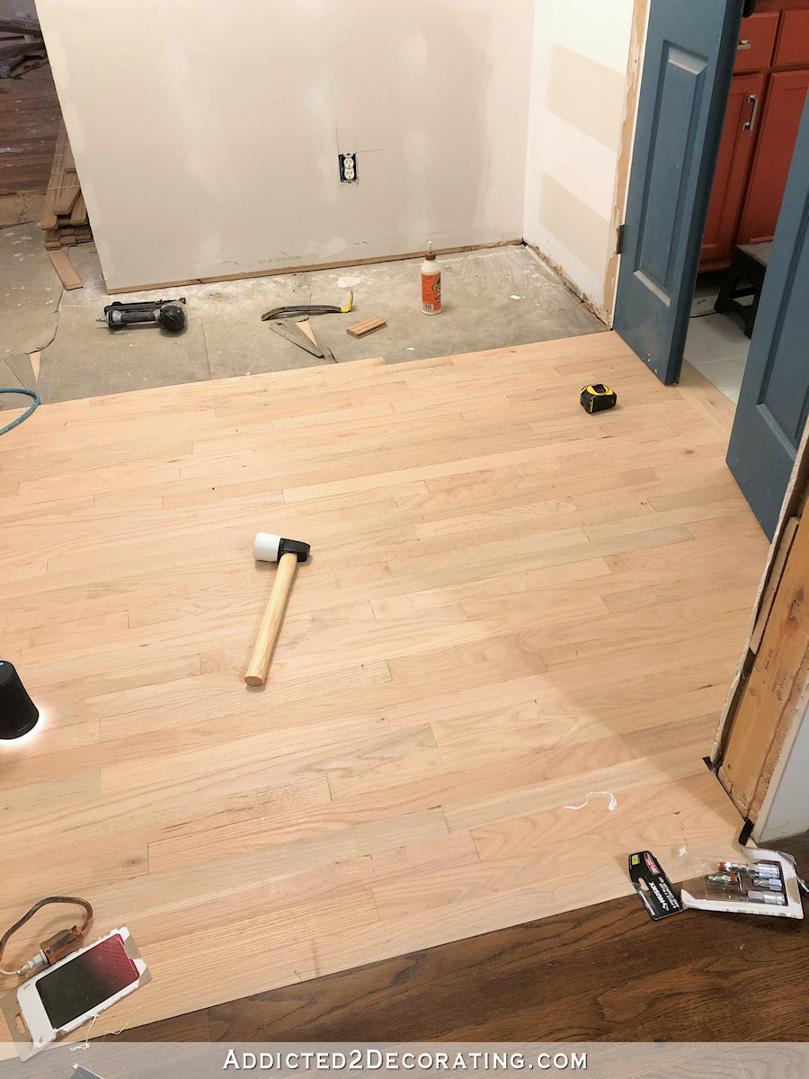
I had one goal — install three new prehung doors in the hallway. That should have been easily achieved, and yet at the end of the day, all I was left with was a very bad attitude. I didn’t even have one single door installed.
I ran into problems with the very first door — the one just to the right of the hallway cabinets I just built. The room behind that door will be Matt’s game room, but was originally planned to be my office (before the garage conversion). And for some reason, I never realized that the original door on that room was only 30 inches wide. I just assumed that it was 32 inches like the other two bedroom doors. And unfortunately, those two extra inches are non-negotiable. Matt can easily fit his wheelchair through a 32-inch door, but 30-inch doors are a problem for him, resulting in scratched and bruised knuckles.
So I removed the original door, and found that there was actually some extra room on each side. I had high hopes that the new, wider door would fit right in there.
But it didn’t. The framed opening was about 3/4″ too narrow.
So I spent literally all afternoon reframing that doorway to accommodate an extra 3/4″ of door width. Oh, I know. That doesn’t sound so difficult, right? But it was one of the most frustrating things I’ve tried to do in a very long time.
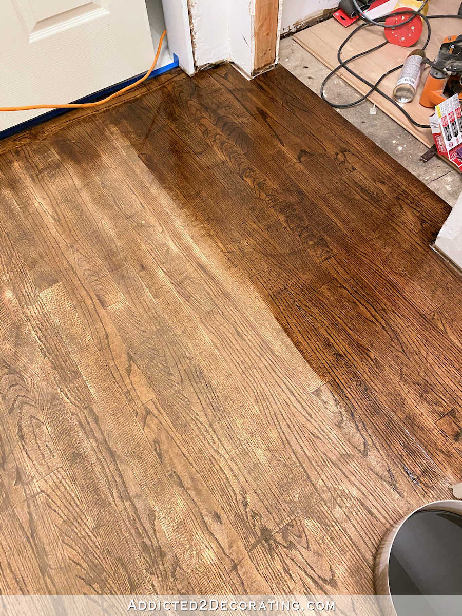
First of all, that wall is load-bearing, so removing and replacing a stud has to be done with care. But also, as I’ve mentioned many times before, these walls aren’t just 2″ x 4″ framing with drywall. The walls have solid wood shiplap under the drywall on both sides. And while that’s never really been an issue before, this time it was. I swear to you that the shiplap on this particular wall has somehow turned to petrified wood, because my saws refused cut through it.
I tried my reciprocating saw, alternating between two brand new blades (one “wood” blade and one “wood and metal” blade), and it would’t cut through the wood. I tried my circular saw, and it literally stopped the blade completely almost every single time. Sometimes it might cut 1/8″ before stopping. Other times, it wouldn’t cut anything before stopping.
I’ve never experienced anything like it. I finally did get it cut, but it took about two hours, alternating between the reciprocating saw and the circular saw, and taking frequent breaks to walk off the frustration so I didn’t throw my circular saw across the room, to cut a line 80 inches high.
But that’s not the worst of it. After all of that frustration and time, and finally getting the shiplap cut the full height of the door, I went to install the new door and the upper left corner wouldn’t fit. The opening is about 1/8″ too narrow…still. So I get to cut through the petrified wood all over again.
After that, I was done for the day. And I’ve had to look at that door, sitting all cockeyed in the opening, seemingly mocking me, for the last 36 hours. But today, I will win. 🙂
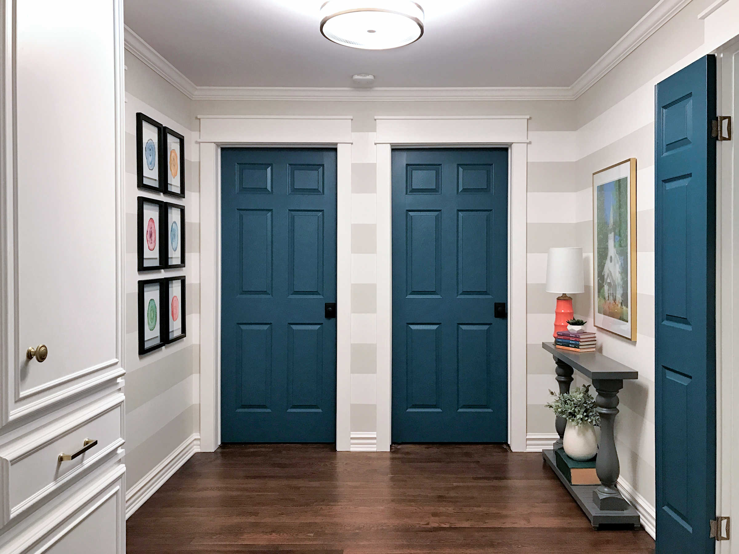
Anyway, while I didn’t do any actual work yesterday, I did take a few minutes to put some paint samples up in the hallway. I’ve made a decision about how I want the hallway to look, and it’s going to be a pretty big departure for me.
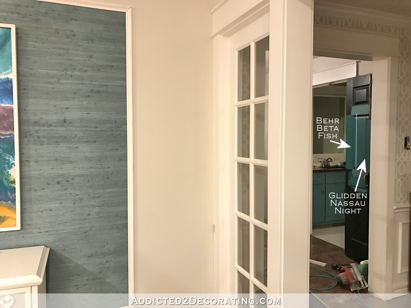
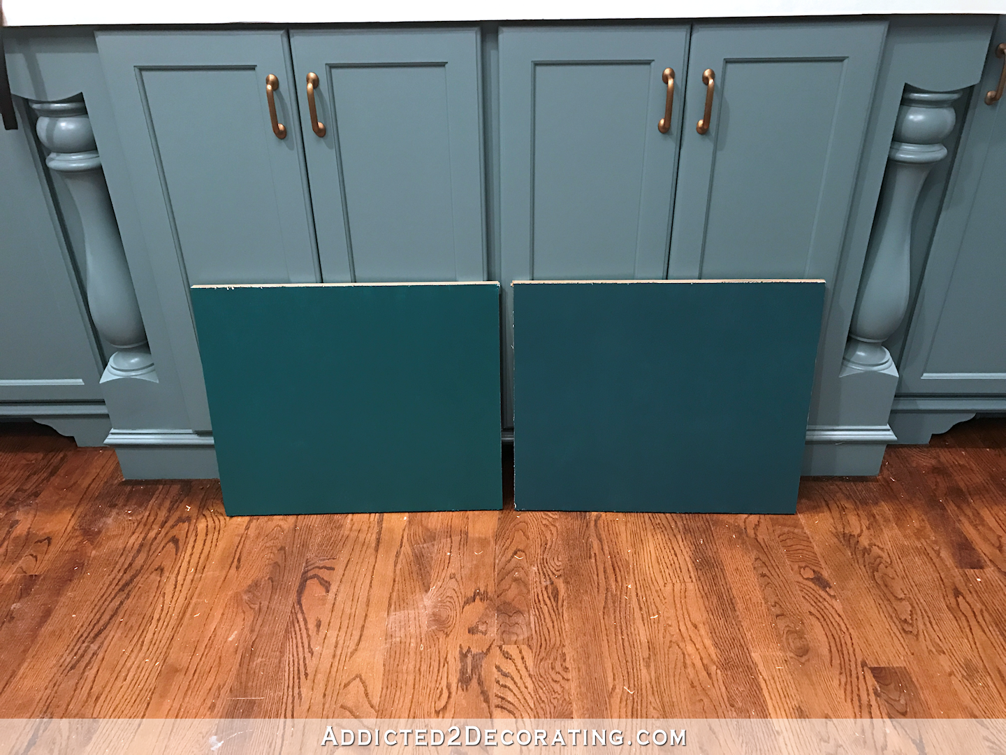
I’ve decided that I want to paint the doors, the cabinets, and the trim (crown moulding, baseboards, door casings) a bold color. And since we’re talking about my home, of course the color I chose is teal. I started with five different teals, but narrowed it down to two — Behr Beta Fish, which has a bit more green in it, and Glidden Nassau Night, which is more on the bluer side.
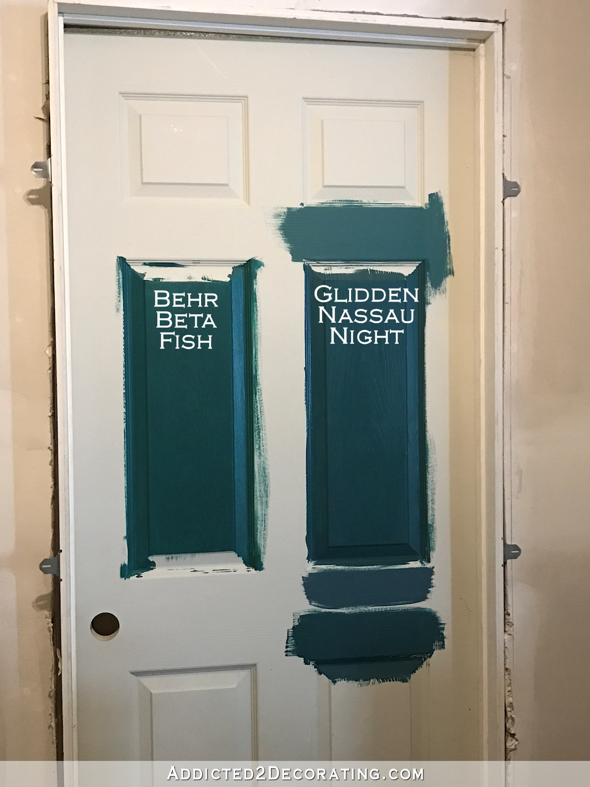
I’m generally drawn to teals that are more on the blue side, but in this case, I really like the greener Behr Beta Fish better. That touch of green just adds so much life and vibrancy to the color, whereas the blue one just seems a bit flat and dull by comparison.
But of course, the bluer one seems to complement the other teals I have in the house better. I painted some samples on the hallway bathroom door and tried to get a picture showing the entryway grasscloth and the bathroom door together…
(Never mind the teal vanity in the bathroom. That can be easily changed.)
I don’t need them to match (which is good, since neither of them match the grasscloth), but I’m afraid that the greener one is too green to even complement the grasscloth. And that disappoints me because I love it!
I think both of them complement the kitchen cabinets, although I do think the bluer one looks a little better.
But that green one. *Sigh* I love it. I’m trying to convince myself that it will work, but I won’t make my final decision until I get my new hallway light installed. It arrived yesterday, so I hope to get the ceiling primed and painted today so that I can get it installed by the end of the day. Then I can see each color in the actual light that will be in the hallway. That might make the decision a bit easier.
Anyway, I’m excited about my plan. I’ve never done a room where I’ve painted the doors and trim the same color (other than white), so this is a bold departure for me. But I love the look when I see it in photos, so I have high hopes that I’ll love it in my hallway as well. And if not…well, it’s just paint, right? 🙂

Addicted 2 Decorating is where I share my DIY and decorating journey as I remodel and decorate the 1948 fixer upper that my husband, Matt, and I bought in 2013. Matt has M.S. and is unable to do physical work, so I do the majority of the work on the house by myself. You can learn more about me here.

I think you are going to be happier with the blue-er tone. Save the beta-fish for something in your studio that isn’t in line of site of the rest of the house. If it is close, but not quite right, it will bug you every time you see it. Love seeing your progress!
I agree with the blue-er one as well! I think you will end up repainting if you go with the greener one. The blue-er one just seems so right!
I lean to blue also but am with you on the green this time. Ultimately, I think the blue-er one is a better match given all the considerations. You can’t lose either way. They are both gorgeous. Sorry to hear all the frustrations. I am frustrated for you just reading about it. Gah! Yes, WIN today! Have a great one.
YES! It is just paint and it can be changed! That’s why I love paint so much, I can change it on a whim. I love color and sometimes you need to just realize that shade or color just doesn’t do it for me and change it. Live with the colors that make you feel happy when you see them. I can’t wait to see your hallway all painted!
Bummer. I’m not a fan of shiplap, and now, well, my feelings are worse. Good for you, though, having that winning spirit!
I like the blue-er color. It will look great with the doors and trim the same color!
Happy Anniversary!
Love the blue-teal from Glidden! Immediately caught my eye. Not sure about how you plan to use it so looking forward to seeing the end results – you’ve changed my mind a number of times over the years!
Also, what color/treatment will be on any wall space? May have missed that info :/
Poor you – it made me cringe with frustration just reading about the not-cutting-episode on the doorframe, so I do not really want to picture myself in that situation – I definetely would have thrown something across the room! I keep my fingers crossed that you’ll manage to get it fit today and can move on to nicer things!! Such as painting.
I do not really understand why the colour in that hallway has to complement the kitchen (can you really see both at once??), even though I understand about the grass cloth in the entryway. Anyway, I am drawn to the more greenish colour, too, and thus thought perhaps you have to reconsider other paint options when you’ve installed the light in there? Whatever you do, I wish you good luck and am looking forward – as ever – towards the results!
What if you mix the 2 colors together?
Sorry about the challenges with the door!
Excited to see this space come together!
I actually think the greener one is a nicer compliment without getting too matchy-matchy. Since it is only paint and you really do like the green – try painting that one first and live with it a bit. You can always go to blue if you do not like it. But you will never know if you do not try!
Me too! I second the beta fish! At least on my screen it does not seem to detract from the rest of the house in any of the photos, and I feel you are trying to force a colour you may ultimately regret by choosing the bluer colour that doesn’t really speak to you.
for an 1/8″, I wonder if a sharp hand planer (where it can reach) and a chisel (where you can’t plane) would work well? Only if you can protect yourself from wayward slips.
Exactly! I was thinking, “You need a plane!” lol At the top, where you couldn’t get in the corner, that’s where a chisel comes in handy.
Remember repainting those green kitchen cabinets? Opt for the bluer tone.
Kristi, The two colors are so close and far enough apart that I don’t think it makes a difference. I immediately went for the greener one too. As suggested above, do you think you can mix the two?
I bet you won’t even remember liking the greener one once you put the blue one up. They are so similar – I think the only reason you can really tell a difference is because they’re right there next to each other.
I say to go with the greener one, you want to layer colors that compliment and are not to matchy-matchy or any time you add in a slight variance such as this it will look out of place. I say go with the green and add a few pieces of art places. I think if there was a wider angle image, we could see that the art that is on the grass cloth actually compliments the green paint and pulls it together in an organic non matchy matchy way.
Firstly, Happy 15th Anniversary, Kristi and Matt. Secondly, I feel so sorry for the frustrating day you had with cutting through the ship lap and fitting the new door and third, the paint colors are both gorgeous, but for me, I’m leaning towards to the blue-er teal. Just wondering though, will having the cabinetry, doors and all the trim painted in this dark teal color, make your hallway feel too dark? I know you have great vision, so will look forward to the reveal.
I just knew that bathroom wasn’t safe from changes 😉
I honestly cannot tell the difference between the two colors. I like the name Nassau Nights better, not that it matters. Poor Kristi, your story about the petrified ship lap sounds totally surreal. I bet by now you have cut another 80″ line. But from the pictures, I cant even tell the door is cockeyed. So you are going to also paint the bathroom door to match? That makes sense.
I’m drawn to the bluer teal, but if you really love the greener one–and it is just paint–I’m in the paint-it-the-color you love camp. If it’s not right, you’ll know soon enough and then it won’t be a hard decision–and you’ll have a lovely base coat of a close color.
OK, lol, that is a BOLD choice, but I admire that you choose what makes you and Matt happy! So sorry about your frustration with the door though! Hopefully it will be smooth sailing from here. Did you post photo’s of the light fixture you plan to use? I’ll have to look back through prior posts and see if you gave a sneak peek!
Happy anniversary!
I hate it when home improvement projects mock you. I’ve had my share of them in a 50’s house with nothing plumb. I like the bluer teal myself, but then blue is my favorite color. I think it complements the other colors in your decor better. You can always use the green teal in a bedroom or the game room. I wonder what that shiplap is made from to be so hard. A friend has an old house (built by her grandparents that has solid hickory plank boards under the walls and she said they are tough to cut.
Good idea on waiting for the light. It will change the colors and may end up making your decision. I love everything painted one color and I too am a teal girl. Just found the right color for one of my walls and it took some time because the light kept changing things. The look I wanted was actually not my first choice, but the way the light reflected, ended up looking more like my first choice. Hope you followed that. I too prefer the greener one, but it’s going to look different when you get the light in.
I’m loving the Beta! The Nassau looks great with your kitchen cabinets but it’s very matchy matchy in my opinion. That Beta tho…
Congratulations, happy anniversary to y’all!
I think the Beta has more spunk to it. But if they are both driving you crazy….maybe you are really craving a different color entirely? Please don’t throw paint cans at me… 😛
May we see a photo of your 2 painted board samples right next to the grasscloth?
Put the bluer one on the cabinets you are building now. Maybe change the bathroom vanity to the Beta Fish color?
Remember the post about “hiring out”? This instance is an example of having a really good relationship with a Big Man With Big Tools. I’m speaking of someone about 6 foot / 225 pounds. You have the knowledge and skill…but not the size. Sometimes size really does matter.
Waiting for the light is a good decision. And I almost always say go with the color you love, but if you think it will bug you, maybe use the blue toned one in the hall and save the green toned one for your studio. Either way, it will be a pleasure to see the finished result. Sorry about the difficulty with the door; it’s so frustrating when things go so awry. I totally enjoy your blog!
I think i would mix up a sample of the two colors together and see if i like it better. Just try it and see. Good luck.
Go with the green, Kristi. I don’t know how dark the hallway is but if you are depending on lamps the greener has a light to it the blue does not. And anyway, green and blues are complementary colors.
Congratulations to you and Matt! May you have many more years together!
As to the paint, well, shucks, blue and green are classic complimenting colors, right? Go for the one that speaks to you and lifts your spirits every time you look at it. I love a variety of colors that coordinate rather than match exactly. Getting the light installed will probably help you make the decision.
And, as to the difficulty of cutting into the shiplap, at least you know your house is solidly built, right?
Happy anniversary, Kristi and Matt!
Kristi, I think you need an angle grinder to cut things that the saws wouldn’t take. There are smaller grinders that don’t require extra physical strength, I have a cheap one for occasional jobs like this. It can cut through stone or concrete, virtually through any material.
I already said so on Facebook, but wanted to say so here —- HAPPY ANNIVERSARY Kristi and Matt!
We had or 42nd on Wednesday!
I felt bad that you had such a time Wendesday, but I’m sure you’ve overcome it by now. As for the paints, I was drawn to Beta Fish too, but I know you will choose what looks best in person. Sometimes what we see on the screen isn’t the same in person.
Hope you are having a better day today.
*our*
Happy anniversary! Love them both and as somebody else mentioned I think the Beta Fish looks fine with the glasscloth, at least on my monitor. Sorry you had a rough time, so frustrating!
I’m a green lover so I’m naturally biased toward Beta Fish, but objectively I think you are right that the other option is a bit duller and not as interesting, like you noted at the top of the post. As for “going” – I think almost all blues and greens and blue-greens go together well. They do in nature! And in peacocks. Go with the more beautiful greeny teal, because to be overly frank, I’m getting a little bored of all the teals in your house being within half a shade of each other. I think this will be just different enough to add zing and similar enough that it makes sense in the larger story of your home. Condolences on the dang doorway width & saw frustrations!
Like Rebecca, above, I don’t see the difference between the colors. Just a subtle nuance when side by side. I’d go with the one that goes better with everything else. The lighting will be all important, so wise to wait till that is up. I was all set with my dining room color, until I turned on all of the lights one evening, and it was not acceptable. Whole other look. I painted several posterboards to get a good idea, but still difficult to tell for sure in all lighting.
Happy anniversary! You’re pretty amazing. Way to hang in there and get that door to fit! I lean blue. Can’t wait to see how it turns out!