I’m At A Crossroads
Before I tell you what I did yesterday, let me answer the most-asked question from yesterday. It went something like this: “Kristi, why are you worried about your kitchen right now when you have so many other projects that need your attention? Why don’t you finish your breakfast room first?”
I get it, and I completely understand those of you who get irritated with my jumping around. Here’s the deal…
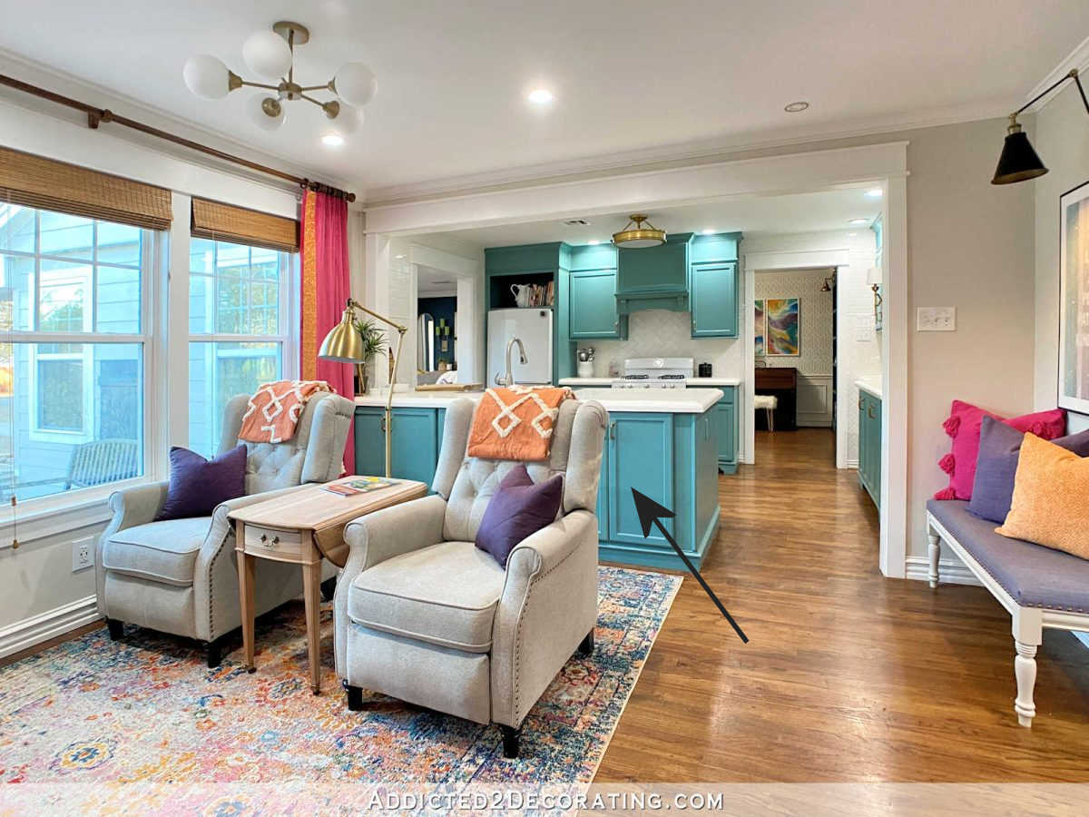
My kitchen is in the very middle of the “public” spaces of my house. You can see it from my front door as soon as you walk into the house. It connects the breakfast room, the music room, the dining room and entryway. You can see it from the hallway. While it’s not literally in the center of the house, it definitely feels like the center.
That means whatever I do in the kitchen, especially since I’m not an “all white kitchen” kind of person and I want something bold in there, will necessarily need to be the jumping off point for the rest of those rooms. My breakfast room walls are primed and ready to be painted, but I can’t do that until I know for sure what I’m going to be doing in my kitchen. And if I’m going to be doing a wall mural or stencil on the breakfast room walls, it sure would be easier to do before I install the trim around the doors and windows.
So I’m in a holding pattern for now either until I figure out my decorating plan or until my bank account is replenished on the first of next month and I can finally start building my pantry cabinets. I’d rather not waste these last few days of this month, so it seems like a perfect time to figure out my decorating plan.
All of that to say…that’s why I’m talking about my kitchen right now. 🙂
So now about yesterday…
I looked at those greens all day yesterday and finally decided that the one I liked best was actually the light one on the right.
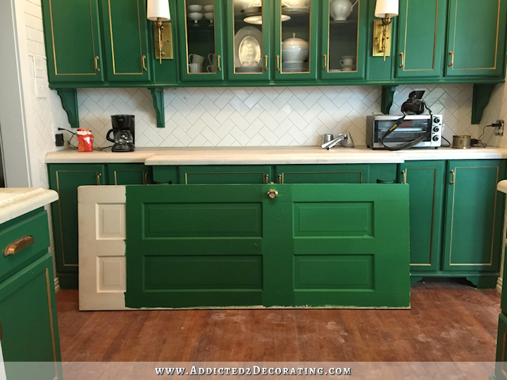
Interestingly, it looks darker during the day. It’s at night with no natural light that it looks a bit brighter.
So I took that paint swatch to Home Depot to see if I could put together a color palette to go with the green. I want a bright, fun, cheerful, colorful house, so I need other colors to go with that green.
And that’s where I hit a dead end every single time. This house for the last two years has made me doubt my decorating skills, and it’s been so frustrating for me. I mean, I decorated a condo filled with color that I absolutely loved.

And yet every time I try something in this house, it’s wrong. I just can’t get it to work.
Well, you know what I realized yesterday? I don’t think it’s me. I think it’s the color. I think I’m trying to take a color that’s really best for one thing, and I’m trying to do something else with it.
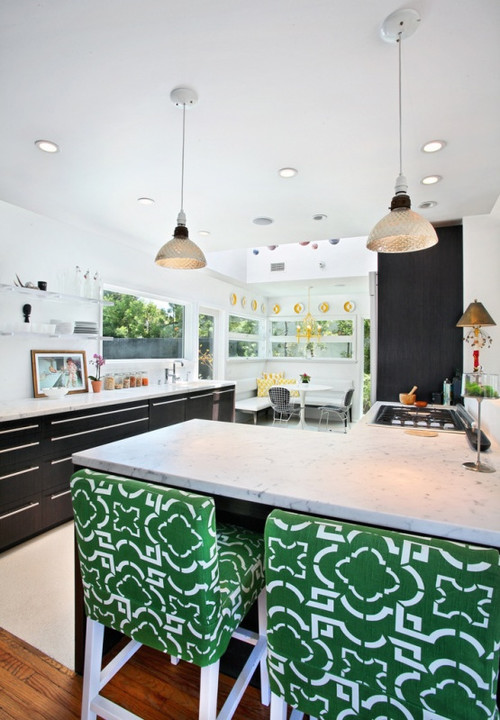
Kelly green is a very strong color. If you go to Houzz and look up “kelly green,” you’ll see a bunch of rooms where kelly green is the dominant color, and there’s not much else going on in that room. That’s why you see so many rooms with kelly green and white. Or kelly green, black, and white. If there’s other color used with it, it’s almost always in a very small dose. Very small. As in, not enough to satisfy my color-loving self.
See? Kelly green and white…
More kelly green and white…
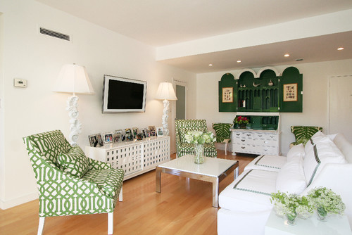
Kelly green, black, and white…
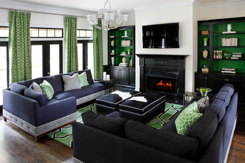
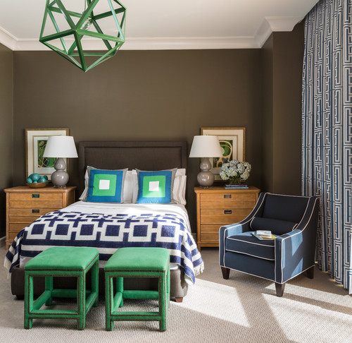
Of course, it goes great with brown, and the most common color pairing with kelly green is navy blue…
More kelly green, black, and white…
Kelly green and neutrals…
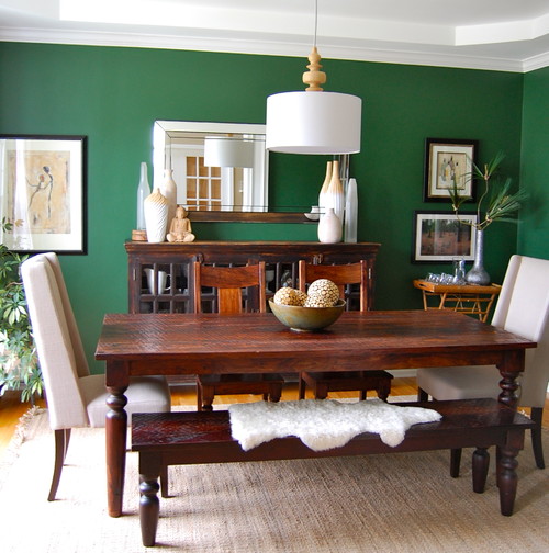
Kelly green, black, and white…
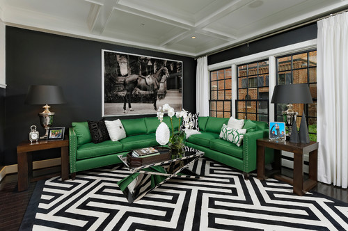
You get the point. Even if you search on Pinterest for “kelly green decor color schemes” or something like that, you’ll find a lot of kelly green and white, kelly green and black and white, kelly green and white and navy blue, kelly green and neutrals. Every once-in-a-while you’ll see kelly green and white and pink. Or kelly green and white and black with a vase of yellow flowers and a yellow throw pillow.
That’s not to say that there aren’t rooms out there that have a dominant kelly green color mixed with lots of other colors. The problem is that I’ve only found about three or four, and I don’t really like them. Kelly green, when used as a dominant color, really shines best used alone with white, or with black and white, or with neutrals, or with an equally strong color like navy blue. A second color works in small doses, like a vase of flowers and a couple of throw pillows. But any more colors thrown in just start to look busy, in my opinion.
So while I as at Home Depot, I decided to just put kelly green out of my mind for a while, and I just started grabbing colors that really appealed to me. I wasn’t necessarily trying to put together a color palette for my house. I just wanted to pull colors that I liked and see where that took me. Here are a few that I ended up with…
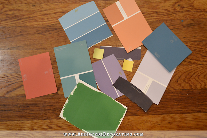
And of course, that kelly green sticks out like a sore thumb. 😀 I had some other softer greens that looked better with those other colors, but evidently I lost the card. And the biggest surprise for me? The purples. For years now, I’ve hated purple. HATED purple. Hated it. And now all of a sudden, I’m drawn to purple again.
And the most interesting thing was that I just imagined one of these other colors on my lower kitchen cabinets and what that might do for the rest of the rooms, and all of a sudden it all started coming together in my mind. I won’t say what color I imagined, because nothing is set in stone and I could change my mind 100 times again before I actually repaint. But the point is, the ideas started flowing, and the ideas started flowing with each other. I could finally imagine a colorful and unique kitchen, and connected color-filled rooms that all blended together and complemented each other. Ending my two-year-long fight with kelly green seemed to unlock something in my brain.
So all of that to say that at this very moment, I have no idea where I’m heading. I really, truly love the idea of a kelly green kitchen. Kelly green kitchens are rare, and I like that. I don’t want something that five million other people in this country have. I want something colorful and unique, and kelly green certainly fits the bill.
So I’m at a crossroads. If I stick with kelly green, I WILL have to hire an interior decorator to help me come up with a plan for the rest of the house. I’ve demonstrated for two years that I can’t do it myself. I just start filling the rest of my house up with black and white, and any time I try a color, I end up redoing it. (How many times have I repainted that dining table? The buffet?) I hit wall after wall after wall. And even if I hire an interior decorator, based on what I’ve seen on Pinterest and Houzz, it’s doubtful that even he or she could come up with a plan that would satisfy me.
Or I can go the other direction and pick a different color that’s easier to work with and lends itself more towards being a “colorful neutral” that can be used with many different colors in adjoining rooms.
I’m leaning towards the second option.
UPDATE:
I did repaint my kitchen, but I went in a different direction. Click here to see what color I chose and how it turned out…

Addicted 2 Decorating is where I share my DIY and decorating journey as I remodel and decorate the 1948 fixer upper that my husband, Matt, and I bought in 2013. Matt has M.S. and is unable to do physical work, so I do the majority of the work on the house by myself. You can learn more about me here.
I like, no love, option 2. Because hiring a decorator just isn’t you.
And those blues….💙💙💙💙
Can you tell my favorite color??
“colorful neutral” is a fantastic term. Go forth!
I love your cabinets. I think you should keep it simple if you keep the green. It will still be unique because it’s YOUR home. And let’s face it, not a lot of people do green. I love a beautiful neutral home with pops of color. If you mostly have your bedroom left to do, can’t you do fun colors there?
I was thinking do the Kelly green + B&W when you get to your bathroom 🙂
I do think you have hit the nail on the head as to the problem. And the answer is do Kelly green and limit other colors; if you want other colors, nix the Kelly green as dominant.
As to your color options, I know you have done it and so many others as well, but Blue to me is the best neutral “color” their is. I think you should consider yellow, which really will work well with some of the other colors and plans you already have in place.
Have you ever heard of something called ‘the sunk cost fallacy’? It sounds like what’s happening with the kelly green paint.
Even though it’s making your life harder now and will continue to do so, the emotional/time investment is keeping you from dropping it. Lifehacker had a good article on it and if you read it, this sounds a bit like the relationship comparison in the article.
I think you should try out different colors and follow that new direction of plans. Worst comes to worst, it’s just paint. If you really miss the kelly green and regret changing it, you can paint your cabinets back to that green with zero regrets or doubts about it. I mean, yeah painting them twice takes time and effort, but it really sounds like this color is only hindering you now.
Good luck! As always I’m looking forward to more of your posts. 🙂
To me, it is indeed, honoring, sunk costs. The green was bold and beautiful and would look good as a stand alone room. However, homes don’t work like that. I would bite the bullet (or the paint stirrer) as suggested and go with repainting and reconsidering. I just went to Home Depot and came back with a huge handful of color cards so I can ponder painting three rooms. I want them to flow and my painted living room is not playing well with others.
I feel your pain, because we were handed down a really nice leather couch and club chair, and it’s a dark green. I’ve struggled for years to decorate around that stupid green furniture. I’ve finally settled into a green/navy/coral-orange scheme and this fall I added in some deep plum which is really pretty. But my green is much darker than what you have in mind, so it’s a little easier. All that to say, I feel your pain! Your all green kitchen is very dominant and it would be hard to find other things to coordinate. I’m glad you’re open to redoing the kitchen because I think you kind of pinned yourself in with such dramatic cabinets, even though they’re beautiful!
I think Kelly green can look nice with bold peaches (like in the patterns in your other rooms). If you can see yourself using that in other rooms with splashes of the green to tie in the kitchen. I also like peach with navy. Otherwise, I like option 2. You have had a Kelly green kitchen for a while now, so it is not all for naught. Keep up the great work, you are an inspiration.
I also find great inspiration for color combinations in fabric.
Kristi, have you ever checked out http://www.design-seeds.com before? A great website for color palette inspiration, and almost all of it is free of charge.
I love Kelly Green, White, Navy, and Coral together! With that palette, several other colors can be added as highlights or accents:aqua, yellow… ones already in your handpainted mural. ~:0)
Agreed on both counts.
I’m still of the mind that you should just go ahead and paint your upper cabinets white before you do anything else or try to make any color decisions.
I tend to agree . Green means Life and you are all about that .
What is the difference between hiring a color consultant for a couple of hours and hiring a floor guy ? I have received valuable help with my home by doing that, but the outcome is all me .
Sherwin Williams Stores have free design and color consultant services. You just go in and talk to the person and tell them your problem. They will come out to your home and help you with color choices. They probably expect you to buy your paint from them, but it is good paint. You can always say you have to think about it. Then take the colors you have and go wherever you want. A bit dishonest maybe, but only if they expect you to buy from them.
Agreed
Until you can decide, why not leave your breakfast room walls white at last for a while? You could then use painted chairs and/or table in the green as well as other colors. You can certainly find a wallpaper or curtain fabric with lots of green in the leaves, a white ground color, and colors in the patterns. That would enable you to bring in all those colors in the other furnishings.
Yes, this is good advice. During 20+ years in the home finishing business, I always considered walls the floors to be the canvas upon which the character of the room is joyfully “painted”.
Kristi, white upper/kelly lower cabinets truly can stand on their own. It will be an artful mixing of metaphors, and given the layout of your house, surrounding rooms can still be everything they tell you they want to be. Whatever you decide to do, I know I will remain amazed at your vision and at your work ethic that makes it come to life.
Kelly green, cobalt, and orange?
I feel so bad you’re hitting this roadblock. My heart goes out to you. 🙁
You’re very passionate (and specific) about color and watching you go through all this, it’s been like watching you try to use all of your favorite crayons in the crayon box on the same page and they just don’t work together. That’s one of the problems with an open floor plan. Your rooms aren’t really separate entities and I think because you’re going room by room, you’re feeling it even harder.
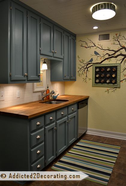
This probably isn’t helpful, but I really like the one with the green curtains and blue sectional above. I usually dislike kelly green, but that room seems to use it in just the right balance. If you liked the blue (which I know isn’t your favorite), I could totally see you doing that in the breakfast room with green drapes, blue banquette cushions, and maybe a green accent rug or chair covers or other fabrics. It might even blend with keeping the cabinets green, though that might be too much.
I think maybe the problem you have is “too much of a good thing”. You’re right that kelly green is a very strong color and it kind of takes-up everything if you use a lot of it. So maybe, just use less of it? The cabinets are the biggest thing in the room, so maybe they shouldn’t be green. That begs the question of what color they should be, of course… I don’t know. You don’t much care for neutrals other than black. White against the white tile will probably wash-out, unless you can get some color out of the countertop and things ON the countertop. How about a gray, or a brown, or a nice navy blue?
I know a lot of designers ask their clients to find an inspiration piece or to tear-out items from a magazine so they can get an idea of the color palate they like. Maybe you need to start that way, too? You seem to be working like a builder (starting with paint and matching everything to that). Maybe you need to start with a fabric or a lamp or a chandelier or a wall hanging and take your inspiration from that? Since you like to create, maybe you need to do some crafting…create some wall hangings or interesting little side tables or a couple of pillows or cushions just to get your inspiration going?
Hmmm- what a dilemma. But it sounds like you have found your sticking point. Part of what you loved about the inspiration photo was the gold accents and now you have let go of the gold so perhaps the kelly green can go too but come back in accent pieces instead of the main stage. Opening up the mind to new options is a very freeing thing once we get past the old images in our head. Good luck!
What I noticed with the paint sample cards, which I’m sure you’ve noticed too, is that they are all colorful yet muted/duskier versions of your kelly green. These colors also seem to go with your bathroom better as well. What about a slightly more muted/duskier version of green?
That struck me too!
Yes, me too. And, the kitchen cabinets in your condo were not brightly painted but painted in a muted blue, which blended nicely with the remaining multiple color choices. But, not one of the colors jumped out and screamed color. Since I am an artist, you can’t have all your colors screaming at you. I am always complimented on my decor but I guess that’s probably because being an artist I get the whole house color scheme concept. I don’t want dominate rooms or items, I want a beautiful cohesiveness. And, through the years, I’ve had to throw out ideas that I love that just don’t work in the grand scheme of the current house. (I’ve had more than a dozen houses) Obviously, this won’t be an issue for you any more because you’ve grasped the issue now with gusto. Not that it will all be easy peazy, but you are aware of what you are fighting and that will make it easier to eliminate potential problems before they arise. Even if you keep the green you will keep it with the understanding of what you are up against. Beautiful.
I always wondered why you went from a cooler toned colors to such warm colors at the new house. If you notice the colors you picked out yesterday are all a bit cooler. Still bright and lovely, but def cooler. I think you wanted a green kitchen because you like the idea of it. But the other colors are really what your heart desires.
Having said that … if you want to work on your kitchen and not something else – GO FOR IT! It is your house, your time, and your money. You can do and re-do as you see fit. I don’t understand why people think they get a vote as to what you do or work on!
Have fun with your new ideas!
Get down with your bad self, imo. Go with what moves you since you’re repainting anyway. And given that you’re probably going to be re-decorating your home forever as your tastes shift, whatever you choose is only temporary. 🙂
As an aside, many years ago I won a home depot gift card from one of your giveaways which I’ve been selfishly hoarding all these years for “a rainy day.” We just moved to a new state and our funds are pretty drained and our washing machine didn’t work. So we got a new washing machine and finally used the gift card I won. 😀 So thank you for saving us on our rainy day!
I was wondering if you ever just considered painting the top cupboards white like in the pictures, and leaving the bottom cupboards the green that you have? It might make a difference.
Green is hands-down my favorite color, so I see why you would’ve wanted green (especially Kelly green) cabinets. I think your kitchen is gorgeous, but you have to be happy with it not me. Would coral or peach cabinets work? I remember in high school my mom painted our kitchen cabinets peach and I thought it would look crazy, but surprisingly it looked great. I love your enthusiasm and passion for color and how you want your home to look and feel. I can’t wait to see what you come up with. Good luck!
Kristi, remember how much you loved that Cameron Diaz kitchen? Maybe you should go back and figure out what attracted you to it. It had very prominent copper backsplashes that were a beautiful foil for all that green. And it does not look like it gets much natural light. To me it looks like a rich malachite more than kelly. Remember back when you were painting glass panels to consider them for a backsplash? I’m surprised you did not explore a copper metallic paint given that kitchen. CD’s kitchen is a world away from those green and white kitchens. I think you have just veered away from the original inspiration for the green. You were not originally inspired by green and white subway tile kitchens. But now you have gone that way, and that may be the best way to go because you have a beautiful house filled with light and space and that was a dark looking Manhattan apartment. I’m not saying you should go back that way or tear out your white subway tile (if you even think of that don’t blame me) just realize that maybe the the saturated malachite and burnished copper kitchen works better in a cavelike or cocoon like atmosphere than it does in a beautiful airy Texas home.
well said
Very well said!
I love love 2nd option. I love your bold choice of the cabinets. Neutral or soft color cabinets with strong accents will look great. As always I love following you!
Don’t know that this will help resolve your current indecision, but I thought of you immediately when I ordered this book: COLOR THESAURUS! I LOVE color!
Can you tell me where you got your Color Thesaurus from?
Just an observation, but the colors you tend to navigate towards have been soft or muted, not jewel toned. Could it be the tone you are wrestling with, and not the color exactly?
It lakes a while to figure out the colors that make our minds hearts and eyes happy. I look forward to seeing what you decide.
Joy, I totally agree with your observation of “jewel” vs soft tones.
Bless your heart. I’m praying for discernment. And no hired decorator can match what you want in your heart.
I know you don’t like all white kitchens, but have you thought about green for the bottom cabinets and white for the top? It would make it so that they green wasn’t so dominate and easier to pull in other colors to other room. Also, another mural on your breakfast room wall? You have the beautiful bird and butterfly mural, and another something similar to that might be a bit over done. I am excited to see what you decide.
I agree that kelly green is a really dominant color. I was actually going to post a comment on yesterday’s post, if you hadn’t done another post today. I actually love 1) kelly green, navy, white, and coral or pink or 2) kelly green, khaki, white, and turquoise, or 3) kelly green, black, white, and yellow or 4) kelly green, white, and royal blue (like the inspiration bathroom) or 5) royal blue with shades of turquoise and green as accent colors. But, given the samples that you picked out yesterday, I really think you’re drawn to slightly more muted tones. Maybe it’s the camera or my crappy computer screen, but the samples all appear to have just the tiniest hint of a gray undertone. It feels like any of those would fight with the jewel tone of the kelly green. There was a comment along these same lines on yesterday and another today. I’m sorry you’re struggling! It’s so tough when you think something should be easy for your, but it turns out to be hard.
Back when houses were either all avocado green or gold, I had the green for years everywhere. So never liked the strong green in your kitchen. Then another house years later painted my master bedroom and bath peach. My husband disliked it immediately and said it was pink. Few years later, I hated it.
We retired and got my dream home with very opened concept. All of it was painted SW copper haze. It is a beautiful warm neutral. I have changed so many color schemes in almost all the rooms over 12 years we have lived here and the wall color has never been a problem.
All of this to say be wary of lots of green and peach or coral. There’s a reason for neutrals.
So what I see in your color chips is beautiful, muted colors. What I see in your condo is beautiful, muted colors. The kelly green, while beautiful, is not muted. You can’t add bright pops to it like you can with the other colors, because as you noted, it doesn’t play well with other vibrant colors. And clearly, a neutral palette is not your style. So how can you add that pop of kelly green into your kitchen? Are there accessories you can incorporate? Just seems like the wall tile and counter (even if it was black) would fit with those bright pops, and you just need to find a wall color that is in a muted color that will let the pops shine. Maybe just paint the breakfast bar the kelly green? I think there are ways to incorporate it, if you still want to, without it dominating the room like it does now.
Em Henderson is doing a green kitchen right now. It’s not Kelly green, but here are her color pairings:
https://www.instagram.com/p/BL9rkWKDc_K/?taken-by=em_henderson
So chic!
Okay here is one more suggestion. The Kelly green cabinets, soft ivory (towards the yellow spectrum) walls. Then you have the ability to accessorize with black, mint green, navy, darker yellow, gray, brown. I am not a fan of peach but that is an option as well. Love the idea of the Kelly green cabinets. Good luck.
Look at the watery blue card that you have there…It works with everything and it is not far from the condo…and it is always cheery but not jaring like Kelly green…At some point you liked coral and watery blue and coral work….Good luck…I painted my dining room 8 times before deciding I am really a Toasted Almond person…no drama on the walls all in my accessories…Orange, slate blue, etc
This is gorgeous too:
https://www.instagram.com/p/BK3NUqgjKTk/?taken-by=em_henderson
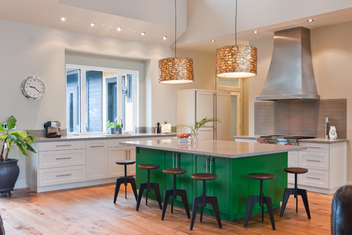
That is a beautiful color green, bold, but not over powering. This would be a color that wouldn’t keep you from using other colors in your home.
Looking at the paint samples you brought home, I agree with many others, that you prefer muted tones vs. bright bold jewel tones. There is a swatch the is very similar to the color you painted the cabinets in your condo, I think that would be beautiful in your kitchen. It would also go with the colors in your dining room and entryway. It goes with everything else I. Your house so far (except the jelly green). All the other colors you have looked at or considered previously have been very cohesive (like the colors in the dining room), it’s just the kitchen that doesnt work. I do love the green and gold, I didn’t think it would look good, but it is beautiful, it just doesn’t really go with anything else though.
I think the blue/teal type color would work beautifully.
I’m confident you can come up with a completely unique kitchen using option #2, Kristi! Yes there are plenty of blue and green kitchens out there, even a few pinks (especially retro) but purple ones are highly unusual to say the least 🙂 I can totally see a dark purple on the lower kitchen cabinets.
Hmmm, I seem to remember you struggling with “green” before. Entry hall? Perhaps you like the “idea” more than the reality. I have never been a fan of green, no matter the shade. Then, years ago, I visited a home where the MB was done in green and white. It was gorgeous! I never did find out exactly what the brand / color was. I will never forget that room but, I would never use green in my own home. Funny, isn’t it?
Have you considered Black base cabinets and white uppers?
Yes, Yes, YES!!! I was thinking and hoping the same. I think that would look stunning with brass hardware. Then add bright color accessories.
Just a thought – you mentioned needing to change the countertop colour – would kelly green work on that?…..with white upper and lower cabinets and kelly green inside the upper cabinets with glass fronts. Or, can your subway tile be painted Kelly green? I would avoid the black countertop – been there – it was a nightmare! But maybe a dark charcoal in the leathered look would work.
What a great post! You use such insight about yourself and so many other things in making these decisions. Many blessings.
I like where you’re going with this… 🙂
You may be the queen of do-overs… but if you don’t try, if you don’t experiment, you’ll never know.
I have to share with you my best-ever decorating moment. In our first home, we made a quick decision to take the space at the bottom of our basement stairs and make it into my office. I had an open house scheduled, so we decided to get this project done in a matter of weeks. I knew I wanted BM bright white trim… but that was it. My husband encouraged me to go with my heart and in 15 minutes I picked out the carpet… I picked out the wallpaper equally as quickly… and the rest of the details just flew into place. The point… usually I have long periods of time to dream, think, and decide. And second guess. Since then I’ve learned that I really need to follow my heart as those first instinctual “heart throbs” have proven best when it comes to color.
Can’t wait to see what you decide. 🙂
I think you need to hire a decorator !!! It would be cheaper than redoing things. It would help you to get things done in a timely manner. That way you would get everything do and can be at ease with it. And I am sure your husband would be happy that it is done.It would take a burden off you.
When you look at your mural and decor in your foyer (which I love), you have the green lamps, coral pieces, a touch of black, etc. I tried to do a close up on the mural to look for greens, but could not determine if any green is seen–the green lamps work together with it whether it is there or not. Regardless, if you take an element of the mural and use it in your eating area of your kitchen, can you pull your palette together from it? Or, if you do a different mural segment, such as in your prior kitchen, could you get a sense of what you are seeking when you consider your artistic decor? It is my feeling that unless you have that in mind, you may be changing the cabinets too early in the process. I agree with the idea that you proceed with the white upper cabinets, maybe touch up the gold for now, and see what you have. I can envision the breakfast area with white moldings; the white wall; touches of artistic mural here and there, with a touch of greenery in the mural; and perhaps coral accents–such as in the drapery. To me, that is bright and airy–a place I would want to cook.
What about using the kelly green in the pantry? Still get that color, but since it’s more separated, it won’t impact everything else in the house.
I love that idea! If her kitchen cabinets are white. If she goes with another color, the room is going to end up looking like a bag of skittles.
I don’t think you should paint your upper cabinets white. You don’t want to be a sheep and everybody is doing that. That’s just my opinion.
Girl! You made me laugh! I was just about ready to stop reading your blog, because of so many unfinished rooms and you changing your mind a million times. But you have piqued my curiosity! Out of all those paint chips, the teal jumped out at me……and maybe the condo came together so well for you because that blue/teal color made you happy! Anyway, I’m going to continue along with you on your journey and see where you end up! Have fun!
To me it seemed, though sure you like Kelly green, the main reason it is in your kitchen is to be different (and were attracted to the inspiration kitchen because it was bold and different). You can be bold and different with other colors that do coordinate, so getting rid of it in the kitchen seems pretty clear. If you feel strongly about using it in your home, you can always use it in the master or other room not seen from your living areas.
or office, completely veer off track for your office. Pretend it’s in a building all it’s own.
“I decorated a condo filled with color that I absolutely loved.” IMHO, there’s your answer.
Repainting the cabinets a slightly lighter kelly green seems like a huge amount of work for such a subtle change. I think you’re right, the problem is the kelly green …
Yes! Exactly….
I loved the condo, too. It was very inviting…
I do that also, get stuck in something I believe I will love and then, eventually I hate it.. I just bought a house…circa 1979. Great bones, too much wallpaper and amazing diagonal teak walls. I finally was given a painting that I’ve been coveting it since I was 5 yrs old from my mother…the colors are not what I would usually choose, and yet, this is my favorite painting ever….so I’m decorating around it. Sometimes what we think we want isn’t necessarily what we want…
It is still possible for you to have a totally unique kitchen without going to the extreme (i.e., kelly green). I wouldn’t worry too much about “selling out” to ubiquity. I’m pretty sure your kitchen will be one-of-a-kind, no matter what.
I vote that you thank your kelly green cabinets for all they have done for you (Marie Kondo!) then let them go. They are keeping you from moving forward.
I don’t think the Kelly Green fits your style or the house. I think you’ve been trying to work with it for some time now, in every room, except the bathroom, which you blazed through with no problem. I have a very saturated purple in one room and I love it, but not sure I would in the kitchen. I guess at heart I’m a teal girl. (teals and whites, then you could use the apricot elsewhere).
Sometimes a little goes a long way and maybe that’s what you should do with the kelly green. Something else for the cupboards with a hit of kelly green somewhere else would probably sing!
Pick a different color or use the green just as an accent. I’m prejudiced. I dislike kelly green.
I love the Kelly Green! Green, any shade of green, to me, is a neutral. I think it pairs well with any color. The trick is matching the intensity, value, saturation and hue of the paints. Your Kelly should meet hot pink, or bright turquoise, fire engine red, or tropical yellow. Plus, have you looked on your color wheel? It might help. Also, the trend nowadays is to use anything that clashes, i.e., HGTV Home Magazine. But thankfully, you aren’t one to follow trends or fads. Keep the green,
but just remember the key is getting the intensity, value, saturation and hue.
Yes! Some of the other colors you have picked out, Kristi, have come across as flabby, soft, weak next to the kelly green because the intensity, hue, value, and saturation have not stood up to the kelly green. Bold with Bold!
Kristi, I said this before a few posts back when you featured a photo of kitchen with white cabinets above and green below. Gorgeous, striking and elegant kitchen. I still feel the reason that kitchen works so well is that the paint technique looks like a chalk paint or Smallbone type paint job. It is a lovely wash of blue over the green that softens it. Plus, a matte finish. I hope you will consider that the paint chips you picked out were shades or tones of blue – how about trying some paint finishes that combine your beloved green with blue? While your current kitchen is striking, to live with it every day I personally feel it is too much green for a room that size. If you soften it you get the best of both worlds maybe. Maybe?
I don not see anything wrong with bringing in a decorator. I know you are a decorator, but sometimes a second opinion can really help. Right now your mind is running in circles, it seems like, and you are stuck on this kitchen cabinet issue, which actually involves more than just the cabinets. Frankly, I love your kitchen. But if it’s inhibiting you on the rest of your house, get a second opinion!
From looking at what you have loved as compared to what you have done in your kitchen, do you think the kelley green is really not what you love, maybe it too strong of a color. In the condo, you have used muted tones of colors. That is not to say you cannot use Kelley green as an accent in some sort of way. I am the same way in which I love red but I cannot imagine my whole kitchen in red. I know choosing paint colors is a hard decision. Keep up the good work, I enjoy reading what you have done and are an inspiration to me.
I love the colors on your dining chair that you upholstered. I also liked the first material that you chose for those and didn’t use. Both of them seem to incorporate the green in my eyes. In fact the colors you chose on the dining chair are some that are in your swatches there. Can you choose colors from the dining chairs to move thru the other rooms? https://www.addicted2decorating.com/diy-upholstered-wingback-dining-chair-finished-how-to-upholster-the-frame-part-2.html
I think you are on the right track! Take a step back and let your mind start over with all the colors you love and see what feels right for the kitchen and adjoining rooms.
If you decide not to keep the green in there but still want to use it somewhere, perhaps you could save it for something more closed off from the rest of the house, like a bathroom? Oooh, or the future garage workshop – that would be amazing with bright green cabinets!
Going back through some of the photos of areas you love I am noticing a trend besides dusty colors, wood surfaces. I think the kitchen is lacking a wood surface besides the floors. You mentioned staining the counter tops black, maybe instead stain wood tones instead. Condo kitchen had wood counter tops, the bathroom has a wood ceiling and several of the example pictures in this post have dark wood pieces in them. You have cross pollinated the green to all of the rooms you have decorated to date. Green in the chair fabric, art above the fireplace, art in the bathroom as well as the shower curtain. I am curious if just changing the counter top color would make it all flow?
Kristi I feel your pain. As a designer my worst client is me. I end up with neutrals and unexciting colors in my home when I love color.
When I work as a color consultant the worst jobs are where it is a blank slate. The best and easiest is when there is an inspiration piece that my clients absolutely love. Find your inspiration piece and use it as your color palette and to make sure all the colors you select work with it. Come up with the COLOR RULES for the public rooms in the house.
The dominant color in each room can be different but should relate to your inspiration piece. I think of it as the feature color in each room. Use your inspiration piece and feature a different color from it in each room. Then the accent colors should tie back to the inspiration piece and the colors from the other rooms. They can be darker or lighter but they do need to relate. Colors not in your inspiration piece can be used in conjunction with colors that are, but it works be best if they are not the dominant color in the room.
It is also important to determine if you want your color on your walls or furnishings. And, each room will work best if there is dark, medium and light elements, especially when saturated colors are used. For example: light walls, medium floor and a dark furniture piece.
Since your house is now open all the walls should relate if you can see them throughout the house. Since your walls are mostly very light continue that pattern.
In following your own COLOR RULES your entire house will be tied together. These rules can be broken in powder rooms and isolated rooms but if followed through out your house can be very colorful and still feel very cohesive.
So Kristi, what are your COLOR RULES?
I think you’re right about the green in the kitchen. You’re using such a difficult color that limits you in other room. You know you want the upper cabinets white so go ahead and do that. Then do the colors you were thinking of on a door & place it in front of the lower cabinets and look at it from all rooms. You seem to like blue/green. You used it at the condo & loved it. Just because you used it there doesn’t mean you can’t here. The blue/green will give you more options also. If the Kelly green is holding you back now it will continue to down the road.
One thing I have noticed from being a reader of your for many years, is you tend to struggle with allowing any of your projects to be “supporting cast members”. That is why things get done, and re-done, and re-done again in your home. Everything cannot be front and center.
The kitchen is a perfect example. Or the painted floor situation. Or the piano. Homes need neutral, quiet, non attention demanding elements in order to flow and be calming.
Navy Blue and white is a beautiful combo. It will look elegant with the gold lighting and cabinet hardware.
Very well said Melissa.
I think this states the problem very well. The reason the last home felt calm in its own way is because Kristi, you eventually allowed some pieces to be calmer and at rest. Look through the home designs you did for clients in the past Kristi. See how you balance it. I let everything rest in my house at times so I can see where I am going and where I need to find balance.
yes
I keep going back to your original watercolor looking fabric and thinking it could be your jumping off point for the whole house! It has the kelly green color in it along with other colors you could pull from for each room. You loved that fabric (and so do I) so maybe go back and take a 2nd look at it and the colors it would provide you. 🙂 Can’t wait to see what you do!
https://shop.newsouthhome.com/products/fleurish-raspberry-fabric-swatch
I also saw this post today and the blue cabinets made me think of the color samples you had pulled.
https://stylebyemilyhenderson.com/blog/modern-deco-kitchen-reveal
Of the paint swatches you have shown us, two stand out for me. The muted plum in the center and the muted navy on the right side. I have colors very similar to both of those. The plum is on the bottom in my dining room. It has been there since we moved in 26 years ago. The top has changed about three times. It is now a very soft grey, that often looks very light blueish. The dark blue swatch is similar to my Needlepoint Navy. It is a Sherwin Williams paint. I have it in the master bedroom, sitting room and bath. I love this color. I really love the muted plum, which is obvious since it has been on the walls for twenty six years. I think the plum would make for an interesting bottom cabinet color with white on top. Unfortunately I do not see it going with black concrete countertops. I don’t know what would work, other than white marble, which I would love. Maybe my next dwelling will have a plum kitchen with marble countertops and white on top or maybe white open shelving. You have me dreaming. Good luck.
I love purple. And purple goes with everything in my book. Even red. That said, your last house looks to me like the main tie-it-together colour was a very neutral grey/blue. I once had a house that had a different colour in every room. The entry was kelly green. Another room purple. Another room red. Another mustard. I enjoyed it for a while, but I craved a more relaxing colour scheme within a couple years. I have never gone back. And trust me – I LOVE colour (people always remark how colourful my artwork is – even my shadows are colourful!) But I have decided I need more calm, with colour that I can switch in and out. Still, that doesn’t seem to be your mindset with this house.
Since you do love the green, I think you should save it and use it in your (future) office. Do a Kelly Green desk or shelving/cabinetry . You’ll still have the bright green pop of a less common decor color, but it will be in a smaller space that isn’t the center of your home.
Are you still planning to do white upper cabinets, regardless of what new color you choose? If that is the case, why not go ahead and get those done and see if that narrows down your top choices any?
Well, as of this very moment, I’m still planning on white uppers. 😀
Hi Kristi,
I feel your pain! Would you benefit from simply painting your upper kitchen cabinets white, to see how much that affects the use of the green? I know the current green in situ isn’t the one you want, but at least that would give you a better idea of how much difference the upper white cabinets will make. You’re intending doing white cabinets anyway, so you’d be getting something ticked off your list, too. Just a thought.
Good luck!
Liz.
This sentence from your post jumped out at me:
“Kelly green kitchens are rare, and I like that. I don’t want something that five million other people in this country have. I want something colorful and unique, and kelly green certainly fits the bill.”
Who cares what other people have? This is your home, what other people have is irrelevant. If you love it, go for it. It’s not as though you are going to be in all those other kitchens at the same time as you are in your own. Do not stick with a color just because you want to be ‘unique’ and ‘different’, that’s how innocent infants get named ‘Apple.’
Now if you love it and love it more than anything else and can make it work, then go for it. Even if that color turns out to be white, or grey or some other popular color or it turns out to be green or red or whatever. Get what you love and do not make a decision based on what other people might or might not have.
Nooooooooooo 🙂 I LOVE kelly green. It has been my favorite color since I was like 3. I was so excited to see you use it. And I love the kelly green, white and black that you had started. However, I never thought the coral color you were trying fit in with the kelly green. One is bright and the other is muddy. So I can see how you don’t feel like things are meshing. But, I mean, if I were you I would keep the kelly and ditch the coral 🙂 I am like you – I love color. However, I’ve taken the approach that my main rooms stay a little more neutral (just because its too hard to get all of the colors I love to mesh) and the bedrooms get the color. Is that an option? Also, I meant to share this the other day when you were talking about possibly going white in your breakfast room: What about white walls and a black ceiling? We just did that and I am in love with it. You still get the benefits of an all white room, but its not completely boring when you throw in a black ceiling. Check it out here: http://www.ourcorneroftheworldblog.com/surprise-we-painted-again/
I feel like the coral + green is exactly where the conflict started.
The Kelly Green is beautiful. But, when I look at your pictures, it doesn’t have that calm and elegant (mainly for lack of a better term) look your other rooms have. I think it’s so vibrant, it tends to stand out like some of the very eclectic homes I have seen on various sites. Your condo flowed and had that calm, elegant and graceful look that made me want to live there. Again, it’s beautiful. The green just “jars” me visually from room to room.
As I read your post, I’m wearing a Kelly Green plaid shirt… other colors in the shirt are Navy and a light gray. That is the color scheme I would do if I were you.
Pairing the green with navy may help it to mesh better with the bathroom.
I totally understand needing to get the kitchen right before moving on to other rooms. I painted my kitchen cabinets 3 times in quick sucession for the same reasons you are going to repaint yours! If you were choosing for a client, you’d have had this all buttoned up by now. But because it’s your own house, there is a bit of a creative block or repeated second-guessing. I get it!!! It’s just the way it is, lol!
Hi Kristi
I haven’t read any of the previous comments yet so forgive me if I am repeating something that has already been said.
But you said that you had no trouble at all filling the condo with color… and I noticed that all the colors in the condo are muted colors whereas in your home they are bright saturated colors.
Could this be the problem because I notice that the colors that you have chosen on your trip to Home Depot are also muted colors.
Just a thought!!
Oh Kristi, I feel your pain. Color is tricky. I used the color “Eggnog” on my walls and have yet to get tired of it. Maybe that would be a color you could use. It will go with any color and is bright and sunny and also changes color with the light source. Good luck but just know – I know you will figure it out. You go SuperWoman!
You could hire a designer or just throw that money away. You’re not going to like what they suggest and still do whatever it is you want. Your color scheme and design are all over the place. That Kelly green belongs in a Crayola 10 pack. Your swatches are from a Crayola 64 pack of crayons.
Gee, thanks. Feel better now?
inspiration…I love how you didn’t get defensive:)
I remember once seeing this really chic woman dressed in a red cardigan with a purple skirt and kelly green top. It was a pretty stunning combo. i loved it and would never have thought of pairing green with navy or purple with red but they go! I am super thankful for people with that vision sense. You have it Kristi!
https://www.google.ca/search?q=clothing+color+combo+purple+and+green&ie=UTF-8&oe=UTF-8&hl=en-ca&client=safari#imgrc=8DOtXDyggOHgLM%3A
I really truly love reading your blog and your sponsors will be glad to know I’ve purchased products you’ve endorsed.
As a corporate spouse I moved a dozen times always making the home neutral for the inevitable transfer. Since retiring and buying our forever home I’ve been stuck, thinking my choice would last forever thus ending up with no choice. As you’ve demonstrated color can be changed overnight 😹. Start your day with a smile, whatever color that is, bathe your breakfast room in it, change as needed 😆. Your mural makes me smile every time you feature it, but that’s just me. PS what color makes Matt smile?
Any color that makes me happy makes him happy. 🙂 He’s partially colorblind, so he just lets me do whatever I want. He’s said no pink walls, but I have a feeling that if it came down to it, and that’s what I decided would really make me happy, he’d be okay with it. 😉
Cheryl..Ive had the same problem..we are, hopefully, remodeling for the long haul..both of us are seniors..and Ive tried to do our house in something that we can live with for a long long time…then whoever has this house next..can change things if they like..we considered hardwood floors…because they are very popular right now and beautiful as well..then thought about ceramic tile..shaped and colored like hardwood..ultimately..we decided to go with carpet..soft and cushy..because we both have issues with our joints and esp our feet…the carpet just feels so much better..we have beautiful tile in the kitchen, bathrooms, foyer and our little project room…the tile looks like salvaged wood..in shades of green, brown tan…etc…it makes a statement as soon as u walk in the house…our carpet is the same shade of brown..almost a chestnut with caramel tone…and its a short shag..which I love because it reminds me of my younger years..when shag was all the rage..:)…now wall to wall carpet is no longer “in”…and it took us sev years to just bite the bullet and get what we wanted as opposed to what might sell better in the future…for our kids or even us if we decide to downsize…we are so happy we got the carpet..its beautiful and ties all the rest together..but we literally labored of this decision for sev yrs…
Hi Kristi,
As I was looking through Pinterest today I came across this…
http://pin.it/vZLMWvD
I sent it to you via Pinterest plus two more but this is my favourite. I can see this palette easily working in your home with wood furniture and gold fixtures. The colours are beautiful. The key is just how you use them.
Cheers
It seems to me the colors in your condo were not quite as bright, more deeper/neutral tones with color pops throughout. So I also agree with the kelly green not having the right tone if you are wanting lots of color pops throughout. It seems you prefer the brighter colors as accents throughout with more deeper/neutral tones on your prominent pieces (cabinets, etc.). Also, for what it is worth, I have heard quite often to pick the paint last, after all the other selections have been chosen, but perhaps that doesn’t apply to cabinets.
It seems to me that the main part of the green kitchen cabinets problem is there is just too much of it. May I suggest taking a look at the color wheel, specifically the Ives Color Wheel. On the Ives, the complimentary color to green (which is close to a kelly green) is magenta. Green’s triadic partnership is green, magenta and purple. Check with your local library to see if they have a copy of Color Play by Joen Wolfrom. The book is geared to using color in quilts; I don’t see why it can’t apply to anything else color. The book might be a help. Just a suggestion among many. Good luck with finding the right color road.
I love the kelly green – love it – but I totally understand about it being such a dominant color, and not playing well with your other favorite colors. I think some shade of coral might give you the same punch for the lower cabinets, and still work well with colors already in your house. Plus, it would be so different than “just another Pinterest room.” Coral would also work with your current countertops, or even black or charcoal, giving you more options. It just seems like it would give you more wiggle room to coordinate with other rooms, and still be very much a standout on its own in the kitchen. I know you aren’t afraid of bold color, because of the buffet already in the dining room!
Have you seen any of Dimples and Tangles blog? She used a lot of Kelly green with blue and white, leopard, turquoise…http://www.dimplesandtangles.com/2016/01/the-secret-to-pretty-pillows-and-money.html?m=1
http://www.dimplesandtangles.com/2016/06/2016-summer-home-tours-my-interior.html?m=1
Is the issue that the green is so bold/saturated and the other colors are more subdued? Like maybe you need equally intense colors to compliment the green?
You had a beautiful green kitchen that you liked for quite a while. The rest of that area was a work-in-progress. Now that the other rooms are being designed, to me, it makes sense that the green won’t work for you any more. You painted it. You liked it. You used it. Now, it’s okay to move on to a different colour. Give yourself permission to redo it; it’s not as costly as adding a room on!
I love yellow. It’s hands-down, my favourite colour. I painted my kitchen a cheery yellow a few years ago. And, though I didn’t hate it, I wasn’t happy at all. I had leftover sage green paint from a bedroom paint job and put it in my kitchen. I’d never wanted a green kitchen; ever. Until I saw the sage on my kitchen walls. I am in love with my kitchen. I think that’s how it might be for you. The green cabinets in your inspiration photo were absolutely lovely. And that worked for a while. Now, it might be time to paint another palate.
I think you can still love a color and not have it show up in that large quantity in a room. I actually learned this recently as I bought a red rug for my living room. I have always loved red tribal patterned rugs and assumed I would love it and that this was going to bring everything together. It in fact did the opposite and made everything look extremely traditional and the opposite of the way I wanted, but I had to learn that by doing it. I think you can still incorporate green into the kitchen as a non-dominant color but at some point you have to admit what isn’t working. If you’re having this much trouble working around the color then it is the wrong color and something else will work better.
As I get older, I no longer care what the rules are or what someone else thinks. This is our home. We have stuff we love. We have colors we love. We redid our bathrooms a couple of years ago. Every time I walk into my bathroom, my heart sings. I designed it the way I wanted it
Life is too short to worry about what someone else thinks. Go for what you want.
I really love your green kitchen.
I LOVE the green that you are leaning toward right now. (the lighter one.) I think it would look splendid on your bottom cabinets! Also, I love the idea of totally changing your color scheme. Someone said something about purple on the bottom cabinets…that could look awesome! You’ll get it right! You painted your dining room green…didn’t like it…and painted it white, again. I LOVED the journey! To me, that is the fun part!
About hiring an interior decorator…my mom has always been the best decorator I’ve ever known. She just has “it.” You know? When my parents moved into their current home, she was just at a loss for her Great Room/Kitchen/Informal Dining Room combo room. She hired an interior decorator for TWO HOURS. They sat in my mom’s great room, visited, relaxed, talked about color and it came to them. Maybe that’s all you need. Anyway, just a thought…it was definitely worth the money to my mom.
Your house is going to be stunning!
I’m late to the game, so someone may have already said this… But it seems to me like the biggest difference between your condo (which turned out beautifully) and your house (which is frustrating you!) is that your condo had an actual color scheme. Pretty much everything was some variation of yellow, green, or blue, right? Analogous colors. Maybe instead of heading to Home Depot and picking your favorite colors from thousands of overwhelming choices, grab a color wheel and see if you can put together a new color scheme that would apply to your whole house. Analogous, complementary, triadic, throw in an accent pop of color, rinse, lather, repeat 🙂 And then make your little painted wood chip key chain that you did for your condo (which was totally genius and I totally have copied), and always reference back to that. Just a thought! 🙂
Yes to this!
I’ve always thought it was the green. When you were going to change it by a bees whisker I was thinking no!! Lol
Reading this blog, absorbing your words regarding your struggle I kept saying in my mind, it’s the green, its the green, it’s the green and sure enough I read on further and you said it’s the green ☺.. I’ve followed you from the beginning of this house and with the kitchen being front and centre with such a colour that as you said yourself only really goes well with black and white, I believe it is making choices incredibly hard for you. I love the colour, don’t get me wrong however it appears it’s one of those stand alone colours ☺
Cheers from Australia
Krissi..you don’t really have to explain to most of us when you change your mind…altho if u choose to..that’s very nice…but the truth of it is..you are an artist…I think that ALL really good, instinctive, natural designers are artists…and they come from a place of perfectionism…you are trying to bring the reality of the room..or the house..or the garden..to match the picture in your mind…and if you are uncomfortable with a particular shade or hue..then it’s your duty to change it because..if u don’t..u will never be satisfied with the room…actually..we are all along for the journey..and while its fun and more interesting that you often include your audience in the decision making process..it is ultimately your work of art…so just keep doing what you do…you don’t need approval…your work is exquisite..and I absolutely love stopping by for a visit while I have a cup of coffee…I learn from you and even more important..I see a work of art unfolding…from one of your fans
Well said, Nonna! This is Kristi’s art, Kristi’s process, and Kristi’s project. We’re just along for the ride and it’s more than generous of her to share it with us. 🙂
You do you, Kristi!
Sorry Kristi😑This has to be so frustrating.
Your piano, your bold curtains and your cabinets are all such statement firecrackers that anything else in the room needed to recede.
These other colors are much more subtle and all could play well together in the same space.
Your dining room chair is a great piece, with all the colors you pulled. Could fabric swatches be a good inspiration as well?
When you painted your cabinets green, I followed suit…but put white on top, wood countertops, and did a copper back splash. I also bought a Kelly green chair for my living space as it is all open. Everything is more neutral with orange accents so green fit right in. I would send a picture…but I don’t know how😁
I also liked the chair in your dining room!
I know I already discussed jewel v muted colors being the source of conflict in my comment on the last post. Here’s how I would address it. Pull the pictures of your favorite projects from this house and put them all together. Don’t consider if they “work” together right now. Just see what you’ve done that you did like.
Here’s some of what I threw together quickly. http://imgur.com/a/7k6Ph
It’s not just the green. Paint the cabinets by all means. But don’t try and say the green is the only conflict in the decorating scheme. There are so many styles and colors competing here. I know you are starting to lean back to the color and design palette of the condo and that’s fine if you want it but don’t just settle for easy if you want something bolder. You tried a similar look when you did the sitting room at this house and you immediately hated it. My last house I did a transitional cape cod farmhouse look with primary colors and white everywhere. My new house is industrial rustic with dark muted colors and lots of wood tones. It is such a challenge to push my comfort zone with both looks but both houses dictated their looks and the reward is so worth it.
Back in March you had a blog post with a picture of a bolt of Tutti Fruiti P Kaufmann fabric. Are you still planning to use that fabric anywhere? It seems to be the perfect example of the saturated tones and colors. The paint swatches you have assembled above are beautiful, but more pastel than we’ve seen you tending toward. My opinion doesn’t carry any weight, but I think I would keep the green on the bank of cabinets with the glass fronts, treating that section like an accent piece of furniture. I’d paint the rest of the kitchen cabinets white/ivory on the uppers, and black on the bases.
Hi Kristie,
I have been following your adventures for a while and I am amazed at the difficult tasks you undertake. You really are to be congratulated.
I loved what you did in your condo. I think the secret for that makeover was the continuing colour co ordination right through.
In my humble opinion there are so many things you want to try that they conflict with each other for attention. Remember less is more. If you have too many stand outs it just becomes a hodge lodge.
I know it might be boring but I think it’s best to start with a neutral base and build on that with accenting features in each room. You need an overall plan before you start. Like a blank canvas.
We have just finished renovating (it’s taken three years) my stepdaughters old rental property on a shoestring. We decided to paint all the rooms in the same colour (Martini – a neutral beige colour) but with different tint strengths. The darkest rooms have the lightest tint and we painted all the trim and doors in white which has a 1/8 tint of the same paint. They go together very well.
When we did the bathroom we decided to use Palladian Blue with white bathroom fittings. We did the adjoining toilet and laundry the same colour but in a lighter tint.
We have just finished the kitchen using recycled white cupboards and painted the benchtop in a stone finished paint using pieces we cobbled together.
The tiles are white and beige with floating timber floors. I made Beige roman blinds and drapes throughout. They blend with the walls and make the rooms look bigger.
It is all rather bland but it looks nice.
Now that we have finished the house we can start doing the fun part and adding colour and features here and there a little at a time to get it right.
I think you need to stick with an overall theme for the house. Keep it simple!