My Attempt At Pet-Related Artwork {and This Month’s Winner!!}
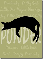
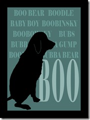
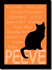
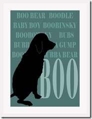
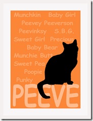
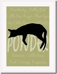
Remember last week I told you that I really wanted to do some pet-related artwork to go above the pet station? Well, I’ve given it a try. It’s not completely finished. I still have to have it printed out, and then decide exactly what I want to do with it. But here’s what I came up with…
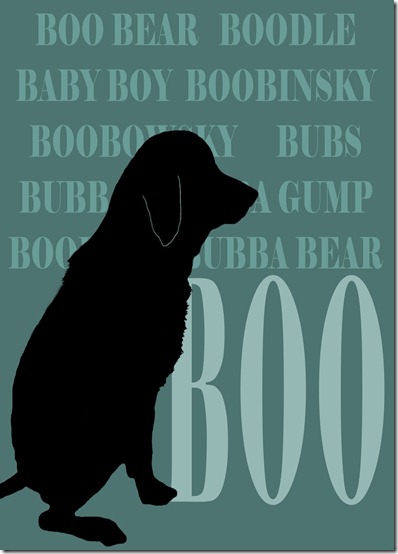
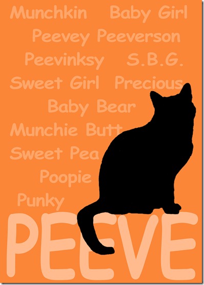
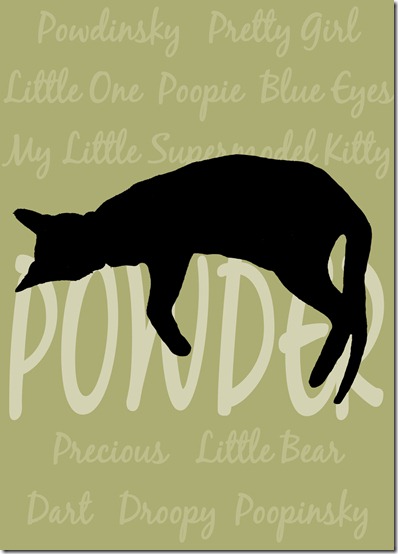
We love nicknames, and each of our pets has several of them. Interestingly, they each answer to most (if not all) of their nicknames, as well as their real name.
For each one of these, I took a photo of each animal, used my Paint Shop Pro photo editing program, and made each animal into a silhouette. Then I cut out the silhouette and pasted it into a new document, where I added all of the names.
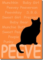
I really like them! I love the colors, and I think they’ll look great hanging over the pet station. Now I just have to figure out exactly what I want to do with them. I could print them out, and then decoupage them onto MDF that is the exact size of the print, which would look something like this…
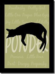
Or I could put them into black frames, which would look something like this…
Or I could do just the opposite, and put them into white frames, possibly with white matts.
Now that I can see all of these together, I think the black frame idea may be a little too much. I don’t have much black in the room (if any), so that much in one place may be look too heavy. So I’m either leaning towards the no frame idea, or the white frame with white matts. What do you think?
And now for this month’s winner for the gift card giveaway!! It is…
Jeannine Bruner!! Jeannine’s winning comment was on the A2D Facebook page, where she left this comment…
…on the post entitled The Evolution Of My Ceiling.
Congrats, Jeannine!! Send me an e-mail and let me know from which store you want your gift card, and where to send it!! Shoot me an e-mail at addicted2decorating[at]live.com
P.S. Just a quick scheduling notice. From here on out, the winner of the monthly drawings will be announced on the last day of each month, rather than the last Friday of the month. I do apologize for this month’s winner being announced late. This last month has really taken its toll on me, as on top of my normal duties (blog, full-time business, housewife), I’ve also had to be a full-time nurse to my [disabled] husband who sprained his ankle not once, but twice. These last couple of weeks, I haven’t known if I’m coming or going. Hopefully things will be getting back to normal around here now. I appreciate your patience. 🙂
Addicted 2 Decorating is where I share my DIY and decorating journey as I remodel and decorate the 1948 fixer upper that my husband, Matt, and I bought in 2013. Matt has M.S. and is unable to do physical work, so I do the majority of the work on the house by myself. You can learn more about me here.




I love the "no frame" idea the best. I agree that the black matting is too much. The white framing seems to wash out the print(perhaps because of the blog background of white?). I know whatever you decide will look great!
Blog stalker here….. 🙂 I love love love the prints you created! The colors are awesome and go together well and the silhouettes look amazing! I am a big fan of pet related artwork and think you did a fabulous job! I have a suggestion for the actual creation …. my friend and I recently made three pieces of art for my baby room. I bought precut balsa at Michaels (12×24)? and painted them three different colors. Then we printed up our photoshop creations to the right size and carefully traced the lettering onto the wood thus making indentations we could see. We used paint pens to fill in all the letters and only needed two coats (of white lettering). I love how it turned out and it seems like it would work on this too? I could send you pics if you were interested…….
Munchie Butt???
I really think that the white matts would be best. But place them in thin black frames. That would repeat the black without overwhelming the space with black.
they are really cute … i'd go frameLESS!
I love the way the dark frames makes the artwork pop, but like you I don't have any black in my room. I know my eyes would always go right to the black & then I'd drive myself crazy wondering "does it go with my room?" Friends and family would love it & have no idea that we actually spent hours wondering what color frame we put our artwork in. LOL We are way too hard on ourselves. I can't wait to see which you decide on using. BTW – I am now looking at two signs I painted and noticed that they are not centered and I HAVE to fix them.
Since you aren't too fond of the black frames, I suggest going frameless. They have more pow.
I think this is such a clever idea, in general. I'm going to steal this idea and do something above the spot where my dog's food bowl is!
I like them with no frames, but either way is great!
First, congratulations to Jeannine!! 😀
Second, please don't use comic sans. Peeve deserves better. Sorry, graphic designer pet..peeve…crap. Maybe it's perfect! 😀
Thirdly, did you try it with a white silhouette instead of black? Since your house is mostly lighter colors, I think it might work better in your space. Course, it might not. :O
I really like how you incorporated all the nick names! My animals also have a ton of nick names and that's a really nice way to tie it all together. 🙂
So cute! I love your art homage. I think white matt, white frame would look crisp and colourful.
P.S. I love your comment to spammers. I got my FIRST spam comment the other day. I left it because it makes me feel like I've made it in the blog world. If spammers think they'll benefit by posting on my blog, then I think I am officially cool. lol.
Love them all, but especially the mounted ones. These are so great!!!
Love the one Frame less:)
Love,love, love what you did! I vote for frameless. You could even have them printed out on canvas and stretched onto those stretcher bar things that artists use. Is it OK to copy these ;)!
Sindy
Sindy, of course you can copy these!! 😀
Super cute idea! I also like the frameless best.
I love the "no frame" idea the best. I agree that the black matting is too much. The white framing seems to wash out the print(perhaps because of the blog background of white?). I know whatever you decide will look great!
Kristi, These are gorgeous. I love them!!! Thanks for leaving a comment on my blog… I don't get many comments! (Keimosabi Ice Cream Co.)