Painted Wood Floor — Three Design Options
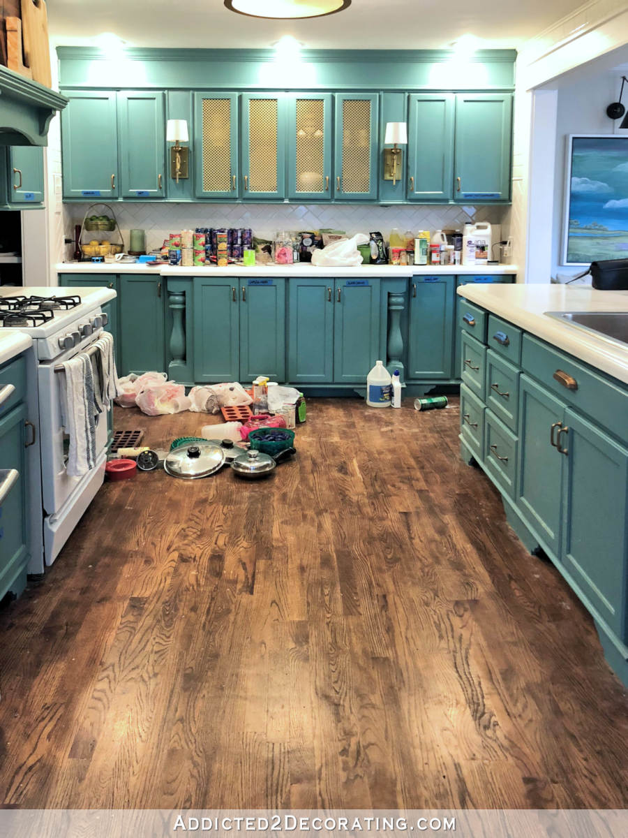
My goal yesterday was to get my kitchen floor patched, sanded and painted with at least the first coat of paint. So I headed to Home Depot to get sand paper for my sander, and that’s when I took a detour down a rabbit hole that took my focus off of my goal for the better part of three hours.
I hate it when I let myself get distracted!! But it happens all the time. Here’s how the confusion set in.
My original wood kitchen floor is a tongue-and-groove wood (I think it’s pine), and the boards are exactly 3.25 inches wide. They don’t have anything like that at Home Depot. So I considered ripping up all of the original wood in the kitchen (now is the perfect time to do that since the kitchen is completely empty) and replacing it with all new wood so that the width would be consistent throughout when I continue the flooring through the breakfast room.
So then I figured the “per square foot” cost of the new lumber (1 x 4 pine), and found that it was about $2.80 a square foot. Well, they had tongue and groove solid red oak floor that is a perfect match to my original hardwoods in the rest of the house. It’s in stock, and costs just $3.18 per square foot. So I thought why the heck would I pay $2.80 for regular lumber when I can get actual oak flooring that matches my existing flooring for just a bit more?
But I really have my heart set on a painted floor for the kitchen, and I don’t know if I could make myself go to all of the trouble and expense of ripping out the original floor, installing brand new oak flooring, and then painting it. I just know I couldn’t do that. So then I’d be stuck with finishing it in the exact way as the rest of the house, and it would be one continuous floor throughout. That’s fine, but it’s not what I have my heart set on.
*Sigh* Long story short, I’m sticking with the original wood, and I’m going to paint it. Then I’m going to use regular 1 x 4 pine lumber in the breakfast room to match. I don’t think the additional 1/4-inch width will be noticeable going from the kitchen to the breakfast room. (1 x 4 lumber is actually 3.5 inches wide.)
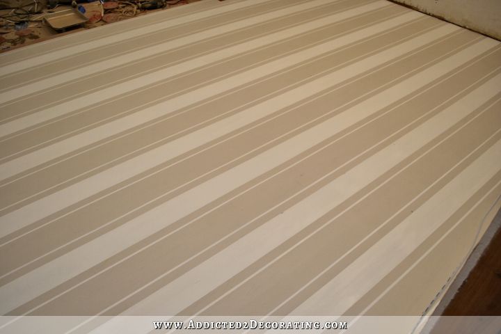
So after all of that wasted time on indecision (once again), the only thing I got done on my kitchen floor was selecting the colors that I’ll be using. Here’s a peek at the two colors:
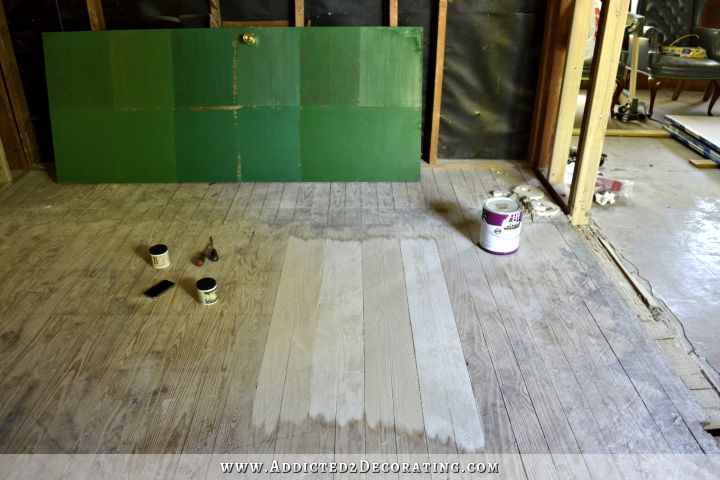
The lighter color is called Polar Bear (Behr). It’s what I’ll use on all of the trim throughout the house. The darker color is called Oyster (Behr). And you can see how those colors look with the green color called Derbyshire (Sherwin Williams) that I’ve picked out for my cabinets. Derbyshire is the one on the bottom right on the painted door.
So now my final decision is to decide on the design of my painted floor, which will be in the kitchen and the breakfast room.
Right now, I’m leaning towards stripes. If you’ve visited my blog for long, you know I’m kind of crazy about stripes, and I think a striped floor would be pretty amazing.
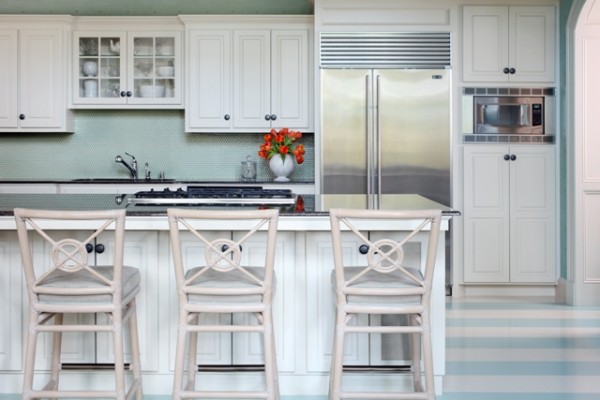 Beachy kitchen with painted striped floor, designed by Tobi Fairley
Another obvious option would be a checked floor. I know that checked floors are classic, but sometimes I think they remind me a bit too much of linoleum or tile. But then I see amazing checked floors like this one from Fieldstone Hill Design that makes me think I’d love to have a checked floor in my kitchen and breakfast room.
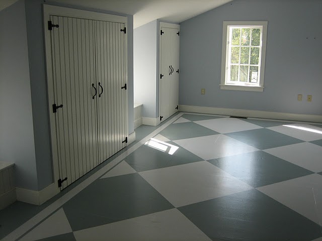 Painted checked floor from Fieldstone Hill Design
And then a third option would be to go with a more geometric design, like this showhouse room by Grant K. Gibson.
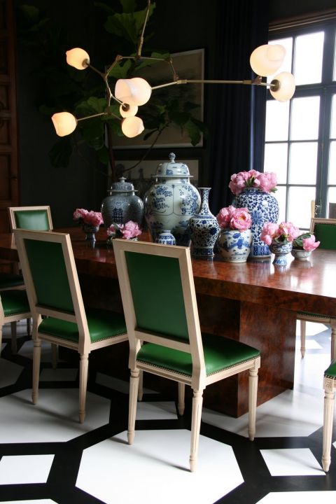 Painted floor with geometric design, by Grant K. Gibson
And when you get started looking at geometric designs, you see that there are about a million different options, which just adds to the confusion.
I’m pretty sure that I like the stripes best. They just seem more “me.” Don’t you think? I also like that stripes would add interest without being busy or distracting and stealing focus from the other elements like the cabinets and backsplash. Subtly striped floors would play nicely with those other elements. It would also be so much easier and faster to paint stripes than anything else. Not that I make my decisions based on what’s fast and easy, but it’s an added bonus that the one I think is my favorite just happens to be the one that’s the easiest and fastest.
So I think I should just go for it and stop second guessing myself, but then I wouldn’t be me if I didn’t waste several days second-guessing every single decision! 🙂

Addicted 2 Decorating is where I share my DIY and decorating journey as I remodel and decorate the 1948 fixer upper that my husband, Matt, and I bought in 2013. Matt has M.S. and is unable to do physical work, so I do the majority of the work on the house by myself. You can learn more about me here.
I love the stripes or geometric design…Leaning more to geometric design b/c its unexpected.
I love the stripes and Derbyshire is definitely my favorite of the greens.
I agree with both of these, so pretty & classy. Stripes in the light and darker creams would be beautiful. Im in the process of redoing my kitchen now, doing a breakfast nook….now im thinking about a striped floor!
Hi! I liked your post today as I just finished (literally last weekend!) painting our hardwood floors in our den. It came out just as I’d hoped. We have an old farmhouse we are restoring and this was very period appropriate. Good Luck, I love your aesthetic as it jives well with mine and I am so excited to see how your kitchen comes out!
https://scontent-b.xx.fbcdn.net/hphotos-prn2/v/t34.0-12/10270245_862549917103834_1351428469_n.jpg?oh=aad7cd0c9d455793b7a6d62619954897&oe=536B0879
Mary your floors are beautiful. You did an excellent job.
Terrific looking floor! Great job!
Mary…your floor looks fabulous! Great job!
Wow! girl, your floors look beautiful!
Mary –
WOW!!! What a beautiful job!!!
Wow Mary! You are so talented. Your painting is perfect. If I could paint as great as you did I would be painting my kitchen floor right now. Thank you for sharing your beautiful work with us.
I love how you painted your floors Mary! Great job!
Wow, Mary, those floors are gorgeous! Great job! I love the look of an old wood floor, painted in some unexpected way. I like that your checks are on an angle as it were, not quite harlequin, but not the typical way we expect to see checks. You should be proud of how nice those floors look!
It seems to me that the darker one is a “warm” tone and the lighter one is a “cool” tone. What tone are going for with the whole house makeover? Warm or cool? Does it matter to you if the entire house is the same tone, or can different rooms be different tones?
I think the stripes are the best bet in your kitchen with the rest of what you are intending for that room.
The lighter one (Polar Bear) is more of a warm white. It has just a touch of red in it…just slightly…and no hint of blue whatsoever. I definitely lean towards warm neutrals over cool neutrals. If it doesn’t show in the picture, it might be because I still don’t have lights in my kitchen. Or perhaps it’s my horrible pictures. 🙂 Or it could also be the fact that I painted right over raw wood, so it’s doing some funny things to the paint. When I do the actual painting, I’m going to prime first so that the colors are more opaque and the wood grain won’t bleed through like it is on the picture in this post.
Take advantage of the fact that there is nothing on the floor right now and go with a geometric design. If for some reason you decide you don’t like it, it would be easier to repaint the stripes with everything installed rather than going with stripes now and then thinking what if about a geometric design.
Stripes! Stripe! I am like you and love stripes, they go with everything. Plus you can bring in the geometric pattern another way.
Yes! Do the stripes! I love the colors you have so far for cabinets and floor. I so cannot wait to see your finished kitchen!!!!
I LOVE the colors and I really like the stripes
My husband an I are planning on painting our kitchen floors. Right now we are trying to decide between checked (and of course what size checks) and a geometric pattern (and all that goes with that). I can’t wait to see how your floors turn out since I’m using colors very similar to yours.
I would love to see what you would come up with as a geometric pattern. The stripes will be nice, but I think you could make it amazing with your talent.
To me, stripes are more contemporary while checks are more traditional. So, it depends on which vibe you’re going for. If you go with the stripes, which direction would you run them? With the wood, or against, which would visually widen the kitchen? Also, which design would draw more attention to itself, and is that what you want? What will be the focal point of the kitchen? Just a few questions I thought of.
Whichever you do, I think you should just trust your instincts. You have good taste and I’m confident that what you choose will be perfect for you.
Oh, and as for wasting time and getting sidetracked, I always think that my doing that is just part of the process, and helps me to feel that I’ve considered all options and settled on the right one. So, it’s not really time wasted!
I think you’ll love the simplicity of the stripes. You could use a geometric pattern in fabric on your chairs or somewhere else. You don’t want your floors to scream at you. 🙂 Can’t wait to see it all finished! It’s going to be beautiful!
Love the stripes! Others are too busy…..
I love the idea of stripes and since that’s what you really want, go for it! A benefit you’ll have from the two colors is that it won’t show dirt as much as one color. I had a very light painted floor in my kitchen for years and have pets like you do. It showed all the pet prints all the time and it felt like all I did was mop. I’ve had much better luck with a little darker color.
Do a herringbone design…I know you love herringbone!
What? You don’t want some fancy Trompe L’oeil that looks like a glacial crevasse? LOL… no? lol 😉
I think the stripes will serve you well. 😀 It’s classic. 😀 I can’t wait! 😀
My opinion is the geometric design, but in a large scale pattern so that its not too “busy”. It might be faster and maybe a little easier to go with a larger scale geo than taping off all the individual stripes.I am sure whatever you do will look fabulous! Maybe painting the floor and having the “lines” of the geometric print stained instead of painted would look so cool!
I love the contrast of the floor and cupboard colors. Have you ever considered doing the floor with a border? I did that for my outside porches, and it was a great decorative way to define an oblong space into a couple of areas.
Love the stripes and the colors! Geometric is too busy in my opinion.
I’m pretty sure your floor is fir. We just did all the wood floors over in our 1924 house and installed 3.25″ width fir floors in the kitchen to match the floors in the rest of the house. It was very hard to find, had to be special ordered and cost over $6.00 per linear foot. Your wood looks almost identical to ours. I have to say while it looks beautiful in our home, it is less than 3 months old and already has dents in it. The older fir, being old growth heart wood, is somewhat harder, but the new growth fir is very soft. My kids have so far dropped a cutting board and a 25′ tape measure, both leaving dings in the wood. Also, the old floors, being 90 years-old, have a very different patina from the new wood. My installer tried to match the new wood to the old by staining only the new area before he applied oil-based polyurethane, but they still do not match. This was a very expensive mistake on my part.
I love the two paint colors you’ve chosen. The stripes are going to look wonderful. How about on a diagonal? Too weird?
Go for it. Do the stripes you love so well. Me I like the geometric design.
I really like the stripes. They are clean and interesting without competing. A very long time ago I saw Mary McDonald’s home tour on HGTV. The house was a beautiful old house and she painted the kitchen wood floor in stripes. To this day I still think about how nice that kitchen looked. If you like stripes I say go with those. I can’t wait to see your finished kitchen. I know it’s gonna rock!
No time spent in deliberation is wasted. I’m glad you’re going with you gut. As to pattern choice, a kitchen is a busy place, so I’d be tempted to keep the floors subtle–the better to highlight those stunning lighting fixtures. Brava.
Stripes!!
I vote for stripes ! If it were my kitchen I wouldn’t want anything to interfere with those stunning cabinets. 🙂
You are making great choices from all the decisions you have to make. I like your methodical and thorough approach to each one.
Whenever I am faced with becoming distracted from a decision I have already made, I find it very helpful to do exactly as you did in the flooring department. I see the other option, thoroughly think it through from all angles, and then realize that my original decision was the one I really wanted all along. This keeps me from getting the “what if’s” later on once I go ahead with my original option. I feel pleased and assured that the decision I have made is the best one and I’m able to relax and enjoy my finished project.
You’re doing great!
I like stripes best, will look great with the planks.
Do you have a lumber yard in your area? If so you might be able to find the same tounge and groove there. I prefer shopping at lumber yards due to the much wider selection over the big box stores and often they end up cheaper too.
I love the stripes! Not to busy and it won’t compete but will be beautiful on their own! Really like the subtle color choices against the green too. Looking forward to seeing it!
I love the stripes and the checkerboard. I think either would be subtle enough in those colors. The geometric might compete too much.
I have seen a painted floor done with a chevron pattern that had a solid border around the edges and I loved it!
I really like the stripes. I painted my cabinets in Oyster years ago and love the color. A geometric design would be great too, but I think you might be right about it being too busy.
Love the paint color choices. I’m leaning with stripes also!
Have you thought about your awesome love of HERRINGBONE??? The best of BOTH worlds! – Stripes with the geometric design!
😀
I’m sure no matter what you choose – it’s gonna rock!
^This^ is a brilliant idea! Herringbone (and stripes and checks/diamonds) is also a classic look. Something to consider!
Oh, Kristi, how I envy you. My kitchen and breakfast area has hardwood, oak, and the planks are only 2 1/2″ wide. I don’t like them that narrow, but hey, they came with the house. I think painting them is the greatest idea ever, my hubby…not so much.
Have you considered using a stencil? They have lots of great geometric designs and in larger sizes. Cutting Edge Stencil had a chevron, a great looking herringbone, as well as lots of others that would work. Of course my favorite was in the Moroccan set and I think it was call Marrakesh Trellis. I thought it might be too small until I read the descriptions. CE, and some others, will also make a design to your measurements. With the size of the stencils, there is not as much moving the stencil as there is on old style stencils. You might want to take a few minutes and browse some of the sites. It will certainly cut down on your time measuring, marking, taping and stenciling. I like your thought of using low key colors. You can even choose a design with more movement or something like a harlequin diamond (large) and it won’t try to fight with cabinets and other custom features.
Love the stripes, and especially the floor colors. They seem to blend together really good!
Stripes! Anything else would be so busy it will make it difficult to do anything fun with the backsplash, and would compete with the green cabinets too much. Plus stripes are classic 🙂
Stripes. That way the floor won’t compete with the beautiful cabinets, it’ll support them.
Wide stripes — however I have to say a larger checkerboard in those neutral shades would be stunning and perhaps make the space look larger if that’s a need.
I love the geometric design in a large scale pattern.
Stripes!!!!
Stripes. 🙂
Stripes with the green- made for eachother!!!!
Stripes in your chosen color(mine, too) will be so pretty!
I vote for stripes too. It would obviously line up with the wood floor planks, whereas checkerboard and geometric designs would look busier with the obvious lines from the wood planks becoming more noticeable in the pattern. And also since your cabinets are going to be such a beautiful center point, the focus will stay on those and the floor will be a little more subtle. You know, kinda like when people pick out a beautiful bold counter top, and then also pick out a beautiful bold backsplash, but the two combined compete for attention too much, when less would be more. I love the colors of the floor and the cabinets! Can’t wait to see!
I have an idea for a new rabbit hole……How about stripes on a diagonal in the kitchen (which would make it look wider) which would set the cabnets off even more– btw -Love them. When you get to the floor for the breakfast room, could have the option of continueing and/or changing angle (like-1 chevron point, or even direct angles sa diagonal into horizontal, or a herrinbone. Or breakfast room could be completely different with a Transition Strip. You could do breakfast room floor on the stripey with a faux rug in a different pattern (like for under the table or around the edges of the room). Loving your results!! Do you ever get to Ohio, I have a house that could use your eyes. LOL
Love the stripes and the floor colors! 🙂
I love the stripes, Kristi. Great idea to use 1x4s in the adjacent breakfast area. If you get to feeling anal about it, you could always rip down that extra 1/4 inch. 😉
I think you have a very workable color palette. It should look very pretty when its completed. As far as the floor, I would prefer the stripes or one-color floor, but that is just my opinion. So exciting to watch this take shape.
My kitchen floors are pine. I am painting mine also. I painted one section so I could put the refrigerator back into place just one time. I used Sherwin Williams porch paint. It’s very thick and seems to be durable. My only regret is that I didn’t fill in the cracks between the boards. Someone in the past filled the cracks with something that crumbled and came up with my paint brush. I will fill the next section with latex caulk so that it gives with the movement of the floor. I’ll be using a stencil for a pattern. Haven’t chosen that yet.
I do love the look of a painted wood floor, and the stripes in the inspiration pic are lovely. If you haven’t seen Mary’s checkered/diamond floor that she posted a pic of, take a look at it, they are very well done. If It were my kitchen, I’d probably go with stripes or the diamond look because either are a simpler, cleaner look and I think you will have a lot going on in the kitchen with those gorgeous green cabinets. If you can find a geometric design that’s not too busy, that might also be a consideration. Whatever you come up with, it’s going to be gorgeous!
I like the stripes. Have you considered the darker colored stripe being a bit wider than the lighter color stripe? Anything you decide on will look amazing!
Having painted floors before I would NOT fill in the cracks. I did that with my entire upstairs and after a couple of years the latex caulk was wearing out and pilling up and not giving with the floor like I thought it would. It did look FAB for about a year though, so if you are thinking short-term flooring, it will work. It just won’t go the distance.
I did use porch & floor paint to paint all my upstairs floors a creamy white, with a checkerboard in one room, so I have to admit, I’m partial to the idea of a LARGE check, like 2 foot squares, on a diagonal. I think it will make the room look bigger, and with the lovely subtle colors you have chosen it will not be too busy.
Love the idea of the stripes but want to encourage you to reconsider the plans to put matching pine in the breakfast room. As a previous commenter said, pine is a VERY soft wood and will show every single dent when things are dropped on the floor. IMHO it would be a shame to put all of the time and effort into your permanent kitchen and leave the floor as it stands. As you’ve said before, now is the time to do the floor with everything out of it and a blank slate!
Love your work Kristi!
Stripes!
I think the stripes are nice because they highlight the wood element. Also, I support your decision to use the original wood. It’s the ecological and economical option.
I think that the stripes are fantastic! I love old painted floors and the colors you’ve chosen will go really well with your cabinet color! The checked floor is nice in the large checks, as they then really don’t look like tile, but the geometric design reminds me of a hornet’s nest (creepy) and is way too busy! I say stripes all the way! Looking forward to seeing the finished product. This room is going to be so awesome! Hugs, Leena
Did you happen to check Lumber Liquidators http://www.lumberliquidators.com/ll/c/Southern-Yellow-Pine-Clover-Lea-SYP4/10001337?googlePageType=searchresult
What will hold up to style in 5 years. I go with the check pattern because it is classic and will remain so as time marches on. I saw a striped wall in person at a recent open house. I feel like it dated the place. In my opinion it’s old hat. I think it would hold true for the floor.
Stripes! It shows the contrast of colors without being too busy. That geometric design would drive me nuts!
Love the idea of the stripes; I think that the stripes are fantastic! I love old painted floors and the colors you’ve chosen will go really well with your cabinet color! Whatever you come up with, it’s going to be stunning!