Searching For The Perfect Kitchen Cabinet Green (the first six color options)
Some of the kitchen progress might be delayed for a bit, but for a very good reason. The one thing that’s been holding up so much progress in this house will finally be corrected on Friday of next week.
We’re finally getting our house leveled!!
It seems like we’ve been talking about and planning that for forever, and so many things I want to do have been put off because we need to level the house first. So finally, that will be done, and then it’ll be full steam ahead. I’ll be able to put up the wall between the living room/entryway and the music room like I want. I’ll be able to install wainscoting and grasscloth in the living room, I’ll be able to build the overmantel.
So many things have been waiting on this one thing.
And naturally, I don’t want to put up drywall in the kitchen, or install kitchen cabinets, until the house is level. I’ll happily wait.
But in the meantime, my search for the perfect kitchen cabinet green paint color has begun. I bought six samples yesterday, and this very well may just be “Round 1” because I don’t know that I really love any of these colors.
First, let’s take another look at the kitchen that inspired me to go for green cabinets.
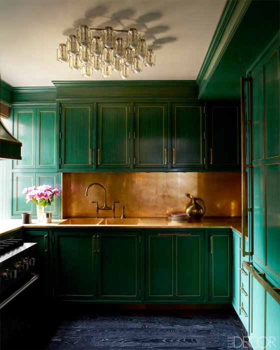 Cameron Diaz’s Manhattan apartment kitchen as featured in Elle Decor
As I was selecting some paint samples, I realized that I tend towards more olive greens than whatever that is on those cabinets. But I did force myself to get one very similar green. Unfortunatly, it’s the one color that I just can’t get to show up accurately on these pictures. And I’m actually surprised because I think it might be my favorite one.
First, here’s what they look like in the kitchen against the cabinet wall. Of course, it’s really impossible to get an accurate read in the room at this point since I still don’t have lights, and there’s black tar paper on the walls instead of bright white painted drywall.
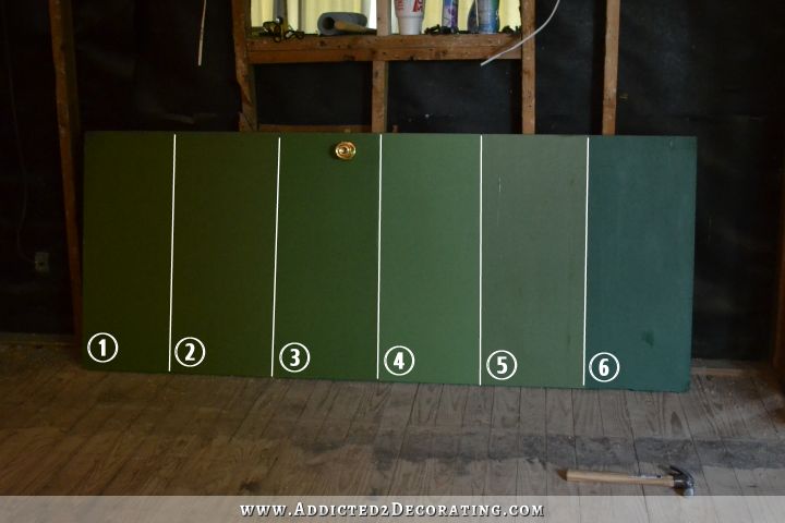
These paint colors are:
- Mountain Forest, Behr
- Pacific Pine, Behr
- Vineyard, Behr
- Torrey Pine, Behr
- China Green Marble, Martha Stewart
- Forest Green, Glidden
And here’s a look at those same paint colors outside in the shade.
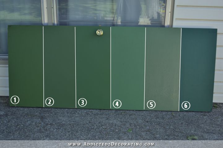
I’m so frustrated that I just can’t get that Forest Green to show accurately. At least on my computer, it appears to have a bluer/duller appearance than it does in person.
Anyway, I ruled out #4 and #5 immediately. #4 looks like it belongs in a child’s room to me, and #5 is just way too dull. I want something that looks much more vibrant than that.
So have any of you used any of these colors? I’m really especially curious about the Forest Green. I just don’t know why it’s showing up looking so much bluer in pictures than it does in person. The likely explanation is that I don’t take great pictures. But the off-chance explanation is that my camera is “seeing” something I’m not, and that makes me a bit nervous. I do NOT want a blueish green on those cabinets, and I really don’t want to choose the wrong color, and then have to repaint my cabinets. Walls aren’t a big deal to repaint. Cabinets are a headache.
But like I said, this might just be “Round 1” of this color selection. While I hate spending $20 more on paint samples, I do want the perfect green! After all, my green cabinets will make or break the design of my kitchen.

Addicted 2 Decorating is where I share my DIY and decorating journey as I remodel and decorate the 1948 fixer upper that my husband, Matt, and I bought in 2013. Matt has M.S. and is unable to do physical work, so I do the majority of the work on the house by myself. You can learn more about me here.

I don’t like any of the samples. Cameron’s was more of an “Emerald Green” and was there a bit of a black wash over the top?
Sorry, but I also tend to agree with Bruce.
Of these, I like #3. I love your site and your posts, Can’t wait to see your kitchen come together.
YES 3!!!
I don’t think I really like any of them. Maybe 1. It is hard to tell the real color. From you inspiration picture those cabinets look like a stain to me. I stained my island an olive and LOVE it. Also have painted a mirror in ASCP Olive. I think you should consider a stain or a green paint wash.
the inspiration picture looks stained to me too.
Kristi,
I like #3, it has ore of the emerald green than the others. The forest green does have blue in it on my screen too. Good luck!
Annie
Hmm. I’ve noted that there generally seems to be a disconnect between camera shots and what the eye sees, especially over a computer monitor. To me it seems that Cameron’s cabinets do have a bit of blue in them–emerald?–and a certain sheen. None of the samples seem to match that.
Are you totally committed to Behr?
What Beverly said. On my monitor, the inspiration cabinets do appear to have a bit of blue in them, and they also have a bit of a sheen which is just beautiful. To me, they appear to be stained and then finished with a low- to mid-sheen protectant. I don’t know why they remind me of malachite but with a hint of blue, but they do. I think they are just gorgeous and it’s easy to figure out why they are your inspiration and you want to duplicate them!
Of all your current paint samples, the last one is the one I like best, but that’s because it appears to have a tint of blue to it (I’m an aqua/robin’s egg/turquoise/teal kinda gal, the green-blues and blue-greens of the ocean are my favorite colors); that said, I don’t know that I’m crazy about any of the samples you’ve shown today. Try again? I’m confident you’ll nail it!
I like #3 it is bright and dayk at the same time, mixes well with all colors.
Of those colors I like the forest green one the best. It does look like it has a bit blue in it, but if you look at your inspiration picture so does that color. It has a bit of a turquoise cast in some lights there so it has to have some blue in it. It looks much brighter than your sample though, but like you said you couldn’t photograph it well.
Maybe try Pine Grove by Behr in round 2?
I think more emerald too!
http://somethingisdone.com/painted-emerald-living-room-dresser/
I do like think that this Pine Grove does look more teal too! None of the greens above look like a teal, which is how Cameron’s kitchen reads.
It does look as though the designer added glaze or antique finish to Cameron’s cabinets and some other color around the door frames. Gold perhaps?
Here’s another emerald green (BM) used on kitchen cabinetry. Perhaps you’ve already seen this.
http://www.decorpad.com/photo.htm?photoId=104109&index=0
I agree. This color is beautiful!
I agree Pine Grove by Behr looks much more like the inspiration colour and would be brighter like Kristi is wanting.
I think this color is gorgeous and would be beautiful on kitchen cabinets! Hope this gets considered in round# 2!
Like some of those who have already comments none of them are exactly like the Diaz kitchen. I think #3 is the nearest to the green in the picture. Perhaps, you should look at more samples. I enjoy reading your blog and look forward to seeing the final color. .
have you tried painting your room online where you upload your room and then paint it and if you like it “in the room” then you can do a sample for real.
Google “white balance” – it’s probably why you are having a hard time with photos matching what you’re seeing. Your camera is probably having a hard time deciding what colors it’s seeing in that lighting. For example in the second picture in the shade, is the house siding behind it white? Off white? Looking at the white may and figuring out if it matches reality may help you tell what your camera is doing. White balance issues can usually be cleared up in Photoshop.
Not knowing if we’re seeing the same shades of green or not but 3 and 1 are the two that strike me the best.
My favorite is number 3 and number 6. I wish number 6 wasn’t so dark, otherwise it would be my favorite.
After studying the inspiration picture for a moment I noticed that the lower cabinets to the right in the picture look very blue with the light on them, a teal blue actually.
I’ve been wanting to paint my cabinets green forever!! Someday I will do it :). A friend of mine has the most beautiful green cabinets and she used Benjamin Moore, HC-112 Tate Olive. HC stands for historical collection, it is a stunningly beautiful color!! Well now, I think the time to paint my cabinets is drawing nearer :-). I’m inspired by typing this post!
#3 would be my choice, but it’s still not the perfect color.
Forgot to say in my previous post that my friend painted her cabinets Tate Olive a few years ago and still loves it! So much so that she’s going to paint the cabinets in her laundry room the same color. I’m going a bit more bold in my laundry room, thinking about teal and coral just for fun. I love those colors and that’s about the only place I could get away with using them since hubby doesn’t do laundry 😉
I love the forest green, #6! Forest green and gold is my favorite color combination (they were also my wedding colors). I also think the blue tone in the forest green will flow better in your overall color scheme whereas going with emerald exactly like Cameron’s kitchen or #3 could be garish against the living room color palette .
Are you planning to use Behr paint? I love Behr for walls but had a terrible time with it on cabinetry. I added floetrol but I still had brush marks. I switched to SW Pro Classic and was much happier! I’ve also heard great things about BM Advance paints but have no personal experience.
As for color, monitors and photos change the colors so much that I don’t want to weigh in on that.
I agree with you. I do have behr on my island without a poly. No chipping at all. I did glaze so the brushing isn’t bad. My laundry room is SW. No brush marks
Be noticed we both like the same colors and see the same backgrounds in color. I would pick 6 out of these samples. I do think the green kitchen in the pictures has a glaze over it. I use lowes valspar glaze on everything and I love it.
Not Be. “I’ve”. That was my iPhone typing with a pop up on the screen. I couldn’t see what I was typing
I like 3 and 6.
You aren’t making your final decision until you have your final lighting situation installed, right? Because that will change everything all over again. Don’t ask me how I know that. (Did I have to repaint an entire room because of that mistake? Why, yes. Yes I did.)
YoungHouseLove struggled to show their green kitchen accurately on the computer, too, so much so that they finally repainted it a different color. I think that’s a hard part about being a blogger: you have to choose something that you love in real life but also something that you don’t have to constantly explain everysingletime you post pictures of it.
It looks like you aimed squarely at the olives and grabbed one blue-green and that’s what got you. Move away from your comfort zone. The custom cabinets look more emerald or grass than olive or forest pine.
Inside, you see tints of the greens. Outside the blueish light of natural shade balances the “overly olives” and intensifies the blue in the forest color.
Go back and look at emerald green colors:
Behr: Par Four green 440-B7, barnyard grass 440-B6, Dublin 440-B5, green Acres S-G-440, Treasure Isle 480-B6, Clover Brook 480-B7, FOREST RAIN S-H-480, EDGEWATER T14-4, Pine Grove 460B-7, Green Grass 450B-7, Chopped Chive S-H-460, Precious Emerald S-H-470, Parsley Sprig S-H-450.
too scary bright? find the gray-tinted versions.
huh? pick this, not that
Be sure to eyeball the colors in the paint chip light booth too. You don’t want anything that drastically changes color in the booth.
For the camera/light/tint issues:
You want to eyeball your white balance setting.
Also consider your Kelvin setting in camera:
once you go Kelvin you never go back
Learn to shoot proper white balance
need a video? White balance/saturation etc. in camera
If you really want to see what happens, snap the same white paper/card in the same location for a whole sunny day with the same camera settings. Then do the same thing on a cloudy day. Your whites won’t be the same. Cameras can’t magically adjust for the tints like our eyes+brain do.
(If that Kelvin scale seems familiar, it’s been adopted to explain the tints of LED bulbs.
The bulb color temperature can warm up or cool down a room. Most people complain about the “blue bulbs” look. Get the yellow or orange tinted ones for the closer match to incandescent colors in a room.)
If you want the same color as Cameron’s why not contact the designer, Kelly Wearstler? I’m sure she’d be flattered and more than willing to share the info. Also, I’m not sure you’ll achieve the exact color with just paint as her cabinets were lacquered- in a custom color per the write-up: “In Cameron Diaz’s Manhattan apartment, designed by Kelly Wearstler, the kitchen is a fearless combination of unsealed brass countertops and dramatic emerald-green cabinets… the brass-trimmed cabinetry is lacquered in a custom color…”
Forrest green was my first choice. I would paint several boards and hang them high and low where the cabinets will go in the kitchen in live with them for a couple of days in the different light. You are also going to have white counter-tops, which will bounce a lot of light onto the cabinets, so maybe put something white down to mimic that. Finally, something I learned from a colorist: the light coming into your house will be changed by what’s around–if you have a lot of green trees, near the window where light is coming in, it will change the paint color; if you have a roof overhang over the window where the light is coming in, it will change the color. Hence, mount some boards and see what happens.
Her cabinets are lacquered. You may have better luck finding a match with a stain, or heading towards an emerald paint, possibly.
I’m wondering if the inspiration cabinets are stained…as opposed to painted. The lighting is not great in the apartment photo…so it’s hard to tell…but the right side of the photo the cabinets almost have a turquoise colour to them (I know…not what you are going for).
As far as the paint swatches go…the Forest green would be my choice…but I’d check out stains and glazes too.
Could the difference in the looks of the color in #6 be the difference in ‘brand’ of paint. That is the only Glidden. Maybe if you sought out the Behr brand, you might find a different end result.
Hard to tell without the “gloss” on them. I’d keep looking for that emerald green. I know you’ll find the right color!
I’d have to agree with others that Cameron’s looks more like a stain than paint. The paint on your samples looks very saturated. Cameron’s look light & bright (if that makes any sense).
You crack me up…”happily wait”?
#3!!!
Hi, will the kitchen have lots of natural light? I think Diaz’s cabinets are stained, not painted. I admire you undertaking this huge project. Good luck!
I agree with you…none of them look quite like your inspiration. Several look like they’re more yellow and they all look like there’s too much of something else…maybe gray? Cameron’s cabinets remind me very much of the Pantone Emerald that was the “Color of the Year” last year. I’ve seen samples of those at either Home Depot or Lowe’s…so maybe give that a shot?
Out of those selections, #3 looks great in both lighting situations.
Have you checked out Benjamin Moore’s Advance paint for your cupboards? It’s amazing and everyone who has tried it, loves it!
Are you going for the exact color of the inspiration cabinets, or just a green of your choice? I too prefer a warm green rather than a cool one, and on my monitor, I like #1 in your samples above.
Immediately #6 jumped off the screen to me….even in its blue state…or because of its state. 😉 Kristi…it looks more like you and the colors you use than the greens. You love teal….and that appears to be more in the teal family.
I’m wondering…is Behr the best paint for your cabinets? I may have missed something…but I thought that Benjamin Moore was a higher quality paint for something that will get high use like kitchen cabinets. I know you do your research…so that’s why I’m asking.
BTW….thanks for all your help 2 years ago. Yes…yesterday was my 2nd blog anniversary. 😉
My suggestion would be to wait on color until you have all your lighting and wallboard in place. Then I would take leftover large pieces of wallboard and paint with your favorites, place in your room and see how they look in the different light throughout the day. Refinishing cabinets is such a large project it would be disheartening to have it go wonky and have to start over. I like the suggestion to contact the designer…the worst that can happen is they say no to your request for color and technique, but they might just give you exactly what you need!
Hi Kristi: I was just reading through a magazine the other day and guess what they had green cabinets and the colour. I live in Canada so i don’t know if you get the house and home magazine, however one of the questions people were asking was what are the best colours to paint my cabinets and this one came up. It looks very rich in the picture. the colour is Earl (CLV 1148N) by General Paint. The decorator says it is a bold decorator favourite with an english manor style especially in high gloss.
Honestly, I think it’s a waste of time to try and find the perfect paint color right now. Once you get walls, ceilings, lighting, and countertops, the paint color is going to look completely different. It’s all about reflecting light. Get everything in place and choose your paint color last.
That bluish emerald green looks so 90’s to me. My sis in law had it for her wedding with stargazer lilies, very chic for the time, bluish emerald green all-over lace bridesmaid dresses. About the same time I hung it in ruffled polished chintz valences and panels in a pretty pine paneled room. It was a nice foil for the rich brown paneling. But I can never go back to formerly chic colors, just me. I was undone when someone had it for their Color of the Year recently. After decades of being tired of pink, I’m only starting to wear it again. But I LOVE Cameron’s copper back splash!
But I know your vision will be amazing when fully realized and you will probably bring me back to this lovely color
Kristie, I think some colors just don’t photograph well. I have a front door done in the color of Valspar Shaded Lake. It’s a gorgeous bluish green teal but in photos it shows up to be just a plain ol dark blue that I hate! I wish I could get the true color to show!
That said I like the Forest Green you picked on the far right.
But what about taking one of your old cabinets you just tore down and painting just the front facing (door) of it so you can hold it in different lights including your darkened kitchen? That way its an actual cabinet and you can move it around within the room and see it in different lights?
I just finished my cabinets about 6 months ago. Big job…and you don’t want to have to redo them! 🙂
#1 and #3 were the two I liked the best. But, as someone stated above, I think waiting till you can look at the samples against the drywall once it is installed and the lights put in, will be your best bet!!!! I, too, wish #6 was clearer!! I love the name, but if it has too much blue, then go with a different one!! Best of luck!! 🙂
You might consider the color of these green cabinets which are similar
http://www.peppermintbliss.com/2013/02/greener-pastures/
This is the exact color I was going to suggest…BM- Once upon a time! There are some other pics of this kitchen where the cabinets are shown with the lighting shinning on them and they too have a teal look in the sunlight. But clearly this color does not have the rich deep shine that the lacquer (?) has.
There’s a texture the the Cameron cabinets…not sure if it’s grain peeking through or a glaze/wash or brush strokes. But it’s not a flat one dimensional color…which is why I’m not liking the paint samples. #3 is my fave…on my monitor…which really means that our votes should mean zip to you. 🙂
Hi, I think that Carmeron Diaz’s kitchen looks like a emerald green with a gold wash on top of it, which accentuate the gold lines. I think you have to try different approach on those color to see which one will work. I might be wrong but from the picture, I don’t think any of those colors match Cameron’s one. Good luck
Amazing progress! I am glad to not be in your shoes with color selection.
I was blog hopping and found a color green sample piece on STONEGABLE blog
Called Antibes Green with a rustic finish….now I know you are not a lover of ASCP but this sure was pretty and I immediately thought of your cabinets when I spotted it. It is found under the title of “paint washes”. Good luck
My vote would be the closest color to the inspiration cabinets – I see emerald in the cabinets, which in my mind has blue in it. I would also try to find a stain or glaze, so the wood grain would show. Before I saw today’s post, I ran across a picture of a green electric guitar – reminded me of the cabinets – hmmm, your kitchen reno must be on my mind – good luck on a your decision:)
I think the inspiration cabinets are emerald green with a blackish glaze/wash. The finish on those cabinets is spectacular, I love it and I hope you can achieve that same look!
Are you planning on replicating the look in the inspiration photo? Or is it just inspiration to choose something similar? If you’re planning on replicating, then I think you will have to lacquer the cabinets. And choose a more emerald green. If not, I think you should just choose a green you like, but do it after the drywall and lighting are both in place. Happy leveling!
In my experience as a decorator, Forest Green usually does seem to have a bluish tint to it. I think what you might be looking for is more of an evergreen color. You don’t want Emerald or Kelly, too over the top I think a deep rich evergreen. Maybe you should look in nature ….oh wait you live in TX….this is gonna sound stupid, do you have green stuff where you live? Can you tell how often I have been there? How about any golf courses near you? Maybe you could take a nice evening walk on one and gather some grass and greens as you meander, or just take pictures. Even going to a fabric store and gathering small swatches of fabric with shades of green that you think you might like can help. Tropical prints always have loads of greens sometimes the folks who think up color names are a bit touched in the head and their idea of a color may not jive with your idea. I have a color on my kitchen/lounge walls that I love, it is a Sherwin Williams and it has been in the line for years because it is a really poplular darker neutral. It is also an exterior color. It is called Curio Grey. I absolutely love it, but it is a far cry from grey in my opinion. I have slate back splash in various shades of greys and and grey/blues, grey/pinks and grey/whites and it looks like it is in the brown family next to them. It also looks more of a camel color next to my soapstone countertops which are grey when I do not treat them and then a very dark almost black with veins of green and smoky white and touches of gold. So you can see how the name does not sound like it should fit, the color, but so it stays. My livingroom and upper half of dining room were repainted a few years ago with a very soft grey that I picked on the fly because I knew it would work and I also knew that grey was due to be the next big neutral. My painter kept asking if I was sure and I said yes, it will be fine. I have a print sofa that is a silvery grey with teal and pinks and some soft teal silk chairs and a teal leather Chippendale love seat. Everything else is cherry in its natural state (not the red look). All the trim is white, I have Persian rugs with too many colors to count. Once that paint went up, you would swear it was light blue. However, if you put something that is light blue next to the wall you see that it isn’t. It is all about the lighting, and everything else in the room that is going to bounce color back at your cabinets, which you know. Your backplash is going to sparkle and shine and reflect light, your light counters are going to reflect light as is your floor if you go light. All of those things have to be kept in mind when you choose your paint. Going deep without the shine is going to draw the eye in so you will get the richness you want from your cabinets along with your beautiful ceiling fixture. I can’t wait! This is like giving birth, so much fun, don’t you think, especially since I don’t have to do any work, ha ha ha. Wish I could help. It will give me lots of experience for when we move to FL. Keep on doing what you do….you are great~
Just a thought… work backwards.
Look at this plethora of dark green cabs (link below), rule out (from your swatches) what you don’t want and see what’s left.
Also Camerons cabs are lacquered, now that could just mean a custom mixed lacquer paint, or a tinted/goldwash/copperwash/flecked clear hard lacquered coat (or many coats) OVER the dark green, which will change the base color.
This means you need a bunch of sample paints and try diff lacquer effects over them to see what happens… which may not be a bad idea to get something original that you love, still close to Cameron’s kitchen.
https://www.google.com/search?q=green+kitchen+cabinets&rlz=1C1CHFX_enUS454US454&source=lnms&tbm=isch&sa=X&ei=NUNhU8GvFs2yyATa1YCYAw&ved=0CAgQ_AUoAQ&biw=1920&bih=965#q=dark%20green%20kitchen%20cabinets&revid=400534847&tbm=isch&imgdii=_
I’m not sure how that helps you with fining your favourite colour, but my first impression (and lasting one) was: wow, I need to get colour no. 6 to paint something in my house 😉 exactly because it has a bluish tint to it do I love it!
I agree with the people above that all colours are different from the inspiration kitchen, though – to me that is a plus, because I like a couple of your choices far better than the Diaz’ colour (again: doesn’t help much, sorry). What I like about her cabinets is the vibrant depths of the colour – I guess that is achieved by either staining and/or covering the colour afterwards with a wash. I guess you still need more test runs to reach this kind of look, and while I don’t envy you for the effort involved to reach your goal, I’m very happy that you make the process available to us! Many thanks, as always!!! Btw: I’m sure I’ll like your kitchen far better than the inspiration kitchen – I can tell from experience by now 🙂
I am so excited for you! Getting the house leveled opens up so many avenues for you decorating! As for the cabinet colors I love #6. But it seems a bit dark can you go down 1 shade one the paint card. Also will there be a gloss or varnish on the cabinet and will this affect the final color? I know that I will love whatever you do. So, I will “happily wait” for the final outcome!
Sorry to keep blabbing on.
I just used the room coloring thing at homedepot.com and put Mountain Forest on some cabinets in the kitchens to choose from and I guarantee you will NOT love it at all, based on Cameron’s kitchen as your inspiration.
http://homedepot.colorsmartbybehr.com/paintstore/
I searched your color, 410D7 Mountain Forest, chose it, went to the preview paint colors and put in on cabs. Not good. To me it’s like a dark asparagus, not a forest.. lol
It’s not a perfect previewer, but it is really helpful and did help us with a project recently to figure out what we hated based on some ideas we were playing with and preview what I thought I liked and see where we were and wound up with actually a really nice bright office in what I originally thought was hospital green (and it’s not, it’s lovely)
I think you need to stick with the green shade you’ve used in the rest of your house.
When seeing the samples, I was immediately drawn to #6. I love the vibrancy of the color!
I know you already ruled it out.. but 5 gets my vote for sure! Beautiful colour
Hi, green is my favorite color, but I’m not using it much in my kitchen. I want light and bright. Having said that, 4 and 5 are my favorites from your samples. Forest Green does have a lot of blue in it. To me, the inspiration cabinets look like a glaze.
Off topic, will you be doing a very detailed post on leveling your house? Mine needs that and I am very interested in the process.
HI Kristi…. Looks like you tend to lead towards a more yellow based green than that with more white in it…. you may want to back into the green color choice and perhaps you might want to look at some coordinating colors that you will be using (Window coverings, seat cushions, etc.) that might be pleasing to you and then pick the green of your choice…
Have you given any thought to just glazing over the colors you have to see if it would give you the look you are wanting? The inspiration photo does look like the cabinets have been glazed and clear coated.
Kristi, I bet you’ve already thought of trying to locate the owner of that kitchen through whatever blog you found it on, and see if you can learn what colour it is. I’ve never been too shy to ask people about paint colours, going so far as leaving notes in letterboxes when I was choosing colours for the exterior of our house.
Also, what I did lately was look for anything that had the colour I was considering as using for my 2nd colour in our kitchen. I wanted an old fashioned green. Sort of minty, sort of greener than aqua… Ended up I found 2 different greens that I liked. One was on a metal coat rack in the hardware store and the other was in a milk paint I bought online. Since the metal was a surface the paint matching machine couldn’t read and the milk paint flakes and makes it hard to read as well, I used my artist acrylics to mix up colours to match them, painted swatches on paper and took them into the paint shop yesterday, The guy was able to read and match them perfectly for me so now I have 2 tins of paint for my doors.
On my Mac, Cameron’s cabinet color looks like the color of Malachite, and your #3 looks the closest to that,to me. Personally, I’d practically die for having Malachite colored kitchen cabinetry!
Bingo! That’s exactly what I thought when I saw Cameron’s cabinets the first time… and again this time. Is it because I’m also on a Mac or that I love gems 😉
#3 – Vineyard is my favorite because it shows well in the darkened kitchen and outdoors. Did you try the colors with a bright white background?
Oh, I thought I heard a noise. Was that you giving the old Victory shout? I really am happy the floor will finally be leveled. So many of your projects were being held up because of it. I hope you at last took one good breathe of relief before the image of all the projects you can start on began running around in your head.
Cool!! This is so much fun. I can’t wait to see what’s next, especially since YOU are the one doing the work.
Now you know I’m not going to say anything about the color of green since I can’t see it in the environment where it will be used. They will change again after all the lights are in as well as the drywall. Whatever color you decide to use on the walls will really have a lot to do with how the color shows even if you do decide to use white. After all, there whites and then there are “whites”! I am glad to see you are stepping out of your comfort range and going for a different green than you have used previously. I think the cabinets are going to look fabulous.
Try to see if you can find something that is the color you want to use. It could be something from a magazine or book, a container, vase, or whatever you can round up. For instance, I just looked over at my bookcase and I have a box of note cards and the sides of the box are a beautiful green. It would work well for a color match. Just avoid fabric (or so I was told) because, even with their technology, it is still difficult. Of course, maybe he just told me that because the color I got certainly wasn’t the same as the fabric. Besides, if you have a brand of paint you prefer you can have it mixed in your preferred brand. Actually, I found a lovely color on a paint chip. However I new the brand did not give good coverage so I took it to another store and had it mixed in Brand Y. Generally they have access to the formula even for brands they don’t cover. So, have courage my friend and let’s try a new direction of green.
Maybe it depends on the fabric? I brought a shower curtain to HD a few years ago and they matched it perfectly.
In the indoor pictures 1 and 2 look very olive so I liked 3 and 4. 5 looks very blue.
They look totally different in the outdoor picture. I like number 3.
So my final vote would be number 3.
I’m not feeling any of them, I think the inspiration room is a true emerald with a glaze. The samples look either too yellow or too blue to me. I recently painted a wall in my living room green, I think it was called Simply Green, from Lowe’s. I did samples and it was really scary, but I went with it and it is amazing. The inspiration kitchen really reminds me of it, especially if it had a glaze. Also, I think brass looks the best with a true classic green, you might try holding your sconces up next to your samples or future samples. Can’t wait to see what you decide and I’m so happy for you that the house is getting leveled.
I wonder how you make time to read our comments…and get any work done! The guys at the paint center at our local Home Depot do a great job matching any paint color. I suspect it is a service offered at all paint departments. We have all custom paint blends in our entire house, all Behr, simply because Consumer Reports gives it very high grades. Personally, I like the #6 choice, because of the slight blue, but it seems way too dark and overly blue. You could do a blend of that and something more green, to tamp down the blue. When I make a blend I obtain the actual paint color formula (it is coded by color and how many aliquots of color is added) then have the guys add a little of one and take away a little of something else until we get it right. I advise that you choose a non-busy time to play because it does time, but well worth it in the end! I have them do up the options in the little paint sample canisters.
I’m for #3!!
4 or 6, but I would see what would look good wit the blue and green you are using in the living room.
I don’t like any of them. How about a sage green or something with some gray in it.
It’s so hard to tell due to differences in computer monitors but based on what I see I love number 6 and number 1 is a close runner up.
To me, Cameron’s looks like the emerald green Lowe’s was selling as Pantone’s color of the year last year. I think they sell a green stain that might be close to the correct color. I agree with some previous commenters that I don’t really love those swatches, but it’s not my house, so you do what you like! They just seem really dark on screen. Best of luck! You are brave! 🙂
If these 6 samples were the only greens in the world, I’d say #3. But since they’re not, I say keep looking. 🙂
I am SO excited to see the process and finished product.!!
I looked at all the Behr green shades and I was drawn to BEHR Premium Plus 8 oz. #450B-7 Green Grass Interior/Exterior Paint Sample. I minimized the inspiration photo next to the sample and they seemed to be similar. You might consider it too!
These are all too dark. But 4 is closest- it’s the brightest
Hi Kristie, have you thought about taking your picture of Cameron’s kitchen to Sherwin Williams and having them color match the green? The second thing I want to mention is when I look at the light hitting the green on the right side of kitchen, I see kind of a turquoise hue like a swimming pool or the water in the Caribbean. I can slightly see it in the cabinets on the left side of the picture. All the shades u have shown us on yr sample are all too dark and do not come close to the green in the picture.
#3 of these samples; however, Cameron’s is definitely emerald green and with glaze. It was probably custom blended per the designer’s instructions.
I love #5. Especially if they were sanded and antiqued with a taupe glaze. But if that’s not your style I understand. To each his own. Good luck choosing.
Hi Kristi,
On Kelly Wearstler’s website she shows another view of the kitchen from the hallway with brighter light. If you haven’t already checked out her website here is a link to the picture. If the link doesn’t wok go to Kelly’s website and click on Manhattan apt. and you can scroll to it. http://www.kellywearstler.com/Manhattan-Apartment/residences_detail_manhattan_apartment,default,pg.html
All the Best,
Amy
I haven’t taken the time to go back and review the post which showed us your inspirational pic initially, but I don’t recall you stating you were looking for that exact green. What we prefer really doesn’t matter as you have to live with it and love it. You have impeccable taste and I can’t wait to see it all come to fruition.
I know you specialize in easy-on- the budget decorating but you really need to consider better paint for those cabinets! Kitchen cabinets, of course, take a lot of abuse require a high-adhesion, long-lasting, super leveling paint. Use Benjamin Moore! They even have a formula especially for cabinets. Color selection is probably the best on the market. It is more expensive than those brands you are considering but so worth it!
Honestly, I’m not sold on any of the colors on the chip! Any way you can write to the magazine to see what color was used in Cameron’s kitchen and if they used another process (glaze, wash, etc.)? The magazine pic where the sun hits the cabinets almost looks like a “green” turquoise and it’s beautiful. Where the sun is not, it is more of an emerald green. Either way, something besides a coat of paint was done.
I vote for number 3! 🙂
I agree with other posters that Cameron’s cabs are lacquered. But… you have a sprayer! So, you could do it!
They just have that translucent look, that I don’t think regular paint is going to get. Not that regular paint will look bad, it won’t, it just will not really look like the inspiration, but than, you probably know that. Duh.
I also agree with the poster that said to reach out to the designer and ask about the color. Why not, nothing ventured, nothing gained.
Number 6 jumped off the page..it looks rich and bold..I’m liking the green stain look on Camerons cabnets as well…I seen someone posted they thought perhaps that was a stained green. I’m nervous paint may not bring out the color as well as a stain would..so, off you go. Need some colored stains. Id be interested to see how that looks..
I like #4!
But for some reason the last 2 months I haven’t received any blog updates on my dashboard or through Bloglovin. I just tried subscribing via email and received an error message. Not sure what’s going on. I really enjoy your blog and missed seeing your posts.
So sorry for the inconvenience, Brandi! This Bloglovin feed seems to be working: http://www.bloglovin.com/feed/blog/4887529
You have done a formidable process and we will be grateful to you. I think the inspiration room is a true emerald with a glaze. Thanks for awesome sharing.