Samples! (Countertop Materials & New Half Bath Tile)
I have some countertop options to show you! I took some time yesterday to go to Lowe’s, Home Depot, and LL Flooring (formerly Lumber Liquidators) to pick up some samples of flooring that I might consider for the studio countertops, and tile samples for the studio half bath backsplash/accent tile.
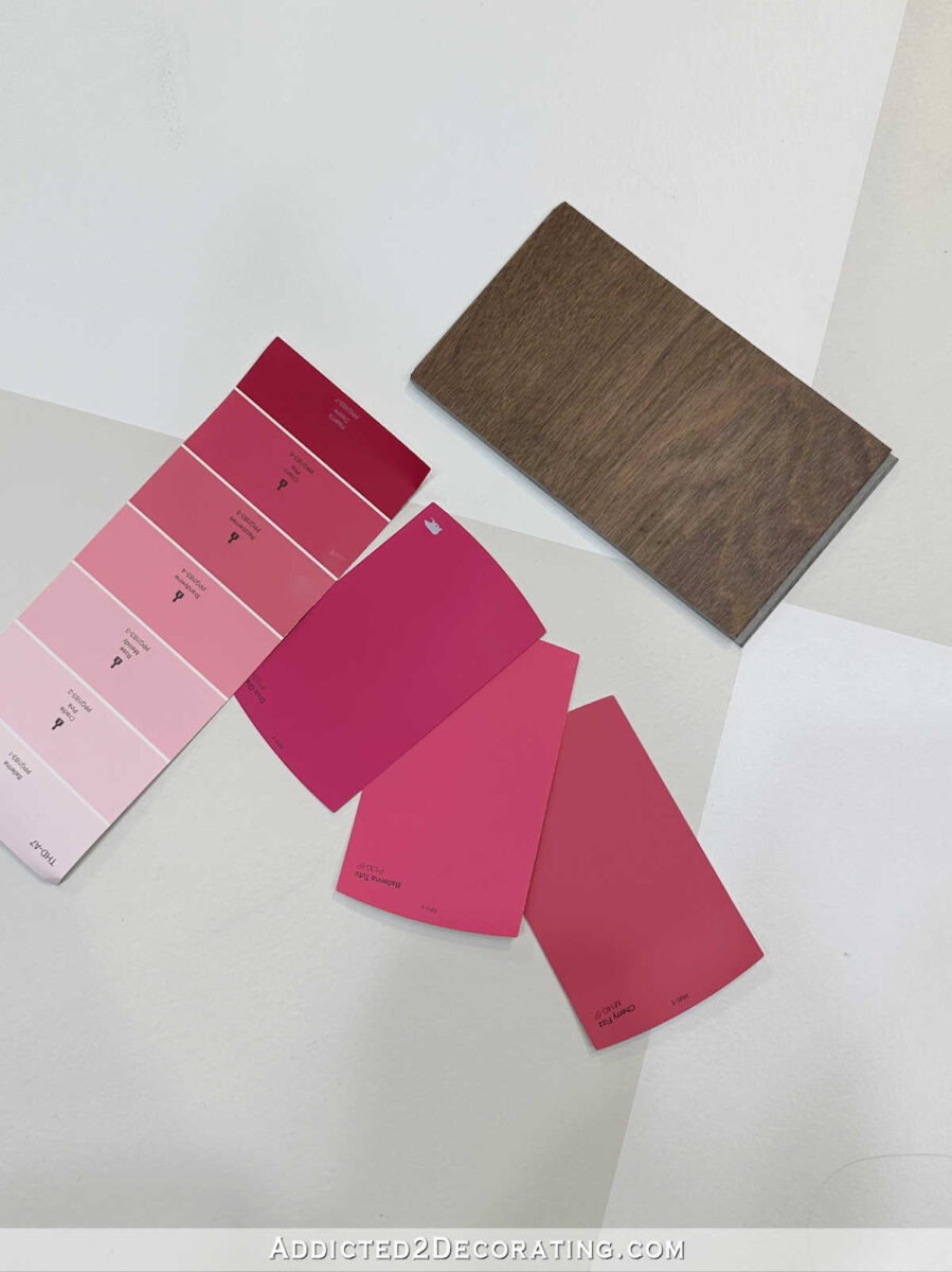
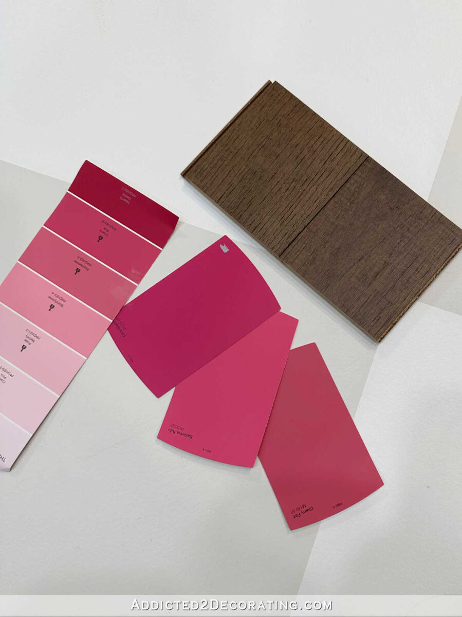
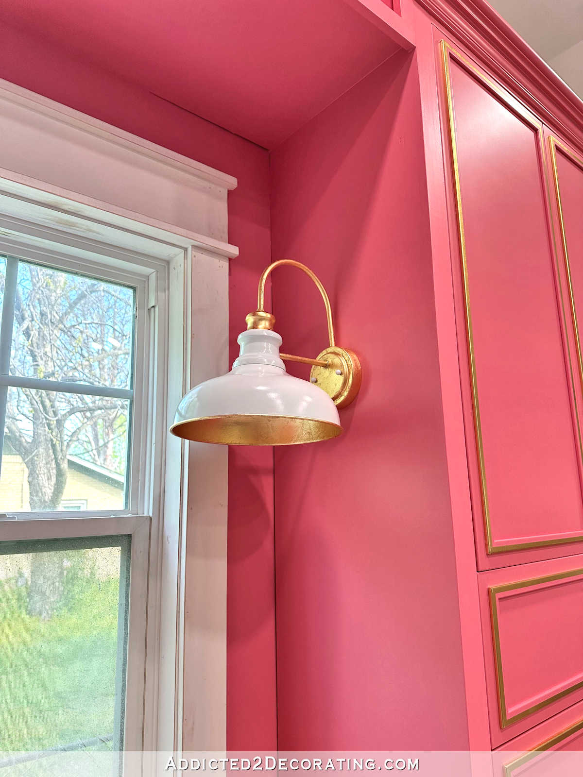
I also tried to find a paint color similar to the one I plan to use, but I’m here to tell you that no such paint color exists. It looks like the color that I use for my studio cabinets will end up being a custom color.
I was surprised at how much purple my favorite cabinet paint color option has in it, but the paint samples available at Home Depot jumped from too pink to too purple, and I needed the happy medium that didn’t seem to exist. This is what I was trying to match…
But you’ll see below that I didn’t really find anything like that. I picked up a few samples that might be considered in the same color family…maybe. But I’ll have to have them color match that exact color.
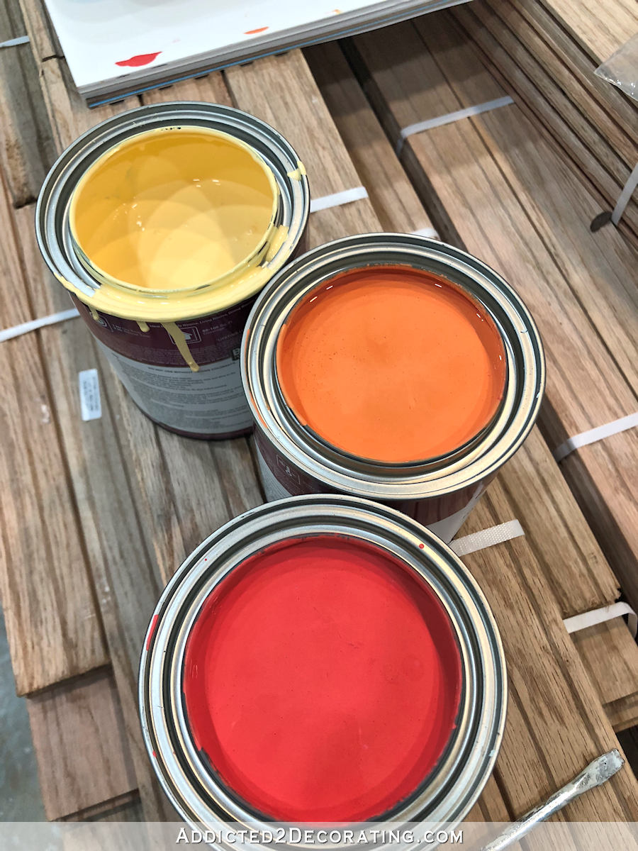
For now, the paint samples that I chose will at least help to narrow down the countertop material. And after giving it quite a bit of thought, having considered unfinished hardwood flooring and charred wood for the counterops, I have finally decided to use a prefinished flooring option rather than an unfinished flooring like I used on the pantry countertop.
I made this decision because by the time I get to the studio countertops, there will be so much of the room already finished (floor, ceiling, walls, wallpaper, window trim, etc.), and I don’t want to bring in unfinished hardwood flooring that will then have to be sanded down quite a bit. Once I get the dust from the floor project cleaned up and start on the other finishes, I don’t want to have to create more dust in the room.
So I’m pretty set on using pre-finished flooring. (Obviously the charred wood idea is out after so many of you talked some sense into me 😀 , and since I couldn’t find any samples that had a black stained wood look, I guess black countertops are out as well.)
I headed to LL Flooring first, and here are the samples that stood out to me. First up is this Brazilian Chestnut engineered hardwood. Here’s the larger sample in the store…
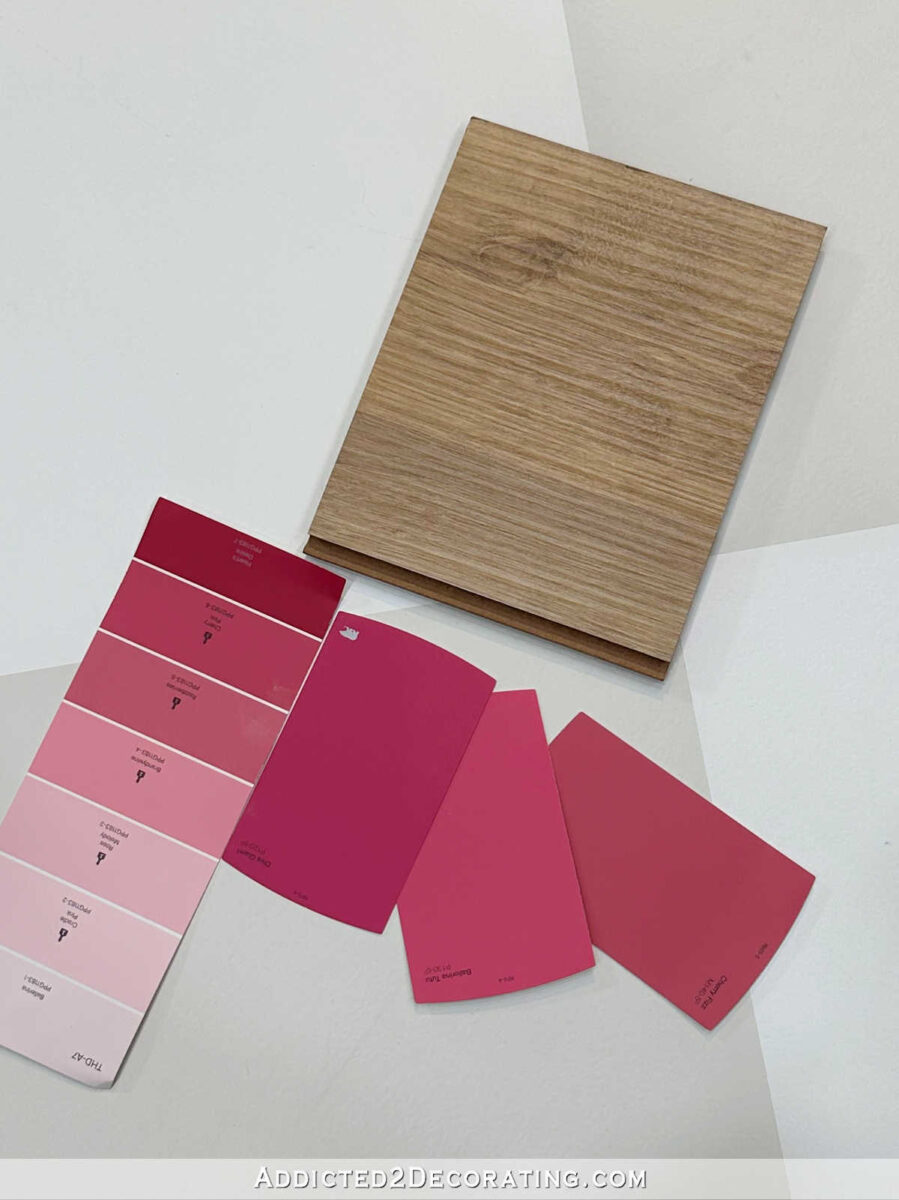
And here it is in the studio with the floor colors and the paint samples that are in the same color family as the one I hope to be using on my cabinets.
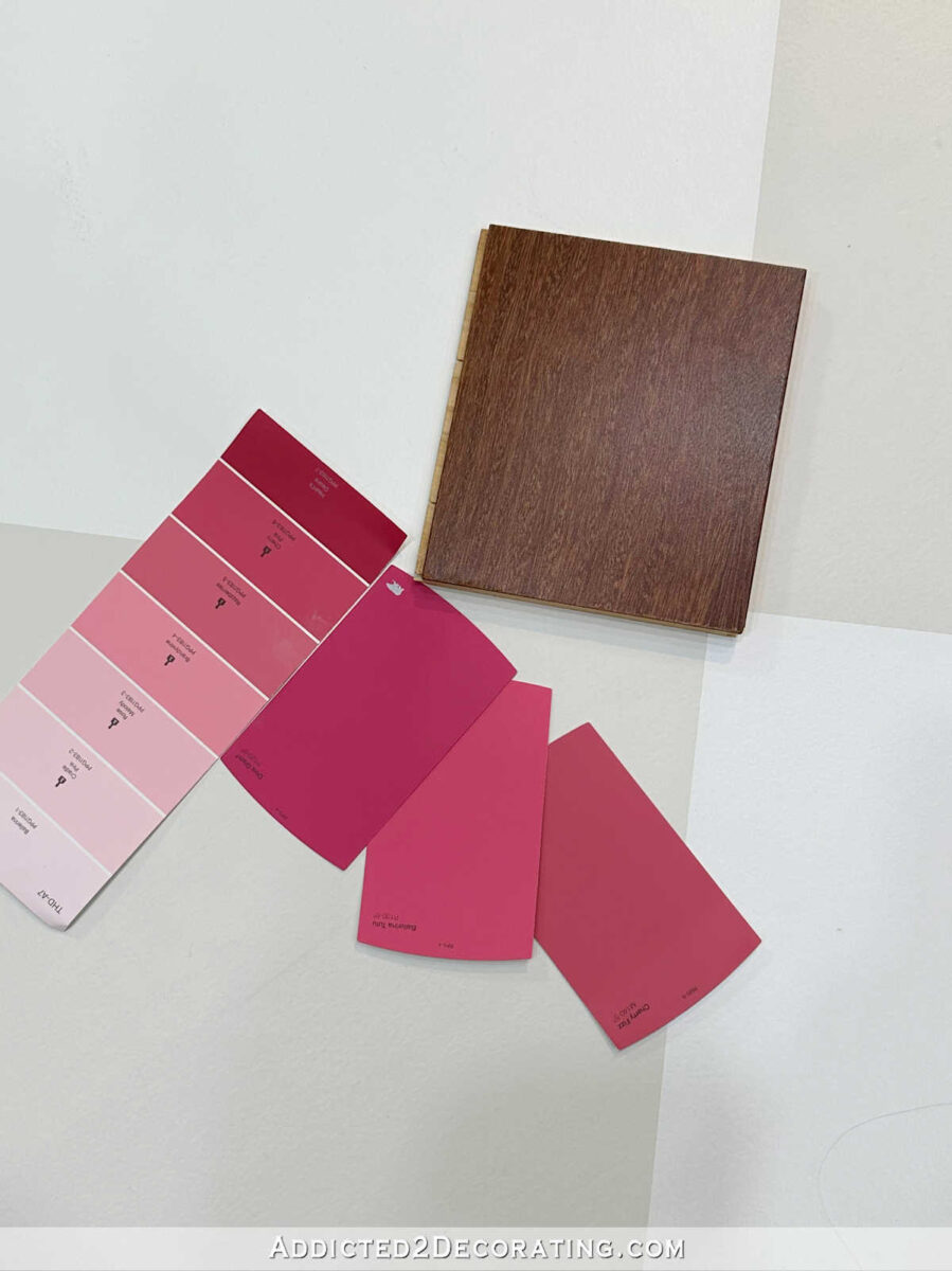
I loved that sample in the store, but I think the wood is a little too red for the paint color.
Next up is this Dream Home Grace Harbor laminate, which looked really white in the store…
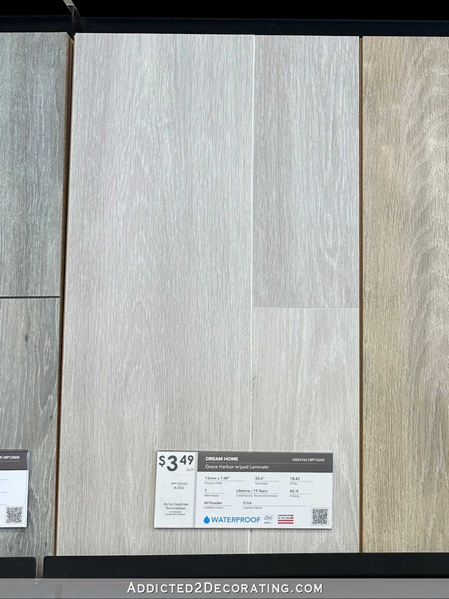
Next to my floor colors, it looks much more gray, and I think the gray might look a little too cool to go with the warm gray on the floor. It’s really pretty, though, and I love how it looks with the paint colors.
This next one is Dream Home Coastal Oak laminate. This is the first one that caught my eye when I walked into the store. I love that light brown tone.
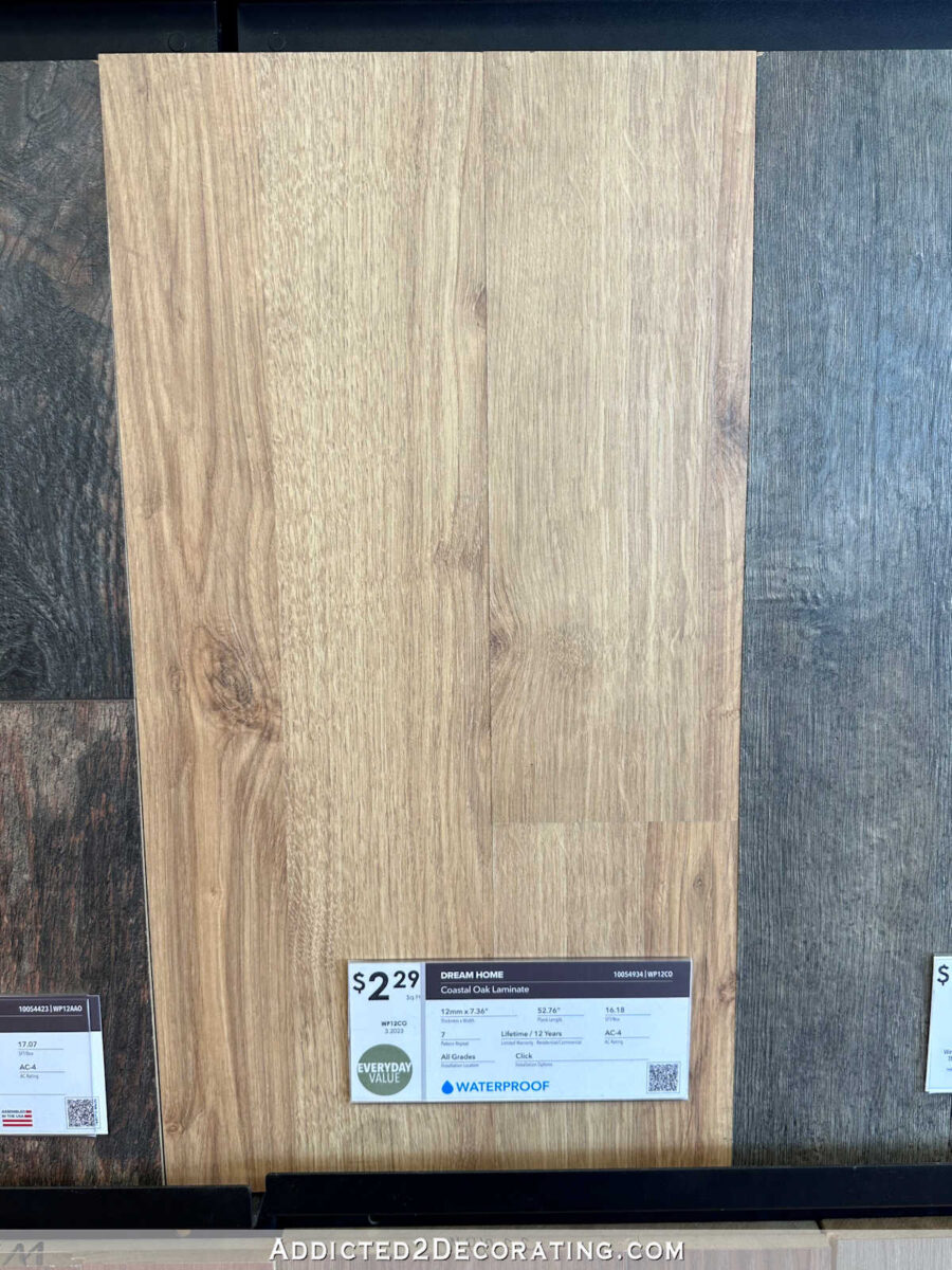
I think it looks really pretty with the floor colors and the paint colors as well, but it ended up not being my favorite.
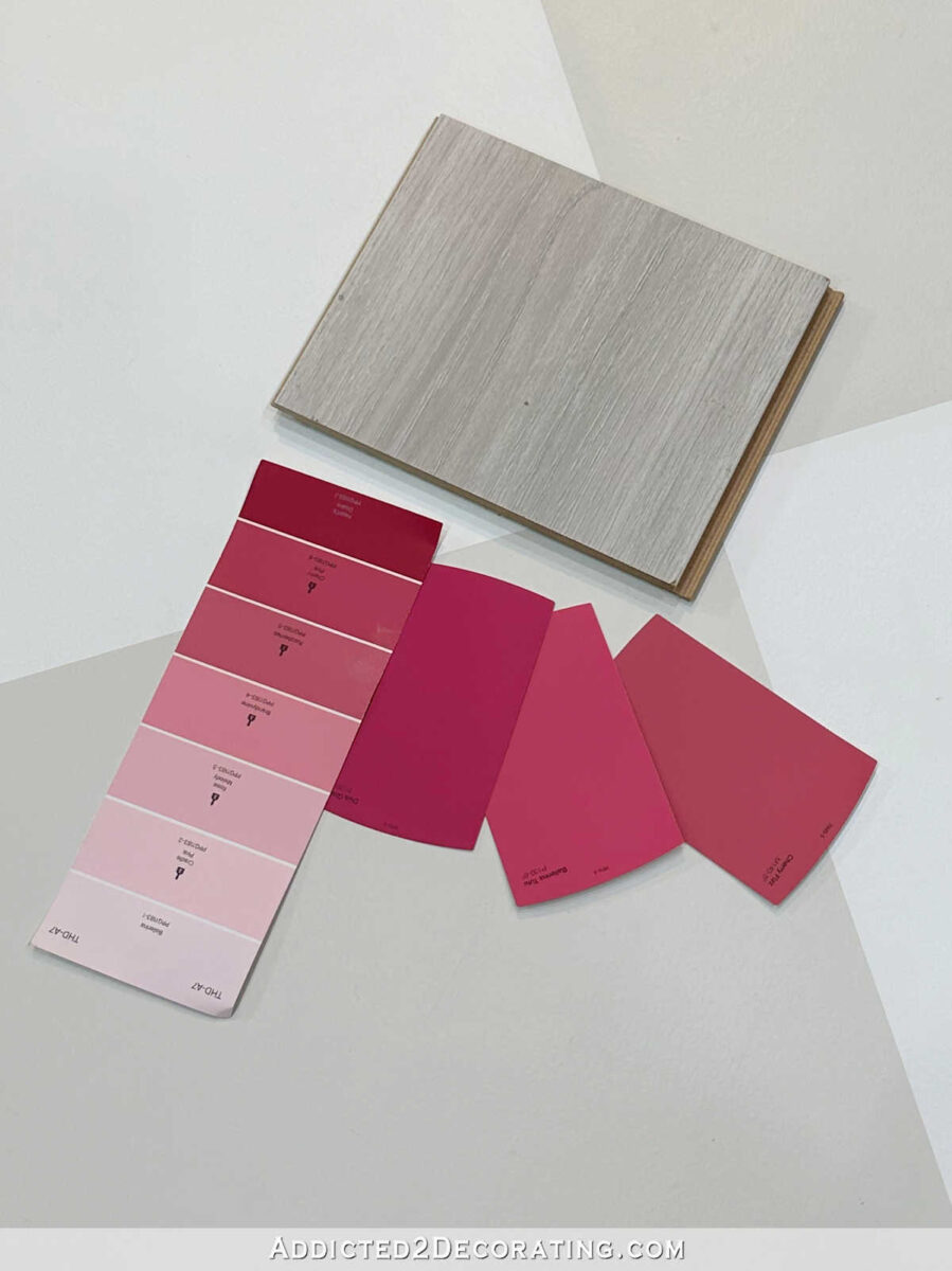
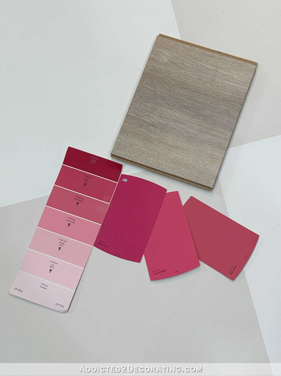
This one was right next to the one that looked white in the store but turned out looking gray in my studio. It’s the same flooring, different color. This one is Dream Home Capistrano Beach laminate. I picked up the sample even though I was sure it wouldn’t make the cut.
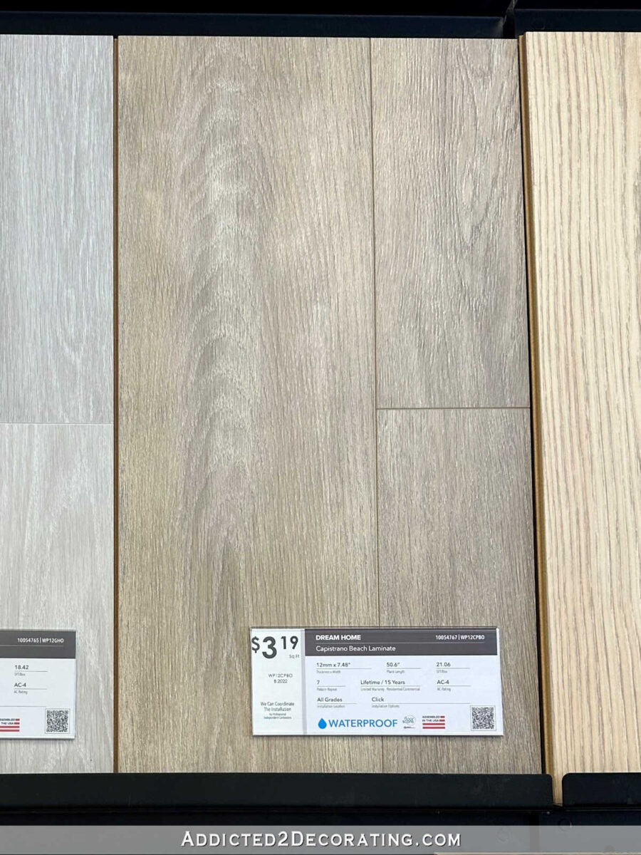
But it turns out that of the light samples I brought home, this one is my favorite!
Next up is Coreluxe Nashville Oak vinyl plank, which is another really light brown/natural wood color.
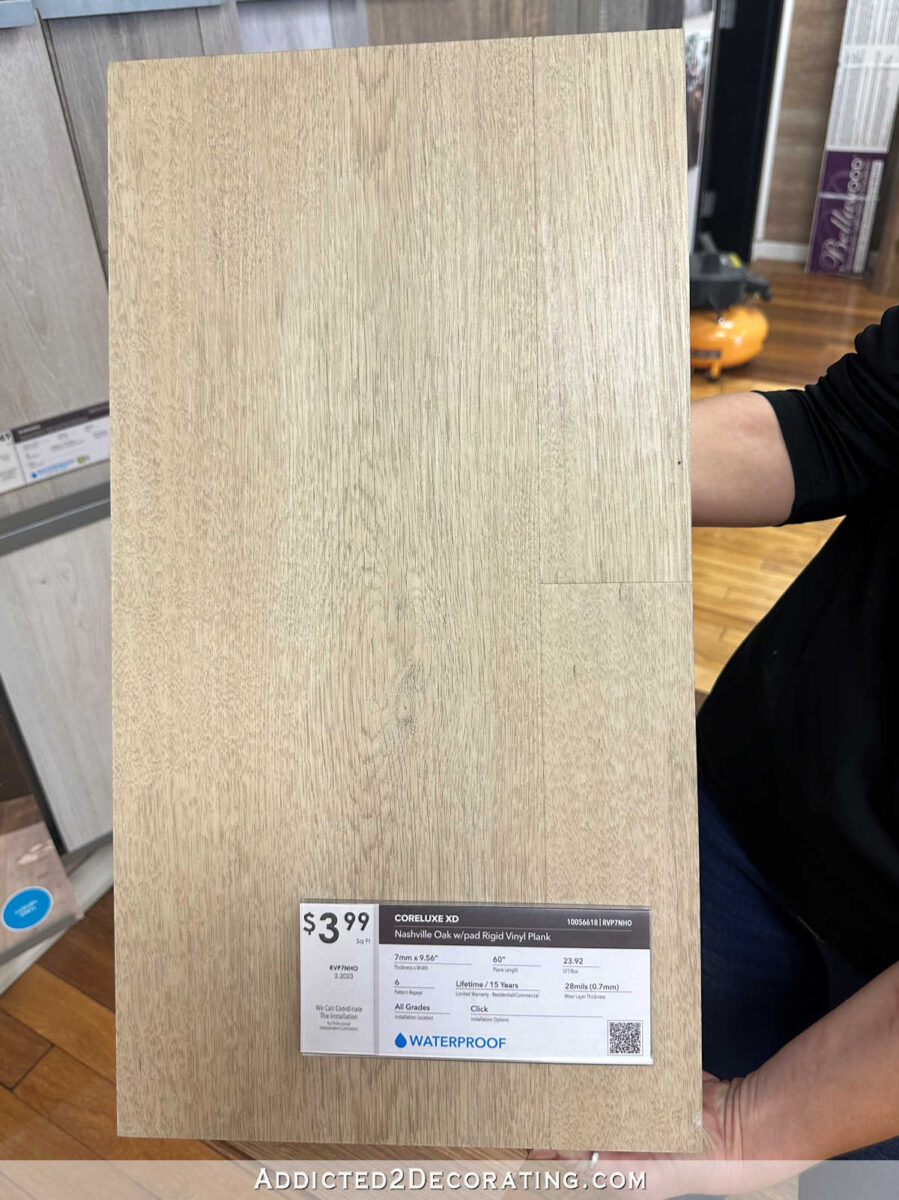
It’s also really pretty with both the floor colors and the paint colors, but to my eye, it comes in second to the Capistrano Beach laminate when it comes to the light colored samples. It’s a close second, but it’s a second.

The next two are from Lowe’s. This one is called Belmont Birch, and I’m pretty sure it’s an engineered hardwood. I do love the contrast of the dark wood against the light floor and paint colors. It’s a more neutral brown, as opposed to that first dark brown I showed you with the red undertones. So this one works much better with the paint colors.
But as far as the dark samples go, this one is actually my favorite. It’s called Saddle Hickory, and I’m pretty sure it’s an engineered hardwood as well. I just love the richness of the dark wood against the floor and paint colors.
Next, I turned my attention to tile samples. As I’ve mentioned several times, the crazy colorful studio half bathroom is going to get toned down to let the wallpapered back entry take the attention in that part of the room. I don’t want the bathroom upstaging the back entry. So the bathroom redo will start with swapping out the yellow backsplash/accent tile with a new tile, and then I’ll decide what to do with the upper walls once the back entry wallpaper is installed.
The first tile that caught my eye was this shiny white wavy rectangle tile from Lowe’s.
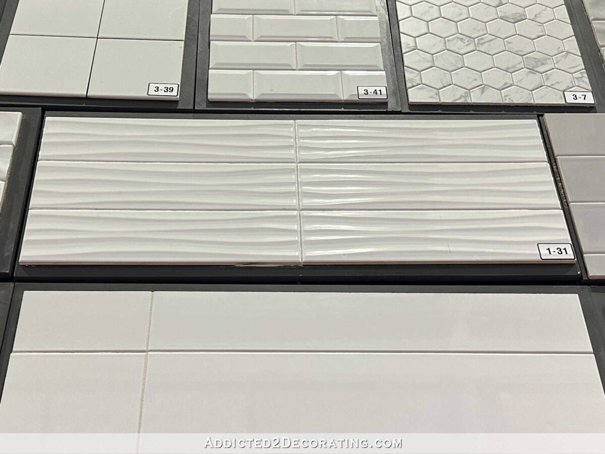
I like that it has just enough texture to be interesting without demanding too much attention. But if I go with this one, I would install it vertically. The area I need to cover is about six inches high, and I think these tiles would look great lined up vertically in that space.

Next up is this small dark gray (almost black) herringbone tile from Home Depot. My studio has a lot of black accents (lighting, doors), and the bathroom has a black faucet, so I think this would look nice with those other black accents. d
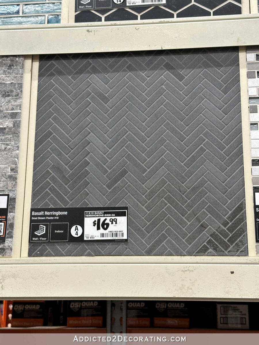
I’m not quite sure what I’d do on the walls with a black tile accent, but I’m sure I could think of something! I’ve loved this tile for a long time now, and it would be great to get an opportunity to use it.
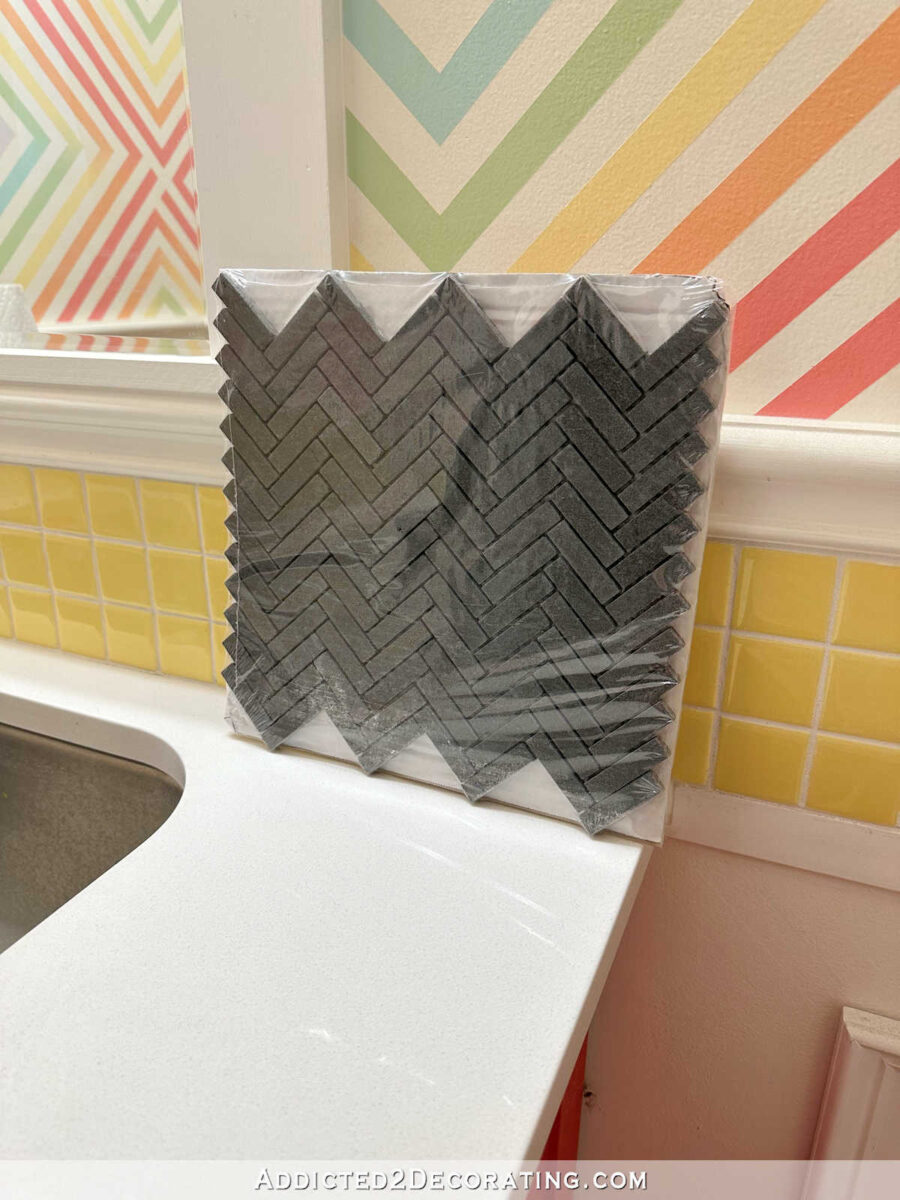
Another black option is this darker and larger black herringbone from Lowe’s. I like the look of the small herringbone a bit better, but I also like that the larger herringbone would have fewer grout lines to keep clean.
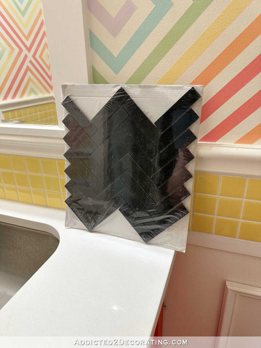
Lowe’s also had this black chevron, which could also be very pretty and coordinate with the other black accents.
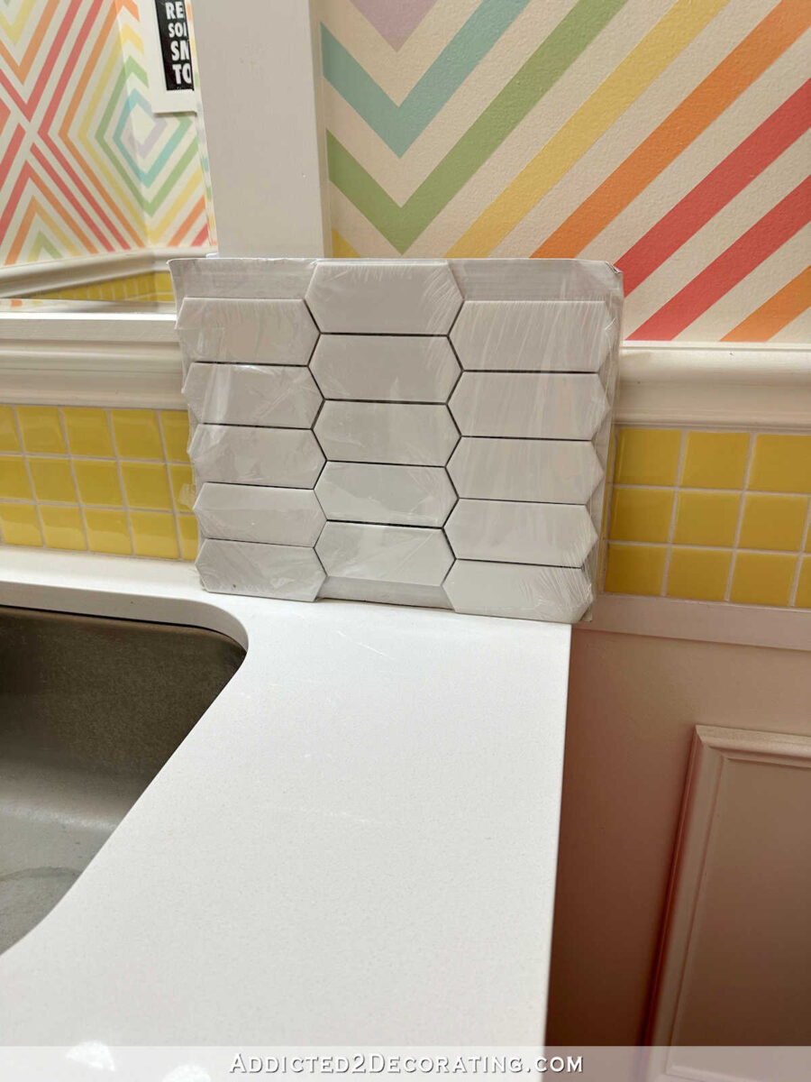
I also picked up this white irregular hexagon tile from Lowe’s. If I use this one, I’ll install it horizontally like shown below. Three rows fit perfectly in the backsplash space.
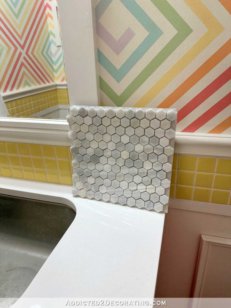
And finally, I picked up this small hexagon marble mosaic. Most of the marble tiles available have too much cool gray to go with the gray on the floors, but this particular one has quite a bit of warm gray in it (which I think is more evident once it’s grouted). It’s pretty, but it might be a little too traditional for my studio area.
So if I were forced to narrow down the options today, my light colored countertop preference would be the Capistrano Beach Oak from LL Flooring…
My dark countertop preference would be the Saddle Hickory from Lowe’s…
So now I have to make the seemingly impossible decision of whether I want my studio countertops to be a light color, or a dark, rich brown. I think either one of those would be beautiful.
My bathroom backsplash preference, if forced to make a decision today, would be the wavy white rectangular tile, cut in half, and lined up vertically…
I like that the white backsplash gives me more options and possibilities for what I can do on the upper walls in the bathroom. I feel like any of the black tiles would limit my options for the upper walls and may appear too stark in contrast, but of course, I could change my mind as I live with these samples over the next few days.
Update:
The studio countertop is finished! You can see the DIY process, plus the finished 20-foot countertop, in this post:

Addicted 2 Decorating is where I share my DIY and decorating journey as I remodel and decorate the 1948 fixer upper that my husband, Matt, and I bought in 2013. Matt has M.S. and is unable to do physical work, so I do the majority of the work on the house by myself. You can learn more about me here.
![The Current State Of My Studio (The Reason For My Procrastination) [VIDEO]](https://www.addicted2decorating.com/wp-content/uploads/2018/05/video-thumbail-1.jpg)
I have used that white wavy tile in the bathrooms of two houses I have flipped and love it!!! I think you will too.
Wondering if the tile is easy to keep clean? Do minerals, soap residue build up on ridges? Perhaps only an issue with well water.
It’s really pretty, stylish in such a simple way.
I agree with your choice of the beachy floor and the white tile. I was going to tell you my house I have now had black tile as a backsplash in the kitchen, needless to say, I had that ripped out and replaced, it showed every drop of water that splashed on it. It was hard to decorate because it was just dismal in the kitchen and I believe the kitchen should bring joy to the family. I hope you stick with your right now choices but if not, well you are Kristi after all. LOL
I like either of the floorings for the counter, but lean towards the lighter. I have always loved that hickory flooring for floors, but feel it’s a bit stark for a counter. As for the bathroom tile, I LOVE LOVE LOVE the wavy, but can’t envision it running up and down. To me, it totally resembles waves in the water along a beach. I don’t think the other direction does it justice. And I agree that white tile is way more flexible in design choices. Good luck picking!
Try looking at a Sherwin Williams or a Benjamin Moore paint deck for additional paint color options. I love the light counter with your cabinet color. I also like the contrast the dark one gives with the floor.
Have you concerned doing the tile from floor to ceiling? I think that would be lovely. I love the look of the Dream Home Coastal Oak for the counter tops.
I would also go with the Capistrano for the top, but would choose the white hexagon horizontal look for the backsplash. Fewer cuts and a great look!
I like the white irregular hex tile too and maybe use black grout!!
I love the lighter color wood tone you picked for the counter top and the wavy white tile. However I agree with whoever said, laying vertically and chopping it up would loose it’s impact. If you go with that one, I vote lay it horizontally!
Can’t wait to see where this goes!
That wavy white is spectacular.
Have you considered making your own custom tiles using your alcohol inks, like in your pantry? They came out so beautiful and really show your creative talent. Is the bathroom vanity getting repainted also? Can’t wait to see your choices!
Have you thought of bringing wallpaper into bathroom, instead of hallway?
Love the light flooring option! It matches the grey of your floors so well, and I think it would help to highlight your wallpaper more than a dark brown would. What will you be doing for the front edge of the countertops? (Though I suppose I’ll wait and see 😁)
Hi – I 1000% agree with all your choices. Winner winners all chicken and steak dinners!! (I’m starving, almost lunchtime 🙂 )….Beautiful either way with the light vs. dark – if it were me, I’d put them in your best viewing spots and all morning through day into night take many looks and see which is that ‘instinct’ look the best to you throughout the trails.
Absolutely go with the lighter tile – loved your choice – and I have dark dark grey in one bathroom and love it but it’s flooded with large large window light and I know for as long as we are here I will love it. So many more options with white imo….
Thanks for asking us our opinions I’ve learned much from you and others.
I forgot to say I’d totally do it tile vertically! Great idea. Thanks again.
The flooring you like is almost the exact same flooring we used throughout our whole house when we built in 2 yrs ago. Love the wavy tile as well.
Hi Kristy:
When I saw the charred black countertops, I really, really liked that. I also like your selections above; however, if you were still liking the black counter tops (engineered flooring) but can’t find what you are looking for, you might want to consider the following at Wayfair. It reminds me of the white textured subway tile above so it would tie in well with that, if that is what you choose. Your really coming along well with the room! I absolutely love the look of the new Studio floor!! You are doing a great job, as always.
https://www.wayfair.com/home-improvement/pdp/montserrat-builders-maple-59-thick-x-6-12-wide-x-varying-length-engineered-hardwood-flooring-w001739269.html?piid=
I have the white wavy tile as my shower surround and I love it. everyone that has seen my bathroom comments on it. It’s different and adds so much texture.
I vote for the lighter counter…that dark is also pretty, but will show dust badly! White wavy tile is my favorite.
I like your tile choice. The white is different without being too much. I could go either way on the countertops. Which countertop
do you think will withstand the test of time. The darker wood – I would guess, but I can see a light, bright studios well.
Agree with all three.
Please leave the walls in half bath alone! I love them!
I must have missed the post about paint colors for your cabinets. Really bold which suits your color requirements. My eye doesn’t like wood tones with those particular colors but we’re all different, no? As for the new accent tile the first thing I saw in the wavy pattern ( hope I don’t ruin it for you) is they look like reeds and it would be fabulous installed vertically. It would compliment the flowers ( reeds + flowers=🥰) I think. Good luck making your decisions.
Instead of new tile why don’t you paint the existing tile?
Dark counter tops show every speck of dust, lint and detritus. I know it seems counter-intuitive, but lighter colored counter tops look and stay cleaner.
Years ago I put a black counter in one of our bathrooms. It was a nightmare to keep clean. I finally switched it out with a light quartz remnant. So much better and easier to keep clean!!
I also used the wavy tile in my primary shower. It was stunning.