A Peek Into My Creative Process
I’m still waiting for my hardwood flooring to acclimate to the studio before I start installing, so that’s given me plenty of time to obsess over the walls in my half bathroom at the back of the studio.
And obsess I have. 😀 I thought I had narrowed down the choices to three, which I shared a few days ago, but the more I looked at those and read your comments, the more I questioned those choices. And if I’m questioning, that means that I don’t really love them. If I really love a design choice, I’m going to go for it no matter what.
So I got out some craft paint, brushes, and art brushes, and just started playing around with patterns, colors, etc., to see if something finally clicked.
I started off by trying a design similar to this Cole & Sons Prism wallpaper.
I didn’t get very far before I realized that while I love that pattern, and I love all of the colors, it would make me crazy on a wall. So I’ll save that design for a place where it can be used in a much smaller dose.
I kept going back to this idea of an ombre or gradient design. I started off just trying a single color with an organic shape that gets lighter as the rows getting lighter as the rows

As much as I loved that, I just couldn’t picture using one single color on the bathroom walls. I’ve had my heart set on a multi-colored design.
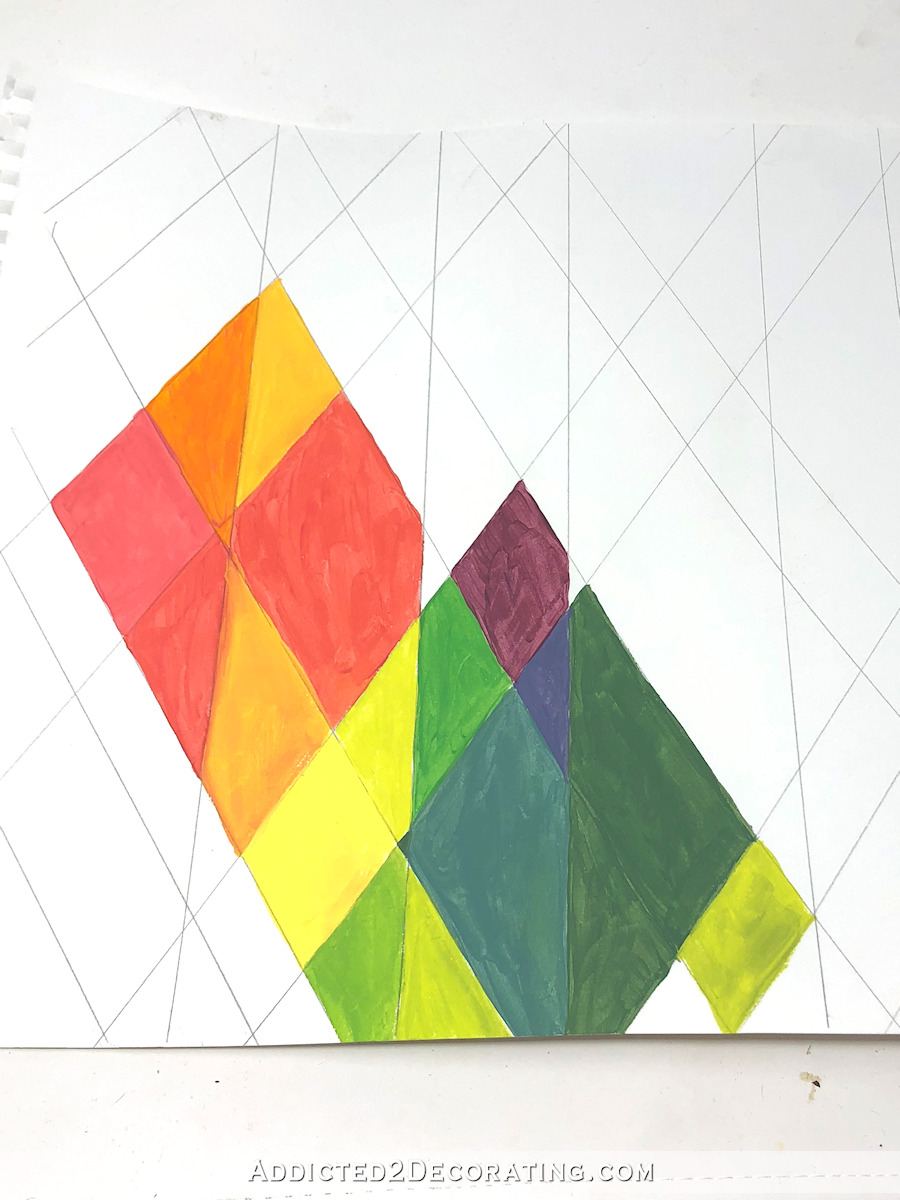
So then I went to the complete opposite end of the spectrum and used ALL of the colors. 😀
That was way too much color. That belongs in a child’s room. So then I just isolated the warm colors.

Then I felt like I was getting somewhere, except that that bright yellow stuck out like a sore thumb. It needed other colors in between for a more subtle transition.
That reminded me of flower petals, so I used those colors and painted a very simple flower. I had no idea how this idea could be used, but I just needed to get it out of my system. But I do think it would be pretty as something like this huge wall mural.
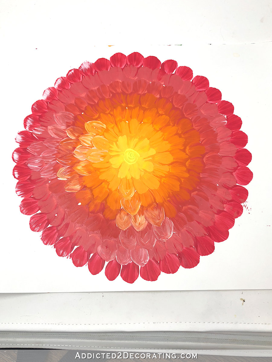
But I was going the wrong direction with that. I had started off wanting something linear or geometric, and I was heading in the organic shape and then flower direction. There’s no way I’d put flowers on my bathroom walls when that room is so close to the studio where I’ll be using a big floral wallpaper.
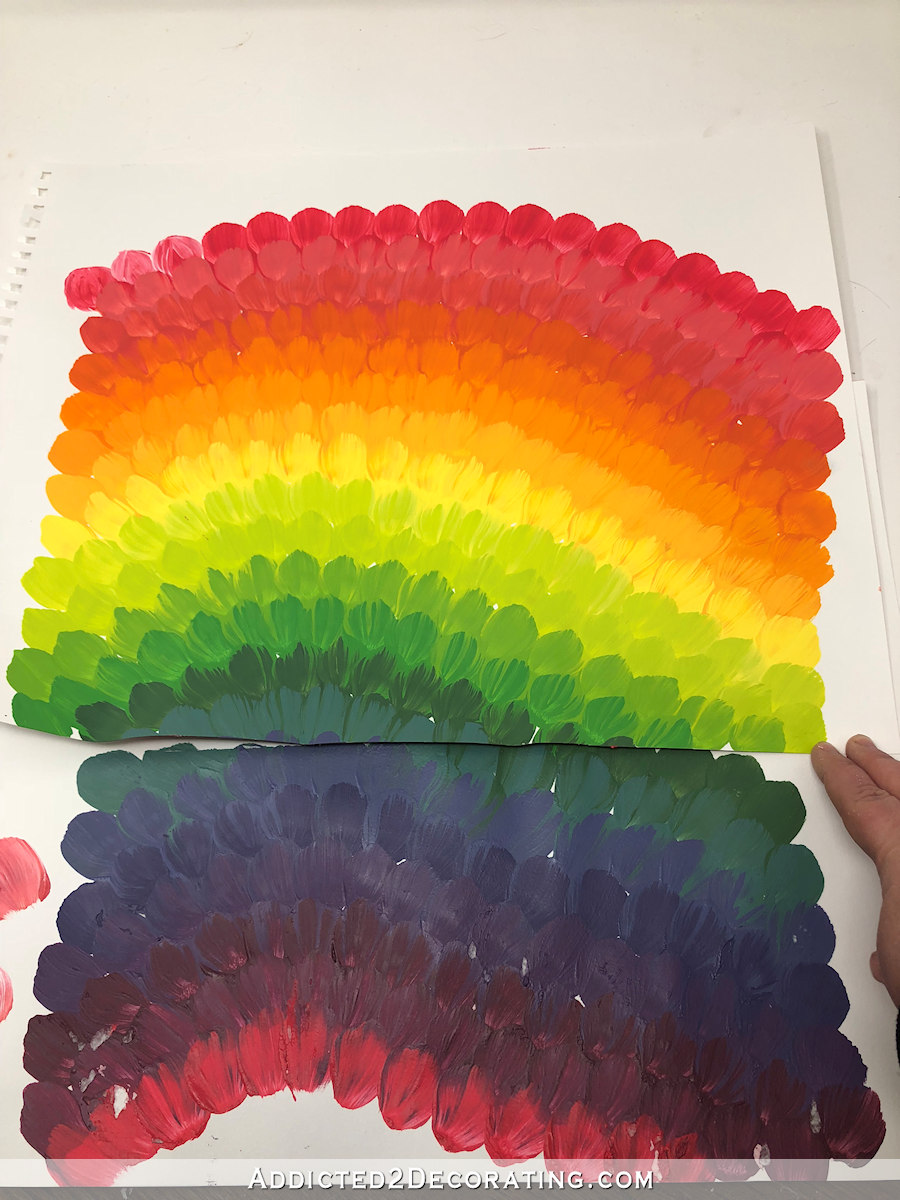
I did love those colors, though. I liked the warm colors being used as a gradient without the inclusion of greens, purples, and blues.
So I stuck with that orange-to-pinkish red gradient on a stripe design.

I later added a hand painted herringbone design based on a wallpaper I saw on Pinterest (which I can’t find now). But none of this was clicking for me. I was surprised, because y’all know I generally love all the stripes. Anything striped. I want to put stripes on everything. But when it came right down to it, I just had a hard time picturing stripes in that bathroom.
I did feel like I had found the colors I wanted to work with, though. So I graduated from small bottles of craft paint to real wall paint, and picked up these three colors.

These are all Behr from Home Depot. The yellow is Marsh Marigold, the orange is Orioles, and the pinkish red is Roulette. And I made sure that all three looked good with the studio wallpaper.
I did a little sample ombre/gradient using these three colors, and I think they’ll be beautiful together, and I also went ahead and painted the ceiling the yellow color.

And somewhere along the line, during all of my color and pattern testing, I also came across a geometric wall design that will work perfectly. It’s a combination of two of my favorite things — stripes and Greek key designs. It’s a design that I can create with painters tape on the entire wall, then paint all four walls. That will be so much easier than using a stencil.
So I am going to keep a few of the details to myself for now, but I’ll be sharing soon. And I’m hoping that it all turns out the way I see it in my mind, but if not, y’all know I’ll just start over again. 😀
The whole point is that the creative process — trying out different ideas, seeing what sticks and what doesn’t, letting one idea spark another idea, and working my way towards a final result that speaks to me — is sometimes very time-consuming, but it’s a huge part of what I love about this process. Sometimes things work out, and sometimes they don’t. But as long as I enjoy the process, that’s what keeps me going.

Addicted 2 Decorating is where I share my DIY and decorating journey as I remodel and decorate the 1948 fixer upper that my husband, Matt, and I bought in 2013. Matt has M.S. and is unable to do physical work, so I do the majority of the work on the house by myself. You can learn more about me here.


Hi! Just a thought – maybe it would make sense to incorporate the coral cabinetry color? Can’t wait to see what you come up with!
I thought of you when I saw this art and wanted to share! https://www.designsponge.com/2019/04/top-20-diy-projects-of-all-time-13-origami-wall-display.html
That’s a cool art piece!
thanks for that link, I love Origami and am really tempted to create this for my home!!
Hi, I went through the same process, multiple colors, directions, and didn’t love any of it. I ended up putting all 6 colors on the wall at once, and used sheepskin to blend it, and it’s exactly what I was looking for- totally modern and unique. If at first you don’t succeed, keep trying til you love it!
I absolutely love those colors. Years ago I came across an old India travel poster in a magazine that also included a green and a (not dark) blue-black. Although I never use those colors as my inspiration, it cracks me up that those are the colors I love to use.
As I’ve been reading through your posts about choosing floor patterns and wall design it got me thinking about tessellations. I’m not confident in my ability to explain the process, but I have a strong feeling that you would enjoy it and be able to create something beautiful and unique.
Oooooh! I like this idea! I think a design of this type using the green from the hall and blue background from the wallpaper with a touch of black would be gorgeous in there and layer beautifully looking in from the studio.
I like that idea, too! Tessellations can be as simple or complex as you’d like them to be. There are tessellation-making programs like http://www.tessellations.org/software-shodor.shtml. Can’t wait to see what you decide!
Thank you for the link, I never knew that type of pattern had a proper name.
You’re welcome! One of my favorite artists is M.C. Escher, an amazing mathematician-turned-artist known for his incredible, mind-bending tessellations. Check out his work at https://www.mcescher.com/ 🙂
I have that color combination in my guest bath! I painted 3 walls in golden yellow and then went crazy with the shower curtain and have a French art poster “Tournee du chat noir” with with that orange and red ombré. It’s fun and really different and can be changed out any time I change my mind!
Those colors with the green walls. Swoon.
In my perfect wishful world :-), you would paint the ceiling yellow like you did, the cabinets coral and you would do that beautiful birds/butterfly mural that you used to have in your entry way…. It keeps it light an airy in a small space, yet still adds multiple colors.
That’s what I was hoping for too. Those birds would be perfect in there.
I loved that bird mural too… but Kristi has said she wants a geometric for the bathroom and that would definitely be another floral. There’s more house to go though! I’m not giving up hope for its reappearance!
That flower pattern reminded me of the spoon art you did. How would you feel about doing the ombre and maybe cutting out a few of the flowers from the wallpaper and randomly place them on the ombre? For me, (and maybe not you) I would prefer just one color throughout the room (since the ceiling is kinda low) and then incorporate the largest piece of art in the room that I could. Or one color with a POW! ceiling design. Can’t wait to see what your idea is though!
Hi, Kristi! I need your help. For some reason, I’m not getting your posts anymore. I’ve re-subscribed several times but no luck. I have whitelisted you and nothing gets into my spam folder. Any suggestions?
I’ve been following you for quite a while…I’m the “background” type of fan! LOL. I love everything you do. Thanks to you, I am planning to change my “safe beige” lifestyle! I’m currently working on my bathroom too, so I’m going to take the plunge! You are an amazing person. Following you is the highlight of my day! Thanks for all that you do!
Hi Kristi, I was really happy about your artwork mail on the weekend, but when I wanted to download it, the mail has completely vanished from all of the files which could possibly contain it. Is it possible that there is a “use by” date on these gifts (is that even possible?)? If not, i would be very grateful for you to send me another link to that picture if that is not too much hassle for you. Sorry for being so complicated…
I’m loving that yellow ceiling! I can’t wait to see what you eventually decide on. I’m sure it will be lovely!
Those three colors you chose make my mouth water. So yummy. Thank you for sharing their names, I may have to go buy some for myself.
I LOVE THE OMBRE FLOWER…. maybe you can make a few of them in your blue and green colors as well..
I’m sure we all will like what you decide on..
OMG I am feeling like Im going to love your studio the most out all your spaces (so far)! I love all the colors and the beautiful ideas that you have <3 What Im saying is if you find a camp cot in the back of the studio it's just me
I really like the way you try things out… just do a sample and see how it hits you. No luck? you try another! You may go back and change, but you’re always moving. I feel that it’s easy to get stuck in one place, afraid to move. I like your confidence and energy!