A Few Updates — Pendant Light Progress, Desk Accent Decision, and New Desk Chair Fabric Swatches
I’m still working on the pendant light to go over my desk in the studio. Every. Single. Day. But I am making progress, and I’m starting to see the light at the end of the tunnel. I really do think I can finish all of the components this weekend, but I’m not quite as confident that I can actually get it all assembled and finished by Monday. But I can assure you that I’ll try my hardest!
So far, I have the first (and biggest) ring finished and ready for the next ring to be assembled.

And I have seven more rings finished and ready to be assembled.

I have two colors that are completely painted and gilded. I still need to drill holes and attach them to rings.

And then I have four colors that are painted on the fronts, but still need gilding on the backs and fronts. Then I need to drill holes and attach them to rings.

And then I have one color that is painted on fronts, gilded on backs, but still needs to be gilded on the fronts before I can drill holes and attach them to rings.

So there’s still quite a bit of work to be done, but I passed the halfway point a while back. I hope to have a finished pendant light in the next few days.
Now moving on to the desk. As several people suggested, I took a look to see what I could find locally for my desk makeover. I did find the Target panels and the Kirkland’s panel locally, but they just didn’t do anything for me. Then at Hobby Lobby, I found this panel that I really liked, but the middle part (i.e., the actual decorative part) was made of very thin wood. I don’t even think it was 1/4-inch thick, which means that it could break very easily.

But look what I found…and bought!

As soon as I saw these, I thought they might be perfect. They look very similar to the darker green leaves in the wallpaper mural.
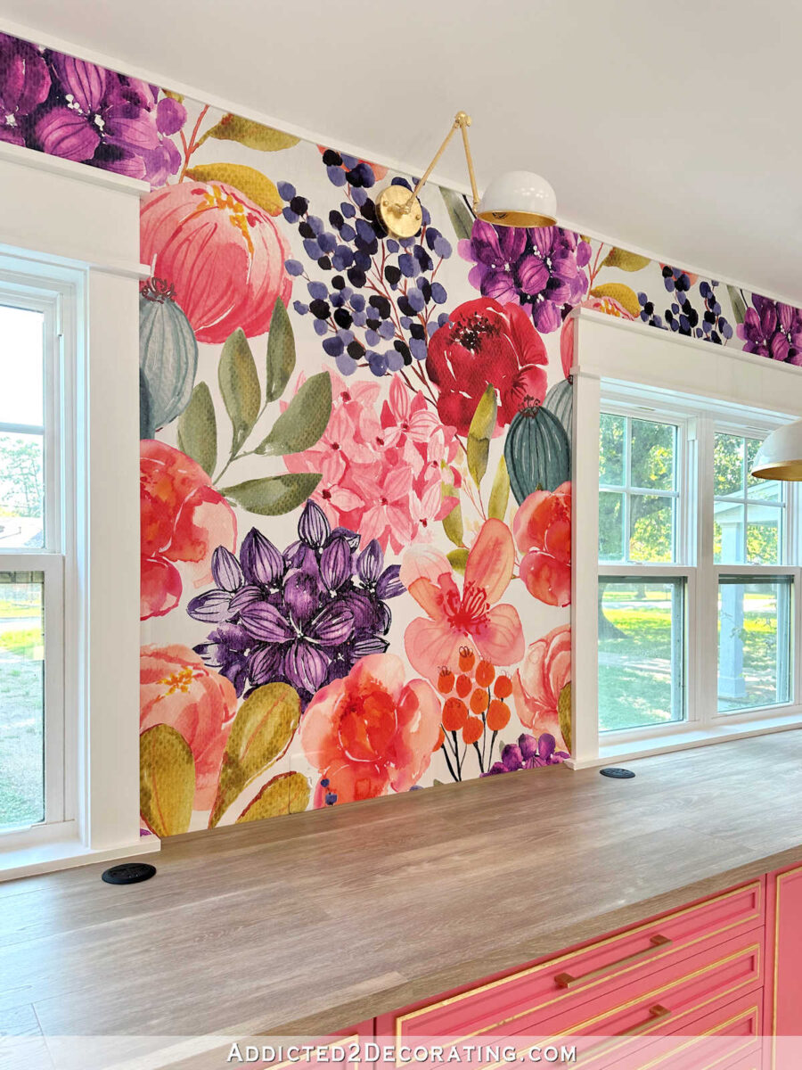
I love that! It’s like these were made for my desk! Well, kind of. I absolutely love the design, and I think they’ll be perfect once they’re incorporated into the design and everything is painted the same color.

But, as you can see here, the cutout design is about an inch too short.

I’m not quite sure what I’m going to do about that, but I’ll figure out something. Because these are too perfect to pass up!
And finally, let’s talk about the desk chair fabric. My last round of samples didn’t really work out. I realized almost immediately that green wasn’t the right color for my desk chair. So while I was at lunch with my mom last week, we talked about some other possibilities. She suggested that I look for a solid fabric in the darkest color on my favorite striped fabric.

I loved that idea! Instead of looking for a contrasting color, I loved the idea of doing the chair in a color more similar to the cabinets, but in a darker shade. So I ordered every dark pinkish red velvet sample that I could find from KOVI. Obviously, one of them was an immediate “no”.

So that left me with these four as possibilities. They are all very similar, but they do have very subtle differences.

I liked all of them, but the one of the far left seemed a bit too true red to me. It seemed too harsh against the cabinets.

So then I was down to three, and I tried to determine which one looked best not only with the cabinets, but also with the darkest red color on the pendant light. My eye keeps going to the middle swatch.

I’ll show you a close up of each one. The far right swatch has some variation in color which almost makes the velvet look shimmery, but it’s not.

This is the one that my eye keeps getting drawn to. It has a bit of a texture to it that reminds me of a tiny, micro corduroy.

And then there’s the left swatch, which has more pink in it than the middle one.

So it’s down to these three. Whichever one I choose, I’m going to cover the whole chair in this fabric, and then add white piping and a white three-letter monogram to the middle of the front chair back (i.e., where my head rests). I’m pretty excited about this idea! But I just need to make a decision about the fabric. As of this moment, the middle one is the winner for me.



Why not try a gold velvet to go with all the gold accents?
Hi Kristy
This might be only me, or my slow rural internet, but your posts are always difficult to load here. The photos are very slow and often don’t all show up. For example, the site is done loading, but I don’t have any of the closeup photos. I don’t know if it’s because your site has so many previews/ads/pieces to load. For example, I was halfway through writing this when I new add filled in just beside this box. (I just scrolled up, and those last 4 photos are here now.). It’s like all of the ads need to load before the rest of the photos, and they take a long time.
A lot of days I get frustrated and leave before all of your photos show up.
I have the same issue. I think it may be the size/resolution of the photos. Maybe “gaming” computers handle it more quickly. I usually open the blog and let it sit for 5 or 10 minutes before coming back to read it. As far as the swatches, the middle one to me looks like it’s already snagged some lint. I just remember that being a problem with corduroy. They’re all fairly close, but I say whichever one matches the petri dish that’s almost dead center (the bright/dark pink) – that’s the one I’d go with!
It loads just fine for me on my 4.5 year old phone. It’s internet speed!
It loads fine on my tablet. It’s the internet speed that makes it do that. I had to get a new tablet several months ago, because the other one couldn’t download certain apps.
I get that it’s my internet. I can stream Netflix without issue though. I think it’s the site design. There are so many ads and previews on the page that things don’t load well (even when the address bar isn’t “spinning” anymore, I still don’t have all the content). Sometimes it never finishes loading the images. I just wanted to point it out since I doubt Kristy visits her website often and she might not know that it doesn’t play nice a lot of the time for some people.
I would go with the shimmering fabric on the right. The middle one seems off to me in comparison to your cupboard colour, and I really like the fact that the colour lof the right one is not completely solid (wouldn’t that help with wear and tear as well?). I love the idea of a monogram on the back of the chair and cannot wait to read how you will make it. Have a lovely weekend and don’t overdo it on the chandelier, it doesn’t have to be done by Monday!!
Oh, I have a belated comment on yesterday’s plant post: I think that the sub-varieties your garden architect has chosen might be really important, as they often determine not only colour, but growth and final measures of the plants. Be sure to research them before changing to something bearing the same plant name but being a different variety. Ask me how I know :): I have a plant in my very small garden that is beautiful, but I started with the dwarf version (very appropriate) then got the generic one which is far bigger and has overtaken so many flower beds that I constantly have to dig it out and give it away as a present, as my garden cannot cope with it….
I have been a Texas gardener for over 30 years. It takes enormous money (aka water) and effort to sustain a landscape like that. If you don’t have a full-time yard crew, you are looking at disappointment.
Which fabric will be more sustainable with your cat?
They all will. They’re all velvet.
Middle one for me also. I like the texture.
I had the same thoughts. Perfect color and the texture is better than the other one that is so similar.
Could you add a tiny bracket on each end of the branch. Maybe even one that is transparent and it would look like it’s floating?
I’m not sure how to describe what I’m thinking of to solve your branch problem. What if you attached pieces of wood to the top, bottom and sides inside the current frame on each end that is about 1/2 inch narrower than width of the current frames so it’s inset a bit. Then attach the pretty branch/leaf inside of that? I still think think the teal in your wallpaper would be the best choice for your chair. The chair would stand out against the cabinets. Using a pink that is close but not exactly the same as the cabinet will look like you tried to match the cabinet but failed. The sample in the center looks too red. The one on the right has subtle variation and would be the best choice out of the three if you have your heart set on a pink tone.
I’m afraid I have to agree with Laura regarding using a pink for the chair.
Like Kristi I LOVED the stripe. However, I know this is now reserved for another project.
I would use the new pendant as a reference and choose another colour from it and contrast with the cabinets. I’m actually drawn to the pale green in the pendant, which I feel would “freshen” the area which would look very “hot” if done in pink.
I can visualise that amazing pendant finished and hung.. it’s amazing!!
That light is going to be gorgeous! Can’t wait to see it finished! 🤩
Are there any abrasion resistance differences between the chair fabric samples, e.g. “rubs”?
I’m excited to see how the light comes along. I’m still a little confused how it is going together, but I know Kristi knows what she is doing, and will pivot if needed. I’m not feeling the pink chair. I think it will look too much like a failed match, and too much pink in that one area. It might be just me, but I would rather see a beautiful teal or eggplant, or even a golden color with a nice lumbar pillow or arm covers of that striped fabric for a pop. Just feels to much the same to me…just me of course.
RE: appliques to go under the desk. Since you are now an accomplished beader, what about splitting the gap and placing a bead at each end between the applique and the desk leg? Could be stone, metal or painted wood.
What about price of the 3 you like? Why use white of the piping? Seems like that will cheapen the look. Why not use the same material for the piping as you did for the chair, so it looks all together?? Why the monogram at all? You know it is your chair? I’m grumpy today so don’t mind me.
What if after all the work on the light, you don’t like it?
Have a good weekend.
I love the monogram idea, unique and it is the icing on the cake..chair!
Why you even bother to post? All negatives today…..
Looking forward to seeing it all come together and am more and more intrugued by the pendant light. I like the emblishments for the desk and I’m sure you’ll figure out how to make up that extra inch.
As to the desk chair fabric, I like the slight contrast I see in the photos of the micro corduroy with the cabinets but I’m in love with the more pink velvet on the left.
I’m also not a fan of the pink idea for the chair. I think it’s going to be too color blocked and take away from the cabinetry and desk details. I liked the green idea, but I think the green needs to closely match the sager green from the alcove. I’d also advocate against the white piping on the chair- this is a workshop- you’re going to get dirty while working, and that white piping will soon be grubby and dingy.
What I loved:
1. The leaf appliqués for the desk sides- did you buy multiples for each side, or were you planning on one per side? I think you can figure out a way to create a frame for them to make up for that 1″
2. The pendant light progress… that is going to be a stunner and worth every moment of time that you invested in it!
I only bought one leaf cutout for each side. Once I get the top five inches or so blocked off to hide the drawers, I think just one leaf cutout per side will be just right. But i not, I can buy more. 🙂
I am concerned that your cat will be able to hook their claws into the micro-corduroy.
Everything is coming together so amazingly in your studio.
For my 2 cents worth regarding your desk chair, IMHO, I think a solid eggplant type color would work well, it would be a grounding color against all the bright colors.
I hate to disagree with you because it’s your choice in the end, but I also am against the pink for the chair. It’s just too much pink overload for me. I love that teal, or even the gold, that pulls in the gold accents on the cabinets. And why white piping? I don’t understand that at all. The piping should be a shade lighter/darker than the overall color, or, if you have any of your curtain fabric left, use that for piping. Personally, I would rather have a leather chair in white if it were my room, and give kitty a scratching post nearby, and only allow her in the room when I’m there. But as I’ve said, it’s your decision ultimately.
The fabric I like is not pink. It’s red. And I don’t understand why “piping should be a shade lighter/darker than the overall color”. Who made that rule? Piping can be any color or pattern you want it to be.
https://pin.it/1snwyqMG0
Lovely project coming together! I am impressed by your innovation. I am not a ‘pink person’ so take this with a grain of salt…I would love a moss green for the chair picking up the colour in the wallpaper. But did you really say white piping? I hope you are considering vinyl or a washable indoor/ outdoor fabric for the piping.
Pick one the cat will not like.
Of your final three swatches for your desk chair, I like the one on the right. To me it looks just a tad lighter than your cabinet color, and it looks softer. Of course after you get the your color choice on the chair and it is finished…I will like that one best.
I love the leaves you bought and can’t wait to see how you use them on your desk.
Gold embroidered initials would be beautiful under your light and in front of your cabinets:)