Deciding On A Trim Design For My Studio Cabinet Doors & Drawer Fronts
Two days ago, I went to Home Depot and bought a whole bunch of small trim so that I could add a trim design to all of my IKEA Veddinge doors and drawer fronts for the studio cabinets. Yesterday, I returned all of that trim. 😀 After giving it some thought, I decided to order Overlays for these cabinets. I hate that I didn’t make that decision until yesterday, because now that will delay the completion of my cabinets. But I really like the idea of using precise laser cut designs to dress up these cabinets over cutting a hundred little pieces of trim and trying to glue them on precisely. I’ve done that before many times, and it’s doable, but I just want to try something different this time.
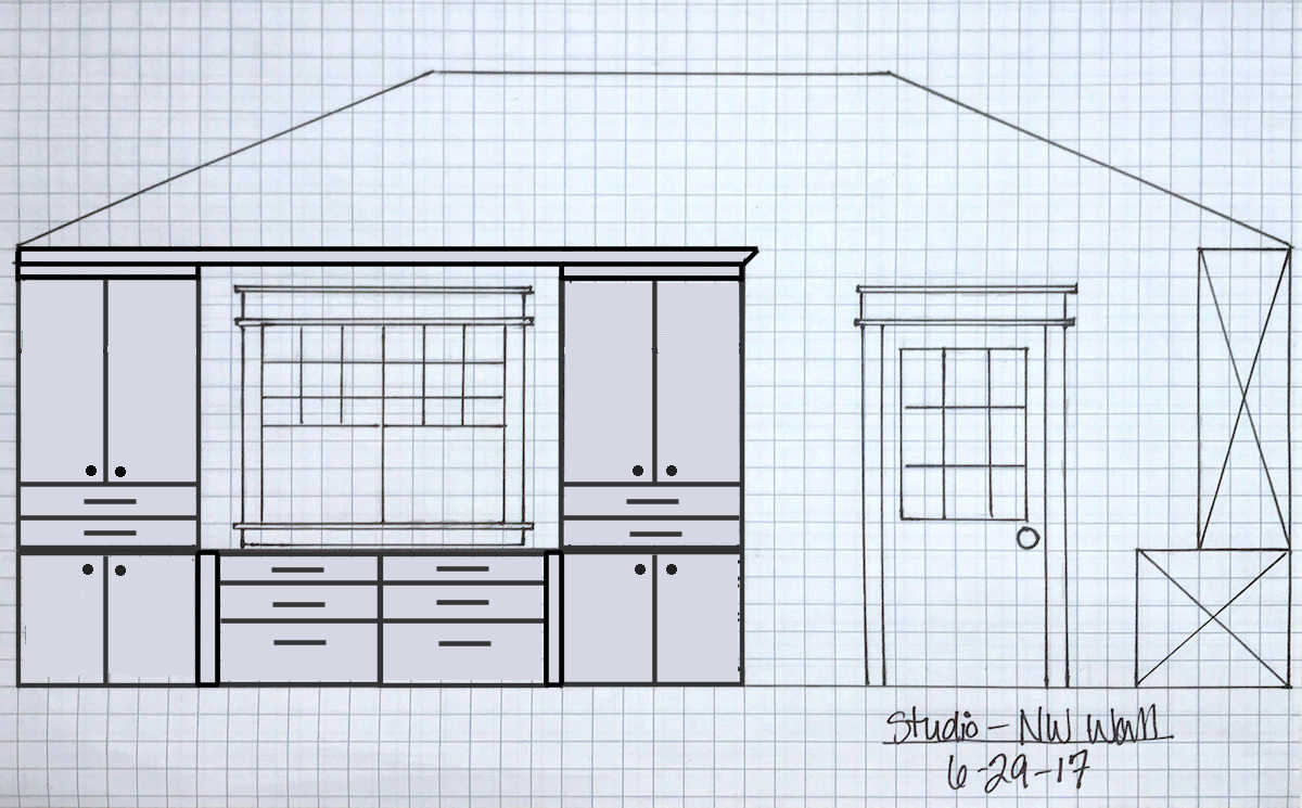
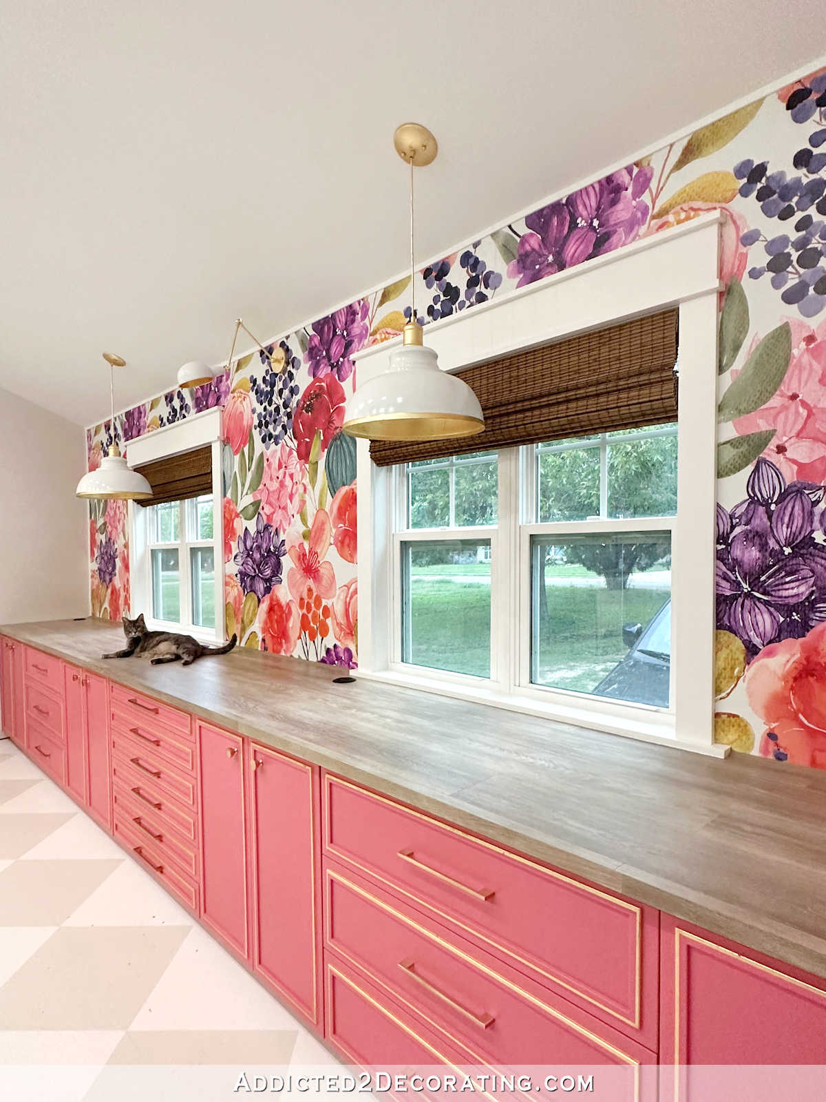
So if you’re new to this studio project, this is what I’m working with. I have a long 20-foot wall with lower IKEA Sektion cabinets the full width of the wall, and then on the outer sections, I’ll be adding 60-inch-high upper cabinets which will cover the areas of the wall without wallpaper.
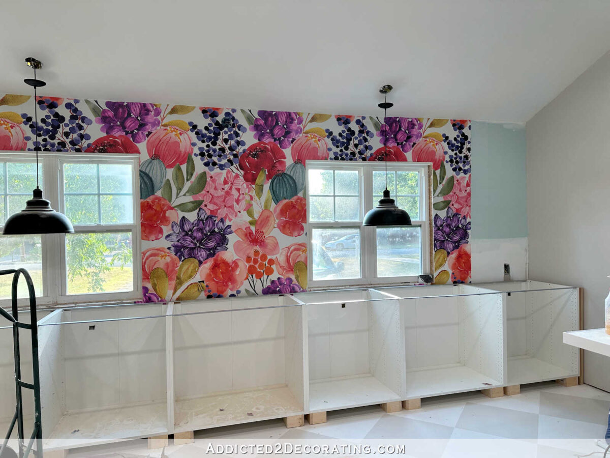
I’ll be painting the doors and drawer fronts after they’re trimmed out, so I haven’t been in a hurry to get those put on just yet. But here are the details of what I bought. All of the #2 cabinets are 30-inch-wide, two door cabinets with shelves. The #3 cabinets are 36-inch-wide, three-drawer cabinets. And the one #4 cabinet is a six-drawer, 36-inch-wide cabinet.

After looking at all of the Overlay designs, I’ve decided to go with the Anne panels, which look like this…
I’ve been trying to decide exactly how I want the Overlays to look on my cabinets. I decided almost immediately that I didn’t want a separate Overlay panel for each individual door and drawer front. I think that would start to look too busy on such a long wall with so much going on. So I know that at least for the four double door cabinets, I want one Overlay Anne panel to cover both doors, cut in the middle so that the doors will open properly.
But beyond that, I don’t know. I’ve come up with three different options for the drawer sections, and I can’t decide which one I like the most.
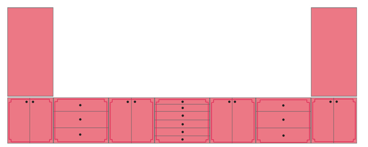
Option 1 – One panel per section
This is what I had initially thought just to keep things from looking too busy. I planned to use one panel (which I’ve shown in darker pink/red because my cabinets will all be painted the same color after the panels are attached) per cabinet section. That means that one panel would span the double door sections, as well as the three-drawer sections, and the middle six-drawer section.
I know it’s hard to see the detail on a mock up of such a long wall, so here’s a peek at just the left half of the mock up, which shows the full panel on all three types of cabinets.
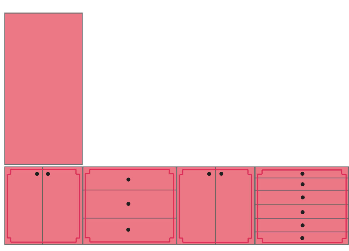
I was sure that’s what I wanted until I saw the mock up, and now I’m not so sure. While I didn’t want it looking too busy, I almost wonder if that’s too plain. So then I tried something different for the drawers.
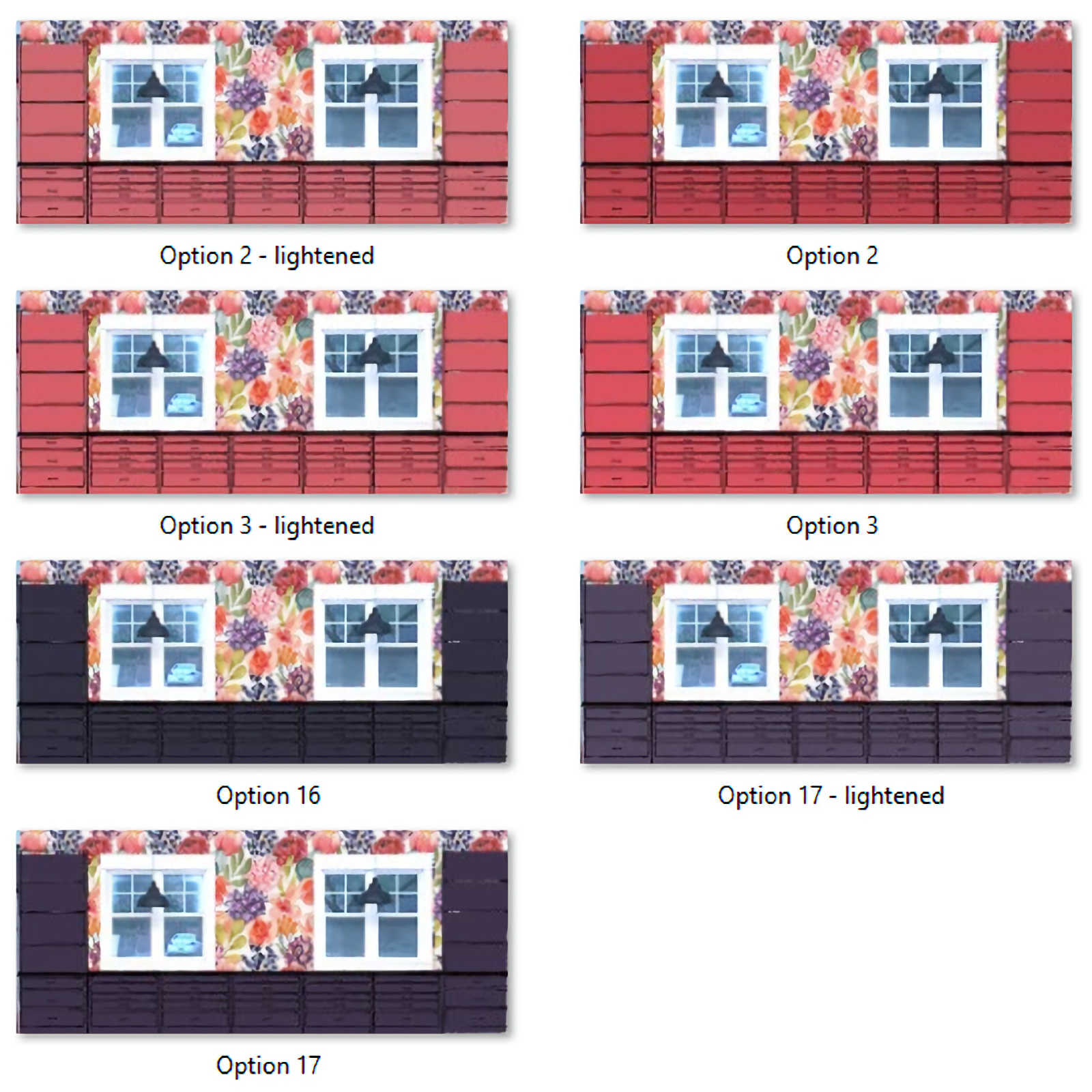
Option 2 – One panel per door section, large drawers treated individually
I like that this one mixes things up a bit. This gets away from that plain, everything-the-same look that Option 1 gave me, and I don’t think it looks too busy. I wasn’t sure about that middle drawer section (those drawers fronts are only 5 inches high), so I tried out using the same size panel on those as are on the larger drawers.
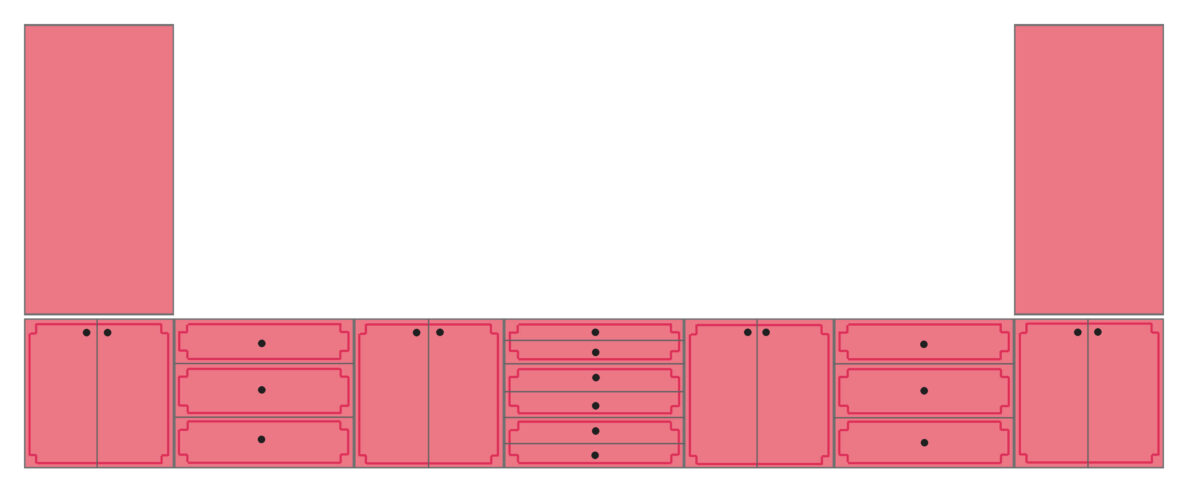
And once again, here’s a closer look at just the left half where you can see the design on all three types of cabinets.

But I did notice that they sell Anne panels that area very short (like 3 inches high) and very wide, so they’re for things just like my middle drawers. And that leads me to…
Option 3 – One panel per door section, all drawers treated individually
I decided to give it a try, and I really like it! I love those small center drawers, so I really do like the idea of them being seen by having their own individual panels.

Here’s a closeup look at just the left half showing the three different cabinet types.
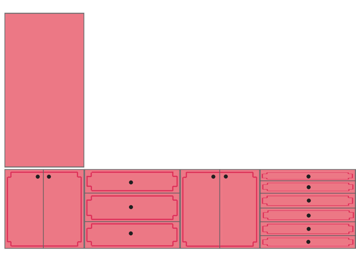
So I think those are the three options, with my favorites being #2 and #3. I just can’t decide! It’s that middle cabinet with the six drawers that is the big question for me, and it’s because if I do individual panels, the corners on those really short panels would necessarily have to be a different (smaller) size than all the rest of the panels just so that they can fit on those short 5-inch-high drawer fronts. And I’m just not sure how I feel about that. Would that look cohesive? Or would those smaller corners stick out and not look like they belong?
Obviously, whatever I do on this long wall will be replicated on the other wall. But that wall is simple since there are no sections with really short drawers. Tell me your thoughts!


For ME, it’s option 2! Can’t wait to see the results!
Option 2. 3 is too busy. Looks like you are going to have your own “Barbie” room.
I wouldn’t allow Barbie and her imaginary world to steal your joy in what you have chosen – besides, your pink is totally different from Barbie’s as well as your style is so much more sophisticated!
I like Option 2. The middle drawers are just too shallow to carry off the individual overlay. #2 makes the whole wall cohesive with drawer units all matching and offering a nice arrangement of doors and drawers.
I agree with Crystal.
Option 2 is lovely!
I agree as well, #3 seems like the design will get lost with that many drawers.
I love Option2 for the symmetry and consistency! But, as usual, whatever you land on will look AWESOME!
I like #2.
I really thought I would say #2 until I saw #3. I say go for the gold. Number 3 makes it feel like a special piece of furniture rather than typical -all the same- looking cabinets. It’s going to look so great, I can’t wait to see the finished results.
I agree. #3 keeps the uniqueness of the piece of furniture.
Oh boy! This is hard! First, I liked #1 best. Then I liked #2 best. But I think I like #3 best of all. The thing that is throwing me off is that you have the outlines colored in a dark pink so they stand out whereas IRL they will be the same color as the doors/drawers so won’t stand out as much and will be subtler. I like everything outlined myself.
I like option 3 the best. I like each drawer given the same prominence.
I know my choice is not what you want, but I am of the keep it simple group, if there is one. I am liking clean looks, and those drawer pulls that a minimally visible curves on the edge of the doors/drawers. Plain, simple and contemporary/minimalist. Now, if I have to choose between the three, I’d choose #2, but only under pressure! LOL!
I prefer #1, however, agree if you like 2 or 3 better, go with what you like best. That wall is busy with the wallpaper and the tall cabinets, the drawers just more of more with so much trim from 2 and 3. However, you have always made great decisions and I have confidence in you.
I agree with Francine. I like #1 the best because the wall is already going to have so much going on because of the wallpaper, and I prefer the more stream-lined lines of trim in #1.
I like the middle solution. It is symmetrical and simple, but not too simple.
I love the happy medium of 2! The having to squish down the proportions of the corner designs put me off of 3, though I do like the satisfactions of all the drawers getting to have trim.
How about option 4? You could do one panel per section on all but the 3-drawer cabinet. On those, you could panel each drawer separately.
I am going to go all out on no 3 the trim will not be so obvious when the same color of cabinet. No 2 comes in second although until I studied it longer it was my first choice. For no two to work you will really need a standout pull that covers the two drawers at the center of the trim.
You said you really like the small drawers and would like to draw attention to them. Go with #3. IMO it looks the nicest.
It’s a tough choice between option 1 and option 2 for me. I can’t find a post where you mentioned what hardware you’ve chose so if you haven’t, Ithink you need to make a pull vs knob decision and pick out your hardware before deciding on trim. Color and size of hardware are going to play a big role in the final look since they are the jewelry of cabinetry. Also, I have a hard time believing your 36″ drawers will stay well aligned with a dinky single knob as depicted.
Good point — pick the hardware at the same time you are picking the overlay design!
I wouldn’t allow Barbie and her imaginary world to steal your joy in what you have chosen – besides, your pink is totally different from Barbie’s as well as your style is so much more sophisticated!
I totally agree on the sketchy alignment of all those 36″ wide drawers with two knobs each – the temptation will be to open them from one side when you’ve only got one hand which could easily make a wreck of an IKEA drawer that wide…
Having been a residential kitchen designer for a time, I often demonstrated our 36″ wide drawers on display – I wanted the customer to feel them opening and closing and see how they can be easily waffled even on very high quality cabinets…one thing that would help prevent uneven opening would be to remember to always open with two hands grasping both knobs – Or, get one very long pull and center it on each drawer…that could make quite a stunning hardware statement as well!
I like option #3, but if the multidrawer section seems too busy for you, did you consider doing that section as you did in option #1?
Oops I meant to say option #2 for the multidrawer panel.
My first thought is, if you put elaborate designs, you will have to dust them. I always go for low maintenance finishes, especially in a place where there will be creative activities. So how much are you willing to clean. The plainer designs are just as nice–depends on your taste.
Yes — good point! This is a room where there will be lots of things being created, which creates dust!
#2 gives you the symmetry and isn’t too busy!
I really love #3. Everything else gets its own outline. The little drawers should as well.
Kristi….Please don’t shoot the messenger… I love the plain no decorated Cabinet Doors & Drawers….. They don’t compete your most magnificent wallpaper. With all that trim all I hear is… “Hear I am …Look at me….!” And if you are planing to use your saws in there, all I see with that trim is a place for sawdust to gather… which means MORE HOUSEKEEPING…. Not to quote an over used phrase… “Less is More….!”
I agree. Having had 3 studios i would definitely go with no trim. Ive had trimmed doors and drawers and hated cleaning all that. I was in there for fun, not cleaning.
This is what I think, too. I think the trim looks cluttered and competed against the wallpaper. If it was a plain wall I’d say go with trim, but that’s too much for one wall.
I like #2 the best of these options.
If you look at the drawing of the entire wall of #2 you see the doors with vertical trim and drawers with horizontal trim alternating every other one. For some reason I don’t care for that pattern and prefer #3 which has a different size on the middle set of drawers. Maybe you could find out from the manufacturer how big the corners on each size and better tell if the corners on the narrow overlay would look much different from the larger overlays. I also would suggest you use pulls (fairly long ones 6-12″) instead of knobs on all the drawers and doors. The knobs look lost on a 36″ wide drawer. Or, use knobs on the doors and pulls on the drawers.
You may want to use two shorter pulls on the 30-36″ wide drawers.
I’d do two orders, one of the doors and see how you like the cut design and it’s install in person. Then choose #2 or 3 from there.
If in a bigger rush go with the individual ones somehow I think it’d be easier to hide errors with a non-cut design.
I’m 100% for number 3. I think those smaller drawers deserve to stand out, epecially given they are in the center. Besides, it adds a nice contrast to the other drawers and even the cabinet doors. I really think they will look amazing! Good luck deciding! <3
Another possible idea- I believe you can get nested/hidden drawers so the middle section could have three matching large drawer fronts but the utility of six drawers inside the cabinet box. Ifyoulove the six visible drawers, then I vote for option 2 as less busy than option 3.
Well I liked the clean look of #1, especially with the bold wallpaper (which I love!), but you have essentially taken that off the table. Between #2 and #3, it’s #3 for me, I like the distinction of the middle smaller drawers. To my eye #2 make it look like you are forcing “matchy”, “matchy”. Funny that I go from the simplest to the busiest. But the decision is yours. I’ll be fun to see what you decide.
Two looks like you! 3 is too fussy! Love the symmetry of 2. Thanks for asking us!
I think 2 looks the best in the mock-up but 3 will look the best in real life precisely because of what you said about the random corners and the interruptions to the trim. I’d go with 3.
#2 or just plain for me. But personally, i think they all look too busy. I hate dusting anyway, and those little ledges are the perfect dust catchers. Thats JMHO though.
2
Team 2 for me. BUT…those little edges will catch all the dust and detritus from whatever you do. I have paneled doors, and they do get dirty. So I take my windex and a white cloth and clean all 8 panels on both sides of door and watch the rag come away black. Maybe the pink will hide more dust than my white doors, but it’s something you need to think about.
#2. Symmetry matters!
I like option 1. And a question, nothing for the tall upright cabinets on the ends?
Number one if you are going for simplicity. The others are just too busy for my taste. I think you have plenty of movement with the wallpaper & floor.
My first thought was what a dust-collecting nightmare trim would be, but maybe that’s just me (I can think of so many other enjoyable things to do in that studio besides dusting). If you don’t mind the dust, I suggest 2. The curved corners are likely to be lost on the those shallow drawers.
Mt only issue with trim, and it’s my personal problem, is that it’s a lot of trim to dust or clean and it will get dusty in your work space. As i get older, 78, I look at everything i purchase as how hard is it to keep it clean. You will select the right trim for you because you always do.
I vote for option 2.
I vote option 3
Go for each drawer having its own overlay! It won’t look too busy – as in reality, it will all be the tuberose – unlike the line-drawn elevations with its black lines…
The extra horizontal trim molding style will require a bit more dusting, but I think it’s worth it for the lovely Chinoiserie statement!
I forgot what metal your hardware will be in…black like the line drawing?
Or satin brass? Or?
I like the simplicity of option 1. It’s a lot of cabinets and drawers and knobs/ pulls. It is just the right amount of molding.
I think Option #1 has the Anne Overlays spread so far apart that it all looks like an unfinished after thought.
Option #2 looks really nice, and well planned out. Easy on the eye when needing to open up a drawer or door.
Option #3 really looks outstanding. May be too busy for some people, but not for me.
That’s my thoughts, but I know your final decision will be perfect and I can’t wait to see it all when you have it completed.
I think I like the middle ground of number 2. I like the look that all the trim kind of matches, although it has two drawers per trim. I would never have thought to do that, but the smaller drawers just seem too much to me all trimmed. That being said, I think even more, I would love to know what pulls you are planning on as well, for the big picture. Those small drawers will look pretty busy if you also have long pulls, which I think would look nice overall. I agree with some others…it will make work for cleaning…I’m thinking you weren’t sawing things in there, but my house gets dust everywhere, no matter what! I’m for lower maintenance, but I’m older than you…🤣
I vote for 3. 2 would be my next favorite.
Option 2 looks best to me! Symmetry!
Whatever fits with your need for symmetry will work.
I’d advise you look closely at it for a few days so you don’t end up
You don’t want to have to rip it all out.
Actually,I’d go with no trim. Easy to wipe down. Less ledges to collect dust. Just my opinion..
I like option 2 so the little drawers don’t look so tiny yet they look like they belong. In option #3 the little drawers with all that trim look tiny, I think.
I think 3 panels not 6 for the center drawers. More symmetrical.
My vote is for 3 – Can/t wait to see what you do!
My vote is for the 2nd option…It’s just busy enough to be interesting.
The trim looks fussy, old fashioned. Clean lines and focus on unusual hardware. (No offence intended!)
I like all of them, but I would probably choose option 2. Option 3 looks a bit too busy to me on the 6 drawer unit.
Although I personally would leave the fronts unembellished, I know that you want and need some sort of decoration. But #2 and #3 just seem like too much. (#3 especially reminds me of that godawful reproduction French Provincial furniture that made the rounds in the ’60s!) You’ve chosen a strong wallpaper — let it have the spotlight and let the cabinet trim support (not compete with) it. Option #1 gives you that. And as others have pointed out, your choice of hardware is also critical. A subtle dash of curvy trim, offset with a strong rectilinear hardware, would really balance the large floral/curvy wallpaper.
I like option 2 for the drawers but would do individual panels for the doors. The wide expanse when one panel is split on two doors throws off the symmetry for me. 🤷♀️
My favorites are also #2 and #3.
I really like #3. It looks appropriate in the center of the wall. I draws the eye to the lovely wall paper with its difference. I just looks intentional.
Sheila F.
#3 all the way!
#2 would be the best, IMHO. I think you’ll be happier keeping all of it looking alike.
Personally, I’d not do any trim, Simple fronts with the wild wall paper. I’d try it first, then order the fronts if you still want them.
Add your pretty wallpaper to your mock ups. I believe it will help give a better sense for the whole design. Even add in the windows with their trim for a complete perspective. Whichever design you choose though my recommendation is to also add the trim to the top cabinets. Having lived with flat panel kitchen cabinets for 17 years I do find the “clean” look a little boring now.
#2 is brilliant!
Considering the space’s purpose, ie, a workspace that will regularly get dirty and visually needs to have breathing room in order to create without bombardment, I think ~no~ to the beautiful decorative overlays in this room. What about a simple painted stencil instead? You can add just a little detail, could be with the same “picture frame” effect as the overlays, but with more subtlety. Could be monochromatic. Plus will be easier to clean than all those crevices in the trim!