
Dining Room Chairs And Benches (Help Me Decide How To Use These Fabrics!)
Yesterday, I started working on upholstering the dining room chairs, and in true Kristi fashion, I began to second guess how I was using the fabrics. I’m not having second thoughts about the actual fabrics. Every fabric I purchased will be used in the room. But it’s the way in which I had decided to use each one that I began second guessing. And you have to just give me this one because I wouldn’t be me if I didn’t second guess my decisions at the last moment. 😀
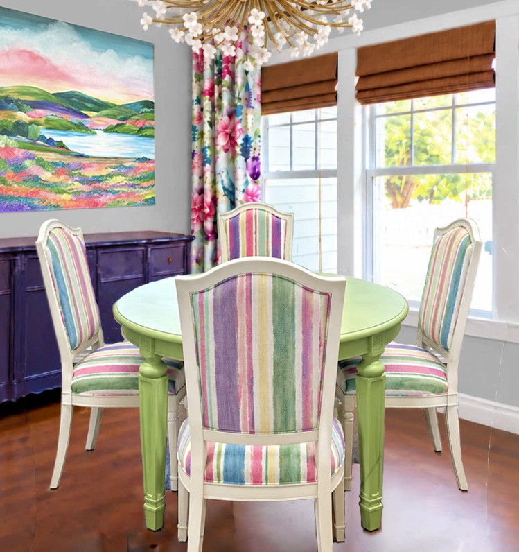
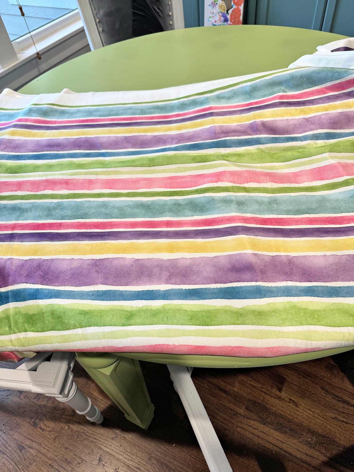
The last decision I made was to use the striped fabric on all three sections of the dining room chairs. This isn’t exactly what my fabric looks like since this is a ChatGPT mockup that I shared before I created my own fabric design, but this is the general idea.
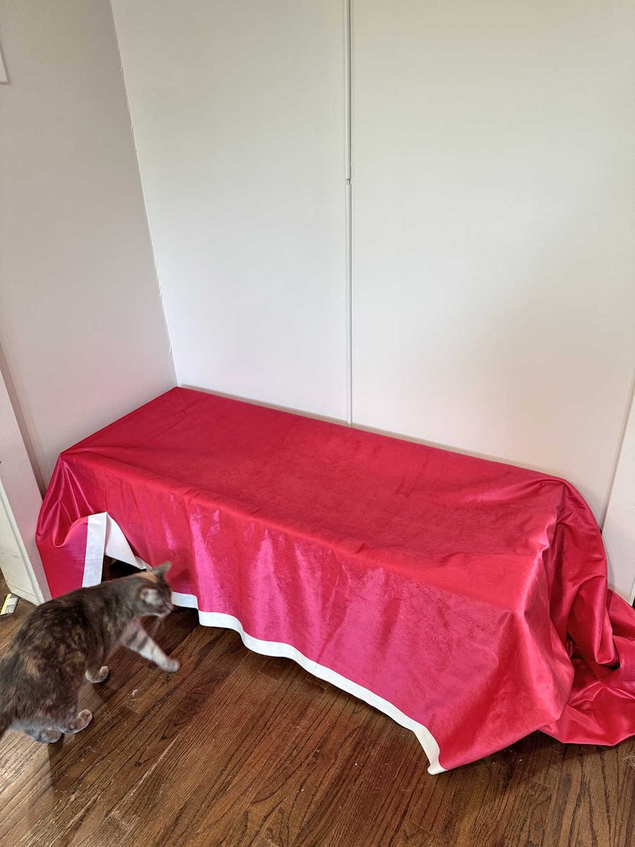
And then the idea for the benches was to use the solid pink fabric on the upholstered tops.
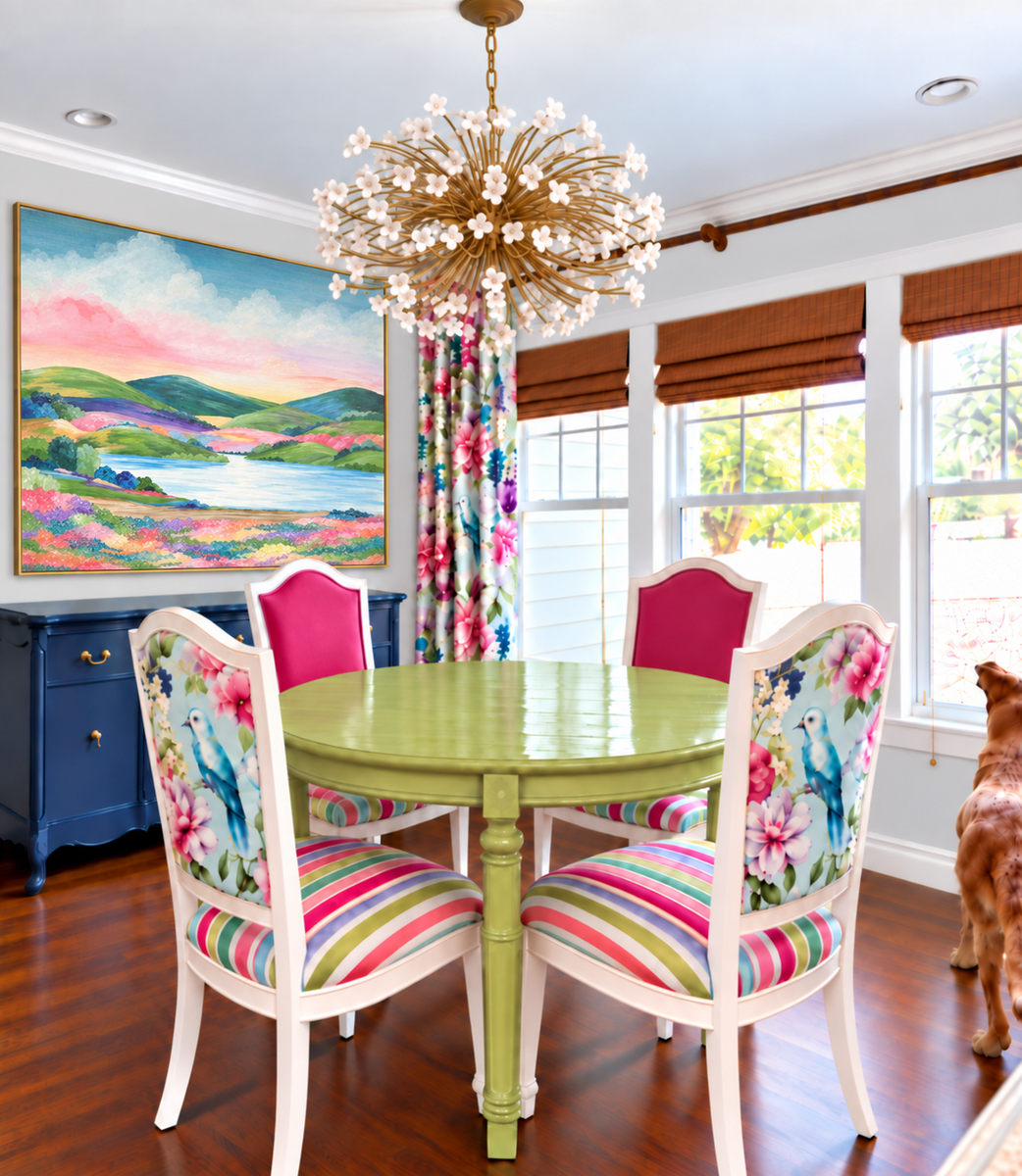
But as I was removing the original trim and fabric from the dining chair seats and getting them ready for new fabric yesterday, I couldn’t help but wonder about that original plan with the three different fabrics on the chairs. I’ve only ever seen that idea it in this ChatGPT mockup.
So before I start cutting the fabric, I decided to do the best I could to see what that idea would look like now that I have the actual fabrics in hand. I really like how these two fabrics look together on the chair.
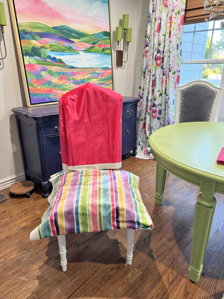
And here’s what the back would look like. If I go with this three-fabric idea, I think I would order a couple more yards of the floral fabric in the velvet so that the fabric matches the other two. I don’t like the idea of two of the fabrics being velvet and one of them being cotton.
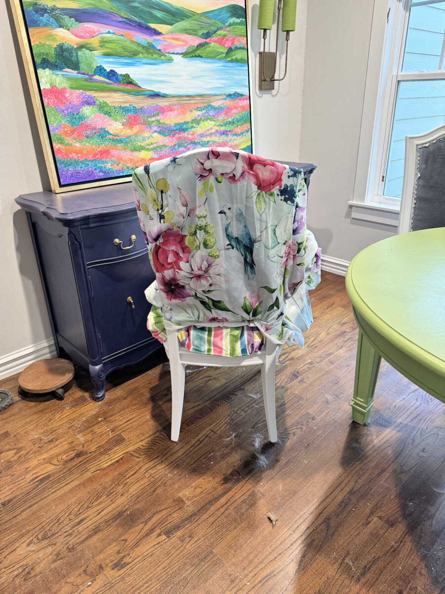
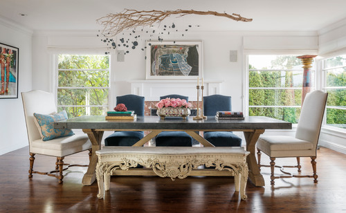
If I do that on the chairs, that means that I’d use the striped fabric on the benches. I wasn’t sure that I’d like that fabric so close to the artwork, but I really do! I would definitely repaint the lights green, though. That much color on the artwork and benches needs green lights instead of gold, in my humble opinion.
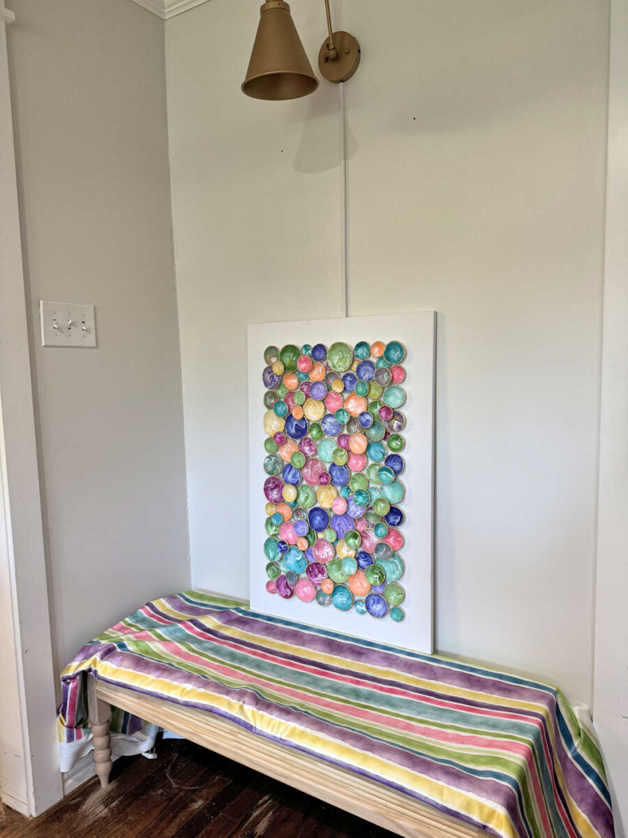
Anyway, I can go ahead and upholster the seats on the dining chairs for now, but that’s as far as I can get before I need to make a final decision. What do you think? Should I stick with my most recent decision — striped fabric on all three sections of the dining chairs and solid pink on the benches? Or should I go with the original idea — three different fabrics on the dining chairs — and then use the striped fabric on the benches?

Addicted 2 Decorating is where I share my DIY and decorating journey as I remodel and decorate the 1948 fixer upper that my husband, Matt, and I bought in 2013. Matt has M.S. and is unable to do physical work, so I do the majority of the work on the house by myself. You can learn more about me here.


I like the stripes on the benches and the 3 fabrics on the chairs.
I vote for 3 fabrics on the chairs and stripes for the benches. Also, I love your new artwork!
I like all stripes on the chairs, the 3 fabrics seem busy to me. I also think a solid on the bench doesn’t distract from the artwork.
I’m voting for this, too.
I agree with you. Solid on the benches.
I agree
So agree!
I’m voting for this one too.
I love your original idea!
The three fabrics on the chairs are fun and unexpected. I do love the striped fabric on the benches.
Three fabrics on the chairs and stripes on the benches.
Do what speaks to you. It has always worked for you before.
I think the artwork with the stripes clashed. The benches need a solid color. And then use bird print on pillows, stripes only on chairs with pink piping.
I agree with Bobbie.
I like the stripes on the benches and the 3 fabrics on the chairs.
I think the stripes on the benches with the artwork looks amazing!
I find the floral fabric dull compared to the vibrant colors on the stripes and the pink. Maybe the floral with a white background? Bring out the colors of the fabrics and birds better?
Personally I don’t like all three fabrics on the chairs. Especially the floral on the backs. I think it competes with the stripes rather than enhancing each of them.
If you want multiple fabrics I would do pink seats and stripes on the front and back of the tops. But all stripes looks more refined and beautiful to me.
I feel like stripes on the benches distracts from the artwork, looks way too busy for my eyes. Love the pink for the benches, gives your eye somewhere to rest. Can you do stripes on the front of the chairs and floral on the back?
I have loved the 3 fabrics from the beginning. The birds on the backs are such a fun look.
Sheila F.
I agree ! Stick with original plan.
The three fabrics looks too busy to me as does the stripes with the art. You want the art to be the star of the show on those walls and stripes and green lights will take away from that. I vote for option 3: stripes on the seat and seat back (where you are testing pink) but go with the birds on the back. That’s two patterns on the chairs and then pink on the benches with striped pillows to tie it all together
I line the stripes in the chairs and the pink on the bench
I think the stripes take away from your artwork
I would do the bird on a pillow on the bench
I love the colour palette
This is an excellent example of design creep. Look at your initial goals & boundaries. Maybe re-read the posts and wants. Doing the benches and chairs in one or more of the same fabrics is very matched vs collected. Does this achieve your initial want? I remember you having a pattern discussion earlier not wanting too much matching and skipping the bird fabric on the backs but I can’t explain your words well. See if you have enough for a pillow after to tie it in.
I don’t like stripes on the bench because I the bench is the wrong shape for the scale of those stripes. It’s possible something feels lightly off and trying to fix it with the fabric that makes you happiest. You are close but getting an uncanny issue. Maybe the initial photos had more warmth from the glaze on the green finish and wood tone on the benches. I’m terrible at Id’ing it but there’s a shift. I’d re-read then decide.
I like your original idea of the striped fabrics on the chairs and the solid pink bench. The 3 chair fabrics look excessively busy to me, and the striped on the bench takes away from the fabulous artwork.
I like the stripe on the bench. Your picture is not going to be that close and the wall gives your eye that rest. The pink front with the stripe seat looks good too. Based on my computer the bird fabric is what makes me question that choice due to the blue back ground. Have you tried the bird as the seat fabric ? What happened to Matt saying no pink? I laugh as we have a fuschia sofa wool herringbone print because my husband loved a fabric he saw while I was looking for fabric..
I’d go different again. Plain fabric on the benches to keep the artwork front and centre. Stripes on the chair fronts and the plain fabric on the back or stripes all over the chairs. I’d keep the other fabric just for the curtains.
Having said that, it’s your home and not mine and tastes differ. You need to go with what speaks to you the most and what you’ll be happiest with.
Hi Kristi: I’m enjoying seeing your progress in the Breakfast room. I agree with you – I really like the striped fabric with the artwork (and yes, definitely a green light fixture too)! With the dining room chairs, since you have so many colorful prints and artwork in the room, I believe having just two fabrics would give the room a more peaceful (albeit a bolder type of peace!) and cohesive look. The pink on the front (back and seat) with the floral on the back side of the chair. With the typical spills that can happen with any dining room chairs, the solid color would probably be easier to keep clean. It’s looking great! I know you can do it. You always impress us!!
I love the three fabrics on the chair as you originally posted. Fun and unique!
It’s tough to tell from the pictures, but I feel that the pink is jarring. The watercolor stripes are soft and the drapes are soft. What if you did all the chairs and the benches in stripes. Pillows on the benches in drapery fabric and paint the sconces green. Maybe a pillow in pink. Just an idea to try.
Since you mentioned the sconces, please consider the rechargeable art picture lights from amazon instead! FYI for another room, there is a fantastic chinoiserie pagoda lantern chandelier for only $30 on your Waco Marketplace that is calling for a bright color.
I like the pink on the benches so you can have some fun pillows. I think stripes, patterned pillows, and busy artwork would be a lot. I like the plan of one or two fabrics on the chairs- the stripes and the solid pink 🙂
I love the three fabrics on the chairs and stripes on the bench.
3 fabrics on the chairs and striped benches. It feels more Kristi.
Absolutely three fabrics on the chairs and striped on the benches… your artwork sings with those stripes on the benches… and the chairs are true Kristi gorgeousness with the three fabrics. I love how your mind works!
So many decisions! I like the stripes all over the chairs, front, back, and seat, and pink piping. I really like the stripes on the bench, with pink piping. BUT, I think they should go from front to back, so your eye follows the vision up and down. Easier on the eye. Then what to do with the pillows… MORE patterns in the fabrics, or just pink to seperate the patterns???, and give the eye a rest.
I love the artwork, especially the gold edging on the disc. I would leave the lights gold, and do the frame in wood painted white to compliment the bench. I know you will find the right balance to fit your taste. Keep being creative.
I love the 3 fabrics on the chairs and the stripes on the benches. Even though you are adding one more pattern on the chairs and to a busy room, the solid color on the chairs keeps it in check.
Love the three fabrics for the chairs. That pink chair front really pops against the green table. Just an overall more elevated design. I’m more ambivalent about the bench fabric, but the stripes would give you so many options for paint color on the base – and I am liking the idea of repainting the sconces green.
I don’t like the drapery fabric on the chairs. Maybe stripes on the seat and the back with solid on the posterior of the chair.
Don’t like the stripes on the benches. Too busy. I think the solid looks better with the art work.
Speaking of artwork, I love this piece with the bowl shapes. Have you given any thought to making the second one with a different geometric shape like square bowls? or even triangular or hexagon? Just not identical shapes. It would be cohesive but not matchy-matchy.
Can’t wait to see the finished room!
Sometimes when we focus on one element or one corner it may seem somewhat plain or lacking, but when we zoom out and look at it all together it makes sense. I feel like that is what is happening with the chairs and the benches here. I’d stick to the solid on the benches with stripes on the chairs, as you planned, because they look good in context of the entire room.
I like the idea of the pink bench then using the striped fabric as cording around the edges and a bird patterned pillow with all striped chairs. This brings the pink from the leading edge of the drapes over to that side. To my eye the drapes are not as vibrant as the other fabrics so I think just the stripes on the chairs would look really nice. But it’s hard to know without being in the room. Whatever you decide will look great I’m sure.
So many options! My eye always sees the pink as a little bit too deep for the chair back which you generally see first, so I’d reserve it for the seats. Then, if you want all three fabrics on the chair, I’d try the chair back with stripe on the front and birds on the back. If you want to use two fabrics, then use the stripe on both sides of the chair back. Since you’d be using the pink on the chair seats, for continuity you could continue the pink on the bench.
I think I would go with the three fabrics on the dining chairs and the solid pink on the benches with pillows out of the striped and floral to put on the benches.
What about stripes on the front and seat of the chairs with pink on the back? I think the bright pink on the bench overpowered the more muted colors in the artwork a bit. I like the stripes there because the colors seem more balanced. But if you really wanted to use the floral bird fabric somewhere else in the room, how does it look on the benches?
Pu the solid pink on the seats and a print on each side of the backs.
My vote is for striped fabric on the chairs, pink solid fabric on the benches, and possibly floral fabric for pillows on the benches.
Solid on the benches, stripes on the chairs and floral curtain material on the bench side pillows would be the way I would go. Best of luck!
My vote is for the three different fabrics on the chairs and solid pink on the benches. Using just stripes on the chairs is way too boring for that beautiful table. At the very least, you have to add in the pink !
I like solid on top of chairs it gives your eye somewhere to rest. There needs to be some balance with all the patterns in the room.
Go full tilt!
Since you’re asking 🥰, I always felt like the all watercolor stripes on the dining chairs looked very dated like my aunt’s old chairs from the 90s. The mixed fabrics look fresh and exciting!
I LOVE your original idea and I was disappointed when you changed your mind so please go for it and use the three fabrics on the chairs and the stripes on the benches!