
Dining Room Wall Design Options (A Mom vs. Kristi Disagreement)
Well, y’all, my mom is at it again, trying to control how I decorate my house. I’m just kidding, of course. 🤣🤣 (I love you, Mom!) She does give me her opinion on my projects and my decorating decisions regularly. Sometimes we agree, other times we disagree. In the end, she really does recognize that this is my house and we have wildly different decorating styles. But she does offer her opinions when I float various ideas and options that I’m considering in a blog post.
And that brings us to our current disagreement — the dining room walls. 😀 My current plan is to do a design using the two neutral colors that I’ve used throughout the other “public” rooms of the house — Behr Polar Bear, which is a creamy white, and Benjamin Moore Classic Gray, which is so light and neutral that it doesn’t really read as a gray to my eye. It’s a touch on the warm side, so it’s more in the greige category, if you ask me.
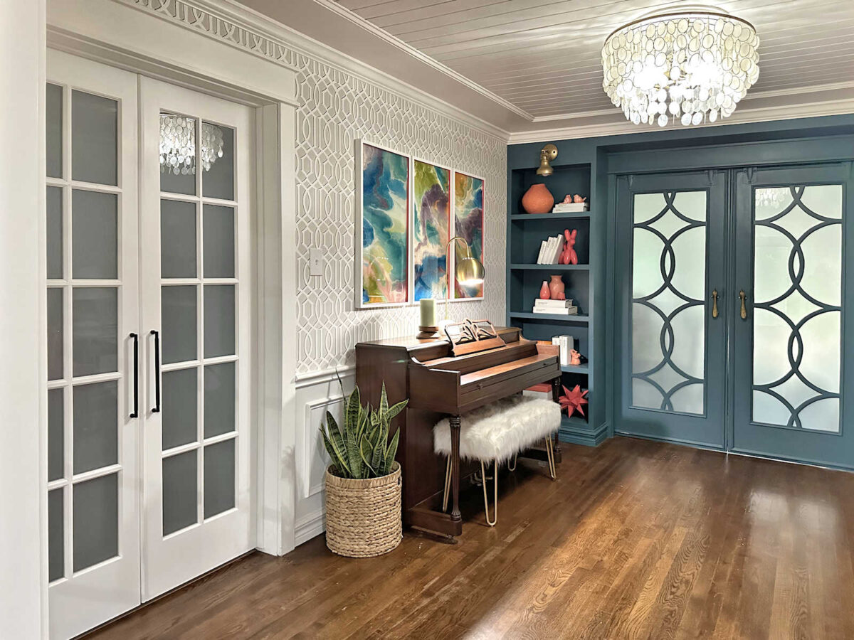
Those are the two colors that I used to paint the stenciled design on the music room walls.
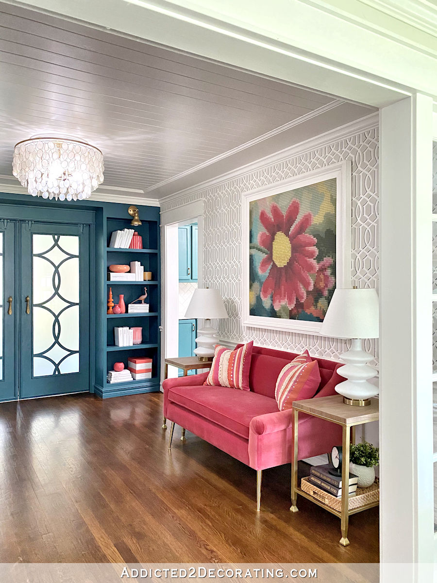
But also keep in mind that I outlined that stenciled design with a black Sharpie marker to make the design more dimensional. So the contrast between the two colors is even greater on these walls that it would be on the dining room walls.
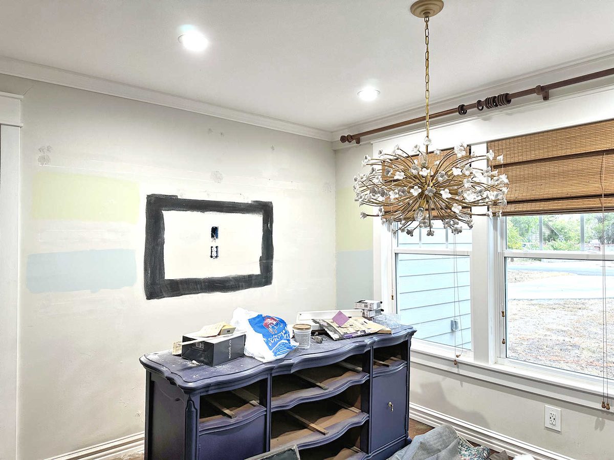
The walls in the dining room are currently painted in the Classic Gray color, although right now, they look like a complete mess with the paint samples that I considered, the black rectangle on the area where the TV frame used to hang, and the areas that I’m currently repairing after removing the shelves. So you’ll have to look beyond the mess and just focus on how the Classic Gray looks on the walls in this room with the Polar Bear trim and white ceiling.
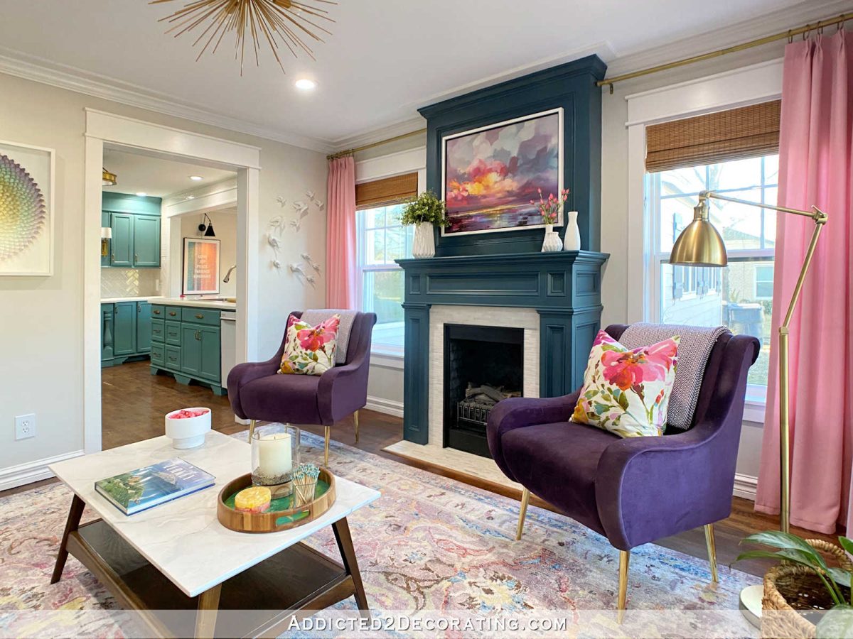
Here’s what the Classic Gray looks like in a finished room. And here, you can see from the living room into the kitchen (which has white tiled walls) and into the dining room with the current Classic Gray walls. Obviously, this is an older picture, as you can tell from the artwork on the walls.
So with all of that in mind, my mom thinks that solid Classic Gray walls would be better in my dining room where I plan to use bold, colorful artwork, colorful fabric in at least two patterns, and a green dining table. As you can see from the pictures above, the color shown in this photo isn’t quite right. It’s much darker and grayer than the Classic Gray. If I go this direction, I would stick with the Classic Gray, so it would be lighter, brighter, and not so obviously gray. But this gives us an idea of what a solid neutral color would look like in the room.
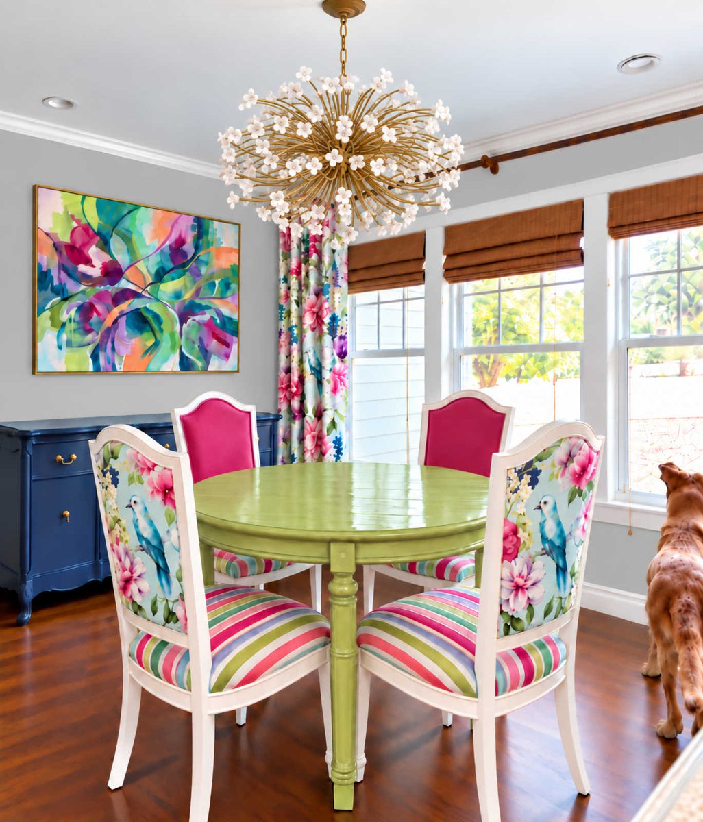
She says that there’s already so much going on in the room, and there’s so much for the eye to take in, so the solid color gives the eye “a place to rest”.
And believe me, I totally understand that concept. I utilize that concept in every room. That’s why I use neutral walls in my house. That’s why I use white wainscoting in so much of my house. I guess our disagreement is that I believe that giving the eye a place to rest doesn’t necessarily mean solid, neutral colors. I think a neutral pattern can still give the eye a place to rest. Or maybe my eyes just don’t need to rest as much as hers. 🤣 And that’s obviously true. I do love color and pattern and a mix of patterns way more than she does.
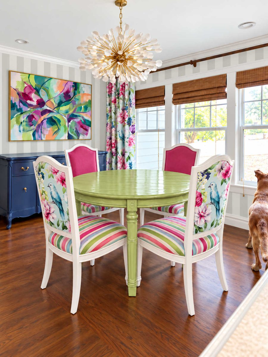
So with that said, here are the ideas I tried out. First, I tried out a vertical stripe. Again, I think the gray is too dark and too gray. You’d have to refer back to the music room walls to see the actual colors. Immediately, I didn’t like how the stripes on the walls seem to compete with the stripes on the chairs.
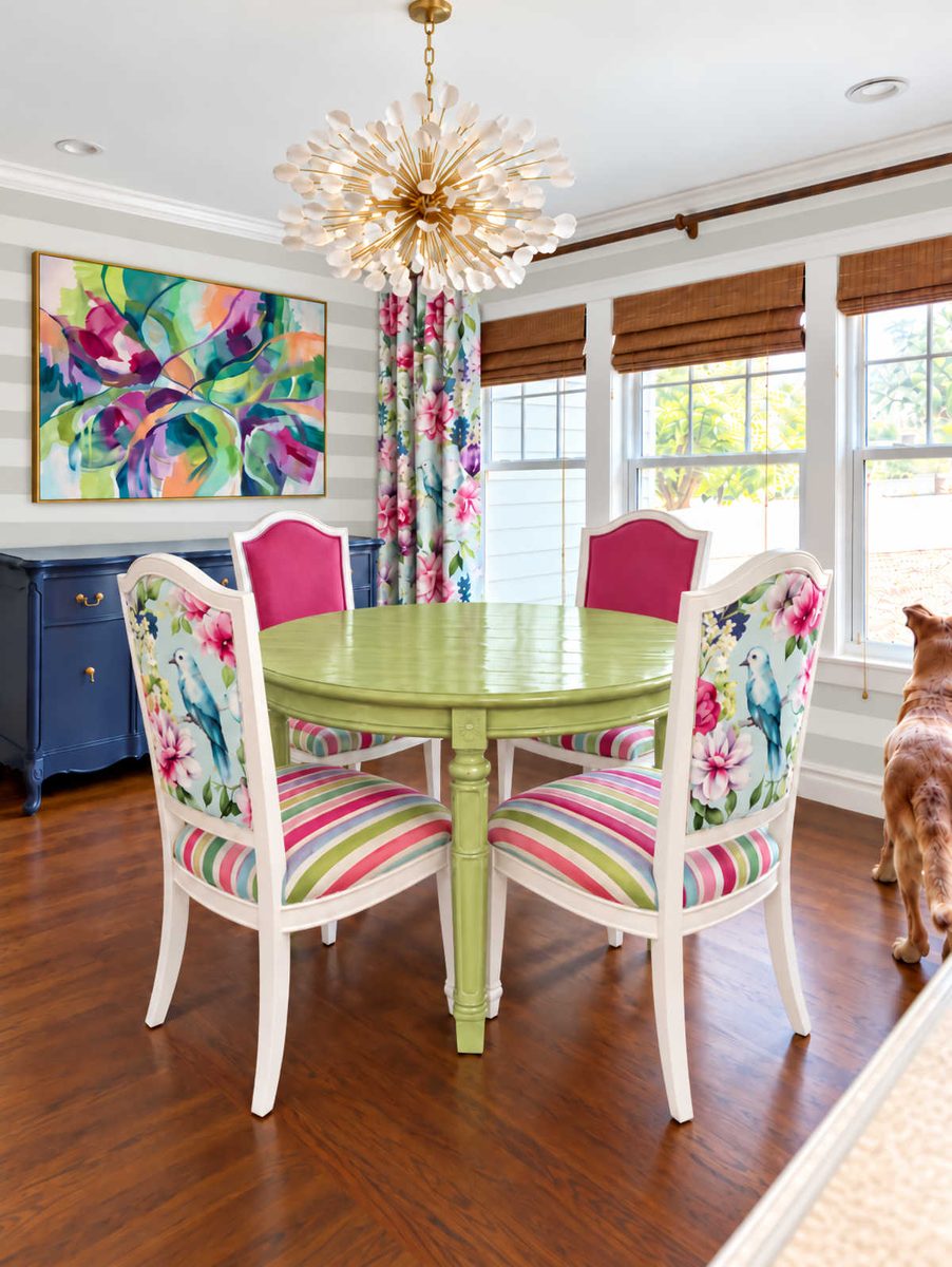
So I wondered if a horizontal stripe might work better. I still didn’t like the two competing stripe patterns.
But then I tried a harlequin design. I love this one. If I do a patterned wall, this is what I want.
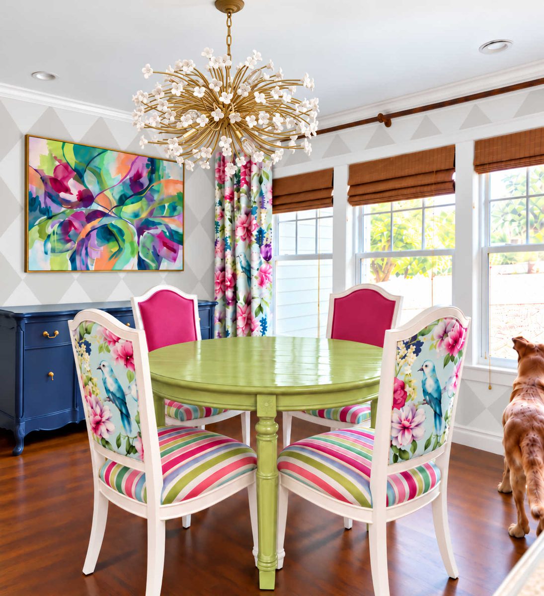
And if this is still too much contrast with the white and super light gray color, I could always go with a white-on-white harlequin design using an alternating matte and glossy paint. That would give enough contrast with the different sheens to make the walls interesting without actually using two different colors to create the pattern. It would also take me back 22 years because that’s exactly what I did in our bedroom in our first house in Oregon, except that in that bedroom, I used a dark red to create the harlequin pattern — same color, two alternating sheens. Talk about a throwback! That was so long ago that I don’t think I even have pictures of that project, but it turned out really pretty.
So anyway, are you Team Mom with the solid Classic Gray walls, or are you Team Kristi with a neutral harlequin pattern? And if you’re Team Kristi, should I stick with the Polar Bear and Classic Gray pattern, or should I do an all Polar Bear pattern with alternating sheens?
More About Our Breakfast Room
see all breakfast
room diy projects
read all breakfast
room blog posts

Addicted 2 Decorating is where I share my DIY and decorating journey as I remodel and decorate the 1948 fixer upper that my husband, Matt, and I bought in 2013. Matt has M.S. and is unable to do physical work, so I do the majority of the work on the house by myself. You can learn more about me here.


I have always loved the Matte/glossy pattern use in a room. I’ve done it myself. It looks so classy.
Team Mom
Ditto
Hey Kristi,
I think you will be sad to go with a solid wall so skip it. I also believe the white on white with different sheens would look so classy, and bring the movement you crave. I would do that.
However, you thrive with color and pattern so the gray and white is my second favorite, and might suit you better.
I remember when you painted your living room all white and that drove you nuts so the two sheens may not give you enough interest.
Good Morning, Kristi! I’m team Mom. I think you want the continuity of the Classic Gray walls with the rest of your house.
Without knowing exactly what will live on the pantry walls and how you will finish that area out, I can’t say for certain. If those walls will end up too plain for your vibe, the two sheen Classic Gray is a great compromise. I don’t love the harlequin pattern though.
The views of the buffet wall and window wall have a lot going on. I think the brilliance of each element gets lost with patterned options.
You’ll find just the right thing…you always do! Have a marvelous day!!!
YHWH Bless You : )
Alternating sheens.
Personally, I’m with team mom, but if you decide to do the design, I’d vote for one color with two sheens.
Team Mom …. but having said that, it is your house and you should do what makes you happy. You can always paint over it if you do not like it. It is just paint!
Your studio floor is harlequin in grey and white, and since you mention leaving the door open a lot, I think it might be too much and matchy-matchy if you do the walls white and grey, too. Tone-on-tone with different sheens would be a fun surprise!
I don’t think the stripes compete with the chair fabric (and the stripes could also be tonal).
Team mom.
I am with team mom, but white on white harlequin sounds interesting.
Team Mom – mom’s always know best! 😀
I lean towards Team Mom on this one, just because you have so many beautiful colors and patterns in the room already.
The grey/white harlequin pattern also reminds me of the floors in your studio, and I personally prefer that pattern on flooring rather than walls. If you have your heart set on a pattern vs the solid grey, I think a single color with different sheens could be the best of both worlds: visual interest/pattern, without overwhelming the other lovely patterns and colors already in the room.
And at the end of they day, it’s just paint!
Solid wall color. Team mom.
Harlequin
Team Mom, at least try it and if you don’t like it then do one color with 2 sheens. Good Luck!!!
Would you see your dining room wall and your studio floor together with that door open? Would you want that same pattern/color combo? I love that harlequin pattern – just wondering if it would be too much together?
Lovely ideas. My vote is on the harlequin in two differens sheens of Polar bear, but possibly also in a bit smaller scale and/or a true harlequin pattern where the shapes are rhombs/diamonds and not squares.
Also, I know you discarded the thought of color on the walls, but when I saw that photo of the almost cleared out room I just thought, “Oh, but wouldn’t a pale lavender or purple look great? It would connect to the drapery fabric, the buffet, the pantry tiles … and all the other splashes of purple in different rooms.” Maybe worth a simple mockup?
Team Mom. Solid color walls!
Team Kristi, with neutral harlequin pattern. Polar Bear and Classic Gray.
The vertical stripes are beautiful! If not, possibly the neutral harlequin pattern. You are SO talented. I need your help in my house! Keep inspiring us! 🙂
I like the grey Mom suggested, for consistency with the rest of the house, but with matt/gloss horizontal strips for me – sorry if that chucks another option into the mix. Horizontal stripes will make the room feel more spacious too.
Rooms looking good though, love the lime/pink combo
I agree with mom, and that is “good for now” to complete the room with your current decisions.
It’s not perfect, but a solid color keeps you moving. I see your maximalist want for a pattern, but feel it’s not settled enough and can shift the current decisions. If you did a pattern today, you’ll be driven to adjust more, or whenever you work on the kitchen or the extension again. So in Kristi style. A patten can come, but at a less logical time, after settling in and enjoying your current decisions.
I vote harlequin sheens.
Pattern and color make you feel good. Give Mom some large wraparound sunglasses when she comes for dinner. You live in the room, you know what will work.
My humble opinion: Team Mom. Solid color classic gray walls. Let the primary experience of being in that room be the food, the company, the break from life’s activities, and gazing out the window. Take away some of the color and pattern stimulation and give the eye, and the whole being, a place to rest.
I actually like the vertical stripes. It gives some pattern to your wall but it is repeating an existing shape that’s already in the room. The two stripes are not right by each other and the scale /color is different. I think adding the harlequin pattern muddles the design bc there’s another shape for the brain to process.
Team Mom. There’s a lot going on in that room pattern and color-wise, so classic grey walls would add a sense of calm to the room.
Team Mom !
I was going to suggest a pattern with matte and glossy! I love the idea and I’ve seen it in a friend’s house and it was subtle and yet striking at the same time. I can’t wait to see everything pulled together!
Harlequin all the way! I like the two sheens idea best.
I’ve noticed that your mom and I usually align in how we see things, and it’s true in this case too. I’ve also noticed that you usually go in a direction that I would not have, and yet, it turns out great and very Kristi! So my vote is Team Mom……which really means Team Kristi! 😀
Team Mom
I am with team Mom on this one. BUT it is your house and you make the final decision. Whatever it is, when you are done it will be beautiful.
Team mom. There will be enough pattern/color in the room. Eyes need a place to rest.
Team Mom. But I think Team Kristi won’t go there so I would prefer white on white or gray on gray.
Team Mom. Finish the dining room now, live with it for a while, and you can make a change later. Move onto other projects, and come back with “new eyes” of appreciation or critique.
Team Mom. The solid color wall will allow the beautiful table and chairs to be the focal point of the room without competing with them for attention.
Have you considered having HD do a color match to the background of your fabric? I think using that in different sheens would provide cohesion while providing interest
I have a question for you, Kristi. Do your walls not have texture on them? I’m in Texas like you and every house I have ever lived in has awful bumps all over the drywall. I can’t imagine trying to paint a straight line across this texture.
I want smooth walls that I can paint on. What’s your secret?
PS: I think the design you painted on the Music room walls is ABSOULTELY gorgeous. That whole room is stunning.
Team Kristi with white and gray harlequin. It is so neutral it can’t compete.
I’m on team Mom but know team Kristie will win. 🤪
You do you, (but with alternating sheens, maybe) But my vote would be team Mom. There is a lot of pattern in your chairs. And it would be a lot easier to change things up occasionally. Truthfully wither would look better than that blue.
Team Mom. There’s enough going on in the room already.
100% Agree with your Mom on this one! It’s too busy and detracts from all the other colors and design
I like the two toned (or two sheens) options because it adds texture without detracting from the stars of the show. If you love harlequin, nuff said. But I think you might enjoy experimenting with a smaller pattern.
Definitely Polar Bear alternating sheens harlequin pattern. I think the white will allow the other colours to stand out more, whereas the grey will tone everything down. I was originally thinking just plain white but I love the harlequin pattern and with alternating white sheens, it will be just beautiful !!
For some reason, I thought you were considering changing the walls because you thought the curtains clashed with the classic gray wall color. If that is not the case, then the classic gray gives continuity with the rest of the house and lets the decor be the star.
What about grey in grey Harlequin? Continuity of wall color from other rooms. But, I do like the white on white concept, too.
Team Mom!!
Have you considered having the background color of the drapery fabric color matched at the paint store. It might give you enough color while letting the pattern of the drapery shine and not competing with the other patterns in the room. It ultimately might be too blue but it could be worth a consideration.
Harlequin, Polar bear with alternating sheens.
I’m definitely team mom…all three patterns look crazy to me with all the other patterns going on. But I don’t think you’ll go solid. You’ve already made up your mind. You do you! If you really wanted to hedge your bets go with the solid and see if you think it’s boring in the end. It’d be easy enough to add a contrasting pattern later if you want to, right? Or just go for the pattern from the start…you’re not afraid to repaint if that what you want!
Team mom. A neutral background doesn’t detract from the colorful affect you’re going for. I would argue the opposite is true, since the neutral background let’s the artwork, fabrics, and colored table and benches be the stars.
I’m on team “another idea to muddy the waters”! It could be really cool to do a matte/gloss tone on tone damask stencil. Prettier than the geometric patterns, imo.
I’m team Kristi. I like the idea of altering sheets
I am Team Mom, but not in the way that you might expect. I feel like this is a perfect opportunity for her to re-create the beloved birds and butterflies artwork on a large scale with perhaps just one single branch winding its way up the wall. I will always root to bring that one back!! 😅
Either solid, or vertical stripes is my vote
Team Mom. Solid color walls.
Team mom, all the way. Every room doesn’t have to be frantically over the top.
I love the harlequin in gray and white! That will look fabulous! I’m a team Kristi more is more type of person!
Team Kristi with alternating sheens of white!
Not two tone. My vote is for single color or pattern with alternating sheens. Personally though, I think stripes with alternating sheens would be better than the diamond pattern. I agree that the walls need to be your “canvas” … A solid foundation for your colorful accents.
Team grey/white harlequin. For some reason plain walls in the dining area look boring to me. Have fun whatever you decide.
Have you thought about using a real or even faux grasscloth in this room? There is a Lillian August faux grasscloth in color Sea breeze that I think might work well with the blue in the wp and cabinets. That would add warmth and texture without add another obvious pattern to the room.
I thought I liked your mom’s pick but when I saw the vertical stripes I said, Ah, that’s Kristi! I might make them a touch wider so the scale is farther away from the chair fabric but even as is, I like it.
I think it’s your dining room, so do it your way.
Usually I go with your instincts. However in this case even with lighter gray in the wall pattern it’s too much happening and really distracts from the pleasing pattern mix you already have going on. So much so that it’s giving circus vibes with a pattern wall. And I don’t think that’s what you are going for.
Team mom – there’s a lot going on already
I like Mom’s vision. You already have tons of pattern and color going on and if you use a large piece of art on the wall, you’re hiding most of it anyway. Even so, I think keeping the continuity of the walls as a background rather than ‘a player’ in the room is the way to go.
But in the end do what you want because you have to live with it
and like it.
IMHO, any design on the walls using paint is too much. You have bright colors with stripes and florals. The walls shouldn’t compete with your stunning pieces of art and textiles. Perhaps a wainscoting of gray/white would fancy it up a bit without competing with all the great colors you have pulled together. In every picture, somebody has to be in the background. Your walls will do that. The dining set and chandelier are the primary center of the room. The drapes and buffet complement them well.
Or you could just go with that rusty brown color on the right side of the picture! Mottled and very plush! Use that color on everything and we could play a game called Find Cooper!
1. Team Mom
2. Classic grey with two different sheens
Team Mom