Music Room Stenciled Walls Update
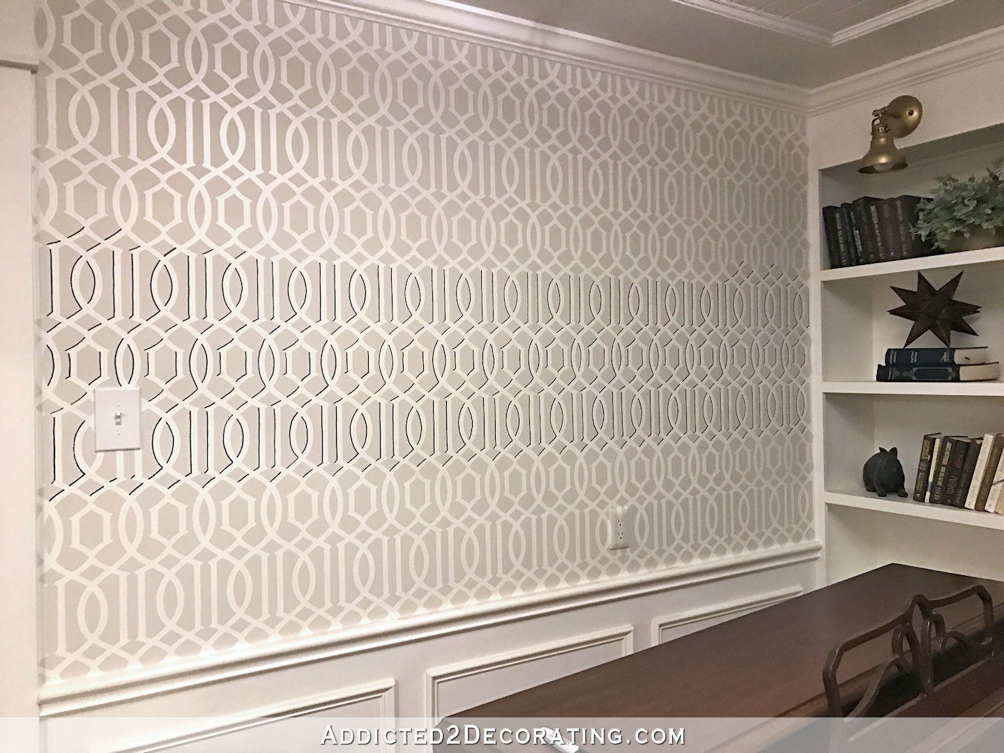
For a while now, something has been bothering me about the stenciled walls in my music room. I love the design, so don’t worry. I’m not about to paint over them and start over. But the design just seemed a bit…flat. So after trying several ideas to enhance the design, I found the answer…a chisel edge Sharpie marker. I used the Sharpie to outline parts of the design, and it just made it come to life. Not only did it add some depth and interest to the design, but it also looks fantastic with my black doors.
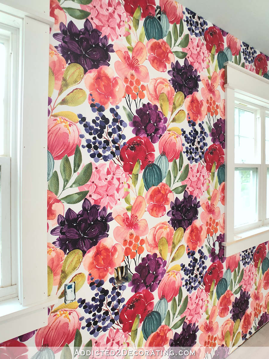
Sadly, the impact of the detail gets a little lost on small pictures (the impact on the full sized, in-person view is quite amazing, in my humble opinion), but I’m going to try to show you anyway.
Here’s how the stencil looked before with just the two colors (Behr Polar Bear and Benjamin Moore Classic Gray).
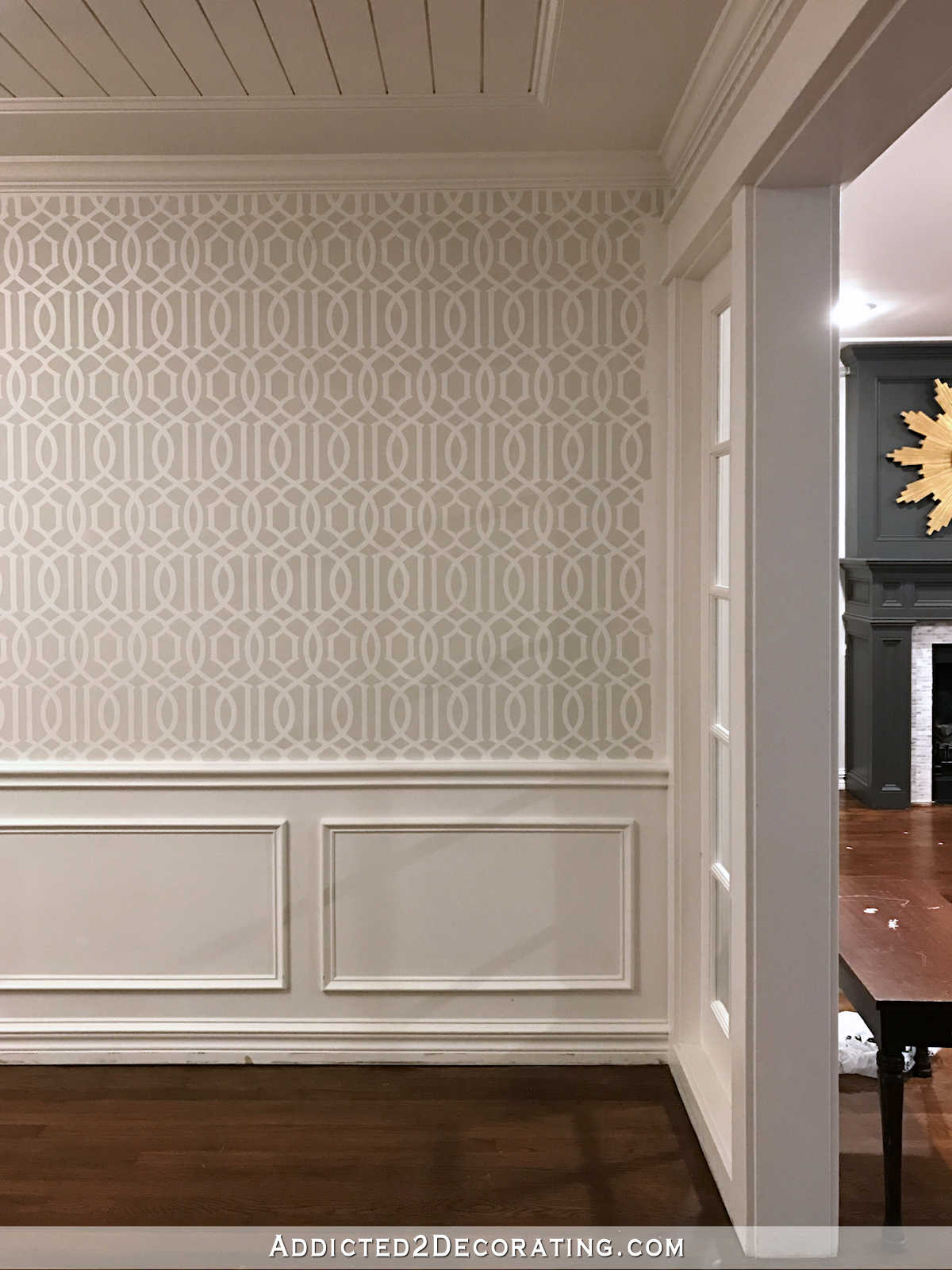
And here’s how it looks with a little black added…
I know some of you will much prefer the subtle look of the original stencil, but subtle really isn’t my thing. 🙂 The black just sets off the design perfectly in my eye.
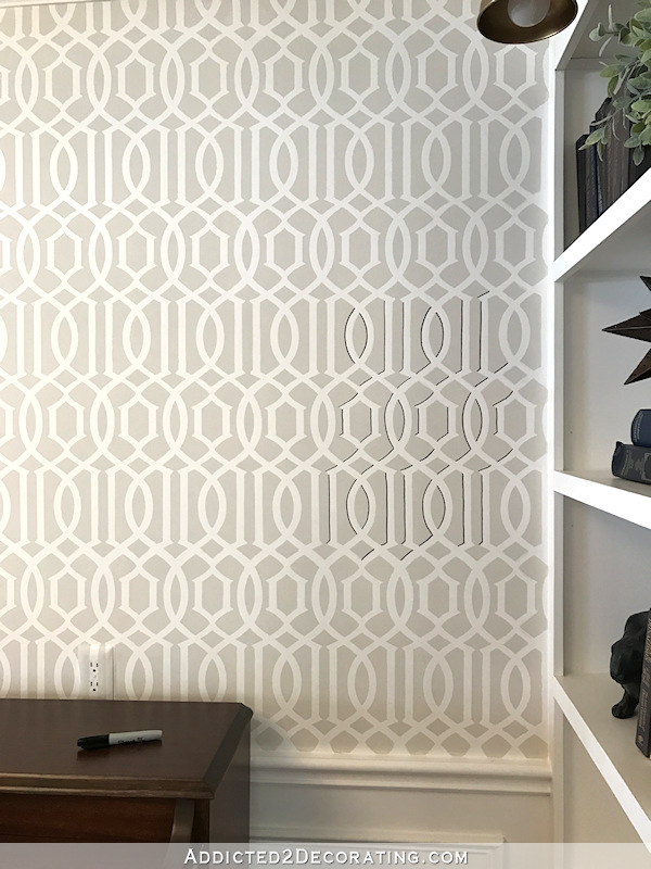
Here’s a small section by the bookcase where you can see the black detail compared to the “before” stencil…
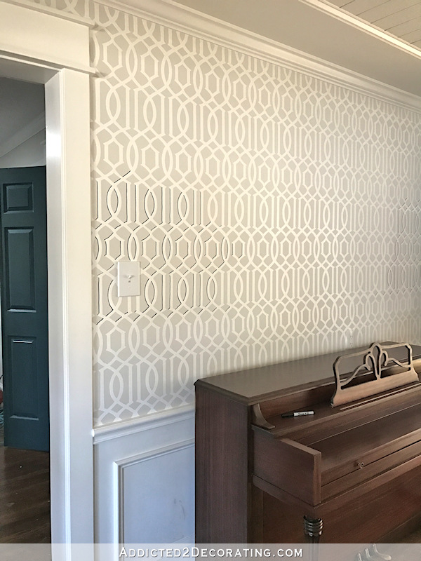
And here’s another section by the light switch…
Do you see how it adds not only some black (and every room needs a bit of black, right?), but also gives the design some dimension and depth? I wasn’t necessarily going for a “shadow” look. I just wanted to outline some areas to give it depth, so I outlined the top and the left parts of the white design. I kept repeating that over and over in my mind as I worked so that I wouldn’t get confused. “The top and the left of the white. The top and the left of the white.” 😀
And here’s the middle three rows finished. If you click on this picture, you can see a larger image with more detail…
When I texted my mom a picture of it to get her opinion, she said, “I love it! It’s gonna be a lot of work though.”
I figured it would take many, many hours…days, even…to get it finished, so for the first two days, I would just do a few minutes at a time. Each time I walked through the music room, I’d pick up a Sharpie and work on the wall for just a few minutes. I figured if I chipped away at it five minutes at a time, then in a couple of weeks I might have it done.
Then last night after dinner, I decided that I just wanted to go in there and work on that one wall until it was finished. I had three-and-a-half rows to go, and I was expecting it to take quite a while.
Those three-and-a-half rows took me 38 minutes. That’s it. That means that entire wall would have taken about 95 minutes. That’s not even the length of an average movie.
So one wall is done, and I have another wall plus some small bits around the cased openings to go. It’s one of those little things that has a big impact on a room. Here’s another pic that you can click on to get a larger view…
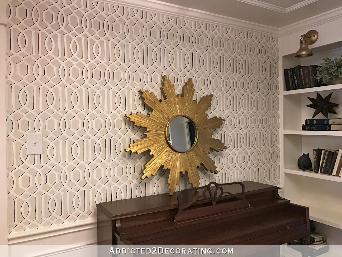
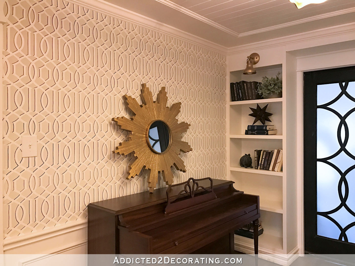
And finally, here’s a picture I took this morning with the early morning sunlight. You can see how awesome the stencil now looks with the black doors. You can click on this picture to see a large image.
On another note, thank you all so much for all of your input on my fireplace yesterday! I’ve only gotten through just over half of the 400-ish comments, but as I’ve been reading them, a plan has been developing in my mind.
I don’t think I’ll be going with the most popular suggestion (a lighter gray with purplish undertones). Instead, I think I’ll try out another idea (or maybe a hybrid of ideas) that some of you gave me that involve more than one color. And if that doesn’t work…well, it’s just paint. 🙂 I’ll keep trying other suggestions until I land on something I really like.
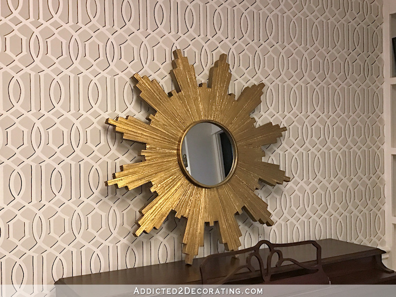
You can see from the picture above that I already took one suggestion that many of you had to remove the sunburst mirror and replace it with something colorful. I’m not sure if I’ll use it over the piano, but I do already have an idea for a piece of colorful artwork that I want to put over the mantel, inspired by one of my favorite artists I follow on Instagram. But more on all of that later.

Addicted 2 Decorating is where I share my DIY and decorating journey as I remodel and decorate the 1948 fixer upper that my husband, Matt, and I bought in 2013. Matt has M.S. and is unable to do physical work, so I do the majority of the work on the house by myself. You can learn more about me here.
Honestly, can you bottle some of that energy and send it my way? 😉 Looks great!
I love this! Bravo My Queen
I’m not always on boards with some of your “do-overs” but this one is spot on. Wow – what a difference a little detail makes! Great idea. It sure adds dimension.
Totally agree, it adds so much to an already great design.
That is sweet!!! I love it. I wouldn’t have thought to take a sharpie to my wallpaper. Very clever. I also can not wait to see more than one color on the fireplace.
Brilliant! I love it even more!
oh, YES!
WOW!!! Big impact but I do agree with your mom – a lot of work. Maybe a rainy day project??!! Good luck – it does make a huge difference.
How do you know which areas to highlight with the black?
I just outlined the top and the left of the white areas, while keeping the bottom and the right sides of the white plain.
Kristi, Are you doing this free hand?
Yes, the black part is freehand.
I LOVEEEE this sooo much!! Schumacher makes a trellis paper that looks JUST like this, the shadow makes all the difference!!
I think you are a genius!
I’m thinking the same thing Dana. I’ve been following Kristi for years. Kristi you hit the nail on the head with this idea. It’s so alive now.
Wow! The black just makes the design POP! I absolutely love it! ❤️
Wow! You have some “eye”. Visiting the inside of your mind would be a real adventure!!! You are one of the most creative and innovative persons I’ve ever seen. Congrats!
Great call! Looks Ah-mazing.
Looks great. Such a difference!
Happy to read that the sunburst will be relocated. I’ll await the next surprise to land above the mantle.
I really like that. It looks really good and works with the doors.
I loved the stencil as it was and wouldn’t have thought to change it. However, WOW!! I love the added dimension that the black gives it. And I love black accents in a room.
WOW, what a difference…the wall looks awesome!
As Dana says….you are a genius. Just what it needed!
Loving the depth the black “shadow” brings to the stencil!
I LOVE THIS CHANGE!!! It really looked good before, subtle and classic. But this is just so cool! I’m sure I never would have thought to do that and even if I had I probably wouldn’t have been brave enough to actually follow through. I’m so glad that you did. LOVE IT!!!
Glad to hear the sunburst is getting relocated. I was on the fence about whether or not you should keep it in the living room, given all the changes you’ve made.
Can’t wait to see the mantle!
So, does this mean that you’ve already added some items to what was your master to do list? 🙂 I’m not sure “taking sharpie to music room wall” was on there. 🙂
Haha! It definitely wasn’t on the original to do list for the year. But now I’ll have to add it just so I can cross it off. 😀
Beautiful difference I like the sun in the piano room.
LOVE IT! WORTH EVERY SECOND IT TOOK! AN AMAZING DIFFERENCE!
These walls are my favorite in the whole house! The shading is even better than the original and I didn’t think that was possible. I hope you keep the sunburst mirror in there, it looks so good against this wall!
Wow! What a difference. The outline makes the stencil look 3D. Nice! 😊
Black is the mascara to a room in my opinion. Well done.
Oh my gosh….I LOVE it! It’s amazing how such a small detail added so much dimension to it. It made it look as if it’s actually popping off the wall. I just may have to give this whole wall treatment a try in my home!
Amazing! I can’t believe the difference this “little” change made. And how wonderful that you were able to get that entire wall done. Now, on to the rest of that space with joy in your heart. I love the sunburst and liked it above the fireplace, but I know you’ll find just the right spot for it.
Wow…what a difference. Subtle, yet very impactful. I’d’ve never thought of that, and I’m impressed at how quickly you did last night’s work. <3
Wow!!! I love this change! Not that it didnt already look beautiful, but now it really pops for sure.
As for the mirror being moved, i like that idea. I thought it was too much over the fireplace. I always loved it on the entryway wall.
LOVE how a simple Sharpie brought the stencil to life. Well done!
(Have you considered store facing the fireplace? Nothing heavy, but bring in a different texture….just a thought.)
Kristi, the minute I saw the wall with the black on it, I saw a third dimension! It is almost like a real trellis is mounted on that wall and I love that look. It was nice like it was but the additional dimension is visually fantastic!! Great job and so wonderful that it didn’t take you weeks to do. Keep up the great work.
PS. I think you should paint the fireplace surround the same purple as your buffet in the breakfast room. That color is beautiful.
Wow, wow, wow! What a great idea! That really looks classy! “I’ve your blog!
Holy Moly ! Amazing results ! How do you have such a steady hand to trace the design so perfectly ?
Is your wall flat or orange peel or knock down ? I’m thinking flat to give such a beautiful look .
My walls are flat — no texture. And while I do have a steady hand, the black lines are far from perfect. But I’ve come to learn that en masse, imperfections tend to disappear.
This is amazing!! You are so smart!! I love it.
Wow! Just amazing. I love it even more
Wow way different. love it!
Wow…it’s amazing what a difference that makes! Adds so much dimension! Love your ideas!
Spot on!
Wow! Just Wow!
That was a brilliant idea and you were right, it definitely adds some dimension. I love it.
Love it. I love dimensional artwork and walls and this is perfect!!
Wow! Love how the design now pops and has dimension and movement. What great start to your 2018.
That is EXACTLY what that room needed! And I am so relieved to see that starburst mirror down from the fireplace :). Can’t wait to see updates. How are the drapes coming? Having them up may help solidify the fireplace decision as themdrapes will certainly change the lighting/shadows in the room. Good luck.
So far I’ve only cut the panels. 😃 I’ve got a long way to go! But I’m also waiting on some trim that I ordered for them, and that won’t arrive until Tuesday.
What a difference a tiny black line makes! Now it feels like a real wood trellis. Great idea by you!
A little off subject, I love the sunburst you made, just don’t love it a shiny gold, maybe a dark gray would look pretty on you lattice wall. Have you ever considered painting it over?
LOVE LOVE LOVE! Did I say I LOVE it? Absolutely stunning!!!
I’m glad you included your mantra, because my first thought was “omg, I know I’d immediately trace the wrong side and that imperfection would haunt me for life.” haha! In regards to your fireplace, yesterday evening I started following @memehillstudio on Instagram and one of her most recent photos was of this awesome fireplace where there is a teal backdrop and then the mantle/fireplace surround are white. It really pops! I was trying to figure out how you could do something like that without reconstructing and came up with no ideas, but maybe it’d give you some!
Okay, I just went and looked at that fireplace, and did you notice that the curtains look light purple? I love it!! Hmmm. I wonder how I could achieve a similar look. I’ll have to give it some thought.
Yes, I definitely noticed that!! I think if you could find a way to do it, it would look gorgeous. Except I think yours might look best with a white backdrop and a bold mantle/surround. That could provide the separation between curtains and fireplace that a lot of your readers suggested…
Stunning. I’m sure you can figure out a way to mimic it.
Stunning. I’m sure you can figure out a way to mimic it.
What a beautiful difference…such depth! You hit this one out of the park.
Wow! The difference is stunning!
L O V E the Sharpie detail! I didn’t comment yesterday about the fireplace since you already had so many to read through, but the gray has always looked green on my screen, so I’ll be glad to see it go. I’m excited to see what you do! The drapery fabric is to die for!
LOVE it. The 3D effect it gives is amazing!
incredibly awesome…it is what was needed and you nailed it. Have you thought about painting that sunburst thingie in black? As I looked at it that is what is missing. What are your thoughts?
YES! I love it. It really makes the stencil pop now.
You’re right. My personal preference would still be the understated look, but it looks great both ways.
I think the difference is that without the sharpie, it looks like a subtle paint effect. It intentionally sort of fades into the background but adds texture. WITH the sharpie, it looks more like a feature wallpaper, designed to draw the eye a little more. In fact, I find it almost an optical illusion.
Wow! Totally brought the walls to life!! Great solution 👍🏻 👏🏻👌🏻
I loved the original stencil but, like you, I thought something was missing. I just figured it didn’t translate on camera. Your sharpie trick just makes it pop! Totally love it.
I do have a question … Will the sharpie turn from black to brown over time?
Thank you, Melinda
Hmmm..I have no idea. Do you have experience with Shapies changing color that would lead you to believe that? I think it could probably fade, but I have no experience to lead me to believe that it might turn brown. But I think we all know that by the time the permanent black marker fades enough to actually make a difference, I will probably be ready for a different design anyway. 😀
Yes, I have had a picture colored with a sharpie go from black to an espresso brown. However, this was a number of years ago and the ink could have been a different formulation than they use today. 🙂
Looks amazing! I love it! Really great decision. Makes you black doors look so intentional and really cohesive.
Hopefully you wont want to change the walls later — I read something once upon a time about issues with painting over top of sharpie that it will always bleed thru over time because of the composition of the sharpie ink. I wold think acrylic sharpies would avoid this? But didn’t you use sharpie on your entry way bird art and successfully paint over? technology is ever evolving so maybe there is something to combat this alreafy
Yep, I painted over the entryway wall with no problem. I’ve never had an issue with bleed through. If you use an oil-based primer over it (Zinsser Cover Stain is my favorite), bleed through won’t be an issue. Then you can paint over the top of that with latex paint.
Oh good to know! Thanks for the info! I won’t be so hesitant to try it now!
Love it! When you do the opposite wall, will you still do top and left of the white? Or would you do top and right of the white?
Oh, that would have been brilliant! But I’ve already started it and did it top and left. 🙁
Pure genius! Never would have thought of doing that but it’s perfect. Looks like high end wallpaper. I wasn’t able to get your blog to load on my iPad yesterday to put in my two cents worth about the fireplace. I really think you should do it white like the trim. For one thing it’s going to be very hard to get a light gray that will work with gray in the fireplace surround AND the gray walls, I think you might have a lot of fighting going on there. Plus the room will look more cohesive with it done in white IMO. White will set off the drapes nicely too. Either way I look forward to the change. Oh, and I agree with some others that the sunburst mirror somehow wasn’t working although I think it might look better with a white over mantel😁
WOW it is amazing what the black does to the wall. The trellis pattern has now come alive! I love it! Looks fantastic with the doors. Can’t wait to see what you do with the mantel.
WOW, the difference is amazing. LOVE IT.
Holy mackerel! What a difference. Makes the original look not only flat, but dull. Love it.
WOW! Your creativity, along with talent and skill levels continue to amaze me. I loved the stenciled walls, and the outline just added such a depth. I wished I shared not only your abilities, but your courage to delve into those light-bulb moment ideas. I struggle with simply changing vignettes, thinking will it look ok..is it too large/small/dark/light/etc. etc. until I end up not doing anything! Your posts are great inspirational guides.
Wow, it really does look nice. I didn’t think the stencil on the walls needed improvement, but I have to say, it is quite amazing how much “oompf” has been added with a sharpie …. and in a good way!
WOW!! Also, wish I could send you a photo of a fabric I found at my Joann’s. I have the same living room rug as you. The pattern on the fabric I found is somewhat similar to your wall design. That pattern is a variegated blue that is identical to the blue shades in the rug. It has soft matching beige “brush” stripes inside the blue pattern that is over what I would consider a “polar bear” white color. I made a pillow and also used it to cover a very small footstool that sets near the rug…looks wonderful. It looks like you, or at least what I think looks like you! 🙂
You can email me a photo! [email protected]
Love it. Honestly ditto for me on your tenacity and persistence, you have my admiration….
Just curious did you consciously choose to repeat the rhythms… the doors, the walls, the lyre for the piano music? Personally I love it. I like some drama, texture, contrast, etc but I love elements that have some connecting rhythms.
I even do that in fashion…. may pull an element from a clothing item into an accessory….
Just love connection
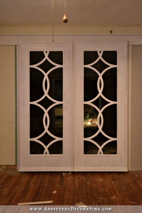
I did intentionally choose this pattern for the walls because it complimented my doors without being exactly matching.
Great idea! That did the trick. Pops!
What do you think about using that trick on painted cement floors? Hmmm…
I think it would wear off unless you coat it with something. I’m a big believer in General Finishes clear coats. Not sure what they have for floors, but surely they have something. Or you could just do Sharpie touchups when needed in the traffic areas.
Oh boy, does that ever make a big difference! I especially like how it brings out the background color.
LOVE it!!!!!!!
Genius! And challenging, at least for me! But I’m 64! Seriously, that looks so awesome!
The black outline does really make a difference. Well worth the time. Great job as always.
I didn’t care for the stenciled wall at all before but now I love it. The black is just what it needed to bring it to life and not look like an unnecessary pattern. To me, it looks like beautiful three color vintage wallpaper. Excellent!
WOW!
Love the added dimension it gives. Great idea and great job.
Don’t hate me, but I really do not like the brown piano against that wall or so close to the black doors. I would’ve loved to see you paint the piano. I know, I know, not a popular opinion. I have loved following your blog for years and continue to enjoy your decorating journey. Keep Calm and Decorate On.
Don’t worry. This area of the room will have lots of color by the time I’m done. 🙂 The piano will just be a foundation piece that grounds the color.
I really really loved the before picture and I’ve been scheming how I might do this myself. But the after!!!! Wow!!!! I am running out of exclamation points here, on a tight budget, lol. On my laptop this photo looks amazing and there is a gorgeous 3D effect. Not overwhelming or screaming at you, just tasteful and popping off the wall in a very very good way. Well done Kristi!
Wow! That makes a wonderful difference!
I love the change that the bit of black adds. Beautiful!
Wow, I would have never thought of doing this. Brilliant idea Kristi. The stencil design really makes it pop now. Love it.
You nailed it!!
This now looks live VERY expensive wallpaper I have seen and loved.
You are so right! This really makes an impact. So much better. I agree with more than one color on the fireplace too. I painted mine with chalk paint – top dark gray, front and sides taupe. I added decals and antiqued them with the gray. I really like it. I am with you. If I don’t like something it’s gonna be changed. Ha!
Loved the stencil before but now…WOW! Like you sun in there too. Can’t wait to see what you do next. Wish I had your energy but…20 years makes a difference!
Kristi, the addition of the black detail on the stencil wall is astounding in how much dimension it provides. On my screen in some of the pics it even appears to add vibrancy to the paint colors. Such a seemingly small thing that gives a big impact!
Did you use a regular Sharpie, or a Sharpie paint pen? I have a couple Sharpie paint pens that I’ve tested on a flat, horizontal surface and they work fine, but I’m wondering how they would work if used vertically, and if they might possibly drip?
I used a chisel tip, which is basically a bigger size of the regular, stinky black Sharpie. I don’t think I’ve ever tried a Sharpie paint pen, so I’m not sure how they’d work on a wall.
Awesome.
This is amazing!!! Who knew! Well, Kristi did 🙂
WOW! I can’t believe the difference! I thought it was beautiful before, but now…… WOW!
What an amazing difference in the detail. Whatever made you decide to give it a try!
I already loved this wall but the addition of those black embellishments makes the whole thing POP. I’m gobsmacked.
It adds a whole new dimension! Great idea on this upgrade.
Love this! I am feeling inspired to look at my guest room with new eyes. It looks good. Fine but not great. Now I’m thinking maybe it just needs a tweak, add a little black maybe 😊, instead of starting all over.
This is simply incredible. Is there any way you can post a close-up of the black outlining? Did you use a fine, medium or broad-tipped Sharpie? I can’t draw a straight line with a ruler, much less outline anything like this! You are awesome!
The last three pictures are clickable so that you can see the outline in more detail on a larger picture. The Sharpie I used is called a chisel tip. It body of the pen is a large oval shape rather than round like most Sharpies, and the actual tip looks like a calligraphy pen where you can draw thick or thin. I used the tip to do the markings on my wall, which still makes pretty thick lines since it’s one of their largest markers to begin with.
Thanks, Kristi! You are so, so talented!
I can’t believe how that outline or shadowing makes the design jump right out from the wall. It now looks 3 dimentional. Great job.
Phenomenal. Just phenomenal.
Wow!!!! That little sharpie makes a HUGE difference!!!! Great job also keeping the marks on the correct side.
What you did would be considered a trompe l’oeil technique, wouldn’t it? It really does ‘deceive the eye’ into thinking it’s three dimensional. Outstanding!!
Wow! It makes your stencil design jump right off the wall. That is amazing! Love your creative touches and brilliant ideas that just kick your designs up a notch.
Love it!!!!! FYI….were you aware not all of your post are making it to Facebook newsfeeds? Non to my email address. I go in search for your post, so don’t worry I’ll find you!!! : ) I don’t want to miss anything!
I love this!!! Gives it a 3-dimensional look and really POPS!
Where is this stencil from? I love it!
It’s very old and has been discontinued, but if you search “allover trellis stencil” you’ll find several like it. I suggest Royal Design Studio or Cutting Edge Stencils online.