Struggling With Choosing A New Paint Color For The Studio Back Entry
I have been around the color wheel and back in my effort to choose a new paint color for the back entry of the studio. If you’ll remember, I recently decided to bring the floral design to the back entry by having the floral pattern printed on fabric which I’ll use for curtains on the back French doors.
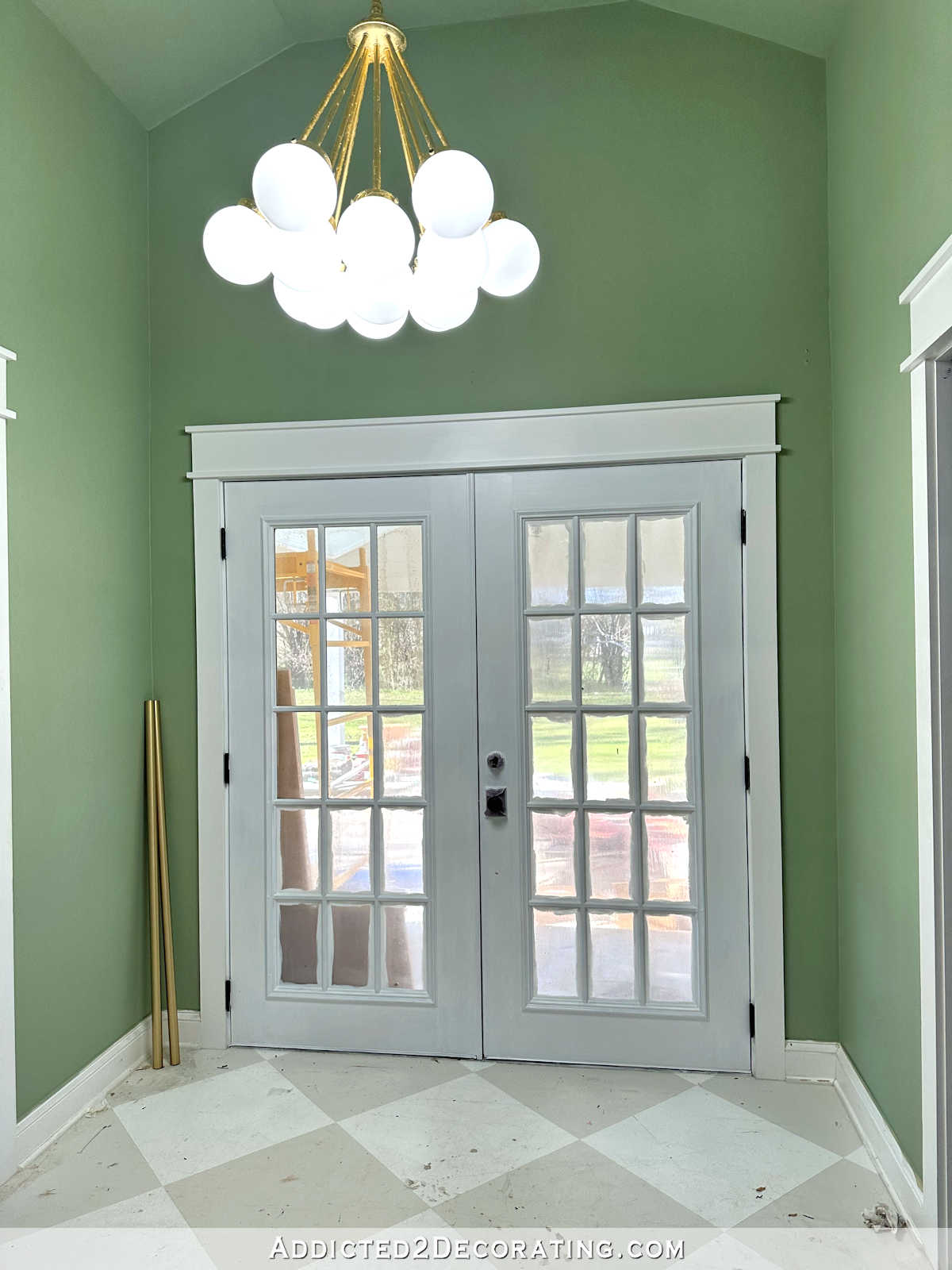
The back entry walls are currently painted green (I haven’t been able to track down the name of the color), but that particular green is all wrong for the mural and fabric. So I’ve been testing out different colors, and I just can’t seem to make up my mind.
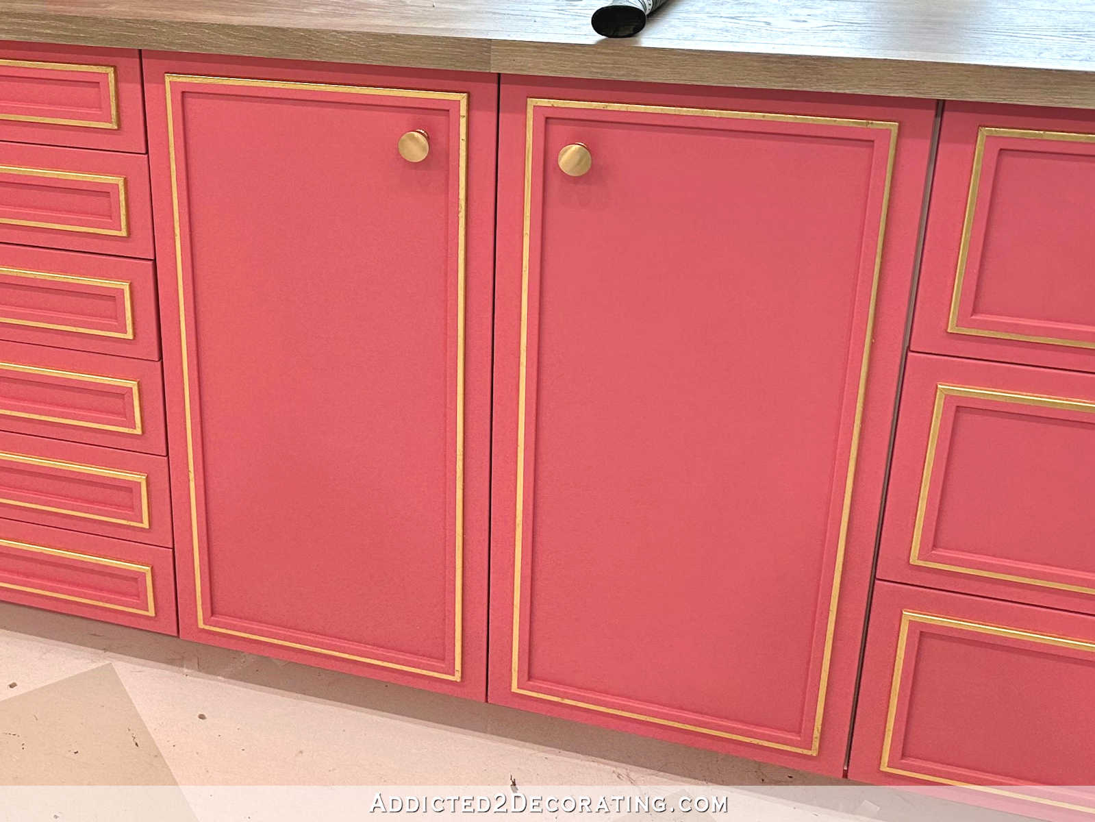
My first thought was to go with a dark blue or dark purple. In my mind, going dark would allow the walls to contrast beautifully with the slightly purplish medium pink (Sherwin Williams Tuberose) that I plan to put on the studio cabinets. So I tried two Behr colors — Vintage Velvet, which is kind of a purplish blue, and Black Sapphire, which is the super deep purple that I used on the buffet in the breakfast room (sitting room). You can see these below, with Vintage Velvet on top, and Black Sapphire on bottom.

I ruled out Black Sapphire immediately. In this area, it just looks black. I can’t tell any difference between the Black Sapphire and the black door. Here’s what it looks like in the breakfast room…
So of those two, the only real option is the Vintage Velvet. On the sample card, this color looks a lot more like a dark blue. But once I got it home, and accidentally spilled it in the carport (oops! 😀 ), and then put it on the wall, I could see a whole lot more purple in the color. I used my photo editing software to expand the sample so that it covers that whole wall, so this might not be 100% accurate, but it will give us a pretty good idea of what it would look like.

I really like this color, but I’m just unsure about it with black doors. I don’t think those play nicely together. I’m not totally opposed to painting the doors, but the only other door color I think would work with this wall color is white, and y’all know how I feel about white doors. Bleh. White doors are always my absolute last choice. But again, I’m not totally opposed to it if this wall color is the best option, and if it would work better with white doors.
The main thing I’m concerned about is that the back entry wall color needs to work well with the color that I plan to put in the cabinets in studio. The paint color is called Tuberose from Sherwin Williams, so to see how they work together, I just copied and pasted a sample right onto the photo. Of course, in reality, these colors won’t be this close together.

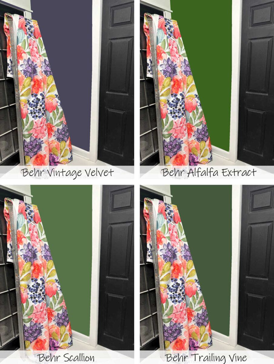
The only other color I think will work for the walls is green, but the green that’s currently on the walls is completely wrong for the fabric and wallpaper mural. So I took a scrap of wallpaper to Home Depot to choose a new green, and I narrowed it down to two — Scallion on the left and Trailing Vine on the right. The Trailing Vine doesn’t exactly come from the wallpaper, but I preferred the depth of color on that sample, so I thought it might work even though it doesn’t exactly match any of the colors in the leaves.
But when I got the samples on the wall (Scallion on top, and Trailing Vine on bottom), I wasn’t thrilled with either one of them. But that could be the original green throwing everything off. I do like the greens with the black doors, though.

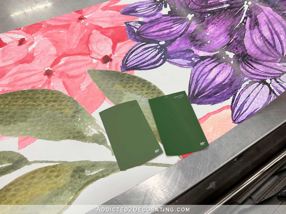
Since I wasn’t completely sold on either one of these, I rummaged through the other samples to see if any of them caught my eye. I thought that this one, called Alfalfa Extract, looked really nice with the fabric. (See the paint sample taped to the fabric?)

You can see that it’s darker than the original green, but it’s brighter and truer green than the new samples.

Here it is against the original green so that you can really see the difference.

So here are those three colors on the whole wall (which I did with my photo editing software, so the real thing might be slightly different). This is the Behr Alfalfa Extract.

And here’s the same color with the cabinet paint color sample.

Here’s what Behr Scallion might look like on the whole wall…

And here’s that same color with the cabinet color sample.

And finally, here’s what the Behr Trailing Vine might look like on the whole wall…

And here it is with the cabinet paint color sample.

So here are the four options all together. From left to right, (1) Vintage Velvet, (2) Alfalfa Extract, (3) Scallion, and (4) Trailing Vine. I really do like the Vintage Velvet, but I don’t love it with the black doors. Of the greens, I’m quite shocked, but the one that stands out to me is Scallion. But I just can’t seem to make up my mind.

Addicted 2 Decorating is where I share my DIY and decorating journey as I remodel and decorate the 1948 fixer upper that my husband, Matt, and I bought in 2013. Matt has M.S. and is unable to do physical work, so I do the majority of the work on the house by myself. You can learn more about me here.


I think all the greens can work and it’s the black doors throwing things off . The fabric looks really great .
Scallion!! I prefer the greens to the purple and of the greens I like that this was pulled from the fabric. Hard choice though!!!
Scallion for me too!
Agree. Scallion👍
Option to do the vintage velvet color at lighter percentage?? Hate to see you change black doors—- they look beautiful 🤩
Another vote for scallion
I agree! Scallion!
Scallion is my first choice, but the other greens look good too.
Vintage Velvet gets my vote. I even like the black doors with it. Second is Scallion. Black doors with that as well.
Oh choosing a paint color… the bane of my existence. I find that with matching a color to fabric you cant always look for an exact match but more for a match to what the color is reading… I like the scallion but the fabric is reading a dustier more muted shade of that green. The purple is reading too blue and maybe needs more red/pink and a slightly lighter tone closer to what the purple flower near the floor is reading in the photos. If the studio is staying the pretty sky blue would you consider a midtone/darker blue from the blue flowers. I like the black doors and i think every room needs a black accent somewhere.
Personally, I would get rid of the black door. A neutral cream or vanilla white would not clash with all the other colors in that room. Sometimes less is more.
I agree with Maggie regarding the door color. I like the scallion also but maybe in a shade lighter so it doesn’t steal the brightness of the colors in the fabric?
I agree!
I prefer #3 Scallion. It offers a restful quality next to the vibrant floral. I think it balances the energy nicely.
I think the problem you’re having is that all the samples except Alfalfa Extract are muddy toned colors while the fabric and the Tuberose are very bright, clean colors. You need to find a likewise clean color to paint the walls, otherwise it will look wrong. The Alfalfa fits the bill if you want green. Have you considered painting this area the same color as the cabinets? It might be too much, but just a thought.
It wouldn’t be my personal first choice, but I also thought that using the cabinet color (or a shade or two lighter or darker) would be a good option.
That was my thought as well… Tuberose at 50-75%. I’m not one for warmer colors & would normally pick a green over a pink, but these would be a pass for me. The dark walls, dark doors & bold fabric feel like they’re competing.
This was exactly my thought- all of the colors except alfalfa seem more muddy and less clear than Kristi’s usual palette
No black doors. Alfalfa Green looks good.
Before reading the full post, I was thinking you might paint the entry purple. I see what you mean about it not working so well with the black doors, but it doesn’t bother me. If you want purple, maybe try a less intense shade. But in your samples of green, I really like the scallion. It is a bit more muted than the other two greens so it makes the fabric sing. It looks good with the black doors as well as the pink cabinet color.
All of these color samples are very saturated. I like the purble and scallion colors best, but I wonder if a lighter version of those colors might work better in the smaller entry space and with your black door.
I also like the Vintage Velvet, but I think the Scallion is the nicest green with the fabric. Since the cabinets are so far away, it doesn’t seem like they are really a factor with the hall. I can’t remember now what you are doing with that bathroom off the hall…hopefully it looks nice with that green?
My first choice would be Scallion too.
I’m going against the crowd to say I like the purple with the black door and the pink of the cabinet s together. It feels like they are all in the same intensity, not that I know anything about that. I also like how they interact with the fabric. I also think the purple would play nicer with the light blue walls.
This is exactly how I feel. I’m not a big fan of the green knowing the main studio walls will be a light blue. I think the purple/pink/blue all play nicely. The black doors don’t look out of place to me either. Team purple!
I agree with you Kathie. The purple caught my eye and I kept going back to look at it. It would be my choice.
The Vintage Velvet looks stunning with the black door and beautiful with the Tuberose! Can you paint a larger sample on the wall so you can stand back and look at it to help make a decision? If you like green, I think the Scallion matches the green leaves more closely than the others.
go with a sage color that looks good with green. There are leaves this color in the fabric, it will look fantastic with the black and the curtains will stand out. Check out this and then look for brighter or softer depending upon what works with your light.
https://www.sherwin-williams.com/en-us/color/color-family/green-paint-colors/sw9130-evergreen-fog
I am not sure why you want that entryway to be so dark. It is a small area and dark colors just seem to make it “close”. I would chose a light shade from the fabric that would also go with the Tuberose to open that entry up. Perhaps consider repainting the black door with one of the greens and the walls with a light shade from the fabric. Green pretty much goes with any color since it is nature’s background, considering the right shade for the other colors.
Go for the scallion! It looks great with the black doors and the Tuberose cabinets that will be viewed beyond the entry vestibule! It’s not overbearingly dark OR loud allowing the light and airy floral curtains and the black doors with white trim to really punctuate the space…
Scallion looks best to me with the wallpaper, black doors, and cabinet color. I wonder, though, if toning it down just a bit would be better — maybe having it mixed at 75% or something?
I vote for the Scallion!
I think my first choice is Scallion (or even a little lighter) because the value of it more closely matches the value of the paint for the cabinets.
Second choice is velvet.
Cannot wait for those cabinets to be finished. This is going to be absolutely beautiful. I think you should have us all over for a working party, 🤣
Scallion is the best with the pattern and pink for the cabinets.
I like the purple with a light natural wood door. I don’t know how that would look with white trim though.
My favorite is Scallion. Have you considered the more yellow green leaf shade from the fabric?
Only for about five seconds. 🙂 I don’t think I could live with large quantities of that color. It’s fine in small doses, though.
That’s exactly what I was thinking too!
Allowing for the fact that your color choices will certainly be different from what I’d choose personally, I think you need to keep looking for the right color. I’m not sure you’ve hit it yet. The green/black entryway has always felt really jarring to me–not at all as pleasing as your other rooms. Even though your style is different from what I’d choose in my own home, I (nearly) always think what you come up with is beautiful. That entryway has never given me that feeling (kinda like some of the early renditions of your living room.) I *think* you need to find a softer color to allow the walls to become more of a background for your artwork (including the wallpaper you’ll be able to see from there.) Maybe your cabinet color, but a couple shades lighter? Or if your wall color in the workroom matches well with your wallpaper (I’m assuming it does), that color but maybe just a couple shades darker? The entryway is very much a part of the space, so I think you need to allow it to blend rather than stand out. Let your wall paper and curtains be the focal points, not the wall color. You’ll figure it out and I’m sure it will look lovely when you’re done.
I agree! Also since you are redoing the bathroom walls, those colors have to be factored in. I think of the wall color as a background to that beautiful print and it should not compete for attention + it is a small area compared to the room. Whatever you do always comes out beautifully!
These are good points!
I agree 100% that Scallion is the best of the colors you’ve shown, particularly with the black doors.
I would try a medium blue/purple that “matches” the “berries” in the fabric. Since the are lighter berries next to very dark berries, you know it would look good against the black doors. Since it is close to the pink flowers, you know it would also look good with the cabinet color. It should also look good with the black vanity in the bathroom.
Completely agree! I think I’m in the minority but all of the greens look awful. Kristi originally said she was going to sample a dark blue and my first thought was questioning why she wasn’t sampling the berry color.
I also think the pink from the cabinets would look beautiful too.
Vintage Velvet would be my first choice, but of the greens Scallion is by far the best in my opinion.
I’m gonna be the weirdo, today. I like the golden color from the leaves on the fabric for the walls, and the doors in the deep purple, but leave the frames around d the doors black. I think the gold color would make the hallway pop, and would still work with the black, but the purple on the doors would be fun and a bit different, especially if framed in black. This coming from a die hard purple walls person…
I am with you. I also like the gold colour. It would be outstanding with the black door. Otherwise the entry would be quite dark. Still a strong colour, but not dark.
My choice would be to lighten the purple up maybe two shades? It would still go with the Tuberose and the black door would look good with it. I find that green on the walls makes people’s skin color look odd. JMHO
I think you’re getting close with scallion BUT I don’t think you should go so dark and saturated. Your fabric will shine with something a little more muted- not jewel toned.
Vote Scallion!
Have you thought about using the cabinet color?
Scallion
I vote for SCALLION.
Scallion
Vintage or scallion are my top two based on the pics.
Honestly, I don’t like any of the greens much. If it were me, I’d go for a lighter yellow- green with the pink cabinets. The purple’s not bad, but I agree it isn’t great with the black doors.
I think the problem with the black door going with the velvet is the sheen of the black. The black needs to be more “velvety” lol
I love the Vintage Velvet. IMO it looks great with the black door, fabric and cabinet color :).
I like Scallion best; I think it works best overall. Trailing Vine is second choice. The others? Meh, not my personal taste. But as always, choose what works best for you. If you find you can’t live with it, it’s only paint and can easily be changed. Looking forward to seeing the finished work!
I’m leaning toward the Scallion simply because I love green. I think it looks nice against the black door, and the green with the floral curtains just gives the area an outdoor feeling going to your carport, like bringing a little nature indoors!
Im not feeling any of the colors thus far? meh….I do however flower garden quite a bit, and Im not sure if you have ever seen a sweet potato vine against all the vibrant pinks, purples and dark blackish purple plants? Marvelous color limey golden greenish plant it is! I think I see that type of color in your custom drapery fabric? I think it would look lovely with the the fabric, making all those colors pop! Plus it would perhaps even make the black doors just look even more regal!
What if you did your door in a matte black or more of an eggplant colour. I love the vintage velvet you have chosen.
Have you thought to paint doors and trim in the wall color? Make the doors disappear and the fabric to stand out? (Keeping the cased opening trimmed in white for separation) Three doorways is a lot in a small space.
It will be a hard choice the color needs to coordinate with the studio and bath when the door is open.
Scallion 👍
I’m in agreement, though not any help. The purple is my favorite, with the scallion a close second. I don’t care for the black doors with any of the colors, though I’m a white door and trim person. Not keen on the cabinet color with either the purple or scallion, but it could be more that I’m not fond of any shade of pink.
I don’t know if this will work, but take the same cabinet color and use a different sheen. It looks great with the black door.
It may bring cohesiveness to the space. Just a thought.
I like Velvet. You could paint the doors the same color as the cabinets. 😃
Scallion is the one I was drawn to also. It looks good with the drapes & the black doors.
I’m just loving the studio project!!
I have painted the kitchens and living rooms in my last 2 houses, a farmhouse in Missouri and a ranch house here in Arkansas, Crushed Oregano. These states are notoriously brutally hot in summer and frigid in winter due to the humidity. For some reason this color green “feels” cool in summer, and “warm” in winter. Maybe you can find a green that sort of conveys that sort of feeling to go with your beautiful vibrant wallpaper.
Another vote for scallion.
I would go with a lighter shade of green, there are so many beautiful bold colors in the room already.
LOVE the scallion!!!!!
I like scallion best
Definitely Scallion!
To me, the Scallion looks the best – it seems to be the same depth of color as the cabinet color and doesn’t look to dark in the small space.
Try putting your color possibilities on that view you had of looking through the entry vestibule to the Tuberose cabinets and wall mural beyond…it included the current black doors with white trim as well…this is an important view as it is what will be seen upon entering from the studio door…
I like purple & black together. Of the green I like the Trailing Vine with the black undertone the best. You have a good eye & whatever you choose always looks awesome.
I like the purple.. Can you paint the door the same color? Do doors have to be white or black? You are more of a purple girl..and I love it with the tuber rose..
Scallion is nice but trailing vine is more mature.
1
For me, B Scallion is going in the right direction but still feels a little too heavy.
Scallion
Trailing vine
Scallion, hands-down!
Vintage velvet, and I vote leave the door black! Admittedly, I’m biased against anything pink and green, as that was my bedroom color combination in the 70s, and I never want to see it again, lol…
I like the scallion!!! It’s so pretty!!
Trailing vine is my first pick and then scallion. No matter what you choose it will look fabulous!
I love the Scallion with the black door. Whatever you choose will look amazing!
Have you considered the chartreuse color in some of the leaves in the fabric?
Scallion!! Works well with door and the pink.
I would try gold color in your gorgeous wallpaper. It would act as a neutral but still be a colorful option that would complement your other color choices.
Thank you for your fun blog, I have really enjoyed following your wonderfully creative remake of your home.
Love the soothing scallion against the hot colors of the flowers. It feels very rich, like a secret garden. The black also stands out but doesn’t compete.
Of the 4 samples you’ve shown my choice is scallion. However, I agree with other commenters: I think you’re trying to go too dark/saturated with the wall color. A dark color will detract from the bright, beautiful colors in the curtains and they’ll be less of the focal point in the space. A less saturated purple or green would accomplish that, as well as being a subtle background for whatever colorful artwork you have planned. You chose a soft, muted color in the main studio area so the wallpaper would be the star. Shouldn’t the entryway be the same or similar?
Tuberose walls would pull you into the studio. Love the black door.
I vote for scallion
Scallion without s doubt
Scallion gets my vote!
I like the Behr scallion the best out of these colors. But that’s IMHO. I think it works best with the black doors.
Even though greens are my favorite colors, I think the Vintage Velvet would be my choice, but what do I know!
I think the Scallion with white doors keeps with the whole floral vibe of the wallpaper and fabric and it’s pretty. I like the purple with it but the darkness of that color and the black door seems too much of a contrast to a floral theme.
I really like #3.
I love the Vintage Velvet with the black doors, the future cabinet color, the wallpaper, and the wall color. They all have a similar richness of color and look beautiful together.
I like the Vintage Velvet with white doors. I think it coordinates better with the cabinet color. But whatever you decide will look fabulous!
Vintage velvet is by far my favorite. Beautiful with the pink too. It is so rich and just perfect! Scallion would be a far, far second choice if you really want green. The other two would not pleasant to see every day for me.
If we’re picking greens I’d go with scallion.
I like the Vintage velvet the best. I agree that it isn’t the best with the black door. And a white door would be harsh.
What about painting the door the Vintage velvet?
I would use Vintage Velvet and the same, or very close, for the door.
I vote Tuberose walls!
Two ideas:
1. Paint the walls a noticeable darker shade of the cabinet color. I did this in my dining room (in reverse) and it worked well. My walls were a taupe-y color that I loved, so when I couldn’t decide on a color to paint my buffet, I had the wall color lightened.
2. What if you use the purple color but paint the doors that color as well? The more I think about it, the more I like it. Then the dark purple wouldn’t “fight” with the doors, and the doors would still be a nice moody, dark, non-white 😊 color. On my screen the purple reads dark enough that I think it would work on the doors as well.
Scallion is the best green, but what about using Tuberose? It might balance out the pink cabinets on the other side of the room.
The scallion is beautiful! You’re eye for color is exceptional! Wish you could come pick out colors for my house 🤣. Whatever you pick will be perfect!
White
Behr Scallion gets my vote. It blends beautifully with the green leaves in the fabric, black doors and soon to be painted cabinets.
I like the green scallion better than the purple. Have you thought of a light goldish color that would go with the one flower? or lavender?
I’d go for alfalfa or trailing vine.
Ooh Vintage Velvet for me. What about a pale pink for the doors, like a couple shades up from what your cabinet colour is? Kind of like the hydrangea(?) that’s underneath the blue-circles flower on the fabric.
Alternately, another vote for Scallion 🙂
SCALLION immediately caught my attention, of the greens that would be my choice. Love ❤️ that fabric!
I do truly love your sense of color. Great choices!!!!!!!!!!!!!!!!!
I also like the Behr Scallion. One thing I would like to bring to your attention is, your progression thru choices is much too quick!
I do admire you soooooooooooooo much!
I was wondering what your focal point for the entry way is? Is it going to be the curtains or the walls or both? I like the paint that you already have in the big room.
Trailing vine for me, though it doesn’t look like many readers like it. I think it’s closer in tonal value to the black of the doors, so it just calms the space more and lets the colors of the fabric pop. It also has cooler undertones than the other greens (on my screen) but still relates to the lighter greens in the fabric. I think it would be a nice ying to the yang of the wallpaper and cabinets in the other room. Yes, it is dark and, yes, it will make that space feel more intimate, but that would be a nice contrast to the lighter, more open space of the workroom. I will warn, however, that you’ve attempted greens before (kitchen cabinets and this entryway) and hated them. So maybe hold off until you have everything else done and then decide on this space.
I am team Behr Vintage Velvet all the way! Unless you thought about using the Tuberose on the walls to pull the cabinet color in the back entry…
Vintage velvet or scallion for sure! Both look great with the fabric and black doors. The scallion is the only one out of the green choices that doesn’t seem to fight for attention with the tuberose. You do such beautiful work. I can’t wait to see the finished product 😁
What is your focal point in that area, the drapes, right? Use the wall color from the rest of the studio so the drapes stand out and do not clash with the wall or the door.
I immediately likEd scallion best, but thought you’d never go for it! Guess I was wrong. 😎
Have you considered painting the walls the color of the cabinets? Or 25%lighter or something similar?
Although purple is typically my least favorite color, I like it with the fabric, door & pink cabinet. And ironically, I usually love green, but the only one that I like here is Behr Scallion.
I agree on the Scallion! The little bit of muting in the green helps all the floral colors pop. And, let’s be honest, you’re not afraid change the colors down the road if they don’t hit right. 😁
Citron? I think a green that leans a little yellow could be really beautiful.
I know you’re looking for a wall color for the back entry but on my computer I’m noticing the cabinet color has a purple undertone? Looks to me like you need a color with more orange/coral like your front door. Since I’m the only one who has noticed this, I’m going to assume it’s my computer. Or my old eyes. As for the wall color, I like the Scallion!
It definitely has more purple, but the cabinets don’t need to match the exterior of the door. I considered so many colors, and did several posts on cabinets colors, before narrowing it down to this one, so I really don’t want to change cabinet color at this point. That was a long process, and I need to be confident in my decision or I’ll never finish this room.
I really like the scallion color it has a brightness to it and to me it goes so well with the fabric and doesn’t fight with the black they seem to compliment one another.
Vintage Velvet or Scallion! If you go with VV, you could change the door color to a much darker version of the VV.
I’d mock up the lighter yellowy green.
Neither the green nor purple for mine. I would try a lighter pink than will be on the cabinets. Keeping it tonal will still provide a colourful room and let the lovely fabric sing. I think the green and purple are competing too much with the fabric.
The problem I see is the cabinet color…….the first green is my fav and the cabinets should be the same as the entrance walls. JMO
I don’t want to muddy the water for you but I see some gold in the fabric and was wondering what a color like golden rod would look like. I think it would play nicely with the black and pink. But if you are not a gold person I like Scallion. Of course I think anything you do will look fabulous!
Love the vintage velvet as well but have the same problem as you do— the black doors. And I thought scallion was way off till I saw it covering the wall. I think that’s the one!😉
I really see the Alfalfa as best. The other greens look “muddy.” I think you tend toward “clean” colors, if that makes any sense. As much as I love the purples,I just don’t think they work in this space. I am sure you will find the perfect color! Even if you must paint 3 times! Lol
Sheila F.
Do you have any wood tones in the rooms any more? I can’t remember, now that your floor is painted.
What about the purple, with the doors done in faux wood (gel stain)? I love wood doors.
I have done gel stain over paint and it looks like wood. I KNOW you could pull it off!
I’m a Scallion fan. Even if you choose one of the other new greens, I think you’re on the right track.
Scallion
As many have stated, everything but the Alfalfa Extract is muddy and I can only imagine what it will look like when all the walls are so dull. I’m not in love with the Alfalfa either and think you may have to mix your own color on this one. I mocked up a violet using the violet-colored flowers in the curtain and really liked it though that might be a bit intense in a small space. I also took the alfalfa a half shade lighter and preferred that too. At this stage of the game you could go with anything and incorporate it into the vertical stripes in the bathroom.
I suppose you wouldn’t consider bringing the cabinet color into the foyer? Because here is my thought: paint the doors and trim in the cabinet color, (or just the doors) then the walls in either Scallion or Trailing Vine. I would not introduce the blue, unless you plan to bring that color into the other spaces, as there is not enough of it in the wallpaper to stand out much. I think the cabinet color needs to dominate throughout, to ground the riot of color. But you are the talented one here, I am not!
Scallion is my first choice for a green, but have you considered painting the entry Tuberose to tie with the pink cabinets? I think it would be a great balance for the whole room to have Tuberose cabinets on two walls and the entry wall painted Tuberose also.
I agree that Scallion is the best color. It just “sits better” than the other colors. 🙂
I absolutely love the Vintage Velvet! And I think it looks great with the cabinet color. They are both very prominent in the fabric so it brings them all together nicely. I also think it looks good worh the black doors. But I also know that whatever you pick it will look beautiful.
With*
Would the cabinet color on the walls be too much pink?
I agree: scallion. It was my first choice before I read your last thoughts. But you do you of course!
I’ve not been a fan of the dark colors in this area–the black doors seem so harsh. Would painting the doors to match either the door into the Breakfast room or the cabinets work? The light, bright, colorful workroom just seems out of sync with dark walls and dark doors in the back hall. My 2 cents.
It’s just me, I’m sure, but why not white, it is the background color in the paper. That paper does not need a competing saturated color, IMHO
I am a green wearing person, but don’t like green on the walls.
My other choice would be the little light teal colored berry near the top of the design. Have you tried it. It may be close to the color of the studio walls, but that could work?
Scallion has my vote 100%.
Scallion definitely the best one
I also like the Scalion the best.
Behr Scallion
Scallion!
Be careful on color over saturation. White door to match trim, scallion green wall. Keep in mind the fabric is very intense on its own. Don’t over do.
Vintage Velvet!
I like Scallion best….the fact it’s a bit grayed down looks very nice with the fabric and the door. It’s also very nice with the cabinet color!
I like the scallion. The other greens pull too much yellow. They look like they need a shot of grey or blue to work- to my eye.
Personally, I would use the mustard from the floral. It contrasts well with the black door, and also with the cabinets.
hmmmm Color is hard but to be honest I like the green u already have on wall. It looks classy. The others look like u are trying too hard. I’m not into matchy-matchy, are U???
They don’t have to match, but I don’t like colors and patterns that compete with each other or clash, either. The green on the walls right now clashes with the greens in the fabric. That might not show in pictures, but it’s very glaring in person.
My first choice is the purple one , and I am not a purple paint loving person. Lol
My second choice is the trailing ivy colour. Is white completely out of the question? Lol
Good luck, hard decision. But, judging from past experience, whatever you do, will be beautiful, it always is.
scallion – then vintage velvet. the scallion makes everything just pop!
trailing vine and leave the door black. JMHO.
I think you’re going to have the same issue with the walls that you will with the painted floors. I think the walls should be the same paint color as the studio otherwise it will distract from the real show…the cabinets and the floral print. However, I know whatever you do will be amazing (if not, you’ll change it!). 🙂
Paint the door the same as the cabinet color. Then Scallion wall or Velvet wall. Then you are away from the black door but it is a color, not white. The fabric looks good with either wall color. That would be a welcoming entrance into your house and studio. I prefer Scallion out of any greens. The velvet looks a little dull.
What about the bathroom?
Hi Kristi,
If the deep purple is your preference, would changing the door colors slightly make a difference – maybe the new bathroom vanity color? Or would that be too matchy-matchy with the door and vanity the same color?
Also, do you feel that the entryway wall color should play nicely with the blue walls in the studio as well? Didn’t know if adding one additional color swatch to your mock ups to include the blue might help narrow down your choices?
Good luck! Can’t wait to see what you decide on!
Hmmm, I’m feeling this is the wrong direction, but can’t exactly put my finger on why… Could it be that those colours are too saturated to act as a background (to either the doors, the curtains, or the cabinets – which yes, I know are on the other side of the room, but still, they should be stealing the show)? Or something else? Not sure. What colour will the walls in the main area be? And maybe they should be the same colour for the sake of cohesiveness? (I mean, if you have a background colour then the wallpaper being the centerpiece, with the curtains being right across and mirroring that situation…) Not sure what the answer is, sort of thinking “aloud” here… might be some things to consider?
Not liking the dark colors for such a small entry way. It’s a studio entry and in my head it should be bright, light, fun and airy feeling – it’s not a parlor or boudoir. You always make room choices that are good but this one for some reason feels confusing so far.
The colors are so dark and dreadful, especially for an entry which should feel inviting. There is a beautiful lavender shade in the flower and a pretty light green in the leaf, either of which would compliment the heavy pinkish Tuberose. If the paint was a lighter shade, you could keep the lovely black doors which compliment your floors so well. The small space with the tall ceiling just seems like it needs to feel lighter and welcoming. Just my opinion though. 😊
I love the purple. Whatever color you choose, what about painting the doors the same color?
I vote trailing vine!
I am with you, I like Scallion. But it is your room and your choice.
That color green that you are considering is almost the exact color of green that I love. And the date of this post is on my birthday! You just have to choose it!! JK I do love you process of elimination