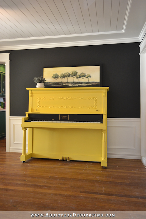
Which Color For My Piano: Yellow Or Green?
This past weekend I worked on two fun projects — a desk makeover for my niece’s bedroom (more on that later this week) and my piano. I didn’t actually get very far on the piano because I got sidetracked with paint color options, and then almost talked myself out of painting it completely. I had one of those “before I paint, I must see what’s under that thick, old finish” moments at around 10:30pm on Friday night, so I got out the paint stripper and got to work. The next thing I knew, I had paint stripper all over the large front piece, and all over one whole side of the piano.
I was really hoping that piano guy was wrong, and that the thing would be made out of solid pine. Or oak. I have no issue at all painting pine or oak.
It wasn’t. It’s walnut for sure. It’s not burled walnut like he said it was, but it’s definitely walnut. And it’s beautiful.
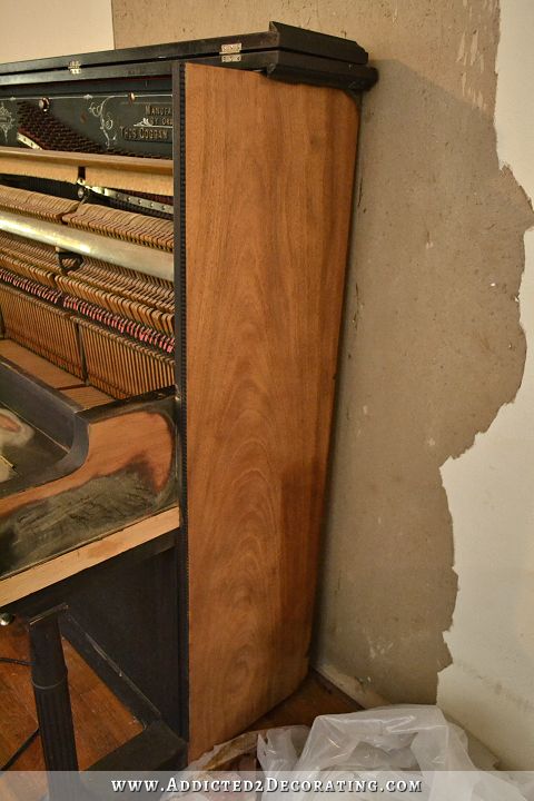
After seeing that, I really felt guilty about wanting to paint it, and I actually wavered back and forth the rest of the night and the next day. But in the end, I decided to go for the paint. The fact is that I don’t think stripping this piano is a DIY kind of project. The old finish came off in such a thick, sticky mess (kind of like scraping thick, cold molasses off of the piano) like I’ve never experienced when stripping furniture. Not only that, but it took three coats of stripper, with lots of scraping between each coat, and then I still had to use my sander after that to get down to bare wood. That old finish just does not want to let go. And it’s not like this is a solid piece of walnut. It’s veneer, which is only so thick, so I run the risk of sanding right through it if I’m not careful.
And if I had trouble with the large, flat areas, how in the world am I going to get the intricate detailed areas, like the carving on front, and the fluted legs, and the beaded details on the edges, perfectly stripped? I don’t think I have the capability. There comes a time in every DIYers life when she must face the fact that perhaps this project is one for a professional. For me, this is that project.
But of course, hiring a professional to completely strip the piano isn’t really in the budget for now. That would cost somewhere between $2000 and $4000, and that’s money that I can’t justify spending right now on a project like this. I definitely want it done in the future, though. That wood is too pretty to be permanently hidden underneath paint.
But in the meantime, I paint! 🙂 The question is, what color? I’ve been thinking that yellow is perfect for it. Yellow is a beautiful complement to green, and from where the piano sits, you can see my green kitchen cabinets. Yellow also looks great with the coral buffet in the entryway. And yellow is the brightest of colors, and would really brighten up the music room, which has no windows and only gets natural light indirectly from the neighboring rooms. Plus, yellow just makes me smile.
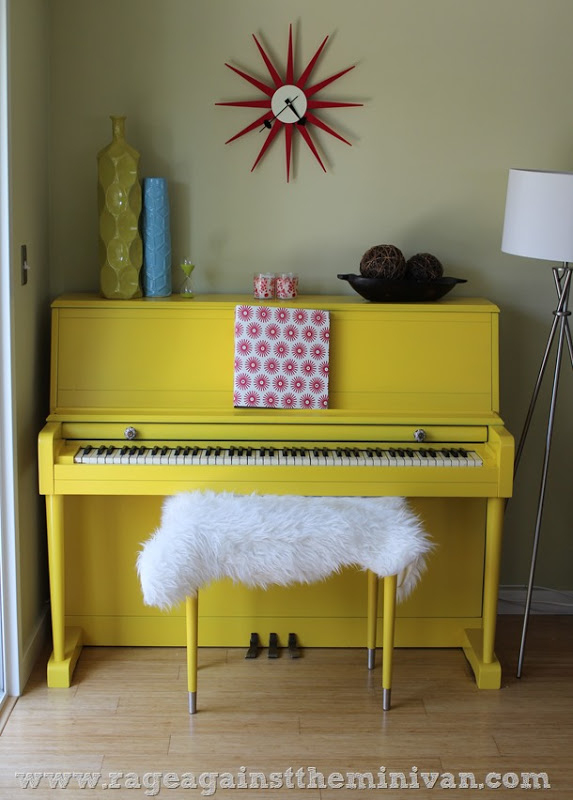 via Rage Against The Minivan
 via We Are That Family
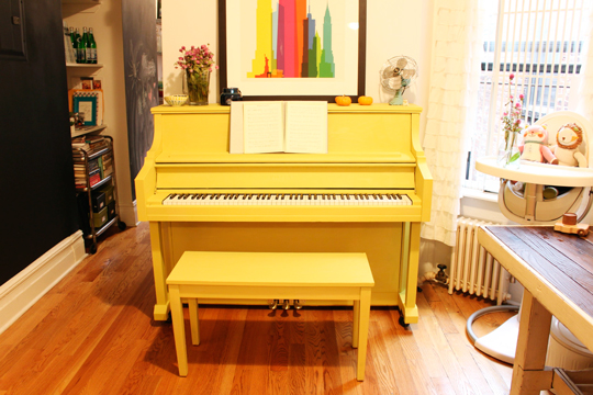 via Love Taza
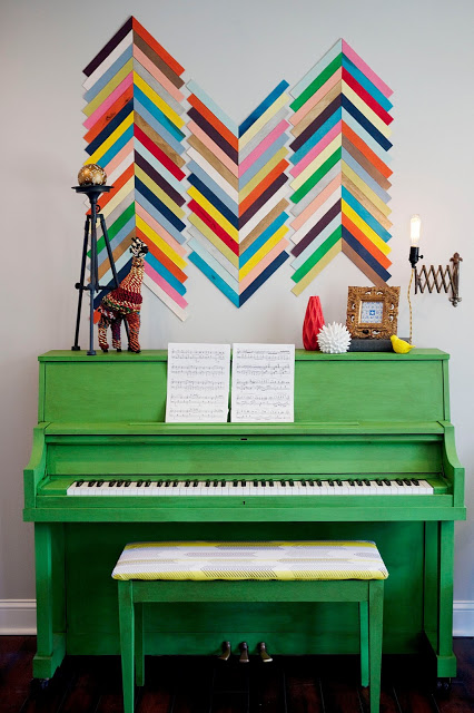
But then on Saturday, my mom said that she thought I should paint it green — one that is much lighter than the kitchen cabinets, but one that will complement the cabinets. I hadn’t even thought about green, quite honestly. So I grabbed some samples at Home Depot to try them out. Hmmm…a green piano.
 via East Coast Creative
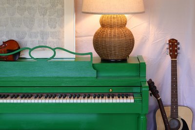 via Design Mom
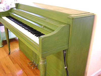 via Cute Pink Stuff
Actually, none of the samples I bought from Home Depot (green or yellow) ended up working out. They were all way to pale for my taste. But I spent an hour or so mixing my own colors, mostly from paint I already had on hand, and came up with some options that I really like.
Here’s what they look like during the brightest time of the day…

To mix these colors, I used Behr Wildflower Honey (a bright, saturated yellow), Behr Polar Bear (the white I use on my trim), Behr Sap Green (a soft green), Sherwin Williams Derbyshire (the green on my kitchen cabinets), and Behr Pure Black.
1. Behr Wildflower Honey + Behr Sap Green
2. Behr Wildflower Honey + Behr Polar Bear
3. Behr Wildflower Honey + Behr Polar Bear (less white added than in #2, obviously)
4. Behr Wildflower Honey
5. SW Derbyshire + Behr Wildflower Honey
6. SW Derbyshire + (more) Behr Wildflower Honey
7. SW Derbyshire + (even more) Behr Wildflower Honey
8. #7 mixture + Behr Polar Bear + a touch of Behr Pure Black
Interestingly, I tried using the Derbyshire and just adding white to it to make it lighter. That didn’t work at all. It turned this horrible mint green with ugly blue undertones. Any time I added white to the Derbyshire, it started turning blue. In fact, here are the same colors later in the evening (I took this the day before the previous picture, and it wasn’t quite dark outside yet), and you can see how that last one has a touch of blue in it because I added white, and I only added a very small amount of white to it.
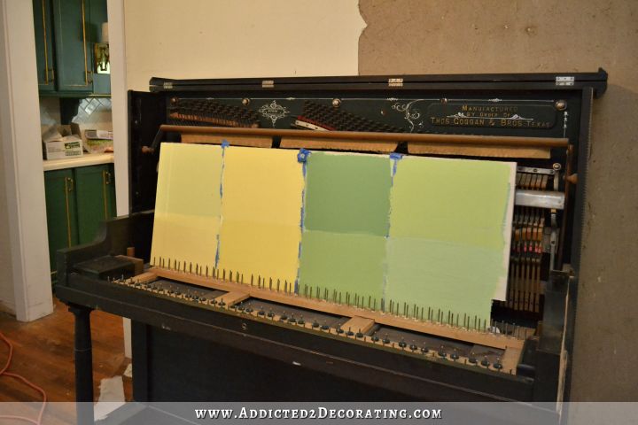
I hadn’t intended to post that picture, since there’s a shadow on my favorite yellow (#2) that makes it appear darker than it is (and since there’s a messy kitchen in the background 😀 ), but the rest of the colors look accurate to me, and this picture really shows the differences in the greens.
Anyway, I’ve completely ruled out #1 (too muted, and in that awkward middle ground where it’s not really green and not really yellow), #4 (too bold and saturated), and #5 (too dark). My favorite yellow is #2 (the Wildflower Honey with more white added to it), and my favorite greens are #6 (Derbyshire with Wildflower Honey) and #8 (Derbyshire, Wilflower Honey, Polar Bear, and Pure Black). If I had to choose a green right now, it would be #6.
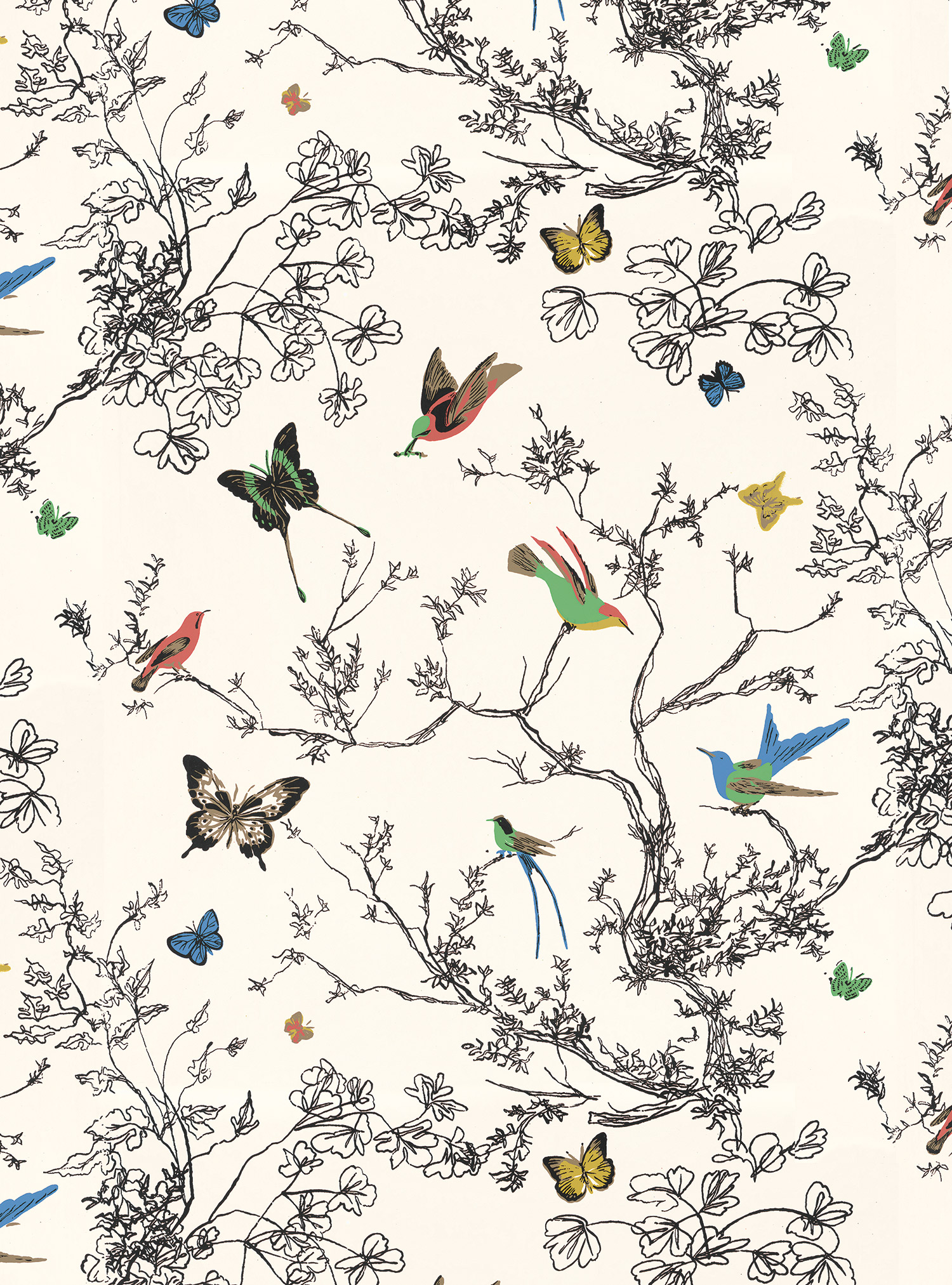
But anyway, I’m not really concerned right now with the specific tint/shade I should choose. Right now, I can’t even decide on a general color. Yellow or green? I personally think either green or yellow would look good next to my kitchen and dining room. And I think they would both look fantastic against my hand-drawn version of Schumacher’s Birds & Butterflies wallpaper (sans butterflies).
And strangely, I really don’t have a favorite. I honestly think I like the yellow and green equally.
So I’m taking the easy way out and letting you decide. 😀 Yellow or green? Majority rules on this one.

Addicted 2 Decorating is where I share my DIY and decorating journey as I remodel and decorate the 1948 fixer upper that my husband, Matt, and I bought in 2013. Matt has M.S. and is unable to do physical work, so I do the majority of the work on the house by myself. You can learn more about me here.

Love number six, but seeing as you have that gorgeous green dresser in the hallway nearby I think the perfect shade of yellow stole my heart. Also, another option that would be very cool would e the paint everything yellow except the top and sides which could be stained walnut! How modern yet traditional! And Those parts might make the diy stripping for feasible. It’s going to be gorgeous. I can imagine some striped or the floral fabric from the dining room on the piano bench paired with it too. Gorgeous. I think Kate spade would approve 🙂
*would be to paint. Stupid phone
Loving the yellow! Agree w/Melissa re the dark walnut topped piano!
Exactly what I was thinking as well. Stained flat Walnut and then a fun pop of yellow.
Sorry – I meant to say “then fun pop of deep blue from the artwork instead of the yellow.”
yellow in order to pull the gold out of the kitchen
I vote for #8 green.
I like the idea of a yellow piano in a shade similar to Rustoleum’s Sun Yellow spray paint. However, are you going to like the coral buffet leading to a yellow piano in the music room that’s adjacent to a kitchen with green cabinets? (I may be confused on the floorplan). I would go for the green paint instead. But you seem to make things work in ways that us mere mortals cannot:) Good luck with whichever color you decide on!
I had the same thought. Will you see the piano from the door, where you will have the coral buffet in your line of vision also? And possibly the kitchen cabinets when you open that up to the dining room (I thought you mentioned that somewhere, but I could be wrong)? I fear it might start to look a little elementary when you get so many different colors on primary pieces going on. I know you ruled out refinishing due to cost, but some wood pieces (maybe somewhere else) would really look nice mixed in with the painted ones. I really like what you have done so far.
Both colors would look nice if just looking @ the piano, but I just question it being seen from other rooms also. Maybe a more nutural color such as .a different shade of Black , off while, gray with glazing. me personally I would need to pull more of the other rooms together before deciding for fear I wouldn’t like it afterwards. Especially being undecided yourself. You may get a vote for a color you don’t really care for too. Remember how you changed your mind on the vaniety color in the bathroom when you got further along. If the room was closed off I’d say go for it. Love your work. Good luck.
Went & read your answers on FB. See you don’t like gray and you don’t want more black or white. That in mind I vote for #2 yellow. Green I think would be too much for the coral buffet. Waiting for the finish project.
#4, yellow. There’s a lot of green in your house…go different! If you do go green I like #6. Your mom IS very talented though…maybe just sick with “mom knows best” and go green. Bah! I’m no help! Good luck!
Yellow!!
yellow, go with your first gut instinct 🙂
Yellow all the way, baby!
I vote for yellow. I actually really like the straight Wildflower Honey!
I agree with Ann Marie, I love the Wildflower Honey on its own.
I like the yellows #3 and #4 I like the creamy buttery ness of them
#2 please that is such a beautiful yellow. I don’t think having a “pop” of color in the entry, the kitchen and the music room is to much (you can never have too much color, in my opinion) as usual whatever you decide will be perfect!
yellow #2
Bright, sunny yellow all the way!
Hi Kristy –
I’m kinda not loving those colors – since you have a small room, have you thought about maybe
painting the piano in the background/cream of the wall paper? Then you could add the bright
colors in picture frames, maybe a vase, etc.? Just a thought… – J
I really like this idea of matching the white background! The room is too small and dark for the other colors.
Exactly what I was thinking. I’m really not liking any of these colors. A nice, rich white or cream to match the background would look beautiful.
Bright yellow! Especially if you plan to include lots of bold colors in the birds on your hand-drawn wallpaper… you could bring some coral from the buffet and some green from the cabinets into the music room as well.
I agree with Debbie Periman.
Yellow!
Yellow!! And I don’t even generally like the color yellow. But really, look at those pictures again. Doesn’t the yellow look much happier and approachable than the green? It makes the piano look fun and inviting. This is more than just a piece of furniture. Love your blog!!
^^^ I agree with this. 🙂
Loving yellow.
Yellow for me.
I love the yellow.It will look fantastic next to that wallpaper pattern and will bring out the gold accent in the kitchen cabinets.
I like #3! The color stays bright in all lights. (I like #2 for daytime but it pales at night). Now as much as I love the yellow, I am tempted to listen to your Mom. As an artist she can really make colors work! Lol. So I AM NO HELP! LOL!
Yellow #3. this would look fab with a wood or green top?
Between the coral buffet, black/white stripes, yellow piano and green kitchen. Not to mention wall that will have two different designs, one in the dining room and one in the music. There is just so much going on, sensory overload! I have faith that you will get it all figured out, you always do. Can’t wait to see what the finished look.
My thoughts exactly. I’d paint it a rich, glossy white (or cream) or black.
That was my thought exactly. Between the striped rug, floral chairs, handpainted wallpaper, etc…I think I would do either a nice cream or a deep, dramatic black.
I would suggest black or white. They are classic colors.
ditto
Oh man. I agree with her…
Though we seem to be in the minority, I am in total agreement with the sensory overload.
I have to agree as well. Black or white/cream IMHO.
I agree, I think you have way too much going on and need something a bit neutral
My thoughts exactly. High, high gloss black would be stunning, especially with that detail work.
You didn’t mention the teal vanity in the bathroom. I vote black with your great ‘wallpaper.’ But the yellow could work.
Yellow – it’s just a happy colour !
You know yellow is my all time favorite “not”…but I must admit those pictures you posted of the yellow pianos vs the green pianos made me stop and go back and look and I decided yellow was the best color…it is hard to match a green unless you use the same green as the kitchen and I don’t think that is the best option. Soooo in the long run…yellow is it.
Have fun.,..can’t wait to see it done….
Yellow! It’s just a such happy color 🙂
I recall you saying you don’t like to do things in the traditional way or order, but in the case of the piano, it might be the one time to wait and get the rest of the room done and then decide on the color. If you can stand it…:-)
You took the words right out of my mouth! I know it’s hard to wait, but get the dining room done and the wallpaper up and THEN I think it will be obvious what color the piano should be!
You wavered thinking long and hard about painting this historical piano and feeling almost guilty so what I say is, get back with Burt and Robert at your local company and offer them your piano. As you said in the original post, Robert rebuilds and restores pianos and because he said the Goggan is “very special” and he has one of the very few remaining, I believe he would be extremely interested in having yours. Burt sells pianos so perhaps you can get a trade-in and own a less significant piano you won’t feel the least bit guilty about painting. Down the road, you won’t have to deal with stripping and restoring it yourself as you mentioned. You have plenty of projects to keep you busy until you find the replacement piano.
I agree with not painting that piano. It is special and deserves to be respected as is. Trade it for another and paint it instead.
YELLOW! Like you said, this room has no natural light so it would definitely brighten up the room. While I do like the green, I’m afraid it would end up being just a large dark object in there.
But what do I know?! 🙂
P.S. Yellow is my favorite color! hahahaha
I think painting the piano is a great idea. I like #3 the best but of course I’m not there in person to see it. Also, I think a royal blue like the one in the wallpaper would look terrific and go well with all the other colors in the house. Then maybe you could use yellow to emphasize the design on the front of the piano and some of the other raised edges. That would be pretty! Can’t wait to see what you decide.
Or instead of yellow on the raised edges, you could use gold like you did on the kitchen cabinets.
Yellow! Bright Yellow!
I think I would wait on committing to a colour on the piano until I had the music room decorated. You’ve got a lot of punchy stuff going on around that area and visible from there (the green & white kitchen, the multi coloured dining area and that coral buffet, black chairs and intricate wall pattern leading into that room).
Fun as it might be to paint the piano now I think doing so would be a mistake and you’d be forced into decorating the music room around the piano rather than having the piano complement the decor. Or, horror of horrors, you might have to repaint the piano once the music room decor is decided.
Good idea!
I personally prefer the #3 yellow with perhaps some “antiquing” finish. I love the idea mentioned above with staining the walnut top and sides and the fabric on the bench. I am feeling a bit overwhelmed with all the different colors and almost like there is some mixed message. Have you considered a black and walnut piano?
I like #1 and #3 maybe a combination of both yellow and green?
Have you thought about a stain? then you would get the pop of color you want but still see the burled walnut under neath. I used the blue color for a side table it was the minwax water based in a tube but it worked well…it’s a nice color and then I did a water based poly over it. I LOVE the pop of color in the wood. If you want to see a pictures….email me and I will send
Now, if you’d only asked me without providing pictures I would always have gone for green, as I looove green and don’t like yellow that much. But in your inspiration, pictures the yellow pianos look all fun and inviting and great whereas the green ones look a bit boring. So I’d say if you really like yellow next to your green kitchen and the coral buffet (this would be my turning-to-green reason – too many different and bright colours next to each other) I’d cheer you on to go with yellow. I like the buttery #3 in your second picture; in the first it looks completely different though, and your favourite #2 looks buttery there, so I’d go for that colour that actually looks creamy and rich and – delicious 🙂
YELLOW!!!!!
Yellow!!
Love the yellow #4. Since when have you been afraid of bold? Go for it! It is beautiful!! 🙂
Bright yellow! Assuming you will use bold colors on the birds in your hand-drawn wallpaper, you can carry the coral of the buffet and the green of the cabinets into the music room that way.
I vote yellow, or a loud lime green! I I like the idea of the stain on the striped part. Why not, it would sure be different you’ll settle on what you like best, for you, and we all can’t wait to see!
Not a fan of yellow. I would do a white with a glaze…that way, you can change colors or styles and the piano will still coordinate! It would also brighten up the room…
I like the white too
Yellow. I liked the #4 sample. So bright and cheerful.
I haven’t read all the comments so I don’t know which color is winning! 🙂 I say yellow!!! With the black and white of the dining room and the PPP of orange and the super saturated green in the kitchen….if you add a paler green to that mix it is not going to flow and mesh. All of those muddy avocado is colors would really look so sad with all of your bold bright colors you’ve gone with so far. If you use green the only green is use is the kitchen cabinet color, but I would choose a bold bright yellow that can stand its own next to a black and white room with an orange buffet!!! 🙂
Duh! Sorry for all the typos! Autocorrect sucks and I didn’t proof read! Should’ve drank more coffee before commenting! LOL
I think that the key is going to be your floral/watercolor chair fabric. That has to be the tie in for everything!!!!
Yellow. I love green(my kitchen is green, now as well), but it is too matchy, matchy. Yellow. 2 or 3.
Can not wait for you to do the accent wall. I might join you in that venture too!!!
YELLOW!!!!!!
I really like the yellow, looks so bright and happy!
Yellow would be a fun and exciting color….for awhile….then it could become tiresome to the eyes in time. It would for me anyway. I think green #6 would be kind to the eyes and look great with the green kitchen and coral buffet.
Yellow!!! I also would like to see the walnut stained top! Good luck it will be gorgeous no matter what!
YELLOW!!! YELLOW!! YELLOW!!!!!
Yellow #3. It will bring out the gold in the kitchen cabinet moldings and brighten up that interior room. LOVE the first photo you posted of the yellow piano!
Sorry, Mom, but I vote yellow. I prefer #2, personally. And, that piano wood grain is beautiful!
yellow #4
#3 in the yellow or #7 in the green, but I like #3 the best.
Yellow #3.
Yellow with Gold Leaf accents. Earlier two ladies mentioned doing gold leaf with blue, I think. But, I think a yellow piano with gold accents would be darling! Or, a yellow piano with no gold accents would be darling, too! 🙂 I don’t even like the color yellow and I still am WAY on board with your yellow piano idea!! It will be awesome!!
What’s wrong with white? To me too many painted pieces with bright colors is dated!
Yellow!!! It’s such a happy color. But I really like the idea of a stain/paint combo. Take advantage of that beautiful walnut on top and paint the rest. If it doesn’t work out- you can always paint it. 😀
Yellow
There is always metallic gold. (Google Candice Olson gold piano)
Yellow #2 or 3
Definitely yellow! It would create a nice color bridge between the coral buffet and the green cabinets.
Yellow. More color in that room plus you are trying to get away from so much green and blue. . .
I like 6 or 8. I have no problem at all with painting a piano but since a piano in my opinion is an important and dignified piece of furniture, I think green would be a better more classical choice. I also love the idea of leaving the top the beautiful walnut. I think you’ll get the fun pops of color you want while maintaining the integrity and history of the piece.
Totally agree with Kathrine’s words regarding leaving the top (and maybe sides) beautiful walnut and give it your pop of color to the front. You’ve done that with the bathroom vanity and your buffet. 🙂 I like Yellow #3 or Green #6.
Yellow!
I vote for the darker green that’s shown in one of the photos. I know everyone else is for the yellow, and actually I have little color sense when it comes to putting rooms together with different colors, so you should probably ignore me, but I love that darker green
Thanks for your great blog and all of the tips.
I would go with #6 green. I’ not a fan of yellow myself. Green is he color of nature it will bring life into your room.
Yellow!
Yellow!
#3 yellow is my vote. But in looking at the wallpaper you show, I also like the peacock blue, it complements the cabinet green and the coral sideboard, IMHO. But, I’m no designer! 😉
And I just noticed your banner has the colors I’m thinking of! HA!
I really like the yellows, as a concept, but I tend to agree with previous comments that talk about too many bright/saturated colors and sensory overload. Have you seen the pianos here: http://catalog.pianorevivalproject.com/collections/10 ?
I really like the grey with white accents, the black with silver accents (maybe gold for yours?) or the creamy white with yellow accents. It would still bring lightness and brightness to the room, without being another bold presence.
Wow! Some of those are absolutely amazing!!
WOW, those are fabulous! Love them so much better than one color overall!
I have to say that these get my vote! The best of both worlds. Especially if you could paint the areas that would make stripping difficult, and leave the areas that would be easier to strip (sides, top, etc.) stained. I like the ones with a pop of an accent color as well. Perhaps you could have the stained wood and mostly green (or I like others’ suggestions of cream) with pops of the happy yellow? I went back and looked at the original photos of the piano, and I think that it would look fabulous doing something like this. But then, it will look fabulous no matter what you do to it, I’m sure! (To answer the original question, though, I vote for yellow as opposed to green if you’re going to paint the whole thing.)
Love love love the cream with yellow accents!! If going with a solid color yellow would be my choice. Getting the right shade is the hardest part. You want happy, not maniacal :).
These totally get my vote! I think all one bright color is going to compete with the beautiful coral and green you have now. But these are just the right mix of color without being so “in your face”. Good Luck!!
Those are fantastic.
Wow! Those are beautiful. I love the the retro gold piano. It would look beautiful with parts of the walnut stained.
I vote yellow. #2 or #3
YELLOW 🙂
You are painting every cabinet/furniture in your home a bright color, the kitchen, the bath cabinet and the coral dresser. In my opinion it’s starting to look like you’re trying too hard to create uniqueness. I think its going to start looking a little primary color overload and childlike. Give the eye a moment to rest when it wanders from room to room. The best comment I read so far was painting it a cream or white if you feel you want to brighten it up. If every piece screams “look at me”, then you have just removed the elegant and class from your decorating style.
Yellow!!!!! (pretty please???) 🙂
I love the yellow in the picture from via Love Taza. I also like the yellow you have in #4. The first thing I noticed in your picture with the paint samples sitting on the piano, is the yellow actually compliments or matches or goes with (whatever phrase you want to say) the gold trim on your kitchen cabinets. I vote for a shade of sunny smiling yellow! Whatever you decide, I’m sure it will be beautiful. Have a Blessed Day.
#2 yellow with a walnut top.
And that’s my final answer!
I like #3 yellow if you paint it a color,,, but I think it would look stunning if you went with black on the piano! It would be classy and you are going to have some black accents in the dining room…To many different bright colors, to me, take away the elegance and traditional look of what you have already…Well just my opinion…I wish you the best always Kristi…I say pray about it.
I love yellow! its so bright and cheery… but I’m strangely drawn to #7 … even though I usually dislike green…maybe its the mixture of the yellow and green. #7 looks bright and cheery as well.
Yellow #3. 🙂
Yellow, or maybe a more lime green.
I agree with your mom…….. some color of green and it doesn’t much matter to me as long as it makes you happy!
Yellow.
I vote for Yellow #3 🙂
First instinct was yellow : )
So cheery
Yellow! I love #3. The green is great, too, but you have a lot of green already. The yellow makes your other greens look great.
Number 5 green is the prettiest with the hallway dresser red, and the kitchen cabinets just beyond. Yellow would clash with both to my eyes. I think if it were up to me I would paint the piano black, with accessories in colors.
I like the idea of painting it white with a dark stained top & maybe the decretive part on the front also stained dark.
Green is my favorite color, but your sample pics of yellow pianos were fantastic! Your green color samples don’t really grab me. So i’d go with a clean, bright yellow. Maybe with wood stained top??? Can’t wait to see it.
The sample of the wallpaper you show has a bird with a blue upper body and tail, and green wings. I’d like to see the piano emulate that combination, maybe one of the colors for the side and top, the other for the front.
More warm colors! Go with yellow.
Not sure which one, but I vote yellow all the way!
I say go for yellow. One caveat. You mention the area lacks natural light, so it won’t be well lit unless you put some lighting in that area. Are you sure you want to use a yellow or a green that is a tone in an area that doesn’t have much natural light? Wouldn’t a more pure yellow or green create a nicer overall effect with the hand painted “wallpaper” look you are going to back it up with? Just think a yellow closer to a pure hue would be more effective against the black and white vines effect. IMO, that is.
Well, I seem to be in the minority, but I’d choose the green because your kitchen cabinets are so close. Too many pops of color isn’t something I could live with on a daily basis. But I don’t have to, you have to choose what makes you happy! 🙂
Yellow. And #2 or #3 work..I didn’t care for 1 and 4 for same reasons you stated.
I use more and brighter colors than anyone I know aside from you, so I instantly thought a cheery yellow would be perfect, for all of the reasons you mentioned. (Although I might stay away from a yellow with greenish undertones since you have that perfect coral buffet nearby.) While it might be too much for some people, you seem to thrive on color like me, so go for it!
Have you considered a combination–either mostly stained with painted accents or mostly painted with stained accents? [The BEST of both worlds!]
Yellow #2 for sure!
Yellow!
Definitely yellow! 3 or 4 get my vote! Lots of great ideas for you to choose from though! Good luck! (Not that I think you need it! You really do amazing things!)
Yellow #2 …. a dark walnut top would be gorgeous with it, if you’re feelin’ it. 😉
I too would wait until you’ve done the walls to decide on the paint color. I would go with partly stained wood and part white….but I’m boring like that.
I think yellow is my favorite.
You’ve said in the past that you want to have some non-green/blues, as well, which makes yellow a good choice. And I like the yellow piano pictures you’ve posted.
It looks like yellow is going to win- but there’s something to be said for primary overload. How about a pale yellow with a pad on the bench made with a white, yellow and green print?
I’m in the minority, but I like the lighter yellow-greens as opposed to the yellow. I think a nice bright lime green works better with the coral and the cabinet green, and the wallpaper.
Kristi you make a very compelling argument for NOT refinishing the piano! It sounds like it would cost more than the piano is worth to refinish it. But if the varnish is thick, how will the paint look when you paint over it? Are you going to have to sand the finish smooth?
I think either yellow or green would look good but I do prefer yellow. Yellow really is more cheerful.
Yellow! I love your idea!
Love that green on the “East Coast Creative” pic. It’s so happy and fresh. Not digging the samples.
Yellow! Love the wallpaper mural too! So happy. Even happier than your original stripes.
Yellow #2, not 3 or 4, and no on the antiquing especially with that wall art/decor (it will just look dirty I think). White would be too cold or formal, plus the piano would be lost against the wall. 🙂
Here’s a curve ball, what about orange? It’s bright and cheerful, co-ordinates with green and the right shade could even compliment the coral. If not, I like #2 also.
YELLOW! Please!
I personally don’t like any of those yellows….but I think YELLOW is the best choice 🙂
I would like to see your color board near your buffet. You are going to see both pieces when you walk in your front door, I don’t think you kitchen matters all that much. By the way, weren’t you going to put a swinging door between the kitchen and the music room way back when? When did that idea get flushed? I would really like to see it near the coral before making a decision, but my gut is going with the last green. It is soft and dignified and if you go for a bit of elegance in that space it won’t garish it up. Blessings.
I really think you should wait and decide at the end. You will have a lot going on in that room and it’s too early to decide if you want it to stand out or be more in the background. I love the yellow more than the green but I just see a potential for you to be repainting the piano a second time as you get closer to completion of the room.
Just my opinion. So impressed with all of your work and the thought that goes into every decision.
I’m part of the minority who’s having sensory overload just thinking about this! No votes for a color here!
I would love to see a combo of wood and yellow #3!!! Green would be too much with the kitchen in view. I think it might come down to whether you want to design the room around the piano or make the piano fit the design of the room.
Yes! Love the idea of a two-toned piano! Maybe those beautiful walnut sides and top, then the curvier parts could be yellow. Swoon… 🙂
Yellow!!!
I know you weren’t considering this but a cream or ivory that worked with the background of the butterfly wall would keep the room looking light and then you can add the color that you love in other ways. I’m quite intrigued by this room as it is in the middle of the house and the one you pass through to every other part of your house. I’m not sure what your plan is for the rest of it but I picture it with a wall of bookshelves and maybe an upholstered piano bench, a chair or two in a vibrant color (your wing back chairs?). Or maybe an art gallery wall which I’ve always wanted but don’t think I could pull off. Of course, we all have different tastes, needs and wants which is why reading DIY blogs is so much fun. Can’t wait to see how this room turns out!
Green…
Am I wrong in thinking that the music room has stripes and nail heads on the walls. And the butterfly paper is going in the foyer? That isn’t right is it but what is? Thanks!
Honestly I would paint the piano classic lacquer black with red lacquer details. Get it pin striped for some pizazz. Black is just so beautiful on a piano. Not that other colors aren’t but sigh shiny black is so dramatic but classic! Don’t for get to answer my quandry about what goes where?
I’m doing full-wall (i.e., 8-foot-high) recessed panels (like on my bathroom wall) on the entryway wall, and using the bird and butterfly “wallpaper” in the music room.
Thanks I still cannot figure out why I thought the music room was done in stripes with nailhead trim…..has that motif been done somewhere in your blog?
Oh, it was! I started that wall treatment at the beginning of this year, got one wall almost finished, and decided it wasn’t really the look I was going for 😀 It was a fun project, though!
GREEN!!! #5 or #6! 🙂
Yellow!!!
Yellow!!
I know you like bright, saturated color. But I am a bit concerned about too much color at the sorta same saturation point, if that makes sense. I’m trying to visualize it from your front door. If I’m right, the coral piece would be to your left as you enter from the front door, right? From that vantage point, your black dining table would be visible forward and to the right, I think? And the piano would be ahead, but on the right wall of the music room? Plus there would be just a peek of the green kitchen cabinets visible beginning about where you would enter the music room?
I agree that doing the piano in a dark color would just enhance how little natural light is in the room. But coral, green, and yellow, all basically in the same intensity would, IMO, be a bit of an assault on the senses. You’re about a gazillion times better at this that I am, and of course, it’s your and Matt’s house. But have you considered a less saturated color, maybe a light-ish (not pale) aqua blue for the piano? With maybe even a slight “aging” technique with a wash of a light-ish wood stain? And perhaps something that might coordinate, but not match, the brown handles that will be on your coral piece? (I also think eggplant would look great, but it’s too dark.) Coral, aqua, and green all coordinate but they don’t clash, and I think they’d all look great with the black in the dining room, as well as the black and white in the music room. Just a thought. I know it’ll look great no matter what YOU do, because you’re Kristi, and the end result will be Kristi, through and through. As it should be.
Barring that, I prefer the green over the yellow. But yellow is just not a color I’m particularly drawn to.
I think you should paint the piano after all the other solid, decided decor is finished. You might go with a beautiful shade of mahogany red. Your piece isn’t a smaller console(?) piano that you found in a nursery school . You need to give this more thought! And by that I mean walk away from that piano for a few day s.
Yellow with white accents would be ideal in my mind. Cheery and light, but not overpowering, and fitting in perfectly with the hand drawn leaves, butterflies and birds wall design..
Something like this:
http://sincerelysarad.com/wp-content/uploads/2013/10/Yellow-Painted-Piano1.jpg
Yellow all the way. I think there is enough green going on with the kitchen. And since the room has no windows I am loving the imported sunshine.
I also like yellow #2 , I think it would look bright with the wallpaper and green and the red buffet too Christmas… Also you have all that green in the kitchen and you said you were trying to break out of your safe colors. Blue and green!!
I think none of the greens are strong enough for your house. And those shades of green are pretty much my favorite colors. Unless you intentionally don’t want this to be an accent piece that pops, but I doubt that. I like #3 the best, although #2 is a close second. #3 just pops a little more, which I think is a good thing.
Love the yellow #2! It’s a MUST! I can’t wait to see it finished…no matter the choice!
Personally, I LUV the idea of a cheery Yellow … AND … leaving the large piano sides and top paint free and showing that gorgeous Walnut wood!
I like #4 the best.
Wow Kirsti,after reading the above comments. I love the mural that you are going to do. So I would probably leave the piano until the room is completed. The solution running through my visual mind,would be Gloss Black and with the lovely fabric that you will use on the piano stool. But it’s your home and I’m sure you will work it out,as you will be living with it,so happiness personally is your call. Love your Blog and work ethics.
My personal opinion is that using green a different shade of green might fight to much with the already distinct green in the kitchen. How about a very matted dark charcoal grey? Or as some have mentioned even a black might be nice, but I think matted might be better than glossy.
I love the bright yellow, totally makes me smile, how can you beat that?
Love your blog! Glossy white or glossy black would be my vote.
Here is my thought…paint it black. I LOVE color! But you have a coral buffet and a beautiful green kitchen. I cannot see another green and yellow is not appealing either. I think there will be too much going on…maybe you should put a cushion the bench that pulls all the colors together green from the kitchen, your wallpaper, the piano and the coral.
Yellow! Oh how I wish my husband would agree to having bright, saturated color in our home.
As much as I love green……I vote yellow. There is just something about a yellow piano that screams….happiness
I think two tone would be great. Maybe even with stripes.
Yellow #2
Neither, it should be gold. Your doors are so beutiful and decorative, the gold will show them off. Maybe blue with gold accents if an entire gold is too much.
You have a lot of green and need to tie the green in with the rest of the house. Blue is in the same family, but dont use the ones your trying. Go for a peacock blue. It would also tie in with your foyer orange furniture but not compete like the yellow or greens your trying.
Its a “music” room so go a little (or lot) Liberace. Its only paint:-)
Sensory overload. Too much going on. Wait until you have more of the room done before making a decision.
I know I’m in the minority but I agree with white. I guess I’m old enough to remember all the regret of people painting their furniture yellow or green in the 60’s & 70’s. Remember antiquing? White is so crisp and classic especially for a piano. I know you’ll pick the right one because you’ve got it go in’ on!
Glossy yellow and white, but if you don’t want two-toned then yellow gets my vote. I love the inspiration photos. I love all of your greens and blues, but a bright yellow with your inspiration wallpaper would be so fun! I wish I had a yellow and white room in my house.
When I gutted my kitchen 7 years ago, I installed butternut cabinets with a coffee glaze. The cambria countertop is a rich, speckled brown with black, sort of rust, etc., specs. My appliances are black. I LOVE these cabinets, and the oranges, reds, greens compliment. I was so afraid to leave the realm of “normal” and go to the butternut, even though I loved the color. Once I made the decision to go with my heart,I have never regretted the choice and have received many compliments. I have hardwood floors, and the floor also goes together with it all. I think all your colors would go well with that sort of butternut “yellow”, possibly making it richer with a coffee glaze. Just my input 🙂
Yellow.
Yellow for sure- I think using any of the greens will only compete with the green cabinets rather than compliment them. It will stay light, bright and airy like the wallpaper.
Yellow…because it’s a happy color 🙂
yellow!
Yellow, all the way!
I like the yellow for contrast. I feel like 1, 2, and 4 are ‘dirty’ looking….so #3 would be my pick.
I think all of those colors are horrible. 🙁 I agree with the others that there is a lot going on in your house. Its going to start looking like a circus with all the bright colors. Black or White would be stunning and much more sophisticated IMO.
Kristi, I am so glad you decided to see what the finish looks like on the piano. I can now appreciate it being painted! 🙂 I do, however, agree with the few who suggested painting it black or white, or both! The examples of the two-toned painted pianos was very neat. Can’t wait to see what you do! I know it’ll be great!
While I love the idea of a yellow piano, I think I would wait until the entryway and dining room are completed to see the impact of all the color as you look from your front door and I’d also suggest doing your ‘wallpaper design’ before choosing the final color. My personal thought, with so much color in your dining room/entryway and kitchen, I would opt to do the piano in a glossy black to tie in with the gorgeous doors in your music room and your black dining table and have the piano stool and decor items in your music room in bright colors to compliment your coral buffet, the dining room fabrics etc and your stunning green kitchen.
Oh definitely yellow! It will be a hit of happy! Either #3 or #4 or go even brighter in shade!
No post in two days? I’m having withdrawals!
(And yellow, yellow, yellow!)
#3 Yellow
Definitely yellow. #2 or #3 because if you paint it green it will look like an extension of your kitchen cabinets.
The yellow is also much more cheerful for a piano.