I’m Done. You Make This Decision For Me, Please!
If you know me at all, you know very well that I have a tendency to become hyper-obsessed with certain decorating and design decisions. Some decisions I can make very easily and quickly, and I can get those things done and move on. With other things, my brain becomes like a car stuck in mud after a huge rainfall. I’m pressing on the gas, trying my hardest to move forward, the more dug in to that one spot I become. No matter how hard I think, consider my options, or try to force a decision, the harder it gets for me to actually make progress.
Even after all these years of living with my brain 😀 and understanding that this happens, I still can’t make sense of why certain decisions (and very often, seemingly insignificant decisions) get me so stuck and obsessed, while other decisions (and often, very big decisions) seem so easy. And a lot of the times, it’s the insignificant decisions that I seem to become hyper-obsessed over. I can’t explain it. But I do know that we all have those idiosyncrasies that we know we have, but we can’t explain why we have them. This is one of my many.
What I do know very well is that by the time this particular idiosyncrasy of mine begins to wear on my own nerves, that’s when I know that other people’s nerves have been worn for days, or weeks, or sometimes even months by my hyper-obsession and indecision. And I think we’ve reached that point with these stupid doors in the back entry of my studio. I decided last night that I’m not going to try any other faux finishes to try to make them look like wood. I’m not going to replace the doors with real wood doors. I’m not going to do anything to the doors that requires me to remove the doors (like adding veneer).
I’m going to paint the doors, be done with them, and move on. I have way more important and more exciting things to do, like installing wallpaper in the bathroom, sewing curtains, and finishing the rest of the cabinets. So when I made that decision last night, that brought me right back to the questions, “What color?”
Believe you me, as much as you’re rolling your eyes at me right now, I was rolling my eyes at myself last night. We’re right back to the color choice. Internally, I was yelling at myself, “MY GOSH, KRISTI!!!! JUST MAKE A FREAKING CHOICE AND LET’S GET ON WITH THINGS!!!!!“
Just so you know, yelling doesn’t really motivate me, whether it’s coming from myself or from someone else. 😀 That just gets me dug in even deeper. So I went back to my photo editor, did a few mock ups, and made the decision that I’m going to let you decide which color I paint the doors.
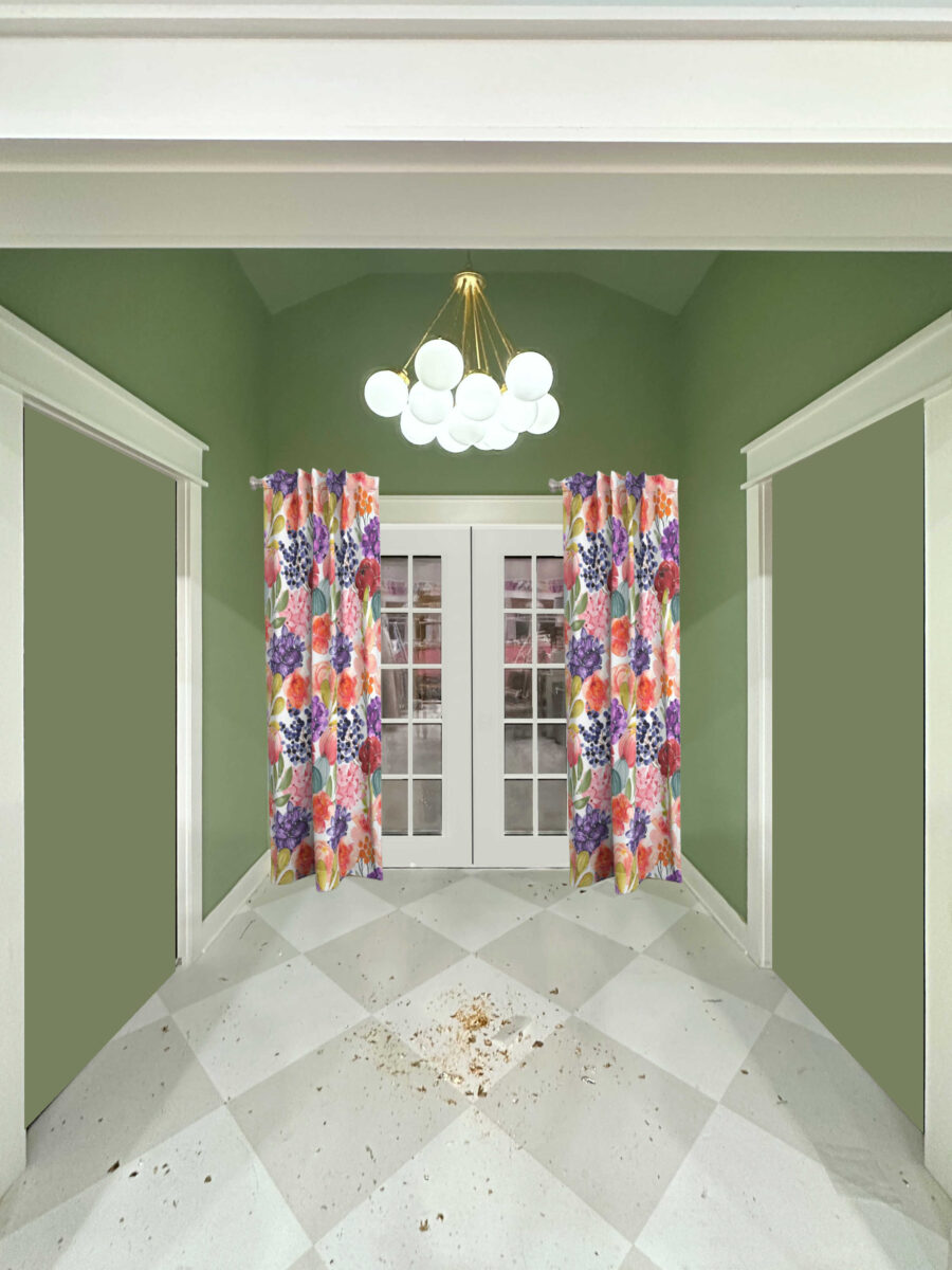
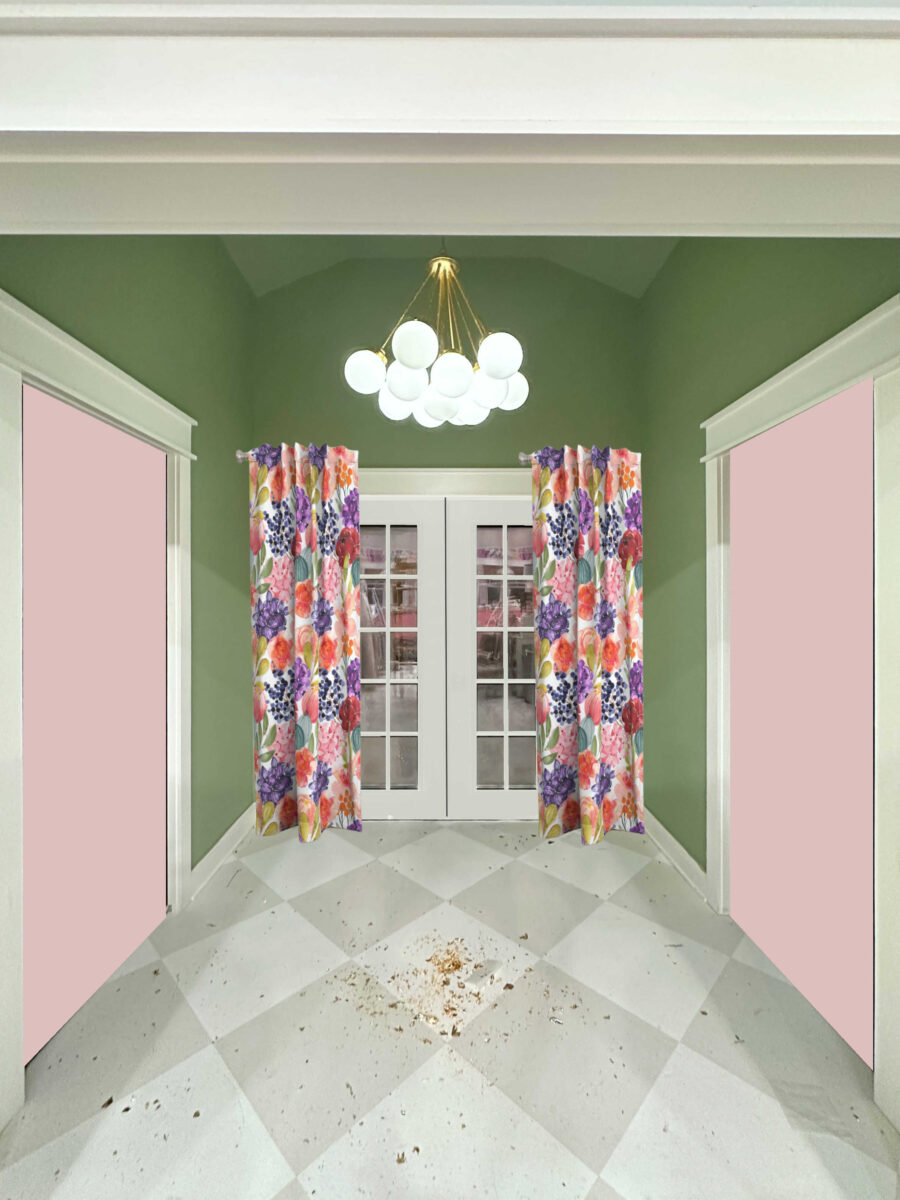
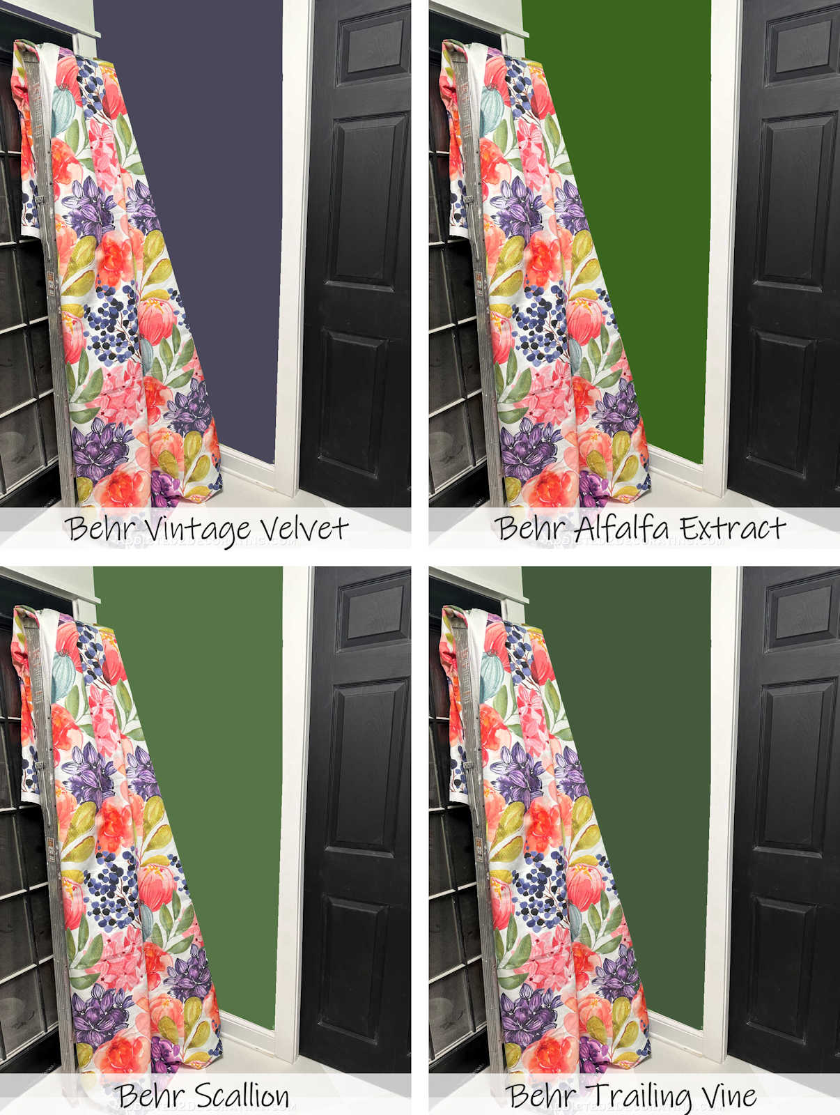
For those of you asking, “Didn’t we do this exercise already,” yes, we did. But that’s when I was planning on painting all of the doors the same color. I’ve now decided to paint the French doors white (at least I was able to made that decision on my own! 😀 ) and only paint the two side doors a different color. I’ve narrowed it down to the colors I like, and you can decide from there. And to make it easier on my brain, I’m just going to go with the majority vote. The majority will win, I’ll buy the paint, and I’ll get the doors done ASAP so we can all move on, and I can stop obsessing over doors.
Just so that we’re clear, white isn’t an option. If you vote for white, you’re wasting your vote. Write-in candidates never win. 😀 So here are the colors that are actually on the ballot.
Option 1 – Dark Charcoal Gray (like Sherwin Williams Iron Ore)

Option 2 – Dark Eggplant (like Behr Black Sapphire)
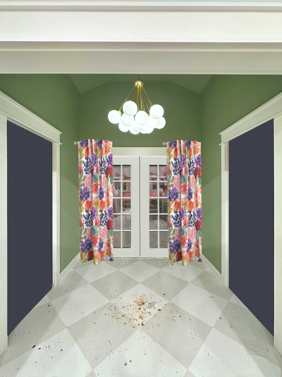
Option 3 – Dark Green (i.e., darker than the walls)
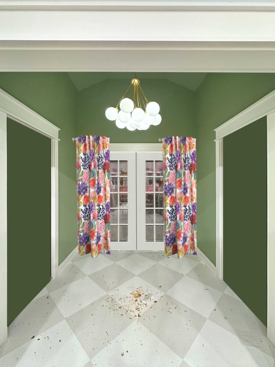
Option 4 – Green, same green as the walls
Option 5 – Light Pink
(I didn’t like this option before with the French doors the same color. But now that the French doors are staying white, I really like the pink.)
Option 6 – The cabinet color (Sherwin Williams Tuberose)
(Just like with the light pink, I didn’t like this at all with all of the doors this color. But with the French doors painted white, I really like this bold look.)
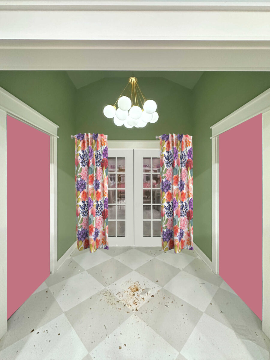
So those are the options. I narrowed them down to these six, but that’s as far as my brain can take it. The final color is your decision. So, what say you?

Addicted 2 Decorating is where I share my DIY and decorating journey as I remodel and decorate the 1948 fixer upper that my husband, Matt, and I bought in 2013. Matt has M.S. and is unable to do physical work, so I do the majority of the work on the house by myself. You can learn more about me here.
Dear Kristi, I’m sorry this is such a hard decision for you. I like the first option best, dark charcoal. Let’s see where this is going 🙂 I hope you can concentrate on something else in the meantime, something that gives you a break. (as you always say: it is only colour, so if you don’t like it in a couple of years, you can always repaint!)
I agree. Dark charcoal
Eggplant!!
Dark charcoal gray
#4 #4. #4. #4. #4
While my real vote would be white, going to throw in for the first option, charcoal grey. Can always change it later and I am sure when you order doors for the new addition you can swap the bathroom doors at that time.
Eggplant!
Option 4. There’s a lot going on with so many doors. They need to blend in.
I agree. Make the pretty curtains and french doors the focal point.
Dark charcoal
Eggplant
I vote charcoal or eggplant.
My vote is Option 4, the same green as the walls. Looking forward to seeing the finished area soon!
I agree! Doesn’t make the area looked so closed in!
I vote eggplant as well. As much as I don’t like purple it is unexpected and beautiful here.
Hi Kristi,
To me it seems that colors different than the wall color make my eyes go directly to the doors as the focal point. I like the more harmonious colors as in keeping the doors the same color or the darker green.
#4,same as walls for the doors and the trim around them. It will make those beautiful French doors and drapes the stars of the space.
This is my vote too…the doors and trim the same green as the walls so the focus is on the back door.
My vote too. Same color as the walls.
I unexpectedly like the eggplant!
I vote for option 4! Your French doors, drapes and chandelier make a beautiful and custom focal point! Making the hallway doors and maybe even the white trim around them? disappear will make your French doors the star of the show! You’re my diy hero and a daily inspiration, thank you!
This!! These doors should not be painted with any special color; they are a necessity, not a feature in the room.
I agree… I do like the pinks, but this has a richness that Charcoal and the greens don’t have.
Option 4 same green as the walls, there are a lot of doors in that little space, it will help them disappear. You’re welcome. ☺️
I actually prefer the darker green doors. The doors don’t stand out too much and yet they register as a different element. If I were going to do them the same green as the walls I would paint the trim around them the same as well so they disappear as any kind of a feature.
My second choice would be for the pink that is on your cabinets but I think it’s a bit much.
I absolutely agree. Same as wall color. Others look like too much going on in that small space. This option lets the beautiful drapes really stand out.
my favorite is either of the greens, I like that they help elongate the look of the green, the other colors chop up the space more. The green draws your eyes back to the beautiful curtains and even the light fixture, and if the door to the powder bath is open you won’t have the door color competing with all the color going on in there.
If you’re leaving the trim white, then the darker green.
Dark green is my first choice. Lighter green is my second.
I agree — Dark Green#1 Lighter Green #2. Otherwise it just draws attention to all the doors instead of the curtains, light fixture, etc.
I agree.
I agree Option 4, make focus on french doors and drapes and let side doors blend into the background.
#1
My vote: Dark Gray (Iron Ore). I think it’s stunning. =)
Option 4 would be my vote
Eggplant for me!
Option 3, the darker green. It directs your eye to the doors and the colorful curtains and doesn’t compete for attention.
Yes, the Darker green.
Option 4. And I’d paint the doors’ white trim that color too, so all the attention is on the French doors.
I agree with Meredith, paint the doors and trim the same color as the walls and let them disappear so the focus is on your beautiful fabric.
Dark Charcoal Gray
Dark charcoal
If I had a second choice it would a darker green.
Green – because I think you want the curtains and double doors to be the focus of that entry. (And maybe paint the door trim green too?)
I’m team dark! My favorite is the dark eggplant, then the charcoal. I know this feeling of indecision and it’s the worst!
Charcoal, it was the one that best let the french doors stand out. I found the other colors distracting.
Option 4 – Could you possibly paint the trim around those two doors as well so the doors and frames and walls are all that green and the back door(s) and curtains be the focal point?
This!
Me too!
Eggplant looks like your style
Charcoal gray!
Iron ore
I like the darker green. My eye is drawn to the white doors.
Eggplant!🤩
I hear you! I have the same decision making problems, but it usually ends in the project just not happening or being put off for years! I like option #4, but in a different sheen than the walls. I feel the dark colors look like giant dark holes on either side of your gorgeous entry and I feel the pinks compete with the curtains for attention and possibly conflict with the bathroom. Hope this is helpful!
Love the darker green..pops just enough without taking away from the floral curtains
Charcoal
I still think, the same as the walls. It makes them almost go away and the beautiful curtain and light become the main focal. Good luck.
Dark Green looks great
I’m torn between the charcoal gray and the darker green. They both look great!
I like 4 because it make the back door and curtains the focal point. With the other colours it feel like they’re all competing
I agree with Joanie. Keep them the wall colour; you want the focus to be on the french doors. I know it seems plain, and you are never a plain person, but to just get it off your plate for now and revisit when inspiration strikes. This way, they will be finished enough to ignore for a while. Good luck
OPTION 3 DARK GREEN
#3 – Dark green 🙂
Option 4 – Green, same green as the walls
for me. I like that the doors disappear.
Can’t wait to see which project you tackle next 🙂
My gut instinct goes with eggplant.
Iron ore
Surprisingly, eggplant.
Wall color. Keep it simple.
charcoal, none of the others hit me, but def not the pink.
Dark green
Option 4
Eggplant
EGGPLANT!! I love that it pulls that color from the curtains and you really have not used it anywhere else in the space. Perfect color!
First choice, Eggplant. Second best, same green as walls.
Dark green
Hi Kristi. I can understand how hard it gets to make even one more decision when you are overwhelmed. I’ll keep this brief so you can move on to the next person’s recommendation. I would choose the Dark Charcoal because is is neutral, goes with everything/anything else you may choose to do down the road. My second choice would be the Dark Eggplant because it picks up the color of darker flowers in your wallpaper and I know that you love color. Using the same color as the hallway paint doesn’t do anything for the space. The other choices are either too light, bright, or have already been used generously in your adjacent studio. Just my opinion and I think you are going to be happy once you finish this space and move on to other areas.
Take care! Merry Christmas and Happy New Year!
Looking at the colors from the picture, either the the Charcoal, or the eggplant.
I think the eggplant color is more about the tonal saturation with the green and not the color itself. I could totally be missing this, but I think you will grow tired of the green on the walls, so I would avoid green on the doors.
Green 😊
Option #1 hands down
Either one of the pinks.
number two… Dark eggplant♥️
I feel your pain 🙁 I’m doing the same thing with my kitchen cabinets and finally had to go in a somewhat different direction than I’d thought I ever would. I’m for the darker green. White and same green as walls are too monotonous. My second choice would be the eggplant. Don’t love the gray at all (or the pinks).
Option #4 for the win! Even better if you paint the trim the same color so this doors ‘disappear’. 😃
Only a bit of help. The eggplant is gorgeous, but the darker green does a more soothing transition with the walls. So perhaps I am looking at the darker green as my final answer.
Dark Green or Charcoal
Eggplant all the way!!!
Definitely eggplant.
Ok Kristi…. Here goes….. Keeping in mind your love of color…. First: Those magnificent drapes on the french door are your focal point…. And I humbly believe they are also the “culprits” causing your indecision…. This time too much color is perhaps just that….so… my vote would be if you must have color the Dark Eggplant…. However… the same color green as your walls, just might give your eyes and mind a much needed TEMPORARY rest…. And by living with the wall green FOR A WHILE… may just allow you to move on for THE TIME BEING….. those two doors can’t take more than an hour or two to paint and you can always come back to them when everything else you WANT to do is completed….
Option 1
Sapphire or the same color as the walls. But, I really like white the best!
SW Tuberose
The first two choices look great. Not the green on green so much.
The same green as the walls, because the eye skips over them and goes right to the beautiful fabric of the curtains on the French doors. Second choice would be the darker green, just for a bit more contrast.
Option #3 (or #1 at a push)
I vote same color as the walls, that way the curtains & light fixture are the focus.
The darker green…..green is life….I love it matched with the gorgeous custom draperies!
3 or 4. Preferably 4.
Same green color as the walls please. Easier on the eyes.
Option 4 Green to match the walls. Keep it simple to highlight your special points of interest.
Sorry, but I can’t vote for any of those options.
I like option #4 because it makes the floral curtains really take the spotlight.
Option 1 (only because white is not an option 🙂)
#4 the same as the walls! 😊
With gold hardware of course.
Option 3, the darker green.
I’m with the others…. I vote for wall color on the doors and painting the door trim the same color. We don’t really want attention on the bathroom and storage room entrances… The French doors with the drapes/outside will be the focus.
My vote is for either option 1 or 2.
I vote for #3 or #4.
Green same color as the walls.
Eggplant.
I really like the gray but think you’d be happier long term with a little bit of color.
Dark green is my third choice.
Option 3, dark green gets my vote.
But I can see why it’s such a hard choice to make. I actually like all of them EXCEPT the charcoal gray which seems to be a favorite with many others.
All the other colors look intentional and cohesive with the overall studio design, the charcoal says “utility closet” or “garage door” to me.
My first thought was the darker green. I’ve painted furniture that had a blond wood look formica. I wanted to match some of the darker furniture I already, I found Kona Brown rust-oleum, turned out beautiful. Also did you think of using formica in sheet form? There is a color called Oxidized Beamwood that looks like Walnut. Formica might be a good fit for that entryway.
Eggplant
If we’re doing ranked choice, my first vote is #2, second vote #6.
If not white, then Option 4
Option 1. Done.
Eggplant looks great! It captures the color in the curtains.
I think the Tuberose knocks it out of the park. The greens are too much green, the grays and eggplant are too dark. But the Tuberose brightens up the whole space, and looks great with the paint color and fabric.
Eggplant!!!
Option 2 – Dark Eggplant is my vote! I love the way it brings out the purple in the fabric!
Option 4 – Green, same green as the walls
makes the entry feel larger which is nice,
but I like Option 2 – Dark Eggplant (like Behr Black Sapphire)
I applaud you for digging in and painting to get on with other fun projects. Love watching this evolve.
Eggplant and charcoal. You’ve got enough color going on that hallway.
Either the charcoal or eggplant. Hate the pinks.
Tuberose. It will be a nice balance with the other end of the room and bring that color across the room. You already have the pattern in the drapes, gold in the light fixture, and the tuberose will be the perfect accent.
Option 4 makes the doors disappear
How realistic is it that both doors will remain closed most of the time? On the storage closet, I assume most of the time, but the bathroom will probably be open most of the time. If that’s the case you’ll want a color that will also blend well with the bathroom wallpaper since you’ll see that just as much as the curtains and entry walls. With that in mind, my vote is the same green as the walls. You know it works well with both rooms.
IIRC both are pocket doors so when not closed they will be tucked away and not seen?
Hi, Kristi,
I understand your struggles! You are NOT alone! I had a crazy thought, but what about NOT painting the doors one solid color, and incorporating some of the effect from the gorgeous multi-color cabinet?
I really like the eggplant. Looks very dramatic. I also like the pink to match the cabinets, that kind of ties everything together.
Option 4, same green as the walls, but I vote the trim is painted that same green as well 😊
#6
Eggplant, or same green as the walls for me.
Either dark green or charcoal.
Eggplant – it works with the colors in the curtains. The pinks are too jarring to me, and while green is my favorite color, I think that green doors are too much with the walls.
Eggplant #1
Tuberose #2
Kristi,
I can only imagine that all the choices you have to make can make it difficult at times. Especially when there are soo many to pick from. Both my husband and I are team dark with the Iron Ore coming in first and the eggplant purple in second. Can hardly wait to see what color is the winner! Have a fabulous day!
Marti
My vote remains purple. I love the dark eggplant! I like all the options though,
except the green.
Option 2!
#4 and paint the trim the same. No matter what color you paint those doors if you don’t paint the trim as well it will detract from the beauty of the White French doors and colorful drapes. Yes, the doors & trim will fade into the walls but it is such a small space it won’t look so ‘choppy’ with the same color as walls.
I still like the dark green best.
Option #4 – you’ve got a lot of other elements competing for attention, so I agree that keeping the focus on the French doors is the way to go.
Eggplant! 🙂
Pink! Pink! Pink! Pink! Pink!
🩷🩷🩷🩷🩷🩷🩷🩷🩷🩷🩷
I think the light pink is so perfect with the green and brings out all the pinks in the curtain fabric. If you go with the dark grey or purple you will lose that light bright feminine aesthetic you are going for. The deep pink of the cabinets is nice as well but I think the pastel will look best.
I really like option 3 and 6 the most
I hear you! No yelling here — you have to make soooooo many decisions. I vote for the eggplant. I think it pops the color in the curtains.
Well, if all white (my choice) is definitely off the table, then I would go with just not adding a new color to the mix: so either the cabinet color or the wall color (or a shade of it).
I feel your pain and appreciate you sharing the “unglamorous” parts of your process. You really do keep it real.
Hope you like whatever the end results are.
Option 3 – Darker Green
Eggplant. Makes your purple flowers pop nicely.
I love the Eggplant! I didn’t think I would, but it’s really pretty!
+1 vote for option 6, Sherwin Williams Tuberose! 😊 That along with the fabric tie it to the other side of the studio very nicely, and you’re right the bold look is great with the white doors.
Option 4 same green as the walls. It’s a small space and the French doors with the colorful drapes need to be the star of the show. Painting the other doors the same as the walls will help them recede into the background.
Dark Green!
Same green as walls, with the trim painted the wall color also. The white trim sticks out like a sore thumb on all the picks. If you don’t want to paint the trim, then only white will work. The main point is to make your eyes look forward towards the curtains, not go crossed eyed trying to see the side colors.
Option 4 but with trim painted same color so it all disappears and the back door is the focus.
Eggplant! I like the deep rich color with the green walls and floral fabric. I also like the Iron Ore but think the purple tone is more Kristi. The greens are not as exciting, tuberose would be redundant and the light pink is not as sophisticated.
I believe the darker colors disappear more, letting the curtains be focal. So with that, I prefer Iron Ore and Black Sapphire.
Option 4 – same green as the walls. Perfect!
I vote for Option #3, the dark green.
4
6 Cabinet colors. I think one reason the walnut was appealing is that it is medium in tone. Not too light, not too dark.
I vote for the same color as the walls, but under duress. MY brain votes for white, lol.
I like the cabinet pink and add some fine gold leafed trim to the panels.
I really like how the eggplant makes the drapes come alive in the space
Not going to lie, my first choice would be white. Only because I’m not as adventurous with color. That being said, I think eggplant is my favorite. It’s unexpected yet it’s repeated in the curtains and the breakfast room buffet.
While I like the green and pink, I think both may be too much of a good thing type of thing.
I don’t care for Iron Ore. Has to much grey and makes it feel like a cool color when everything else is so warm and inviting.
Can’t wait to see what you pick!
Option 4. It keeps the flow going and your eyes focus on your beautiful curtains and French doors.
Darker Green
Tuberose
Option 1 – dark charcoal grey
dark green
Dark green
Light pink or dark green.
I feel like this entry area is not that big, and that the photos make it look bigger than it really is. If that’s the case, I am not a fan of the dark colored doors as I think the doors will look like dark holes. On the other hand, I like the eggplant, but would like it more if it was lightened to a similar tone as the tuberose like you did when you revised the purple in the wallpaper. I don’t see large swaths of Iron Ore in the rest of your home and, even though that is a popular door color on the interwebs, I don’t think that is Kristi! Hard decision, but I know you will find the right one!
Eggplant!
I’m surprised at myself, but I vote for the Eggplant.
Option 4! And the dark green is a close second.
I vote for 3 or 4. Three better than four. Thanks for the opportunity to vote.
TUBEROSE! For no other reason than i like it
I shall vote for the Tuberose (option 6). Although, honestly, the best look would be the same white as the other doors. Sometimes simple is better. Barring that, though, the pink from the cabinets would tie in nicely.
Option 4 or 1
While I love pink and green together, I can’t wrap my brain around such large patches of the two together. The doors disappear in the mock-up where they are the same color as the wall. And my eye is immediately drawn to the curtain and light. Good luck!
option 3 – dark green
Option 4, Green, same as the walls.
Option 3- dark green looks classy and does not compete for attention with the things that are special.
Dark green!
Hello – Tuberose. Go Big or Go Home. 🙂
I just love the way the Eggplant makes the curtains pop! And you seem very much like a purple person:) It makes the hall sing!
Green—same as the walls
Eggplant!
I have followed you from your condo days. That said, I know how you like color. Therefore, my vote is for the Tuberose. It brings the two sides together and it is a bright, pretty color. You might be able to add a little gold leaf. Whatever you decide will be great!
My vote is for either Eggplant or Tuberose (the cabinet colour).
I like the green slightly darker than the walls or the cabinet color with some gold leaf accents around the panels
No pink!!!!! color of walls !!
The Tuberose really makes a bold statement and I think that is definitely the vibe you are creating in your special place.
Option 4 with option 2 as a second choice.
Option 2
OPTION #2
Be done with it, already!!!
Eggplant. While not a huge fan of the color for myself, it seems to me that it makes the curtains on the back wall/door stand out more. And I do love that fabric.
Option 3 the darker green for me, but the eggplant is a second
Option 3 is by far the best solution. Nice contrast and yet doesn’t jump out at you. They are only doors! I’m sorry you are having trouble deciding. Always remember, you are amazing and sometimes we just need guidance!
The draperies on the French doors are beautiful but block the beauty of the doors. Why not put them on the other side to use when needing privacy? Or just don’t cover the doors!
Option 4, green – same as walls. I think this will keep the focus on the French doors and pretty curtains.
🌻
#4 green wall color
First choice, Green same as the walls and possibly paint the trim. Second choice the darker green with white trim. Would like to have seen white. Bottom line, you need those doors to disappear; not highlight them. I was surprised how good the darker green looked though, kind of a good compromise between hiding them and have a little punch.
Dark eggplant
My vote is for either one of the greens. Next choice would be the eggplant.
Option 4
Charcoal. 😊
Black Sapphire. I love the way it makes the curtains pop.
Option 4, same green as the walls.
Option 3, dark green! Good luck.
I LOVE Tuberose on the doors!!! You NEED this color in this area because it will tie everything together. Yes, it is very bold, but this is not your living room, it is your studio and you are all about bold! And at the end of the day if you hate it you can repaint. Be BOLD Kristi!!!!
Option 3 for me!
Eggplant!
Eggplant
I am not a decorator and I understand your indecision, I have the same problem. I have looked at all the comments so I am going to go with #4. However my first choice was #6. I know it’s kind of bold but whatever you decide I think in the future you will make another change to those doors. But once you decide you can move on to other projects.
#1 – Dark Charcoal Gray. Can’t wait to see what the majority vote for!
Eggplant is my vote.
Dark Green!
Eggplant….gorgeous color.
Either of the greens. Personally, I like the darker green.
Oh no!!!!! Now I can’t decide! I like the green of the walls so they disappear or the pink of the cabinets because it ties the two areas together. I love the darker green Or the lighter pink, but I think in person it might be to much. I guess I’m no help! I need to go lye down for a while.
I don’t really like green But having said that … I vote for the same green as your walls. One of the reasons is, it makes it look more like walls with white trip and not a variety of doors. You know when you go in the fun house and don’t know which door to go through. More peaceful to me or calming.
Option 4!
These are not beautiful entrance doors, that you want to stand out. You will already have that with those beautiful French doors and stunning curtains. Keep them quieter…it’s a bathroom and storage closet! No need to make them stand out. I like both greens, just to get it done, and then the entrance looks even more impressive and the focal point. The same green is good, the darker might make you happier, BUT I would stick with the one of those greens. I think you will be happier in the log run, and MOVE ON, to have some fun! PS) I know several people that can’t make decisions about ANYTHING, including what to order at a restaurant. YOU make 1000’s of decisions a day…one or two tough ones are bound to happen. Love you.
The dark green, but I also love both of the pinks, so I guess I’m not much help.
Either of the GREENS – the dark or the same color as the wall. Preferably the darker one.
Eggplant!
Eggplant
#3
Dark green
I’m surprised to see so many votes for #4. I think it’s boring. Eggplant is my favorite and has been since the first time you asked!
I vote for dark green. Second choice tuberose.
#1. Dark charcoal
I like the green, same color as the walls, but also with the trim painted.
Eggplant!
Same green as walls (possibly a different sheen if you want a tiny bit of contrast).
I don’t think you want the doors to stand out unless they’re spectacular doors like the music room! Let them blend in and make the wallpaper the focal point.
Option 4, same green as the walls. I would also use the same color on the trim for just those two doors too. Let the pretty curtains and French doors be the stars in this area.
Eggplant!!!
Option 4 would be my choice.
Dark Eggplant
Option 4
Eggplant or darker green but I also think off white would be the best. That’s me!
Option #4–same color as wall, with the trim painted the same.
That is exactly what I was going to say. And paint the french doors and trim the same wall color., while your at it.
While I am a closet purple person and I just love the eggplant, you had me at Tuberose. Go for the gold, or pink in this case…but I still really like the eggplant, something about it made that back area seem so rich in feeling. Again, it is the 8-year-old in me that never got to paint my bedroom purple when I was a kid. But with Barbie so popular these days, that pink is truly the in color this year. Whatever you chose or all of us, we all know that it will be fabulous. Keep on trucking.
Aubergine
Dark Eggplant all the way!!
Dark charcoal gray, first option! It’s warm, it grounds the other colors and blends well with the brighter colors without being too heavy
Dark Green
I like the cabinet doors color.
While I like the eggplant, I vote for same green as the walls so they don’t distract from the curtains.
Dark green, while simultaneously worrying that you don’t like green that much.
Option 4
Dark green or darker pink
EGGPLANT for the win. It draws out the color from the drapes. The charcoal has no reference to anything.
Option #3, Dark Green.
Same as wall is my vote. You have so many colors going on in that extended space. Let the cabinets shine along with the back door. Any other color will take attention away from those beauties!
Eggplant
Iron Ore is the most visually appealing to my eyes. Good luck!
Option 3 or Option 4
Either green, though I like the darker one a bit better.
Dark charcoal
I vote dark gray for now. (I loved the walnut look, but understand not being able to justify the expense and hassle. Personally, I’d keep an eye out for a cheaper walnut veneer option I could install in the future like repurposing panels/doors from a walnut veneer armoire or similar.)
One of the greens. Probably the darker green if I had to choose.
Option 6
Eggplant
1) same green as walls
2) iron ore or similar dark gray
Iron Ore for the win! Initially I wasn’t intending on voting when I saw so many agreeing with Option 1, UNTIL I saw so many also going for the greens (yikes). Every vote counts. ha
I vote for eggplant, it brings out the purple in the drapes. The charcoal is not matching anything or adds to the other pretty colors. The eggplant also looks good with the green. The pinks are reminding me of a little girl’s room.
#3!
Dark eggplant is my choice. It coordinates with the curtains on the French doors and the wallpaper on the far wall.
My vote is #3. The dark colors (grey & purple) are just too harsh for me in such a small space. They stick out like a sore thumb. But it’ll be gorgeous whatever you decide. It always is.
Option 4 …..WALL COLOR
I’m not crazy about any of those options! There’s just too much surface area. Don’t shoot the messenger, but I would consider breaking up the color by painting a harlequin pattern like the floor in subdued colors. Or something like that. You have such a good eye, I’m sure you would come up with something really cool.
The same color as the walls makes the space more open-looking keeps your eye on the focal point. All the other colors, although some very good choices, seem to cut the room up.
Eggplant!
4!
This will be a beautiful hallway no matter which color is chosen. That being said, my vote is for the darker green. It relaxes my eyes when I look at it. My second choice would be eggplant, BUT I think it’s too much with the pink cabinets in the room. There’s my two cents. I can’t wait to see it complete.
Already outvoted, but I prefer the dark green 😜
#4 first choice
#3 second choice
The beautiful drapes and chandelier don’t have to fight for attention. I am trying to visualize view from inside house through studio with colors of pink cabinets, wallpaper, desk, paint swatch cabinet, work tables, etc. All of which I love. Green would let the doors on each side of the hall become the background rather than jump out at you breaking the scene. And, if when the rest of the studio, bathroom, etc. are completed and you have a stunning vision, repaint them!
Option #6
The same color as the walls.
This would be so cool:
https://murphydoor.com/products/paint-grade-flush-mount-bookcase-hidden-door
Plus you could easily build something like that.
Eggplant
Green #4 , but paint a giant flower on each one from the wallpaper.
1. Eggplant
2. Dark charcoal
I vote for doors same as wall to let curtains shine. My second choice would be tuberose but I’d need to see from the main room to determine the impact related to the other tuberose cabinets in the studio.
dark green
Darker green adds subtle interest without screaming at you, which I think the pinks would do over time. Grey is too industrial esp since you moved away from most of the dark finishes. Eggplant pulls from the drapes…but it pulls attention from the drapes, too. Good luck…never seen so many comments for you!!!
Green – same as the walls, or Dark Green.
Good for you — you made a decision — that is: PAINT. It will be done quickly and look great.
I have several doors painted Iron Ore, which I absolutely love. BUT, the dark eggplant could tie in with your curtains. No to the rest of the colors b/c You already have a lot going on…which I love! BTW, I have ADHD and have a tough time making decisions for myself…but no problem when choosing for others! It’s weird! Can’t wait to see what you decide!!!
Dark green. It is both harmonious and interesting.
Glad you decided to move on, I painted all woodwork & doors “Perfect White”; except the Inside back of my front door. I painted it Dark Gray and love it. I would begin to simplify your trim (and I am 68 and loved all the years I changed woodwork/door colors) but doors and baseboards get scuffed up and it’s so easy to repaint everything “Perfect White”.
I vote charcoal!
Dark Eggplant
Eggplant! I’m choosing that because I’ve followed you for a long time and I think it would be what you would choose yourself eventually. But I’m thinking they will be transformed within 5 more years 🙂
Exactly my thoughts too. All of this sounds like the Kristi I admire
Tuberose
Thinking about your love of colour (and mine!) I vote for #6!
Bringing the pinks from the cabinets will bring it all together!
I love option 6 ! And I too would keep the French doors white as you said but add gold leaf to the French door, just on the small trim that’s just around the window panes, a little bit like your cabinets. OR gold leaf onto the pocket doors on the small lines on the edges of the raised areas of those doors. I don’t think just plan painted doors will satisfy your love of the fanciness and colors you love in your beautiful work room.
Have fun !!!
I’d hang the curtains and get other things complete and come back to this decision.
I’m rooting for dark eggplant or the tuberose! So pretty
Eggplant!
Either green, but #3 is my pick!
Dark Green (i.e., darker than the walls)
Iron Ore, then eggplant, and third is the darker green. But I’m definitely team Iron Ore first!
Dark Charcoal Gray (like Sherwin Williams Iron Ore)
#2
Option 4
option 5
Dark Aubergine (eggplant)
Dark green has my vote. But none of them look bad really. Runner up would be the wall color. Whatever wins, it’s just paint. You repaint the way I change socks. 🙂 it doesn’t have to be a big decision…if the color bugs you after a while just try another.
Dark charcoal grey!
Eggplant! 🙂
Eggplant
1st choice, dark green.
2nd choice, same as walls
I would go with the same color you painted the paint-chip cabinet side panels, so that there’s some visual flow.
Cancel that—I thought the cabinet was eggplant. 😁
But I would still go with the dark purple that you’ve pulled out of the curtains.
Option 2 – Dark Eggplant
Option 4 – Green, same green as the walls
(1) Eggplant
(2) Tuberose
I STRONGLY dislike the gray, and my reaction to the 2 greens is “Not enough color in this space”! (It’s possible you’ve rubbed off on me. 🙂 )
I don’t think any of them distract from the amazing curtains.
I like 3 best but 6 is a close second
LOL … oh my word on all of the votes. 😀 Too funny! Your readers definitely enjoy decorating by committee. LOL.
I’d personally choose white, but of the options you’ve given, Option 3. 🙂 (And almost anything except pink.)
Eggplant: the curtains pop and not in a bad way. The color complements the walls.
I still really like the darker green. To me, that is the PERFECT solution.
Same as the walls in my opinion, Kristi! Being a color, rather than white, is statement enough. Let the elements you already have sing without further competition. Also, the dark colors, especially the dark gray and the purple, just look a bit heavy in this situation to me although I normally like dark doors.
Dark green.
Option 4, same as the walls.
Same color as the walls, then your focal point is the french doors and drapes.
Option 5 – Light Pink.
It just seems to make the hallway brighter to my eye.
If you need a tie-breaker, then my second choice is Option 6 – Tuberose; 😉
Green that matches the walls.
I’d paint the doors the same color green as the walls, and try the dark green for their trim. I agree that would nicely highlight the French doors and the curtains.
Option 4
Option 3
Nice calm color but different than walls. You might not get tired of it like you would with the totally different colors. Good luck with your decision!
Man, you’ve got your work cut out for you tallying all these votes! So many comments!
My vote is for eggplant.
I agree with Sheila that the gray says “garage door” or “utility room” and is not your style.
Second choice, the dark green.
Good luck.
Dark charcoal OR the same color as the walls
Dark Green
Option 3 – darker green
Having six choices really dilutes the vote…consider a run-off with the top 3
Remember that this isn’t only the view from where the green starts. It fits into the whole workshop view. With the cabinet surround painted black right in that view, you have to consider it. The black already on the doors looks good with the black on the cabinet. The squares are echoed in the door and cabinet. If not black then the color should come from one of the colors in the cabinet (paint sample) at least.
I always told my children that when they couldn’t make up their mind between A and B, then C is usually the right answer. Sometimes it is best to just let it rest for a bit and work on other stuff and then out of the blue it will hit you what you should do. Just be sure to have fun!
I vote for dark eggplant.
Darker Green
I voted for Option 2 – Eggplant, and then showed the options to my husband (without telling him my vote). He also liked the Eggplant far above the others. Does his vote count? Ha!
While not normally a green person have to say #3 Dark Green is first choice and #4 is second. To me they highlight the doors and drapery without being too much in your face.
Dark Green!
I have to go with #4
My vote is green like the walls.
Dark eggplant!
The dark green.
The color of the studio cabinets under the window.
1. Dark Eggplant
2. Dark Green
Either 4 or 6 for me. If 4, the trim done in the same color so they become part of the walls and let the focus go to the back wall.
Eggplant is my vote
I like the eggplant. I don’t like the green at all. I think you will get bored with that pretty quickly.
I vote the dark charcoal grey. I just painted the lowers in my 115 year old kitchen with Behr Cracked Pepper and could NOT be happier. Now I’m a huge fan of what dark charcoal can do. It really enhances everything else in the space.
Having said that, the many suggestions to paint those doors the same as the walls to let them sort of disappear, letting the french doors be the focus is also a great idea. Not something you’ve done before.
#1. These will recede and let all the other beautiful pieces of your room pop
Darker green! It really pulls that room together!
My vote is option 1 or option 2
My vote is Dark Green. It’s the only example that wasn’t jarring to my eye as I scrolled through. It just seemed to belong without taking away from the French doors and colorful curtains. The focal point remains the focal point. That’s my 2 cents, for what its worth. 🙂
First choice: I like the Dark Green with the white trim
Second choice: Charcoal gray since it addresses the gray in the floor
This must be so frustrating for you when this happens!
As for the colour, do you want your eyes to be drawn to those doors or not? If you do, then the eggplant. That is a gorgeous colour. If you don’t want to be drawn to the doors, the the dark green or wall colour.
Option 2 – Dark Eggplant
You are so darn cute!!! Take a deep breath. You accomplish more in a day than I do in a month. You are okay!! My choice, the dark green. There’s a flow and continuity to the colors. The curtains provide all the pizazz you need.
1st choice – #3
2nd choice – #4
Dark Green all the way!
Option 3, dark green, looks intentional but fades while looking at the hallway from afar.
Second option would be 4, but it looks less intentional to me.
I’m surprising myself with this vote, but I like option 1 best – Dark charcoal grey. I thought I’d like Option 4 – the same colour as the walls to sort of make the doors disappear, but nope I find I don’t really like that at all.
I don’t often comment but I love option #4 with the french doors being option #5
Eggplant!
I love the dark iron ore (which would look good when the French doors are open and you see the black paint cabinet), but a close second is the dark green.
6 is awesome. A happy color
Eggplant, creates a subtle layered look!
Eggplant! It really makes the purple in the curtains pop!
Option 4 looks best to me.
I vote for dark eggplant!
Hi Kristy, I’m sorry this is a difficult decision for you. I know you and lots of other like the charcoal, but I feel like it doesn’t go with anything.
The eggplant is gorgeous, so are the greens.
Dark green.
#3 gets my vote
My first choice is Option #2-Dark Eggplant and my second choice is Option 1-Dark Charcoal Gray
Dark charcoal gray
I have to go with Option 5 – light pink. I think it’s a nice alternative to (gasp!) white, without competing for dominance with the bold colours in the curtains.
I vote for dark charcoal, option 1. But I also really love the light pink doors. I just think that in this space the charcoal wins.
#3 darker green. I like that it makes the curtains and white doors the focus of the space.
I like the way the eggplant is going, but would try a somewhat lighter, but still dark purple like you have in your curtains rather than the Black Sapphire. Perhaps the one that is on your paint swatch cabinet down at the far right bottom.
Option 3 (same green) or option 4 (darker green).
IMHO, this is a hallway and a certain flow through is visually appropriate.
I know you like color- which is why I’m kind of surprised you chose white for the main, French doors. I won’t be surprised if you eventually decide to change that.
Can’t wait to see what you choose.
Hands down, Dark Green.
It makes the doors interesting, but not a focal point, you have many other things in that small space that should be claiming the attention … and I am SO glad you chose white for the french doors!
Match the walls with the light green, but add a sign on each door (“Bathroom”, “Storage”, etc.) so it’s clear where and what the doors are.
Eggplant!
The eggplant color. I go for darker colors because dirt shows more quickly on the lighter colors.
I vote for number 2 eggplant–it seems to bring out the purple in the drapes and feels more cohesive
I’m so glad “my” color is one of the finalists! I think you will really enjoy the dark green doors to accent the walls. That color is not totally feminine and is not totally masculine. It is just right like Goldilocks’ bed! I’m not going to put down the other colors because you liked them enough to make the cut, but the dark green doors and truly beautiful. I’m anxious to see what your final pick is going to be.
Option six
Count me in for Team Eggplant. It looks really great with the drapes.
Dark Charcoal Grey
Another vote for Charcoal!
Coming back to comment that in my opinion, you might consider doing a mock up using the angle from your last post. It includes the cabinet (which is very visible with one side door) and also shows the size of the room a little better. Even though all these colors are really, really beautiful together, they don’t all read as well with the cabinet and the actual size of space.
Again just my opinion. Good luck- and may your tallying process go smoothly tonight! 😉
I completely agree. I feel that I need more context of the space as a whole to make an informed decision!
I love Option 2, the deep sapphire color!
I feel like I know you and I believe 2
Dark pink.
The dark green
Kristi I can understand why this was such a hard choice. I would choose option 3, dark green.
Option #1 for my vote.
Eggplant
#2
Hi Kristi,
Walk away for awhile and keep trying different colors. You will know it when you see it. Enjoy your holidays:)
Props to you to invite followers to participate in this decision. It’s just paint and you can change in future.
Of all the blogs I read, I like yours the best. That’s because you are real and relatable. No humble bragging- you show the reality- not just Instagram ready photos. We all know you have monetized your social media -but you are up front about it, and have never been less than honest in your posts.
Option 1 is my vote because it seems to be more cohesive when viewed from the studio and the paint sample cabinet is in your field of vision.
The pinks both compete with your curtains. I like most of the others but think that the dark purple helps pull out that color from your curtains but doesn’t draw your eyes away from the curtains like the pink does. My first impression was that I liked the charcoal the best, but then looking at the pictures with the curtains being the focal point, the purple took first place.
Definitely the same color as the walls. You have enough going on without another color that is going to stand out, like a strong color such as charcoal would be. I love lots of color, but it should be a somewhat cohesive look in an entry way, even a back one. Just my opinion.
Egg Plant
I think the dark charcoal makes sense, it pulls your house together. Your other doors are basically the same color (correct me if I am wrong) it makes sense that these doors would be the same. To me anyhow because I like all my doors to be the same color front and back. My OCD would go crazy otherwise.
I like both greens. But for voting purposes, I’ll go with the dark green.
Same color as walls.
In my book, no contest. You have an existing focal point: the beautiful doors at the end. That is where the eye should be drawn to. Any additional color along the walls will introduce a visual detour if you consider the whole effect. I vote for painting the doors the wall color, trim included, using the appropriate paint for the surface. Besides, the doors are nothing special to call attention to. The area is small.
Hi Kristi: I really like the dark green. I think that it is a good transition to your paint color cabinets. It’s like the graduated color look of the paint swatches and since it is a similar color to the walls, it doesn’t compete with the walls or the fabric being used on the back doors. I look forward to seeing you finish the various tasks you have left. You have made a great deal of progress this year!! And your studio looks stunning, already!
Tuberose! I’d pick the light pink for my own home, but it looks too dull for yours, so definitely the deeper pink. 🙂
Option 5
I’d go with the tuberose; it would tie in with the front cabinets and look great with the wallpaper and curtain fabric.
Green to match the walls. Please don’t do the charcoal. It’s depressing!
Dark green-nice contrast with walls!
I surprise myself, but I really like the eggplant. Second choice is dark green. I feel that either of those two pull the little corner together with a nice contrast but not overwhelming.
green, same as the walls. Can’t wait to see the final color!
I’m not a good candidate to be voting on this….but what the heck.
I like the darker green best. The lighter green second.
Back several days ago the eggplant really caught my eye, so if the eggplant ends up being the majority…..I’m for it. I love it.
See…that’s why my vote should not be considered.
My choices are 1, 2, then 3, in that order. The pinks are competing with the curtains and the lighter green is blah.
I had to laugh out loud when you called the doors stupid! That’s what I say when I’ve reached the point you’ve reached. I honestly like can’t decide for you because I would have to actually be in the room to make a decision but just know I’m cheering you on.
Iron Ore!
Option 3
I agree. Option 3.
Dark green, yesssss!!!
I like #4- same color as the walls. It allows your French door and curtains to be a focal point
I love the light pink and the tuberose but the light pink is my favorite! I love color and don’t believe in making things blend or disappear. Go for it!!!🩷🩷🩷
Happy to hear that you are good with moving forward.
Dark green😁
I like the dark green best. To me, the charcoal is too harsh and the same green as the walls is too bland and boring.
My vote is #4. Looking forward to the results!
I vote for matching the green wall color.
My brain says knowing you if you can’t handle the choice you’ll end up changing it anyway. For what it’s worth, I say dark green. Your brass accents will look better with dark green plus it’s a work room door and it won’t show scuff marks as much as the lighter colors. Can’t wait to see the final result.
Dark green. It emphasizes that they are openings, like entrances to another world through the wall, and it doesn’t shout, “Look at me.”
Option 2!!
I love the eggplant for some reason, I can’t say why. Best wishes as you work to get this done!!
Option 2
Option 1: the dark charcoal
I vote for the wall color
Option 1 – Iron Ore!
Same green
Dark Eggplant…gorgeous.
Charcoal or eggplant
Dark Green then Light Green
Option 6, Tuberose. It will make the room feel balanced to have both the mural pattern on the curtains, and the cabinet color on the doors.
Option 3, dark green!
Option 4. I love the way it blends in with the walls. If not Option 4 then Option 3.
I love option 3!
Option 2 or 6
Definitely eggplant!
It’s hard for me to tell by the pics…but I think I just want the French doors to be the star and the rest blend in. Just my first reaction and thought…so that would be side doors and trim same as walls.
#4 same color. Makes that area seem wider when doors blend into walls.
My vote is for the dark green 🙂
BLACK BLACK BLACK! I also think you should paint the French doors black too. (Or Charcoal) Black doors look so super sophisticated.
Tuberose. I think it’s beautiful on there.
Because it’s a busy area, I’d vote for the same color as the walls with the trim painted the same wall color as well.
My 2nd choice would be the dark charcoal to help blend in with the paint swatch cabinet being in close proximity.
Dark charcoal gray
Ebggplant
The safe choice would be the charcoal or maybe the greens but Kristy you’ve never been a safe choice kind of girl when it comes to color. You go for the dramatic color, the one that catches your eye and makes you smile. In this case, it’s eggplant! Whatever you choose wishing you and Matt all the very best for Christmas and the coming new year.
My first choice is the dark eggplant. Gives the area color but doesn’t compete for attention from the curtains.
I’m bucking the trend here. I love option 6. That gorgeous pink makes the curtains pop. I thought pink before I even read the options. So I was super pleased to see you added some pinks. Whatever you do it will look amazing.
Option 2 – Dark Eggplant
Iron Ore. I have doors painted this color and I love them.
6. That was an easy one for me. Done. 😉
No to the pink. Why can’t the doors stay white? The French doors are white and look great with the fabric. White matches your trim around the doors. If you paint your doors a color are you going to want to paint the trim too? If you have to paint them a color, paint them the color of the wall. Then they will blend in with the walls or leave them white. Personally painting the doors UNLESS they need painting is just a time waster. I suggest you think more about it while working on your other projects.
I’m going to go against everyone and vote for the dark pink. I think it reflects your style. While it may look different in person, I disagree with the idea that it is competing with your fabric and French doors. I think it enhances the bright curtains and almost appears to “frame “ the doors and fabric. Before seeing your options, it was my first thought! I understand your frustration. I too get hung up on the small details. Try the pink! If you hate it, it’s just paint. Not too hard to change. I can’t wait to see whatever you choose!
Six! 🩷🩷🩷
4
Option 3: Dark Green for sure
I think same as the walls. Other colors make the doors focal points! 🥹
I agree as well, Dark Charcoal.
As many others have said, all those doors and trim chop up the space and make it look busy. The side doors are not/should not be an essential part of the design. So my vote is: Paint the doors and all the trim the same color as the walls!
I liked the dark green the first time around and I still do. #3 LOL
Another vote for green. I like the idea of the light green for doors and trim so your eye just moves to the curtains and french doors and makes the area less busy. If not going to paint trim, I vote for the dark green.
Kristi- my vote would be for number 2 or number 5. I tend to gravitate to the darker pop and number 2 is not harsh on the eyes like number 1. But then the light pink in number 5 draws my eye straight to your beautiful curtains!!!!
4 for me
Number 1
Option 4. To me, anything else is too much going on in a small space
number 4
Eggplant, that one is gorgeous
bright pink like the cabinets
Same green as the walls.
wow who knew so many opinions!!! I thought pinks reminded me of Pepto Bismo, sorry.
anyway my choice is EGGPLANT
I love a round 2 moment!
For me it’s the dark charcoal or the darker green
Dark green! Second choice is same green as the walls, but I think dark green would help the french doors stand out while still letting the side doors be noticable.
What color won??????
Eggplant
Option 4. You have this little green room with the gorgeous curtains and eyes drawn up to the light. Go green. Little cocoon.
The same color as the walls.
How many votes do I get? Green is my gut reaction – either dark green if you are leaving the trim white, or wall-green if you will also paint their trim that color.
However… this is a wide angle lens shot and I recall the vestibule is shallower… with 6 panel doors, not slabs… and when you are standing in the studio itself you are seeing a lot of other colors in the main room. Maybe the tuberose cabinets would be great to echo in the vestibule?? But as I said my gut instinct is to minimize the side doors, not bring attention to them with a contrasting color. Keep the main things main.
Tuberose.
You did kind of make a decision. The pink colors were the only ones you elaborated on in the description and said you really liked. So you narrowed it down to two on your own. ❤️
4
Dark Green or Light Green with trim painted same green as doors
Option 4. My thought is that the two side doors don’t need to be focal points.
3. Dark Green
Charcoal. (Although my first choice would be w h i t e) that was me whispering.
Def. not rose or light pink. The French doors with the pretty curtains will be the focal point. Why compete with that.
For you, I’d select the eggplant color. It complements the drapery fabric colors, it is more quiet, and looks beautiful against the green walls.
I think you should not blindly go with the majority vote. Look at all the comments and suggestions, then choose the one that your instincts tell you is the best for you. Many of us would not choose so many strong colors in one room, so many will default to charcoal, for their own comfort. I don’t think this is really you.
Your right choice will make itself known to you. You will not be happy with anything else.
My vote is for #1– the charcoal.
Eggplant
No brainer for me, Same as the walls. Anything else is too choppy for my eyes.
I prefer #4. It gives a neat orderly look and allows the entrance doors and curtains to be the most focal.
2 – Eggplant