A Different Direction With Paint Color (Walk-In Closet Paint Samples)
Yesterday, after the flooring guys left for the day, I went into the walk-in closet and gave the walls two coats of primer so that I could test out some paint colors. As I hinted yesterday, I’ve decided to go a different direction with the paint color for that room.
The last time I talked about paint colors, I was pretty sure I wanted to go with a coral color for all of the cabinets. I was pretty sure that one of these two paint colors would be the one. The darker one is Glidden Coral Serenade, and the lighter one is Glidden Sweet Angel.

But then my mom did a few mockups for me, and I’m so glad she did, because that changed everything. The coral with the wallpaper just didn’t look right at all. The problem is that the main warm color in the wallpaper is pink. The coral gets lost in the pattern and doesn’t really show at all. So the coral cabinets against the wallpaper with the prominent pink seem to clash.

And as many of you pointed out last time, the lighter I go with the coral, the closer I start getting to flesh colors, and that’s just…well…that’s definitely not what I want.
So my next choice was green since the wallpaper does seem to have quite a bit of green in it. But as much as I love green (which is hard to tell because I really don’t have much green in our house), I wasn’t loving this at all. Again, it seemed to compete with the wallpaper for attention rather than complementing the wallpaper.

But then we started getting into some colors that seemed to work with the wallpaper a bit better. The first one was more of a light aqua color. I liked it much better than the previous colors, but it seemed too green for the wallpaper. The most prominent color in the blue/green hue from the wallpaper is more of a blue rather than aqua. So while it was better than the previous colors, it still wasn’t quite right.

She sent two more, and the bluer they got, the more the color seemed to sing with that wallpaper. It started looking like they were harmonizing together rather than singing in completely different keys.

This is the final one she sent me. And as much as I had hoped for a closet painted in a color that packed a punch, I had to admit that when seen in a mockup, this was actually my favorite. The cabinets in this color would play a secondary supporting role and let the wallpaper be the star.

So with my wallpaper in hand, I headed to Home Depot on Saturday to look at paint samples. I walked away with a stack of colors, but I narrowed them down to two pretty quickly. The first one is Behr Clear Vista. Here’s the sample pictures from the Home Depot website.
And the second one is called Tahoe Blue. This one has a bit more blue to it than the Clear Vista, which has a touch more gray to it.


But before I could test out my samples, I needed to cover over the mural in the room. I wasn’t sure how many coats of primer I would need to cover it, but I was pretty sure one coat wouldn’t do it. And sure enough, one coat wasn’t enough.

It covered the area that was just bare drywall and drywall mud really well, though.

So I ended up having to do a second coat. The second coat covered it really well. I have a feeling that one coat of primer and one coat of paint would have covered it very well, but since I wasn’t actually painting the room at this point, I just needed to get the mural covered with two coats of primer. I wasn’t concerned about those marker lines from the mural bleeding through since I had used acrylic markers to draw the mural.

Once the second coat was dry, I painted the two samples on the wall, with the Clear Vista on the left and the Tahoe Blue on the right.

Lighting makes a huge difference, and the lighting in this room is pretty poor right now. I’ll be adding lots more lighting to the room before all is said and done. So with the different lighting, neither of these colors looked exactly like they do on the marketing pictures from the Home Depot website.
But they’re still very pretty colors, and I think both of them look great with the wallpaper.

Since I took those photos late last night, I was anxious to see what the paint colors would look like once the sun came up this morning and the room had some natural light coming the window. I took these pictures this morning…

The two colors are very similar, but I can tell that the Clear Vista on the left is a bit grayer, while the Tahoe Blue on the right has a slight bit more blue in it. It still doesn’t look like the marketing picture of the kitchen, though. The picture of the kitchen seems to have a touch of green in it, which isn’t really showing on my wall.

Last night, I wasn’t convinced that I had a favorite. I thought I could pretty much flip a coin and use either one. But now I’m definitely leaning towards one over the other. I’ll be interested to read your thoughts! Clear Vista on the left or Tahoe Blue on the right? Or, should I flip a coin? 😀
FYI, I’m starting short, almost-daily updates on my YouTube channel. You can see today’s update here:
More About My Walk-In Closet/Laundry Room
see all walk-in closet/laundry
room diy projects
read all walk-in closet/laundry
room blog posts

Addicted 2 Decorating is where I share my DIY and decorating journey as I remodel and decorate the 1948 fixer upper that my husband, Matt, and I bought in 2013. Matt has M.S. and is unable to do physical work, so I do the majority of the work on the house by myself. You can learn more about me here.

I like this direction so much better. My vote is for Clear Vista on the left. It seems airy, the other seems moodier, for a closet I like airy, lifts the spirits to start and tackle a new day.
Agree, clear vista, like outside group photos, sky doesn’t interfere with people as subject matter. As a dressing room that feels more natural for sizing up how one would see their reflection in a mirror, focus on you and the outfit. Wouldn’t have to be as concerned about how light is reflected/absorbed by the adjacent colors but would still be uplifting and pretty. Perhaps others feel differently but when I’m checking out appearance if an environment gets too energetic it feels like things get animated, mess with my assessment. Also feels like a lovely fresh color to start and end a day, sort of zen.
I agree that these shades are much better with the wallpaper! I (slightly) prefer the Clear Vista.
Clear Vista would be my choice.
Mine too.
I did not like the stock photo of Tahoe Blue AT ALL, but seeing it in your space and with the wallpaper, I think it adds a nice depth of color over the one on the left.
I agree with Heather
To me, both of these colors look darker and more blue than the final mockup your mom did.
They are, and I’m fine with that. The point is that the closer the color gets to the main blue in the wallpaper, the more pleasing it looks. Other minor colors in the wallpaper don’t work.
Clear Vista is more pleasing to my eye. Is the wallpaper only going in that small alcove? Since you’ve said you are 5’ tall and that Matt uses a wheelchair, is the mirror not too high to use as a wardrobe mirror? I like to get a full-body view of my outfit before I leave the dressing area. Can the drawers be incorporated elsewhere and the wallpaper hung all the way to the floor with a full-length mirror?
The full-length mirror will go in the foyer, along with an upholstered bench where I can sit and put my shoes on.
For now, I only have plans to use the wallpaper in that one section. If I have leftover, I’ll find a way to use it.
It could be my monitor because I don’t see the gray undertone versus blue. The one on the left looks brighter than the one on the right. I’d go with that, especially since you will have shelves and lots of shadows regardless of how much lighting you put in. The good news is that they both look great with that paper, so you can’t really go wrong.
I vote for Clear Vista. Beautiful!
Me too! Clear Vista!
What about going with a darker blue that’s in the wallpaper? In my head I think they would blend in more and make more of an impact. But I’m partial to darker colors.
Tahoe blue is so pretty.
My first thought was black which would really be elegant and make the florals pop. Your clothing would keep it from being all black when completed. Have you considered that?
I’d be afraid to use that much black. It would basically be the entire room painted black. I’ve seen all black walk-in closets, and it’s way too dark for my taste. Here are many all black walk-in closets. That’s not my style at all.
Clear Vista for me!
My vote is for Tahoe Blue on the right
I like the clear vista on the left. I think the wallpaper look amazing against it.
I think you’re fine either way, but I lean to the left (Clear Vista) each time I look. Can’t really say why, though
Clear vista
Clear Vista is the Clear winner in my opinion!!
My vote is for clear vista!
I keep trying to picture our blue sapphire washer/dryers (I got mine after you kept loving yours for a couple years!) against these blues. Will the washer dryer be against the paint of just the wallpaper?
I’m still working out the details of that area. I’d like to use the wallpaper above the washer and the dryer, but I’m not sure if I’ll have enough. If not, I may do something else to mark off those areas as separate and keep the blue that I choose above just to the cabinets in the closet area.
Tahoe is my favourite by far.
I’m not loving either one. I feel like they lack your usual sparkle. I like the blue but I feel like it needs to be a little brighter. I’m sure whatever you decide will be gorgeous! Your designs never disappoint!
I, too am concerned that this is too saturated color for you covering so much of the room, plus isn’t your washer and dryer blue?
Yes. Both look good with the dark blue, in my opinion.
The blues are beautiful! I’m leaning towards the sample on the right, but could easily go with the choice on the left. In fact, the sample on the left would be lighter which might be a plus. I’m wondering if you could add some wallpaper above your washer and dryer? It’s such a pretty pattern.
If I have enough, I’d like to add wallpaper above the washer and dryer or use the scraps somewhere else in the room in a creative way.
Clear Vista gets my vote, though both are lovely.
They are both gorgeous. I like the Tahoe Blue, but I like stronger bolder colors. I think either one will be your winner and with your blue washer and dryer, I think you’ve got a magazine cover closet/laundry room in the works. Can’t wait to see it all come together.
Cheers to you and Matt!
I vaguely remember that you are going to put doors on. I would pick clear vista. Only because it’s lighter. I think you might like the other one better in the long run 😄.
Both colors are fine but I don’t feel they do a great job of balancing the weight of the wallpaper or making it pop. Have you considered using one of the very dark colors, either the navy/black of the background or at least the next darkest blue?
The foyer is going to be a really dark teal. I don’t want two really dark rooms/areas next to each other.
You could take the 2 paint samples and put them up against the teal and see if that steers you in a specific direction. Otherwise, flip a coin.
I like Tahoe Blue, but I’m still recovering from the fleshy shock of the thumbnail. 😀
😀 Right? That flesh color is awful. I’m sure some very talented decorator could work with that, but I just can’t.
I like them both,…and could flip a coin. I’m wondering how the colors play with your bedroom & hallway colors?
On the paint cards, I thought the Clear Vista looked better with the teal that will go in the hallway. But once they were on the wall, both look good with the teal. And the headboard fabric has lots of light blue in it.
I prefer Clear Vista, but, IMHO, I feel it is still quite a bit dark. Could you do a mock up of Clear Vista in half strength?
Tahoe Blue for me. I normally love a little gray in my colors but I think the little bit of brightness that the Tahoe Blue has matches the wallpaper better.
I vote the one on the left. It lets the wallpaper be the star a touch more. But ultimately you’ll pick what you like!
Clear Vista but could you try a other paint brand and find a color closer to your Mom’s mock up. That was perfect to me.
On another note I hate to complain but there are so many ads and they cover up your writing. I can’t delete them. They do eventually go away but it takes a while. Maybe it’s just my phone and sorry to complain.
I can’t do anything about the ads unless I know specifics. I check my blog regularly on my laptop and my phone, and I never see any popups (I’ve opted out), and I never see any that cover up any of the blog post. I simply cannot do anything about it unless I know specifics, including (preferably) a screenshot of the problem, the device, the operating system being used. If you can email me those things, I can send the info along to my ad company. But without that information, there’s nothing I can do since I don’t see what you’re seeing. They need details in order to correct the problem if the problem is, in fact, on my end.
The problem may be with the browser being used. I use Brave (available in App Store) and never have any ads or pop ups.
I like the lighter blue one.
Blue is my favorite color so I’m all for a shade of blue! I think either of the blues would look very nice with your washer and dryer. I like the Clear Vista better because it is a bit brighter. My questions are what color will the foyer of the suite be and will you be able to see the grass cloth in the bedroom and the closet cabinetry at the same time? If so, I’d want to make sure the colors look good together.
Whoops! I just read the comments and saw you answered the question about the grass cloth and hallway.
The foyer will be teal. Of course. 🤣 And the rooms will be visible together from foyer. I think both blues look good with the teal, but I think the Clear vista looks better with it.
According to how y laptop interprets these colors, I like the Tahoe Blue… but then I’m not partial to the ‘greying’ of lighter paint colors for decorating.
(And the ‘flesh’ one is just fugly. I had to grow up in a house with that color or similar on the walls. ~:/ :::shudder::: )
My vote is for Clear Vista simply because it’s beautiful and you will have A LOT of that color in the room.
I like the tahoe blue on the right – I like that its bluer.
Clear Vista for the win. I like the more grayish tone…I think it compliments the wallpaper so perfectly without being too strong. Plus….it’ll be a nice backdrop for all your clothes and shoes.
Vista Left
Clear Vista
Clear vista for sure!!
I’m with the minority as I LOVE the Tahoe Blue. It’s bold and beautiful!
Clear Vista for me. To be honest I’m not a fan of the wallpaper, it seems too bossy. But then I’m not a huge fan of WP in general and it’s your vision, not mine.😉
I feel the same way! I think the wallpaper is so busy it overwhelms the mirror and makes it disappear. But c’iest la vie, it’s not my room.
I vote Clear Vista. It seems “cleaner” where the other is more “Muddy.”
I love the Tahoe!
I like the Tahoe Blue. The Clear Vista colour is what my daughter calls hospital blue.. Where we live lots of hospitals and medical centres seem to be painted this colour. Lately have seen so many clothes in this colour.
I am voting for the left clear vista
For me, it’s a draw. I am leaning toward Tahoe because it is bluer and holds its own with the wallpaper. I like the moody look after I stared long enough. Maybe better with the appliances.
Either one works.
Some of the ads are obscuring some of the text in your post. I like both colors though.😀
I have iPhone and use the Brave browser (available in AppStore). I never have a single ad or pop up.
Hi Kristi,
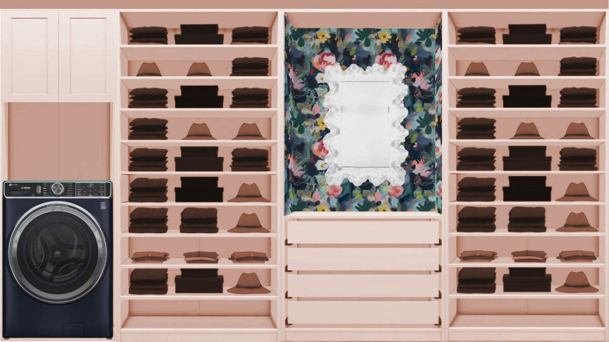
Consider adding doors or drawers to the lower part of the shelving units on either side of the wallpaper/mirror. I have similar floor to ceiling shelves in my bedroom and have found the lower shelves to be dust magnets. It was frustrating to have previously clean clothes become dusty so I’ve removed all my clothes from the lower shelves. I’m going to be adding doors to the lower shelves so that they will become usable.
Hmm I can usually pick a definite right one but these 2 are very similar and I’m leaning to Clear Vista but I’m not sure about it either. I just finished painting my kitchen cabinets blue and I agonized to get it perfect it’s such a big decision. I’d be tempted to try a couple of more samples-or at least swatches-you must have in your studio. I feel like the blue needs a little more depth/saturation.
Good luck but in the end you always pick the right one.
Did you guys do mock-ups with different shades of pink as well? Or only the coral ones? I love the light blue color for the closet, but it seems very different from what you usually do; kind of like the green kitchen. It was GORGEOUS, but ultimately not your style. Whatever you decide to do, it will be beautiful and amazing!
Clear Vista for me!