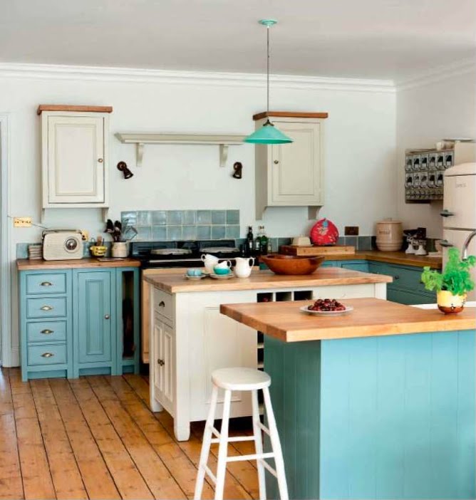
I’m feeling the need for a little completed turquoise (and aqua) kitchen inspiration this morning. There’s just something about this color, in all of its variations, that I find so invigorating.
 |
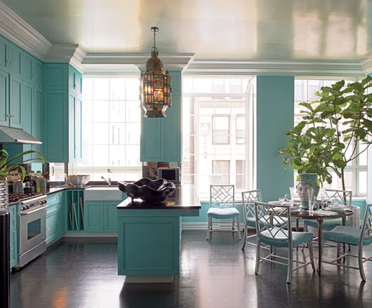
| via The Lennoxx |
So how about you? Is there a bold or bright color that really gets you going? Perhaps you’re trying to summon the courage, or perhaps you bit the bullet and went for it. Tell me about it! I bit the bullet and went for it, and I’ve never once regretted it.
Now if only I can finish it.
Addicted 2 Decorating is where I share my DIY and decorating journey as I remodel and decorate the 1948 fixer upper that my husband, Matt, and I bought in 2013. Matt has M.S. and is unable to do physical work, so I do the majority of the work on the house by myself. You can learn more about me here.


How sriking! Love the color.
I was inspired by the lining inside a little box that was a deep turquoise. When I was trying to decide what color to paint my dining room table, I thought I wanted something really different, and then I thought about that box! My table is gorgeous now, a beautiful dark turqouisey color and unlike anything anyone else has! I can't get enough of that color, but am being careful not to overdo. I have a little pop of it all through the house.
links
Aqua and Turqoise are two of my faves too and my bedroom is a beautiful shade of aqua. OF course I would LOVE to throw in a little honeysuckle.
Turquoise never fails to get me going! These examples are exactly why!!! That kitchen from The Lennox is absolutely my all-time favorite kitchen…what a dream!
Wow!! I really need to do something like this. I am so much of a black/white/tan/neutral type girl. I always see pictures like these and love them but just haven't been brave enough (for some reason) myself to actually try anything like it.
I love your kitchen — it looks fabulous. You are very inspiring and your energy is addicting.
We have light turquoise/acqua walls in our Kitchen and Family Room. At certain times of day it looks even more intense.
It was hard to go this direction because we have 12' high ceilings in rooms that together are approx 25 X 15 so that's a lot of wall space to commit to this color, but I love it. It's BM – HC-143 (Wythe Blue). Here's a link to a couple of old pictures —
Next project in the kitchen – granite counter tops and a nice back splash. I hope to finish it in this lifetime. 🙂
http://hereslucy.squarespace.com/journal/2009/7/18/hooked-on-black.html
http://hereslucy.squarespace.com/display/ShowImage?imageUrl=%2Fstorage%2Fflorida-renovations%2FFamily%2520Renovation%252015.jpg&imageTitle=201966-1638051-thumbnail.jpg
Lucy, what a beautiful color! It's interesting, because in some pictures, it looks more blue. Then in others, it looks more green. Beautiful either way!
I just painted my sewing room a shade of turquoise very similar to the Lennoxx kitchen and LOVE it. All of the trim is white, the ceiling is a metallic silver faux finish, and I'm using black and white in the accessories. Greens and blue-greens have always sung to me and I've been using them in my own homes for thirty years, but one other color that I suddenly fell in love with five or six years ago is a deep coral that I used on the walls in my living room. I was using green accents in there, but I'm about ready to switch those out for turquoise.
Your kitchen definitely inspired me to throw a splash or 2 of that glorious color around my kitchen…if I ever get to my kitchen!!!
I don't care what Pantone says, Turquoise is still my color of the year. I LOVE your turquoise cabinets.
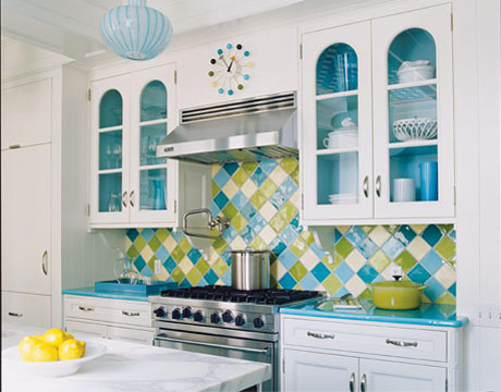
Eeeeee that backsplash in the first picture!! I love it!! 😀 Aqua is currently my favorite color (which is weird, I don't usually have a favorite color) and I'm in love with that backsplash so much!
Love The Lennoxx!
I love turquoise! It's a color that always makes me smile when I see it, so bright and cheery
My husband is threatening to conviscate my turquoise paint!
I love your kitchen — it looks fabulous. You are very inspiring and your energy is addicting.
We have light turquoise/acqua walls in our Kitchen and Family Room. At certain times of day it looks even more intense.
It was hard to go this direction because we have 12' high ceilings in rooms that together are approx 25 X 15 so that's a lot of wall space to commit to this color, but I love it. It's BM – HC-143 (Wythe Blue). Here's a link to a couple of old pictures —
Next project in the kitchen – granite counter tops and a nice back splash. I hope to finish it in this lifetime. 🙂
http://hereslucy.squarespace.com/journal/2009/7/18/hooked-on-black.html
http://hereslucy.squarespace.com/display/ShowImage?imageUrl=%2Fstorage%2Fflorida-renovations%2FFamily%2520Renovation%252015.jpg&imageTitle=201966-1638051-thumbnail.jpg
Fabulous interiors!