An Entryway Change & Sitting Room Rug Doubts
*This post contains affiliate links.
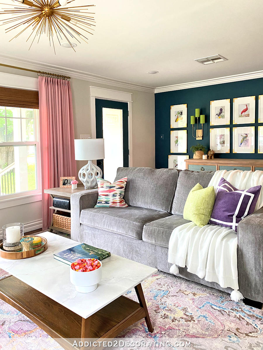
I had hoped to have the sitting room (aka, breakfast room) completely finished by now, and be well on my way to having lots of wide angle pictures of all of these finished areas to share with you by now, but as always seems to be the case, I hit a little snag. I think. I’m actually not 100% sure.
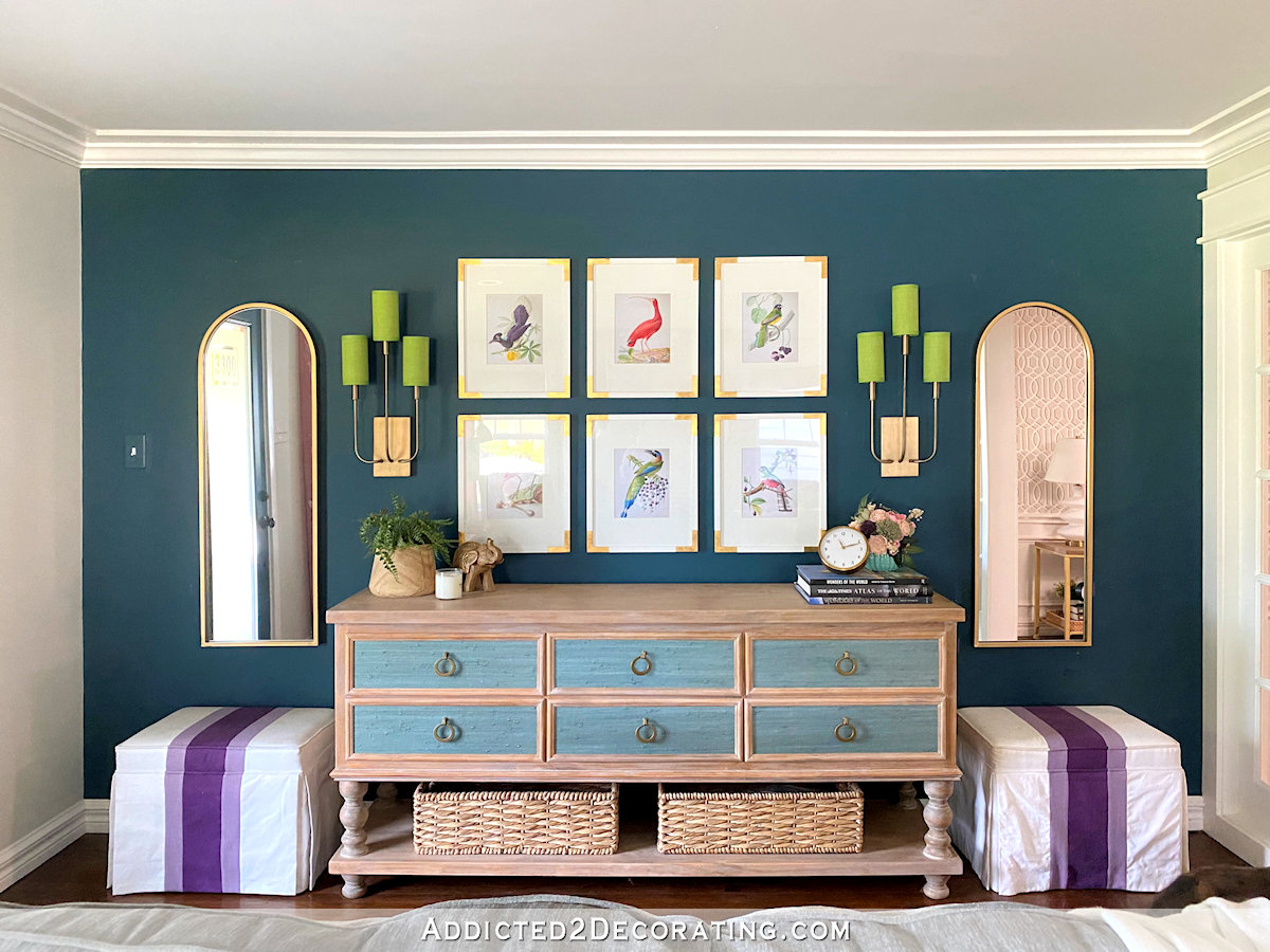
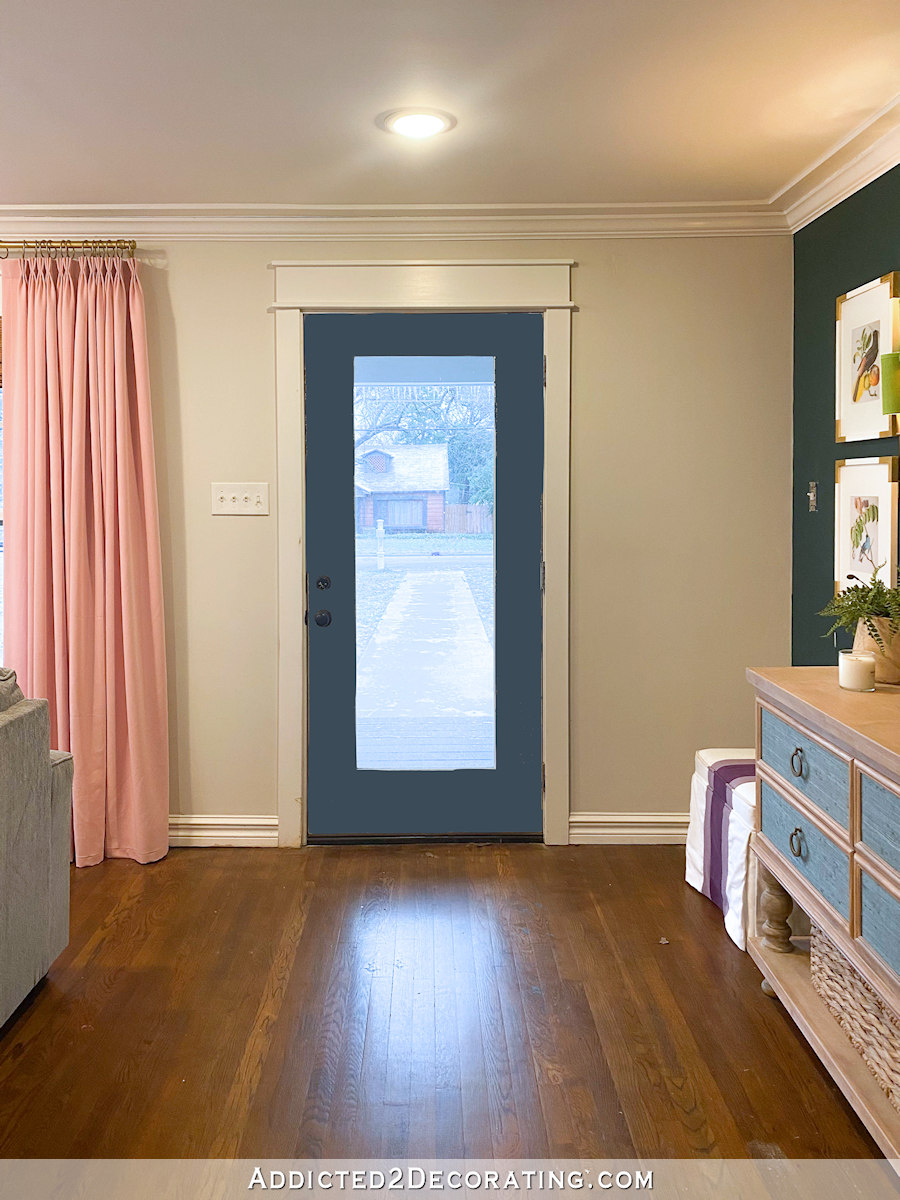
But first things first, I made a little change in the entryway. When I originally finished this area, the rest of the room was pretty far from being finished. Since the wall wasn’t balanced with anything on the other side of the room, I did a gallery wall with 12 framed bird images.
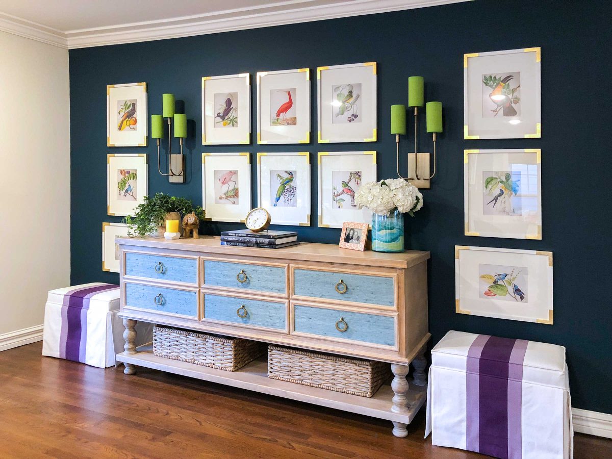
I loved it as long as that was the only finished area in the room. But ever since I finished the rest of the room, I’ve wanted to pare down the number of pictures and add mirrors that will reflect more light into this end of the room.
So I went on the hunt for interesting mirrors, and finally decided that I wanted arched mirrors. I finally found these mirrors on Amazon that were a pretty reasonable price, so I went for it.

I like the calmer look with the finished living room. I was able to keep my six favorite birds, I still get the symmetry I love so much, and now the entryway seems a little lighter than it did before.
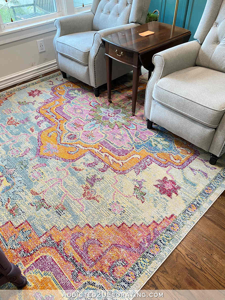
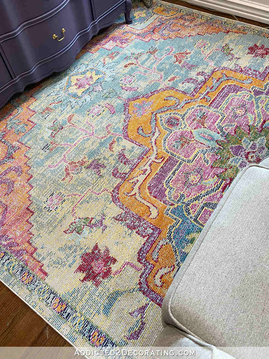
So now let’s talk about this rug. I got this rug from Overstock, and I’m just not sure about it.
(Note: If you’re reading this post on any website other than Addicted 2 Decorating, that means you’re reading on a site that is stealing my blog content. I hope you’ll consider joining me on my actual blog by clicking here.)
Have you ever purchased something for your home, and one moment you love it, while the next time you see it, you don’t? And then the next morning it seems to have grown on you again, but then during the course of the day, you’re just not sure again?
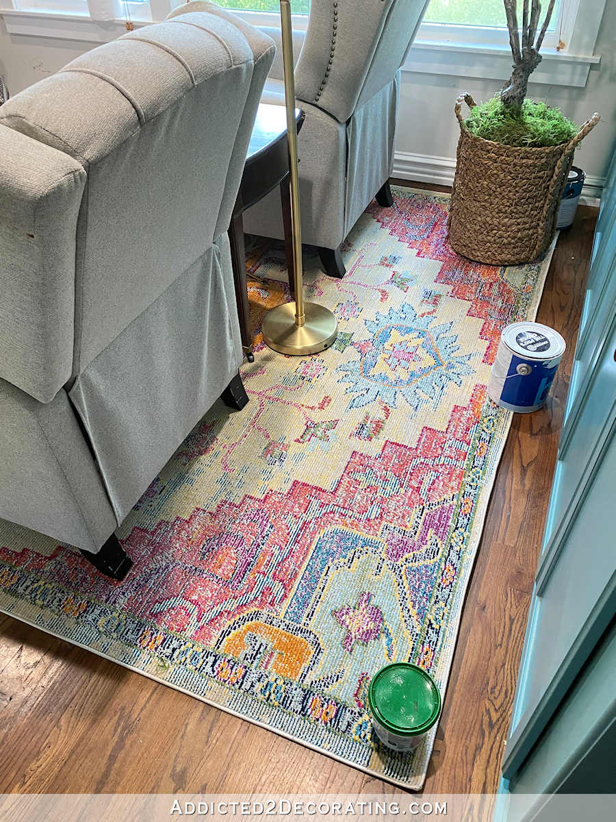
Because that’s exactly how I’ve been with this rug. I go from loving it, to disliking it, to really enjoying the colors, all in the span of a day. Or even in the span of an hour.
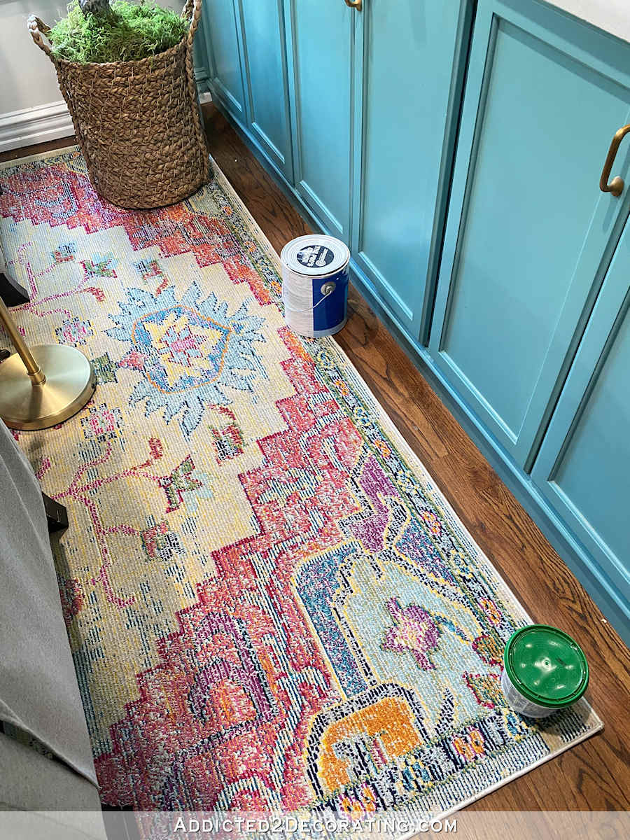
I don’t know if it’s because the room isn’t finished, or if I just really don’t want this rug in my home. And I honestly can’t even put my finger on exactly what it is about it that bothers me.
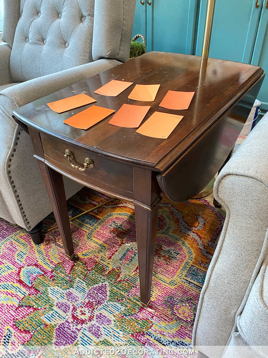
I was in need of a table to go between the chairs, so my mom gave me this table that she was no longer using. I had intended to paint it (yes…ORANGE! :-D), but now that I”m not sure about the rug, I have to hold off on painting the table as well. Plus, none of the oranges that I liked seemed to work with the rug with the exception of that one obvious one. Unfortunately, that’s the one orange that Matt didn’t like.
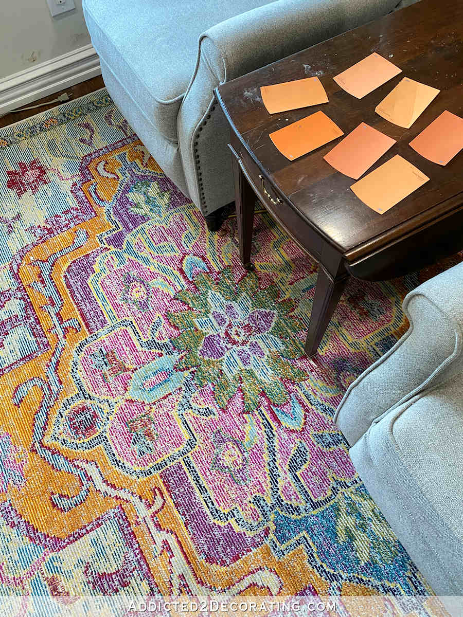
He said it didn’t matter, and I should go ahead and paint the table that color, but I’ll hold off on making that decision until I get this rug issue squared away. And in the meantime, I’ve been thinking that maybe I’ll simply strip the table and see what the natural wood color is underneath. Since every bit of wood in this room is painted (kitchen peninsula, buffet, bases of the purple benches, doors and trim), some pretty, natural wood might be just what this room needs. I do know for sure that I don’t want that dark, heavy stain in the room, so hopefully there’s some pretty wood under that dark finish.
So the rug is still in question. I went ahead and ordered a new rug for the room. This one has more blue/teal in it, but still has lots of bright colors.
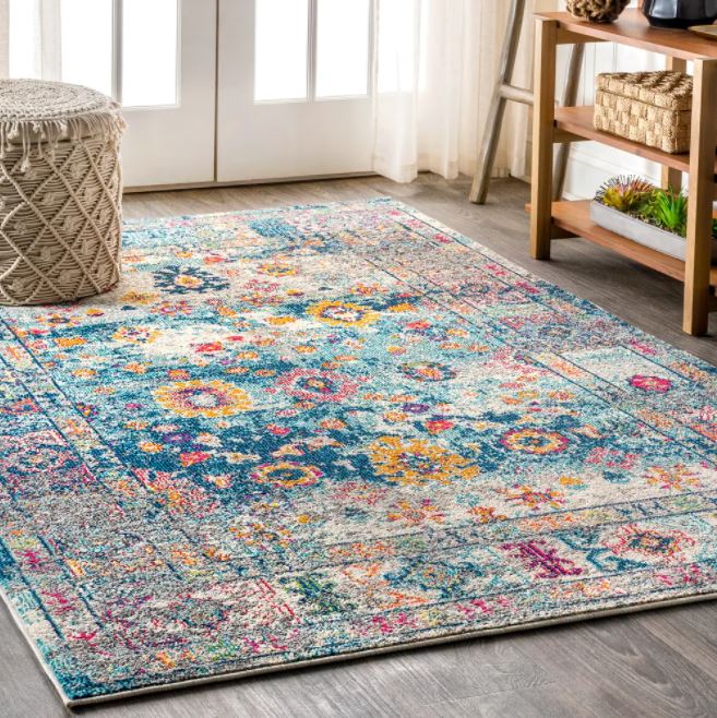
It will be here Friday, and I’m hoping that it will be immediately obvious to me which rug is the better choice for the room. If I were a betting person, my money would be on the second one, but we’ll see. How about you?

Addicted 2 Decorating is where I share my DIY and decorating journey as I remodel and decorate the 1948 fixer upper that my husband, Matt, and I bought in 2013. Matt has M.S. and is unable to do physical work, so I do the majority of the work on the house by myself. You can learn more about me here.
Your existing rug is a definite KEEPER; I adore the saturated colors.
Your Mom’s table in orange will be stunning.
I agree!! My heart yearns for this rug!! BUT…I also can relate to the uncertainty. Once that happens, I can’t unsee the “offending” item. 🙂
Entryway comment. I like the mirrors but now find the light blue on the drawers of your entry table jarring and out of place. I know you love the purple striped ottomans and wonder if a purple would be better on the drawers.
Both rugs are gorgeous. Removing the finish from the table and staining it lighter, maybe leaning on a grayish stain. It could be beautiful. I will love to see what you come up with.
Keep this rug! It’s beautiful. Would also be a nice “quiet” rug for the bedroom. Matter of fact, I’m going to attempt to purchase one for my newly painted bedroom. Love it!
I personally like the second rug better but that could be because I love blues.
Perhaps if you stick with the first rug you could paint the end table pink or purple picking that color out of the rug
instead of orange. I was gonna say I am not an orange person but then I remembered I have a burnt orange sofa and love seat in my living room. They are covered due to cats wanting to sharpen their claws on the ends so I sometimes forget what color they really are. I bought them as they looked great with my turquoise colored wall. I just think pink or purple would look better with the chairs . Of course I know what that rug looks like on the net could be
a lot different in person.
Whatever you decide I know I will love it because you have a amazing way with colors.
I think it’s because the chairs are sitting on the design. I love the rug.
Darlene, this was exactly my thought! Maybe because it cuts the design in half?
Linda
This is what l noticed. You can’t see the design. I want to suggest turning the rug 90 degrees just to if there’s a difference. However, aesthetically, it will be going in the right direction.
Perhaps the rug is just too small for all that furniture?
I thought that, too. You only see one portion of the pattern. I struggled with this when picking out a rug. think the second one will be better in that regard. I love the colors in both!
I would love to see the table in some sort of stain or natural state where you can see the grain. I’m a bit obsessive about wood, but it will be a nice counter point to all your painted pieces, I think.
Love your new rug. Brighter, fun. The first rug was dull looked faded. Didn’t add anything. You want more than just OK.
Hello Kristi,
I love the way you reason things out and yes, you have found another great area carpet. Love the blue colors. However, back to the table. I know you love to introduce color everywhere but in order for colors to shine, you need to have some neutral spaces. What about painting the table a beautiful cream or light grey and putting a book or flower on the table with orange?
I always look forward to your end result as I have been following you for a very long time.
I love the rug you already have. I like it with the soft grey of the chairs. The second one would work too but why more in the blue family?? Not as interesting. The orange table would be a pop color and super fun in that space.
I think what bothers me is the medallion is not” centered” in the room?However I love the rug and its colors
I agree…the colors are nice but bc this rug has a very obvious middle, having the chairs sit on top of it is distracting. I think the second rug will work better with the room layout for that reason.
I loved the first rug until I looked at the green in the center. That green doesn’t work with the other colors. Looking forward to seeing the second rug in the room.
When you’re in the room you see the rug two different ways. One is peripherally as part of the whole and the other is directly as you study the rug itself. Could the problem be that you love the rug itself but it doesn’t feel right it the space when it isn’t your focus? Or visa versa?
Just a thought that might help. 🙂 I like both rugs you’ve shown. I’m looking forward to seeing the new option in your room. I think it might be perfect to tie the living room in with the entryway and also the colors in the kitchen and music room.
I love color. I love your work. You go with what you want. Things are getting a bit too much, too busy for me. You be happy, it’s your house. Ironically pushing myself in my own decor, lol. Finding balance between peppy happy and mellow decor is a sweet spot I have yet to master. Either way my home has to feel like our refuge in this world
Well, I’m with you. Initially I loved the first rug. The colors were perfect. I couldn’t imagine why you didn’t want to keep it. And the more pictures I saw, I felt undecided. Then when the second rug appeared, I fell in love. again. Don’t get me wrong–I like them both, just that I like the second one more.
I like both rugs, but in such a small area, perhaps the second rug would be better. The center pattern of the first rug is a bit bold for the small size of the chairs and space. It’s really all I see, not the space as a whole. It feels like you have a statement piece that you’re trying to tone down by putting it under the chairs. The second rug’s pattern seems a bit more subtle, more comfortable for a small space. All speculation, of course, until we have side by side comparisons.
Love the first rug but, there doesn’t appear to be a dominant color in the rug or the room. Because of that the rug gets lost. I think you will find the second rug works better because of the dominant blue.
The medallion in the middle of the rug is offset, and its throwing everything off. This new rug, with an all over pattern
Will be great!
I think the 2nd rug might have too much blue. The issue I have with the 1st one is all the “white/cream” woven in with the colors. It makes the rug look like you have it showing the back/underside of the rug. Also, to me, the nap on the 2nd rug looks higher than the 1st rug. Hope that won’t be a problem for Matt. Now, the entryway….I like that you did mirrors, but they remind me of dressing mirrors that you might have in your closet or bedroom. I hoped you were going to use the frames from the photos of birds and swap out the photos for mirrors. Then the frames would all match as well as the visual sizing. You do you, of course, I’m just giving an opinion with no decorating background!
I agree that something feels off with the first rug. Reminds me of what the bottom of some rugs look like. The second one you have on order is definitely something I like more, but unless you’re putting my address to deliver it to, the final decision is up to you! 🙂
I like the second rug. The first doesn’t seem to go with your style as much since it has, to my eye, more of a southwest look. I also agree with another commenter about the symmetry of the medallion not being centered in the room. The second rug doesn’t have as pronounced a center. I also like the overall design better. Does it work with your teal walls though? That’s the more important question.
Is the rug too big for the area? What if you angled it to make it a bit more funky?
The only standard size that can fit in the area is an 8 x 10. The room is kind of small, and I don’t want the rug to be in the traffic area from the kitchen to my studio. So that leaves an area that’s about 9′ x 11.5′. The next size down is a 5′ x 7′, which is too small to fit under two recliners with a table in between.
The second rug has more teal/blue, which you already have a lot of in your home. I like the first rug because of the brighter colors, and if you do strip the table to a natural finish, it might come out as a light orange, which would warm up that room. Of course, trying both the rugs will make the decision for you. I like that Matt is willing to give his preferences too!
He’s generally only good at telling me what he DOESN’T like. 😀 So now, after 18 years of marriage, I find out that he doesn’t like orange. Ha!
Well, now! You’re like me. I get something I think I love then It hits me that it doesn’t look just right! I truly sympathize. Now, let’s talk rug. The rug you have now has a definite central design. Since the room is smaller, the chairs cover most of the central design and it bugs you! I think the new blue rug is definitely a better choice. Especially if you’re like me, once I think it is not “perfect” .… well, it will bug the ever-living-daylights out of me!
Get the new rug, wait till it’s in the room before touching the table! I’m sure you’ll make the perfect decision for you and for Matt. He has given you free reign for most everything, so please don’t do orange if he is not pleased.
I agree with some of the others as to whether it’s because the rug is partially hidden.
I also wonder whether you just need to repaint one or two of the plates above the tv. Particularly with the pink, could it be that the pink doesn’t feel like it fits because there’s nothing else in that room that is pink (I think the pictures are more teal/green from memory).
If you’re having doubts about the rug, you’re always going to have doubts about it. No point in settling, or trying to force yourself to ALWAYS like it. Move on to find something you love every time you look at it, no matter how long the search takes.
Kristi, I love it all but was wondering if your new mirrors would work even better if the top of them were even with the top of the pictures? Just a thought!
I tried one of them that way, and didn’t like the big space between the bottom of the mirror and the ottoman.
Two thoughts: yes, the off-centering of the medallion is very distracting, and I think it’s the strong orange shade in the rug that’s jarring your eye – it’s too predominant and not worthy of adding more on the table. Stripping the wood may introduce a softer shade but I also like the idea of using the same purple on the table that’s on the dresser. No need to bring in yet another color, neither orange or pink. All that to say – rug #2!!
Weird that the medallion is not centered. Have you tried If you tried flipping the current rug around? Would that look more centered?
The medallion is centered on the rug and in the room. It’s the chairs that aren’t centered. But if I center them in the room, they feel too close to the TV.
I definitely like the new choice better in that room. Would the first rug work in the studio where you can actually see the design?
That might work!
I have a table very very similar to yours. I ruined the finish because a planter leaked. After sanding mine appears to be cherry? I ended up painting it but I love my table!
I vote for the 2nd one. The first has your colors but the design does not work with your furniture. The design becomes chaotic.
I like both rugs. The first one is too big, needed to be in a smaller size in order to fit in. The second seems to have a great color combination for the area and pattern is a smaller scale.
Not as much a fan of rug #1. Not sure if it is the texture (almost looks like it is upside down), or that specific orange, but that said, how would it look in your music room where pinks and corals are featured? I hope the 2nd one works, but I am sure you will know when you see it. As for the mirrors in the entryway, I like it either way. The mirrors do seem to bounce a bit more light in that area.
It would probably look really good, but I just can’t put a rug in there. It needs to remain clear and open for Matt.
Second rug is better. The patches of orange and red are too large in the existing so they compete with the painted finishes in the room instead of enhancing them. I would definitely strip the table and go natural wood with maybe a simple tung or linseed oil finish.
I love the rug on the floor now! You have enough blue and blue tones in the kitchen etc. The pink and orange are a nice variation while still looking like the living room rug. Good choice!
I think the table just in a wood tone would be great, no more color you got lots!
I like the colours of the first rug a lot, but I really don’t like the pattern. It’s too big or cartoony or not abstract enough. The second rug looks really beautiful.
Without reading any of the comments, my choice is definitely the rug you already have down on the floor. It is perfect for that room, in every way.
The first rug is great. It pulls everything together. I am not a person who mixes so many colors but you do it so well. That existing rug is perfect.
I really liked the first rug until I saw the second rug! Is there another room to use the first rug in?
The only other possibility would be my studio. I might try it and see.
hmmm… to me, it looks like the first rug is turned over and that I’m looking at the underside, not the plush topside. I know which ever one you decide on will be great, though!
I have to say I prefer the bird prints over the mirrors. But both look good. As for the rug…I think you may not care for it because the vibrant colors look a bit worn. I love it for this reason. But you need clear vibrant color to be in love. Also the pattern is somewhat off kilter with the chairs. So something without a distinct pattern un the middle may be a good choice. I love that you are creating a sitting room in there. Making the home fit your lifestyle is key. An odd queation… Do you ever find time to play your piano?
Sheila F.
Sadly, I haven’t played in about a year. 🙁 I need to get the piano tuned. If it sounded its best, I might be more motivated to make time to play.
Perhaps the rug is a size too large – usually I try for a size that leaves a 6″ – 12″ margin all around it…maybe with more floor margin around the rug, you would like it more…
Entryway comment. I like the mirrors but now find the light blue on the drawers of your entry table jarring and out of place. I know you love the purple striped ottomans and wonder if a purple would be better on the drawers.
Are you sure it is the colors etc. that is bothering you about the rug or maybe it is the placement of it. It appears a bit too large. A smaller one or maybe turned the other direction so you could see the pattern better. Right now it seems cut-off in the middle and that would be bothering me, but I like symmetry probably a little too much 😉
I ordered a rug for my living room. Traffic cone orange. I loved it online, but once it arrived, it seemed like too much for me. Guess what? I kept it. I lived with it. I like it for what it is now. It brings life to the room. It’s not my favorite of all favorite rugs, but it’s still a good rug. No need to keep puttering around in the sitting room when you have a rug that works just fine as it is.
I’m actually not “puttering around.” I’m designing a home that I want to love being in. That takes time.
While I realize you are an Artist (meant sincerely) it seems you just can’t “leave well enough alone”. The incessant re-working of areas, while NOT “finishing” other areas, is, IMO cause for concern.
I am “reworking” this area because of my husband’s request for a place for a recliner, and this was the only room. Should I have ignored his request, put the table back in here, and moved on to something else? I hardly see how making a space that my husband requested is “cause for concern.” Nor is it “cause for concern” when changing the use of a room (again, at my husband’s request) leads to decorating changes for someone who is an interior decorator and DIY/decorating blogger.
It could be the center medallion with furniture sitting on it that bothers you, as others have said, but I wonder if it might also be the popular faded-vintage look in this rug that isn’t quite you? For the record, I like them both and the new mirrors look great.
Love the new rug coming. This one looks off to me too. And it’ll bug you forever being it’s not perfect for you now!
Love the mirrors in the entryway!!
Can’t wait to see the other rug in there!
Rug #2 is my vote!!
Loving the entryway also!!
Okay – this may seem crazy, but I read an article by a designer a long time ago and she said she likes to flip rugs over because she enjoys the muted colors. I know you love color, but if there isn’t obvious knots and finishing threads on the back side, it might be an idea to consider. In general I think it’s a great rug, but if something feels off for you, I understand.
Personally I love orange, and I know that colors probably aren’t true on a device, but none of the orange swatches look to match to the orange in the rug, to me. They seem to have to be a salmon rather than that true orange in the rug. But I can’t imagine you would get color tones that off. I’m really hoping your new rug works and you will know which direction to go on the table. You’ve bleached wood, haven’t you, in some diy?
The countertop in the pantry is bleached wood. And I’m pretty sure I’ve bleached wood on another project, although I can’t remember right now.
I love the new entryway mirrors! It does look lighter and simpler and I think it looks great!
I do like the 2nd rug better. But I’m excited to see which you choose and what you come up with for this room. I know it will be great!
The rug doesn’t have that natural-looking worn pattern. It kind of looks like the color didn’t go on it correctly… I don’t know how to explain it, but the coloring is off. The new rug you ordered is absolutely gorgeous!
Those orange colors for the table are so pretty and I think they would really compliment the other colors in the room. I love the way you coordinate colors!
In an effort to identify what you don’t like about it — I think for me it’s the jarring relatively square/geometric parts in two different scales that don’t seem to flow with the rest of the natural elements of the rug. I think? Hopefully the second one will be something you love 100% of the time!
Really like the rugs. Especially the new rug with low/no pile. It compliments wihtout being too matchy.
Love the idea of a natural wood element in the sitting room. There’s a LOT of paint going on, something natural would be a good addition.
Is the rug too big for where it’s at? It seems odd to me that it extends beyond the back of the chairs and under the sideboard. It might make more sense in a larger view of the room, but it seems too big for the placement to me. Also agree with others, that if the placement remains the same something without a center medallion might be the way to go.
Unfortunately, it’s kind of a small and awkward space, and this is the only size that works in there.
I agree with JenW. I think the design of your current rug is not the true issue; it’s the size. I think a 6×9, 8×8 or even a 5×7 would be perfect to ground the chairs and make a comfy landing spot for you and Matt.
What size rug was under the table in the original configuration of the room as a breakfast/eating space? I would probably go with a similar size for your current situation.
Your home is looking so good! I’ve learned So Much from you over the years. You are a master of so many mediums and areas. We followed your cabinet painting protocol when we renovated our RV, which we refer to as the “Love Nest” and the cabinets turned out perfectly.
Much blessing and success is wished, and prayed, for you and Matt.
YHWH Bless You : )
Mrs. David
The first thing I see when I look at the rug is the Taj Mahal poking out from the chairs . I can’t unsee it. It takes the room in a different direction from the rest of the rooms.
I like both rugs, but I L❤️VE the first one! It’s the colors that I just adore!!!!!!!
I really do like the 1st rug. I think it’s only the dramatic scale of the pattern that’s throwing things a bit off. Room size, walkways, etc. dictate furniture placement, and the rugs we love don’t always cooperate. The 2nd rug has a more all-over pattern, and the colors still work. I think you’ll find that it’s probably better suited for your particular room. Agree with other commenters that the 1st rug would be fun to use in the music room.
I like the more abstract pattern of the second rug and also the colors. Having a more abstract pattern negates the off-center look of the first rug. A medium stain on the table between the chairs would be a good. Would love to see a fun, funky drawer pull in a color or pattern.
The blue on the front hall console seems a little out of place. Maybe a warm color would be better. A muted shade of the rosy color might work.