Bedroom Dresser Progress (Or, The Opposite Of Progress)
Alright, y’all. I feel like I have to preface this post by telling y’all that I don’t drink. As in, not at all. I don’t drink socially. I don’t drink at home. I’ve never been drunk a single time in my entire life.
The reason that I’m telling you that is because if I hadn’t prefaced with that, and I had just jumped right to showing you the paint color decisions I made over the last two days, you might be tempted to think that I spent my weekend choosing paint colors while inebriated. I can assure you that didn’t happen. I almost wish it were true because at least I’d have an excuse. But as it stands, I have no valid excuse.
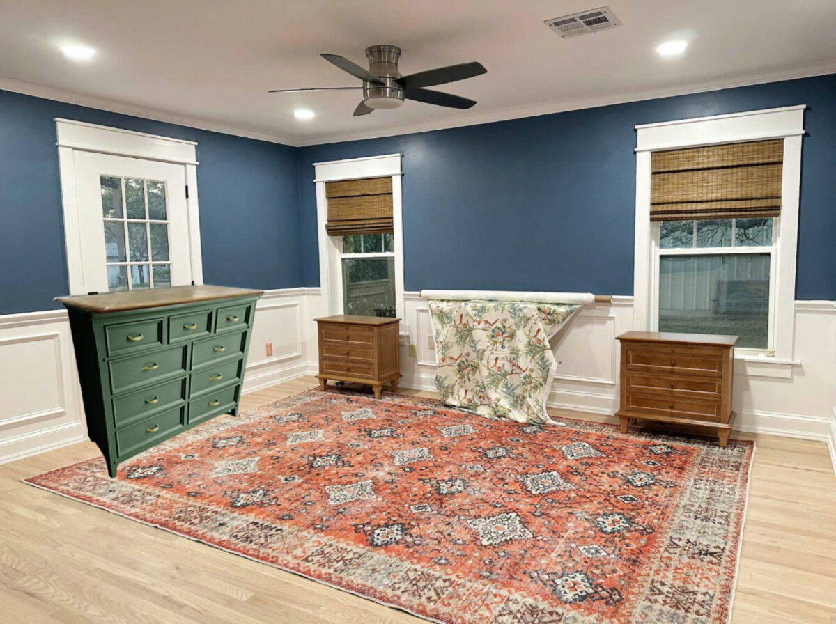
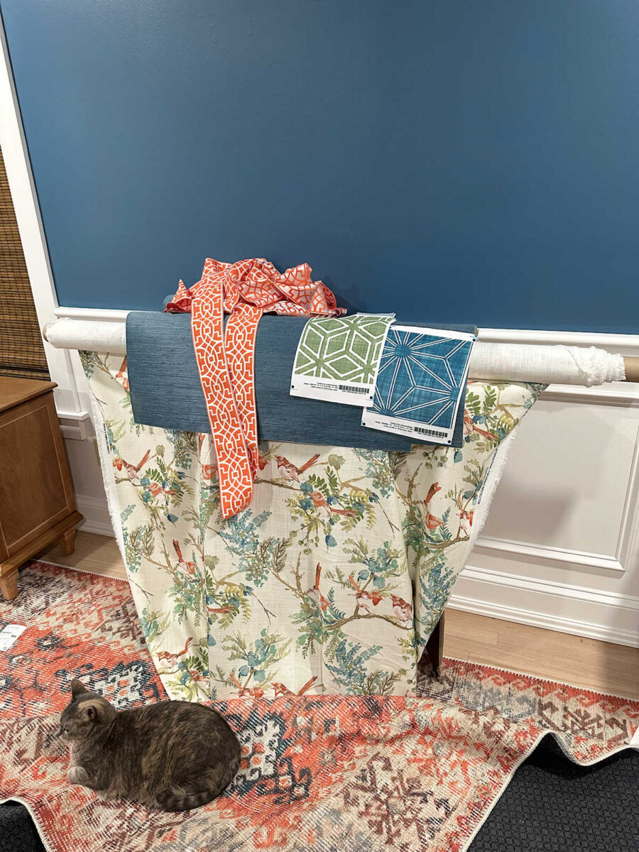
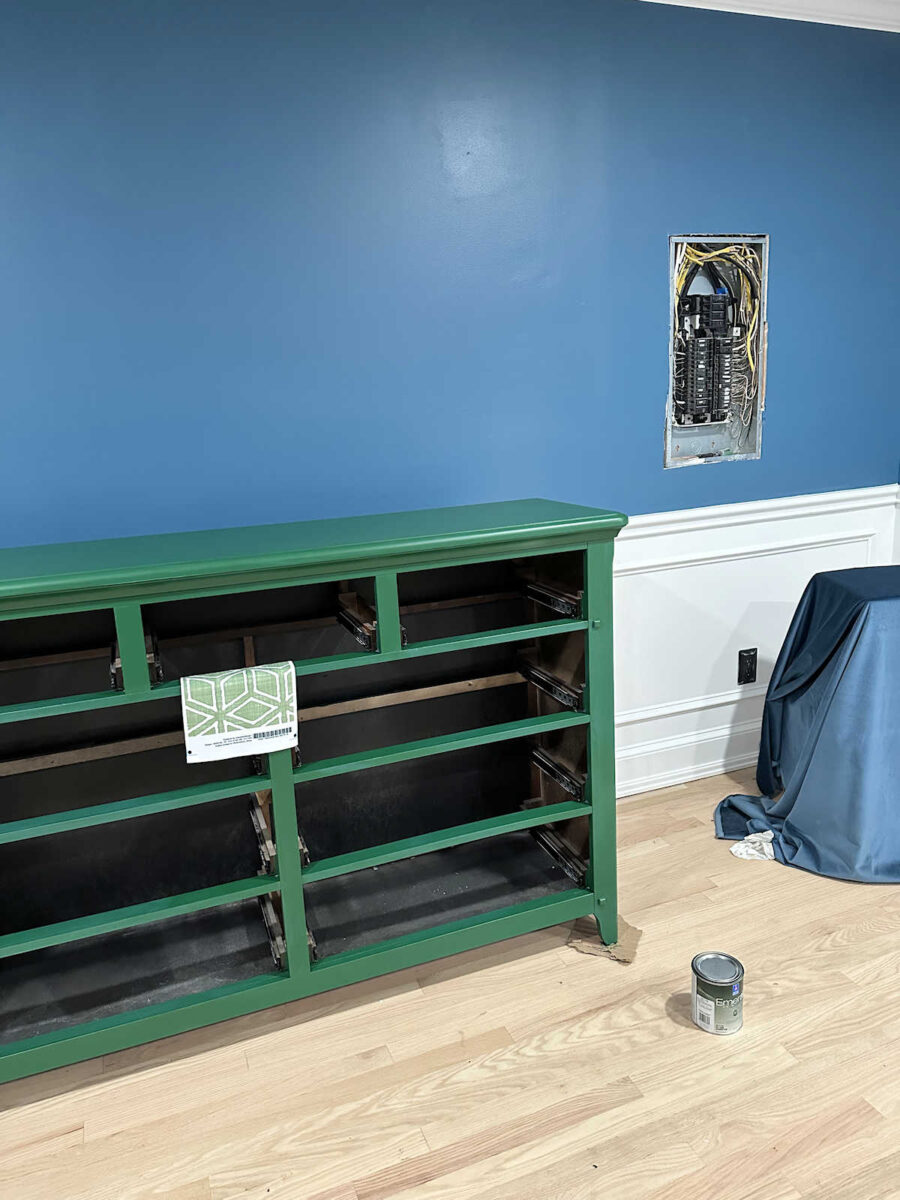
So Saturday morning, I posted the neutral paint samples I had picked up for the bedroom dresser. I didn’t like a single one of them, so I did three mockups of the dresser in green, orange, and coral. Of those, the green was my favorite. I actually really liked this green.
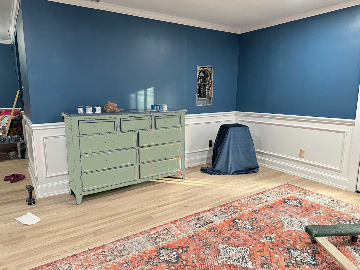
After deciding on green, I headed to Home Depot to get paint, and somehow I wound up with this. 😀 I mean, I can’t even explain it. I can generally tell you how my thought processes work, and how I wind up making a certain decision. But this? I have no explanation for it. But just so that I can save face here, I’m going to blame it on the Home Depot fluorescent lighting, okay?
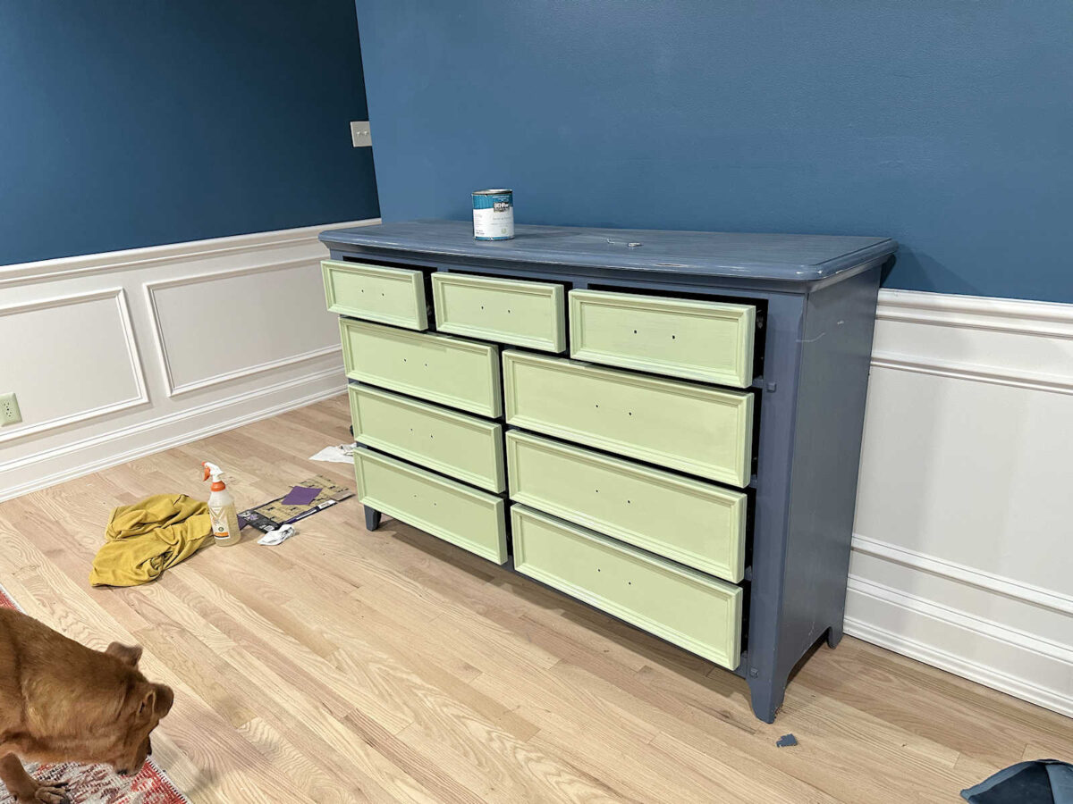
So then yesterday, I went to Sherwin Williams to see what they had. My mom had suggested that I use a much darker green so that it wouldn’t demand so much attention. She thought a darker green might kind of fade away and not become a focal point. So I went with this color.
And yeah. It’s all wrong. I only had one coat left to go on the drawers, and it would have been finished. Finished…and completely wrong.
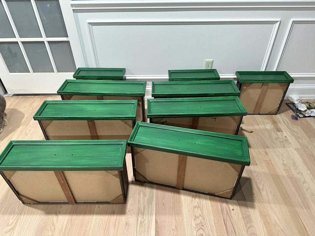
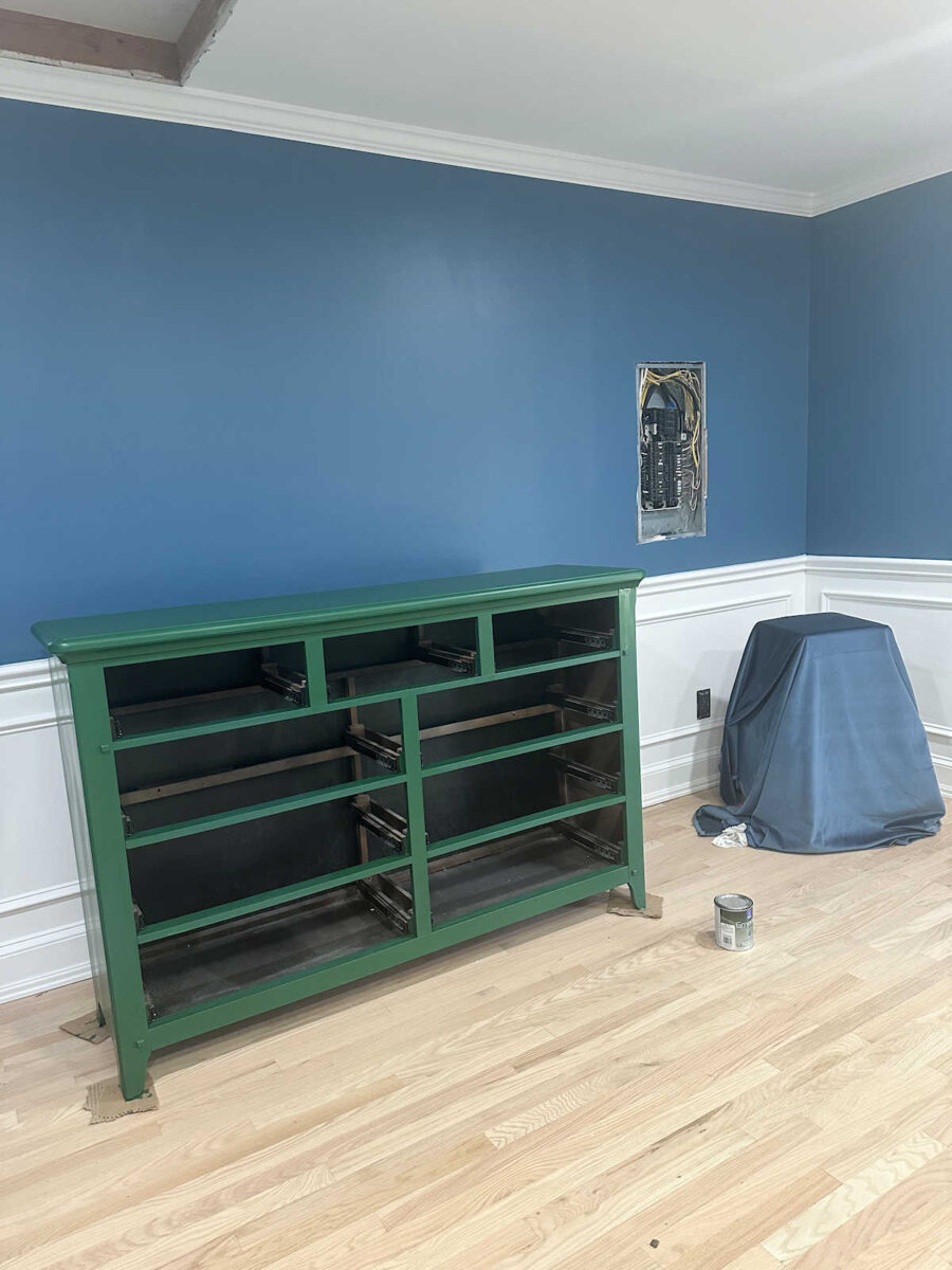
So here’s that dark green after two coats of paint. I think the color is called Shamrock. The picture looks funny because I sent it to my mom, and I had folded the area rug back onto itself, so the really dark gray backing on the rug was showing. She removed that because it was really distracting.
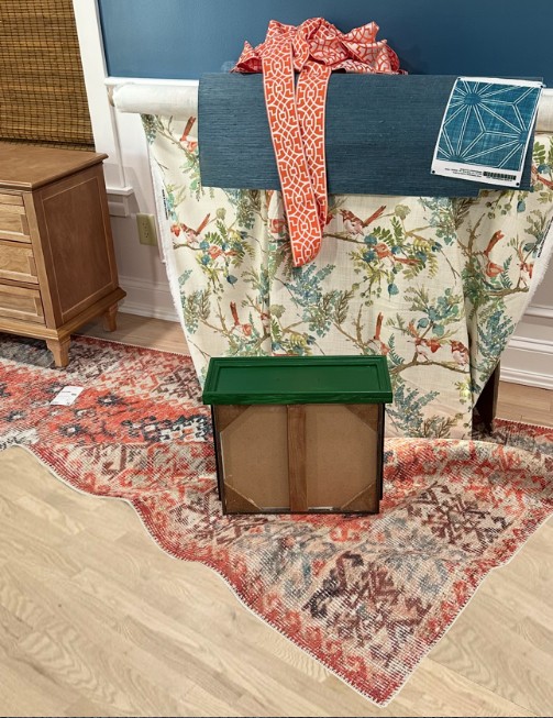
And then she tweaked the color of the drawer and sent it back to me. She thinks I should go more this direction with the green.
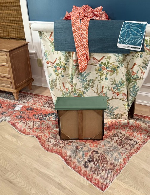
And then she did a mockup of the dresser with the rug and other items.
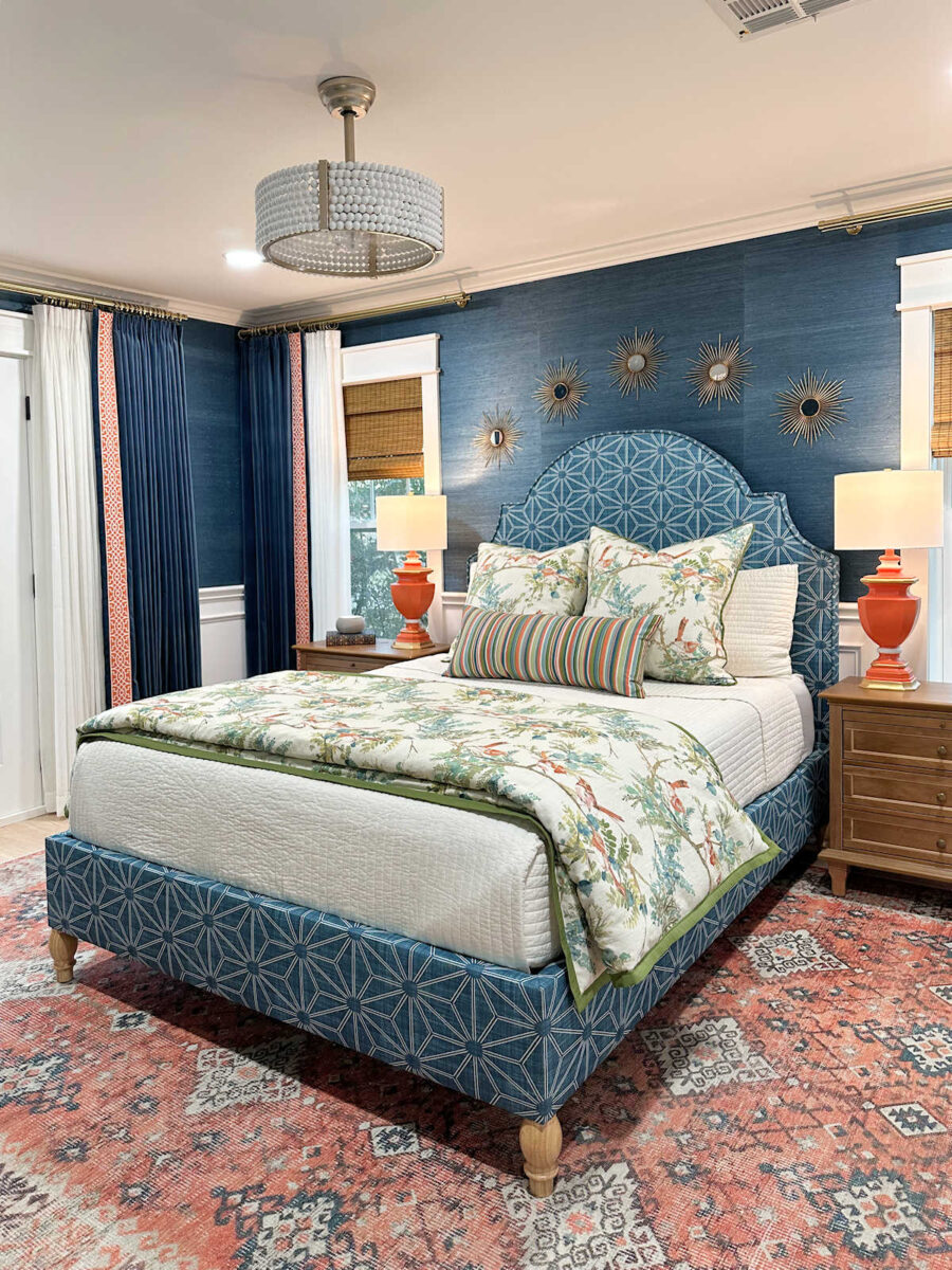
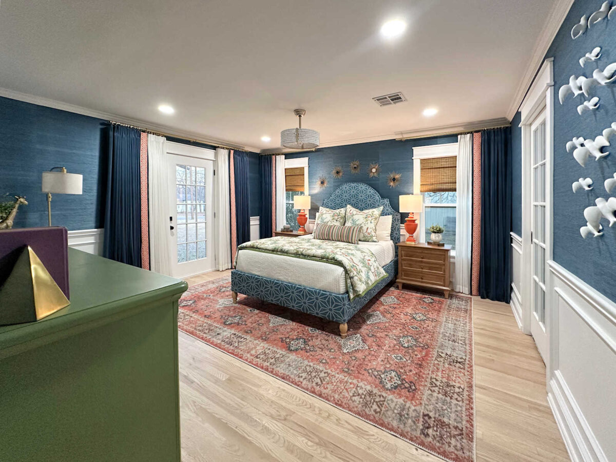
Here’s the deal. I like that green. I think it’s very pretty. I even think it goes really great with the room and the fabric. In fact, it’s pretty perfect as far as going with the bird fabric.
But it doesn’t look like a color that goes in my house. It looks perfect for someone else’s house, though. For my house, it needs to be a bit brighter, clearer, and livelier. So I went back to the fabric samples that I had purchased for the foyer bench. I’m going to use this green cube print on that bench, and that green happens to go pretty great with the bird fabric.
So I’m going to try again today, and I hope to end up with something that actually looks good but doesn’t demand to be the focal point. I’m not feeling too confident right now, but we’ll see what I can come up with. Maybe I can actually pull this off.
More About Our Master Bedroom
see all master
bedroom diy projects
read all master
bedroom blog posts

Addicted 2 Decorating is where I share my DIY and decorating journey as I remodel and decorate the 1948 fixer upper that my husband, Matt, and I bought in 2013. Matt has M.S. and is unable to do physical work, so I do the majority of the work on the house by myself. You can learn more about me here.


I think the greens you used on the dresser are too blue. The greens in the bird fabric have more yellow than blue in them. I love the darkest mossy green leaves in the bird fabric. I know you like bright colors but the grass cloth is not a bright shade of blue and the orange and corals in the rug and bird fabric are not very bright so I think the green you use needs to be a bit less bright. The green cube fabric looks like a perfect shade of green displayed with the grass cloth, bird fabric, headboard fabric and rug. The green cube fabric appears a bit brighter displayed on the green dresser.
I like the Pure Earth neutral the best. It looks so good against the wooden floor and picks up parts of the bird print as well. To me, the greens fight with that gorgeous blue wall.
I agree. I’m a lover of color, but that is a lovely shade. Green is my favorite color, but non of them look right on the dresser, especially the brighter/cleaner ones.
For what it’s worth….not a fan of green. I’m a teal, pink, coral kind of gal. I’m sure whatever colour you pick….it will look amazing! It’s a process sometimes isn’t it?
Here I was thinking (after a brief skim through the previous dresser post) that you oughta just paint the dresser the same color white as the wainscoting. Why try to find a different coordinating neutral when you have one that will definitely blend into what’s already there! However. I have a green dresser myself and have loved it for 13+ years in 3 houses, so I’m certainly fine with going for a green 😉
Off subject here. What did you decide to do with the wallpaper? Are you hiring it done?
You certainly have patience, with analyzing and getting every detail just right.
She’s DIY’ing the wallpaper. There is no one in her area that hangs paper.
I was wondering that my self. Hard to believe in a town the size of Waco she couldn’t find anyone who hangs wallpaper.
I am a lover of the color green as an accent or as neutral and I especially like blues and greens! I think your green needs to have a brown undertone or a gray-brown undertone. Of course,that’s only what I think and I also think that if anybody can pull this off and make the green you have work, it’s YOU!! I am excited to see the completed room!
They gave you Christmas Green! You need a mossy green, a faded green like if it was washed out from sunlight. But I’m not sure green is the way to go, as it isn’t a strong enough color to be on its own. I hope I’m proven wrong, but I think a soft Coral will have a better balance. ( And I love green, it’s in most of my home!)
I think you should paint it teal either like your walls or slightly darker. Teal is your main colour and the grasscloth will add texture and the corals and greens through your accessories will add interest. I think the dresser is too big to be a different colour, just like your bed.
Lol…I have to laugh, isn’t shamrock a color you rejected in your kitchen at one point? After I commented yesterday and looked again at the pics, I think using a color from the foyer, since it’s visible from that direction, is a great idea.
Kristi,
I’m not so good with color, so won’t post any suggestions on what color your dresser should be. I know that whatever you choose, it will be stunning because you never give up until it’s right. I also know that the lighting at Home Depot distorting paint colors is REAL!
First, I wish I had seen your color selection post yesterday. If you haven’t set your mind on that last shade of green, please consider Sherwin Williams Acacia Haze. It’s a medium muted green that I think will pull the darker green color from the bird fabric yet behave as a neutral at the same time.
https://www.sherwin-williams.com/en-us/color/color-family/green-paint-colors/SW9132-acacia-haze
Another decent option is Sherwin Williams Leaflet
https://www.sherwin-williams.com/en-us/color/color-family/green-paint-colors/SW9674-leaflet
I understand this is a difficult choice and I don’t envy you for a minute. I definitely feel the coral should be left to the rug and other accessories.
Best wishes choosing and I can’t wait to see what you do! It always works out beautifully in the end result! Keep the faith!
I love the Acacia Haze color! I need to use that in my home.
I really like the Acacia green. Looks perfect.
That’s what I think I would have chosen–the fern color–if not the soft coral.
Are you secretly trying to punish yourself for some unknown decorating mishap? 😉 Haven’t you tried green in that tone several times in your house and you end up changing it fairly quickly? But…it’s only paint.
I thought the same! That emerald has made an appearance several times but never sticks around too long. I have things like that…I like them on their own, but not in MY house. But I keep trying to make them work.
I still vote for a neutral metallic paint, silver or one of the many beautiful golds that are available now.
I love the green your Mom did in mockup.
Your goals of “brighter, clearer, and livelier” and “not a focal point” are at odds with each other. I understand you want the bed wall to be the main focus but when you’re IN bed, you can’t see it so there’s nothing wrong with having something nice for YOU to look at on that side of the room. It would be unbalanced to have all the pretty decor on one side of the room. I understand you don’t want to overshadow the bed wall but you owe yourself something pretty to see when you wake up in the morning!
I definitely like the SW Leaflet. It isn’t as saturated as you normally choose, but that is what keeps it from competing for a focal point.
Oh Heavens! That first green reminded me of a custom color I had done for our master suite in our house when we were stationed at West Point. One of our more smarty pants cadets, whom we had known since he was in 8th grade, commented that at least we wouldn’t need any nightlights in the room. We dubbed it “Thermal Nuclear Mint”. I see that color every once in a while, and we all just laugh, but at the time it was hideous, a custom paint, so I couldn’t return it. So, I just painted the room and then did a nice whiteish/gray spongey thing over it, and it did tone it down, and I was grateful we were only stationed there for 38 months. Pretty sure if we stayed any longer and they would have been making us pee in a cup to see if we were dropping acid or smoking something, this color was literally seizure-inducing, if not an outright hallucinogen. I have been forbidden to use any greens in any of our houses since then, although I sneak a few in, you’d be hard pressed to consider them “green”, more gray than green. I know you’ll find the color; you always do.
Cheers to you, Matt, and of course the Fur Inspectors!
I’ve probably painted as many colors on as many things as you have, if not more, and I have learned that GREEN is the most difficult color to get right! I fervently believe you need to get all your fabric and wallpaper done before you settle on a paint for the dresser, especially if it’s going to be green. And another thing that helps tremendously is to have your own fan deck from your preferred paint company. That way you see the color in your space before you ever enter home depot! Color will never be right chosen under that lighting.
Now, having said all that, I still think black (or charcoal) would be my choice for the dresser. 😄
Your comment about green is also true for quilt fabrics!
Oh, my.
What about the green from your studio back entrance walls? It’s a more sage-y color than that emerald green.
Good luck today! I actually like the green, or maybe a green closer to your “Kovi” color swatch. It seems to me that if you add too many colors, all competing, the room will lose the tranquil vibe.
Bedrooms should invite a restful and peaceful space
Good luck today! I actually like the green, or maybe a green closer to your “Kovi” color swatch. But not the bright Apple green!
It seems to me that when you add too many colors, all competing, the room will lose the tranquil vibe.
Bedrooms should invite a restful and peaceful space
what about that sage green everybody is using these days?
I’ve enjoyed your blog for years. You’ve worked so so hard and taken care of your husband. All the things you’ve built, designed are admirable. It’s your home it should be as you like it. Im going to have to bow out for awhile. The lamentations that happen over something like the dresser color are very stressful to read. Why not take pressure off yourself and wait til more of the room is complete? The color your Mother sent is beautiful. Not for you, okay. Every color in your home must be colorful? Why, it’s the most pleasing to you? Maybe it would be a good time to loosen the grip on your own rules and have more freedom and enjoyment from your incredibly hard work? You put yourself in a tight vice of pressure unnecessarily. You’re a Christian, but have we ever read you say what does the Lord want? Perhaps you have and I missed it. I’m not scolding you, I’m at least 20 if not more years older than you. Only that my dear girl, we, myself included must be open to change and adapt. If you aren’t open or willing for this, you’ll cause yourself a lot of hurt. Talk to your Mom about it see what she might say.
Are you for real?
I like the green in that fabric swatch – and I would like it just fine on the dresser if it weren’t for the teal grass cloth that is going to be on the wall. I know you don’t care for neutrals but the Pure Earth colour you sampled yesterday is still your best bet IMHO. Not everything must be a focal point and you are going to have a strongly coloured velvet chair right beside this dresser – with an opportunity to link it to the dresser with cushions or a throw.
Looking at the different greens that you are considering, the green on the cube print would work really well on the dresser with the other design elements in the room. It does reference the bird print, and contrasts nicely with the walls, rug, curtains.
It also would create a really nice design moment of its own in that corner, that will consist of your chair, some artwork, a tray or items on the dresser top, etc. and will help to balance it out.
Personally I would recommend staining the dresser top to coordinate to the other wood elements in the room. That would help to alleviate it competing with the real focal points which are (as I see it) the bird print, rug, lamps.
It will be interesting to see what you decide.
I kinda like that idea of staining the top. If it’s possible.
I saw a dresser yesterday and so mad at myself for not copying the link for you. It was perfect for you (IMO). The dresser was stained on the sides and then the fronts had a geometric beige/cream pattern (similar to the shapes in the headboard fabric you shared) on the fronts, then there were beautiful long brass knobs.
I saw a few people suggest adding wallpaper to the fronts and thought to myself, Oh heck no! But then I saw that dresser and thought, that would still keep it neutral, allow some color, pattern, and pizzazz!
I know it will come to you and you will get it figured out. Good luck!
Kristi …. I absolutely LOVE your green cube fabric for your dresser. It’s perfect IMHO. Go for it!!
Have you thought about doing a tobacco-ish color on the dresser to pull the color off the window shades? I think that would provide some weight and balance to the room. A big, bright green dresser will 100% compete with everything else in the room for attention.
Mama knows best! I hear what you’re saying about your love for more clear colors, but it’s just one dresser that wants her moment to be a little different from all her friends.