Bedroom Table Lamp Makeover — Before And After
I’ve been working on my new lamps over the last couple of days, and while I didn’t quite get both of them finished, I did at least get one finished. I may make some tweaks, which I’ll explain when I show you what the lamp looks like so far. But even without those tweaks, I’m so excited about how it turned out.
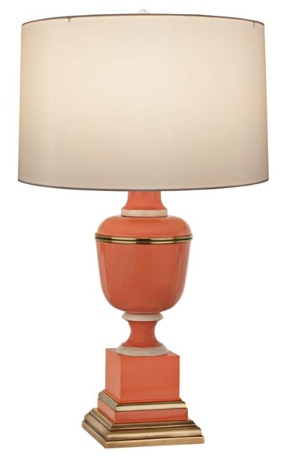
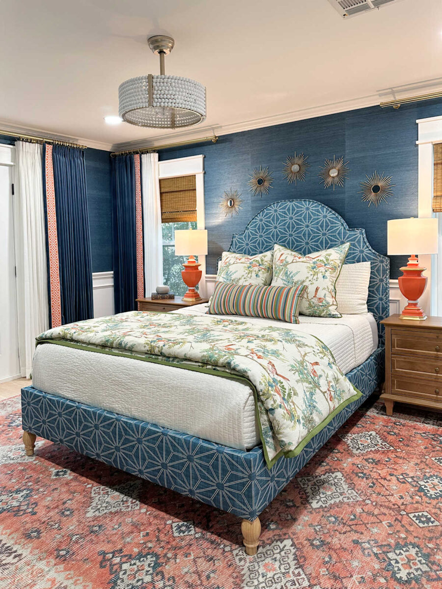
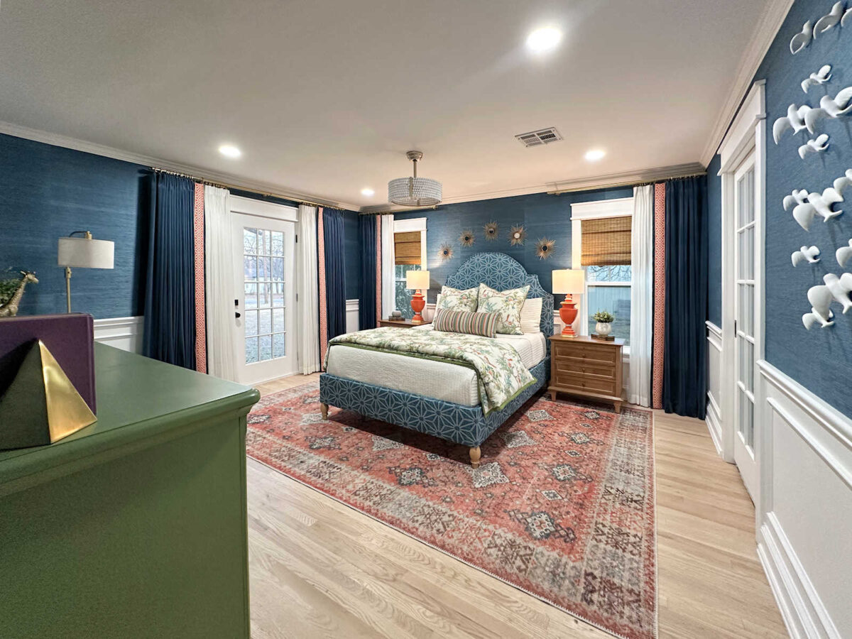
If you’ll remember, this Robert Abbey Tangerine table lamp from Lamps Plus (affiliate link) is the lamp I really wanted, but there was no way I was going to pay over $1700 for two lamps for our bedroom.
So after a pretty exhaustive search for a lamp that I could work some DIY magic on to make it look similar, I finally found two of these lamps on Facebook Marketplace for the amazing price of $40 for both.
I actually liked the shape of these better than the original lamp, so I was excited to find them. But because of my excitement over the shape and size, I overlooked just how heavily textured they were.
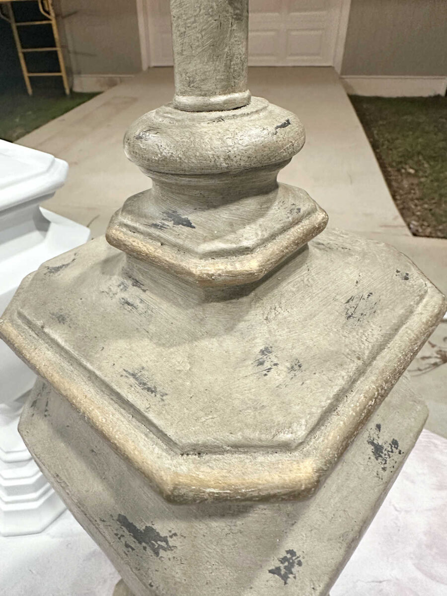
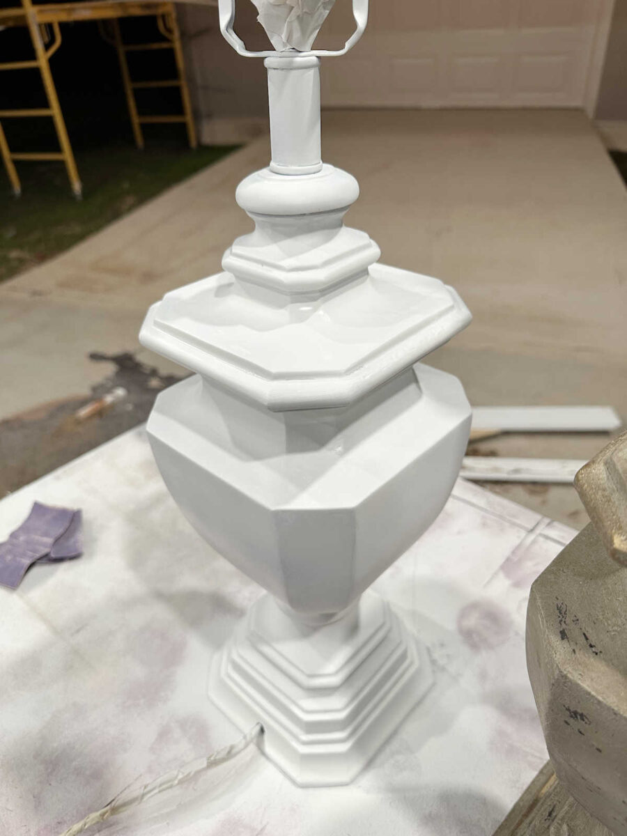
So they required quite a bit more prep work than I had anticipated. But after a lot of sanding, I finally got all of that heavy texture smoothed out so that I could paint them. I did most of the sanding by hand with 80-grit sandpaper followed up by 220-grit sandpaper. But I did use my orbital sander for the larger flat areas. I tried using my Dremel with a detail sanding attachment for the smaller areas, but it was too powerful, making it way too easy to dig into the actual resin. After it was sanded smooth, it looked like an even bigger mess, but at least I had a smooth base to work with.

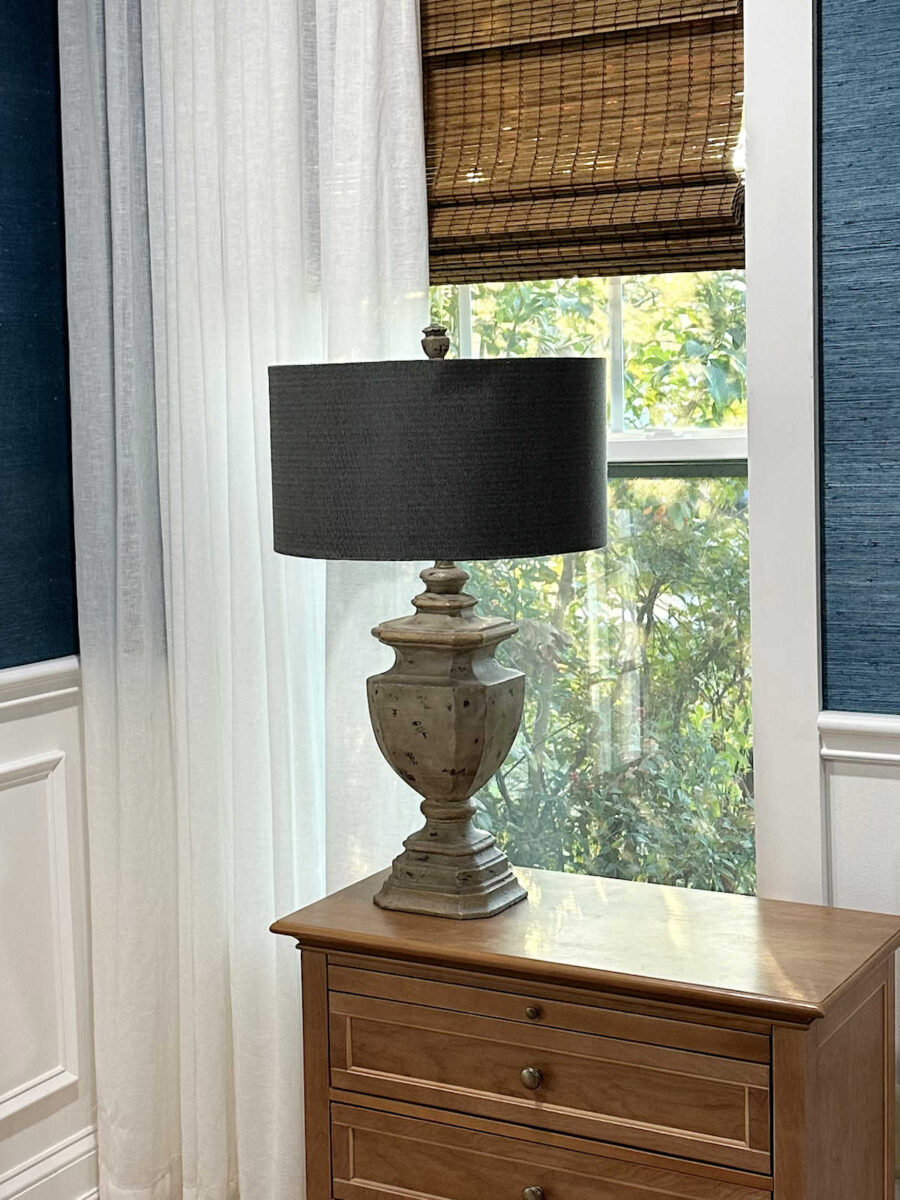
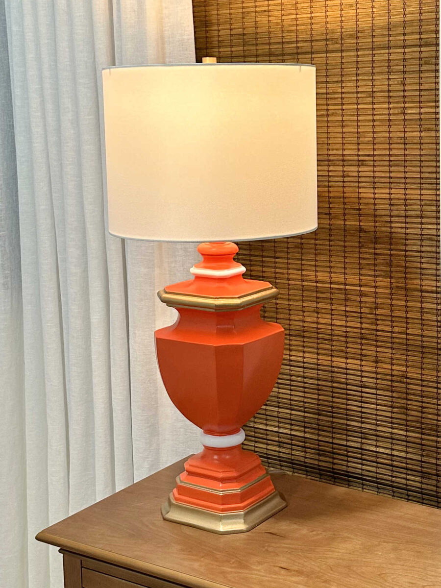
Then I gave it two coats of primer. I used Zinsser oil-based primer in the spray can. Here’s a look at the original next to the sanded and primed lamp base.
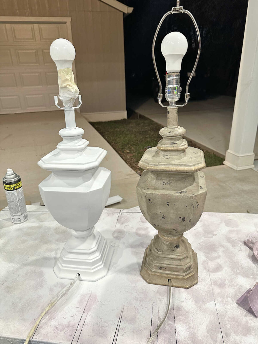
It’s not perfect, but I was able to be a pretty nice, smooth finish on it.
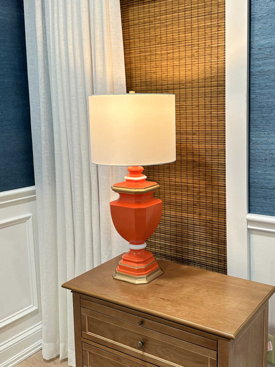
I wasn’t sure if I’d be able to find the perfect orange, but I did! I’ve never used this brand of spray paint before. It’s called Ironlak, and I found it at Michael’s.
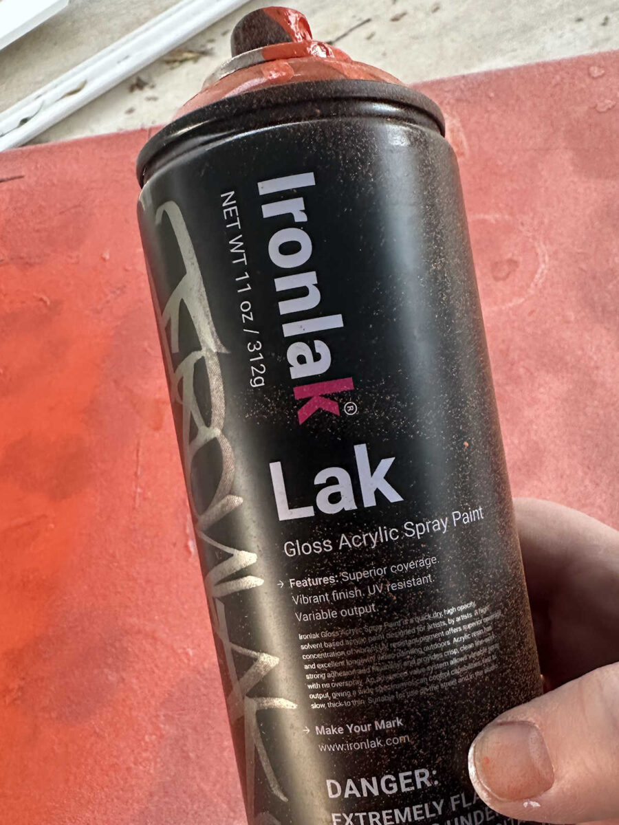
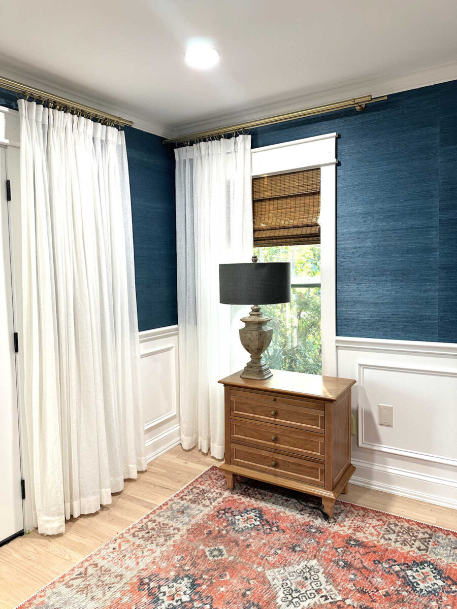
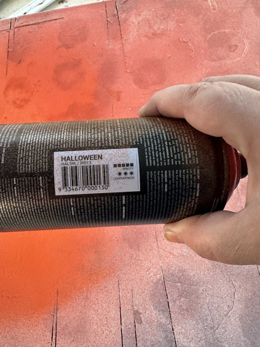
I couldn’t believe how close it was to the orange/coral color in the bird fabric and the coffee-dyed trim for the draperies. The color I used is called Halloween.
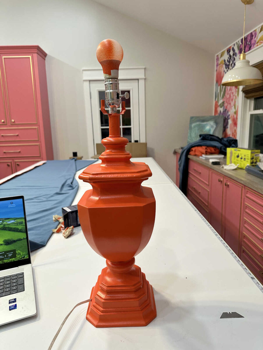
I gave it about two coats of paint, let it dry for an hour, and then brought it inside to paint the details.
For the gold accents, I used this liquid gold gilding. This is the Martha Stewart brand, which I’ve had for probably two years now. I don’t even think it’s still available.
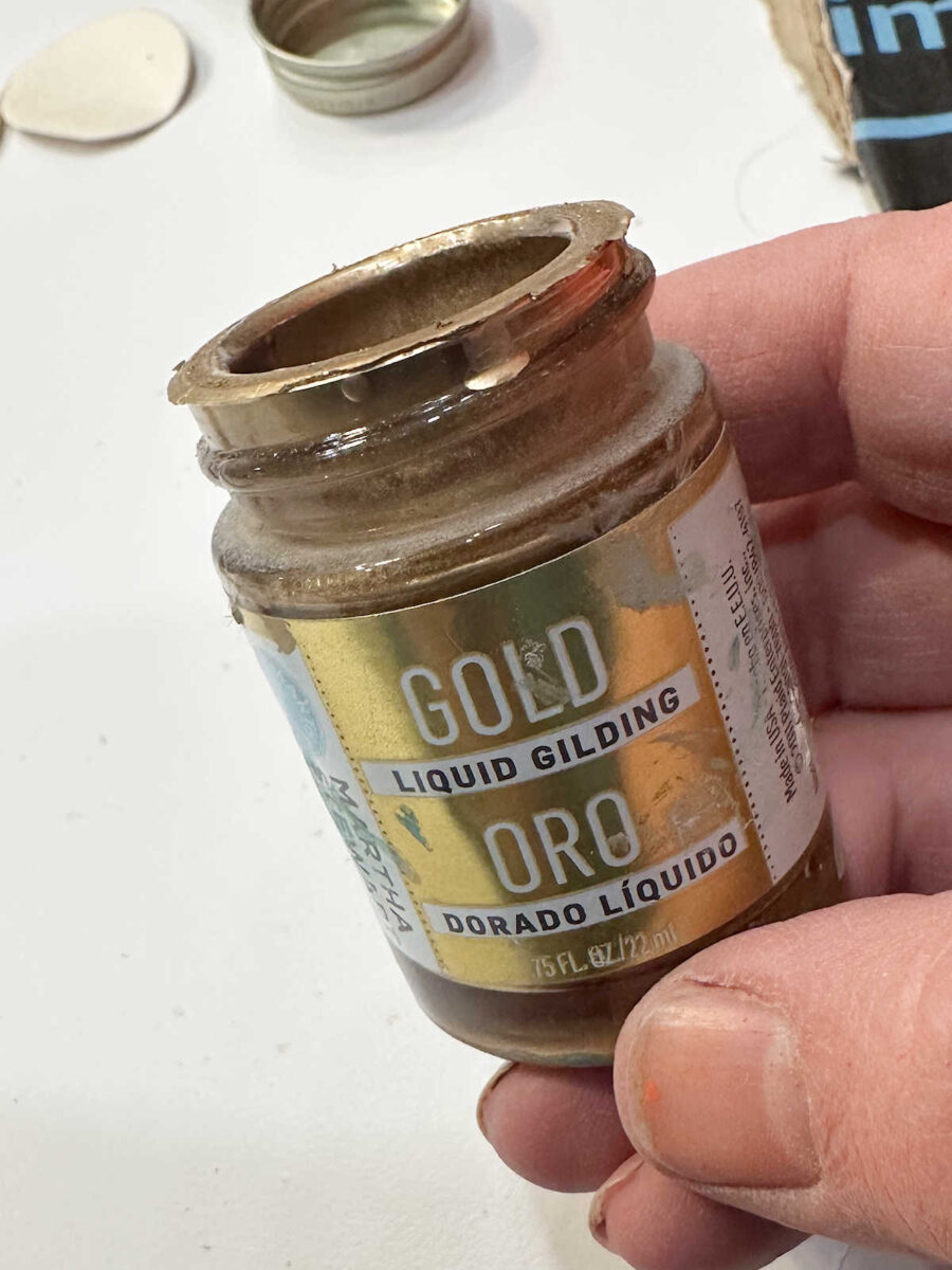
I used a small, flat craft paint brush to paint the gold gilding onto select areas of the lamp base, and then I used regular latex paint in my go-to white (Behr Polar Bear) for the white areas.
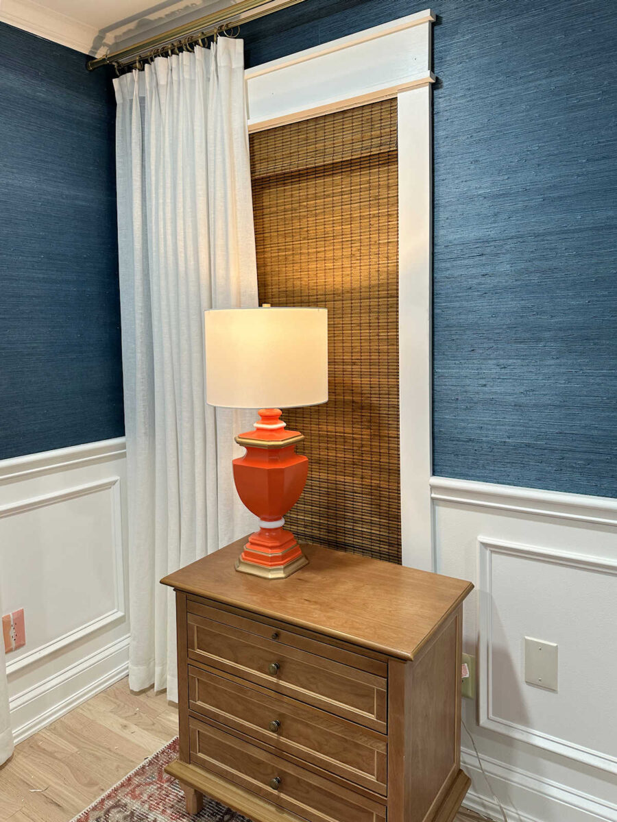
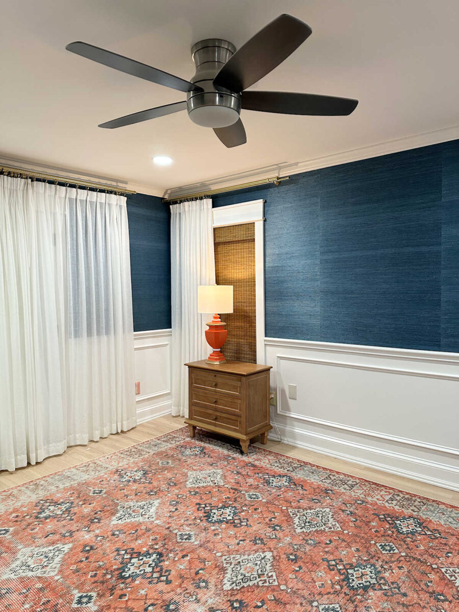
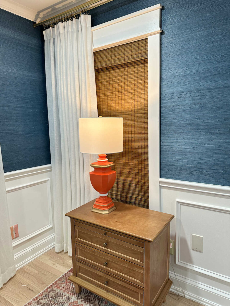
Once those accent areas were painted and dry, I added a new lampshade that I found at Lowe’s, and it was finished. Here’s a look at the lamp with its new look.
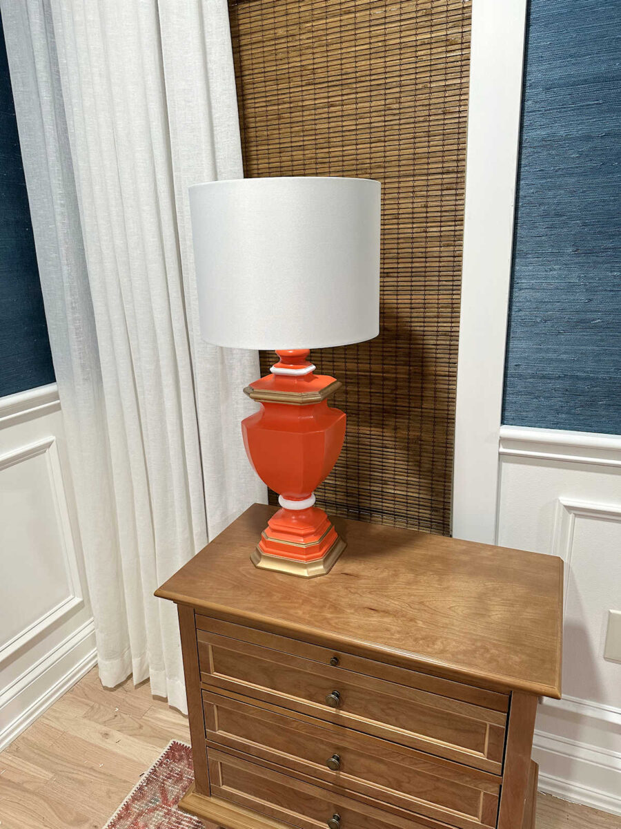
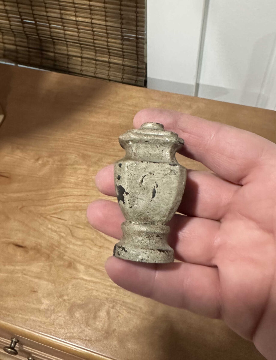
I ended up not using the original finials. I thought they looked too big and bulky, so I opted for new smaller gold finials that don’t draw so much attention. These original finials were just a bit much for me.
Overall, I’m really pleased with how this lamp turned out. I might make a couple of tweaks to it, though. First, I’m not sure that the liquid gold gilding is shiny enough for my taste, so I might go back and add gold leaf to those areas. Also, I think my go-to white paint color is a bit too white. I might need to find another white that isn’t quite so bright for those areas. But I think after I make those tweaks, it’ll be perfect!
And the total cost for each lamp, including the new lampshade, came to about $50. That’s quite a steal!

I think the color is perfect. I still can’t believe that I found the right orange in a spray paint.
So once again, here is the lamp with its original finish and lampshade…
And here it is with its new look…
Even before the two tweaks that I want to make, I still think this is a huge upgrade from the original. Or maybe I should say that for our house, and for my taste, the “after” is a huge upgrade.
And while there’s definitely a very noticeable difference between the original lamp that I wanted and my DIY version, I think I got a very nice imitation at an $800 discount.
More About Our Master Bedroom
see all master
bedroom diy projects
read all master
bedroom blog posts

Addicted 2 Decorating is where I share my DIY and decorating journey as I remodel and decorate the 1948 fixer upper that my husband, Matt, and I bought in 2013. Matt has M.S. and is unable to do physical work, so I do the majority of the work on the house by myself. You can learn more about me here.

Looks great! Can’t get over the horrible name of the paint color…Halloween! I probably would have immediately passed over that can of paint!
I agree!! I’m so glad that I didn’t even notice the name of the color until I had already paid for the paint. 😀
😆
What’s wrong with Halloween?
For me, it’s just that it brings very specific images to mind — jack-o-lanterns, scary stuff, witches. When a name conjures very specific images like that, it’s hard to imagine it as a generally pleasant color for year-round use.
I know! It’s my birthday!
Wow looks awesome, and the color matched perfectly, i would leave it just as is. But, that’s just me. Can’t wait to see the other lamp how it turns out. Have a beautiful day!
Very well done!
What a fantastic upcycle! I agree the white parts are a bit bright, but the overall look is such an improvement -and so close to the inspiration piece🧡
Yes,I agree the white kinda jumps out. A softer white would be awesome. I personally love the gold as is.
Beautiful except for the white. Could that be gold also?
N a i l e d it!
And the too white stripes will be perfect toned down. I do like the gold leaf as is, but whenever I disagree I also always come around to your way of thinking when you’re done!
Awww…its so sweet! The new shade helps alot.
I agree about the white, it just doesn’t seem to fit perfectly. I might suggest you spray the whole thing with a clear high gloss finish to mimic the glossy finish to the base of the expensive lamps. I think it needs a little bigger shade too, but that is just the opinion of a novice. They look great!
Really super makeover! I’ll never be a fan of orange, but I have to say I could live with that shade if I had to. I agree with toning down the white; it seems too white, too “off”, next to the curtains and I would prefer the gold to be a bit brighter as well. I like the taller shade, but the width looks balanced. Well done! But what’s most important is that you are happy. The bottom line always–as long as you love what you create and continue to enjoy it over time, it’s just right!
Looks great! Love to see some of the curtain trim on the lampshade.
Agree with everyone, the white areas don’t work. Is there are issue with changing it to gold? Or a gold tone, although considering the placement of them on the lamp, gold leaf might be better.
I also agree with some that say the shade is not wide enough, it makes it seem off balance, top heavy? but the base isn’t wide enough to look balanced with the taller shade. But that can wait until you have everything else done.
I can’t get over the transformation of the before and after! And I like them much better than the original $800 ones!
Great job…Again!
I thought the base seems too wide for the new shade, but you can’t always tell from a picture.
What if you went over the white with a brown wax/patina and wiped it off immediately? As for the gold, if you decide it needs a little oomph, could you use the same approach you did on your studio drawers?
That turned out beautifully! It’s getting closer all the time. Yay!
I really dont think that white will stand out that much when you get everything else in the room. But thats jmho 😁
That is absolutely amazing and gorgeous! It is SO much better than what you started with and I think prettier than the inspiration lamp. I wasn’t a huge fan of the boxy part at the bottom. I much prefer the detailed base of the one you DIYed. Great job!!
You hit another one out of the park, Kristi! I agree that the white parts need to be toned down a bit. You can see that in the photo of the original lamp. But the rest is close enough to perfect, lol. Isn’t it fun to take a bargain item and with a little elbow grease and imagination, turn it into a designer copy? Well done!
I agree. The white is too stark. If you look at the very expensive lamp, the “white” matches the shade. You can achieve the same color by matching your shade which is perfect for the lamp.
I also wonder if a spray gloss finish would elevate the lamp to mimic the original.
Kudos to you for getting the pair for $40! I love a good bargain, yard sales and thrift stores!
I love an “upscale” on a facebook marketplace find. You are so good at it too. Love it. I might tone down the white part too, but it looks awesome! 👏🏻
Great DIY dupe. Looks like we all agree on the white. I feel the lampshade is too narrow, the proportions look off 🙁
I agree about the white being to stark it’s shocking and needs to blend better. I would also do a bigger shade. The smaller one seems a bit awkward to me. Lastly if you wanted to give it some real pizazz you could gold leaf over your gold. I think that would really bring it to life.
Wow these came out great. Gorgeous!
I agree about widening the shade, the scale feels off to the base.
Maybe with a gold band top and bottom. Maybe not.
You are so talented. The lamp looks grand! What a good shopper!
Beautiful! In my opinion your lampshade looks really good. I find the shade in the inspiration lamps to be “off” and too wide. This project inspired me!
Great job!! Have you thought about using the original shade but using your bird print fabric? It isn’t as hard as you might expect. Hobby Lobby sells the base shade paper w adhesive. I think the original size shade balances the base better. Bottom width of shade should =2x the widest part of the base. Height of shade should = 1/2 height of base ( measured from bottom base to he beginnong of the candle stick.) But once again, really perfect transformation of the base! A lamp buyer once told me that finials are the jewelry of the room. I have always like that expression.
Could you tone down the white banding with a stain to get more of an antique look on those areas. What a great steal for those lamps.
Good job Kristi. I like the shape and color of the original lamp shade. It’s proportionate. The one you bought seems too narrow, and the marketplace one seems too squatty. After toning down the white color and upping the gold factor, a high gloss finish would be lovely.
Wow – what a transformation! I love it, with the exception of the while which, as you say, is too white. You never fail to amaze me with your talent!
It was difficult for me to finish reading your makeover details because the minute I saw the upgraded lamp I began eyeing every lamp in my home. Love it! Once again, thank you for the inspiration.
The orange color is just perfect (despite the paint name) and I do agree with you about toning down the white a bit. Maybe a more creamy shade of white would work better. I like the gold accents you already have but you are probably right that some gold leaf would add a bit of pizazz to the lamp. It’s so fun following along on your renovation journey!
WOW! What a transformation!
I think you are right to tone down the white accent though. And the size and shape of the new shade is spot on. Great work.
Thank you for the detailed information on how you prepped and painted the lamps. I have a pair of resin lamps I want to paint but wasn’t sure of the best way to prep and paint them. I love the orange! It’s perfect with your rug and drapery trim. I, like you, think the white is too stark and suggest replacing it with gold. I prefer the black lamps shades for their width and color.
Absolute perfection! And I love that you’ve had a nice easy project that was inexpensive and came out so well as a “reward for all your hard work!
Hi Kristi! You really did manage to channel the essence of the expensive lamps in your much-budget-friendlier version! It might be the picture effect and not look like that in real life, but at first glance, the white “ring” close to the bottom lookes like a plastic ring added to the lamp. But you already said you might try to tone down the white so hopefully that will take care of that. Otherwise, I was wondering, to align more with the original version, maybe the “ring” could be orange, and have a smaller white border at the top and bottom of it to kind of highlight the ring instead of having the whole thing white, the same way the white is used as a border in the original model? Just a thought!
Would love to see the lamp with its original shade and the original finial sprayed gold, in a split-screen just for funsies. If you like the wider lampshade proportions (as I do), would love to see a “recovering a drum lampshade” tutorial!
Your version is far superior to the shop one it`s a better shape and looks far more elegant ,, they will look fabulouse when the other is finished and they stand as a pair, not sure about the white though, it doesn`t look right perhaps replace the white bands with gold leaf to keep it consistent, the white breaks it up into 3 pieces the gold ties it together,,