Entryway Table Lamp Challenge (Plus, I Really Want To Paint The Console Table!)
I had planned to work on the front porch this weekend, and I even went to Lowe’s and bought everything I need to start on the porch makeover. And then it poured down rain. So I turned my attention back to the entryway instead. The lamps I ordered for the entryway arrived on Friday, so I was pretty excited to get them unboxed and put together so I could get an idea of what else I wanted to add to the entryway wall to complete this area.
But my excitement was pretty short lived. I unboxed the first lamp, and at first glance, I liked the base. I had my heart set on something simple and shiny, preferably glass.
But the shade was dented on the top, and the dent is right on the front of the shade. Ugh.
And then on closer inspection, I noticed this awful shiny caulk between the glass and the metal base. It’s a messy caulking job, and it’s shiny, so it looks pretty tacky.
I decided to unbox the second one anyway, and the shade on that one was worse.
I swapped out the shade so that I wasn’t distracted by the dents and could evaluate the lamp base without that distraction.
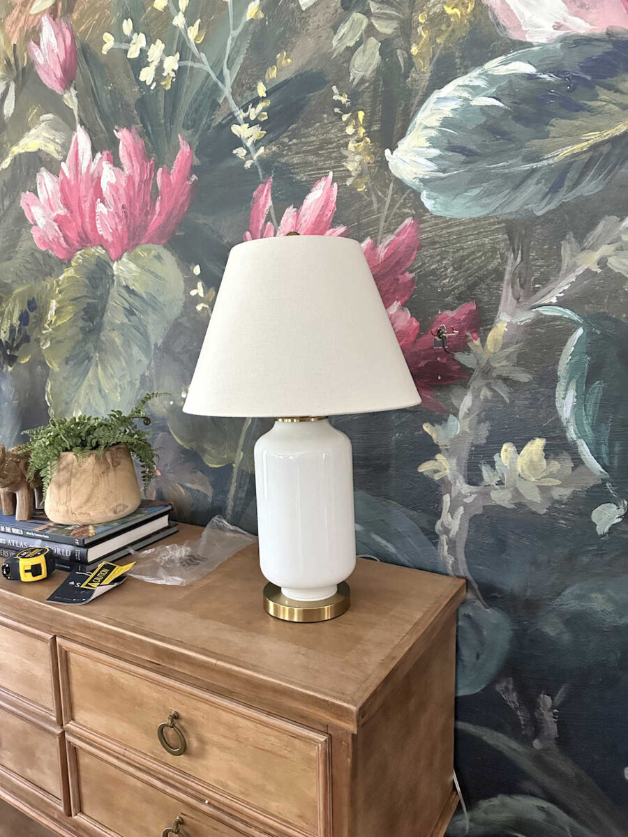
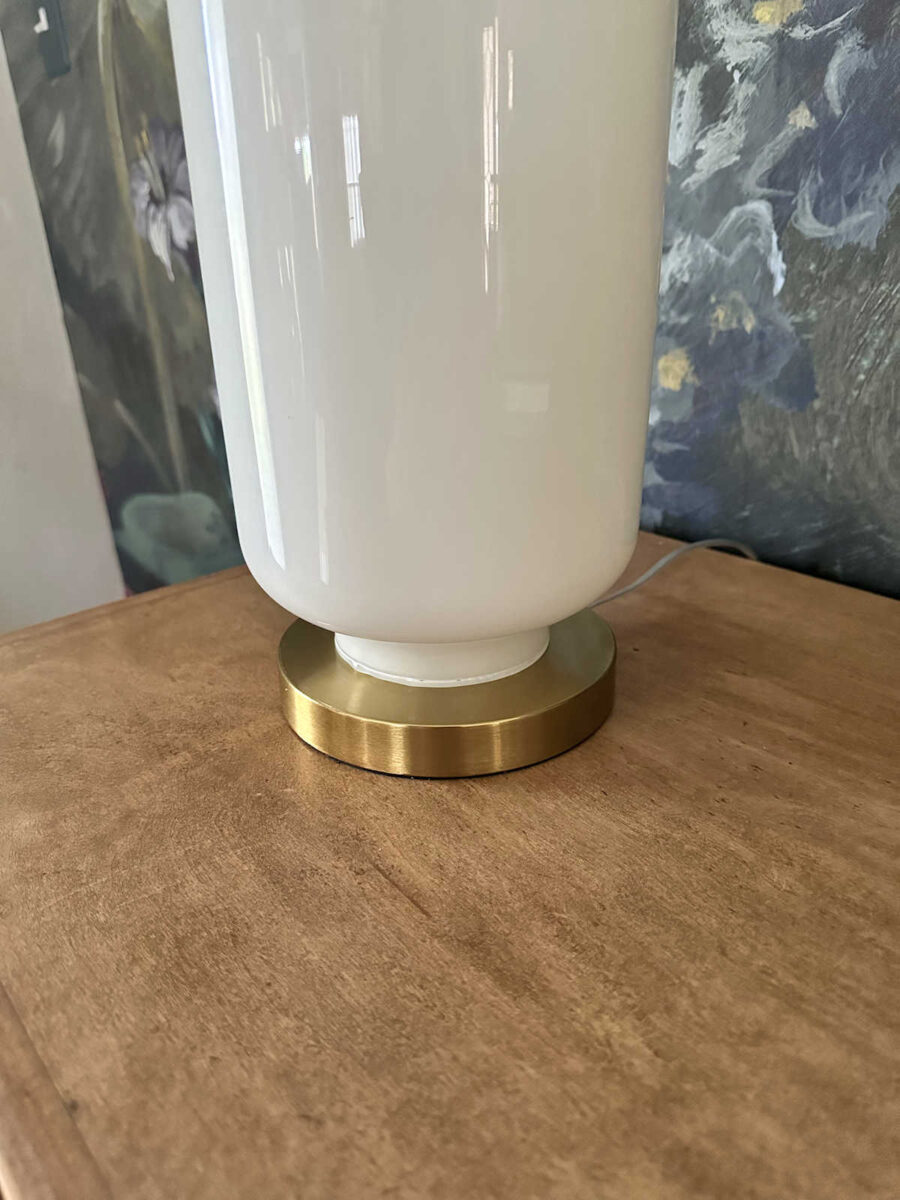
But then I noticed the base on this one. Look at the area where the glass part is attached to the base. The glass part isn’t even close to being centered on the metal base!

Obviously, these have to go back. The picture online was nice, but in person, these are a mess.
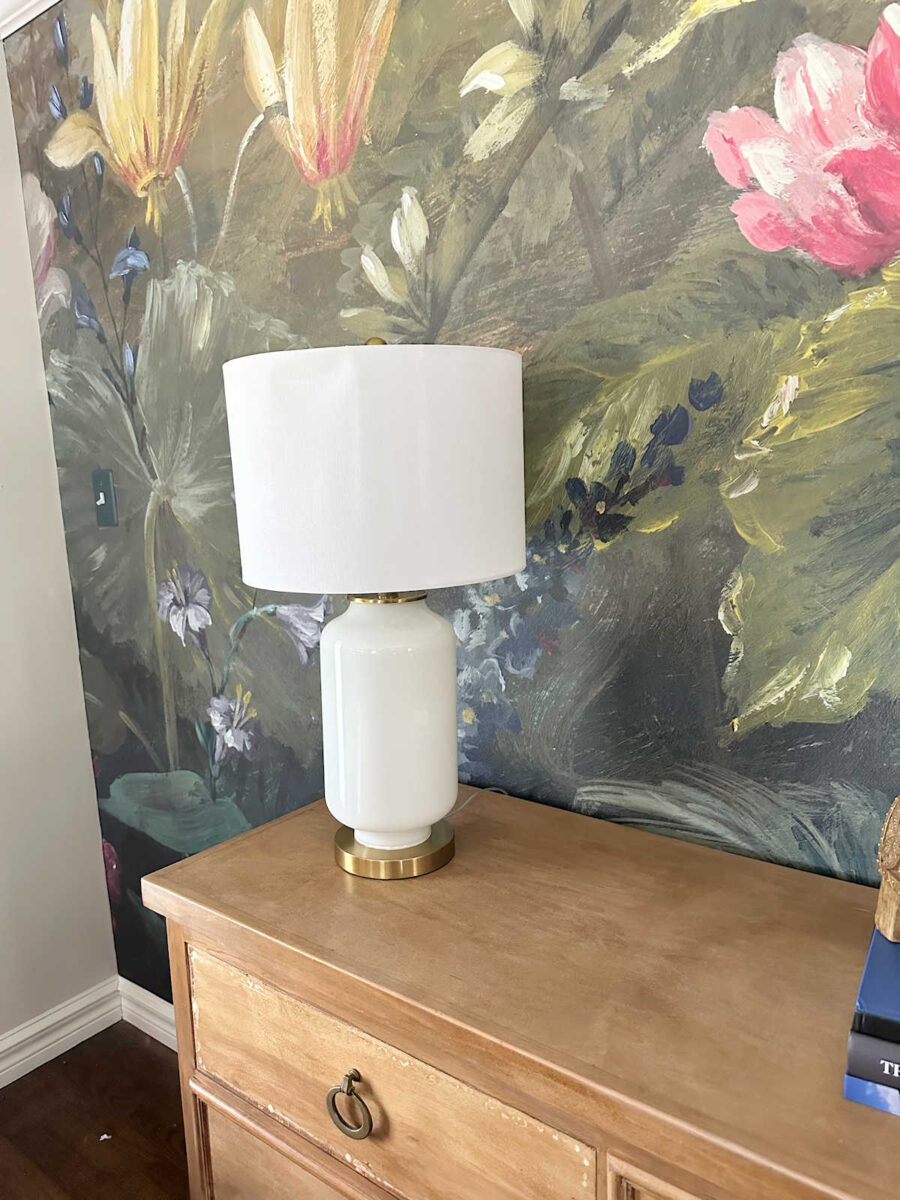
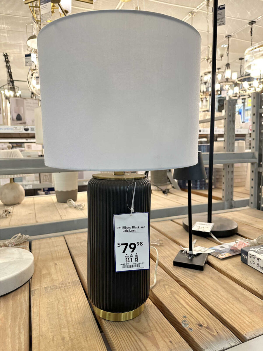
I wasn’t in the mood to get back online, order new lamps, and wait. So I headed to Lowe’s, determined to find something that would work, even if I had to paint them white. The first one I found is this one. It’s very similar to the ones I bought online except that the base has a ribbed texture. But I didn’t like the shade. It looked cheap to me.
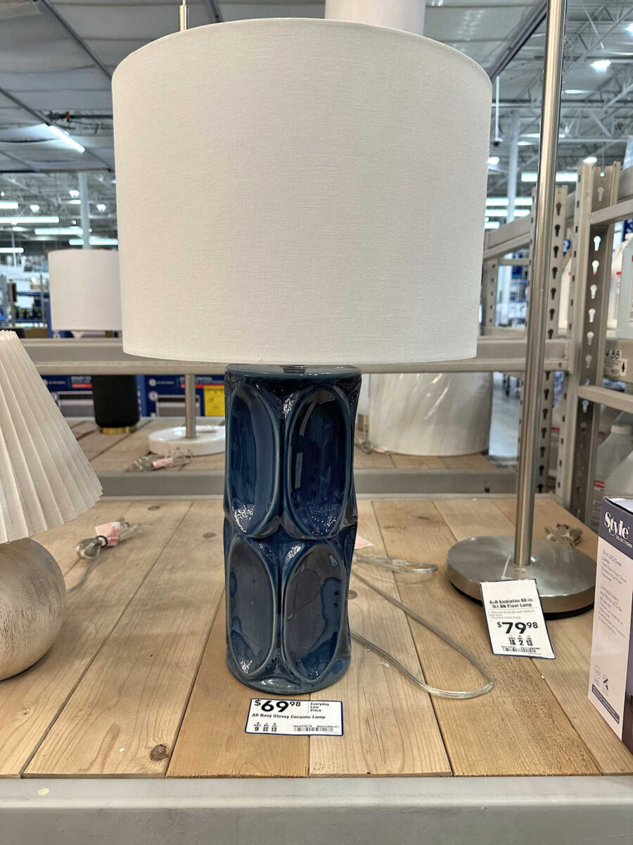
This was a consideration, but I didn’t like the shade on this one, either.
I found two base options that didn’t come with shades. I liked this one, but it looks a bit too “southwest” in style to me. I’m sure painting it solid white would have made it look better fitting for my house, but I wasn’t sold on it.
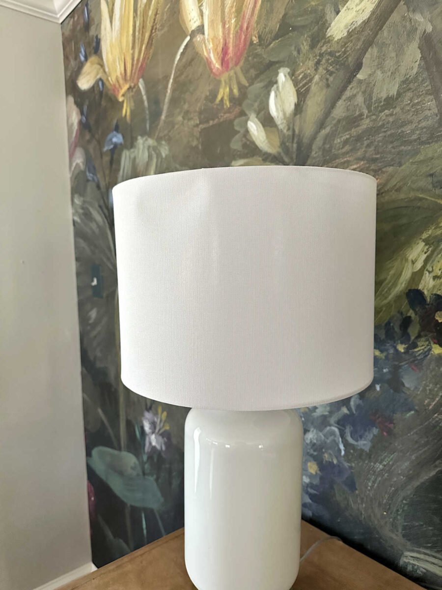
And finally, this was the last option. I liked the shape, but even though it’s already white, it would still need to be painted because the color was about one or two shades off for me. It had a tinge of yellow to it, and I wanted a cleaner creamy white.

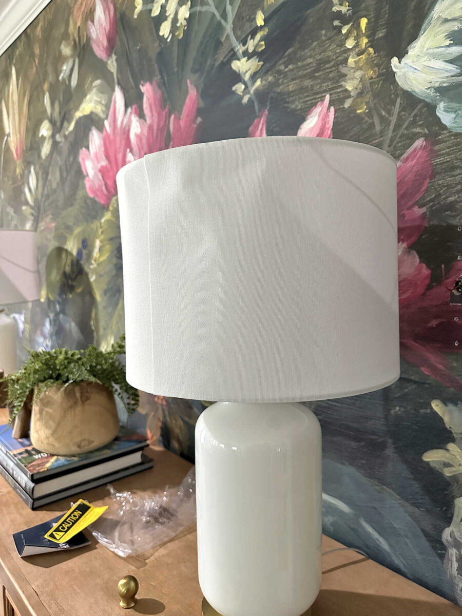
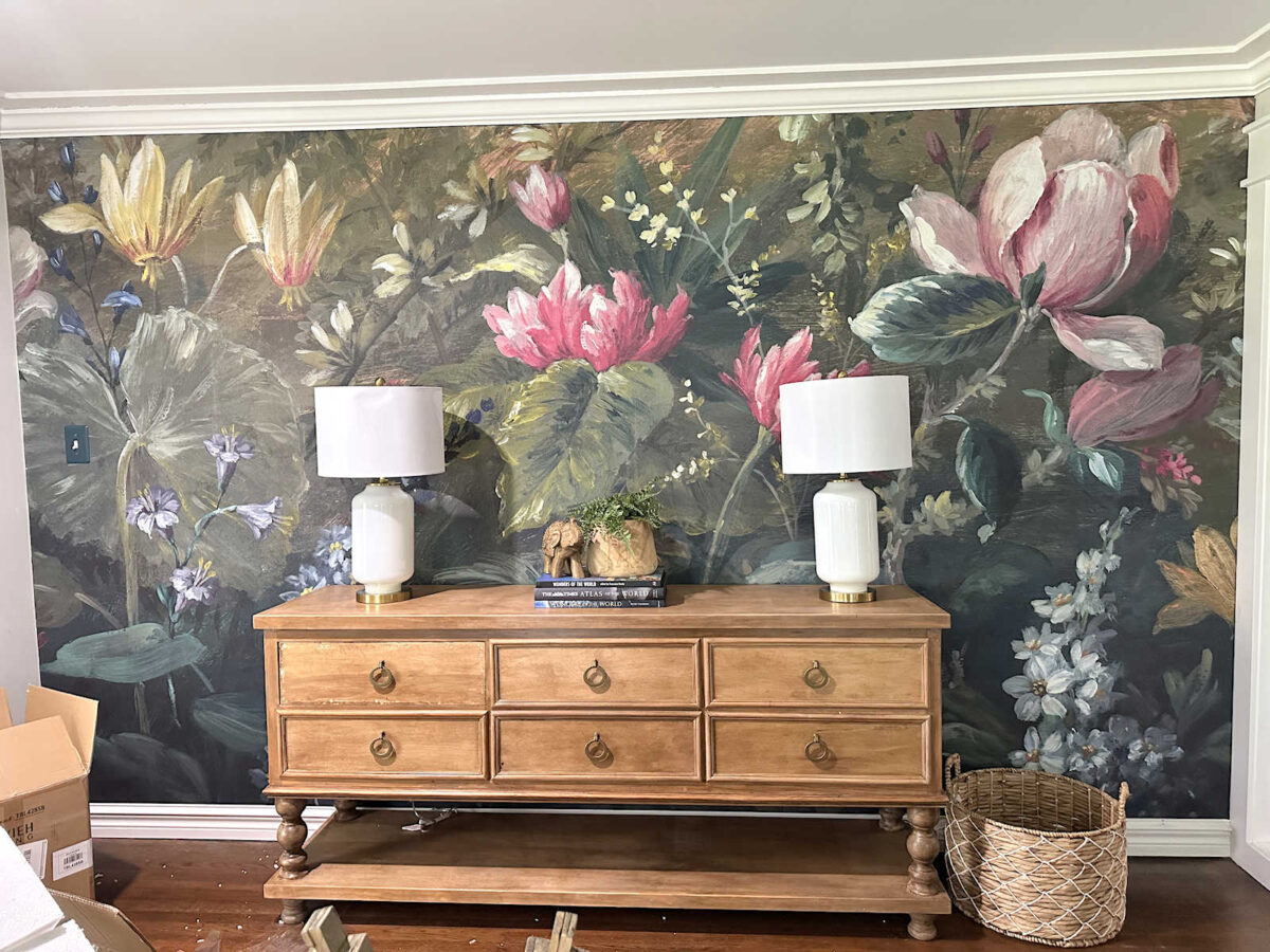
I ended up going with the last option, and I spent about 40 minutes giving them a couple of coats of spray paint in a creamy white to get rid of that yellow undertone. I don’t even know if you can tell the difference in the picture, but I could really tell a difference in person. Obvioulsy, the painted one is on the left, and the original color is on the right.
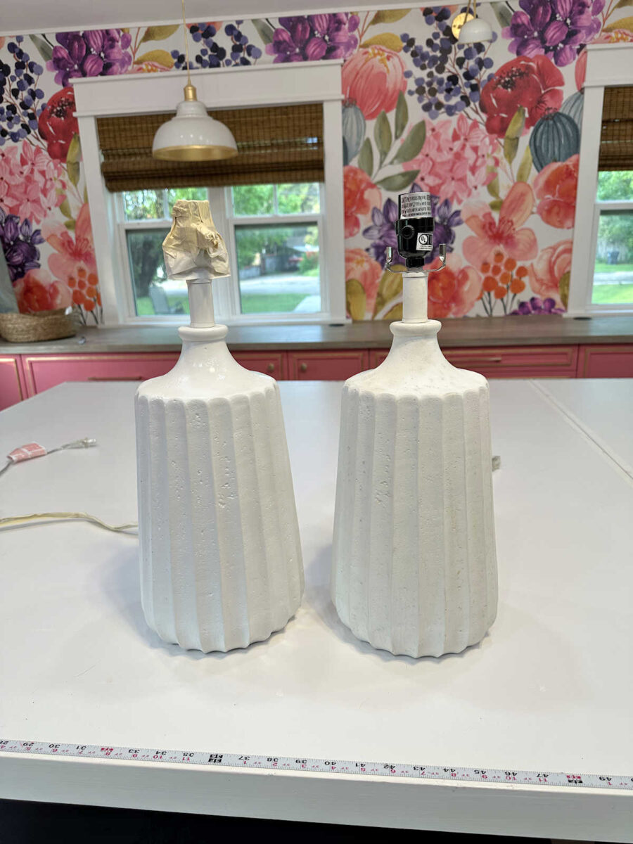
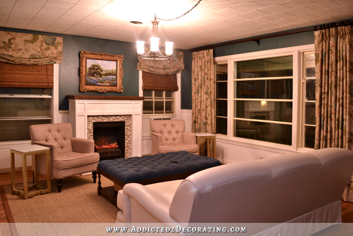
As it turns out, I like these a lot better than I liked the (idea of) the original lamps. I thought I wanted shiny glass, but I really prefer the subtle texture of these. So it turned out well.
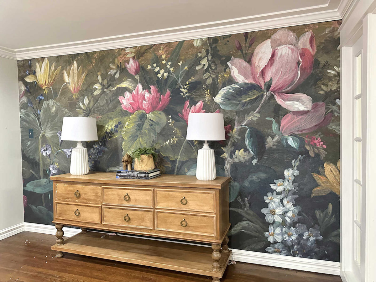
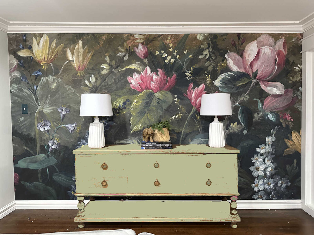
But now, I really want to paint the console table. I’m just not crazy about how orange and splotchy the finish looks. I think it would look so much better painted. So I pulled out a few colors directly from the mural and tried them (using my photo editing software) on the table. First up, I tried this green.
Next, I tried a lighter green. I really like this one.
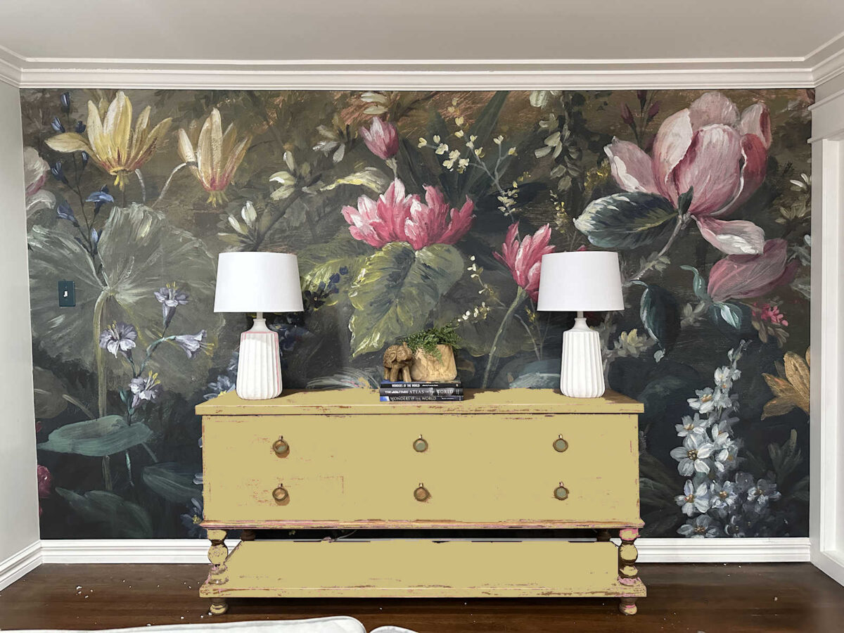
I also tried this yellow-green from the flowers on the top left. I like this color, but I’m not quite sure if I could live with this much of this color.
And then, of course, I had to try out some pinks. I started with a light pink.
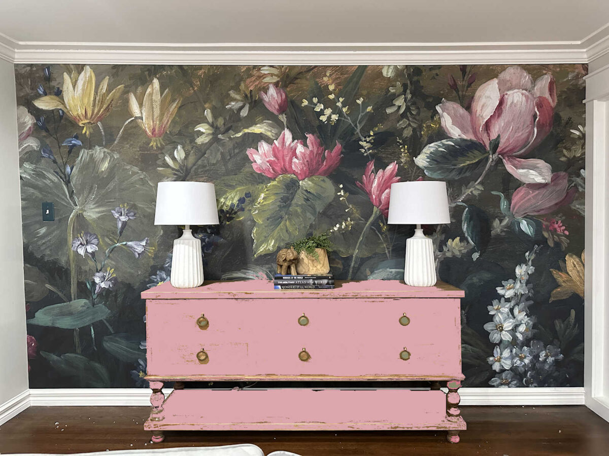
And then I tried out this darker pink that ties in with my favorite flowers from the mural.
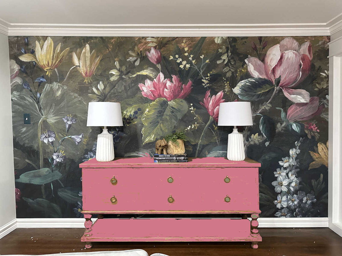
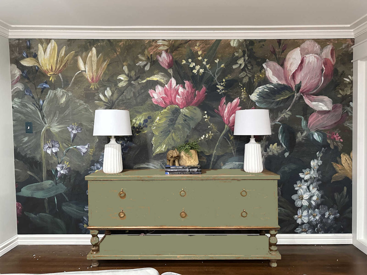
And then I went even darker. I don’t think this could still be called pink. What is this color? Magenta? Whatever it is, I love it.
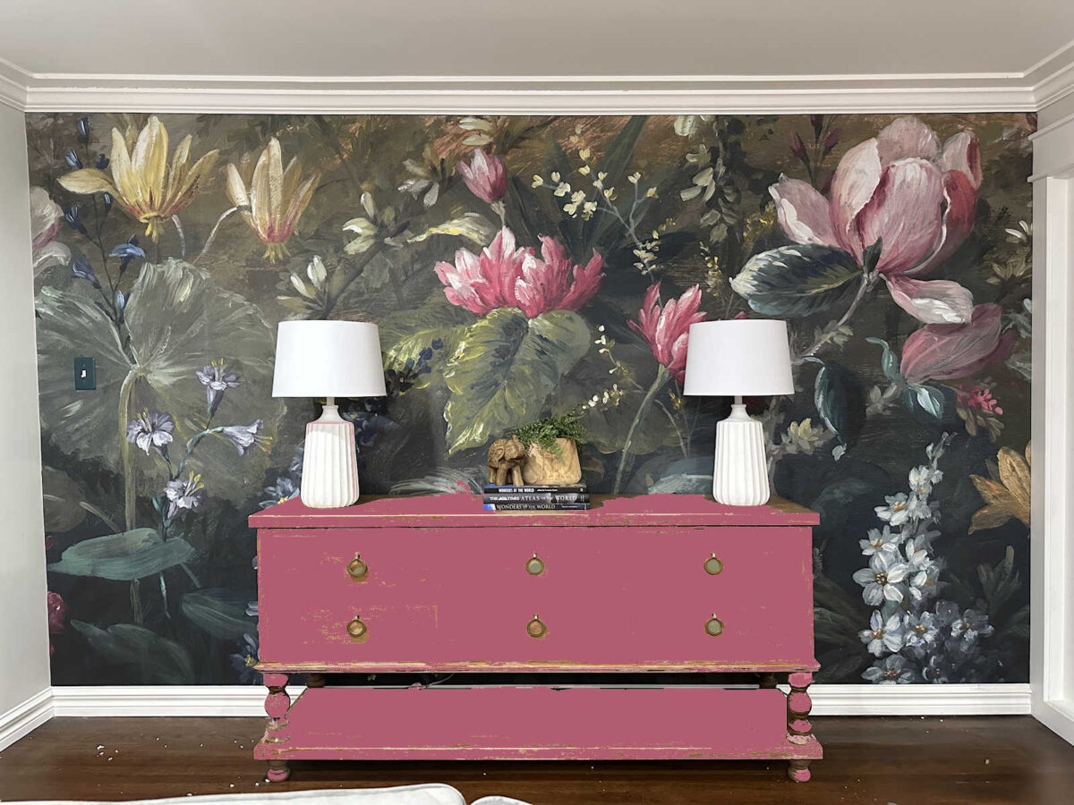
I tried out a few other colors, like different teals and purples, but I didn’t think those looked good against the mural since it’s pretty dark on the bottom. I like the colors that stand out and make an impact. So I think I’m going to go ahead and paint the console table. I have my heart set on it, and y’all know that once I get an idea in my mind, I won’t be happy until I try it out. I just know that I don’t want that orangish wood tone in the entryway anymore, and I’m not up for refinishing it. So paint is the way to go.

Addicted 2 Decorating is where I share my DIY and decorating journey as I remodel and decorate the 1948 fixer upper that my husband, Matt, and I bought in 2013. Matt has M.S. and is unable to do physical work, so I do the majority of the work on the house by myself. You can learn more about me here.

Hi Kristi! your lamp choices…work for me…. However… just wondering what if a shade of the wallpaper’s background would be possible choice for the console??? That paper is soooooo stunning… and something more “subtle” might give it all the attention to the wall paper…….
I agree!
I really like the lamps you choose and painted. I think the matte finish looks more expensive than the shiny finish on the lamps you ordered online. When I saw the green mock ups on the table I thought a darker, less pea green shade would be better. I thought what about the dark pink from the petals? Then saw your mock up. I like the last pink best but wonder if a slightly less bright pink would work better. Like the darkest shade of pink in the petals. It’s going to be a beautiful entry!
That’s exactly what I was thinking. The darker magenta of the underneath veins of the flowers above it. Not maroon, just darker magenta.
Hi Kristi! your lamp choices…work for me…. However… just wondering what if a shade of the wallpaper’s background would be possible choice for the console??? That paper is soooooo stunning… and something more “subtle” might give it all the attention to the wall paper…….
Love the final lamp choice, and the paint color is perfect. Of the painted console colors, the last, magenta, works very well. It did make me think of using parts of the mural on the drawer fronts so the console becomes “part” of the mural as well. Or painting the drawers fronts so they look like the part of the mural that is hidden behind the console.
Ooh I like that idea!
What if the bottom shelf was painted a different color?
Love the lamps but not sure about the coloured console. For me it would need to be a darkish colour as a light or bright one drawers my eye to that. I know you don’t like the console as is but it doesn’t distract from that paper where any of the others do (for me), although the dark green not so much as the lighter greens or the pinks. All I see with them is the console and the paper is lost but then my eye is probably different to yours and it’s your home.
Agree 100%!
Agreed
I agree – the color on the console competes with the wallpaper colors. The paper is stunning. Fro the pictures I see online I think the current color on the console pulls ery nicely with the leaf or petals on the far right. The wall paper makes me think of nature/natural and the natural wood of the current console seems to keep that idea going.
My thoughts echo this. I do understand that in real life it may be a little too orange for you. If you are not up to refinishing, then I’d use it (painted) elsewhere and find a natural wood console that you really like.
I am sure I will be a lone vocie in this. I actually like the wood toned console; it complimented the mural and gave the mural a nice woody/natureal / moody vibe that I love. But I agree it is a bit on the orange splotchy side and certainly understand why you don’t want to refinish it. And for some reason the white lamps worked with that natural console. But when I see the pictures with the painted console, all I see are two white lamps on a dark background. I lose the magnificance of the mural. I know you are going to paint the console but I really don’t like the white lamps with the painted console pictures. Somehow the wood console toned down the white and the paint accenuates the lamps and deminishes the mural. All this to say I would rethink the lamps now, maybe paint them a brushed gold with a natural shade? Anything to tone them down a bit.
No, Leslie, there are 2 of us. I love that console and thought that the color matches the tones in the wallpaper that have a tan-ish color to them. The wood looks like, well . . . wood which, considering the woodlands look to the mural, blends in beautifully. Painted, it looks like you put a piece of furniture out in the woods and left it.
I don’t have any special feelings about the lamps except that they are necessary if no wall sconces.
Make it 3 of us. Not a fan of painting the wood console. I do think use of the remaining wallpaper could look nice on the drawer front with the wood. Not paint.
I think the lamp bases are “heavy”. I had hoped Kristi would choose skinny lamps, like candlestick type bases.
My thoughts exactly!
Make that 3! I think the wood looks great with the wallpaper and agree with Leslie and Crystal that it picks up the warmer tan tones in the wallpaper.
I agree with this.
I agree with this 100%!
Ditto!
Agree, sort of. I don’t like the idea of painting the console, but I would try (maybe on the back?) a deeper stain, just a couple shades deeper. If that didn’t work, I would do a matte black paint, or dark brown. I’m also not a fan of the lamps, I think they are too “weighty” and I would have done buffet lamps, the tall, skinny kind. Honestly, I would do only one lamp, on the left. I know you like balance, but to me, the large flower needs balance to the left with something. A candle or small object below the large flower would be enough.
I agree. Try re-staining for a better finish and if you end up unhappy with the result you can always paint later. I think the wood adds a certain element that would be missing without it.
I’m also with you on this – I think the wood looks good, and not too “orange” at all.
Agree!
I’m in this camp, too. I loved the wood tone against the mural. I don’t think it looks too orange, but even if it is, refinishing it in another, less orange, wood tone makes sense. I don’t like the paint idea at all. It takes away from the natural beauty of the mural. But it’s not my house!
Agreed
Make it 5!
I posted my comment before I saw yours. I agree 100%,
I love the new lamps you chose. The shades, though, feel underwhelming when up against the lovely mural and textured base. I’m wondering if you could trim the shade out in cording or something creative. The magenta is dreamy for the console!
I’m sure the lamps will turn out fine. As for the console: yes, painting it was in my mind from the moment the wallpaper went up. I love the magenta. It holds its own with the wallpaper and is bold enough to say,
“No apologies for me; I belong right here too!” An entry should make a statement and these possibilities do exactly that.
Have you ever thought about removing the bottom shelf to just open up the area?
Jackie, I totally agree! would highlight the mural more and the open space below wouldn’t be so distracting
The lamps are great and I’m sad to see the console table painted – it all looked to lovely together- the wallpaper, lamps and console. I’m partial to more natural looking things and blended furniture pieces. When all the furniture is painted I think it looks less curated, but that’s one isolated viewpoint and I appreciate when folks break the mold.
agreed
I like the wood console the best. A painted one detracts too much from the beauty of the mural. The wood blends. The painted ones scream “look at me!”
I agree. The wallpaper is very organic and so is the wood console. I can see colors of the console in the wallpaper and some of the warmer leaves. There is also a warm glow at the top of the wallpaper which blends with the wood console.
My preference is for the darker green that makes the table melt into the background of the mural. I know it’s not colorful but the darker pink one takes the table center stage and you stop noticing the mural.
I agree with you — a green paint on the table looks good. In addition, I would add small print to the lampshades — could be done with fabric or napkins. In addition, I think there needs to be a large floor vase on the left in a shade of pink to draw the eye in a diagonal from the left low new pink vase to the middle pink flower to the upper right large pink flower.
Love the look of the console painted, especially the darker green which seems to blend into the mural letting it be the star. The white lamps seem very jarring against the dark of the mural. Have you considered tall, thin brass lamps or possibly just one chunky brass lamp and brass hardware for the console?
I see what some have said, the white is rather stark against that darker beautiful mural. I like the pink console, but me, I would tone it down perhaps…closer the the gray toned pink on the flower in the upper right corner…just to blend more and not fight with the mural. Maybe the slightly less bright white lamp with a gray or darker shade to blend more so it doesn’t scream over the whole look. I don’t know…I guess I naturally want it quieted down and enjoy the mural more. (I realize, perhaps not really YOU!) I know I will love where you land on this anyway. PS) I notice even the white on the mural is not a stark white.
What about a watered down paint wash that lets the wood show through but covers up the orangey-ness?
Last week I said to myself…..I hope she decides to paint the table.
And like magic the decision has been made. Love that it is being painted
a color that will match the flowers.
I love the new lamps. I like the first two green shades for the console
I too am not a fan of any of the colours for the console….it screams – here I am! The console as is looks awesome….splotchy & all.
The mural is gorgeous enough without competing for attention with a painted console. The lamps are okay….not a fan of white though…although they’d be fine with the wood console unpainted. It’s your home, as you are aware….if you love it that is all that matters. I’m sure no matter what you choose, it will be beautiful.
Honestly, I think all the console color choices dilute the beautiful colors in the mural. The wood finish, as is, is understated and let’s the mural be the star of the show.
Maybe we are looking at the console and wallpaper without taking into account the entire room. Kristi can probably stand there and see the pink curtains and the rug and all the other stuff in the room and think that a painted console would blend better.
I agree with some others . I think the white lamps stand out too much. Maybe something in clear glass, or a lighter looking lamp. I dont care for any of the colors for the credenza. What about a tanble that is put behind a sofa, long, and just 4 legs and completely open at the bottom. Lots of opinions today and you will decide what you want to to do. Its your house a d has to please you
Wood, all the way. It doesn’t look orangey to me. It looks brighter and less weighty than any of the paint shades. The organic wood works well with the mural and it picks up the neutral shades of the flowers in the upper left. The vase on the console does that too.
I really like it the way it is.
I like the lamps, although I was perfectly okay with the curvy ones you were using as placeholders.
I don’t care for any of the green choices for the console. I would go much darker than the last pinkish choice you have – I’d choose among the darkest shady pink/brown/red colours in the petals. I think that would make the console compete less with that stunning mural.
^^ All that said, perhaps staining the table to a deep walnut colour would achieve a similar purpose and still leave the variations of the wood grain which seem to work well with the mural and not compete with it.
I like the lamps in front of the mural! But like many others here I prefer the unpainted console table. I think the painted options draw too much attention to the furniture and take away from the mural. If it must be painted, I think the first green you tried is the best option for not stealing the show.
Oh no! I wouldn’t paint the wood. I don’t think it looks orange. To me it is a lovely golden tone.
I still think it would look better without the bottom shelf.
It looks too top heavy and seeing the white baseboard thru the bottom open area throws off the symmetry and detracts from the mural. I like that by lowering the console it would allow more of the mural to show
Could you use your photo editor to see if it looks better?
The lamp shades look heavy to me. What if you did clear glass lamps and an off-white shade? https://www.lampsplus.com/p/360-lighting-tibet-27-inch-high-clear-glass-table-lamps-set-of-2__7142g/
https://www.potterybarn.com/products/cove-glass-table-lamp/
I also think the wood tones match nicely with the colors in the mural, and I like the natural look it gives.
I love the lamps from Lamps Plus! I think those would be stunning sitting in front of the wallpaper!
I like the wood console best. Maybe changing it to a natural walnut though. I think it compliments your mural and warms up the space. I also wonder if the pink console would be too close in size to your pink love seat in the music room. Sight wise would they fight?
I kept scrolling back and forth numerous times and found that I cannot like the white lamps at all. To me, the mural is the strongest focal point, but the white heavy-looking lamps draw my eyes to themselves immediately and won’t let go. I cannot totally enjoy seeing the mural due to the lamps constantly drawing my eyes to them. As for the color of the console, a dark color taken from the mural would be nice.
The lamps look great! As for the console color, I think the first green allows the mural to stay center stage. Imho, the bright pink console competes with the pink flowers in the mural.
LOVE the magenta console table! It will look AMAZING!
Yes! Im in this camp too! I also dont care for the “orangey thing”. I love the painted table in the magenta! I dont have a preference for the lamps. 😁
I really like the original color of the table, I think the wood pairs so well with the mural.
I must really love that mural, because I just keep thinking of see through options so that more of the mural is shown. Last week I wanted glass lamps, this week I want a long acrylic console table. Or, if not acrylic, a leggy long console table in magenta works for me. 🤣
Unless you use the drawers for legit storage, in which case…I get it. 🙂
The lamps are nice. I loved the other lamps you had in there but I know they go somewhere else in your home.
I love the console as is. I think it blends well with the yellowish/brown flowers and brings them out. I love the console and think it is neutral, which allows that gorgeous mural stand out. Just my honest opinion, for whatever it’s worth.
The second pink is SO GOOD!!!🩷🩷🩷
You could use gel stain right over top of the stain that you think is too orange; a medium walnut color would look more natural with the mural than paint. If you must paint the consul, the darkest green looks best, so as not to compete for center stage. I would like the lamp color better if it was closer to the warm white seen in much of the mural.
Your choices are spot on, of course! The console color is perfect & I can’t wait to see it painted!
I’m not sure what number this makes me, maybe 17?, but I like the wood console best. It doesn’t look orange at all and really compliments the stunning wall mural.
Can’t believe I like the painted console options but I do! The yellow-green is GREAT to me – very designer, also very in tune with what I personally use to decorate my own home. The lighter green is also quite nice. I don’t care for the pinks. I agree a lighter color is better than medium or dark against the mural.
Don’t paint it! I love it just as it is. There is nothing wrong with having a nice neutral piece of furniture. I think it balances out all the colors you added.
I had hoped you would paint the console table and I love the Magenta!!
Why don’t you just stain the console table a color you like better, may e a bit darker to remove the orange tobe? I, personally, think the area needs the wood tone. It grounds that whole area. And honestly, looks so much better than any of the paint.
I agree to change the color of the stain. I love the wood tone.
That console table is not wide enough for that space .