Fun With Typography
I know I usually share my condo progress with y’all on Mondays, but I woke up this morning and realized…wow, I have absolutely nothing to share today! I didn’t waste my weekend entirely. I managed to finish this week’s Crafty Tutorial, which I’ll share tomorrow. And I also made tremendous progress on the valance tutorial for those of you who requested it.

I just hope you’re ready…that thing has over 50 pictures!!! 🙂 Yep, I got a little camera-crazy. But I’m a very visual person, and I don’t do well with written instructions, so I try to be conscious of others who are like me in that way. That tutorial should be ready some time this week.
So anyway, since I have NOTHING of my own to show you today, I thought I’d pass along some inspiration I’ve gotten lately. Friday’s post about Spell With Flickr really got me to thinking about typography, and different projects that can be done using various fabulous fonts.
Some of my absolute favorite lettered art pieces are from Red Letter Words. Have you seen these yet? They’re incredible! These are two of my favorites.


She has a huge selection, so be sure to visit the Red Letter Words website to see all of them.
I also really love family name signs, like these from the Etsy store Bosheree.


I’m actually planning my own handpainted sign project for my little condo, but if you’re not a DIY kind of person, you can get handpainted signs like these for really reasonable prices…especially considering that they ARE handpainted, and not made of vinyl lettering.
But if you are the DIY type, the possibilities for lettered art projects are endless, and range from the absolute easiest, such as printing out your last initial in a fabulous font and framing it, or printing out your favorite quote or Bible verse and framing it, to the more elaborate, like creating your own “subway art” like this one created by Vivienne over at The V Spot. I’ve seen so many of these lately, but this one is my absolute favorite–probably because of the gorgeous color.
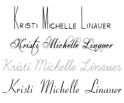
But the bottom line is, if you’re going to do a piece of lettered art, you must start with a fabulous font. Here are a few of my favorites lately.

The names of these fonts are Men In Black Credits, Eutemia I, Learning Curve Dashed Pro, and Ohio Script. You can download those fonts to your computer by clicking on the names, and then clicking “download”. And then, you’re only limited by your imagination!
One more great website I came across is Daily Drop Cap. (I came across this site via the blog Little Green Notebook–my latest obsession.) Jessica at Daily Drop Cap posts a fancy letter each day that you can use on a blog or for other personal (noncommercial) use. I find myself suddenly wishing that my name started with one of these letters:


But I did come across this fantastic “K”. Hmmm…maybe I can use this in my office. I love it!

So head over to Daily Drop Cap and check out the letters that you can use.
Tomorrow, I’ll have the second Crafty Tute Tuesday! Wow…I’ve actually managed to do it two whole weeks in a row. 🙂 Hopefully I can keep it up! If you missed last week’s project, you can check it out here.
Have a wonderful day!


Those are really cute, I love stuff like that!
From Daily Drop Cap, you can change the letter if you copy the HTML code and change the letter in the "" to be the letter you want, FYI. 🙂
Thanks so much for that tip! I really had no idea! 😀 Wow…so many more possibilities now.
Apparently I need to learn to read more clearly. I went to try out the different fonts and realized her instructions were a reminder to delete the letter in the word where you were using the drop cap, not the way to change the letter. I guess it would have to be a whole font to do that. So sorry! Still, LOVE THE BLOG! Your kitchen is WAY gorgeous.
lol…no problem. I'm the worst about skimming over words and getting right to the pictures. She actually just posted a letter that is PERFECT for me!! I was so excited to see it. It's an "L" with a vine pattern and three birds. I put it in my editing program and changed the colors to fit my little condo. I think I'm going to frame it and put it above my sink for a little touch of color.
Thanks so much for the compliment on my kitchen! It's still a work on progress, but I'm loving it, too. 🙂
Apparently I need to learn to read more clearly. I went to try out the different fonts and realized her instructions were a reminder to delete the letter in the word where you were using the drop cap, not the way to change the letter. I guess it would have to be a whole font to do that. So sorry! Still, LOVE THE BLOG! Your kitchen is WAY gorgeous.