Help Me Decide The 72 Paint Color Order For My Cabinets (Two Original Options + Four New Options)
Well, I thought I had my plan for the 72-color cabinets written in stone, but then y’all came along and threw a wrench in my plans. 😀 I had commenters on yesterday’s post present other options, and now I can’t decide which one I like the most! Thankfully, this indecision hasn’t delayed me at all because I only had time yesterday to finish all of the prep work, so I won’t even be able to start painting until late this afternoon. So that gives me time to show y’all the options so that you can weigh in.
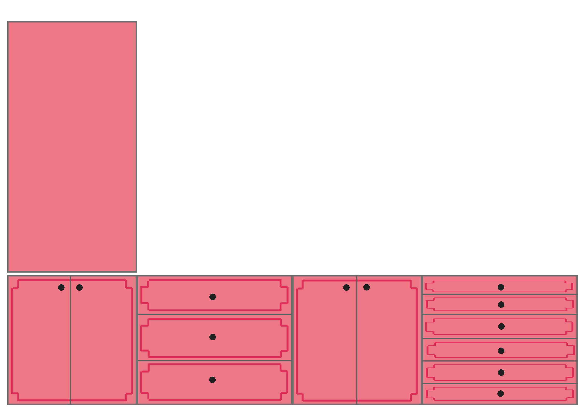
First, let me remind you of my original idea. I have 72 paint colors in a gradient starting with purple, ending with purple, and with the whole spectrum in between. I originally started with the stack of paint chips in gradient order, and laid them out in rows starting with the purple and pinks at the top, and ending with blues and purples at the bottom…

I kept them in the order I wanted them, and did every row from left to right…

The second option I presented was doing the colors in the same order, but reversed so that I start with purple at the top and then go to blues, and then ending with the pinks and purples at the bottom.

Again, that’s all 72 colors kept in order in rows, with all of the rows going from left to right.

But one of the new ideas suggested yesterday was that I do the design diagonally instead of in rows. That intrigued me, so I tried it out. Here’s what it would look like starting with purple and pinks in the top left, and ending with blues and purples in the bottom right.

Here’s the pattern I used to achieve that look. Again, I kept the 72 paint cards in the same gradient order. I started in the top right and then worked diagonally, going the opposite direction with each new diagonal row.

And here’s that pattern in reverse order, with the purples and blues in the top left corner, and ending with pinks and purples in the bottom right corner.

And here’s what that same diagonal design looks like if the order of the 72 colors is reversed, starting with the purples and blues at the top left, and ending with pinks and purples at the bottom right.

And as if those weren’t enough options to complicate things, I also decided to try the switchback layout, with the first row going left to right, and the next row going right to left, and repeat. Here’s that layout starting with purples and pinks at the top and ending with blues and purples at the bottom…

And here’s a visual to explain this layout. Again, I kept the 72 paint cards in gradient order, and laid them out in this manner starting with the top left corner

And here’s what that looks like in reverse order starting with purples and blues at the top, and ending with pinks and purples at the bottom.

And that’s this same switchback layout.

So those are now the six options — my two original ideas, plus four new ones based on comments from yesterday’s post. And I can’t decide!!
Here are all six options together…
Because I’m dealing with 72 different paint colors, this isn’t really a project that I’m going into with the idea, “It’s just paint! If it doesn’t look right the first time, I’ll just redo it!” I mean, all of that is true. It is just paint. And we can all be assured that if it doesn’t look right, I will redo it. 😀 But since there are so many colors, I’d really like to get it right the first time.
I think if I were forced to make a decision right this minute, I would probably choose one of the diagonals. But which one? I have no idea. But then I look at the other ones, and sometimes one of those appeals to me the most. So while I’m enjoying a nice lunch and conversation with my mom this afternoon, y’all get to weigh in on this. And then when I get home late this afternoon, I can read through your comments, make a decision, and get started painting…unless people make new suggestions in the comments today and confuse my brain even more. 😀 In that case, you can blame them when I show up tomorrow still having made no progress on painting after staying up half the night arranging and rearranging paint swatches. 😀 Hopefully that won’t happen, and there will be a clear crowd favorite from the six options above.

Addicted 2 Decorating is where I share my DIY and decorating journey as I remodel and decorate the 1948 fixer upper that my husband, Matt, and I bought in 2013. Matt has M.S. and is unable to do physical work, so I do the majority of the work on the house by myself. You can learn more about me here.
Love the first diagonal. It makes me want to scan it up and down and up again,,
I prefer the first diagonal too. No 3
Ditto! # 3!!!!
3
The first diagonal, #3! I feel like it gives a really flowing feel to it on the diagonal.
Ditto!
Same!
Mother vote for the first diagonal – although I don’t mind the second one either. Definitely the diagonals over the straights.
Diagonal. Absolutely. It flows more.
Definitely would go with the diagonals and Option # 3 looks the most cohesive with your studio, in my opinion.
I love the first diagonal one but the 2nd is nice too.
I am not so so sure you are a diagonal girl. You like symmetry and the diagonal makes things look crooked.
Anyway, I personally prefer the first option, with the pink on top.
Whatever you’ll do it will be perfect, pf that I am sure.
I agree with Diana, you like symmetry. Personally, I like the switchbacks, I’d go with #5. I think so many people are going with the diagonal is because you said you were leaning in that direction.
Option #3 DEFINITELY!!💕
I like option 3. Something about the darker blues anchoring the bottom corner. The diagonal is visually more interesting.
This! 😀
Exactly I needed the bottom anchored. Perfectly said.
My first choice is #1 and my second is #5.
The diagonal layouts look to perfectly planned for me.
I don’t know why, but option 5 just seems like the most calming option. I get a bit of an anxious feeling with the diagonals. It just may be the way my brain is wired. Maybe yours is different and you feel calmer with a different option. This looks like a fun project. 🙂
The diagonals were interesting at first, but when viewed all together, option 5 just looks the nicest to me. Someone else said something about blues anchoring the bottom and I agree with that. Option 5 almost looks like abstract art of the ocean at sunset. Very calm but very colorful!
I think definitely one of the diagonal patterns.
I lean toward the purple/blues at the top and the pinks at the bottom to correlate more with the pink cabinets.
Also, I love the gradient and it makes sense, but the 3 dark green samples in the middle pull my eye too much. I feel like they should be swapped with the lighter greens so that they tie in more with the lighter colors like yellows that are towards the middle.
No matter what you decide, this is going to cool and colorful!
Becky: I’m also for option #3 and agree that the darker green pulls my eyes toward it like it doesn’t belong in the matrix of lighter colors.
The dark muddy greens attract my attention, but not in a good way. If you were to switch those 3-4 swatches for brighter colors — any of the other 60 plus colors that you have chosen — it would be more pleasing to my eye. I doubt anyone would ever notice a “repeated color.” This is your house, and your studio, so your choice should reign supreme.
I agree. Those 3 dark greens stand out and are not pretty colors.
Option 3 would be my choice.
Option 3!
Love the diagonals – option 4 for my vote!
I am completely partial to #3.🤩
Option 3 or 4
I find 3 the most visually appealing
#3
I like option 5 except those two dark swatches in the 5th row. They are jarring to my brain. Because of that, I like the smooth flow of option 3 or the semi-randomness of option 1.
I like option 1 and option 5. Options 3 and 4 look a bit more predictable. All are lovely!!
#4 all the way!
I love the diagonals. The others are sorta boring now, if that’s possible.
Option 4 is the most visually appealing to me! Good luck!
Option #3 appeals to my eye the most. In most of the other options the gradient doesn’t seem to flow. Any one you chose is going to be fun.
My thoughts exactly. The other options have a swatch here and there that seem to stand out and look out of place.
I agree, #3
I like the diagonals much better, #3 or #4. I do agree with a previous poster that the dark greens look out of place. I would switch them with the lighter greens. Hope you end up with a consensus by the time you get home! Love this idea!
Love diagonal 3
Tough decision, but I like #3 and #6 I know they are far apart but they both appeal to my eye. Can’t wait to see your decision, enjoy lunch with your mom.
Agree!
Diagonal #3. The heavier colors are keeping it grounded.
Option 3!!!
Hands down, Option 3!
I like option 4.
Option 3, the first diagonal.
Option 4
Option 3!
The diagonal options are so much more pleasing to look at! Option 3 would be my choice with option 4 a close second.
I like option 3 the best! It seems the most interesting and balanced of all the options.
#3!!
I like #4 the best 🙂
Option #3 is my favorite, by a lot. It’s a beautiful layout.
I do agree with a previous commenter that the 3 dark green swatches are a little jarring with the current shade/configuration. In every design option, I immediately noticed the green first and it felt out of place with the other beautiful colors.
Option 3!
number 3 for the win!
I like either of the switchbacks, but if I were doing it, I’d mix them up all around like a quilt. That’s such a pretty mix of colors.
Love option 4
For me, it’s a strong preference for Option 3, followed by Option 5. I guess I’m “pinks at the top!” more than I would have guessed. Good luck!
Option 4 – the blue and purple diagonal starting in the upper left. I just like how my eye travels along the diagonal with the yellows.
Option 5 would be my pick. It just visually appeals to me the most. I’m not sure I can articulate why. I’m very interested to see what others say.
4
I love the diagonals! I think I prefer option 3 with the blues at the bottom right. I’m not entirely sure why, but I think my brain knows cold is denser and sinks so the cooler tones should be on the bottom not the top. There! A sciencey reason it makes more sense. 🙂
I think I’m with the majority in that I like Option 3 best. As soon as I saw it, my brain went ahhhh. I also think there’s something to the greens being a bit out of order maybe? This is such a fun project!
Option 3 is my favorite, but I would swap row 5 col 3&4 (light orange and darker orange). And possibly row 7 col 1&2. My eye jumped right to 5,3&4. But maybe your eye doesn’t agree!
Yes, number 3. I flows well.
I would choose Option 5.
Diagonal with purple and pink at the top!
#3
Option 4 is my favorite, then 3 followed by 2. Love all the ideas no matter what.
I love the diagonals of Option 3 or 4. All depends on what color you want on top. With your breakfast room having purples I would say that one.
I vote for Option 1 because you’ve already got a lot going on, some obvious symmetry appeals to me. But Option 3 is my second choice so I understand the appeal of diagonal. Good luck!
Option #3. It was the first one that screamed, “I’m it!”, at me. I love #5 and 6 but they look a little too church window to me.
Ooh! Switchback, pinks on bottom! Well, either of the switchbacks. I thought I was sold on the diagonals until I saw those – they really balance out the placement of some of the darker, more saturated colors (for example that dark green that just stares right out at you from the diagonal layout).
…I think I’d have voted for the diagonals if not for that one dark green 🤣 There’s a nice dark-light-dark gradient happening with it that gets broken up by it.
I agree the diagonals are my favorite. Maybe something to help you decide is which colors do you want closet to the back entry if it’s painted green. Do you want the pinker paint swatches closest or the greener colors?
Either way I am excited to see this come together!
Diagonal for sure. Either direction
Option 3 is my vote
Number 3 definitely!!
I am all for version no 1! I don’t like the diagonals much, they seem disorganized and don’t show enough symmetry. I’m really curious about your final decision – and the result!
I expected to like the diagonals, but Option #5 looks so good! Intentional but not cutesy.
Option 3
Option 1 and 3 have my vote!
Option 3!!!
I think option 3 is very pleasing to the eye. It’s not so much of a back and forth thing…..more of an overall appeal. With the lighter colors more on top – the bottom looks better with some of the darker colors. Better balanced…or weighted correctly. And just more interesting!
#1 and #3
Option 3! That one looks the most logical and cohesive to my very OCD brain and it is aesthetically pleasing to the creative eye as well!
I vote for #3
Option #3 is my favorite, I just love the diagonal pattern.
I vote 3 or 6
Option 3!!!
I like option 3..
I’m going to go out on a limb here and say #5. There’s something pleasing and calming about it. It’s not too predictable or discordant.
No question! #3!!! My eyes were “calm” when scanning this one
I like 2 and 6. Something about the pink at the bottom and the blues at the top appeals to me.
#3 would be my choice!
Option 3 is the winner for me!
#4 or #3
Can’t wait to see what you choose.
I’m drawn to option 3 and 6-I can’t say why. I also think that 72 colors are too many.
4 or 6.
I like the movement in option 3 and the way it looks with the wallpaper. You have great taste! I love your projects and I am confident that you will pick the one the works the best for you! Design is so subjective and all that the matters that choices put a smile on your face when you walk in the room!
Option 4.
Light is usually darker nearer the floor, soI like the brighter colors, yellows pinks oranges in that area.
I like #5
Love option 3 and thanks for indulging my curiosity for seeing it diagonally. Something seems out of place with the 3 darker greens in the middle and the 3 lighter oranges on the left. I can’t wait to see how this comes out. This reminds me so much of a project I did in a color theory design class in college.
I would choose either diagonal first, then #5. I am excited to see what you decide!
#3 for my vote! I like the diagonal with the darker blues on the bottom for the visual weight.
Option #3 is the one I like best.
Option 2
Team Diagonal, purple and pink top left! 🙂
Option 3. I like how the top left corner and bottom right kinda balance each other with the brighter running through the middle.
what if you only used the colors that are in the mural, putting one color on each door?
This. I agree.
Option 3. It looks more balanced.
Of the diagonals, l’m drawn to option 4 with the colors going top left cool to bottom right warm.
I also really like 6, which would be my first choice of the two options l think.
I vote for #3. That looks the best to me.
option 3 or 4. I LOVE the diagonals!!! Either direction!!!
What a workout for my eyeballs! Diagonal is the most pleasing to my eye, and I’d choose the one that had my fav colors at my(your) eye level. Thanks for giving me something important to contribute to the day😉
Option #3!
Option 3 is very pleasing to my eye.
#3
Option #3 for the win!
For a design, I like the diagonals, but they are very orderly, which I think gets away from the more random look I think would look best on the cabinets. With that in mind, if I were doing this, I would use option #2, 5 or 6. They are random, but not jarringly so.
Since there are so many colors, making a re-do a bit of a pain, I wonder if you could do a mock-up on a couple of poster boards (or even plain paper), taped together, and hung on the cabinet fronts and see what you like in situ.
You’re going to tire of it quickly. You’re home is colorful and fun, but in my opinion, this is way too much. I follow you because you’re not afraid of color, and I’ve learned Kristi does Kristi. I’ll be following!
Diagonals gets my vote…. Either one…
I’m surprised by the number of people who like the diagonal. That hurts my eyes. There are so many colors already that adding more pattern just seams like too much. In fact, I first thought maybe you had too many colors but when I played around with it, I decided I really liked your scaling of colors and intensities and the orginal layout remains my favorite because I like the violets and pinks on top. I prefer it to 5 for that reason and because in 5 you go from greens to blues, to teals to lavenders and that’s not the way the color wheel goes so it bothers me.
I also think you’re more of a horizontal linear stripes person than diagonal linear stripes person.
I LOVE option 3. Go for it. As you always say, you can sand it and repaint it if you don’t like it.
Diagonal #4!
OPTION 3, for the win!
I prefer the slight randomness of number 5. Just looks more interesting to me than the ordered patterns of 1-4.
3!
I would paint them the same way you painted the cabinets on the wall with windows.
Option 3!
I really love Option 3!
1,000% diagonal. Either one, as to my eye they don’t look that different from each other. The diagonal just flows so beautifully.
I feel like #3 with the diagonals, going from purple to pink at the top give your eyes a little sneak peak into what’s to come as you move into the room. No doubt that cabinet will be visible from several of the public areas of your home, and from afar, those higher colors will stand out more. Having the pink closer to eye level will be like dangling a little gem of a teaser for the rest of the gorgeous room!
#3
Diagonal. Purple and Pink at top left
I really like option 2. For some reason my eye really likes the reds and fuschias up next to the yellows and greens when looking at it against the mural. I do like the diagonal ones too tho. I hope you enjoy this project and it turns out very pleasing to your eye.
I like options 3 and 4, but 4 wins my a smidge. My eye flows over the colors with ease, and it’s clear what you were doing with the colors.
I’m on the Option 3 team.
I’m voting for Option 3. I find it very pleasing to the eye and yet orderly.
Good luck with your choosing.
5
I like option 4 the best but I don’t think you can go wrong with any of them.
This is fun – I choose Part 4.
I like option #5.
Option is my favorite for sure. I like the pinks on the top with teals at the bottom.
I like option 3 the best
Three! Only the diagonals read as a gradient, IMO. Four is my second choice.
Love diagonal option #3 🙂
My thoughts are definitely diagonal, #4. To me the reds are the strongest visually and my brain likes them at the bottom-providing weight at the bottom. When they are at the top it looks top heavy to me. Really, this is going to be a personal preference decision 😁
Option 3 is my favorite.
My favorite of all of the options is option 2 Left to Right with purple and blue at the top. I love option 5 the Switchback rows with purple and pink at the top, and option 6 Switchback with purple and blue at the top. Both the diagonals somehow don’t look as color coordinated or color oriented. Somehow they look like they aren’t in good lines.
I like #1 or #5. To me the darker heavier colors need to be on bottom. Otherwise it’ll be top heavy. I don’t know if that is clear enough to make sense……but the weight of the colors need to be on bottom.
I like #4
No opinion really over vertical/diagonal but I don’t care for the switch back I think it detracts from the gradient effect.
Hmmm 🤔 option #2 tickles my fancy the most. 😁
3!
Diagonals — either diagonal
Ok, in my humble opinion, I like #4. The darker colors are mostly at the bottom of the
cabinet doors (seems to me). That balances the colors going up to the lighter colors in the middle. There are some darker colors up top but not as many as on the bottom. It just looks balanced.
Be sure this is really what you want to do. The choice should not be the readers choice, but your choice. Which one do you like best? It is hard to decide, I can agree with that.
Happy painting.
I like #4 best, followed by #3.
My vote is #3, diagonal 🙂
Love diagonal with pinks near the top!
Option 4 is my favorite! 😍 But, whatever you do will be awesome – as always!
I like the first diagonal, if my opinion helps!
Option #3 for sure!!
Diagonals seem to be more pleasing to the eye – my eye, anyway.
I like option 3 because the colors flow, and because the lighter colors are higher in the pattern. In case of point, the yellow is at the top right corner. The other diagonal pattern places the darker colors toward the top, making the doors look top heavy.
I really like Option 3! Option 6 is not half bad either, a little more geometric looking to my eye.
Option 3 no contest.
3 makes my brain happiest to look at.
Option 4 diagonal
#4 puts some of your favorite colors at the top.
3 & 5 are my favorite. Do what your eye likes visually.
Option 3! Either diagonal is super pretty, but I lean towards #3 because it puts the cooler blue colors on the bottom and the warmer pink colors near the top. That feels more “natural” to me.
My favorite is Option #3.
I love option 4 the best. It looks well put together .
Option 4
Option 3
Options 3 or 4
Option #3….the 1st Diagonal!
Option #3….the 1st Diagonal! I’m just curious…..72 different colors to buy is ALOT of paint. Are you planning on using the inexpensive samples with a poly on top or are you mixing yourself?
Never Mind….I’m now seeing you answered that exact question in your previous post. VERY RESOURCEFUL!
I love option 3 (diagonal with purple and pink at top)!!
Diagonal, pink on top!
I love the diagonals, too! They’re a bit more engaging for the eye than the horizontal patterns. Option 3 is my favorite. What a fun project!
Option 3 feels most comfortable if that makes sense.
I like the diagonals! I’d be curious to see the diagonal with the purples in the middle and the yellow/greens in the corners….if you’re up for another layout 😉
(unless you previously explained why you want the purples/pinks/blues on the edges and I just forgot.)
Option 3 or 4. I think I like 3 a bit more.
The first diagonal, option 3. I think the colors flow better and easy on the eyes.
Number 3 the first diagonal one.
I like #3, but the 3 dark green in the middle bugs me.
Either of the diagonals, they have a better flow than the others.
I guess I’m outside looking in the window! Being a dyer, I’m more of a ROY G BIV gal. Personally, I think the dark colors at opposite corners is just too heavy for my eye. I love all the colors, just not in that sequence. When I first saw your post and you mentioned diagonals, I thought Yipee! She’s going to do diagonal stripes. I’m also a quilter and can see a herringbone pattern with each door having the stripes going in a different direction from the dorr next to it and the colors spread out over all the doors. Although I liked the original idea of the brushed colors on a surface, I am not seeing the 72 colors all on one door. Maybe all put together but swatches would be too small for each door individually. It looks like a plaid to me. OK, I’ll show myself out and let you ladies decide what to do. Bye for now!
Diagonals! Purples and pinks top left!!!
#3
Personally, I like option #3
4
Options 3 and 5 grabbed my eyes and made me want to look at them. But I think the symmetry of option 5 may be better.
I’m drawn to the diagonals, and I gravitate to #4, but think either would be great!
#3
I personally like #3. It is darker on the bottom and therefore, heavier on the bottom. Looks right to MY eyes that way.
DIAGONAL #3
#3
#3 is my favorite!
The first diagonal flows. What a great suggestion..
I love #3. Or really any of the diagonals. I just like them so much better than the first two originals. But #3 is my first choice. Glad someone suggested it!
I think option 3 flows the best and option 2 would be my second choice. Both options end with the blues and purples on the bottom which to me is more visually appealing. They have a heavier/weightier look to them so they just feel like they should be on the bottom to sort of ground the look.
Diagonal 3 !! Love it!
Definitely the first diagonal! It’s the easiest on the eyes.
I like the diagonals the best … instead of going horizontally or diagonally – have you tried top to bottom ? … I like the way your exercise room turned out – and this would be similar – but also different … I give you credit – trying this multi-color idea – MAN ! what a challenge … also you could go from high-intensity colors and finish with the lesser intensity colors … you could also go with dark (or light) around the edges – decreasing the intensity as you go towards the middle … I have no idea if any of my suggestions would work … but it’s all about creativity – which you have in abundance … you seem to be able to visualize what (or somewhat) your finished project will look like … good luck – and remember the saying … paint is cheap – if you don’t like it try again … which you’ve done before … “here’s to a successful and happy (for you) ending” … Judy Ivan
Number 3 is my fave!!
I really love #5, but if it is to be diagonals, please make it #3.
Option 3 looks the best to me.
Option 3 is my first choice and Option 4 is my second choice. I agree that I like the diagonal look better.
Definitely #3. The “weight” of the colors if more balanced in this one%
Love the diagonals especially option 3. Seems like heaviest color weight is on the bottom. Such a fun project- enjoy!
I love Option 2, but I alos love Option 3 IF you make that dark green swatch floating in the middle change places with the lighter greens – the goal would be creating almost a 3-D look with the ‘shadows’ around the edges, while the lightest shades gradually getting brightest towards the center of the whole work…
That one dark green swatch just draws the attention from all the other beautiful gradients as it pops against the lighter/brighter greens around it in Option 3…put it towards the side, and Option 3 is golden!
Option 3!!!! Love the flow
opt 3
rainbow order
Without looking, I am going to say 2 or 3. Now I’ll go look and see how far off I am from everyone else!
Option 3 is my favorite 😍
Too many colors…you will be changing it soon no matter which you choose. Maybe only all the lovelies in the mural. Please yourself, my dear.
I like option 3 diagonal. Those pinks tend to shine towards the top.
Option 3 or 4 is my preference. Even though they’re on the diagonal, either one of one of the options look more balanced to me. I think the darker tints look better across the corners, with the brighter & lighter colors across the middle.
Hope you continue to be mostly free from back pain!
It’s a little late, and you’ve probably already started, but I would definitely vote for either the diagonal or the switchback that starts with the warm colours (so either option 3 or 5). There’s something about starting with the warms and ending with the cools that looks more “right” to my brain. I can’t really articulate why, exactly, but I firmly feel it. Lol.
Definitely 3 for me … I can’t even pinpoint why but as soon as I saw that one it felt like it flowed nicely
I thought 3 with the blue at the bottom was best symmetry. But number 5 is the one my eye was drawn too and made me smile. Which one makes you smile?
I like 3!
Option 3 is my favorite!
Option 3! Has the best energy and the best “weight” of the colors from top to bottom.
Hi Kristi. I like option 1 — I think it is the most striking.
I love the diagonal ones! However, there’s one dark green one in the centre that seems to stand out, if you did the diagonal option could you move the darker colors to the outside?
Option 6 Switchback! It’s balanced, with no heaviness in one area.
Option 2 is my choice.
I don’t like the diagonal at all. I feel like that one really draws your eye to the “lines” instead of just taking in the beautiful colors. I had a strong dislike for it in the thumbnail of the post. All I saw was the yellow stripe through the center. I really liked the initial more random pattern. Obviously, you’ll pick what YOU like best…that can be hard to define sometimes though!
Diagonal #3 is my my first preference followed by diagonal #4.
My initial option would be #3 as well, but I feel that over time, that one strong diagonal would wear on me because it pulls the eye off into space, as if there’s no closure. For the long term, #5 feels less structured and calming. Plus, the 2 dark greens land on the edges and don’t feel out of place there.
Option 3 has so much great motion and interest.
Option 3 made me gasp♡
Option 3 is my first choice, with Option 1 coming in second. (I definitely prefer the pinks near the top.) It’s going to look great!
I think no matter what, the purple/pinks should be at the top with blues at bottom. But of the patterns, I like diagonal most!
3
I prefer Option 3. It seems more balanced to me. Jumbled up things make my eyes jump around and my insides get anxious.
First is option 3 for me. Closely followed by option 1.
Good luck with the decision!!!
#3
I LOVE the diagonal options!!
Option 1
Love number 3! Can’t wait to see how it turns out!
Option 4