Here’s Why I Want To Change The Studio Wallpaper
If everything works out as planned, the home gym will be finished this week. I only have a few small things left on my punch list for that room. That means that next week, my attention will finally be on the studio, and I can’t wait to get that room finished up!
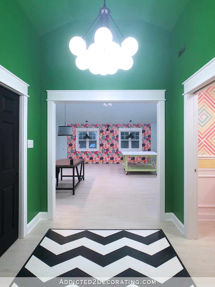
One thing that has been bothering me about the studio is the wallpaper. I love the wallpaper, and yet, there’s something that has been bothering me about it for quite some time. I had considered swapping it out for a completely different wallpaper, but then so many of you urged me to keep. But I had to decide what to do about the one thing that bothered me about it.
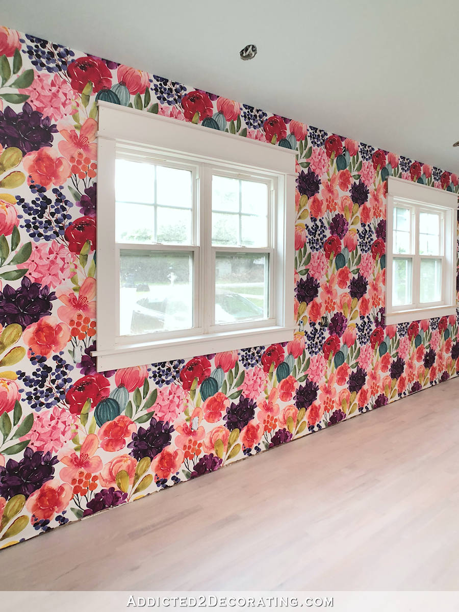
Here’s what I don’t like about it. Up close, I think it looks great. But from a distance, the dark purple flowers turn into blotches of dark purple, and they seem to dominate the rest of the wallpaper.
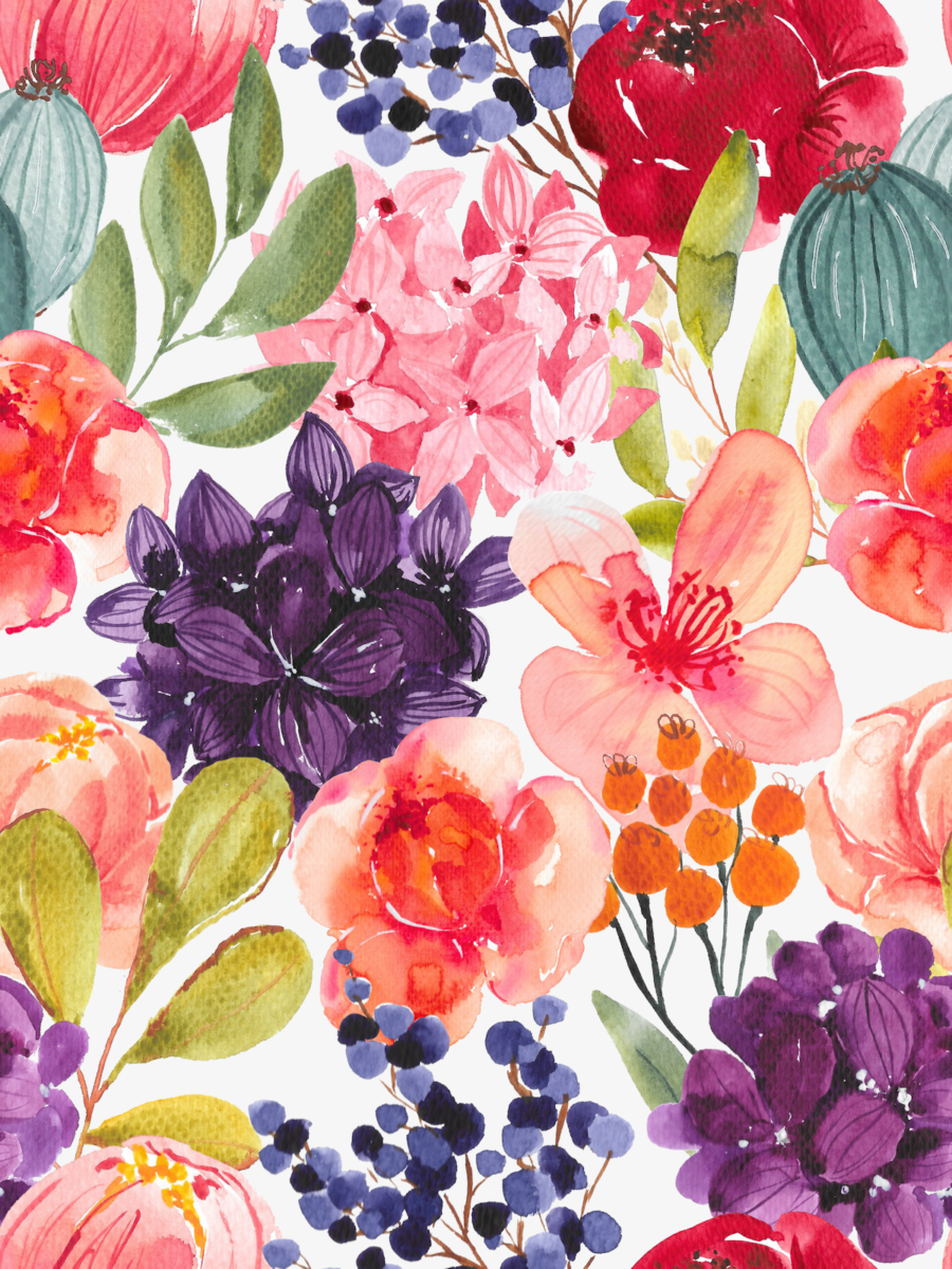
This is wallpaper that I designed myself, and unfortunately, I lost all of my original pictures when my hard drive crashed, including the full sized picture that had every single flower on a different layer to make it easy to move and edit each flower individually. But last week, I realized that I could go into my Spoonflower account and download the file (the large wallpaper picture) that I uploaded to have the wallpaper printed.
So I did that, and then my mom helped me by using Photoshop and separating out the two flowers that I don’t really like (the dark red and the dark purple) and putting those on separate layers in the image file so that I could edit those individual flowers separately.
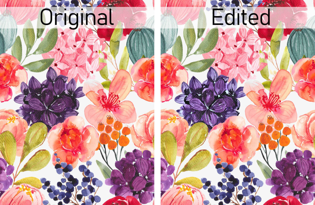
I’ve worked with it some this weekend, but I still don’t have it exactly like I want it. Here’s what the original wallpaper looks like…
Here’s what it looks like with lighter purple and red flowers…
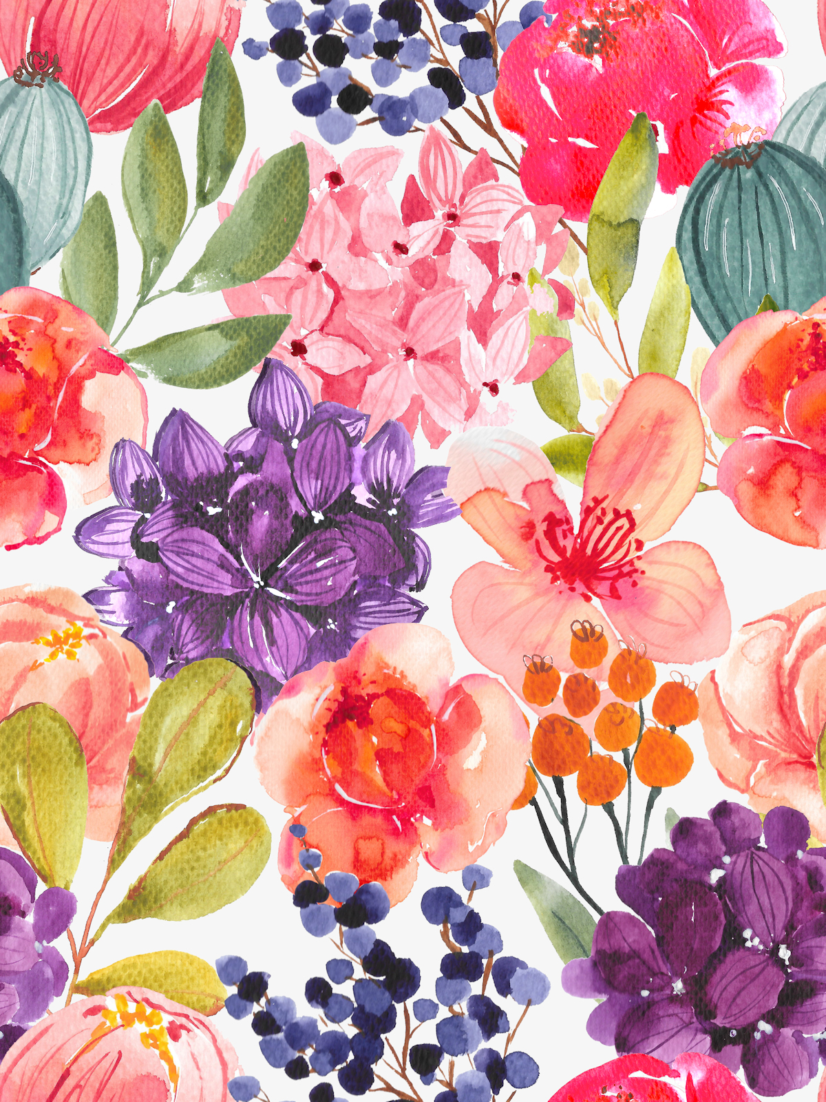
I definitely like that purple better, but when I tile the picture to see what it would look like as wallpaper, now it seems that the two purple flowers are too close in color, and now purple dominates the wallpaper.
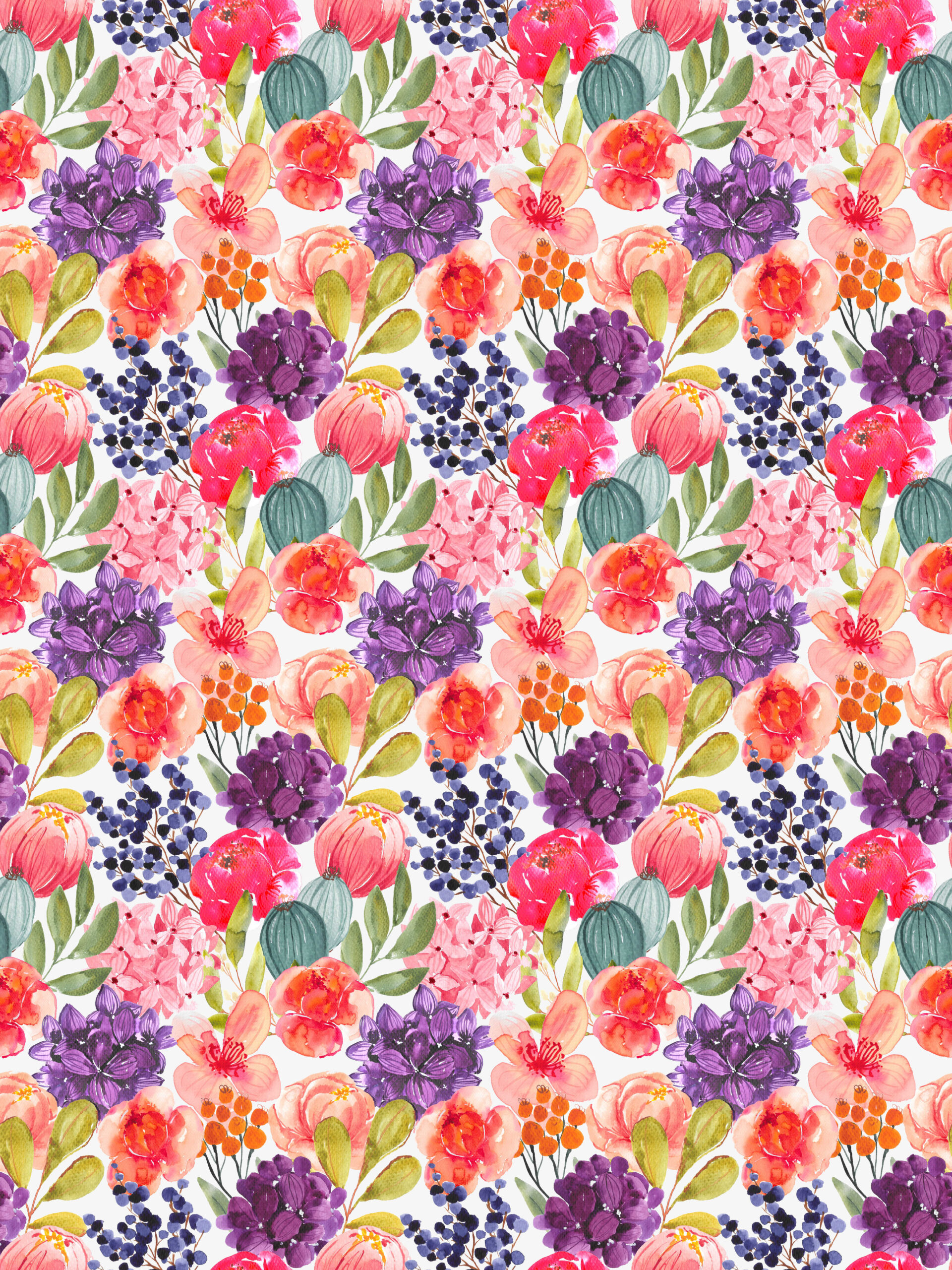
And I don’t want it to go too pastel. But I do think it’s an improvement. So I’ll do just a bit more tweaking, order a sample, and then re-wallpaper the whole wall.
Here’s another comparison. This is a closer view of the wall with the current wallpaper with the really dark purple flowers…
And here’s a mock up with the lighter purple and red flowers.
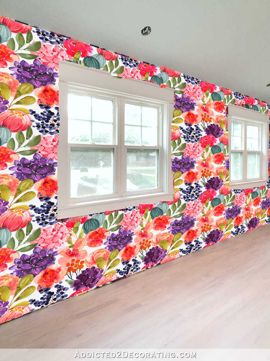
They definitely need more tweaking because I don’t want that much purple dominating the wallpaper. But I do want to get this right because, as I’ve already shared, I plan to do some changes in the back entry of this room, as well as the bathroom. And right now, I’m considering using this wallpaper on the walls of the back entry. I’m still coming up with an overall plan for this whole room, but I think I do want to use the wallpaper somewhere other than this one wall. So it has to be right!
Does this remind you of anything? I did the wallpaper mural in our master bathroom twice to get it right, and here I am doing the wallpaper in the studio twice to get it right, also.
EDIT:
In looking at the tiled image above, I do think that the purple flower is too light and pastel, and that’s not really what I think the flower needs. It just needs more definition so that it doesn’t look like a dark purple splotch from across the room.
So I tried editing it again, and this time, rather than lightening the whole flower, I just tried to add light to the shadows. And then I removed some of the red from the purple so that the color would be noticeable different from the other purple flower. Here’s what that looks like…
It might need more tweaking, but I definitely like that better than the light pastel purple flower that I originally turned it into.

Addicted 2 Decorating is where I share my DIY and decorating journey as I remodel and decorate the 1948 fixer upper that my husband, Matt, and I bought in 2013. Matt has M.S. and is unable to do physical work, so I do the majority of the work on the house by myself. You can learn more about me here.

![The Current State Of My Studio (The Reason For My Procrastination) [VIDEO]](https://www.addicted2decorating.com/wp-content/uploads/2018/05/video-thumbail-1.jpg)
I see what you mean. It wouldn’t even be so bad if you left the dark purple if there wasn’t so much of a pattern repeat. From a distance the dark purple really does pop out with a ‘checkerboard’ kinda pattern. I suppose you’d have to do hand painted wallpaper to keep that from happening, huh?
Now that you’ve mentioned it, the purple does dominate! One thought … you mom’s an artist. Rather than taking down what’s there and ordering more, could she paint over the purple flowers on the wallpaper? A light water-color type of overpainting? Might be worth a try.
I too was wondering if you could paint over the unwanted colors, kind of a whitewash process??
That’s what I was thinking…
Make a lino stamp & use a transparent glaze to lighten the colors on the original wall. Remember, the bottom of the wall will be covered by your cabinets so the lightened purple will not be as dominant as it is now.
This was my thought too! Or even using a whiteout marker or silver sharpie?? Edit the wall like she did with the music room — just freehand (or make a template) to add highlights to those flowers and brighten them up a bit, add more definition.
Have you tried changing the size of the purple flowers? Perhaps they could be smaller and one of the other colors could fill in. That way it would be more of an accent color on the wallpaper.
Unfortunately, I have no way to do that now since I lost all of my files. Changing the size would require me to start from scratch in designing the wallpaper.
Oh yes, I understand. Sorry that happened to you.
Hi Kristy!
I love that you designed your wallpaper. It’s lovely. My suggestion is to add some yellow. This is the color opposite purple on the color wheel and may provide more balance. Looking forward to watching you make your magic.
Is there a type of paint that could be translucent enough to do a light wash over all of it. Sort of like having a bit of blurry vision?
Ralph Lauren used to make a glaze for wallpaper, to give it that aged look.
The last photo looks like violet and plum – distinctly different shades of purple. Nice!
Nice paper, but it seems even the lighter purple dominates.
How about touch up those purple flowers with paint to lighten them up? Simple!!!!!
I hadn’t read the other comments, yet before I posted this- LOL! Sounds like we all thought the same thing as a remedy!
I kind of see what you mean, but you have lots of pinks and the flowers don’t overwhelm or look like there are too many of those. What if you put a dot of yellow (golden?) in the centers of each flower in one of the purples – would that make it look enough different? I do think the wallpaper is fabulous but I think I do like the lighter purple better with so many other light colors on the paper.
I do like the updated version much better. Purple is comprised of blue and red, so blue up one flower more and make the other a bit more on the red-ish side of purple. Also even though you are worried about the many repeats of purple in this gorgeous wallpaper, once its tweeked to your liking and re-hung, please remember, a big part of that wall is going to be covered with cabinets and a countertop, isnt it? so it will also have some interruptions too. I just have to say again, I LOVE THAT WALLPAPER!!!!
Makes sense that when you live with something for a while, you reevaluate how it works. I’m surprised by the baby blue walls and interested in how you’ll tie that in. Your visions always end up gorgeous, so no doubt the studio will be the same.
The walls won’t stay that color. 🙂
Haha! I figured you were going to hand repaint the purple and red flowers when I started reading!
I considered doing that, but if I use the wallpaper in the back entry as well, I really don’t want to have to paint all of those flowers.
Hi Kristi,
I never commented on the cabinets, but I love the two-toned white/wood. I think it would balance out well the wallpaper—whatever option you choose.
Because of how talented you are I was wondering if you considered painting over the purple flowers on your current wallpaper? Add highlights or something that pulls them away from being a blob from a distance.. it would let you see what you like in real time.
I had planned on doing that, but then when I considered using the wallpaper in the back entry as well, I decided that I’d rather edit the wallpaper and have it reprinted instead of having to hand paint all of those flowers.
If you’re definitely going to replace it, what about “experimenting” on the current wallpaper to see what different changes would look like? You could print some from Photoshop and tape them up, or paint a few others to get an idea of what would look good in the new wallpaper.
I just love the wallpaper how it is now. Imagine all your cabinets along that wall and the wallpaper won’t matter. Do a mock-up of that. You are not going to be standing in your hallway looking at that wall with the cabinets installed like you are looking at the blank wall. You are thinking too hard.
Amen to this!
Love the lighter shade of purple. I have one suggestion. Have you considered turning the flower to the right a bit?
Since I’ve lost all of my files, I don’t have the ability to do that anymore. Making changes like that would require me to start from scratch on creating the wallpaper.
I wonder if you could try a white paint pen or sharpie and add some outlines or highlight to the dark purple to make each petal stand out?
What Shannon said is exactly what I was going to say!
Totally get it. Distance plays so many games with patterns. Made the same mistake with my family room window treatments.
Some of the suggestions to tone it down with paint definitely have merit…although the sheen would have to be similar so it didn’t pop out for a new reason. Not optimistic about that approach, but it’s nearly free to try.
You might consider printing out multiples of the edited flower and–if you have a Cricut–cut and put them over the originals. Then you can stand across the room and see if it makes a difference.
No matter, I know you’ll solve it…with the usual brilliance.
What a clever idea!
I personally think it needs differing sizes of the flowers and more random placement its too matchy matchy and too large all over in my opinion. Plus I would try to mimic more of the colors you already have in your house a bit closer so its more cohesive. And maybe pick just one of the colors that you want to be noticed the most and make that the biggest one and in differing shades of it with all the other ones you already have. I love what you have done with your house!
I agree. Too busy and matchy matchy.
Why not add some fine black ‘pen and ink’ lines? That might give a ‘constant’ definition throughout…
Or find a way to ‘weave’ the darker blotches into the lighter ones via a ribbon or such to form a pleasant darker pattern when viewed far away…
Or vary the sizes of the darker and lighter flowers more with an eye to the ‘far away’ pattern that will unavoidably be seen…
Dear Kristi,
I’d love to see a mock up of that wallpaper with the darkest purple flower changed to a soft, beautiful yellow. I think your floral is missing a pretty yellow to bring it all together.
Also, could you show us on the far view photo where the cabinets will be covering the wallpaper? That’d help me get some perspective about what flowers will actually be seen in the final view of the room/that wall.
I hope you’ll find just the right solution and it’ll be easy and very do-able! Have a wonderful day!
YHWH Bless You : )
I hate to say this, but that purple is going to dominate the design no matter what shade it is. Especially from a distance. The hue of the purple would have to be lightened to the same depth of color as the other flowers. With splashes of flowers, if the depth of colors don’t match, you’ll get the darker one dominating no matter what you do to it. I had this problem with draperies I had. I loved the bold floral design but didn’t realize how much the dark green leaves was going to overpower every flower. I’ve had them in a goodwill bag since the pandemic. There’s no escaping the dark/ light contrasts and it Will really stand out from a distance. Sorry to be a negative voice. I always loved that wallpaper you designed, except for that dark purple.
I agree, even though purple if my favourite colour it can be a solid pit of darkness sometimes. I think you have to go much lighter than you already have. Something along the lines of Pantone 17-3640 in lightness. That one is probably not the right shade but it has the right light values needed.
The problem I see is that dark purple flower is solid compared to the airy other flowers. What if you made a stencil to add lighter highlights to it. That would be easier than painting each flower by hand. You could move quickly on that.
I see this as too warm and not cool enough for what you like to live with… It’s a large dose of warm colors.
Even with the editing, will you be happy? I recall the original image that started this creativity. Is there something in the original makes you smile?
I think what it needs is more of your favorite teal palette! Can you recolor one purple or red yo be teal?
What if, rather than repapering, you made a stencil for the purple and the red flowers and then stenciled lighter tones over part of each flower to lighten them?
Should have read the comments first!🙄
With your artistic ability, do you think you could just tweak it with some paint? I’m always amazed seeing your talent!
I love the colors in the wallpaper, Happy Colors! Rather than replace the wallpaper about adding paint to the areas you want to soften.
I hadn’t realized how the purples affected the overall look of the wallpaper, but I do think you are moving in the right direction by removing the heaviness out of that flower. Painting the wallpaper doesn’t really work as the different sheens will draw your eye right to where you don’t want it to go! I know it will be great once you get it right!
Maybe this will get worked out un the printing process but try to get a step repeat or a drop going so it looks less grid like as well. That may help.
Paint the changes on the paper!
I agree with you re the dominance of the dark purple flowrr. Could you try for more of a lilac colour which would lighten it up and not be such a drastic contrast to the rest of the pattern?
I’m going to go out on a limb here and suggest not using any version of this wallpaper and go for a mural like in the master bath. No mater what colors you change, the repeat is still going to have stand-outs when seen from a distance, because of the repeats in the pattern, so don’t have a pattern. Since you’re inclined to use something different from what you have, maybe go completely different. My two cents. I know whatever you decide will look fab!
I agree the dark purple flowers are too dark. Have you tried adding white to it?
Maybe just smaller purple sprays of flowers?
Hi Kristi, just my impression but i think the purple flowers are to dark. But, to me they are too round. Maybe scatter the petals a little or let other flowers overlap them a bit. Or add more white between the petals. Just my point of view. I have been an artist and art teacher all my life. I retired at 70 yrs old when covid hit. Just to let you know im not speaking without a clue. I really like that wallpsper, but the purple flowers bothered me as too round and too solid looking and too dark for the overall look from far off. This is just my suggestion and impression .
When I opened my email & saw “Why I want to change my studio wallpaper”, I was thrilled since I’ve been waiting for you to decide that! I’m quite sure you’ll find a way to brighten the purple flowers as they seem to compete with the other pretty colors. If you lightened them, I wouldn’t consider the result being pastel. Lord knows I can’t complain because my window curtains, bedspread, shams & shower curtain are all pink, coral, red, teal & turquoise. And the coral poppies are as big as my head! Needless to say, they are busy but I love them so. The other flowers in your wallpaper remind me of my ensemble, minus the purple flowers.
Not trying to be a Debbie Downer, but I’ve always known that you’d change that wallpaper, after following you since the condo days! I’m happy the gym is almost done so you can take time to concentrate on the studio wallpaper, especially since you lost your files! So sorry about that. It must’ve been heartbreaking to know that you can’t retrieve them.
Can’t wait to watch this next phase!
Kristi, For years now I have admired your impressive passion, determination, building knowledge and drive to transform your home into the vision you have for you and Matt.
I had missed the posts about the dark bright green hallway and the patterns in that area. Include with that the highly busy flower wallpaper you are struggling with now and all I can feel is a lack of continuity throughout the home. I admire your love for colors. i love your big bathroom, and kitchen! As a stained glass artist, color is my life. I feel that rooms should flow as you go through a home, and instead yours does not, it feels abrupt and confusing., with lack of continuity, atmosphere. Your room patterns are in contrast with each other and unsettling to me, as if the rooms are fighting for attention and burst with their own intense color designs that loudly say “look at me!” Perhaps you may want to look and figure out the flow throughout your home, I know I’ll get slammed for my honesty, I mean no harm, but this morning your pics felt not like a home but instead a catalog of color patterns everywhere with no interrelationship. It was quite unsettling to me. My honesty means no harm, just find it difficult to be part of this. It wouldn’t hurt to consult a home designer to see what ideas they would suggest to integrate your home designing. Sincerely IR
Since you have that flower image separated – have you thought/tried to do a hue/saturation shift in photoshop to a teal colour and move away from the purple altogether? I just grabbed one of your images and made the change it it looks pretty good.
You already have a purple flower in the hydrangea bunch and the teals are in your wheelhouse.
I’d be tempted to lighten the purple cluster and boost the contrast on that one too so it’s less of a purple blob and has more detail. That would make it less aggressive and more in line with the tonality of the other floral clusters.
One last comment – if you email me I can send you a jpeg of my modification.
Rather than just changing the purple to a different purple, try changing it to a teal or blue to prevent the purple from dominating
Just wondering if there’s a way to hand paint highlights over the purple flowers instead of replacing all the wallpaper?
I give it to you that you can take in all of our opinions and still move forward with adjusting your home to fit your needs. It is your home, you and Matt are the people that live there. Do what makes you happy, change it, paint it or strip the wall bare…it is up to you. I have learned to go with your feelings about how you decorate or what you do to in order to be comfortable and love your home….it always works out. You have a vision and it is okay to change your mind about anything you have done to your home.
Late to the party…such a bossy color. Would you consider changing the color to a light green with the purple edging? I’m thinking of a limelight hydrangea.
Congratulations on making your final mortgage payment!
Oh yes, I understand. Sorry that happened to you.
Kristi what if you change the smaller more open flower to yellow or a more blue/purple? I think that would help the overall design
Can’t say I’ve ever been a fan of this wallpaper, and I agree that from a distance it loses what charm it had. But as others have said, I don’t have to like it but you do. I think the purple flowers will always be the bossy element in the design.
I would have never noticed this until you pointed it out. I agree that maybe you should wait until you put your work tables/cabinets in. Whatever happens, you’ll have made your home to fit you and your husband and that’s what counts.