In The Studio: Liquid Acrylic Pour Paintings #1-6 (Plus, The Inaugural Use Of My Acrylic Pour Table)
I got a chance to use the table that I built specifically for doing liquid acrylic pour paintings (you can see how I built it here), and it worked out very well! As suspected, after using it, I did realize that there are a couple of modifications I’d like to make, but overall, I was very pleased. (I added my suggested modifications to the end of this post.)
Want to see the artwork I made during the inaugural use of my table? You can see the whole process in the video just below. I narrated the video after the fact because after videoing the process of doing three paintings, I had a video that was over an hour long. Yikes! So I edited it considerably (and added the narration afterwards), but you can still see the process pretty clearly.
Looks fun, right? It is! And its so relaxing! (By the way, if you can’t view the video above, you can click here to see it on YouTube.)
So first, let’s talk about the painting details.
Liquid Acrylic Pour Paintings – Paint, Additives, “Canvas” and Equipment
For all of the paintings, I used Behr paint. Yep, the kind from Home Depot. Behr paint is 100% acrylic, and the sample pots are such a convenient size. I love that it comes in hundreds of colors, so you really don’t have to do any custom mixes unless you just really want to, and I also like the way it pours. I find that it’s very easy to work with. If I’m using paint from a sample pot that has previously been opened and used, I make sure that I shake it up thoroughly and also strain it through a small metal strainer with fine wire mesh before using it to avoid any dried bits getting into the paint.
Behr paint is too thick to use for a pour painting right out of the container, so to prep it for use, I mix it with a few other things. For these paintings, I mixed as follows:

This was a good start, but I’m going to play around with the formula a bit more. I think the paint ended up being a little too thin, so next time I’m going to try less Floetrol, and I might leave the water out altogether.
The Additives:
Floetrol is a paint additive that you can find at big box home improvement stores in the paint department, or you can find it here. I buy it by the gallon, but it does come in smaller sizes if you just want to test it out.
I buy my Liquitex Pouring Medium on Amazon, because I can never find it in bottles larger than 8 ounces locally, and I purchase it by the gallon as well.
The “Canvas”:
I did these paintings on 1/4″ MDF boards, which I cut to a standard frame size using my table saw. I prepped the boards by priming them with a water-based primer, and then sanding them smooth with 150-grit sandpaper. This worked fine, but next time I will go back to my favorite Zinsser Cover Stain oil-based primer, and I’ll do two coats instead of one, sanding well between coats and after the final coat for a really smooth surface.
So why MDF boards? Oh, there are so many reasons I prefer MDF boards to canvas, especially for acrylic pouring. I now this is going to sound strange, especially coming from someone who was raised by an artist, and who even grew up stretching and prepping canvases for my artist mom and some of her students on occasion. But here are my reasons. Of course, you can paint on whatever surface you like.
- I don’t like finished artwork where you can actually see the texture of the canvas through the paint. (I blame that on my mom and her meticulously-prepped canvases that she did her paintings on.) And in order to get rid of that texture, canvas takes soooo much prep work. (My mom used to prep her canvases with SEVEN coats of watered down modeling paste, wet sanding them with super fine sandpaper between each coat.) By contrast, MDF boards are already smooth. They just need one or two coats of quick-drying primer, a bit of sanding, and you’re ready to go.
- I prefer the inflexible rigidity of an MDF board over the bouncy give that a stretched canvas has, especially when doing liquid pour paintings. This isn’t such an issue if you’re doing tiny 6″ x 6″ paintings, but it’s an issue if you’re doing a big 24″ x 36″ (or larger) painting. The very first pour painting I ever did (and didn’t share with y’all) was on a large 24 x 36″ stretched canvas, and I found it very frustrating to work with.
- I prefer framed artwork over an unframed canvas hanging on the wall (so I generally have no use for “gallery wrapped” canvases, personally), and 1/4″ MDF board is much easier to frame than a stretched canvas.
But again, if you prefer canvas, then by all means, use canvas. 🙂
I did try using canvas boards a few months back, thinking that would give me the best of both worlds — the canvas to make me feel like a real, legit artist, plus the strength of it being adhered to a rigid surface. Well, it turns out that the cardboard (even the thick stuff that the canvas is adhered to in order to produce canvas board) isn’t so rigid as a liquid acrylic pour painting dries. Those canvas boards warp terribly as the paint dries, and you’re left with a bowed painting that won’t lie flat in a frame.
The Equipment:
You’ll see in the video that I use a blower to move the paint around the canvas. To do that, I use my little pancake air compressor (this is the one I have — the only air compressor I use for all of my projects), and I use a pistol grip air blow gun attachment (like this one). I mentioned in the video that I set my compressor to about 60 PSI, but what I failed to mention is that I never squeeze the trigger all the way. In fact, I squeeze it just enough so that a light stream of air comes out, so I could actually set it way lower and it would work out just fine.
Other supplies:
I mix all of my paints in 8-ounce mayonnaise jars (I always buy my mayo in these jars and I never throw them away specifically for this purpose). That way if I have any mixed paints left over, I can store them conveniently in those jars with the lids without them taking up too much space. They’re the perfect size for storing mixed paint. But I don’t like to pour the paint directly from the jars, so when I’m ready to use them, I fill up as many 3-ounce Solo cups as I think I’ll need, and I use those to pour the paint. I just get these at the grocery store. I prefer pouring from these rather than the jars because the Solo cups are flexible and I can squeeze the tops to make a “spout” on one side for a cleaner and more precise pour.
So let’s get to the paintings…
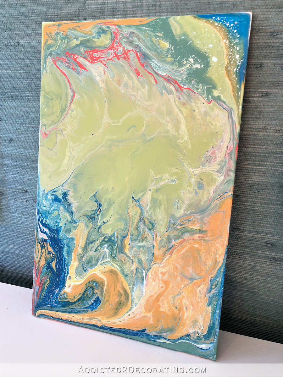
Liquid Acrylic Pour Painting #1 – Teal, Orange, Coral, Green and White, 11″ x 17″
For the first painting, I used these paint colors…
I also used a custom mixed teal that I had on hand, but any dark teal will do. And I also added just a drop of 100% silicone (I got mine at the grocery store in the small automotive parts section, I believe) to each paint cup that I used.
I had a bit of trouble with this painting (as you can see in the video at the top of this post) because I failed to place the painting on a level surface to dry. A level surface is imperative for drying or the liquid paint will move around way too much and you’ll be left with a painting that looks nothing like it did when you left it to dry. And that’s precisely what happened. Although I do like the way this one turned out, I’m going to try again with the same colors. And next time, I’m going strive to actually end up with what I started with. 😀 But I do think this turned out very pretty.

I actually imagine this painting being framed and hung horizontally, but I wanted to show it vertically so that I could use a larger photo to show more of the details.
Liquid Acrylic Pour Painting #2 – Pink, White and Gold, 11″ x 17″
For this painting, I used these colors…
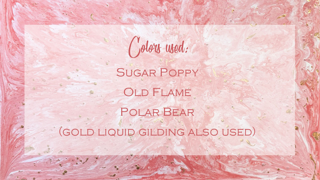
This one turned out to be my favorite of the three that I did on the video. The liquid gold gilding didn’t work out like I envisioned, but I do still like those bits of metallic gold in there.

That picture was taken before I put the protective clear coat spray on top (I seal all of them with a clear matte spray). When I sealed it, the spray actually turned the gold a gorgeous rose gold color. I have no idea why it did that, but it’s so pretty! You can see it here…
![]()
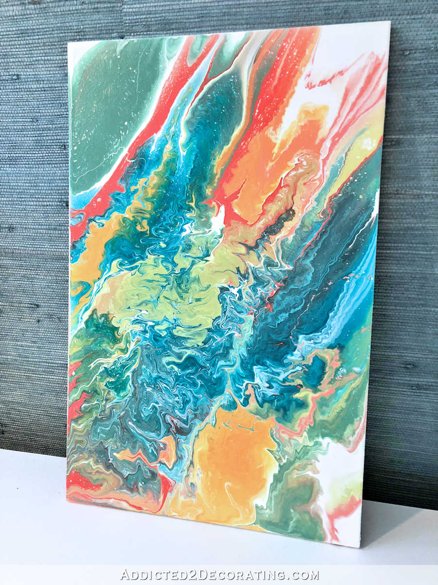
Liquid Acrylic Pour Painting #3 – Blue, Light Teal, Orange, Coral, Green and White, 11″ x 17″
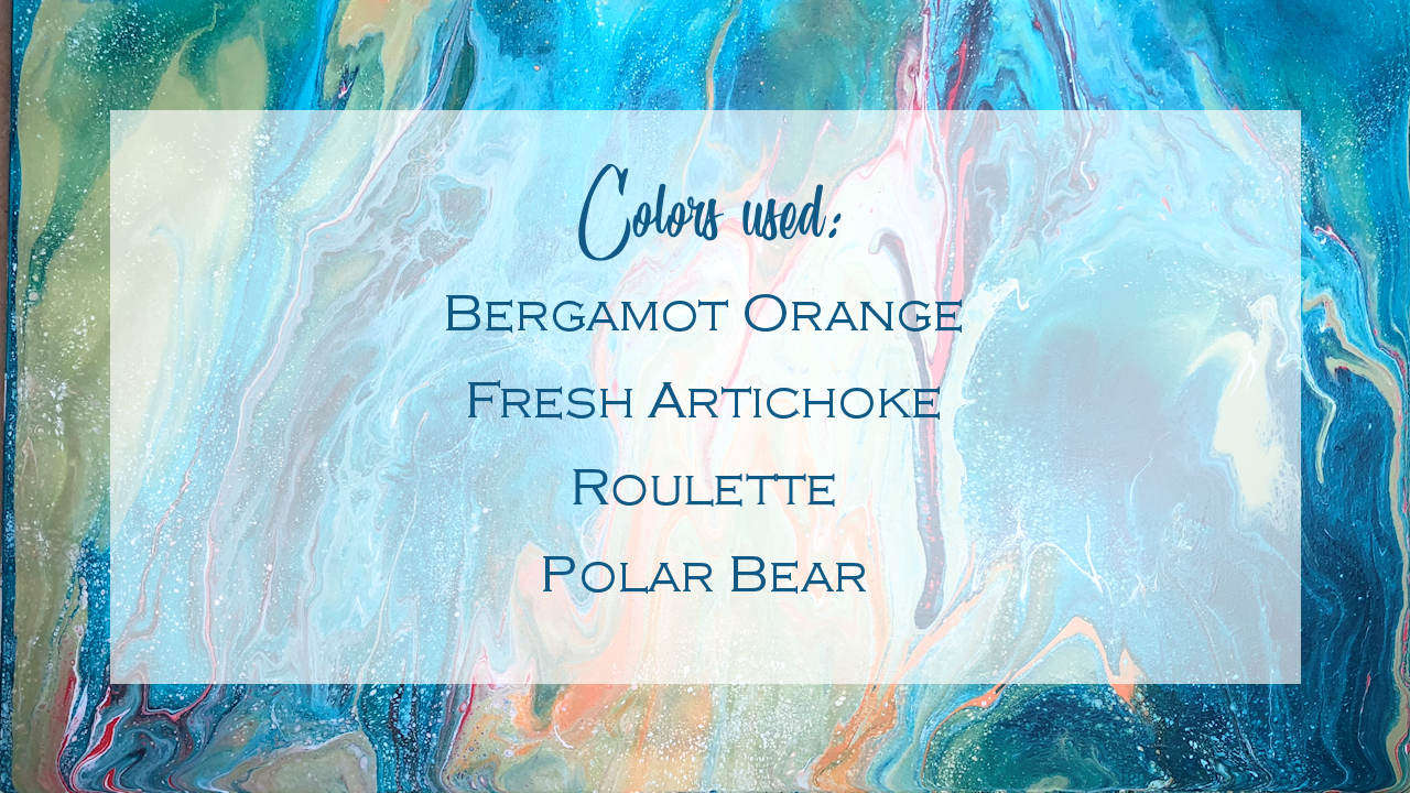
For the third painting, I used these colors…
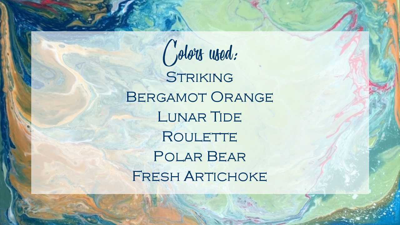
Striking is the dark blue (as opposed to the dark teal I used in the first painting), and Lunar Tide is the light teal.
Here’s how it turned out…
The Roulette is kind of a dark pinkish coral color, and yet when it shows up in small amounts, it comes off more red. I’d love to do another one using all of these same colors, except that I’d swap out the Roulette for a truer pink. Add purple, and you pretty much have the colors I used in my entryway triptych.
I did three more paintings that I didn’t video. Here’s how they turned out…
Liquid Acrylic Pour Painting #4 – Blue, Light Teal, Orange, Coral, Green and White, 11″ x 17″
Out of all six paintings in this post, this one is my favorite. I tried to replicate that original painting in the video — the one that I messed up by not putting it on a level surface to dry. I used the very same colors that I used in painting #1, and while my attempt to replicate the original look didn’t work out, I love how this turned out. And you can also see that when Roulette shows up in a larger quantity, it’s less red and more coral.
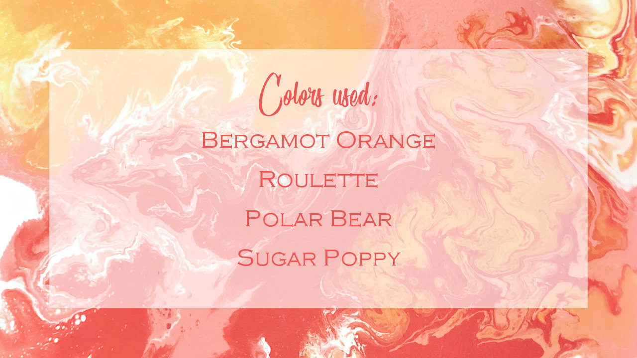
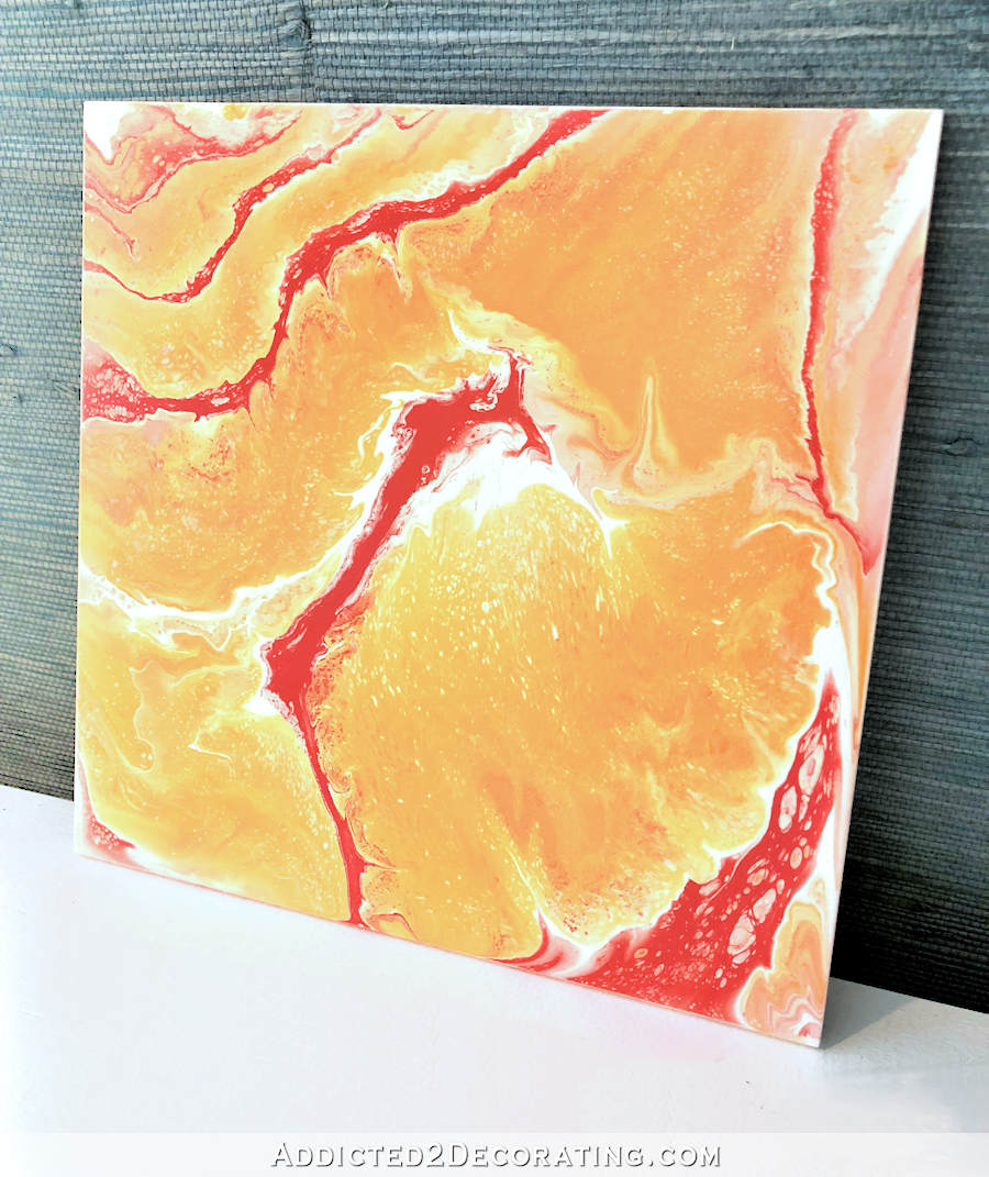
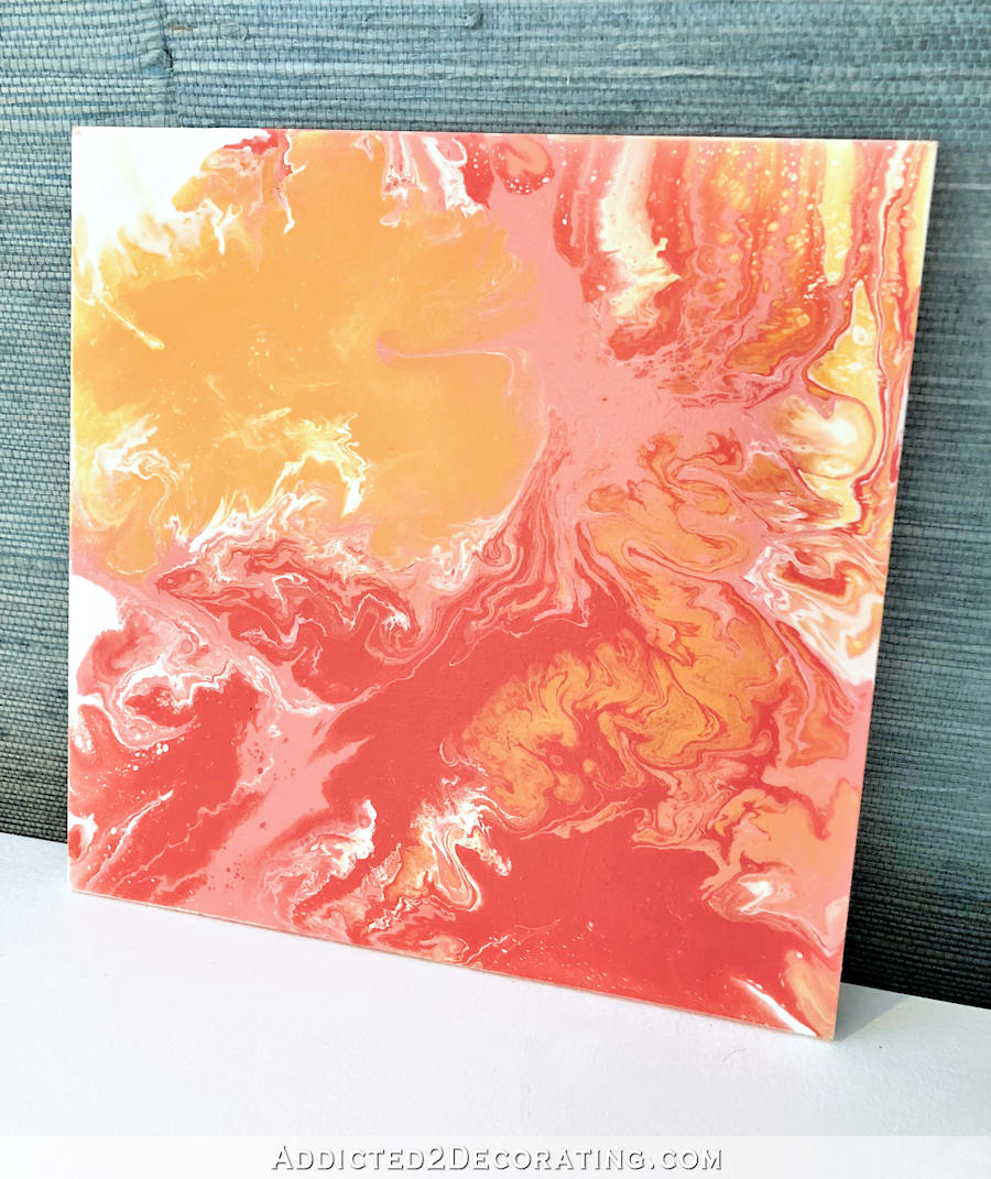
Liquid Acrylic Pour Paintings #5 and #6 – Coral, Pink and Orange, 10″ x 10″
These are the colors I used for these paintings…
Painting #5 actually doesn’t have any Sugar Poppy (the light pink) in it. I did these two as a pair that could hang side-by-side or one above the other, but I didn’t want them to be too matchy-matchy, so I only used the light pink on #6.
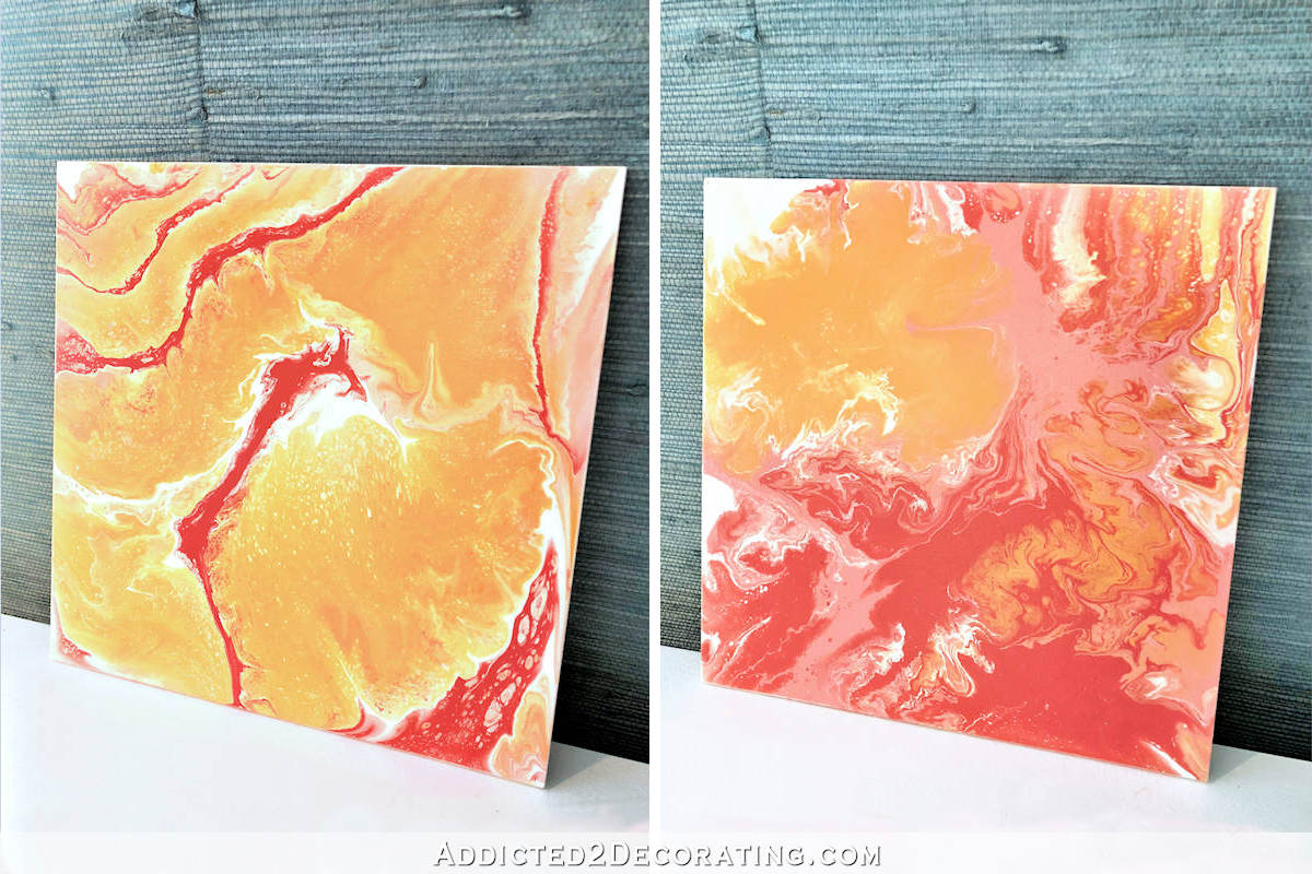
Here are larger views of each painting individually…
All of these paintings are available. For now (and until I figure out a better way) you can just contact me at [email protected] with the subject line “Acrylic Paintings” (or something similar) and let me know which one you’re interested in. For now, I’m keeping the pricing very simple. Any liquid acrylic pour done on 1/4″ MDF board with a clear coat matte sealer, and that measures under 20″ x 30″ (which is the largest standard size I can do on my table) will be priced at $0.35/square inch. I know that’s probably a strange way to price artwork 😀 but I need to keep it simple and straightforward for my brain. So 11″ x 17″ paintings would work out to $65.45, and 10″ x 10″ would work out to $35.
Any painting larger than a 20″ x 30″, or a grouping of paintings that are poured together with a total size larger than 20″ x 30″, like my entryway triptych…
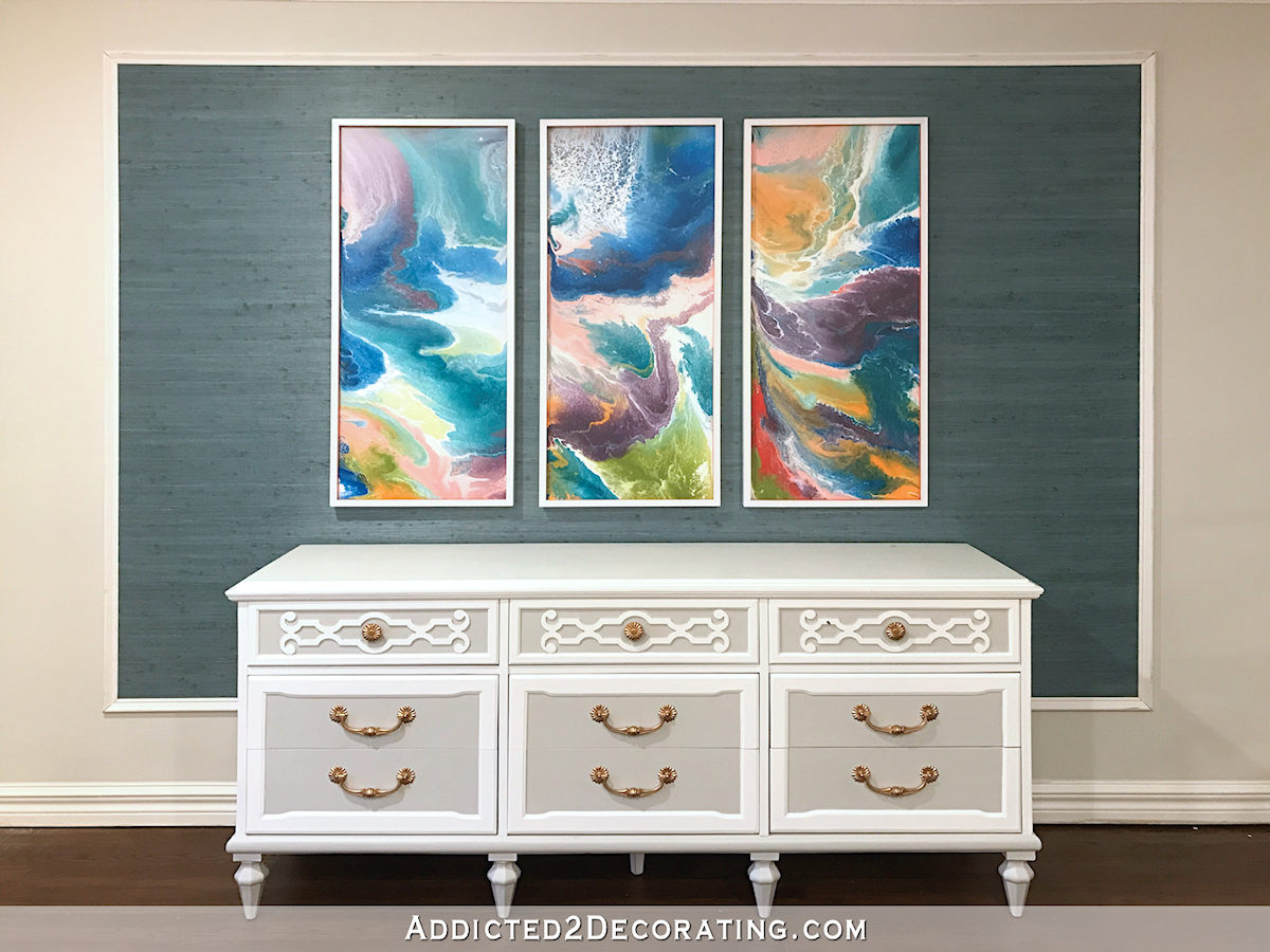
…will incur additional costs due to the additional time and setup required.
If you’d like to see me do paintings in future posts using specific color combinations, just let me know and I’ll add those to my list of ideas I want to try!

Addicted 2 Decorating is where I share my DIY and decorating journey as I remodel and decorate the 1948 fixer upper that my husband, Matt, and I bought in 2013. Matt has M.S. and is unable to do physical work, so I do the majority of the work on the house by myself. You can learn more about me here.
I love #1 and #4! That color combination feels so fresh to me! Good luck selling your art! I think it’s a great avenue for you to expand!
Just lovely. I would stare at those all day and get nothing done 😉
Gorgeous! Love these!
This is wonderful and I love all the details you have shared. You need to sell the tables, too.
It does look like fun. I really love #4!
So glad to see you are selling it, and at reasonable prices too (thank you). Please do fall colors, especially yellows and oranges and greens. Your video was great by the way….What is your preferred paint brand for the house? Is it BEHR also?
I’m kind of all over the place with that. I always use Behr on my doors and trim. Until recently, I also used Behr on my walls, and I still think it’s great paint. Even when I had black walls in the guest bedroom in the condo, and decided I wanted them white, the Behr covered completely with two coats. No primer. I do prefer the Behr Premium Plus, which is basically the original Behr paint. Now they have others like Premium Plus Ultra and Marquee. I’ve never tried Marquee, but I’m not impresesed with the Premium Plus Ultra. I’m perfectly happy with Premium Plus.
With that said, I’ll also say that just recently I’ve become a convert to Benjamin Moore Aura paint in a matte finish for interior walls. It’s amazing stuff, and I generally get coverage in one coat.
For exterior, I really don’t have much experience with different brands for comparison. I had my house painted in January with Sherwin Williams Duration, and I really like it. It worked great on both the stone and the siding.
Thank you. I am glad to know the BEHR paint info. I think that is what we will buy to do the exterior. Picking paint is hard.
If you do use it on the exterior of your house, I’d recommend using the Behr Marquee exterior paint. I hear it’s amazing stuff.
Thank you
Also… could you two that could be hung together with no pink? If they didn’t have pink I would have bought the two to hang together.
So do you mean just orange and white?
Orange, yellow and white would be really nice
This looks like so much fun! So what modifications would you make to your Pour Painting Table??
I added those to the end of this post:
https://www.addicted2decorating.com/how-to-make-a-table-for-creating-fluid-acrylic-painting-to-keep-the-mess-contained.html
Have you tried any of the Modern Masters metallic paints? They have been my favorite wb metallics for many years. I can imagine they would work well for this kind of application. I have to pay attention to the labeling because some are opaque, while others are semi-opaque. Opaque Silver, Opaque Olympic Gold and Opaque Bronze are my favorites.
I’ve never tried those, but I will now! Thanks for the recommendation!
#4 is incredible! that is my favorite one 🙂 is it for sale?
Yep, they all are. 🙂 If interested, just send me an email: [email protected]
Thank you so much for doing a video of this process!! Can’t wait to try it.
The link to your video isn’t working for me. Can you help me? Love the paintings!!!
I uploaded it to YouTube. You can click here to view it.
The vid won’t work for me either on my iPad Mini (the ads make viewing your blog fairly impossible for me anymore.) Do you have this available on YouTube?
I just uploaded it to YouTube. You can click here to see it. I’ll try to remember to do that with all future vids.
Thank you! ~:0)
On my iPad mini as I type…worked just fine. Also, in lieu of a compressor I’ve been known to blow thru a straw, some big some small. Obviously not as much movement, but good for smaller sizes if you don’t own the equipment.
Wow! Really beautiful! I became familiar with this art form
on bolt27bylynettewright on instagram. Love that you are doing this!
Kristi — don’t forget the shipping charges and your time/supplies to pack and mail them.
I love how different each one looks using basically the same technique. It doesn’t sound relaxing to me but then I haven’t tried it. Wish I had more wall space.
I’m not usually drawn to this type of art, but these are growing on me. I watched videos ( for way too long! ) on this way of painting! Wonder how it would look if you laid the paints horizontal? And if you used the blower straight down (or a straw,) instead of from the side? Would it be kind of a flower design? I may have to get out my sample pots of paint and see what I can come up with. I am just thinking also that it seems to waste a lot of paint, but if you are using leftovers, no big deal! It’s almost impossible to dispose of paints anymore. May as well practice some art! 😉
Gorgeous! Such a reasonable price for custom art! I may contact you in the future to commission one for my daughter and future son in law…what an excellent engagement gift!!as someone else mentioned, be mindful of your shipping charges! These will probably be expensive to ship but the cost should not fall on you Kristi! 😸
I just went back and read your update on the table. I am wondering if you make the sides and back higher, would that possibly “trap” the air and bounce it back to the artwork? Also, could you make a separate piece of wood with holes (or use the trimmed off piece) to hold down the dowels instead of an elastic band?
Thank you Kristi. Your last painting in your video looks like a dragon on the left side. Very cool. It looks like fun.
Well done, Kristi! It’s so great to watch you in action and you also have a nice narration voice😉. I like your version of this technique over the ones I’ve seen ( and been taught) that have a lot of silicone in them. The silicone creates the cells which I’m not a big fan of. Where you see topography, I see real ( human ) cells, probably as a result of my Surgical Nursing career. But mostly I see lots of color and beauty in these. I wish you great success with your art. btw, when doing a triptych, do you pour all 3 at once, or individually using the same colors? Do you ever do the “ flip cup” or dirty pour method?
Yes, when doing a triptych, I pour all three at once. To me, a triptych or diptych is different than a coordinating set, like the two in this post. On those, I poured them separately using the same colors, but I didn’t intend for them to actually be a diptych.
I don’t really lie dirty pours. I’ve seen some turn out really gorgeous, but most of them just really aren’t my thing. I prefer to determine exactly where I want to put each individual color.
Thank you for your response. Yes, I like the more intentional placement of colors too, even though they like to move around. But that’s the fun of acrylic pouring. I’m looking forward to more of your pours and tweaks to “ the table”!
Wow, the grasscloth frame looks really great! I saw your post on how you installed it and you hung it like a pro. I should know, having literally been born into a wallpaper family (my grandmother started a wallpaper store in 1950 that’s still in the family today).
Which brings me to my other point – SHAME ON YOU for telling people to buy their wallpaper through a site like Steve’s. I can’t tell you how many times working at the store while growing up that I would help a customer for hours only to have them “showroom” me by writing down the pattern number of the wallpaper I helped them find and leaving. Some were honest enough to admit when they came back to buy paste (I know, the nerve!) that they had bought the paper online.
My family are not crooks trying to gouge the public. They are a family run community store just trying to stay in business in a changing world where wallpaper is far less popular than it used to be. Their markup is reasonable and is as low as it can be to stay competitive while still allowing for expenses, etc.
The funny thing is that going to your local showroom isn’t just the right thing to do, it also could have saved you A LOT of money. I am involved in another family business, where we import and distribute wallpaper, including grasscloth. I know for a fact that we import the exact same jute the P.J. sells, however ours retails for $34.50/yd., and showrooms discount. Thus you would have had the same product for less money plus a place to see it first plus a place to take it if it were defective (with Steve’s you have to pay shipping on ALL returns and with wallpaper that can be a lot).
I’m sorry for going on for so long, it just hurts to see someone as talented an influential as yourself not just heading in the wrong direction, but steering others that way as well.
I understand that this may somehow come back to bite me, but to emphasize my sincerity here I’m using my real name and email.
Eric, I totally understand your point. But no, I don’t feel any shame in purchasing my wallpaper online, or for telling my readers where I purchased it. I didn’t go to a local store, require the assistance of a local store employee to help me with my selection, and then purchase it online. I knew what I wanted, I searched for it online, and I bought it. I’m not going to feel guilty for that. There are times that I require the assistance of an in-store employee to help me with my selections. In those cases, I do agree that it’s wrong to get that free help from a local store and then purchase online. I would generally never do that. But that wasn’t my case. I shop online, and I also shop locally. I’m not going to stop shopping online, and I believe that asking people to do so is completely unreasonable in this day and age.
Kristi,
Thank you for taking the time to reply to me. I’m sure neither of us want this to devolve into a huge thread, but I hope you’ll allow me a further reply.
In what I wrote I tried to make it clear that I specifically did NOT think you had gone and and “showroomed” a local store. I gathered from your posts and bio that you had the talent, skill, and taste to make a decision like this on your own.
My concern was the influence you have on your followers, who may not have the level of talent you do. My fear is that when someone of influence says, “this behavior is acceptable,” without giving circumstances, this behavior becomes acceptable without circumstances.
What you do is obviously up to you, and I thank you again for giving me a brief platform for my beliefs. I simply hoped that in the future you might consider the power of your platform, and try to do the right thing thereby.
So gorgeous!!!
Just watching your video has got me itching to try this! I watched and loved seeing the colors mingle and flow. I just moved into a 1963 ranch style home. It’s all original. I can see how some of these paintings could bring this old home back to life. Thanks for the inspiration, Kristi!
Hi Kristi,
I’d love to be able to see the video, but the link isn’t working within the text, and when I go to the top of your page and click on videos, the Pinterest link is exactly where the play button is. Just wondering if anyone else is having this problem???
There’s a YouTube link just under the video in the post. 🙂
Thanks Kristi 🙂
I had the same problem. Disable your “ad blocker” and you can view the videos.
Thanks very much! I’ll remember that! 🙂
Thank you for your video and very well explained tutorial … I’ve been researching this technique and you gave us great tips … You are an inspiration and the way you work, too …
Black and white.
I’m a fan of #4 also. 🙂 Kristi I think your art is under priced… I don’t buy art for the cost of materials and time I buy it because it’s created by an artist and it’s a work of beauty. I know it will take you time to wrap your mind around this… but Kristi… you are an artist and it shows on so many levels. Your home is just one of the canvases.
Hi Kristi – I’m looking forward to viewing the videos after I get home from work. I just had to say that I went to your website after checking out the latest pictures and videos from the Big Island of Hawaii, where Kilauea is erupting, and was struck by how much #5 & #6 look like flowing lava! I also agree with Mims’ comment above, and would love to see black and white enhanced with metallics. Looking forward to seeing your progress in house and garden, too!
Kristi, I have done some acrylic pour painting, watched a ton of youtube videos, and stilled learn things from you that I haven’t seen anywhere else. I will try coating my surface with paint first next time. The type I am currently doing are a marbleized look on ceramic tile coasters. I add my colors to a cup like a dirty pour, but rather than upending the cup onto the surface, I pour it out in different patterns–sometimes straight into the center, sometimes moving around randomly, etc. I use sample housepaint as well as craft paints. I usually include metallic gold in mine and have found that plain old Folkart metallics show up well, although not with the dimension you achieved. Enjoy your art!
All of those paintings are beautiful and so mesmerizing. Thanks for sharing all that beauty and talent.
I have been itching to do this project for a while. I’m so excited to get started. For the metallic acrylic paints, have you tried the Devine brand that is sold at Target? It’s regular acrylic house paint that is already in a few ready made colors. They have gold, silver, and bronze/rose gold in metallic. I think it’s roughly $20-$25/qt. I have been wondering if they were any good or not.
These are gorgeous!
Wow! Really nice! Really really nice!
Can you distract yourself during your current ‘holding pattern’ by making more?
There’s bound to be local shows in the fall that would should be propping for.
Enjoy, maybe fun!
Super cool Kristi and I’m glad you are taking the leap to sell. I would love to see you experiment with resin coating! These pour paintings seem like the perfect fit for that super shiny finish: https://www.houzz.com/product/112694200-contemporary-modern-resin-coated-limited-edition-painting-60×30-by-eloisexxx-contemporary-paintings
When do you think you might be inspired to make more?
Did these all sell?
I sold #4. I’m hoping to get back in the studio this weekend. I have some very specific ideas that I’m anxious to try out! 🙂
Thank you, I am surprised that is all you sold. Yellow please!