My Walk-In Closet Paint Color Decision And Flooring Color Decision
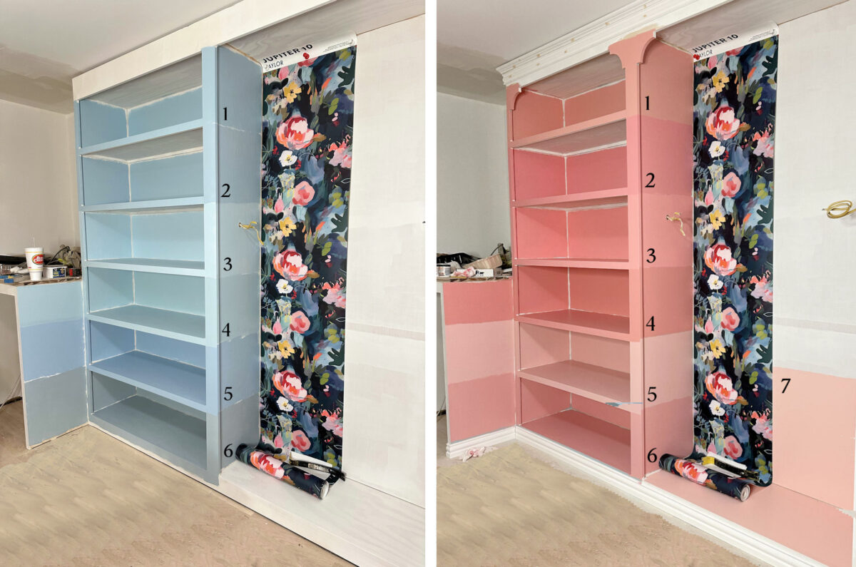
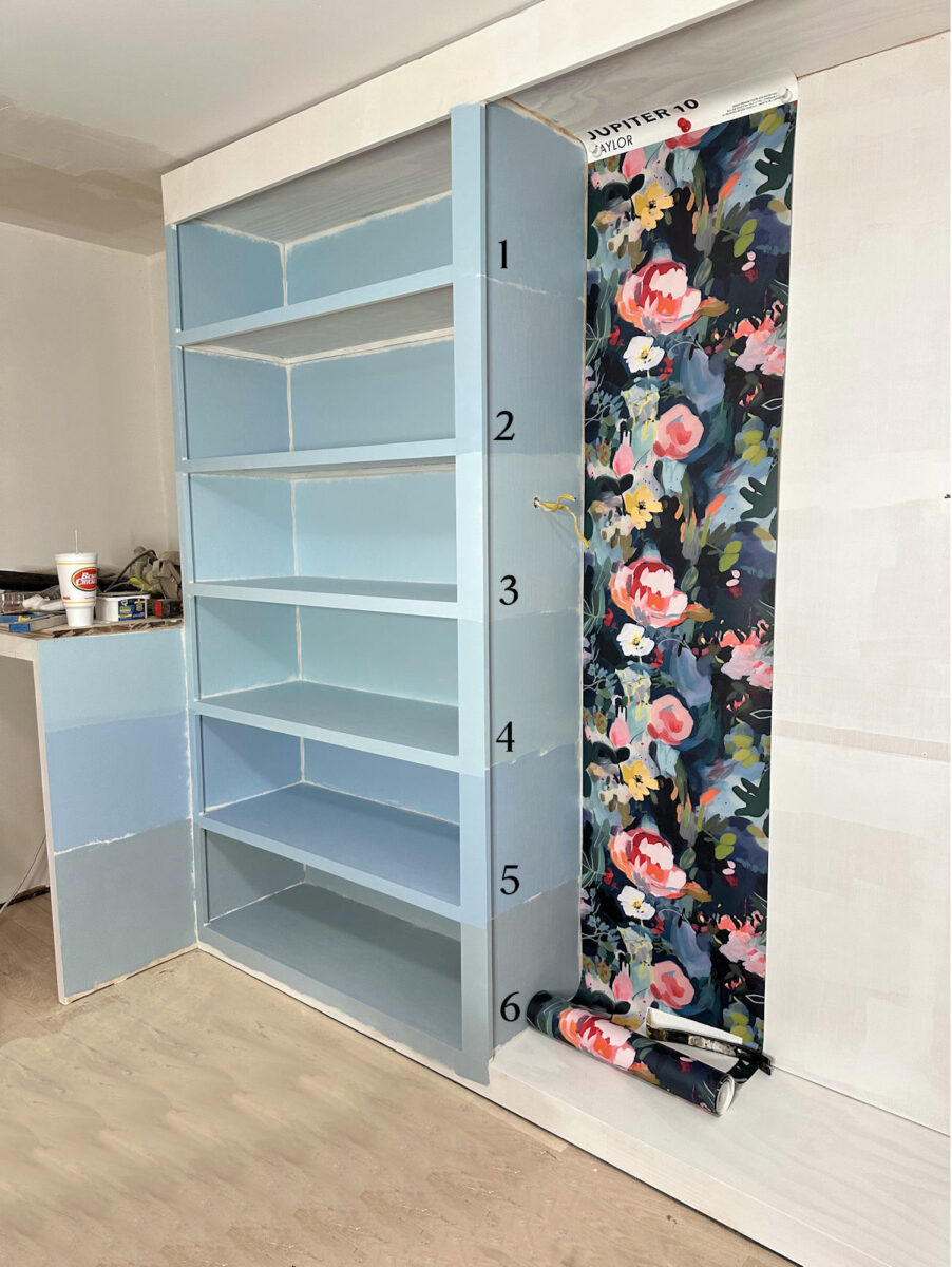
I spent a ridiculous amount of time yesterday obsessing about the paint color for my walk-in closet. I studied the pictures. I tested more paint colors. I tried mixing my own custom paint colors. I looked at pictures of pink/coral closets. I looked at pictures of blue closets. I scrolled through Instagram and TikTok. I searched on Houzz. I read through all of your comments again. I clicked any links y’all provided.
I had started off the day absolutely positive that I was going to have a coral closet, and about 99% sure that I was going to choose #7, Sweet Angel. But by midday, I wasn’t even sure if I liked the coral. Basically, I was allowing myself to be influenced by each new comment that I read. And by yesterday evening, I was more confused than ever.
So last night, I put the two pictures together — the picture with the blue samples and the picture with the coral samples — and I edited the floor so that the dark floor wouldn’t be a distraction.
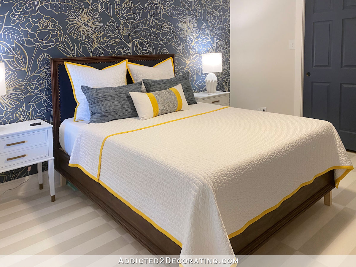
After spending a lot of time late last week obsessing about the floor color, I had already made that decision, and I had ordered the products. After scrolling Instagram and TikTok looking at all of the red oak floors finished with Bona products that I could find, I had decided to use Bona Red Out on my floor, seal with Bona Natural (the second from the lightest), and then use Bona TrafficHD. Every single time I would see a red oak floor that I loved, I would read the description and find that they had used the Bona Natural on those floors. And one TikTok in particular sold me on using Red Out first. So I went with it.
Here’s a great example of Bona Natural on red oak, but this is only one of many that influenced my decision.
So with my flooring in mind, I tried to put all of the noise and clutter out of my head, and just let myself make a genuine, honest decision based on my own likes and wants with no outside influence. Without anyone else’s influence, do I like the blue or the coral better?
I know I’m going to shock you, and probably disappoint at least half of you, but I actually like the blue better.
I like it better for so many reasons. First, I think blue kind of acts as a neutral, so it won’t be fighting against all of the colors in my clothes, handbags, and shoes. Also, it’s much more soothing than the coral. I do love pink and coral, but you’ll notice that throughout our house, I use them pretty sparingly as accents, with the possible exception of my studio. But even in my studio, all of that pink is surrounded by a whole lot of white and super light gray.
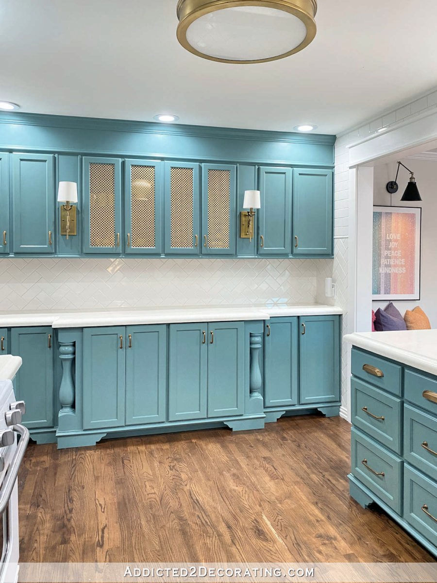
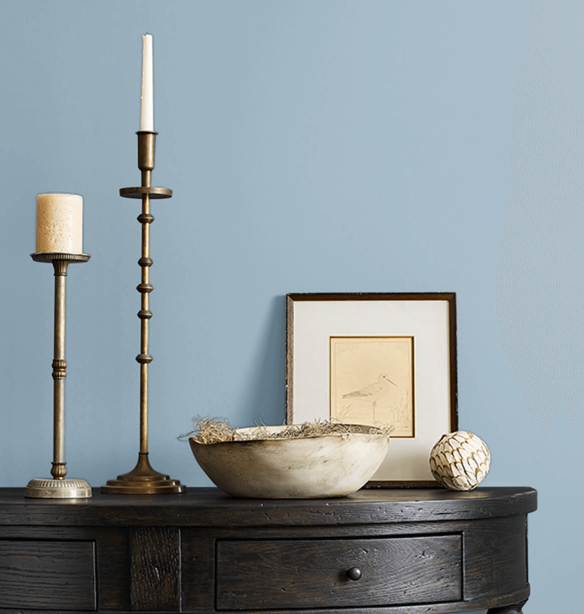
And then there’s my kitchen, which I love. It’s not quite as light as what I plan to use for the closet, but it’s not a dark teal, either.
And let’s not forget our bathroom, where I chose a very light green-blue Venetian plaster look for the walls.

So these lighter blue-green colors aren’t at all out of character for me. I also think that blue will look so much better with the lighter floors than coral. And finally, I think that blue works much better for the overall look of our master bedroom suite that I’m going for. I want that bedroom suite to be full of color, but not necessarily vibrant, jolt-in-the-arm color. I’m actually hoping that our bedroom will be more dark, moody, and bold, rather than bright, colorful, and cheerful. I mostly want it to be peaceful and soothing with accents of bright, warm colors. And I’d like the adjoining areas to complement that look.
So I now have my heart set on a light blue, but it has to have a touch of green in it. That means that I just need to keep looking until I find the right blue.
Last night as I was scrolling and scrolling, I came across a couple of Sherwin Williams colors that I want to test out. As I was scrolling for blue closets and blue rooms, I kept coming across one very popular color called Faded Flaxflower. It’s a little darker than the colors I was testing, and I think that will help to avoid that baby nursery look.
And I actually found a walk-in closet painted in that color with natural white oak floors (which my floors should look more like with the Bona Red Out applied first). This is from Christina Serrano on Instagram.

But if you search “faded flaxflower” on Instagram, you’ll see it used in so many different settings, and I don’t get a “baby blue” read from any of them.

The Sherwin Williams color just a step lighter than Faded Flaxflower is called Sleepy Hollow, and it’s also a beautiful blue that doesn’t read “baby blue” to me.
And then the next one up from that is called Moonmist.
I came across a dressing room painted in that color from The Kwendy Home on Instagram. This one might actually be too light for my taste, but I was pleased to see that even that light, it still doesn’t read “baby nursery” to me.
So I’m going for blue, but the search for the perfect color is still on. I have a feeling that I’ll find the perfect blue at Sherwin Williams. And my fears of winding up with a closet that looks like a baby nursery have now been quelled. I’m also very glad that I took the time to test out corals. Had I bypassed that step, and just made myself go with blue, I would have second-guessed myself every single time I came across a picture of a beautiful pink or coral walk-in closet, wondering if I had made a mistake with my decision. But now I know that I tried them, I compared them side-by-side, and I really do genuinely prefer the blue. I can move on now. I just have to find that perfect blue now.

Addicted 2 Decorating is where I share my DIY and decorating journey as I remodel and decorate the 1948 fixer upper that my husband, Matt, and I bought in 2013. Matt has M.S. and is unable to do physical work, so I do the majority of the work on the house by myself. You can learn more about me here.

Moonmist !! yes !!!
Absolutely the blue. I’m looking at your pics at 7:15 a.m. – and my eyes immediately screamed “NO NO NO! NOT THAT PINK EARLY IN THE MORNING!” So, yep, blue. Nice, soft, come see me and relax, blue.
I have BM 1648 Slate Blue in my entry hallways and I LOVE this color!!!
If it’s too deep, you could cut it with white, but it is so beautiful. Even though it is a deeper blue (which made me nervous when I first put it on), it actually recedes, like the sky.
Anyway, I hope you find the blue that works for you!!
I looooveeee the blue. It’ll be perfect.
I’ve used to Benjamin Moore color called Pale Smoke in two rooms that reads as the perfect blue. It’s actually on a gray paint color chip strip. But for some reason in a room, it doesn’t read as Gray. And it definitely doesn’t come across as baby blue. It’s possible the color you’re looking for is on a gray Paint strip that leans towards teal. Good luck finding the perfect color. Love the new floor color. We have white oak floors in that lighter color so we don’t have to contend with the reddish hue. And absolutely love them.
I have a powder bath in SW Cadet Blue. Their stock photos make it look more gray than blue, but in person it is actually a super lovely neutral blue. My accents are yellow and green (even a few coral hand towels, too!) and it’s the perfect foundation. It is quite saturated though. But a far cry from being baby blue!
I do love blue! Yes, I agree blue is more relaxing the coral. It all depends on whether you want relaxing or invigorating. The photos of faded flaxflower from instagram all look very different. The paint card sample is beautiful, in my opinion. Sleepy hollow and moonmist are also very pretty. I think it will depend on how the samples look painted on your cabinetry next to the wallpaper.
I support your decision! My favorite color is blue. But when I saw the coral, I loved it…however, as I looked more..it stood out too much…took away from everything else. The blue will blend in more, I think.
I like the blue so much more. 😀 It’s going to look great!
I’m glad you went back to the blues. They seem more soothing and calming, and the pretty wallpaper seems to stand out more against them.
Sherwin Williams “Mountain Air” is very neutral. It may be too light for you but it definitely won’t compete with intense colors. We used it on our walls and love it! I love your design decisions and know whatever you choose will be beautiful! Best of luck with your projects!
So glad you’re going blue. Can’t wait to see which shade you end up with, it’ll be beautiful against your colorful clothing and shoes … and with that gorgeous wallpaper!
Don’t forget that you can choose a color you like and have the person at the paint counter mix that selection at a percentage of the color you like (that would be different from a step or two down from the paint sample). I often have that done at Sherwin Williams, and I love that they store the formula under your project name and can retrieve from their computer system.
I like the direction you are headed with the latest blues (and I would have voted pink/coral, but I think that’s because I wasn’t wild about the blue options)! Keep up the great work!
I love the new colors you’re considering – personally, I find the blue shades more calming and would prefer that in my closet. I think you’ve needed to spend this extra time to find the “right” blue for you! Good luck!!
Awesome!!! I can’t wait to see the samples. I know it will look perfect; it always does. Very exciting, and I think blue is really the way to go.
Cheers to you and Matt!
Those blues are a good choice. You will find one soon.
I’m not mad about your choice. I liked both equally well, so I’m still with you! Actually, you remind me of my Mom…she actually looked a lot like you as I was growing up, and her favorite color was blue, like Cornflower blue! She made me crazy with her obsession of blue, so much so that I didn’t want blue ANYWHERE in my house for decades. But now, at 70+ years of age, I’m finding myself drawn to that same color my Mom loved. Go figure! Now, On my screen, your newest choices read with a purple undertone, but that’s computers for ya! I do love all of them, but the one you mention first is my pick – faded flaxflower. Don’t ask us anymore, just make your choice and surprise us! You’ll be happier! You’ve spent too much time waffling with us, making yourself cuckoo!
Yeah. In seeing the side-by-sides, blue is more relaxing and will probably be a better neutral background for your handbags and shoes.
Kristi, my only advice is to maybe keep your mirror lit in a special way or in another room, just so you have a better idea about skin tone/clothing colors when you get dressed. I hope I’m clear. I know there will be all the other colors of the clothes, etc., but I just wouldn’t want you to look blue each time you look in the mirror in your dressing room!
Thanks do much for sharing your process. I see selecting the right color is difficult for everyone and that testing is critical to the desired result. I happen to agree that blue is the right choice to provide a neutral background for your colorful clothes and accessories. Blue will play nicely with the greenish light that is reflected from the lawn and trees outside the window. Looking forward to seeing your final choice.
Yay you doing you.
All will be lovely.
I do think there is something to be said for the blues, teals with light nods to other colors in bedroom/dressing areas. More subdued as a person is settling into sleep energy, letting go, relaxing, less stimulating. Perhaps easing in to a day as well.
I like the blue in the closet….. more framing the colors and textures of your clothes and accessories, less competing. I think if I had brighter closet colors I might have trouble finding, making selections.
I agree with you about the blue. I have used Sherwin Williams “Top Sail” in several rooms in my house and it doesn’t read baby blue. https://www.sherwin-williams.com/en-us/color/color-family/blue-paint-colors/SW6217-topsail
The lighting and the color of the light that it throws will greatly influence how the color paint you choose will look. I chose the perfect color for my bathroom, and then when my new lighting was installed, the paint color looked entirely different. It lost that moody sophisticated look. We tried changing the settings of the fixtures and it improved but it didn’t looked as intended. Repainting is not fun.
I agree with you that the blue will read more neutral than the coral. The blues you have to choose from are all beautiful.
The blue green color in your bathroom is stunning.
I can almost hear your sigh of relief! What a journey, but a good one. Always like to watch your decision making and never being afraid to do what you want! I hate picking out colors…I do like a creamy khaki wall color and have them throughout my home…not for everyone, but I love them and wake up happy. Have used them in 5 of the 9 homes I’ve owned and never been disappointed. Artwork, (which I have a lot), look great with the creamy background.
I love all three of those new blues! They look very sophisticated compared to the other ones. I know you’ll choose the right one.
I am a coral girl but agree with a blue. I am so excited to see how it all turns out. Your choices always look great once the room is finished! Happy painting!
I just did my bathroom and went with SW6212 Quietude but SW6220 Interesting Aqua was also tested. Depending on the light Quietude can look a little more green or blue, I’m in love.
What about using the same color as your bathroom?
I have SW Niebla Azul in my kitchen and love it for a more mid-toned blue.
This won’t help, but I was painting on canvas yesterday, and while using a tube of Master’s Touch Oil #50128 I thought, wow, Kristi would really love this hue:
https://www.hobbylobby.com/art-supplies/painting-supplies/oil-painting/master-s-touch-oil-paint/p/81120811
You’re right! That’s beautiful!
I chose to not comment yesterday because I felt sure you had changed your mind to pink. My choice was always the #7 blue. I an so happy you are going with blue and will not be disappointed with your decision
I like the direction you are going in with the new samples.
Not mad or disappointed at all. 😁 In fact, blue is my favorite color, but was just trying to go along with the coral/pink in there. I love that you went back to the blue. Can’t wait to see it finished.
When I saw the pink/coral come up as an alternative to blue, I had to reserve my opinion. As much as I love those colors, it was blue all the way for me.
You will find the perfect one. Good decision to be patient.
I’m so glad you’re going with blue! Like you said, it’s such a calming color that in the right shade could almost be a neutral, coordinating with most any color of clothing. I think you’ll love it!
I haven’t commented on which color to choose because I get stuck on trying wall colors other than creamy white besides my vote would be biased since blue is my favorite color. But I’m so happy you went with blue. Yes very soothing for a bedroom suite. Also I really think it will act more as a neutral and play nicely with all of your clothing pieces and accessories just like a pair of jeans–to me, anything coordinates with a perfect pair of classic jeans. I love your process Kristi and excited to see the progress. I may just be inspired to paint something a color other than white 😀Blessings to you and Matt!
Hi Kristi,
I love your new closet you amaze me!!! I like both colors, my only thought is you might want to consider installing your lights first before deciding the color because lighting makes all the difference in a color, not just natural light from the window. Just my thought.
blessings to you and Matt
Sherwin williams sea salt is a nice blue green. Relatives in charleston have used it in bathrooms, kitchen and bedrooms
I had settled on #4 in the blue and I admit I was dismayed when I saw all that coral/pink. Certain colors set my teeth on edge and all of those samples were a hard no for me if it was my closet. But of course it’s not yet I’m happy ( and I think you will be too) it’s not pink/coral.
I’ve always considered Sarah Richardson the Queen, if not expert on blues.
Perhaps check out some of her ideas.
Kristie did you ever get the stain off the concrete? I worked getting one up ? Just wondering
I haven’t even tried yet, but I’ve been researching the best way to do it. The issue with mine is that it’s not just oil. It’s oil with hardeners in it. I think I’ll start with a stripper, like a paint and stain stripper, to get the hardeners off. And then I’ll put Goof Off on the spill and let it sit for a long time, and then pressure wash the area. That’s my plan of action I’ve come up with after watching several videos on the best products to use.
I suggest taking the wallpaper to Sherwin Williams or Benjamin Moore and ask the employees there what they suggest. They are after all experts, they might see something you don’t. They will be able to steer you away from the baby boy blue colors. ☺️ I’m so excited for you.