More Walk-In Closet Paint Color Ideas — Testing Pinks And Corals
I know y’all have probably had enough of me coming up with more walk-in closet paint color ideas. Believe me, I’m more frustrated than any of you. I thought I had settled on blue for my closet, but after keeping an eye on those six blue paint samples throughout the entire day, seeing them with natural light through the day and without natural light through the evening, I just couldn’t settle on a color. Of the six that I tested, the third one down, Behr Air Blue, was my favorite. But even that color seemed very baby blue to my eye. And the last thing I want is for my closet to look like a baby’s nursery.
So I decided to go ahead and test out some colors in the pink and coral range. After all, when I first started planning this closet, I had my heart set on a pink/coral color, and I knew I couldn’t be satisfied with a blue unless I at least tried out some pinks and corals.
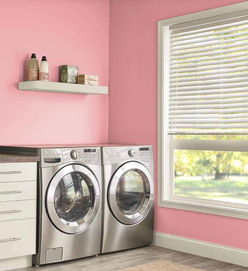
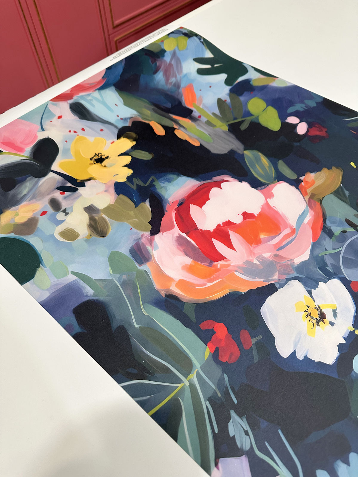
I chose seven different colors this time, and all of them lean more towards coral rather than pink. I chose colors that are more coral for two reasons. First, I’ll be using corals/oranges in the bedroom, and the two areas will be visible together. And second, I already have loads of pink elsewhere. I already have my studio, where I spend lots of time every single day, that is filled with pink.
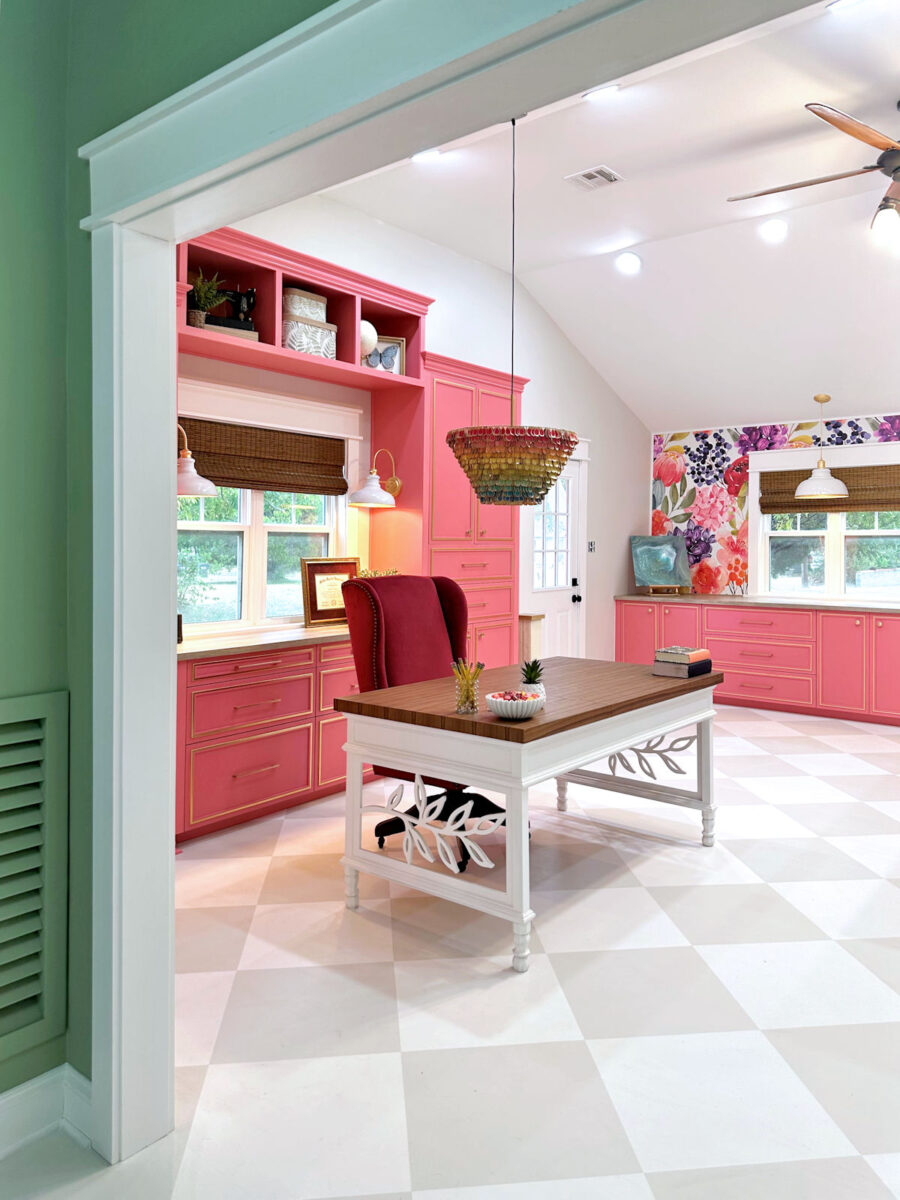
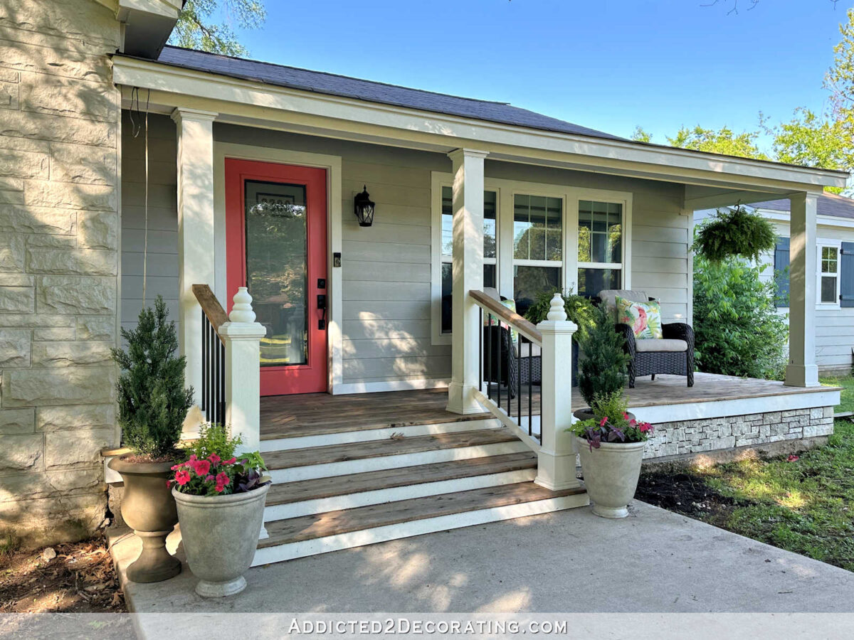
My need for pink has been satisfied. But I love coral just as much as I love pink. After all, all of our exterior doors are coral. It’s the color I chose to accent the exterior of our house and serve as the first impression when guests enter our house.
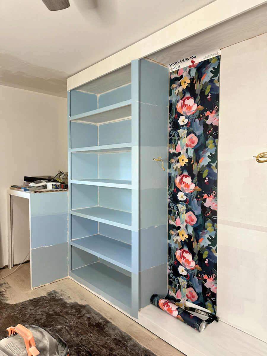
So I chose seven different coral paint colors, some of which lean more towards pink, and others which lean more towards orange. I took most of these pictures last night after the sun went down, so I had to bring in extra light so that the colors would show properly. I’ll be adding much more light to the room before it’s finished, so the colors in these pictures look accurate (at least they do on my computer monitor) compared to what I’m seeing in person.
Here are the seven I chose…
From top to bottom, these are: (1) Behr Passion Fruit Punch, (2) Behr All Dressed Up, (3) Behr Infatuation, (4) Behr Sunset Pink, (5) Behr Noble Blush, (6) Behr Coral Fountain, and (7) PPG Sweet Angel.

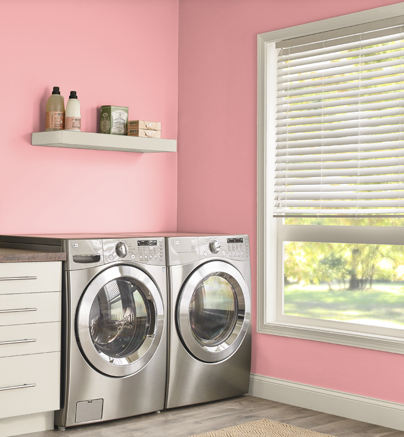
Here’s a different view of the seven colors with the wallpaper…

Because my lighting isn’t great, I’ll show you the marketing pictures of these colors in order. First, this is Behr Passion Fruit Punch…

This is Behr All Dressed Up…
Next up is Behr Infatuation…
And Behr Sunset Pink…
This is Behr Noble Blush…
And Behr Coral Fountain…
And finally, PPG Paints Sweet Angel…
I was immediately drawn to two of the colors, and they’re very different. But let’s look at the colors again in order. The first one seemed too muddy and orange to me. The second one was immediately one of my favorites. The third one was just okay, but wasn’t in my top two. (See my update at the end of the post!) And the fourth one also seemed too muddy and orange.

The fifth one just looked blah to me. And the sixth one didn’t seem vibrant enough for the wallpaper.

But much to my surprise, I loved the seventh one.

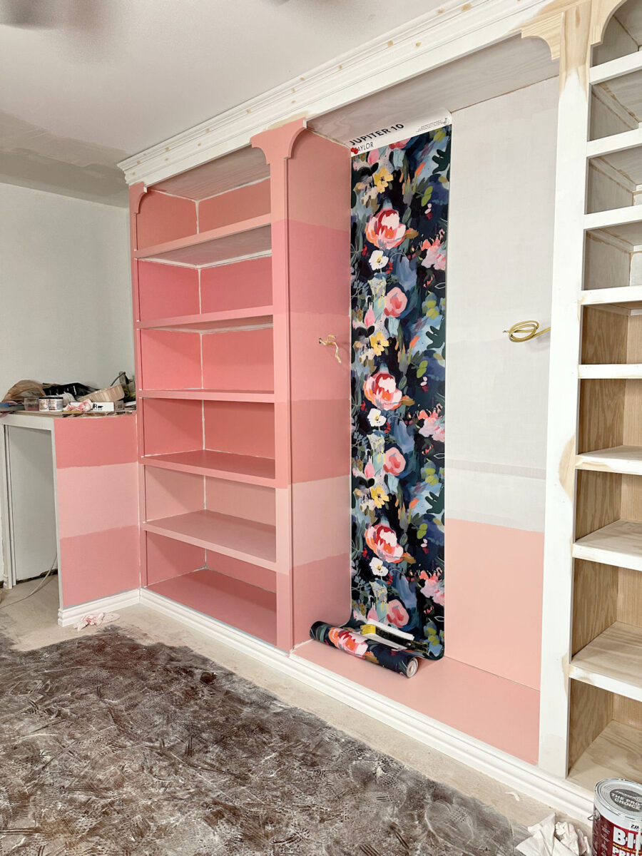
So I did a little editing on the photo so that I could see more of the second color with the wallpaper, and I colored in the whole side of the cabinet with the second paint color, which is Behr All Dressed Up.

So of the seven samples, my two favorites are #2, Behr All Dressed Up, and #7, PPG Sweet Angel. It really all depends on whether I want the cabinets to be bold, in which case I would choose All Dressed Up, or whether I want them to be more of a soft neutral, in which case I would go with Sweet Angel.
And at this point, I’m undecided on that. I think the lighter one, Sweet Angel, would coordinate better with the bedroom. In fact, it’s one of the original coral colors I chose way back when I first started looked at corals.
I did take this one picture this morning after the sun came up, so this is what they look like with a little bit of natural light coming in through the window…

One thing that concerned me about going with coral is how my shoes, handbags, and clothes would look in a coral closet. I think light blue reads more like a neutral, so I didn’t have any concerns about what my colorful items would look like on light blue shelves. But coral is such a stronger color, so I was curious what my colorful items would look like on coral shelves. So I chose some of my more colorful handbags and brought them in to see what they would look like sitting on coral shelves.
I was surprised at how much I like it. I think that has a lot to do with the fact that the wallpaper itself has so many of these colors in it.

I don’t know, but it seems to work. You can tell me what you think.

I do think that the Sweet Angel, which is the lightest of the two colors I like, seems to serve as a better backdrop for my colorful items. I think it works better since it’s lighter and reads more neutral. But that works for me!

So the big question is…blue or coral?
If I go with blue, I’m going to choose #3, Behr Air Blue. And if I go with coral, I’m almost sure I’d go with #7, PPG Sweet Angel, but #2, Behr All Dressed Up, is still in the running.
Update: After seeing the colors with more sunlight this morning, #3, Infatuation, is also in the running.
The A2D Daily:

Addicted 2 Decorating is where I share my DIY and decorating journey as I remodel and decorate the 1948 fixer upper that my husband, Matt, and I bought in 2013. Matt has M.S. and is unable to do physical work, so I do the majority of the work on the house by myself. You can learn more about me here.

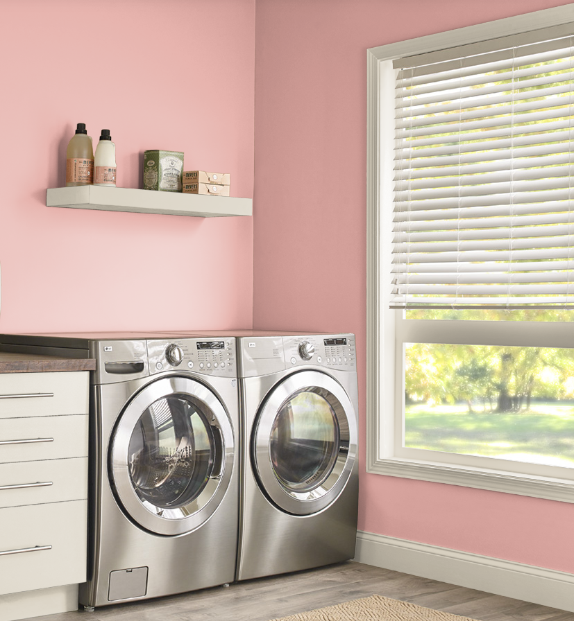
Just personal, but I like the blue much better, especially with the navy washer and dryer.
My vote is definitely for the PPG Sweet Angel! I think it’s light enough to act as a neutral like you mentioned, but feels more sophisticated than the baby blue (which I feel reads very “little boys room”). And it’s still a nice pop of color without being super overwhelming or aggressive. I think the coral option will help the suite feel like one unified space since the color coordinates with your bedroom colors already.
Ditto!!!
My favorite Behr pink is called Ballerina Gown. I’ve painted two bathrooms with it because it’s soft and pale and works as a neutral. Even my Dad is okay with it. If this were my closet and these were all my choices, Id go with either dark blue or a pale blue. They make the pinks and yellow in the wallpaper pop. But it’s also my own bias. It feels like you’ll be happier with a pink or coral.
Ditto
I liked #4 and ##7. I hope you go with the pink colors, it would look good with your wallpaper that is beautiful, plus I think it would just make me happy when ever I walked in there! Good luck, this is a hard choice!
You say the blues read “baby boy” to you, but the pinks/corals read “baby girl” to me….so I’m no help ;o)
I agree wholeheartedly.
Well, she is her momma’s baby girl! 🥰
I vote Sweet Angel.
I definitely prefer the corals – I think I said so in one of your posts about the blues. I was kind of surprised when you moved in that direction and away from the corals/pinks. Your preference definitely falls in the teals (blue/greens) rather than clear blues.
I would go with #7 or #5 (for the same reason I would select the lightest blue you tested) – once you get that much of it in the room a colour is going to reflect off itself and seem more intense.
I also think that the warm colours will be more flattering when you are dressing and choosing jewelry. And with your intentions for the floors.
It might be a good idea to do the floor, get your washer and dryer in place, and sit with the cabinet colours for a few more days before making a choice.
I’d go with Sweet Angel, #7. I didn’t care for the blue paints at all. Not enough green and we all know you like a strong green or teal. It’s a woman’s closet, so a soft feminine coral/pink color is great.
7 is a little bit flesh coloured? I love 2.
#2, All Dressed Up, is my pick. I think the pink/coral colors look better with the wallpaper than the blues. Your closet is quite striking with the pink/coral colors.
Gosh, I’ve refrained from commenting on color cuz colors on my devise are so off. But, then I thought that’s not very helpful to you! Now, I back to shying away,lol. You get great advice from others and you will figure it out. Go Kristi!
Love #7 as it allows the wallpaper to really be the star, which it is obviously! Will look great any way you slice it as it’s so personal to you and your taste! My bedroom suite is Woodlawn Blue by Benjamin Moore. It’s a gorgeous chameleon color that looks great with everything. Enjoying your process even the “problems” that come in from time to time…all the best!
BLUE!!!!!
I agree!!! Almost all the pinks look muddy to me (maybe my screen?) I prefer the blue as a backdrop to all your pink/red/coral bags and clothes. Anxious to see what you end up with.
Wondering if you ever gave green a thought?
I am not a coral or blue fan, If it were me I would pick a yellow from the wallpaper flower and paint it yellow. So sorry, I am no help. If I had to choose between the coral and the blue. I would choose the lightest coral. Good luck. Picking paint is always tough for me.
Coral 2 is far too pink for my taste, so you and I vary there. (FWIW I really favour autumn colors.) My choice would be 4 and if that is too dark, 3. Since I like creating work for myself, I would paint the outside edges of the cabinets 4 with the interiors/shelves in 3 to brighten up and showcase what is contained on each shelf.
Hi Kristi, could you please try out the blue/greens your mother picked out also? Since you’re going in a couple directions. It may very well surprise you.
I feel like the blue’s are a bit more neutral. The corals remind me too much of pink baby aspirin and might clash when you have everything filling the room. As a test, put a couple of rows of shoes and maybe hang some clothes to see how you feel about it. To me a dressing room/closet is about seeing how I look in what I’m wearing but I would still like the room to look nice – just not clashing with my outfit. My closet is about size of your total room minus the washer/dryer areas. The thing I dislike the most is the that the only place I can put a full size mirror to see my total outfit, backs up to a full wall of a rainbow of hanging clothes. Good luck!
I think blue and pink/coral is too much for a large closet. All your clothes, purses, shoes jewelry are different and varying colors that it might end up looking garish against these cabinet colors. The white makes the room look cleaner, brighter and larger. You have enough color with what is going in the closet. IMHO, Paint the walls acolor, but keep woodwork white
I understand that viewpoint, but I think people who know me well know there’s no way I’d ever paint cabinets white. 🙂 White cabinets just ain’t my thang.
I was waiting for that!😂
Remember when you were a designer for paying clients and had to nudge them to make choices out of their comfort zones for the sake of good design? Maybe you subconsciously can’t make a choice because you don’t want to go out of YOUR comfort zone.
I second that opinion. Keep the cabinetry classic white, paint the walls & ceiling a pretty soft pink or blue.
Your studio color is very saturated and bold. (And wonderful). I like #7 Sweet Angel because it is not as saturated. It will give your eye a rest from bold colors elsewhere in the house (you still have the wallpaper) and will allow your handbags and clothes to provide bolder colors and patterns. It may also provide a nice complimentary glow to the room.
I agree with Kim.
I vote blue!
I think you’ll get tired of your colorful clothing in a coral/pink closet.
I’m on the pink/coral bandwagon and while #2 is my pick, I also like #7. Not sure about the pink you just added to the mix. Since both your bedroom and walk in can be see I think the p/c combo looks the best. However whatever direction yo go will be gorgeous!
I’d try an earthy muted green. Match the leaves. Something soothing and calm.
I’m with Cyndee!! If you don’t love the blue, then go with a sage-y green pulled from the leaf color. No more pink! And yes, the corals all read pink. You already have pink in your living room, studio and the music room sofa. Just try out a few soft greens and I think everything will fall into place. It worked so well for the bedroom chair, I think that a muted gray-green would also work perfectly here!
I agree with a sagey green. I fear with colourful clothing, shoes and bags, the blues and pink/corals will “fight” with them, creating a chaotic feel. Just my opinion 😊
I immediately loved #2 of the corals. I’m afraid that #7 will looks washed out in such a large area.
Be bold! Go with the Behr All Dressed Up! It will complement the navy appliances, pull out the best colors in the wallpaper, and be a nice backdrop for your clothing, shoes, etc. It’s much better than your blue options.
That’s my choice too but I like more saturated colors
While I do like the coral. With the wallpaper. I really love the blue. That could be cause I’m a blue girl all the way.
I vote pink, 2 or 3. 7 is too babyish.
I’m going through this with my kitchen cabinets. My 4-year project (so far). And I just ordered 3 more color chips. I think most of the corals would be good, but blue is definitely more neutral. My thought was if you’re worrying about the cabinets being a complementary backdrop to your purses (and clothes), the wallpaper definitely will clash with everything. Especially the handbags and shoes (the clothes are smaller quantities of each color that will be showing (even though you’ll probably be color-arranging your clothes).
What color looks best with your skin tone? I know that sounds weird but you dont want to be getting dressed in a room that doesn’t complement YOU. I would let that be your guide.
I agree with this one. It would like be wise for you to get your season/color palette done by someone very skilled. Then paint the closet one of your neutral base colors. It will suit YOU and all your items will flow. Good luck!
Off topic… but, can I ask where you got your wicker shades from in your pink studio? 🙂
Here’s my affiliate link for them: https://amzn.to/4i9Mo0e
If you’re doing inside mount, order the width just larger than your window, and then send them an email with your order number, and the exact measurement of your window, and they’ll cut them to fit. They’ll also customize the length to fit your window. Just be sure you get an acknowledgement email back from them to confirm that they received your customizations.
I think the blues are reading heavy, which is what I was struggling with. I will also say that they didn’t look like you. I love all the pinks, I would actually lean more towards 3. While the lighter pink would be pretty, it doesn’t feel like you. You love your rooms the most when you go bold. But I also think, if you still feel undecided, you should consider a round of teals. You have always loved that color and it might be the thing that flips a switch for you! But go for bold – you know you won’t regret it!
I typically don’t like flesh colored rooms, but I think #7 actually works here. I think its because flesh colored walls in a closet will show the items similarly to how they will look while you are wearing them.
If you decide against #7 then would you consider something totally different, like deep navy blue cabinets with strip lighting to accent each shelf?
The 7th is my favorite because it is lighter and can highlight and reflect light in a more appealing way.
So I love teal, navy, and greens. Gut thought, ALL of your chosen corals if done on their own, on the cabinet, read *pink* to me on my screen… but I don’t play with color often, nor wear makeup often as a gal(I feel like less me).
There was a theme of influencers painting room they film/narrate in, a blush, because the reflected light made them more appealing without filters.
The more saturated and bright the color of the cabinets, the more the reflected light will dull the brightness of items in your wardrobe and pull out other undertones.
Also, your items would be fighting for attention. I think you want to store and enjoy them for how bright they are.
The blues were chosen to coordinate with the tile, its okay to go to coral again.
Definitely like the Coral better because of the all the blue in the wallpaper. I personally like #2.
Didn’t you switch to blue to match the grasscloth you are bringing into the hallway? Can you hang that up and show us how that works with the new pink theme? I personally prefer coral/pink but very light so that your clothes and shoes don’t compete with the backdrop.
like someone else mentioned, didn’t you go blue to match your washer / dryer? I personally think they wont be seen behind the island and the built ins but wondered how that played into your decision to switch directions.
I love the corals #3 was actually my favorite. I think it’s a perfect choice! I think all your colors will look amazing no matter what you choose but number 3 just pops to me!
I couldn’t be more delighted to see this and I love Sweet Angel! For me, getting away from baby blue without it turning into boring gray is too fine a line. I was actually wondering how that deepest vermilion shade in the wallpaper would look (I’m a red fan) but seeing your accessories against the corals convinced me that lighter was better.
My SIL painted their living room in a color several steps lighter than Sweet Angel that read almost neutral but had the prettiest, most flattering glow. I know you don’t want something that pale but I think Sweet Angel still captures that feeling and is what I’d like to be surrounded by in a dressing area.
I’m going to go out on a limb here by providing a completely different idea. I’ve read through every comment thus far. I have reread your last few posts on closet colors along with views of the closet with only the new trim and no paint colors.
This is said with love and best intentions:
I think your cabinets should be painted the same soft grey as the main rooms in your house with the trim painted a contrasting color taken from the wallpaper if you must have color. Paint colors can bounce (glow) onto your fabrics and skin poorly, skewing what they really look like together. The grey is a true neutral and will not alter how your clothes look against your skin tone or each other. The pink/coral or blue on the trim is unlikely to be concentrated enough to produce that color bounce.
You will have many colors and textures going on in this room with the clothing, shoes and accessories. Let us also not forget you said you were wallpapering the window wall in addition to that one center space with the mirror. I really believe this room is crying for some neutrality and calm. Your clothing will cover much of the cabinet and shelving space anyhow.
No matter which color family you choose (pink, blue, grey, or green) I sincerely believe it should be just the faintest blush of color.
I agree with this idea as the best of both worlds. If you paint the trim the color and the inside greys the frames then will “frame” the collections displayed on the shelves as well, which would be great.
Most of the inside of the cabinets will be covered by clothing/items so I don’t think long term you’ll loose any of the pop by painting insides a neutral. Also, all color on the cabinets can reflect the light so much to throw a “glow” outside of the room that may not be what you want when looking towards the bedroom. I’ve painted offices strong colors and there is definietly to possibility for unitended consequences with lighting/appearance changing color from reflections off the walls.
I agree 100% with both Yvonne and Bridget. You only have 1/8 of the room painted (maybe less) at the moment, so it doesn’t really reflect how the entire room will look being surrounded on all sides with the paint color. Is it possible to do a photoshop preview of the entire room in each of the top 3 colors?
And then a preview also looking in from the hallway to show how it looks in contrast with the teal grasscloth?
I cannot locate the comment but someone suggested painting the island in one of the bolder colors, that way the majority of the room is more calming with the actual shoes/purses/clothes/wallpaper providing the punches of color.
I am also a pink/peach/coral lover, but personally I would feel overwhelmed with a bold color for the shelving. My preference would be to do the pale grey on the shelving mentioned above, or maybe something even lighter than #7. Paint the insides of the shelves a super pale color to allow your accessories to really be the star, although I do agree #7 is a beautiful color.
OK, time for my two pennies worth. I think the blue is a better choice, but perhaps a really dark blue, like the colors of your washer and dryer. You could do a very dark, moody, sophisticated closet with that. Perhaps Behr’s Dark Night, or Compass Blue, or Midnight Show. I can see these colors in your wallpaper, with all things being equal and my computer screen, the lighting, and the swatch sample online…sigh, I do not envy your decision. I love a world of color and have tried not to duplicate it too many times in our home so as to have as much color as possible. Whatever you chose will be the best, but I still think dark and moody would be a great thing for this fantastic closet/laundry room.
Cheers to you and Matt!
Coral 100%. It feels much more like a Kristi color than a blue which isn’t heavily teal. I like #3 & 7 the best with 7 being my favorite. All of them have “dusty” tones to them except 2,3,7 and 2 seems too pink and too bright. I really like 7. Looking forward to what you decide, it will look fab!
If you go with the coral, you could do the island in the darker coral color you like. I really like both so I think it’s going to be which one speaks loudest to you. Which color goes with the grass cloth, appliances and everything else better? Seems like the coral would be a good break in the blue/green world. Good luck! I love your purses!
I vote #2…. but a more fuchsia like color works best with the grass cloth or chartruese.
My vote is Sweet Angel. If you decide to go with blue, Air Blue is my favorite but light blues are not a first choice for me ever. I think Sweet Angel will allow your clothes and accessories and you to be seen in their best “light”.
I like the corals, I think it’s prettier with your wallpaper. Blues don’t blend well and don’t care for it with your grass cloth.
Kristi, weren’t you planning to accent your bedroom with a mossy green or celadon? Very calming and plays nicely with corals, teal and headboard fabric. There’s also a mossy green in your wallpaper. Maybe a shade of that color would work. On my screen, the blues are overwhelming and the pink/corals remind me of pepto-bismol except for #7. A shade of celadon would make a calm backdrop for all your colorful clothing and accessories and also tie all areas of your suite together.
Blue for sure!
I love the coral – sweet angel more specifically. It’s pretty, feminine, soft, and like you said – a nice backdrop for your clothes, shoes, and purses. I think the darker coral is a bit too dark…almost giving pepto bismol vibes, if you don’t mind me saying! The blues are pretty but colder feeling in comparison to the pretty and warm corals. Great options!
Blue is my favorite color but in this case I would go with coral. The blues may not blend well with the grass cloth when all the cabinetry is painted and the grass cloth is hung. Coral being a strong contrast to the grass cloth won’t have that issue. I liked #6 at first because it’s muted but that’s my preference. Kristi likes brighter colors. #2 is brighter and looking at the photos up close and further away, it perfectly picks up the colors in the flowers. #2 seems close to the color of the studio and Kristi loves it, so I would recommend that one! #7 just looks washed out to me.
While i like the color of PPG Sweet Angel, I’m not sure about it with the grasscloth and the blue appliances. I think you should put up the wallpaper in the laundry area and install the appliances, tack up the grasscloth over the back clothes area, and then paint one side of the opening blue and the other coral to help you decide.
Also, at least in photos I still prefer Basin Blue to Air Blue.
hi Kristi! Great progress so far, love watching it come together.
You asked for our opinions so I’ve never been one to keep quiet when asked to contribute.
My first thought when I saw all the coral color was it looked like bubble gum. Now you only have one cabinet painted, imagine a room full of that pink. But I feel the same with blue. It looks very boy nursery to me.
I know whatever you choose will be beautiful, I know I’m glad I don’t have to make that decision. Love seeing you in my emails!
All dressed up looks like it would both compliment your navy appliances and your teal grass cloth by what colors I can pick out from your wallpaper.
Personally, I think both colourways give “baby room” vibes, I would go for a soft green.
It´s going to look fabulous whatever you decide to go with !!
Number 2 in the pink pallette. Number 7 does not enhance the purses. And the blue will always look like a baby blue nursery.
I’m team coral…..number 3 for me. 😁😁 The blue still looks like a baby closet to me. It’s hard to tell from my tablet, but I really like #3 the best of all.
I so much prefer the blue. The coral pink looks dated to me, like pink 70s bathrooms. I don’t at all get a nursery vibe from either color, and I’m in the thick of raising small children and babies. The room plain doesn’t look anything like a nursery and it doesn’t even associate in my mind. I also think you should test some greens just to see if it breaks the tie for you with something completely different.
My picks were, in order, #2, 7 and then 3. In the blues, only #3 felt right to me. I immediately picked #2 in the corals, and had to cover it up to look at the other colors, because that one screamed out as the best, to me.
But maybe I’m not the right one to make suggestions. I love lots of color. I converted a tiny bedroom in my house to a dressing room/closet and used an insanely vivid orchid/pink mistake paint from a local builder’s store, then added glitter to one wall. I love the room. It makes me smile every time I change my clothes. The rest of my house is varying shades of a bright Caribbean blue, so it’s fun seeing this flash of pink when I walk past the room.
Oh I so wasn’t feeling any of the blue (they all scream nursery to me) – my first pick was the coral #2 – it is stunning!! I’m the type to go with my first choice – it seldom steers me wrong! Even the Behr “All Dressed Up” – is so fitting for a dressing room!!
Just my 2 cents. I never got a baby blue vibe from the blues you choose, especially number 3, but I definitely get baby girl vibes from the pinks you chose. I’m a pink loving girl too, so i was reallt surprised by my reaction. I’m sure it’ll be beautiful but I wouldn’t settle until you find one that you love. Good luck!
The blue looks like it’s “trying too hard” if you know what I mean. I wasn’t drawn to the PPG Sweet Angel at first, but it does seem to be more neutral than the others. In the end, I would think that would be the best choice.
I love the #2 coral! That gets my vote. I’m usually a blue person, too, so I was surprised that I liked the coral choices so much more.
#7, PPG Sweet Angel is my favourite! It doesn’t compete with the wallpaper and is a nice ‘neutral’ to let that wallpaper shine and be the star!
Definitely Coral and I do like #7. I also like the more subtle ones like 4 and 6. I think the coral makes the wallpaper pop more. And #7 doesn’t compete with it at all. How does #7 look with the rest of the stuff you will have in the bedroom?
It’s the one that looks the best with the bedroom items.
I like Yvonne’s suggestion for using your neutral used in the rest of the house. I loved the colors until I saw how colorful all the items will be on the shelves. Let your clothes be the color! It’s not like your shelves would look like “white” cabinets because you won’t have any doors and won’t have big expanses of “white”. Or go even lighter than the Sweet Angel? And go a bold coral color on your island? Paint your ceiling a color!
I like the coral better then the blues. When you first posted pics of the mock up with the wallpaper, the shelf color read white with a hint of pink on it from my monitor. With the wallpaper in the picture, it was beautiful. Let the other elements of the room, the wallpaper, the lighting, the clothing accessories, and the mirror take center stage. Make the island bright colored and happy.
The closet build turned out beautiful.
This is such a hard decision. I thought blue #6 was the one, but seeing all the corals/pinks today has now completely swayed me away from the blue or the coral/pinks altogether. For some reason they are all reading a child’s room colour to me.
IMHO, I think I’d go for a neutral or dark blue/navy to compliment both the wallpaper and the grasscloth and let your colourful clothes and handbags pop against a darker colour.
Once everything is in place, I think the island could be the pizzazz pop of colour.
My favorites are almost always the same as yours, but we are differing significantly here. My favorites are Blue #4, the one you discounted as too green (WHAT, Teal Girl?) and Coral #6, which you discounted as not being vibrant enough. On my screen (a big caveat, I know), the Blue-Green pulls straight out of the heart-shaped-ish blob between the smaller pink flower(s). It’s soothing and beautiful without reading “baby boy.” As for the non-vibrant coral, I feel like its subdued-ness is an asset, giving it a lovely supporting role without stealing attention from the showstopper wallpaper.
Whatever you do, I’m going to love it (which is the goal, right? 🙂 ), but I wanted to chime in. Still can’t believe YOU rejected a blue for being too green.
Anyone else on team DEEP/NAVY BLUE?
The two pastels just don’t hold their weight next to the moody dark ( and pretty!) wallpaper IMHO
Agree!!!!! Blue, or darker, would love to see how that looks
Coral is definitely the color. Trash all the blues. I think #2 is too pink. I love #7 I think you would be very happy with #7. However what will it look like with blonde floors?
Well, I have looked and looked at this as if it were going to be my own closet! lol. I am definitely a pink girlie. But,after going over this for a ridiculous amount of time…I REALLY think the blue paint (any of the blues) goes better than the coral. The coral seems like it is competing with the wallpaper. The blue paint is complimenting the wallpaper. I’d definitely go blue. Then, you could do a coral or even that gorgeous burgandy color for the island. That would be beautiful! (My two cents) 🙂
My choice was Infatuation from the get-go. So glad you brought it back into contention.
Hi Kristi: Between the blue colors and the coral / pink colors, I am definitely Team Blue! The coral in such a big dose looks like it overpowers the fabulous wallpaper you have for the walls / shelf areas. I also wonder since you have red oak if it will bring out the red / pink in the wood you are trying to cover up. I also wonder if it will over-power / compete with your clothing, especially your great variety of shoes! I personally like the Air Blue but if you’re not feeling the blues that you sampled, have you tried some other blue shades that would complement both the floral wallpaper and the teal grass cloth? Or even a very light shade of teal (diluted with white added) that would go with the washer/dryer, and both wallpapers. Maybe a light teal family with a similar light intensity that the Air Blue and Sweet Angel have.
I like your choice of corals on your exterior doors but coral looks too much with the wallpaper. I used a similar color to the # 2 coral in my daughter’s room and it went great with her comforter but for as long as it was up, I was told by multiple family members, including my daughter (even to date) that it was pepto-bismol pink. A reminder of stomach medicine was not the look, I was going for. 🙁 LOL
Picking paint colors is hard – take a little more time and get something that you are really happy with – even if it is not one of your initial color sample choices.
Best Wishes!!
I love #7, with#3 second, only because I know you lean toward stronger color than I usually do. I think#7 plays nice with the paper and is not jumping out. You want the paper to be the star!
I honestly believe that you will not get an accurate color reading on any paint color until you have installed all your closet lighting with their proper bulbs. Those lights, how they wash your walls and their color temperature, will greatly affect what the paint colors you see inside your closet will really look like.
Are you still thinking of wallpapering the laundry area? Do you think that would have any bearing on your decision?
Yes, and yes. 🙂
I think the coral looks much better and I thought that whilst you were trying out the blues, too. I’m a strong colour person so I’d go with the darker one, but either would be absolutely fine.
Did you ever consider the really dark color in your wallpaper for the shelves, the darkest? Just wondering
No. The darkest color is navy blue. The foyer and bedroom are going to be dark teal. I don’t want navy blue and teal that close together.
I immediately liked #3. But then I also like #7 … and I choose #7!
Please don’t hate me for this (and i haven’t read any of the comments)
i vote neither!
if you do go with blue or pink, i love your choices … however …
i think there are some other gorgeous colours in there you haven’t explored which would still play nicely with the other rooms.
i’m looking at you, soft buttery yellow, beautiful green, aqua – none of which you have too much of elsewhere in the house.
i know you’ll choose something incredible!! don’t settle yet.
#7.
I liked #7, Sweet Angel, as it is lighter without being too pink…as in baby girl! It is definitely more of a coral, and not suggesting a baby at all. I also like that is lighter, and all the colors look nice with it. I could never zero in on the blues…liked too many. Good luck on this one…I know you will pick the perfect one.