New Studio Bathroom Wallpaper (Plus, Inspiration Can Come From Anywhere!)
I love to watch funny Instagram reels and YouTube shorts. When I’m working, and I take short breaks throughout the day, funny reels and shorts are my favorite way to pass the time. And the algorithms know what I like by now, so they just feed me a steady stream of funny and entertaining short videos. Never did I think that I’d actually find inspiration for my studio bathroom walls in one of those mindless entertainment videos, but that’s exactly what happened!
I’ve considered so many different designs for the bathroom walls over the last two or three weeks. I knew I wanted those walls to be very colorful and a bit crazy. I mean, it’s a tiny bathroom in a studio (my studio), so it’s a great place to have some fun with color and pattern.
That was my thought the first time I did that bathroom, and that’s how I ended up with the walls looking like this…
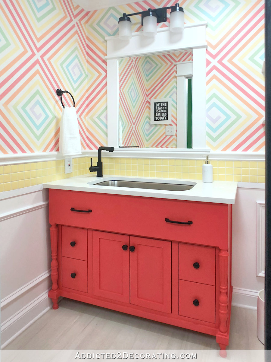
Those walls were a fun project, but over the last couple of years, they just seemed lacking. I’ve tried to diagnose the exact problem. Is it because they remind of me of the LuLaRoe logo? Maybe. Is it because they’re too busy? Definitely not. Was it the lack of definition? No, I tried that and it didn’t change my mind. So I can’t really pinpoint it. Maybe it’s the lack of teal.
But whatever it is, I decided that the walls need to be different. I’ve considered so many different colorful and crazy designs (some of which I’ve shared on the blog in past posts), but nothing ever stuck. And then, a few days ago, I was taking a break and watching some mindless entertaining YouTube shorts, and there it was. It was just the inspiration I needed from the most unlikely source.
Have y’all ever seen this dancing meteorologist named Nick Kosir? If you haven’t, you should. He’s highly entertaining, and his dancing will put a smile on your face. But when I saw this particular video, what caught my eye wasn’t his dancing, but it was the poster behind him on the wall.

I mean, as soon as I saw that, my immediate thought was, “That’s what I want on the bathroom walls!” 😀 So I immediately opened my photo editing program and set about recreating that look using colors inspired by the floral wallpaper and fabric that I’m using in the studio.
Ready to see what I ended up with? Here it is.
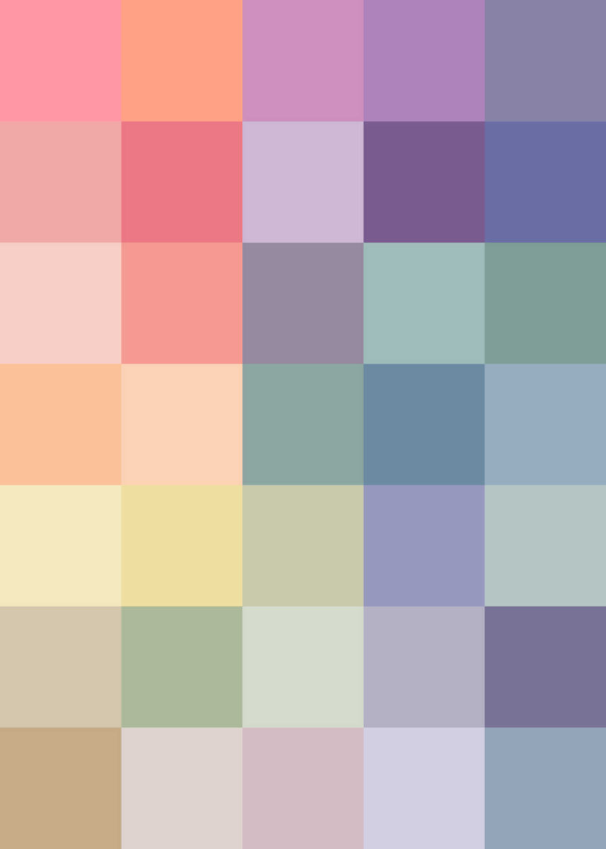
I already know this isn’t going to be to everyone’s taste. Nothing this colorful and graphic would ever appeal to everyone, and that’s fine. But I’m so excited about it!!
Here’s what it looks like with the floral print…
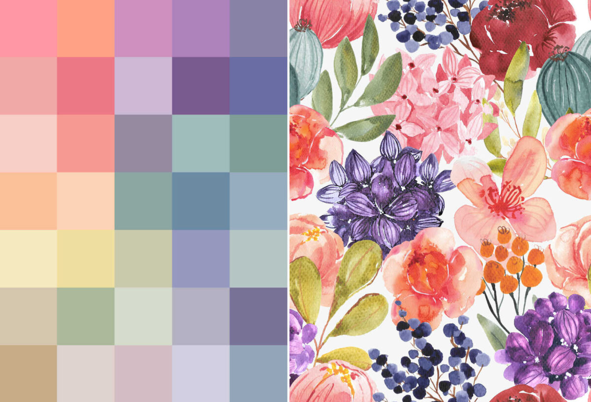
I didn’t make it so that it matches the floral precisely. I wanted them to coordinate, but not necessary look like a matching set. I also tried to add some white on one of the squares, but it was way too stark for my liking. And I don’t really need any white in this wallpaper since the entire bottom part of the walls in the bathroom is white wainscoting.
I ordered it last night, so it’ll be a few days before I get it. I’ve noticed that I receive wallpaper from Spoonflower much faster than I receive fabric, so I’m hoping it’ll be here in time for me to get it installed by the end of the week.
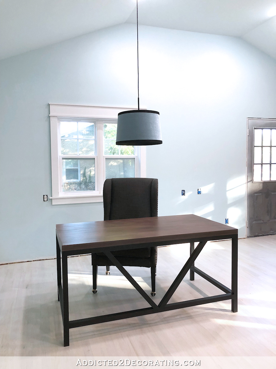
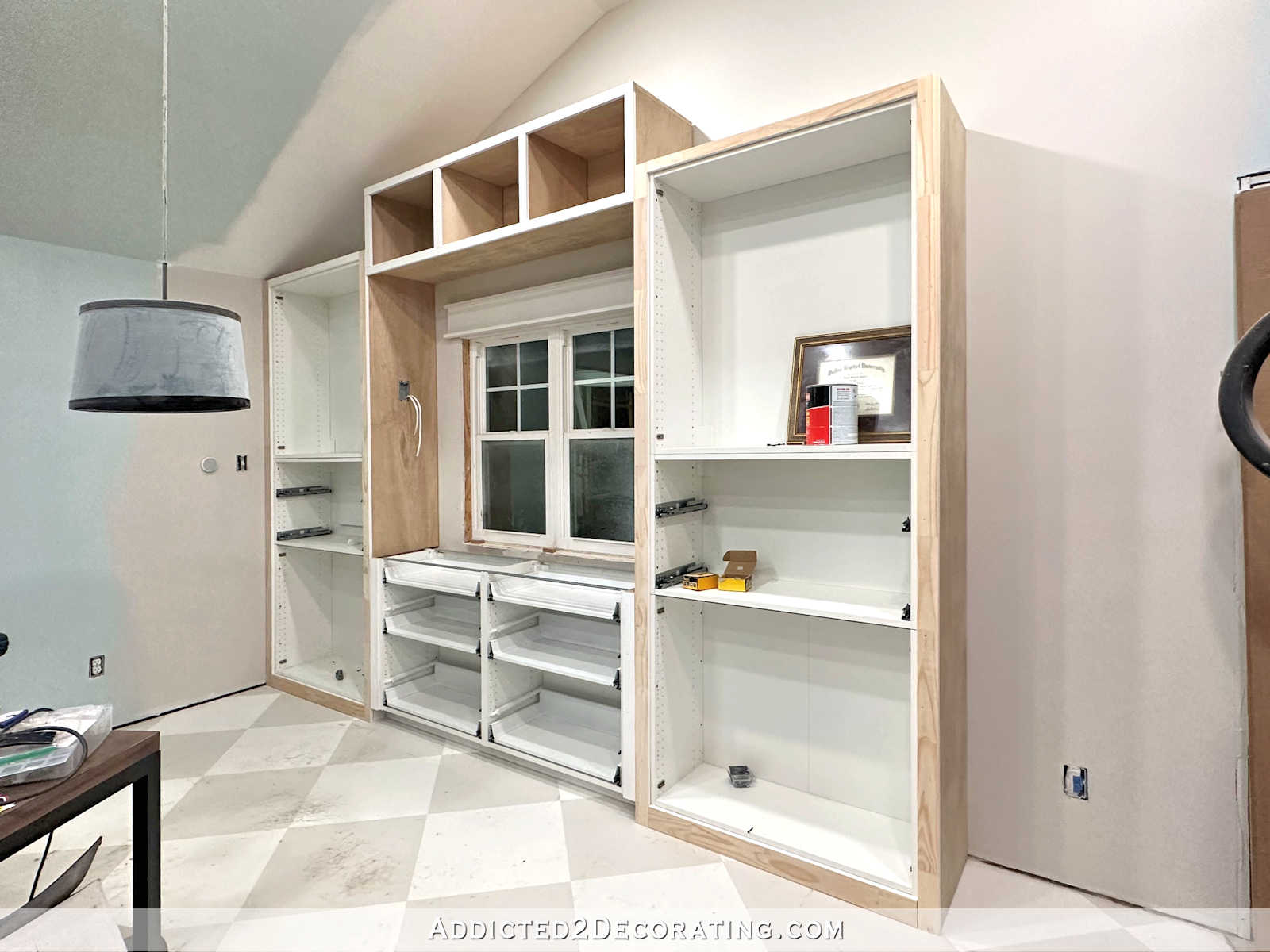
In the meantime, I’ve finally made my color decisions for the rest of the room. After a failed attempt at painting the studio walls and ceiling white (seriously, when will I learn that I hate white walls for my house???), I finally decided to use the same Benjamin Moore Classic Gray that I’ve used throughout the house for the walls of the studio, and my standard Behr bright white ceiling paint on the ceiling. That’s the combo that I have in the living room, and those colors let my pink curtains stand out.
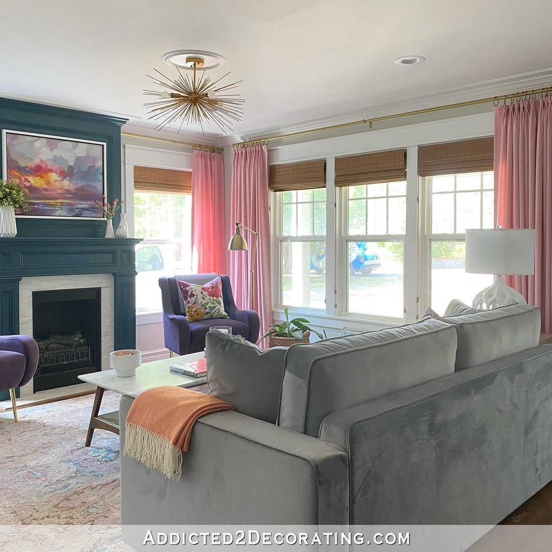
The Benjamin Moore Classic Gray is so light that it doesn’t even register with most people that my walls are actually painted a color until I point it out. But it’s just enough color to contrast with the white trim. It’s not so gray that it feels cold, and it’s not so warm that it looks brown. It’s the most perfect neutral I’ve ever found, and pretty much the only neutral wall color I’ve ever liked.

So I’m going to stick with what I know I love and what works for me. My initial fear was that if I paint the studio walls the same as the rest of the house, it won’t be special. But let’s face it. There’s no way that I can paint cabinets on two walls of a large 20 x 20 room with pink paint and not have it stand out as something special and different from the rest of the house. 😀
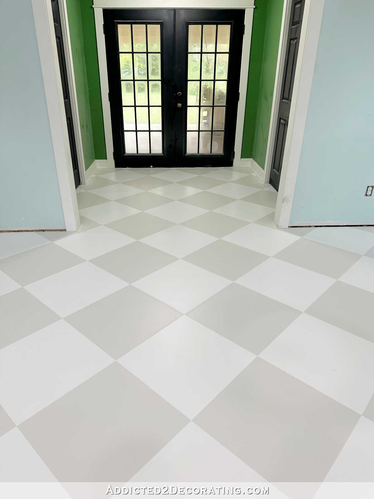
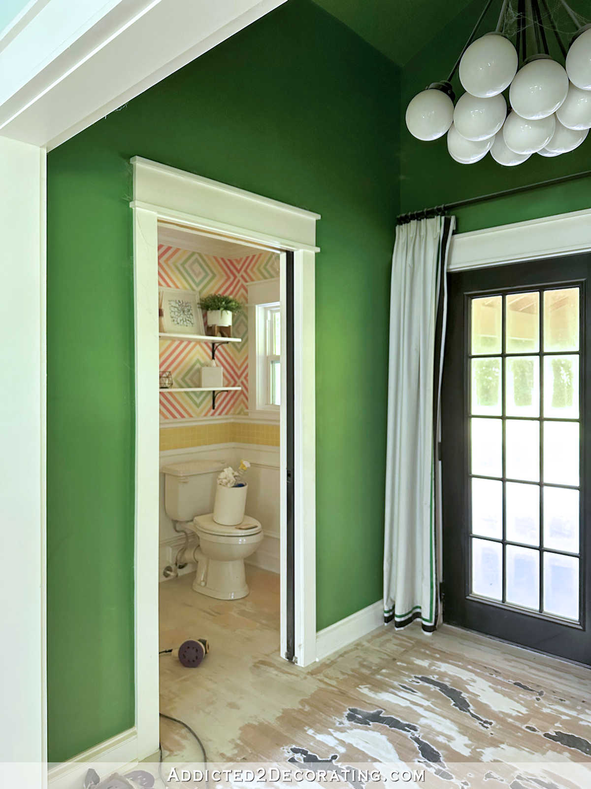
And then for the back entry? (Drum roll please.) Green. I’m back to green. But I’m going to go with a lighter green this time.

I got so frustrated with this decision (and the rest of the colors for this room) that I came this close to purchasing a one-room consult from Maria Killam. I kid you not. I had decided that I just needed a pro to tell me what to do. But then I took that break, watched the video, saw the wallpaper inspiration, and things seemed to fall into place from there.
So the decisions have been made. Now I just need to do the work, and get this room finished!

Addicted 2 Decorating is where I share my DIY and decorating journey as I remodel and decorate the 1948 fixer upper that my husband, Matt, and I bought in 2013. Matt has M.S. and is unable to do physical work, so I do the majority of the work on the house by myself. You can learn more about me here.

Yup. Love it.
Once again, you nailed it! All the choices seem just right. That agonizing middle where one tries to find the “right” thing can be fairly unsettling, so the relief of good decisions is such a good feeling!
HOLY MOLY! I cannot even express how much I love the look of the color block wallpaper. I can hardly wait to see it! I’m glad you went back to green for the rear entry. It’s my favorite of all coordinating colors with your florals, and it’ll look great with the black door and the gray walls nearby. Very exciting!
Oh I LOVE it! It’s like you put a big-squared mosaic filter over the floral wallpaper. Excited to see it in place!!
Great decisions. It is going to be beautiful!
Perfect. I knew you would find the right combo and you have. I know you are anxious to get started so you can get finished.
But I have to ask, what is next?
Anxious to see finished project.
Love your choices and what pulls it together is the bathroom wall. I love the cubes ! Great job!
“Maybe it’s the lack of teal.”
I don’t know whether you wrote that tongue-in-cheek, but oh my gosh, did it tickle me!
(I think you nailed it with the final plan, btw.)
This is exactly what I came here to write♡
LOVE LOVE LOVE!!!!!! Couldn’t love it more!!!!!
Much much better. Those dark colors just weren’t working.
This final (?) decision is superb.
I know it feels good to get all those decisions made. It looks like a great plan. Can’t wait to see everything done. It is for sure “classic Kristi”.
Awww. This I know will work for you!
Great choices, all, especially that for the bathroom. Love, love, love it. Made me laugh out loud. “That’s it!” I have a pillow cover that is very similar and it works so great in my living room here in Ecuador.
How fun to find it the way you did. Breaks are great for musing and inspiration.
Works!! Looks GOOD!!
So, what is the name of that green?
Is it a scaled 50% version of the Scallion?
It all looks great together, BTW!
There’s no name. It’s the green I pulled from the bathroom wallpaper. As soon as I get the wallpaper in hand, I’ll find a green paint color that matches, or have it color matched. I’ll let y’all know when I find it.
Great love the choices.
So glad you did not go to Maria Killam for a consult. She’s not as brave as you. I love the combos you put together. It’s unique and so YOU. It’s great you’re using some hard-edged design to balance the soft feel of your flowers, and that you put it together without exact color matches…much more interesting. Onward!
I couldn’t help but get tickled on how you got inspired because the same thing happens in our family. I will walk away from a project to give my mind and eyes a rest and drive to an antique store to clear my head to walk. Low and behold, I will buy something that the color inspires me (the past 2 times vases) and drive to Lowes where they color match it and low and behold I’m a happy camper regarding my choices for wall paint!
❤️❤️❤️. Will be anxiously awaiting progress posts!!!! No pressure.☺️
Hi Kristi. Love your final choices and think it will look great! I also have Benjamin Moore gray paint in my home as a perfect neutral (though I chose the San Francisco Fog). I’ll be interested to see how the bathroom wall turns out, especially how the squares look together. One more thing, I was thrilled to see that the meteorologist in the video was joined by dancers known as the Williams Fam. They are son’s of a doctor I worked with in the SF North Bay Area for many years before I retired and watched them grow up over time. They are very talented and love to see them getting more and more recognition. Have a great day!
YES! That’s what I’m talking about a lighter GREEN!
I love that green for the entry. It will be beautiful and the bathroom walls will be beautiful too.
The wall treatment reminds me of pixelated art or the paint chip art. Love it!
Going to be amazing!! It’s fun to get inspiration from the strangest of places!!
I love your plan! I equally love how you always take the time to carefully consider what works best for you!
I found a place that also prints fabric, wallpaper and everything else like Spoonflower. It is Itchin to get Stitchin. I order some stuff from them recently and I thought of you wanting to print your own fabric and wallpaper.
I love that green – it is perfect! Good job! The wallpaper idea for the bathroom is interesting and unique. I can hardly wait to see it in action!
Love all of it, but especially LOVE the bathroom wallpaper!!!
Yep! You nailed it!
I’m not surprised. 🙂
I am 1,000% behind your decisions! I think the bathroom will be very AVANT GARDE in style!
I love what you’ve come up with! I’m a super neutral person so I am amazed at what you do with color. Can’t wait to see this. 🙂
I love the wallpaper design for the bathroom and I think you made a great decision with going with the neutral wall paint. It will make all the other colors the star of the show.
I love the new wallpaper idea, the colours are perfect!!!!
As for the green, I’m such a fan of a sage green wall (or blanket, bedding, cushions…. you name it 🙂 ) that I’m astonished I didn’t think of it before seeing your solution for the back entry. My choice would still be lighter and a bit more greyish than yours, but it is quite close and I love it, too. Looking forward to seeing it all together – as always!
Yesss!!! I love this all!! Your pic with all rhe designs and colors are perfect,!!
I was originally disappointed that the lovely pattern you had painted did not work out. Now, I am excited to see how this wall paper will look in the bathroom! I am loving all the new color/pattern combinations! Can’t wait to see it all put together.
Anxious to see it up.
Woohoo! You nailed it! Now you are on your way! So fun when your mind clicks it all into place. I am ready for the ride! Wishing you nothing, but good luck!
Love the wallpaper!
Reminds me of a color chart! Really cool and in your lane.
I think you’re gonna LOVE it! It is just right, bright and happy but nothing is competing.
Yes! I love the direction you are going in now! I love that color green and I love the block pixel idea for the bathroom – the colors are just right. And the gray wall color will be perfect. Can’t wait to see it all come together!
Love, love the green, so calming with the other bright colors! Perfect choice!
I really liked the sense of pattern on the old studio bathroom walls. I wonder if you’d thought of throwing in a little more pattern in the color blocks by having them transition from purple to pink in waves across the wall? I might even flip every other piece of wallpaper so the colors undulate across the walls. Just a thought…
Kristi,
WOW! Inspiration caught you just in time before you turned things over to a pro. You’re the pro lady. I can’t wait to see your inspiration all finished. It’s going to be fantastic, and done by a pro…you.
At first glance of the checkered pattern by itself, I cringed. But then I saw it beside your fabric and other color choices, and I can now see what you see. That’ll be a pretty awesome look! The entryway green color is gorgeous! I had a similar green that was beautiful in a bedroom but looked like mud in my living room… but paint is easy to change if needed. I’m excited to see how it all turns out! And you are the last person who needs pro design help. 😊❤️
Perfect Kristi! God sure knew what he was doing when he decided on green for the grass and trees. It goes with everything. It’s going to look beautiful. Happy decorating.
That is such a great idea…I think you will love it much better than what is there, especially since the colors are all in the paper, and it will be similar that way, but VERY different too. Oh, I hope that pretty light teal in the squares or the green is the color you are painting the hall…both very nice! Isn’t it insane where the ideas sometimes come from!? Enjoy the plans and the finishing. It is going to be SO eye pleasing!
I love the blocks and the way it coordinates with the floral. Reminds me of my own floral balloon shades with a coordinating print shade that I made.
It’s similar to having the lightbulb go off over your head when you made the decision to do the drywall—smh 🤦♀️—I can do this!!
As for the colorful checks pattern, you’re nothing if not brave and you know what you like. Your house, yours to do with what you will. Enjoy!
I CANNOT WAIT!! So fun!!
Yep, when I saw the poster, I went “that’s so Kristy!” Very cool and I know you are going to love it. I can’t wait!
I’m so looking forward to seeing the finished rooms.
Love the new wallpaper idea for the bathroom! Reminds me of paint chip samples which I think is perfect for your creative space. Can’t wait see it up.
I’ve been reading you for a long time, and don’t think I’ve ever commented before.
I am trying very hard to understand why the sign in the mirror is not backwards.
Magic. 🙂
But actually, it’s because the sign on the wall IS backwards. I printed it backwards specifically so that it would show correctly in the mirror. Just a fun, quirky detail.