My Painted Checkerboard Studio Floor Is Finished!
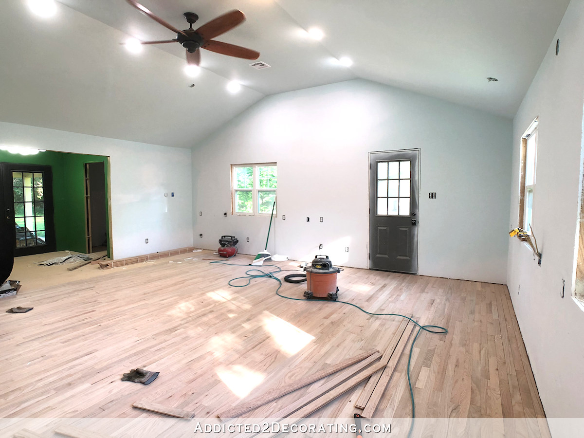
Y’all, this was a huge job, but the painted checkerboard floor in the studio is finally finished. This project would have been so much easier if I could have moved every single thing out of the room and painted the entire floor at the same time. But because I had such large items like my two huge work tables that had to stay in the room while I was painting the floor, that meant that I could only do half of the floor at a time.
And then I got off track with my idea of doing a painted “rug” design on the back entry floor, which (in my opinion) ended up looking terrible. So I had to sand the back entry floor to remove all of the paint ridges and start over.
Because I only sanded enough to remove the ridges from the painters tape, and my goal wasn’t to remove every bit of paint from the floor, I didn’t have to start at the very beginning with primer. I could skip that step and start with painting the entire floor gray, and then taping off the white squares and painting those. (You can see the entire process for painting a checkerboard floor here.)
So the back entry floor was actually a relatively quick and easy redo. And now that I can see it finished, I think it was definitely the right decision to carry the checkerboard design all the way through to the back doors. Here’s how it turned out.
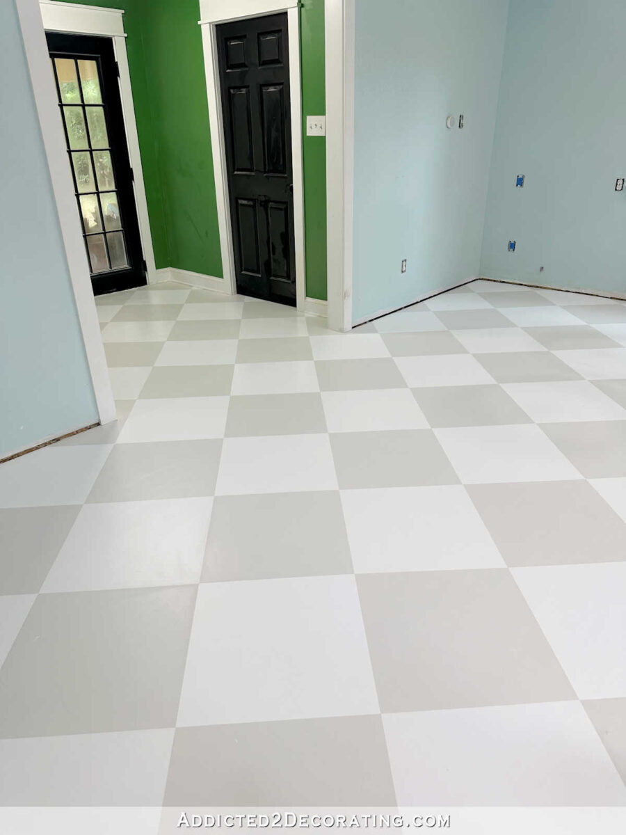
Don’t you think so, too? I like that there’s nothing breaking up the flow of the design into the back area. I think it makes the room look larger and more cohesive. Of course, getting rid of that green on the back entry walls will also go a long way towards bringing these two areas together.

And I have to admit that I was both shocked and excited about how near-perfectly centered the design ended up coming out on the floor. I was expecting the design to be a little off center, but it turned out to be almost perfectly centered on the back doors and with the side walls and doors.
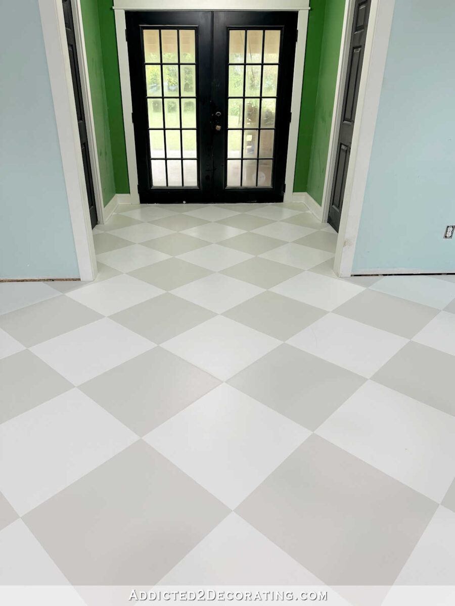
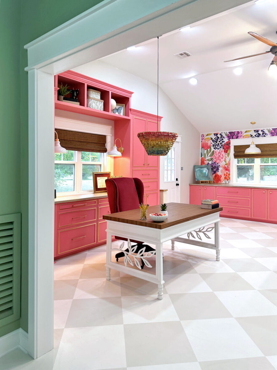
I can’t even tell you how excited I am to be done with this floor! It’s a little dusty, and everything in the room needs to be cleaned, but after some vacuuming and cleaning up, I’ll be ready to move on to repainting the walls. I’ve decided to use the same blue on the studio walls instead of white. But I’m going to have the color mixed at 50% so that it will be much lighter than what it is now. The more I thought about it, the more I just can’t see myself liking white walls. I’ve tried that before, and it didn’t work out.
So I’ll keep the ceiling the exact blue that it is now and the walls will be the same color mixed at 50%. I’ve also selected a color for the bathroom vanity, and I’ve bought the paint. That might actually be my next project since I just finished a big project, and painting a vanity will give me the almost-immediate satisfaction of a project that can be finished in a couple of hours. Either way, I’m just so relieved to be finished with the floor!



I’m so glad you went with the design all the way through. That was my favorite. It looks so nice.
Some times consistency & simplicity are the just the way to go. Given this is a creation room perhaps the more neutral floor & walls will be the supporting cast of projects. Plenty of energy going on. Have fun.
Way to go! You continue to inspire me!
It looks beautiful. That was the right choice!
The floor looks great – I always thought that carrying the pattern through the entire space was the best decision.
I know you have an aversion to white walls but I still think they are the way to go. For one thing the background of your wallpaper is white and the floral pattern has none of the pale blue that’s already on the walls. You are going to have plenty of colour in there with your cabinetry (and I expect to see you change the upholstery fabric on your desk chair at some point). I think white walls will be best in a studio workspace as they won’t distort the ambient light in the same way coloured walls will. I’m also not sure about that cool blue with the warm grey on the floor and counters.
I agree about the distortion of colours. Of course it all depends on what you will do in the room. If this is truly a “work” space, I think you should not throw in a hue which potentially could alter your work.
Love it!
Beautiful floor and room! You are so talented and such a dedicated worker!
The result is well worth your attention to detail and hard work. I am so glad you did exactly that, Kristi. It looks great.
I love it. You made the right decision.
It looks beautiful! It flows nicely and does make the room look larger. Amazing job!
I think it looks great and now the floor will be a complement to the rest of the room. Looking forward to see what color you picked for the vanity. Your progress is amazing, it took me two weeks to spray paint an old wicker rocking chair…
It looks amazing, Kristi! So glad it worked out so well for you!
The floor looks great! I think adding other designs in the entry area would have been too busy.
Oh, Kristi!!!!! I am in love with the floor and delighted that you chose to go all the way to the back door. It looks magnificent! I think the idea of going much lighter with the blue will be a perfect compliment to the room and allow the creativity you do in there shine!
Sorry about all the exclamation points, I just really felt excited about thisl.
Congrats on making the best choice on the floor !
Perfect call on continuing the pattern into the entryway!
It looks great! I love the flow.
The floor is gorgeous! Best decision to take it all the way through for sure! ❤️
It is perfect! I have checkered floors in my bed and bathrooms. I love them!
Great job!
Smiles, alice
I’m so glad to see you continued the checkerboard. The “rug” design just didn’t look right to me. It seemed disjointed and busy.
Love the tile re-do.
I have to disagree about the wall color. I prefer white in my studio since surrounding colors can affect your perception of color when working with fabrics. Considering that I am a quilter and fabric dyer, that’s important to me. Only you know how much fabric or other colored items you’re going to be working with. Perhaps the blue will be light enough that it won’t matter for your projects.
Congratulations on getting the floor finished! It looks beautiful. I really appreciate your post on perfectionism. I often, most of the time, feel paralyzed in making a decision because there may be a better option or that it won’t turn out perfect. Only another perfectionist can understand. I have so many ideas but really struggle with follow through! It is a very real problem.
Oh my Kristi! The floor is beautiful. I love the centered look of the squares on the floor going to the black doors so much and look forward to seeing the finished painting and the bathroom vanity! Such a labor of love with a satisfying outcome!
It will be interesting to see how you tie the blue in with the other colors chosen for the room. I didn’t see the fit for how the blue looked with the previous wallpaper, but I was excited to see what you could to to bridge the gap.
The room is going to look blue and gray if you put blue on the walls with the wallpaper being a completely different value and no color in either the walls or floor to integrate it. If you want the cabinets and the wallpaper to be the feature, you need to let the other stuff back off. Would stick with one of the grays you have used elsewhere in the house or something that compliments the floor. Unless you are going for the look of a blue and gray room.
I, too, don’t “see” how the blue ties into the room. Why not have the gray you used on the floor lightened at 50% for the walls? Just a thought….
I love love the floor. My only and biggest question is, “Why the blue?”
The blue came straight out of the wallpaper.
Love, love, love it!
It was definitely the right decision to continue the checkerboard pattern into the “hall” area! Congratulations on finishing that project.
It looks great! Sometimes less is more!
You did it and it looks wonderful! Congratulations!
It looks stunning!!! Beautiful job…all the right decisions.
It looks great! Best decision!
Love your floor!
Looks Great!
I love your studio checkerboard floor. The way you got the painted tiles centered looks so perfect that I could just picture the entire floor was done and the entry walls were put into place after the floor was done. I admire you for creating every room in your home from a fixer upper into a beautiful home that is second to none of any professional. You are the professional.
👍🏻
Hallelujah! A weight off your shoulders and it looks fantastic. Great job! Now on to other projects.
Amazing work, talent and determination Kristi! I always love your designs and creativitiy!
Oh Wow. I had hoped you would just continue the floor, and I can hardly believe how perfectly it looks…lined up well, and centered. I can barely see anything that is not great. I love the floor so much. Looking forward to seeing how other things get put together…That WAS a huge project…DONE! You must feel great to be moving on…!
Kristi, I love. Love. Love the floor. Your pictures make it look like an optical illusion. Depending on wer you are standing. Great job
First, I love the floor and agree that you made the right choice in carrying the pattern all the way through.
I will join the chorus urging you to paint the walls white. I love the shade of blue currently on the walls, but you don’t have that color in the wallpaper and it may just muddy the fuchsia cabinet color. I also trust those voices of experience that a color will distort any paint or fabric projects you work on in there. I don’t include the entryway in this. There, a color picked up from the wallpaper would look fabulous.
I will repeat a previous suggestion I made to a different post: paint the non-wallpaper wall cabinets in the room the same color as the wall, so any artwork you put on the walls will shine. Think of them as closets, not as furniture, and let them disappear.
Guess I’m joining the chorus about the walls, too. I also like Adelaide’s suggestion about the none wallpaper wall cabinets. Putting color in the entry/bathroom and making the wallpaper wall/cabinets the focal wall.
The blue color came directly from the wallpaper.
It looks awesome. Now just remember to use a dropcloth when you paint the walls so you don’t have to mess around with touching it up.
The floors look terrific! I was surprised because in my mind (I think because of the different floor paint you had in the back entry) I always had pictured it as a step up to that area. It looks so big now and just flows so nicely. Great progress.
You made the right call. It looks beautiful! And I am glad you are doing a quick project to get some of that immediate gratification. Long projects back to back get exhausting, even when you are making headway.
I love how the floor turned out! And while i agree the green entry walls aren’t the right color, I still love that green.
That is so beautful!
Beautifully done!!! Very excited that it came out almost centered for you. That is incredible.
Absolutely beautiful! It worked out perfectly and looks awesome!
Love it!!! 😍
The floor looks so great. I’m about over you getting of the green walls which I loved.
The blues will look great too.
Yeah!!!
Beautiful! Glad you decided on this instead of a painted rug that would break up the flow. Great job!
You made the perfect choice in extending the squares into the entryway. Bravo!
Carrying the pattern through to the back doors was an excellent choice. It look cohesive and enlarges the space. Great job on the floor; don’t think I could have done that much taping and painting. Can’t wait to see the light blue walls and fab wallpaper.
I agree with Chris! It is perfect and looks cohesive! LOVE IT!!
Great work. It is coming along!
Definitely looks awesome! Good job.
The floor is beautiful! Can’t wait to be surprised with the color of your vanity.
Looks fantastic!
I LOVE IT…it’s PERFECT! I’m so glad you just decided to carry it through the entry without any extra fluff. 😊🌺💜
Love!!! I can’t get over how much bigger it all looks. Great job!
Are you kidding me? Don’t believe you’ve ever drawn a crooked line in your life😂 Don’t expect anything but perfection in everything you do. Seriously, the floor is perfect.
It’s perfect, Kristi! I love it!
I love this floor and color choice! And it looks so expansive. Well done, not an easy task! I vote for neutral color on walls, white or light taupe.
Kristi can’t handle white walls, (she has said this constantly,) and I don’t think she will change. I’m adverse to them also, I need slight color in some way at the very least!
I totally understand your wanting a color on the wall. I’m averse to white walls also. Can you explain why you picked blue?
The color currently on the walls is one I selected directly from the wallpaper.
The floor looks amazing Kristi!! I liked the idea of doing the “rug” in the entry way but it looks so good flowing from the entry into the main studio floor. I’m thrilled for you that it landed almost perfectly centered with the French doors. Fellow perfectionist here. LOL! Since you can close the doors in the entry way I think the black line to stop the checkered design will work perfectly. I can’t wait to see what you do with the cabinets. IKEA is my favorite place on Earth and I’ve always wanted to use their kitchen cabinets in my home so I’m excited to see how you add your special flare to them.
It looks perfect; carrying the design into the back foyer was the ideal solution! Now the floor will be a soothing backdrop instead of fighting for center stage. Well done, Kristi!
BEAUTIFUL! WOWWWWWWWW! YOU’RE SO TALENTED!
Gorgeous!
I LOVE IT!!! Sometimes simple is best! And I will love the lighter blue on the walls as well. It’s amazing how the design just worked out so great too it the foyer.
I’m so glad you are keeping the blue! It’s a truly lovely shade.
Perfect. 🙂