Pendant Light Makeover (Should I Keep It Like This, Or Go All Gold?)
I was still getting over my cold yesterday, and I was at that stage where I didn’t feel horrible, but I had no energy and just wanted to sleep. So the only studio project I could muster energy for was giving my pendant lights a makeover. Spray painting seemed about right for my energy level.
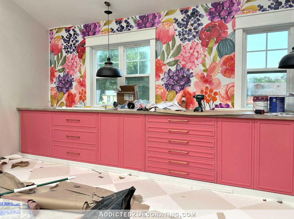
I’ve had these lights in this room for years now, but the more my vision for this room comes to life, the more the black pendants didn’t quite seem right. I like black as an accent, but these just seemed too dark and heavy with my mural and pink cabinets.
The other day, I mentioned the possibility of painting them gold, and most everyone seemed to think that would be a great idea. But then as I was scrolling through Instagram reels, I came across a reel where a woman made a pendant light out of a large bowl, and the finished light had a black cord with a shade that is white on the outside and gold on the inside. I love how this looks!
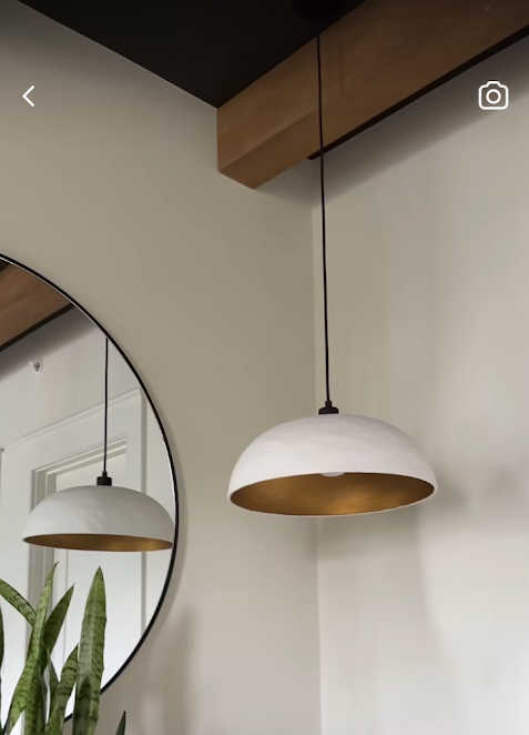
Unfortunately, I just took a screenshot rather than saving the reel, so I have no idea who this belongs to. If you recognize it, please let me know so that I can give proper credit!
So rather than painting my pendant lights all gold (which I worry might end up looking a bit garish), I decided to try this black/white/gold combo first and see what I thought. Here’s how mine turned out…
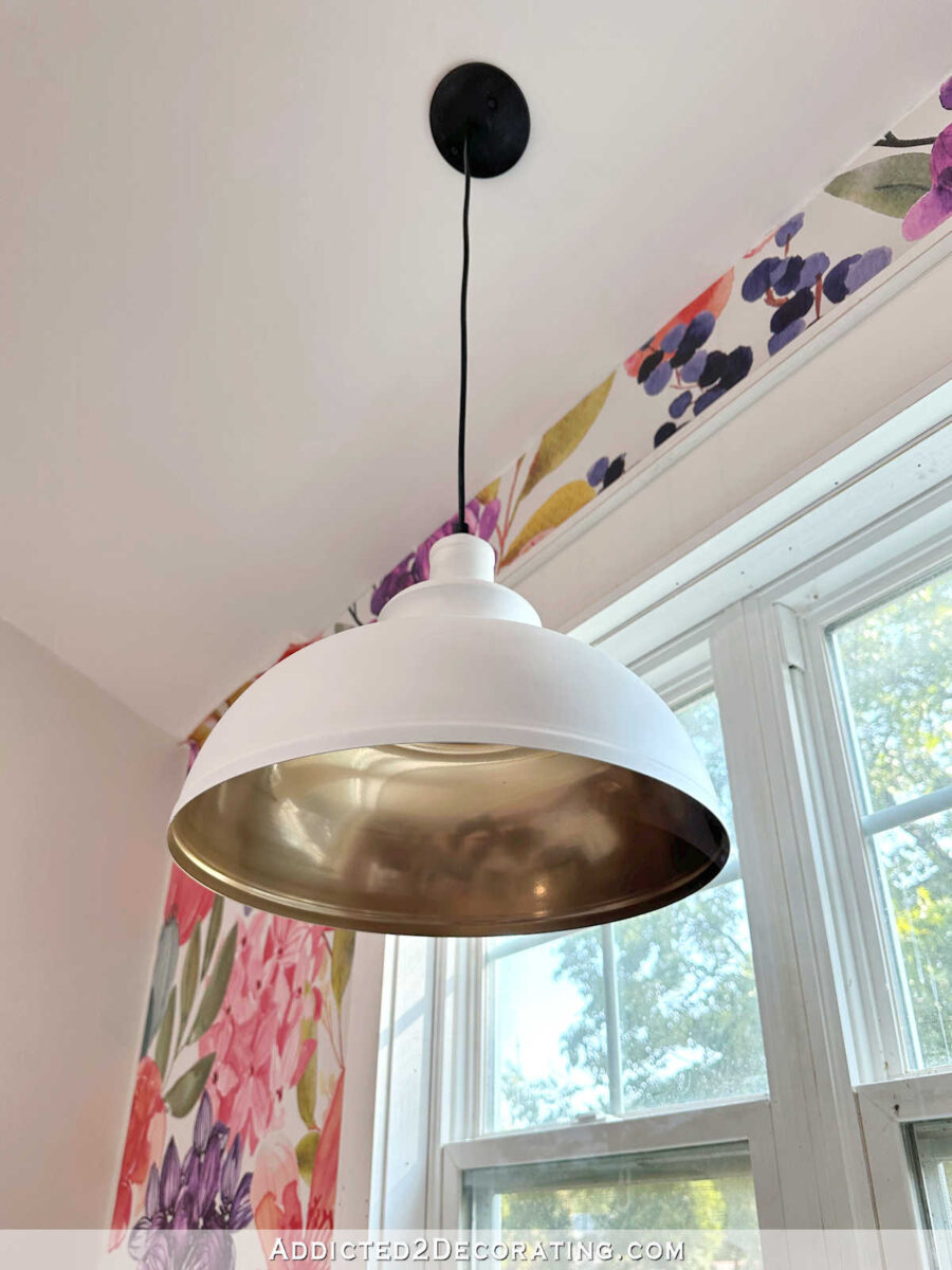
Because I didn’t want to go to the store, I just used what I had on hand. I might want to change the gold on the inside of the shade to another gold. This one seems to lack depth. But overall, I like it.
The process was quite easy. The large shade comes off of this light very easily.
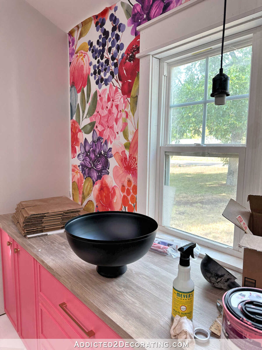
For the gold, I started off using this Rust-Oleum Universal metallic in Pure Gold.
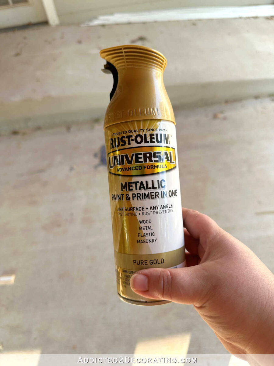
I’ve used this several times on various projects, including the plumbing pipes under the vanities in our master bathroom.

It was the perfect color for that application, but for the light, it looked a little dull.
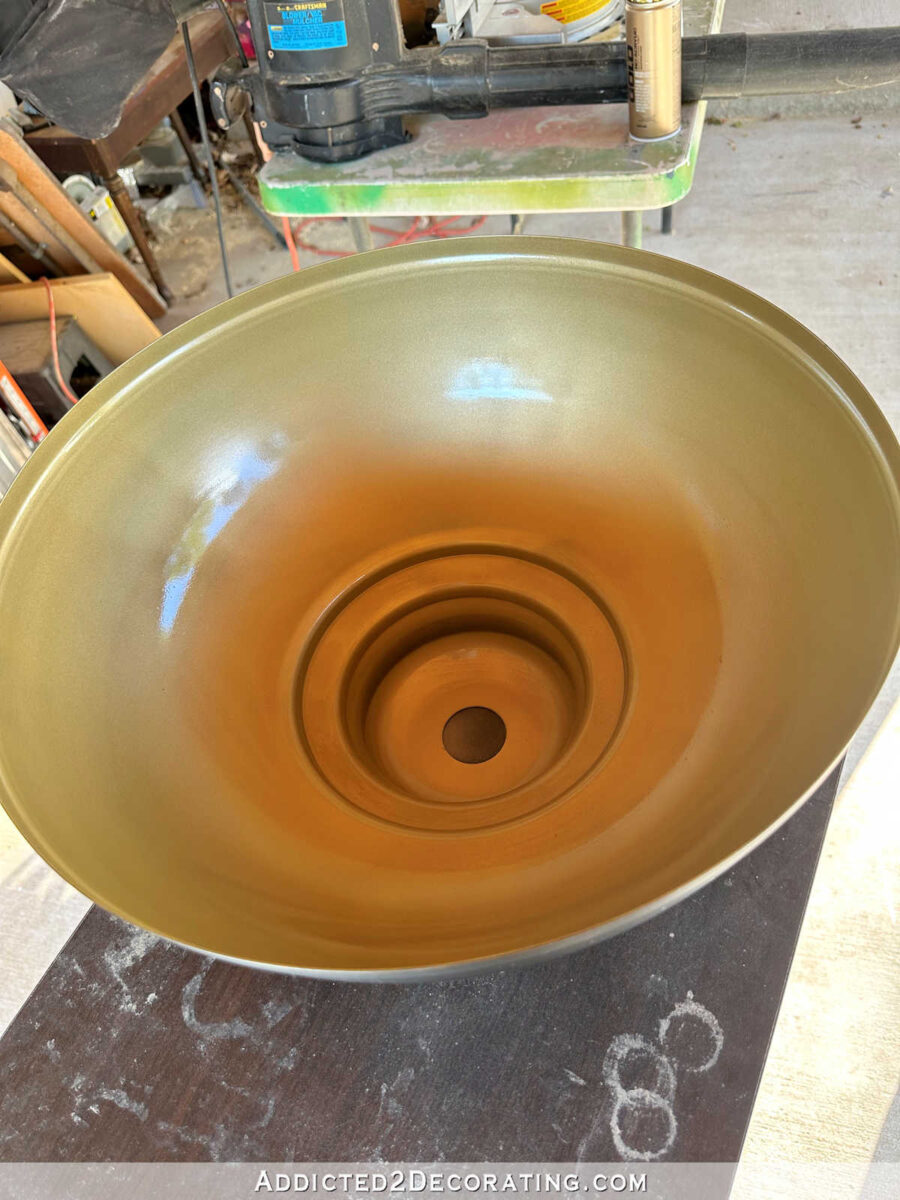
So I went back over it with this Montana Gold spray paint. Their cans confuse me. I get these at Michael’s, and I’m pretty sure Montana Gold is the name of the brand, and not the color. But I don’t know where to find the color name. (Edit: I found the color! It’s on the top, and it’s called Goldchrome.)
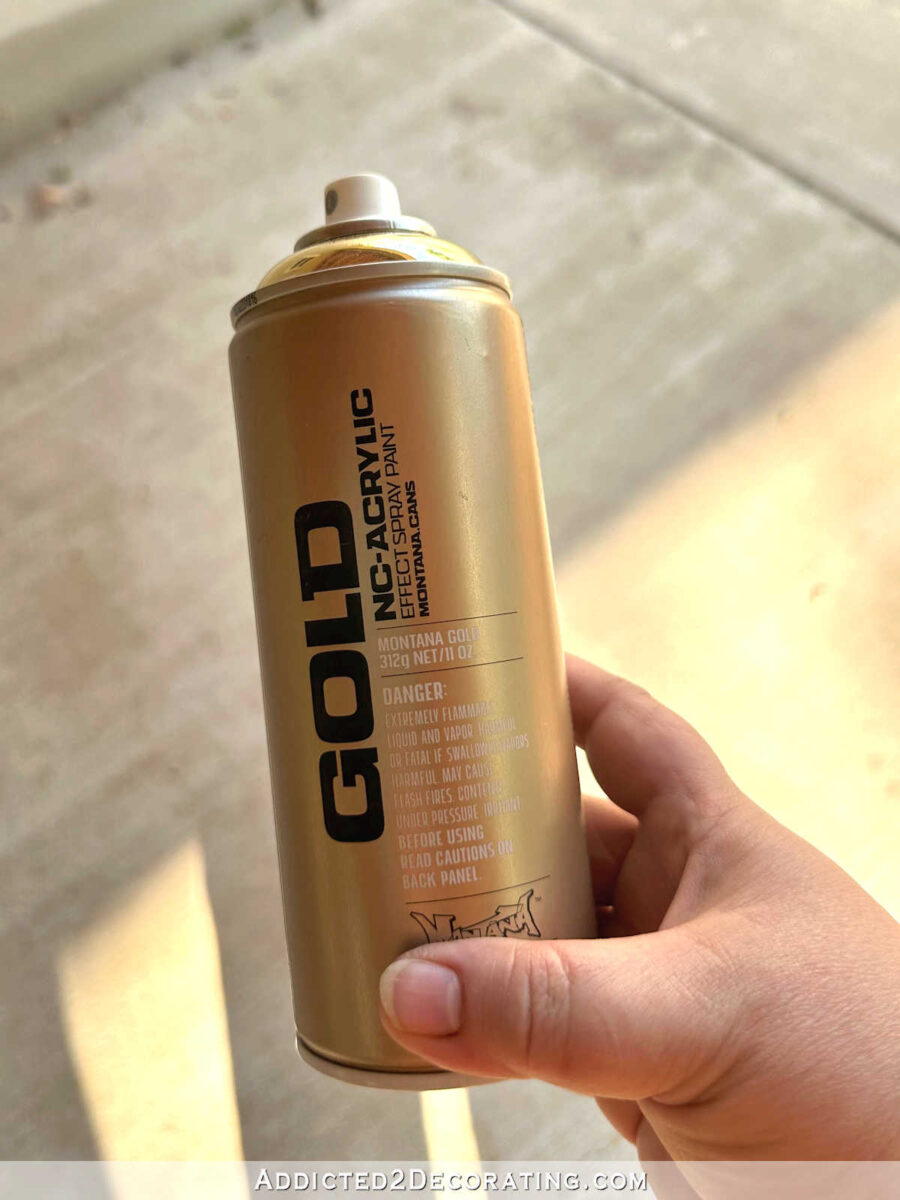
So I sprayed that over the Rust-Oleum Pure Gold, and the Montana Gold is so much shinier and more metallic. It’s really a beautiful paint. For the outside of the shade, I used Rust-Oleum Painters Touch in a Flat White (from Home Depot).
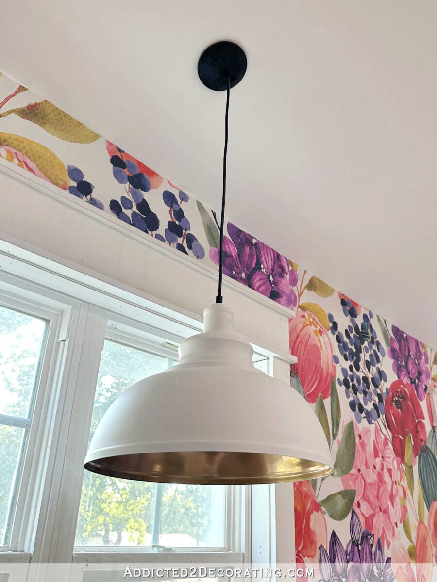
Overall, I like the look. I like that the white shade has a lighter, airier look than the heavy black shade. And I love the idea of the gold inside the shade.
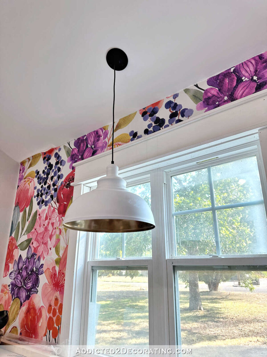
I need to raise the light a little more so that the gold shows more, but that’s where my energy ran out. Maybe I can get to that today.
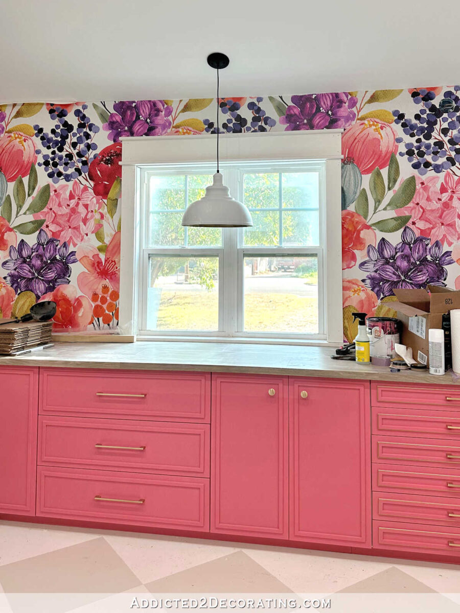
But I’m still searching for the perfect gold. I actually ordered some gold leaf yesterday, so maybe I’ll use that. When it comes to a metallic finish, there’s really nothing that compares to actual gold leaf. (Well, I don’t mean actual gold leaf. That’s too expensive for me. I use imitation gold leaf, but it’s still way more metallic than any finish you’ll get with spray paint.)
So what do you think? Should I keep on with this black/white/gold plan? Keep the outside white, and find a better gold (possibly actual gold leaf) for the inside? Or should I forgo the white and do the entire shade (outside and inside) in gold? I’m pretty sure that whatever I do, I’m keeping the cord and the canopy black. I like how that looks.
Update:
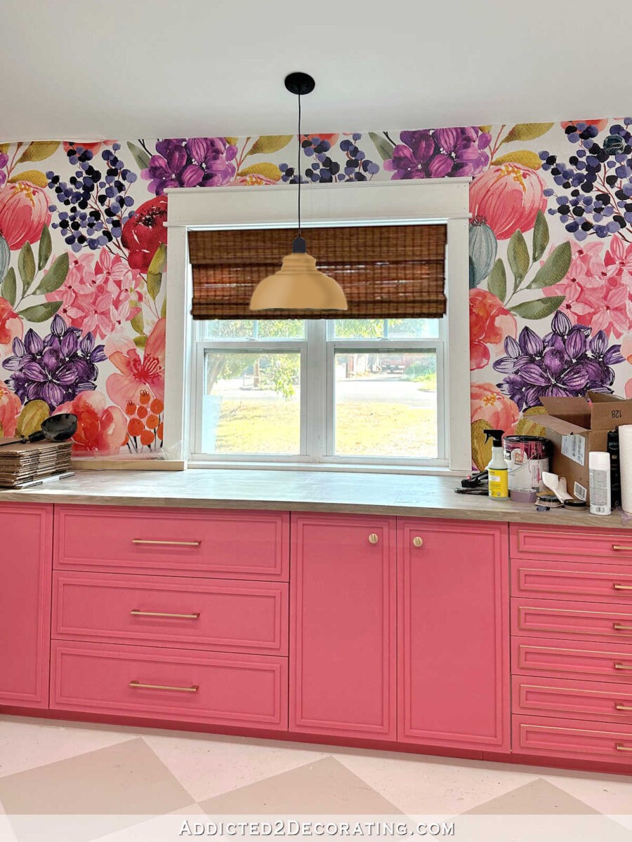
My mom did three mockups for me with three different shade colors, and she included the bamboo window shades that I plan to use so that we can have a much better idea of what the pendant light will look like against the finished wall.
The first one with a gold shade is my least favorite. I prefer the gold to be in very small accent doses, and this is too much gold in one dose for my taste. Plus, I’d have two of them.
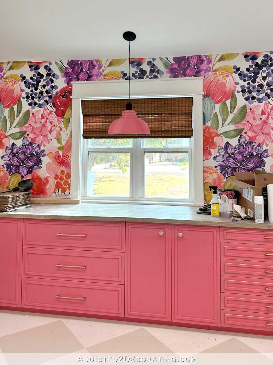
The first time I scrolled through the pictures, I wrote off the pink immediately. I’m not sure why I did that, because I actually really like it. And I like it more the more I look at it.
The white was my immediate favorite, but I don’t like that black canopy against the ceiling. And I think the very bottom rim on the outside of the shade needs to be gold instead of white. I wonder how it would look if I make the whole light white and gold, with no black at all. I could do the canopy and cord gold, the outside of the shade white, and the inside gold, with the gold wrapping around to the bottom rim on the outside.
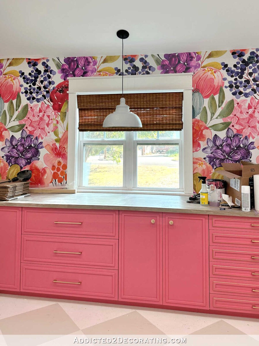
But that pink sure is growing on me! 😀



Gold. The white blends too much in with the window panes.
I disagree. All gold would detract from the mural
I like the white/gold. I think all gold would be too much.
I hope you get to feeling better soon!
Keep the white on the outside, but use a deeper gold on the inside.
I think its perfect!
You could add a coat of satin clear to the white to give it some added pizazz and make it easier to clean
I love it! This looks so much better than the black.
I do agree with you on all-black being too dark and keeping the canopy and cord black. I also agree with the person who said the white kind of blends in with the window frames (though I do love the look and the idea). But I’m not totally sold on all gold. What if you did gold outside and white inside?
Hi, Kristi. I agree that the black pendants, given the direction you took, needed to go–and I really like the white/gold/black cord look. In my opinion, you should stick with this. I think all-gold would, as you fear, look too garish and distract from the overall look of that wall. Good luck finding the perfect gold for the interiors!
I would definitely keep the outside white, but would chose another gold for the inside – something much more golden (as in: darker) and with more depth. I tend to black when I don’t know what to chose, but in this case I’m thinking that the black canopy is too much. On the other hand, it might look weird if you painted that white, too, and leave the black cord. It just feels like an unnecessary distraction on the ceilign to me right now. Is there a way to change both cord and canopy to gold? (this is such a weird suggestion coming from me, I normally don’t like gold, but with this lamp I envision a beautiful sight!). I’m curious which way you will go!
and I hope that you will feel better soon! Hope you can relax a bit more today
What about adding some of the paint pen gold you used on your cabinets to the white. It breaks up the solid white and brings some of the gold to the outer part of the shade.
Yes, like a couple rings around it closer to the bottom of it.
Excatly what I was going to suggest!
A couple of gold pin stripes around the bottom of the outside and maybe near the top too. Would add interest to the white and tie the shade to the pins tripes of the cabinets.
Love the way this is coming along…..
I like it better than the black…it blends in with the window frame. If you’re trying to keep it clan and simple it’s perfect. You could maybe add a small touch of gold to the outside somewhere just to give it a little more definition. But maybe in real life the gold pops out more and it’s just not showing up in the pictures?
I really like what you have. I think all gold would give a garish look to the room. I see the gold in your room as an accent. An all gold light would draw your eye to it. I think it would be come a focal point. I love what you are doing in the room.
I like the white, gold and black. I didn’t think I would but I really do like it. You have such a good eye and a ton of patience!
I actually really love the white, black, gold combo! The gold will look much better with some depth like you said. I love the direction everything is going for you!
I would wait until you get your blinds up. I like what you did to them. The black keeps your eyes distracted. The white & gold look classy & clean . 🤗
I agree. I think that addition of blinds will make a huge difference in the way the light looks. Once you have blinds up, the lampshade will not blend in with the windows. I also think that the gold color needs to be closer to the gold in the inspiration picture. So much richer in color. I like the white with the gold.
I think the top stem part of the shade needs to be black. Yours is a little more elaborate than the one you shared, and I think the black would look better.
Would it be too much pink? if you painted them to match the cabinets? and use the gold inside.
I agree. I think a pink/gold combo would look great.
Just what I thought. Go all the way!
My mom did a few mockups for me, and one of them was pink. It was my second favorite. I’ll add them to the end of the post.
Have you given any thought to one if the other colors from the wall paper??
I kinda liked the black – but now that I see it in white, I’d actually say GO GOLD! 😉 It would tie into the cabinet hardware beautifully – I think the white blends in with the windows.
Maybe add some gold accenting to the top of the light, around the curby bits?
The white is too plain for me. It blends with the window trim and falls flat. Go for it and do the gold! It will be beautiful!
I love the white shade and gold lining! What about the cord and ceiling mount?
I really like the shade white with the gold inside. I’d paint the canopy white too, though, and maybe even the cord. All gold, imho, would look garish. Just one woman’s opinion!
Leave it as is with the exception of the shinier gold inside. Love this so much more than the black/
LOL, when I got to the first photo I thought, she should paint the outside white to blend with the window trim and the inside gold to elevate the look. I like the black cord and canopy as well.
Keep!
I like the results you have. The white looks better than I thought it would and the gold is a perfect shade. Keep it like it is. Good job!
Your redo is so perfect. Don’t go all gold, it will stick out just like the black did.
I agree the gold you have just looks thin and not rich enough. The gold leaf should do the trick.
I love this look! Definitely preferable to all black or all gold. It’s a nice touch without being overpowering.
I feel like we can’t make an informed decision without seeing one all gold. The white, to me, just doesn’t feel like you. You have always been a more is more kind of person. And while I like this, it just fades away, which isn’t what I *think* you are going for. But do it up! You love this wall, so put its jewelry on and don’t apologize!
I love the white/gold/black combo.
Looking great! I like someone’s suggestion to paint the top “knob” of the pendant black and then others’ who suggested edging the white with some gold. I don’t visualize well, but you do and anything you settle on will be gorgeous! This room is going to be phenomenal just like the rest of your amazing home!
I LOVE this!! Looks very good! I would not raise it tho, just add some of that gold paint pen around the bottom edge.
I love the white outside and the gold on the inside!!! Beautiful!!!
Love the “new” pendant!
1. Definitely go for a richer gold in the interior as you thinking.
2. In Photoshop add more black at the top to cover the first “cap” that’s white now. See if it’s too much black or just right.
3. What about adding a matching gold stripe on the edge that’s about 1” to 1-1/2” from the bottom of the shade. I’m suggesting no wider gold stripe than what you’re doing on the drawer faces.
I am not crazy about the white shade with black cord and mount. I like the black shade with gold inside. Three colors white, gold and black are too much.
I love it just as you have it now. I think if it was all gold, it would get lost in front of the beautiful mural. The black actually looked lost too. Now with it white, it looks and fits in perfect. Not adding anything to the mural or taking away anything from the mural. I love the color gold that you put inside the pendant. I gives a hint of splendor in a very busy woman’s work studio.
It looks great! I wouldn’t do a thing to it!
I think it looks very nice as is. ☺️
Leave as is. Looks great.
I like the white and gold. Hope you feel better soon!
I think the pendant with black on the outside and gold inside would look richer. I believe that once the tuberose upper cabinets are installed the black will not appear to be a stark contrast. Your desk is black which would tie in nicely. Doesn’t your desk chair have black or dark gray upholstery? I think the white outside on the light fixture looks inexpensive and blends in with the white window trim. If you keep the white, I would change the wire to gold and the canopy to white or gold.
Have you tried it with the light on? I was just wondering how it would look reflecting off of the gold interior when it is on. I like the white and gold.
I like what you have done!
Kristi, I love it. Change the gold if you want but I think it’s perfect.
I like this. I do think the gold needs to be on the raised rim of the outside and possible the 1st and second indentation right below the cord. This would leave the lightness of the white but let the eye travel to the gold interior.
Sheila F.
I love it! I wasn’t a fan of the all golf idea, but didn’t want to chime in. But since you’ve asked, then yes, keep this idea!
Ha, gold not golf. My phone keeps auto correcting and I don’t even golf!
I like the white/gold/black…I feel like it adds enough pop but yet blends enough not to overpower the mural.
I really like this! I think you’re on the right track.
Give white with gold leaf a try. I like the white/gold but agree that the gold spray paint isn’t cutting it! Would you spray the canopy white? Or leave it black as the cord is black? The black canopy is really standing out to me but I can’t decide if a black cord with white parts would looks strange too.
I read the other comments after leaving mine and am now throwing my vote to cabinet pink with gold leaf interior! That would be *chef’s kiss*!
I’d love to know how you spray painted the inside and outside different colors so cleanly! I seem to make a mess of it when I try. As for the colors, I liked the white version best until I saw it with the windows, for what that’s worth.
I agree with a different gold…otherwise I love the look!!
I like the white, but i think it should be a glossy white, it just looks blah and fades away with the flat paint. I think top knob part where the cord goes needs to be black. I also love the idea of adding gold pinstripe or gold edging around the bottom.
It could look great to have the top portion or that cylindrical knob part in the gold – would make it look like another separate piece of hardware
attached to the shade = more expensive look and more of a gold statement!
Hi!
My vote is for a shade of green in your wall covering on the exterior while the black cord and gold chrome interior remain unchanged.
*hugs*
How about the purple of some of the flowers in your paper with the gold inside? (I’m old , so it may be my “old” thinking😁)
Have you seen those hanging lamps with gold paint or maybe gold letter leafing in the underside? They are beautiful!!
OH, I like the look of the white/gold and black cord. Nice! I can’t remember…are the windows getting the wood shades as well…that will make it look even nicer with the white against to wood. But I do like the white because I notice that less, and the mural more! Very eye pleasing to me. Did I miss something…I was away…did you do gold on the cabinets already? I also like the idea of some gold trim on the white shade.
Previous post she trimmed the narrow drawers with a tiny line of gold.
White exterior/ gold interior. Looks great.
White exterior, gold interior.
Looks great!
PS) Sorry you aren’t feeling well. FAST recovery is wished…and regards to Matt…stay well.
I love the black cord and the idea of the white and gold. I think a high gloss or textured white (is that a thing?) on the outside along with the gold leaf on the inside will make this pop. I’m pondering where I can put one just like this!
And again..anything you choose
Will
Be
Gold
(I think keep searching for gold)
I like the white/gold look so much better. However… I agree the gold is too “soft” and also the white, in my opinion, should be like a lacquered enamel, shiny white. I feel that would be a better match with a stronger gold.
Feel better soon!!!
I’d keep it the way it is. I think the gold now goes better with your drawer pulls. Plus, you don’t want to add a yellow/gold tinge to your work surface.
I’d love to have 3 big pendants just like these over my art table.
I love the white/gold/black!
The white shade with gold inside is perfect I think.
I remember the gold accents in hardware and trims in the 80’s. I also remember that it was a short-lived trend.
I like the white/gold combo – you should definitely stick with it!
I think the black cord and ceiling cap would bug me being so contrast. I am still leaning towards it all gold. Ceiling cap, cord and shade
I think go with all gold! That’s my vote. And my favorite shade of gold is “Gold Leaf”! Perfect!
Ok, I really like the white and gold shades on the lights. I see nothing wrong with the color gold you have used. I don’t think you would like all golding/gold on the whole light fixture.
Sorry you are under the weather. I’m guessing you are tired. You go 90 to nothing all the time. Sometimes we have to rest our bodies.
You are making progress.
Hi 👋 Kristi, what about in the very middle section of the white shade do a gold band. On the flat surface. I think it would add a little dimension to the shade. Plus it’s a stripe!
I like the white and gold combo but feel the white needs a little something. Gold at the very top? Gold on the bottom rim? Something to bring the gold to the outside but keep it subtle.
I like the white and gold combination. 🙂
On Youtube there is a gal, Jennifer Ferguson, that sells beautiful metallic foils that are much easier to work with and less messy than gold leaf. The site is Artistic Painting Studio foils. Jennifer has lots of videos demonstrating how to apply and she sells packages of sample foils. There are multiple golds.
I like it the way you have it now. It could a different good if you’d prefer but I like it as in. My concern is heat from the blight bulb. I painted a shade before and my husband insisted i use a paint that could withstand the heat. He’s an electrician.
I love the current look. I’d keep it just as it is.
I like the gold inside, but I still think you should go with what Kate Watson-Smyth (Mad About the House) calls a “disrupter colour.” In this case, a green picked out from the wallpaper. The white is bland, the all-gold is just no, and the pink-and-gold runs the risk of getting monotonous. Ask your mom to mock up a green, and you’ll see what I’m taking about!
I prefer the white. Might change the ceiling canopy to gold.
I like the white. Maybe add a small band of gold at the edge of the white shade and /or maybe at the top
Just a thought…keep in mind the function for which the light is intended. It should be at the proper length for when you work…function is more important than aesthetics. I happen to like the pink as well, but the white is refreshing as well….with the gold inside. Good luck on your decision.
I like the white exterior of the pendant, with the gold. But then when I saw your mock up of the pink, I thought “what about a pink exterior with gold on the interior”. Look forward to seeing which way you decide to go.
I like the white, but love the pink. On the white, my eyes were immediately drawn to the black cord & canopy though. With the pink, my eyes didn’t immediately see the black. I like that better. Can’t wait to see the finished studio. I know it’s going to be beautiful!!
Love the pink!
How about a white shade with a small pink accent line, a white canopy, gold inside and a pink cord?? 🙂
My vote is for the black/white/gold combo. I would choose the pink exterior over a gold one as a second choice – but I think the white is perfect.
How about painting the shade the deepest green in your wallpaper — it would almost a green/ black?
Maybe pull a different color from the wallpaper like one of the greens you were sampling in the back entry area?
I agree that the ceiling cap needs to be white. I think the black cord could stay black or go gold. I do think you need a richer gold and your inspiration picture almost looked matte gold with a gloss white. I think that combo would look great. Although, the pink is intriguing.
I think PINK! And, I’m surprised at myself, cause I really liked the white. Maybe a slightly lighter pink from the wallpaper.
I like the white but think it should be a gloss, not the flat.
What a joyous room. But the black shade is out of place. The all gold is overkill. The white is boring. The PINK…Now then. It just finishes it….with a gold that has some depth. The cord and canopy? I think the canopy needs to go away. But the cord…??
I like the white/gold combination. I think your idea to rim the bottom with gold would make all the difference. In my opinion, though the pink is a beautiful color it would just be too much pink. Sometimes you have to know when to stop with something wonderful. I do love how your studio is coming together. 🙂
That pink is growing on me, too! I wonder if the problem with the white light is that the canopy is black. In the inspiration photo, the ceiling was black, so the black canopy wasn’t obtrusive. With your ceiling being white, it makes sense to have the canopy white, the cord black or gold, and the shade white with gold interior. But…. that pink is growing on me too! Go for it, you can always change it if it doesn’t work. But – that pink is growing on me…!
How nice of your mom to do that for you! I still like the white but with some added gold at bottom and/or top. If you really want pink, I wouldn’t match the cabinets. Somehow that just seems too heavy to me. Maybe a lighter pink from the paper. Or that very light grayed teal in the paper. Whatever you do, it just seems like one color on the outside kinda screams that it’s been spray painted. Just a little addition of gold or black would make it custom. I’m looking forward to see what you come up with.
I painted a black cord like that with spray paint months ago and it is STILL tacky to the touch. So beware.
Maybe you could change the woven shade to a white? I’d stick with the white and black cord and then add in some accessories, like canisters on the counter that are black and white polka dot or something similar. I’ve read that when mixing finishes it’s best to have it in threes. I’m sure it will look fabulous whatever you decide!
Wow, really love how this room has come together. I didnt understand the wallpaper at first. Especially when you were talking about changing the pattern. The old pattern and the new looked the same to me. until now!!! The new, more defined pattern is beautiful. I adore the pink cabinets. The white, black and gold combination for the light was my favorite until I saw the the pink. Love the pink.
I too love the pink (I’m as surprised as you at that statement!) BUT….I think the white ties in better with the window trim and white background of the wallpaper. And I like the cord black, it reminds me of old lamps. The ceiling cap could be the same as the ceiling, but it really doesn’t bother me one way or the other.
Check out the pendants in this post from last year by Jenna Sue Design, https://www.jennasuedesign.com/modern-mediterranean-kitchen-reveal/
I think this is possible for your pendants too. Either paint the cord or add a chain matching the gold you choose.
I typically read all blog posts once a week so if you’ve landed on a solution already, I’m certain it will be fabulous
You have it perfectly right. White with gold inside and black cord. Stop now! It is beautiful and correct. I love it!
I’m not a fan of the black cord and top part. It seems so out of place with the light, open look of this wall. White would look more in tune with the whole look.
That pink is intriguing. Especially with the black
Like the lamp white outside and gold inside. You need some variation.
You could paint inside pink but gold would look more updated and interesting.
Your attention to detail and your creative vision are truly inspiring! It’s wonderful to see how much thought and consideration you’re putting into perfecting the design of your light fixture. Your idea of making the entire light white and gold with no black elements sounds exquisite. The combination of a gold canopy and cord, a white outer shade, and a gold interior shade, with the gold extending to the bottom rim, promises to create a harmonious and elegant look that will undoubtedly elevate the aesthetic of your space. Your commitment to achieving perfection is admirable, and I can’t wait to see the stunning end result of your design journey!