Studio Office Area Cabinet Progress (Plus, A Design Consideration)
Things are moving right along on the cabinets for the office area of my studio! We had gorgeous weather yesterday, and I took advantage of it by getting all of the trim for the doors and drawer fronts cut, assembled, and attached to the doors and drawer fronts. I got all 18 trimmed out and ready for the next step.

It’s supposed to be sunny and 79 degrees today, so I had hoped to get all of the trim caulked so that I could paint today. Unfortunately, I ran out of time, and didn’t get any of the caulking done yesterday, so that will have to be done today. Our weather is supposed to be beautiful all week, so it’s looking like I’ll be able to paint on Thursday. Once I get that done, I will feel such a huge sense of accomplishment!
I had considered skipping the caulking process and just painting the doors and drawer fronts, but I just can’t let myself do that. You can see here that the trim I used is slightly curved even on the backside. So right where it sits against the door, you can see this little crevice.

Things like that irritate the heck out of me, and there’s no way I’d be satisfied without caulking that little crevice. And the mitered corners of the trim also need a little sanding and caulking.

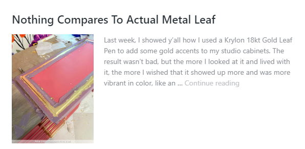
Anyway, this is round two of me prepping, adding trim, caulking, priming, painting, and gold leafing IKEA Veddinge cabinet doors and drawer fronts, and I wrote about it in greater detail the first go ’round.
If you those previous posts and want to see details of the process, you can read about it in these three posts…


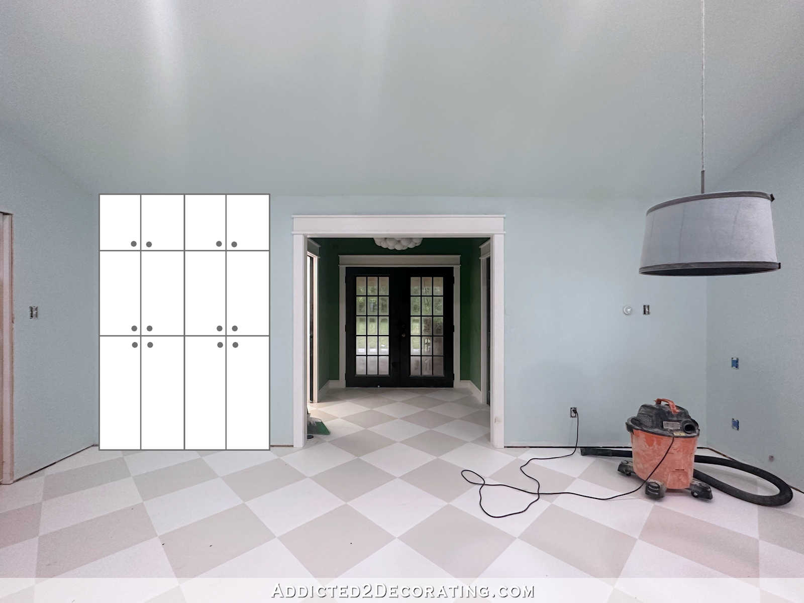
So now that I’m well on my way to getting the doors and drawer fronts finished, I’ve been thinking ahead and planning how I’m going to finish out the actual cabinet boxes. The exposed side on the right will have to be covered, and since I didn’t buy any of those panels from IKEA, I’ll be using MDF or plywood.
I’ll basically be repeating the very same process I used to build out the sides of the paint swatch cabinet where I added added two pieces of 2″ x 2″ lumber to the sides of the cabinets like this…

And then covered that with a piece of plywood like this…

Since I’ve already done that process once, and it worked out great, there’s not really anything else to figure out. I’ll just repeat that whole process to cover over the right side of the cabinets. But one thing I’ve been considering is adding a bridge to connect the two upper sections.
I’ve been toying with this idea literally from the very beginning of designing this room back in 2017, but someone else suggested it a few posts back when I asked for ideas on how to incorporate the floral design in this area of the room. Someone suggested building that bridge to connect the top upper cabinets, and then just adding the floral wallpaper to the wall in that enclosed area.
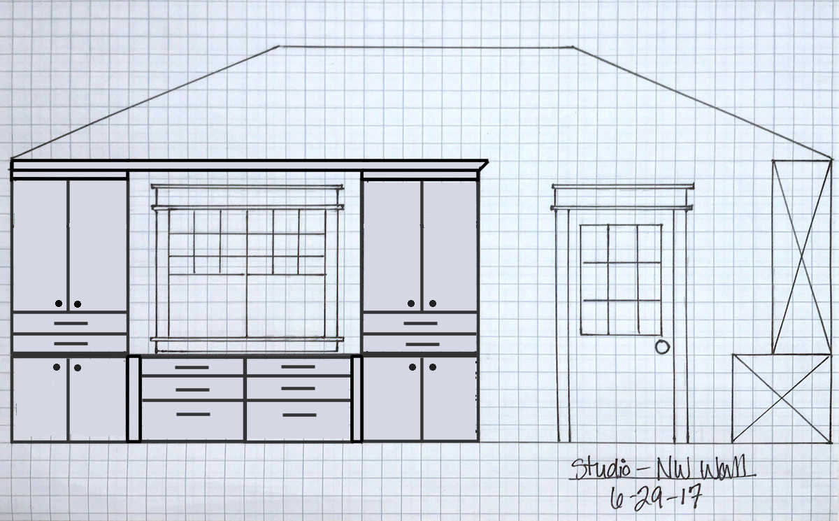
If you’re having a hard time envisioning this, let me show you what I’m talking about. So here’s the plan I’ve been showing y’all for a while now. Even though the design changed slightly when I decided to go with IKEA cabinets, the main idea has been the same since 2017.

But the bridge idea would look something like this…
I don’t plan to add the floral wallpaper to the area inside that area because I don’t think enough of it would show to be worth the effort. But what I do love about the bridge idea is that I could add lights above that countertop. I don’t know if I would ever need lights in that area, or what kind of work I’d do on that countertop that would necessitate lighting above it, but I do like the idea of having it available if and when I need it.
Of course, if I didn’t do the bridge, I could always add sconces to the sides of the cabinets, facing the window, just like I did with the closets in our guest bedroom.
I also like that the bridge gives the cabinets a more finished look (in my humble opinion) against that very tall, wide wall. With the bridge, the entire cabinet area looks like a more cohesive unit to my eye.
So that’s really the main design decision I’m trying to decide on right now. I have a few days to decide since I’m focusing on the doors and drawer fronts right now. Those will probably take me the rest of the week, and maybe even the weekend, since I have to do the gold leaf also. But I’m hoping that I’ll be ready to start on the actual cabinets next week, and I need to have that decision made so I’ll be ready to go.
What would you do? Add a bridge with crown molding for lighting? Or forgo the bridge and just add crown molding to the tops of each individual upper cabinet, and possibly add some sconces to the sides of the cabinets?

Addicted 2 Decorating is where I share my DIY and decorating journey as I remodel and decorate the 1948 fixer upper that my husband, Matt, and I bought in 2013. Matt has M.S. and is unable to do physical work, so I do the majority of the work on the house by myself. You can learn more about me here.
![The Current State Of My Studio (The Reason For My Procrastination) [VIDEO]](https://www.addicted2decorating.com/wp-content/uploads/2018/05/video-thumbail-1.jpg)
Bridge! Hands down. Looks complete and custom.
I agree!
Agreed!
Me too! Agree that a bridge would look fabulous.
I agree!
Bridge and add the same lighting as the other side! At least at the same height since it won’t be coming down from the ceiling
Bridge is a great idea with lighting !
Bride with lighting!
No doubt in my mind: Bridge!!
I would forego the bridge. IMHO it would give the now on trend design a dated look. They used to do this in kitchens, but now you never see it. Everything is light and open. Part of me felt like the bridge kept the side pieces from collapsing. Your pieces are built in perfectly and don’t need it.
I think the bridge would make the window feel boxed in and bring down the height of the ceiling. I’d prefer the crown on the side cabinets with light sconces.
Agree. No to the bridge, yes to sconces. Keeps the high, open look.
Exactly! Boxes in the natural light.
I’d do the bridge and add lights under it. IMHO
Could you do all? Bridge with lightning and sconces and use whichever light is best for task at hand?
No bridge. Might be just my era, but it brings to mind the old kitchens with the bridge between the upper cabinets. I would keep that area open, not close it in. As for lighting, not sure on sconces either. You might not need or want anything with the window there.
I think the bridge is an excellent idea. It would give your built ins a great presence in the room and keep your eye from wondering up the wall. I say GO FOR IT!!!
Love the look with the bridge!!
Yes to the bridge and lighting!
I like the bridge idea because it makes it look finished. Looks more complete and more like a big piece of furniture that won’t fall over. More intentional. I just like the looks of it!
Everything you do it great so this will be also. How much space is around the window? That would be a great place to put the floral wallpaper even if it only showed a bit.
Have a great week and enjoy our nice weather because we don’t know how long it will last.
I like the idea of adding a bridge. It is more finished looking in my opinion.
I think a bridge looks tidy, but over the window feels boxy. It’s a window, so allow it to be a feature, without double-framing with a bridge. I think a Roman shade on that window in the floral wallpaper ties in the other wall, and that way the cabinets don’t need glass panes on top (to show fabric) and can be more functional, without worrying what’s behind the doors and appearing so segmented. Stick with a solid velvet color for the office chair, like eggplant. Go gold with a hanging swag lamp or sconces and possibly some desk accessories.
THIS! At first I liked the look of the bridge, but someone mentioned the light from the window being affected…didn’t like that too much. I LOVE all your ideas…sounds so eye pleasing, and a nice way to highlight the fabric in that area, as well as the the gorgeous color for the chair…solid and beautiful…maybe a nice lumbar pillow in the fabric. She might not like that she isn’t using the same window shades on all the windows in that room though??? Also the sconces and lamp to bring over the golden trims. Glass panels will be another cleaning commitment and storage would have to look nice instead of just storage. That is a decision Kristi would have to make. I’m for keeping things tidy, as at my age, things like glass table tops, wicker furniture and wrought iron are off my list as I am tired of trying to keep them clean and dust free. Kristi is so busy she needs less fuss and areas to constantly be cleaning!
After looking at the picture from your post 2 days ago (studio office underway) with the straight shot of the cabinet, I feel that the bridge is just going to look too crowded. Sometimes less is more.
My only concern would be blocking light from that window. I wonder if you could make it in such a way so that it is removable (holes and dowels?) and try it both ways to see which way you like best. I know a lot of entertainment centers designed like that break down into pieces for easy assembly/disassembly.
I like the bridge with crown molding for lighting. It will look cleaner without the sconces.
I like the complete bridge but would love to see sconces on the side. If this were my workspace, I would put a strip of LED lights across the backside of the trim underneath the bridge. this would provide a lot of light to this area. Flat surfaces ALWAYS get used for something!
This is the easiest question you have ever asked us … bridge and lighting. You’ll be unhappy if you don’t and go back and add it 🙂 Honestly, it’s a no brainer.
You always make terrific choices, so whatever you choose will be lovely (even if that means changing your mind down the road and making adjustments.)
Personally, a long straight line connecting the upper cabinets would drive me nuts, especially when it isn’t centered under the angles of the wall.
I paused at the bridge mock up and could see what you mean. But, I like the open feel of no bridge, which looks airy and unconstricted. As for lights, I would assess the need later and decide once you are working in that space.
Voting no on bridge, but here for you whatever you choose!
I think the bridge would add a more finished, built in look to the cabinets and anchor them against that taller wall. I also think doing glass doors on the top and the mural wallpaper on the back of the cabinet would look great. It would pull all that color to that wall but it wouldn’t be so in your face being behind the glass doors. I can’t wait to see your studio all finished! I am so jealous of your wonderful space to create and dream. I know you are really going to enjoy it once you get it all put together. 🙂
Without – On paper at least, a bridge feels claustrophobic.
My vote is a bridge. 🙂
I like the bridge, molding and lighting!
Do the bridge! I would suggest a similar, but maybe smaller (if you can find one) light like the ones at the front windows. Symmetry!
Either is fine, really, but the bridge does remind me of the old entertainment systems and makes these cabinets look a teeny bit dated, IMHO. But I love your eye, so can’t wait to see what you decide.
For lighting, I think it depends on what you choose for over your desk. Sconces may compete with your desk light. Will there be room for a table top lamp, maybe as part of a little “vignette” there?
Add the bridge for a finished, cohesive look! 😀
With or without lighting!
No bridge!
No bridge. It closes off the window too much IMO. Lighting can be added as you suggested or you could have directional lighting like you have in the center of your mural wall. I also thought about a desk lamp with a shade made of your printed fabric or wallpaper. A small lamp in the desk area in front of the window behind your desk could also have a handmade shade. I love solid purple velvet for your desk chair. I would keep my cabinet doors solid. Line the drawers or cabinet backs w leftover wall paper & have a surprise when you open the doors.
Kristi,
Oh I vote on having the bridge across the top of the two cabinets. The drawing you showed does make the cabinets look more pleasing to the eye. Looks like it is all one piece of cabinetry. I’m glad you showed us this.
Oh….glad you are going to go ahead with the caulking. It would drive me bonkers to see the space between the two pieces of adjoined wood.
Oh, it looks so good with the bridge!! Then again, doing sconces for lighting looks so good as well. Glad I don’t have to make the decision because I’d probably never finish. Just relax and let the answer come to you. I just love what you can do!!
My first thought was bridge; BUT, after looking at your 2 drawings, I think adding a Roman blind in your floral pattern would unify the long cabinet wallpaper wall and your newly revamped entry area better IMHO. The Roman blind would be the added statement to this office area. Love seeing your progress!
I think the bridge looks dated
I am in favor of no bridge. As others have said, the bridge makes the area look boxy and closed in. Without the bridge, the area seems more open and airy (to me, anyway). I absolutely love all of the color in your studio. It’s beautiful!
My, what a lively discussion! The bridge/no bridge controversary has really split the audience. If I weren’t so lazy, I’d count the votes to see which one has more.
I am team no bridge; it reminds me of old kitchens. But Kristi is the designer and what she wants is all that matters. If she decides to install a bridge, I’ll probably see the light and move over to “team bridge” in the end. That’s what usually happens. Her house is a masterpiece in the making and I’m glad I get to watch!
I’m a definite for the bridge. As you said, it gives it a finished look and I love having all the lights in the world. I can’t have enough light!!
In other news, what did you end up doing with your overflow shoe issue?
My vote is no bridge. The look reminds me of the old golden oak TV entertainment centers or the bridge between the cabinets, above the kitchen sink. It’s not as current in design, having a more dated look. Also, it highlights the difference between the ceiling height and the cabinets, giving the whole unit a squat look. I’d prefer just crown molding and a beautiful roman shade made out of the fabric, it you have any left. Then sconces if you feel you need light.
I like the idea of adding the bridge AND the wallpaper. Even though the area covered may be small, I think it would add continuity to the studio.
I’m not a fan of the bridge. It makes the window feel like it’s in a cave. My kitchen window is in a bridge and it’s always felt so closed in to me. But if you like it, give it a whirl! The worst that could happen is you hate it and take the bridge off and put up crown, right? Not a big deal for a DIYer like you! 🙂
Bridge!
No to the bridge. Not a fan. As others have said, it brings down the height and makes it look dated. Ultimately, you will decide and it will be exactly to your tastes.
The bridge over the window header and nothing over the door header seems to throw off the symmetry of that wall. But if the entryway will be a clearly defined area like the cabinets with bridge would be, then I would personally like the bridge. My first choice though is no bridge.