My 72-Color Paint Swatch Cabinets – Part 2 (The Cabinet Doors Are Finished!)
The cabinet doors for my 72-color paint swatch cabinet in the studio are finished. I thought this was going to be such a long, drawn out project, but this turned out being much faster and easier than my pink gold-leafed cabinets on the mural wall of the studio, and that’s even with me having to mix 33 of the colors myself.
Note: This is Part 2 of a multi-post project. You can find Part 1 of this project here: My 72-Color Paint Swatch Cabinets – Part 1.
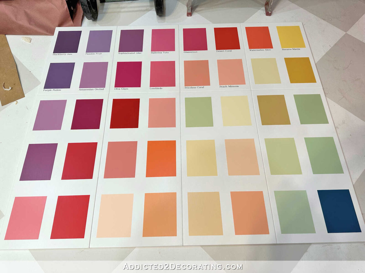
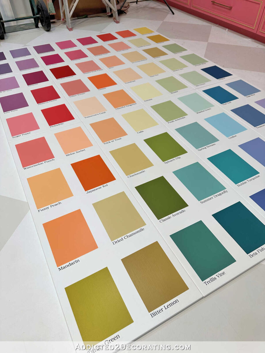
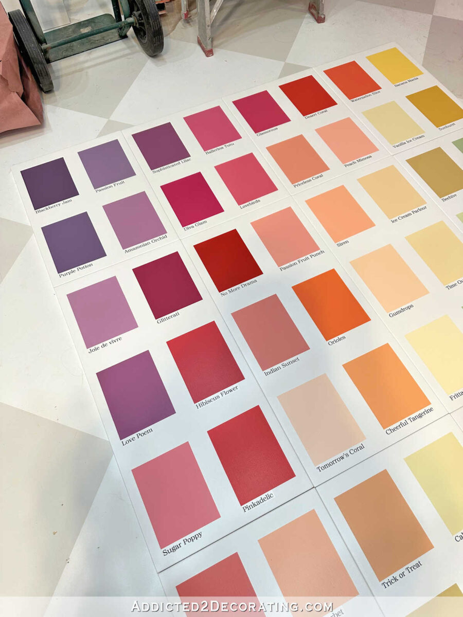
Here’s how the paint swatch cabinet doors turned out. It’s kind of hard to tell, but there are 12 cabinets doors there…
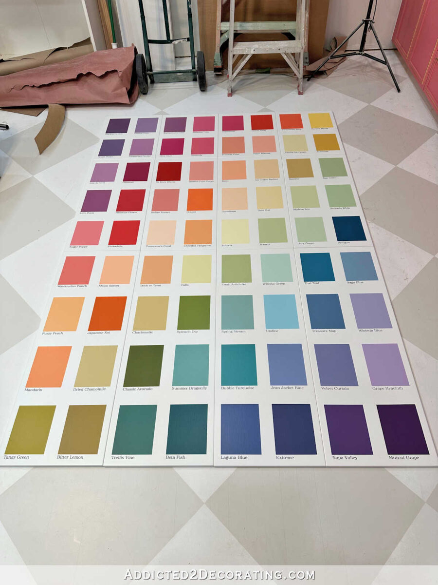
And here’s a closer look so that you can see the paint names under the colors…

I’m so excited about how these turned out! And I cannot wait to get the cabinet boxes all installed and trimmed out so that I can get the doors attached and see how the finished cabinet looks. The one thing I still remain undecided on is cabinet hardware. I have no clue what type of door pulls I should use on these that won’t interfere too much with the design.
One more thing. You’ll notice that mine turned out quite a bit different from my original inspiration cabinet. If you know me at all, that should have been expected. 🙂 While I loved the more carefree brushed design of the original with the handwritten labels, and while I started this project intending to copy those same details, I realized as I got into this project that I had to be true to who I am.
I tend towards things that are neat, put together, tailored, precise, etc. That’s just who I am, and that’s the style I gravitate towards, so I didn’t fight it. I think I would have enjoyed the more carefree look for a while, but I think it would have gotten old for me very quickly. It would have frustrated my brain after a short while, if that makes sense. I knew that the neat, clean, precise look is what I personally would enjoy more. And I’m actually glad it worked out that way. While I love getting inspiration from others, I do like to put my own personal spin in projects so that I’m not just outright copying other people.
Okay, let’s get on with the actual project and let me show you how I did it. After determining the 72 colors I wanted to use, finalizing the order I wanted them in, and mixing 33 of those colors myself (all of which I covered in Part 1 of this project), I was finally ready to start painting the colors onto the cabinet doors.
First, I started off by taping the rectangles on the fronts of my 12 IKEA Veddinge cabinet doors. I used two widths of tape — the purple 1.5″ tape, and the blue 1″ tape — to get the design to look just like I wanted it. In order to get the spacing just right on my doors, I made my rectangles about 7″ high, and allowed about 3 inches of space between the rows. That spacing allowed the design to fit perfectly onto the three different sizes of cabinet doors I used — 20″ doors on the top row, 30″ doors on the middle row, and 40″ doors on the bottom.
Once everything was taped, I went back and pressed the tape down very securely, and then sealed the edges of the tape with the base color (Behr Polar Bear) so that the colors wouldn’t bleed under the tape and I would have perfectly sharp edges.
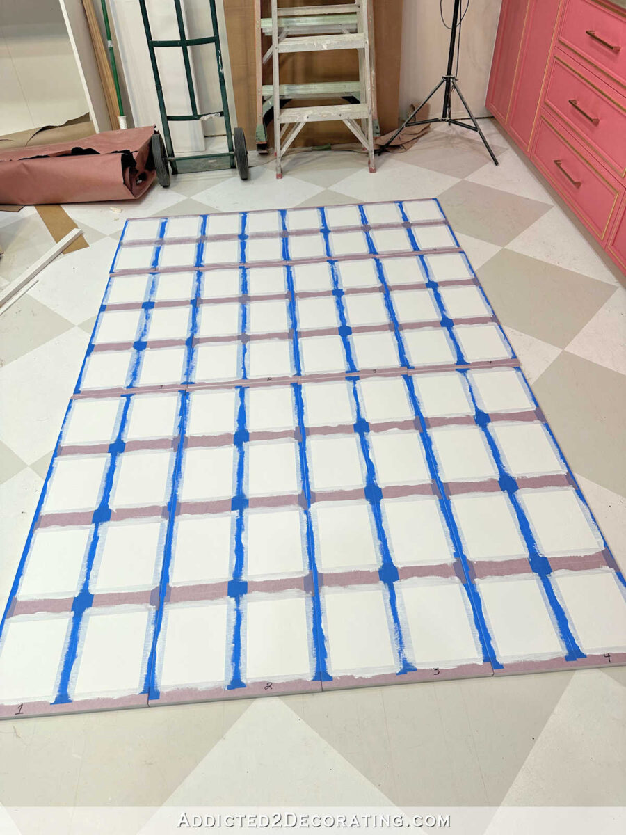
Hopefully you can see the tape details a little better with this closeup. I used two pieces of purple (1.5″) tape to separate the rows, and two pieces of blue (1″) tape to separate the columns.

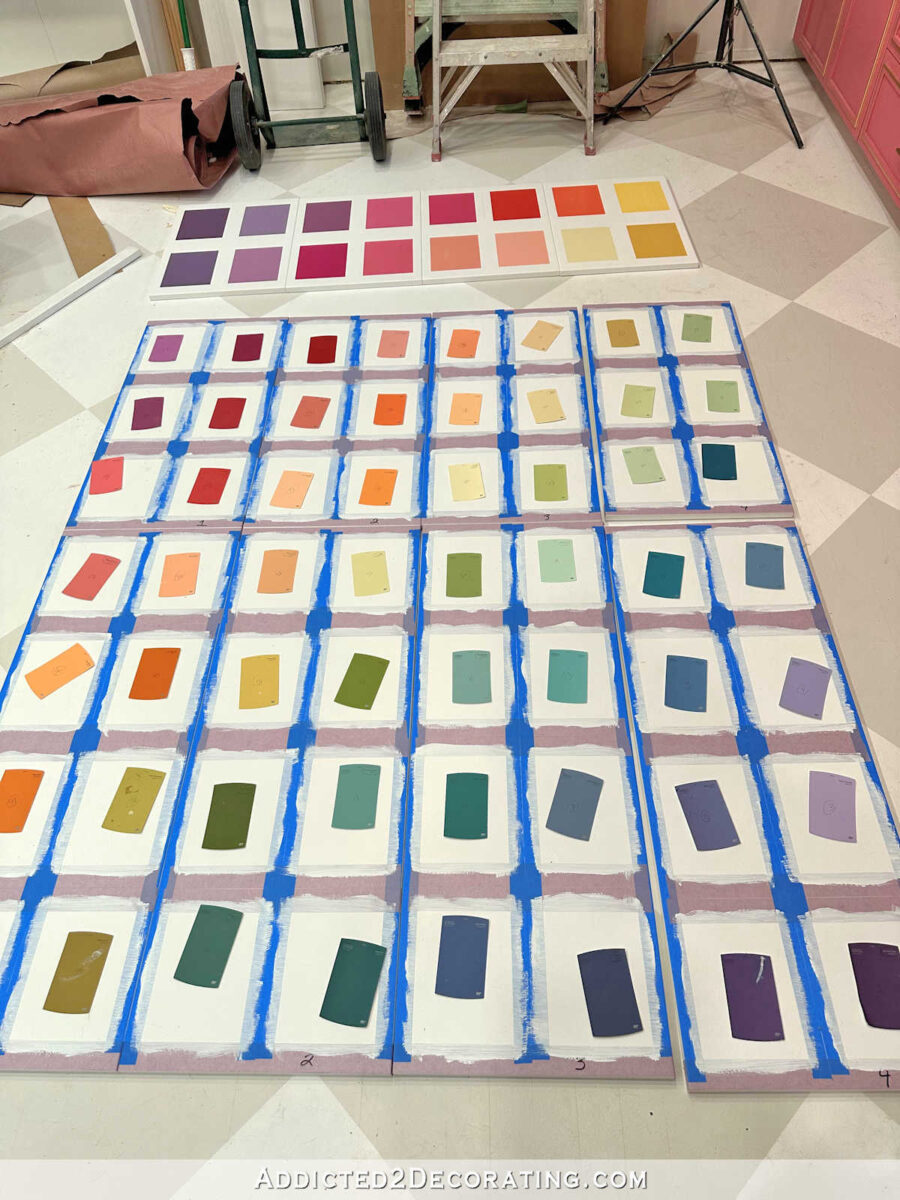
Next, I took my 72 paint cards and placed them on the doors in the order I wanted them to appear. The paint cards were already numbered in the correct order, and I had numbered all of the paint containers to correspond with the paint cards so that there would be no room for confusion.
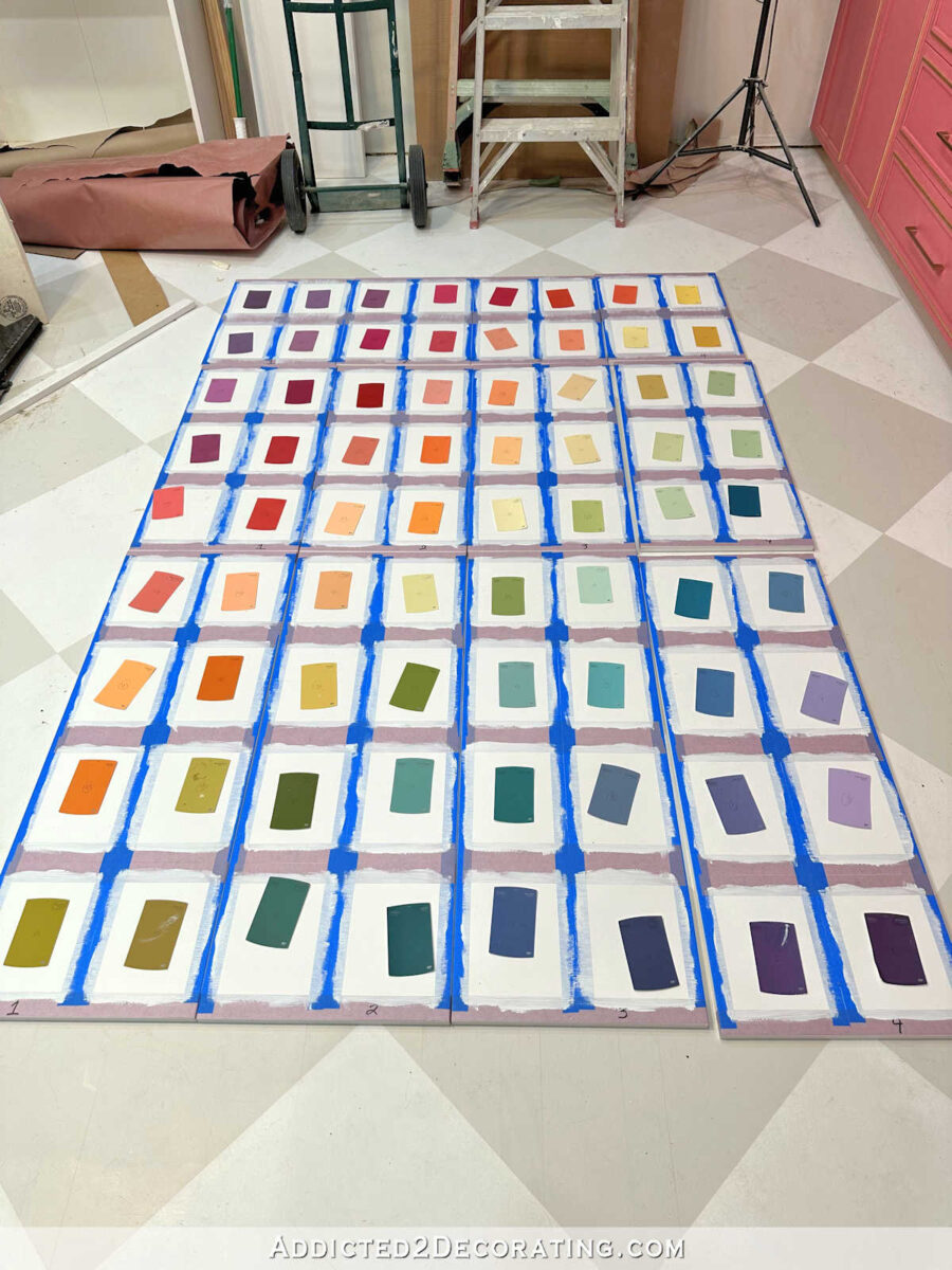
And then before I painted each door, I wrote the color number on the tape above each rectangle. I painted the colors with a 1.5″ angled brush, and each rectangle required two coats of paint. I actually had three rectangles (the most saturated colors) that required three coats, but the rest only needed two. The photo below only shows one coat of paint on those three rectangles.

As soon as I finished painting the second coat on the rectangles, and while that second coat as still wet, I removed all of the tape from the door.
I actually thoroughly enjoyed this process. It was fun and relaxing, and I got to play with lots of color. What’s not to enjoy? And it was very satisfying to see the progress as the tape was removed from each new door and those precise little rectangles were revealed.
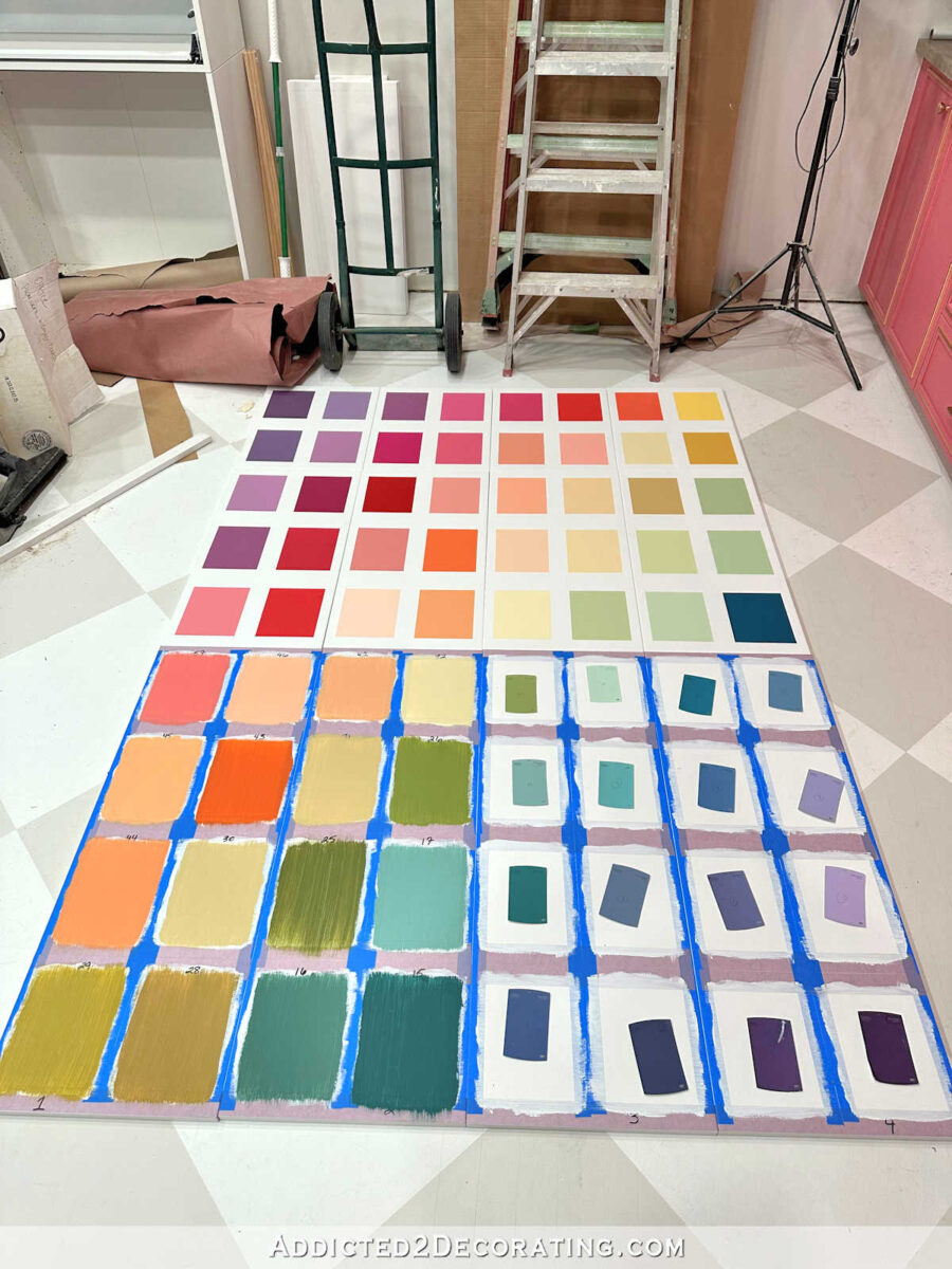
And here’s how they all looked with two coats of paint on each rectangle, all the tape removed, and the doors placed back in order. I could stare at that all day long.

Once all of the doors were painted and dry, I applied one coat of my favorite clear coat — General Finishes High Performance Clear Coat in a flat finish (affiliate link). The reason I clear coated it at this point is because I had still planned to hand label the paint colors, and Sharpie marker doesn’t work well directly on latex paint, so it’s better to seal the surface first.
But then I started practicing my handwriting, and realized very quickly that there’s no way I’d be satisfied with hand labeled swatches. I just don’t write much anymore. Everything we do these days is on the computer or phone, so while I used to love my handwriting, it just looks sloppy to me now, like I’m out of practice. I tried all caps, upper and lower case, cursive. There was just no way I was going to put any of those on my freshly painted, perfectly precise paint swatches.

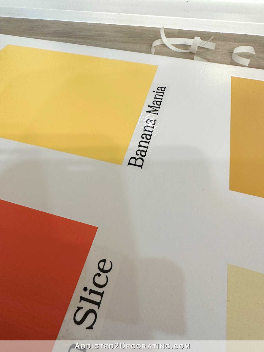
So then I had to scramble for a new idea. I thought about rub on transfers. Can you even make your own? I found out that you can, but that option didn’t seem reasonable. And then I decided to pull out my trusty label maker and see if I could make that work.
Honestly, I didn’t have high hopes that it would work. But I didn’t want to write off the idea until I actually gave it a try. This is an older Brother label maker, and it’s not made anymore. This is the updated (and fancier) version of what I have (affiliate link). So I put the biggest tape in it (3/4″), and set it to the largest font possible, and gave it a try.

I thought the size and font were perfect, and I loved the clean, consistent look. But I was still cautiously optimistic because the labels were very shiny, which made them very obvious.
I wanted to try putting the General Finishes flat clear coat over the labels to see if I could make that shine go away, but I was concerned that the wetness of the clear coat would seep under the edges of the labels, ruining the adhesive, and causing the edges to lift. But I wouldn’t now until I tried. And I’m so glad I did, because it worked!
It took two coats of clear coat (which I applied with a four-inch roller and 1/4″ nap roller covers for smooth surfaces (affiliate link)) to hide the shine of the labels completely and make them the same sheen as the doors, but it actually worked. The wetness of the clear coat didn’t affect any of the labels at all. Not a single one.
This was so much fun to do, and to see it all come together as I finished each door.

I did run into a bit of a snafu because I carelessly placed one of the doors upside down and didn’t catch it before I picked up that door to label the colors and clear coat the door. Can you see the out-of-order door below? It sticks out like a sore thumb to me in the picture, but for some reason, I didn’t catch it as I was actually working on the doors.
So last night, when I had finished all of the doors (all of the labels, two coats of clear coat on all of the doors) and everything was dry, I started placing the doors back on the floor in order, and I could not figure out what the heck was going on. I originally placed them so that all of the labels were the right direction (obviously), but the colors didn’t look right. I thought, “Why is that random green in the middle of all of the orange and yellow? Oh my gosh! Did I paint those colors it the wrong order? Am I going to have to sand that whole door down and start over? How did I not see that before now?!“
It took me a few minutes to clear the confusion and finally realize what was going on. I had turned the door upside down and put the labels on the wrong side of the paint swatch rectangles. UGHHH!!!

Fortunately, it was quite an easy fix. I was able to get use a razor blade and carefully peel the clear coated labels off without causing any damage. Then I just had to do a little bit of sanding with some 220-grit sandpaper to smooth out the clear coat edges that were left around the area where the label had been, make new labels, attach the new labels (on the correct side this time), and give the door two more coats of the clear coat. Crisis averted. I absolutely love how these doors turned out!!
I’m not even joking when I tell you I could waste away my entire day staring at these beautiful colors. I’m not going to tell you how much time I’ve spent just this morning looking at these doors. It’s embarrassing. 😀

I mean, I can’t think of anything more perfect for my studio than a massive cabinet covered in 72 different paint colors. (Actually, it’ll be 73 by the time it’s finished, but more on that later.)
The only thing better would be a cabinet with MORE colors. 100 colors. 120 colors. All of the colors. But 72 colors will work just fine. 😀
This turned out way better than I thought it would. And I think even if it is visible from the main rooms of our house (which it will be), it’ll still look great with its clean, organized look. My main concern with the more freehand paint + handwriting look is what it would look like from the entryway, living room, kitchen, and breakfast room. But this? I’ll be proud to show this off from any room in the house.
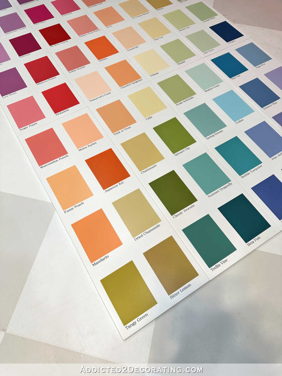
And while I did mix 33 of the colors myself, the colors I ended up with were pretty close to the Behr colors. A lot of them were pretty precise. So I just stuck with all of the Behr names rather than making up my own. So all 72 of these paint color names are actual names of Behr paint colors.

And you’ll also notice that I ended up making a few changes to the order of the greens. As many of you pointed out, I had a dark green that stuck out like a sore thumb and seemed out of order. So I swapped the greens around so that they flowed better, and that dark green was closer to the bottom rather than the middle.

And that’s it for the paint swatch cabinet doors. They are finished! Now the actual cabinet boxes need a little work, and I can check this project off of my “to do” list.
See the rest of this project at the following links: Part 3 — framing the IKEA cabinets to make a stand alone cabinet; and Part 4 — the finished paint swatch cabinet.

Addicted 2 Decorating is where I share my DIY and decorating journey as I remodel and decorate the 1948 fixer upper that my husband, Matt, and I bought in 2013. Matt has M.S. and is unable to do physical work, so I do the majority of the work on the house by myself. You can learn more about me here.
This is awesome! Love your thought process behind each step. Thanks for sharing.
Looks great! What about white low-profile pulls so that they disappear and don’t interfere with your artwork?
https://a.co/d/an7rKat
I guess the Amazon link did not work 🙄. But you can search “white low profile pulls”
The link worked for me and I think it’s the perfect handle solution!
I’m so excited to see the finished cabinet! I love the colors! Looks great!
I love this. And, I didn’t worry I just knew you would do the look in a cleaner, more precise way.
They turned out just amazing! When this project is completely finished, you need to send a picture of it to Behr! Plus, now you have lots of samples for anything else you want to paint in the house 😛 Maybe the handles should just be white and horizontally placed in the white areas of each door?
Stare all you like; you’ve earned on this project. I love it, it’s so you, and so creative and I don’t anyone could get bored with that color palate.
You’ve given me some inspiration on an upcoming project, that will NEVER be anything as good as what you do but I will give it a try.
Cheers, I can’t wait to see the room finished.
Absolutely most creative and stunning idea I’ve seen ever. Beautiful.
I love love love this project! There is something so fun and enchanting about paint swatches, pantone colors, etc. I think a gold flat finger pull would be great a touch for a cabinet pull. Maybe something like this https://www.build.com/product/summary/1140256?uid=4433340&jmtest=gg-gbav2_4433340&inv=1&&&&&ds_rl=1275595&source=gg-gba-pla_4433340!c15146996769!a128720257105!dc!ng&ds_rl=1275595&gclid=CjwKCAjws9ipBhB1EiwAccEi1NBNJvI5k3H8dP1Gu4NT6299vScAboH8O-EPIi5jD4R-hbssWGaCGxoCbZYQAvD_BwE&gclsrc=aw.ds
Kristi,
I’ve never met anyone else who so closely mirrors my own design style, so I keep coming back year after year to see what beautiful things you’ll be doing next. And THIS! THIS is my favorite. You did an amazing job of taking an idea you liked and perfecting it for your own style.
As an artist and former librarian, those colorful, tidy, well-organized boxes are so satisfying that I could waste a whole day sitting there contemplating that work of art with you. Being able to appreciate color (which, honestly is one of my biggest hobbies!) is a blessing and capability that I thank God for regularly! What an amazing thing for there to be so much color out there, and to be made in a way to enjoy it. 💖
Looks amazing! The colors are stunning, and I certainly understand how you can spend time just appreciating their beauty.
That looks awesome! I would love to do something like this in my home!
Just a suggestion that may have already occurred to you on the hardware. How about acrylic knobs or handles? Sing clear they won’t detract from the beautiful paint swatches.
Clear knobs or pulls were my first thought.
So much fun!
Gorgeous, could not be better.
Perhaps clear acrylic pulls would look nice and not interfere…
How about the pulls that attach to the back of the door at top or bottom?
here is a link to the picture I saw online. They could be painted/purchased in any color. White would be good.
https://danslelakehouse.com/2016/03/bathroom-reno-update-mid-century-modern.html
I actually didn’t think I would like all of those colors displayed on cabinet doors but it looks awesome!
I love this! I vote for the same gold knobs you used on the pink cabinet doors. If they had that same style knob in white, you could also use that if you wanted the knob to disappear, but I love the gold ones. Just a little fancy on there.
You should send this to Home Depot/Behr for a DIY project highlight. How better to showcase their paint!
Magnificent! That was my immediate thought when I saw those doors. Kristi, you are my ‘perfect dream’ diy-er. I’ve been with you since the condo days… and even way back then, I coveted your beautiful spaces. Your home is absolutely glorious; I feast my eyes on every room and wish I lived there. Thank you for being you and sharing your colourful, amazing piece of heaven with us.
I believe Ikea makes a push button contraption that will allow your doors to be pushed open – like the opposite of soft close – soft open? I cannot think of the word right now – BUT it would mean you need no handles at all!
Those would be perfect! I didn’t even think about those.
I was just coming here to say the same – https://www.ikea.com/us/en/p/utrusta-push-opener-80230224/
I was about to suggest these also. Perfect solution IMO – nothing to detract from Kristi’s amazing work.
The color names are “icing on the cake”. Just an amazing project well done 🤩
I am always amazed by your creativity, ingenuity and talent and this is just another example of all that! One of my top 10 projects of yours. Thank you for the continued inspiration!
Love, love, love all the colors!
Wow, that looks like a custom store display it’s so nice and precisely done. I really like the way it came out. Thanks for the tip on putting a matte or eggshell finish over the shiny labels. It’s good to know that it can be done.
I love your cabinet doors! How about gold hidden cabinet pulls. https://www.amazon.com/Tidorlou-Handles-Aluminum-Concealed-Wardrobe/dp/B0991YZXRQ/ref=sr_1_16?crid=CH486EG70CPN&keywords=Hidden%2BCabinet%2BHandle%2Bgold&qid=1698084652&s=hi&sprefix=hidden%2Bcabinet%2Bhandle%2Bgold%2Ctools%2C156&sr=1-16&th=1
In my mind I never dreamed this would look like this. So beautiful and so unique. My gosh you’re talent never takes a break. You worked very hard on this and you should sit and stare at it. I know I would. The color arrangement just looks so pleasing to the eye and I love the way you labeled the colors. I can’t wait to see these doors on the cabinets in the Kristi Studio.
Not sure what handles would work, but you don’t need to use handles at all – have you seen these? https://www.ikea.com/gb/en/p/utrusta-push-opener-80230224/
YES!!!! I had forgotten about these! They’re perfect!
I just love it! So creative and is totally you!
Will you be storing all your paints in this cabinet?
That’s the plan, but I think I’ll have room in there for more than just paint. I’m not quite sure how everything will be organized in the studio just yet, but it’ll be fun figuring it out! 🙂
Amazing project! You did an outstanding job.
I love that you finished this on National Color Day (October 22nd)! So appropriate!
It is so beautiful! I admire your patience and persistence!!!
Beautiful – I just love those paint swatch doors!!!
Veyr cool project! Nicely executed! 😀
I love the doors. They look great. Can you install the kind of hardware that only requires a push to pop open. I have no idea what it’s actually called. I think the closure is magnetic. That way you keep your clean flat doors and there is no hardware to interfere.
For knobs, how about those wooden ones, painted white as the doors? Or a Crystal knob could be pretty! These doors came out so pretty, can’t wait to see them on the boxes. Of course you made the orderly and precise, as I knew you would – I have the same mindset!
Oh my gosh. I LOVE THESE DOORS! If I had your studio, I wouldn’t get anything done. I’d just sit and admire everything in it! Your studio is beautiful!
The cabinet doors look fabulous Kristi. What a fantastic job and it’s so fitting to have these colored swatch painted doors in your studio. Absolutely perfect!!!!
No pulls!!!!! You could use the “Push to Open” interior latches. I can’t think of any exterior pulls that would do these beauties justice.
Carol has a great idea here
LOL! I should learn to read the previous posts before commenting. Of course others had the same idea of using the “push to open” latches. Anyway, can’t wait to see these mounted!
It is stunning. I’m so glad the label maker worked out, I agree, the printed letters are so crisp and go so well with the crisp squares. That is wonderful, enjoy it and don’t feel bad for staring at it! 🙂
Looks amazing. The amount of work that you did to get the precise grid. Wow!
I used file drawer finger pulls on pantry pocket doors that I had antique leaded glass inserts installed. I wanted pulls that would not show or take away from the glass.
Something like these from Amazon.
https://www.amazon.com/Peaha-Cabinet-Handles-Drawer-LS7030GD76/dp/B09M83XRWK?th=1
These are available at build.com
Berenson 1057 Bravo Cabinet Hardware
I can’t put a picture or a link here
Very similar to the Amazon ones posted by Barb H above
Looks great! Why don’t you get the push cabinet opener
https://www.ikea.com/ca/en/p/utrusta-push-opener-80230224/
then you won’t have to worry about handles/pulls
I would suggest clear lucite knobs, round orbs, if they still make them. They wouldn’t distract from your swatches.
Beautiful!
That is an amazing project. You really did finish it so fast, and it looks wonderful! I love it. It was a wonderful way to finish one of the cabinets for that beautiful studio, in a totally different way, and still use all those colors. Great job.
Id consider using the push button magnet latches. Simple and easy, and no hardware to ruin the paint swatches.
I was about to suggest these also. Perfect solution IMO – nothing to detract from Kristi’s amazing work.
Your doors are amazing! A word of caution. Years ago l had sciatica similar to yours while repairing my house. I found sitting on the floor was the worse thing to trigger it. I bought a small stool 12 inches high and it saved my back. Just be ware! It may trigger yours also. So glad you feel better!
Just love this project! I would never attempt because the process you described makes my brain hurt. Haha. Looking forward to seeing them installed.
Amazing. Totally amazing.
As much notice as this project creates for Behr, they should be sending you all the paint samples you could ever need. This project should be on one of the brochures available with their swatches.
This cabinet is perfect for a studio for a designer, and even moreso for yours. This may be my favorite project you have ever done, simple as it is in comparison to all your others. Hearts.. butterflies.. perfection!
What a great idea. What about clear knobs so it wouldn’t cover any of the colors. I’m sure whatever you come up with will be amazing and well thought out.
I am so glad you painted the colors neatly and printed the names out. Yours looks so much better than the example you were using as your idea. I might even like it when you get the doors on the cabinets. I anxiously await that picture.
What about those invisible catches that fit on the inside of the cupboard you just need to push the door to close it then push again to open making it all invisible and not detracting from the actual Door front itself ,.
Love, love all those colors. I personally get a lot of swatches and go thru them all the time wondering what I could do with the. Love your idea, however, I’m confused as to what cabinets they are going on. I must have missed that text.
Spectacular. Completely, utterly spectacular. Go look at them for many more hours — they merit every second.
Why not place and paint knobs the same color of whatever rectangle you place them in so they blend?
The doors are GORGEOUS, cannot wait to see finished cabinet.