The Search For Studio Lighting
I’ve been trying to finalize some decisions for the studio so that everything is ordered and ready to go so I can get started as soon as the drywall is finished. One of the big decisions is lighting.
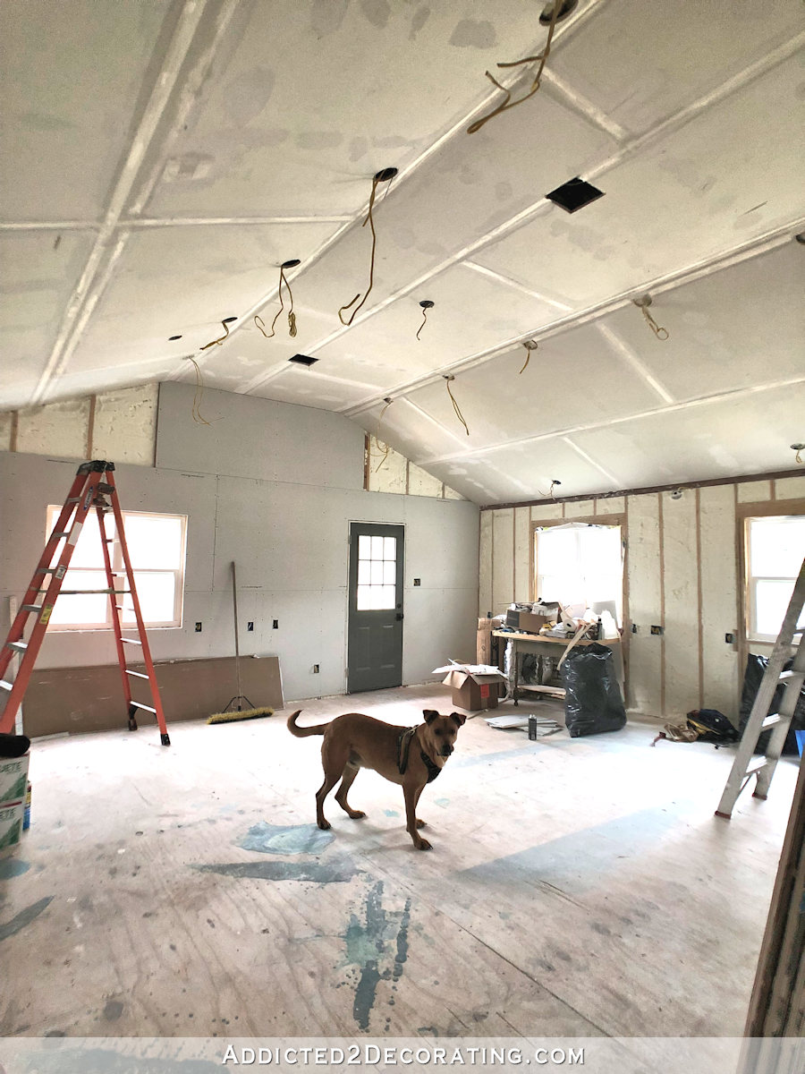
Just as a refresher, let me remind you where things will go in the studio. For reference, I stood in the doorway between the studio and the breakfast room to take this photo…
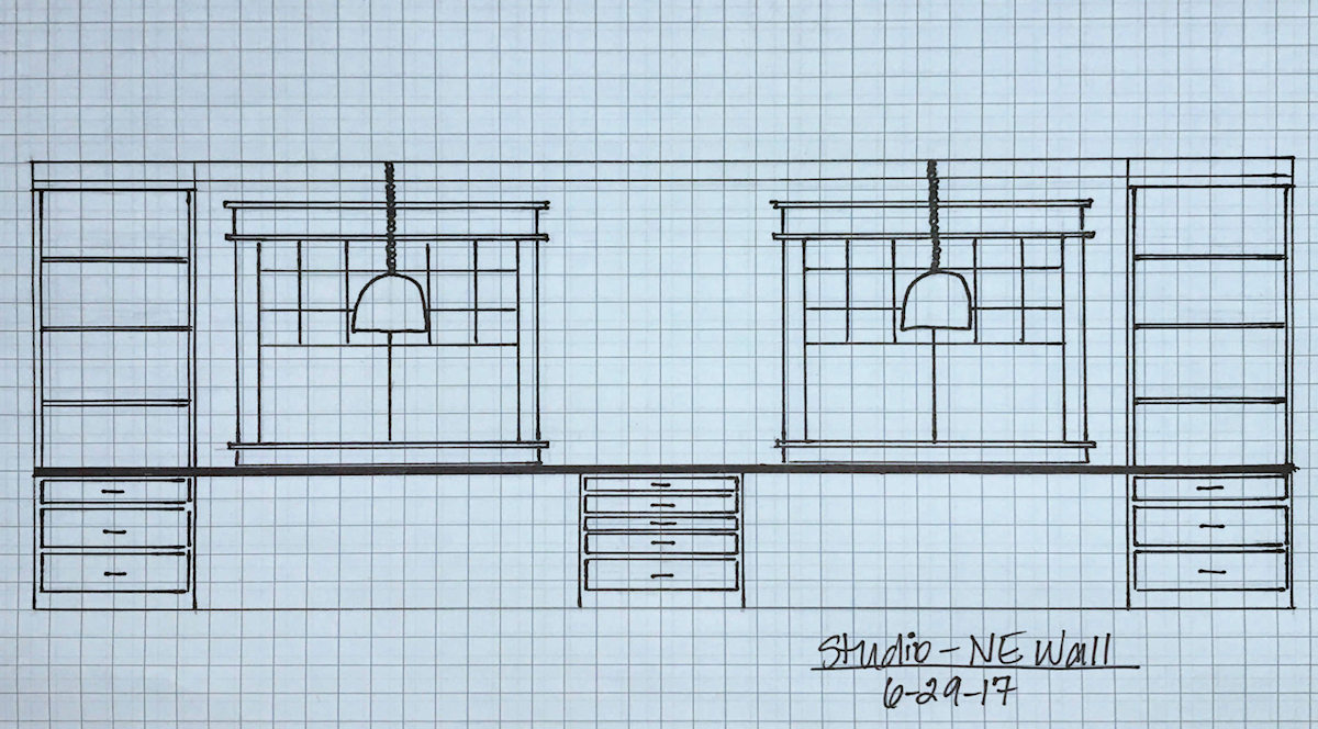
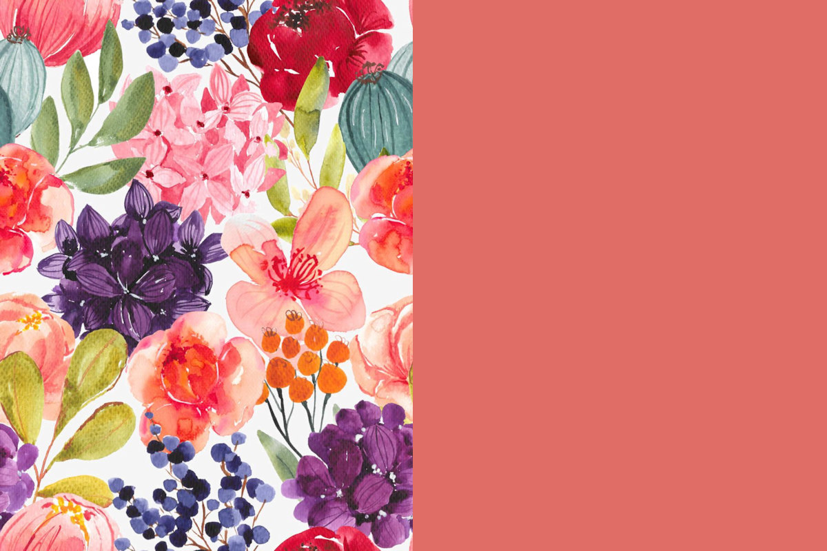
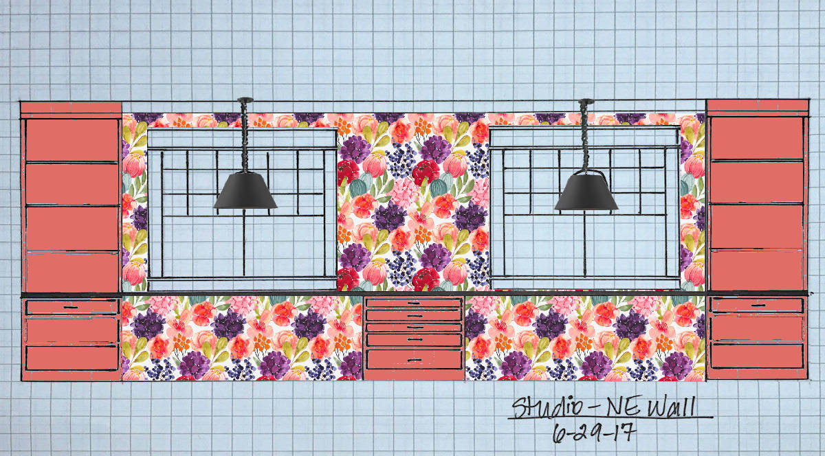
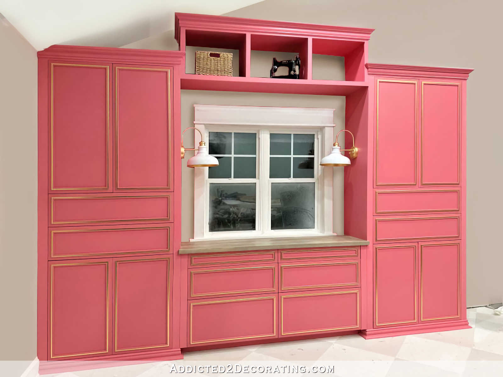
The wall on the right in the photo above is where the floral wallpaper that I designed will go, along with a very wide built-in desk with cabinets on either end. It will look something like this…
And then the door is where the cute little portico is on the side of the studio (that still needs steps)…
And the interior wall to the left of the door in the photo with Cooper is where my office area will go. That wall will look something like this…
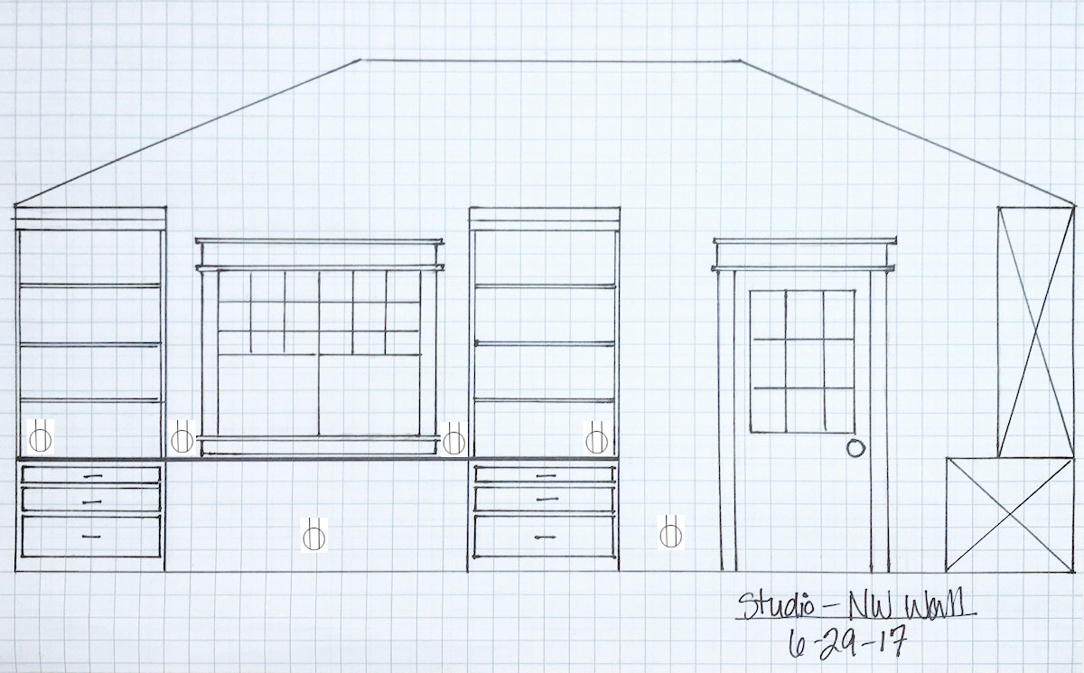
What that drawing of the office area doesn’t show is that I will have a separate desk sitting in front of the built-in, so when sitting at the desk, my back will be to the wall. And I’ll have a pendant light above the desk.
And then, as you can see from the drawing, I need two pendant lights for the front wall (i.e., the wallpapered wall), along with a sconce in the middle of that wall.
For some reason, I thought this would be a quick and easy decision. So on Friday, I hopped online and started searching, thinking that it would take me about an hour or two to find what I need, make a few purchases, and have my items on their way to me. But three days later, I still have no idea what I want. And part of the reason is that I may be changing my mind on the ceiling color.
As I stood in that room and looked at the huge expanse of drywalled ceiling on Friday after they drywall guys left, I started to think that a massive white ceiling and white walls might be too cold for me. I mean, y’all know my experiences with white in the past. I paint walls white, think I love them, and then as time passes, I decide I can’t live with white. The only exception has been my pantry. For some reason, white just works for me in there, but it’s probably because wall to backsplash/cabinet ratio is pretty low.
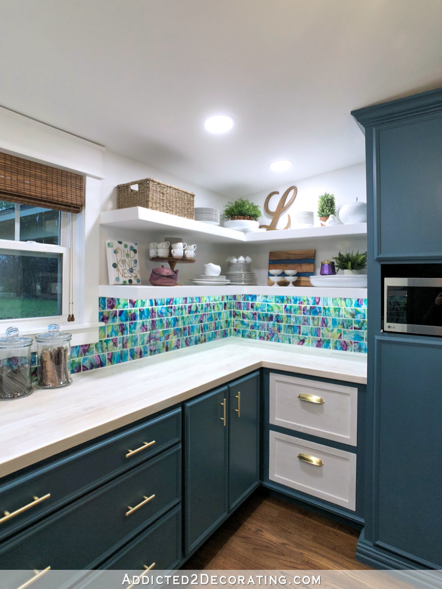
And I really do think that white walls will work in the studio as well, especially with all of the color I have planned for the front wall (i.e., the floral wallpaper), the cabinets, the back entry, and the half bathroom.
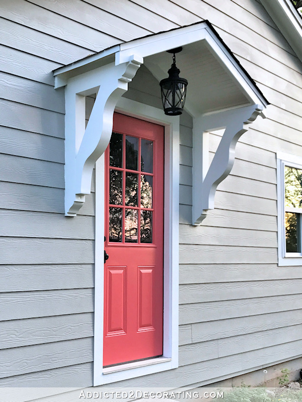
But I am considering a different color for the ceiling. I’m leaning towards the exterior door color for the cabinets (Benjamin Moore Bird of Paradise)…
And I just love how my front porch looks with the Bird of Paradise door and the super light blue ceiling…
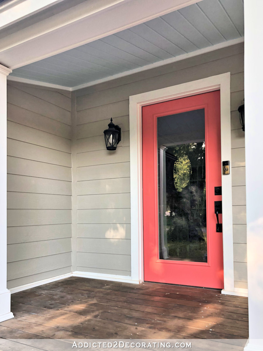
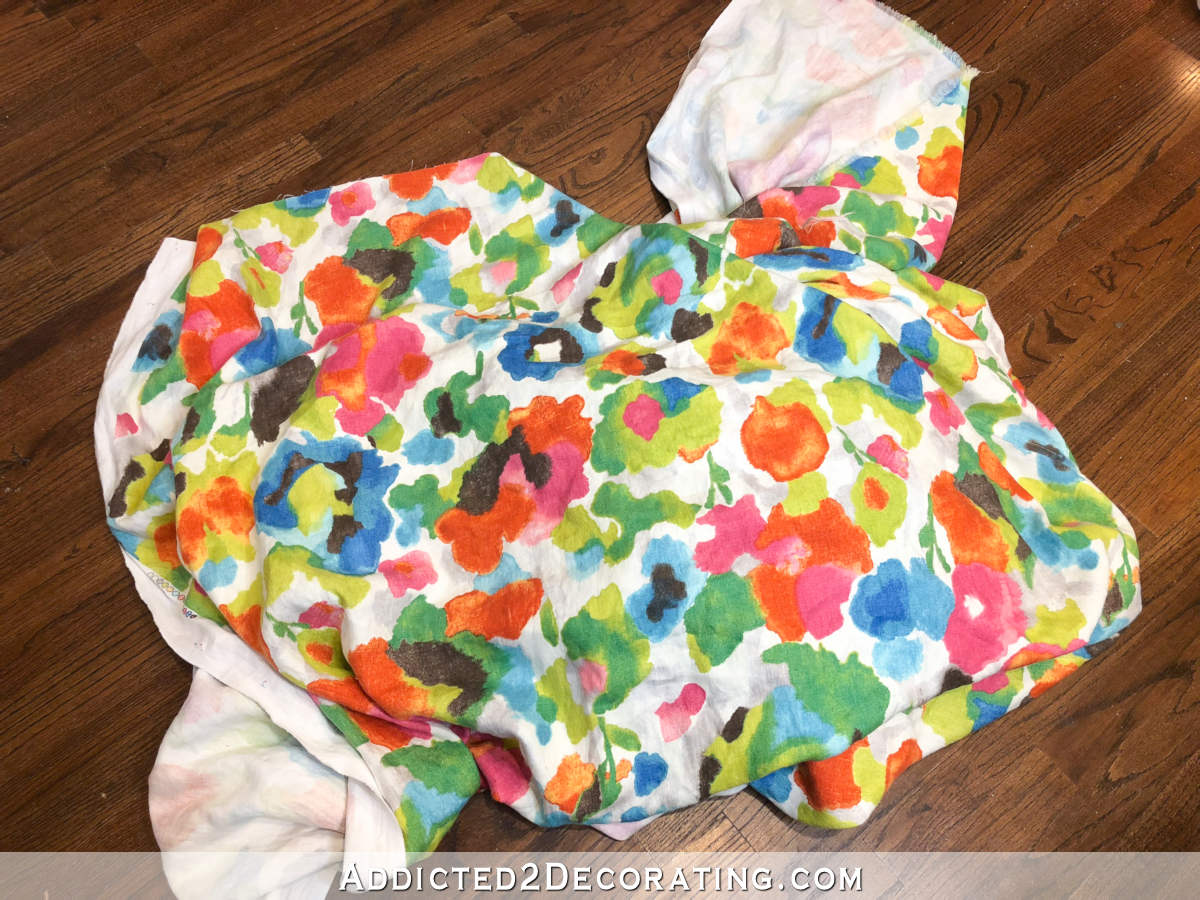
So I’m considering a light blue for the studio ceiling as well. I think it would look so pretty and bright, without looking cold and sterile like a massive white ceiling might look. I wouldn’t be able to use the exact blue that I have on the front porch, though. The wallpaper doesn’t have any blue in it, but it does have teal. So I’d need a blue-green color that’s as light as the blue on the front porch ceiling.
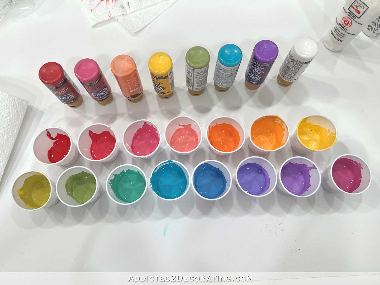
So going with that idea, I thought that black pendant lights would look good since the black accents look nice on my front porch. But I’m just not so sure about it. I found several that I like, and then tried to test them out a couple of them on the drawing I did of the front wall.
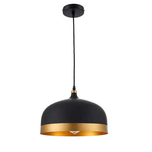
The first ones I tried were these matte black pendant lights from Wayfair.

It’s hard to get an exact idea of what they would look like, but here’s a general idea.
And keep in mind that the graph paper in that image above appears darker and gloomier than the actual room will be with bright white walls, white trim around the windows, and actual sunshine coming through those windows. 🙂
I do really like those lights, but I think I had envisioned something a little more modern. So I tried these with a rounder bowl design and gold accents…

I love that light. In fact, it might be my favorite. But I just don’t think it works here.
So I tried one more black pendant with the gold interior only.


That one would be better if the inside was more gold or brass, but it looks awfully copper to me. I don’t do copper.
So I switched gears completely and tried this brushed brass pendant light.
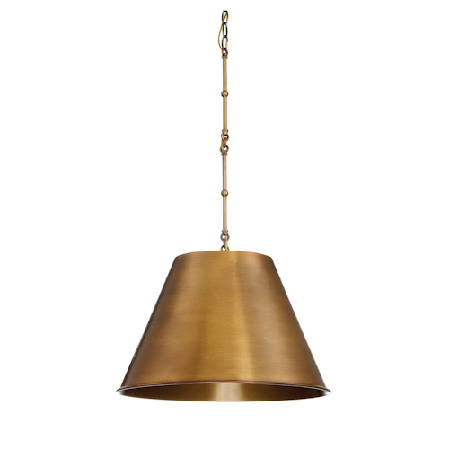

I do really like that one, but I’m not 100% sold on it. I think that’s actually the exact same light as the first black one. There’s just something about that chain that lends a very traditional feel to the light, where I would prefer a much more streamlined and slightly modern look.
So all that to say that I have no idea where I’m actually going to land on this lighting decision. It would be so much easier if I only had two pendant lights to buy. But I have three pendant lights and one sconce. While I don’t think they all need to match, I do want them to coordinate. And finding two pendant light designs and one sconce design that all coordinate AND that I like AND that are in the right color, the right finish, and the right price has been way harder that I thought.
I might end up going with a very simple white drum shade pendant light…
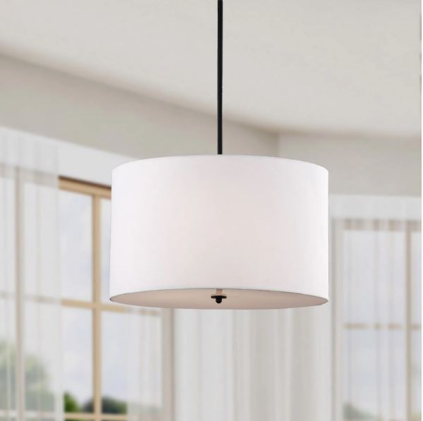
It seems a little boring to me, but when I get it in a room filled with coral cabinets and bold floral wallpaper, perhaps something a bit plain and simple is just what it will need.
So my search continues, but I’d love to know if you think I was on the right track with the black, or if the brass looks better to your eye. Or do you think I should opt for a simple white drum shade?
Please note: This post contains affiliate links.

Addicted 2 Decorating is where I share my DIY and decorating journey as I remodel and decorate the 1948 fixer upper that my husband, Matt, and I bought in 2013. Matt has M.S. and is unable to do physical work, so I do the majority of the work on the house by myself. You can learn more about me here.

The brass and the white are my two picks. The white might look really good with all of that color and stand out more if that’s what you want.
I like the white drum shade. If you will be sanding or creating dust…fabric shades get dirty. Down lighting can cast shadows in a work surface…I like the drum shades with metal work around them…I bought one at Wayfair.
I like the last with the white shade, but not the white shade. Kristy, with your talent and vision it is my personal though you could create your own shade for the lighting and make it your own as always. Painted simple glass shade designed and painted by you. As always thank you for sharing.
I bought a lampshade once with a gold interior and very little light came through. Just wondering if that would happen on the pendant lights with hold interior. I kind of like the black.
I had the same thought. I once purchased a shade that was black on the outside and gold in the inside. It did not reflect light very well.
If these are intended to be work lights, I encourage you to go to a lamp store and see the difference in the quality of the light.
I was going to tell Kristi to watch for that, as that has also been my experience.
Great ideas for the cabinet and ceiling colors. It’ll be so bright and pretty. Why not just go with the basic black pendant lights? I like their smplicity.
Agree. Basic black will balance the pretty coral and not make it too girly.
I liked the black for that reason as well.
I honestly think you need to think how a coral painted ceiling will effect overall light in the room. I know you will have lots of natural and artificial light but white reflects light. Is there maybe something you could do like painted beams on the ceiling rather than painting the entire ceiling any color but white? And once you paint that huge amount of ceiling space, and it doesn’t work, I personally would dread painting it over. Concerning the light fixtures, I liked them all but, what color will the hardware be on your coral painted cabinetry? are you planning to use black or gold or something else? I love that you are on your way to having your studio complete and anxiously await the finished room. 😊
She’s thinking about super light blue on the ceiling similar to on the front porch. I had to re-read that part a couple times before I caught that! I was thinking that would be a LOT of coral with ceiling and cabinets!
yes…I just missed the coral for the cabinets and light blue for the ceiling…just misread. thanks!
I think the idea was coral for the cabinets and a blue for the ceiling. I had to re-read it but I think that’s what Kristi is saying. A pale greeny-blue would be rally pretty and read as white but not “be” white, I think.
I’m thinking gold hardware, but I don’t mind mixing metal colors. So if I went with black for pendant lights, I’d still do gold hardware.
Can you get the tubes(not sure of the correct term) for the wires instead of using chains? I tend to think of chains as dated looking, vs the more modern look of the pendant light with the cord inside a metal tube.
Those don’t work on vaulted ceilings. I’d need either plain cords or chains.
I think brass and white look best. Black looks heavy.
Are you planning to do a dark finish on the desktop similar to your bathroom? I think a white countertop would be beautiful!
I agree the black looks heavy. Since you are asking for our two cents, I would go with the white drum shade. I think I remember you saying you were going to do the same whitewash finish on the desktop as you did in the pantry, but I could be wrong.
I agree with Melissa, I think the white drum shade would be the best……..for light as well as for looks. The white shades will not distract/compete with wallpaper and bold color on the cabinets and will certainly give out more light for you to work.
I want the countertops to be bright white, but I haven’t decided what material I want to use just yet.
Will these pendants give the best lighting for projects?
That’s a good question! Most of the ones I’m finding are just single bulbs, but I could put 100w LED equivalent bulbs in them.
I like the first black option of all the black and brass ones you’ve shown. For me, I would probably go for the white drum. It’s clean and unobtrusive. It would also be the simplest to modify or swap out in the future. My 2 cents worth! I’m so excited to watch this project develop! PS – Love the blue ceiling idea!
https://www.ikea.com/us/en/catalog/products/10390975/
what about white with a touch of brass? I don’t really know much about Ikea’s lighting, but these come in various sizes and have coordinating wall and table lamps.
In my house, I would use the black. But, for her studio, I love their light!
LOL! You’re probably going to get a lot of comments on this post! Here are my thoughts/questions:
1) Is that front wall the best place for your wallpaper? I really think it could look cool if you put it on the “office wall” and carried it all the way to the ceiling.
2) I love the blue ceiling on the porch, but I think part of why I love it is that I love it with the house color. I’m not sure I would love it so much, if it’s just with the birds of paradise coral and white. I think it might end up feeling more like an actual color and not as much like a neutral. On the porch, it feels like another neutral, but I’m not sure it’ll keep that character in the studio.
3) personally, i feel the black is heavy in the studio. I would lean toward metallics.
4) keep in mind your flooring and what that will add to the overall character of the room.
I too think wallpaper on the office wall would really emphasize the height of the ceiling. All the light from the front windows would play off of it, rather than the wallpaper being possibly washed out by the large, bright front windows.
I think the right color blue on the ceiling might balance out the warmer reflected light off the coral cabinets so the value of light in the room is overall more neutral-daylight.
Maybe find three types of white lighting you like and jazz them up in a coordinating style with ribbon or paint or fabric in a teal that coordinates with your wallpaper? We all know Kristi knows how to customize!
I don’t really want the wallpaper on the “office wall” specifically because I don’t want the wallpaper to be seen from the main part of the house. On that wall, it would be seen from the music room, kitchen and breakfast room, and I feel like it might be too busy to create good flow with the rest of the rooms if it can be so easily seen. But tucked around the corner, where you have to walk into the room and then be surprised by a wall of floral goodness…I can handle that without it needing to coordinate with the rest of the house.
I agree with MP. The white drums would be my choice. You might even decide to cover them with the wallpaper print or something, so they would give you some options that the others don’t. Love the idea of light blue ceiling too. So much fun to follow this journey with you!
If you do the simple white shades, you can always add something to them if you want to add color. I’m going to throw another idea out there, it’s probably crazy, but have you thought about deciding on the shape you like and painting them teal? Even though the wallpaper has teal in it, I see you finding a way to add more teal to the room.
I love the idea of painting the ceiling a pale blue!
If your ceiling is a color won’t this color reflect on all your projects? I would think that maybe in the work area you would want a cleaner – more white- reflection. You have other color in the room so I would go with white on the ceiling and satisfy your color itch with all the wonderful projects you will be doing in this awesome space!
I definitely thought, ah, that’s better when I got to the brass and white choices. I agree about the chunky chain not feeling right.
It’s hard to tell. Maybe do all the surfaces first, then revisit the light decision. It seems the simpler the design and color, the less it will distract from the wall. But at the end, if the shape is right and not the color, you could always paint them.
I have had black shades with gold interior in my bedroom either side of the bed for years. They do give a lot of drama but very little light. This is ok in my situation but not where you need the light.
I like the idea of blue ceiling but I am not good at picturing. And like another said I can’t imagine having to paint it twice.
Love how your ideas are coming together. My favorite is the black with gold stripe around the rim, but I know you are going to find the perfect fit. I did wander down the rabbit hole of light fixtures *cough* for you *cough* just for fun. . . lol.
https://www.shadesoflight.com/products/young-house-love-equilateral-pendant?sku=PE16054+++GL&mrkgcl=970&mrkgadid=3269278067&product_id=PE16054GL&adpos=1o3&creative=246121613662&device=c&matchtype=&network=s&gclid=EAIaIQobChMI9OmGlvbo4AIVWiCtBh1bpgrTEAQYAyABEgKAF_D_BwE
https://www.overstock.com/Home-Garden/Harper-Blvd-Avento-Wire-Cage-Pendant-Lamp/13555025/product.html
https://www.hayneedle.com/product/dainolitekupkup201pbkgldpendantlight.cfm
https://www.houzz.com/product/115712603-ceiling-light-pendant-hanging-fixture-aluminum-white-wood-grain-scandinavian-pendant-lighting
https://www.houzz.com/product/115712492-ceiling-light-pendant-hanging-fixture-aluminum-black-wood-grain-contemporary-pendant-lighting
That third one is amazing!
What about a clear glass pendant? I love the wallpaper and for me, the light fixtures detract the beautiful paint and wallpaper.
I was wondering if you considered clear glass too! Thinking they might be brighter lights and blend into the background if you don’t really want them to be a focal point in the middle of the wall like the black and/or gold would be. 🙂 it’s all going to be beautiful either way you go!
I was thinking the same thing. A clear glass pendant would look spectacular. Wayfair sells a beautiful seeded glass Schoolhouse Pendant by Birch Lane Heritage. For a whimsical touch, you might want to try a birdcage pendant with little birds on it. There are lots of great examples out there and you could customize it to your heart’s content!
Clear glass vote here!
That’s what I was thinking too! We got glass pendants for our kitchen island that have a textured pattern – looks like a window screen was pressed into the glass to give the texture. Got them from Lowes about three years ago, and we get compliments on them from everyone who sees them They are shaped like a modern large bowl, with straight sides. Lowes item #560219 Model # P5026-81 is similar, but I know we didn’t pay near that much, so they must have been a different brand. We also got a small version for over the sink. Personally, I would get something that is easy to clean, since this will be a workroom – dust from fabrics & wood will be a pain on black or fabric shades! Love the idea of the ceiling color! Just keep it light (pale) for the light reflection.
That is exactly what I was thinking
Clear glass generally doesn’t appeal to me because the bulbs can be seen. I like for bulbs to be hidden.
The one I recommended from Lowes isn’t clear, but not exactly frosted either. The patterned glass blocks the view of the bulb unless you look up into it. I’m not a fan of clear either!
Have you checked the Young House Love lighting collection at Shades of Light? Seems like their stuff skews a bit more modern and there might be something there. Love the idea of a pale blue ceiling. How about some “clouds” up there too? However you do it, I just know I’m gonna love this studio!
I did check theirs, and they have one design that I absolutely love (the one they used in their own kitchen above the island), but it comes with a rod instead of a wire or chain. Since my ceiling is angled, anything with a rod won’t work.
It seems like so many people have vaulted ceilings that adapters must be available for such a case as yours. Would something like this work? https://www.fergusonshowrooms.com/product/kichler-KIC337005-oiled-bronze-253064 It’s an angled ceiling adapter for rods.
The black lights!
It seems like so many people have vaulted ceilings that adapters must be available for such a case as yours. Would something like this work? https://www.fergusonshowrooms.com/product/kichler-KIC337005-oiled-bronze-253064 It’s an angled ceiling adapter for rods.
I’d go with the simple white drum shade, but you always come up with great ideas. I know it will be lovely!
My bet would be you’ll choose something simpler and add your own color to it. Instead of the white drum, maybe tint it a subtle light coral or a hint of green from the paper. Anyway, I’m looking forward to seeing which direction you go. I know if you can’t find what you want, you’ll make it! 🙂
This exactly! I was thinking the white drum shade with subtle metallic gold/brass/or even black banding at top or bottom.
Can you paint the white drum shades?
I’ve tried painting drum shades before, and it didn’t really work out well.
I’m liking the idea of a very light blue ceiling. Do you have recessed lights overhead? If not I feel like the black pendants will not provide enough light and I’d go with the white but maybe do something with the one over your desk (wallpaper fabric shade?). excited to see the space come together!
I will have a total of 10 recessed lights on a dimmer switch, plus a ceiling fan with a light on it. The room in general should be pretty well lit once everything is installed.
So, I got to thinking. If this is ultimately your project studio, I wonder if all the color you have on the ceiling, etc. will interfere with your projects and cast a colored glow on things so as to not give you a true view of the project you are working on. The wallpaper you designed is PERFECT and the other color pops will be great. Good luck!
Whaaaaat? Pale blue. I was so excited that you were doing the ceiling in Bird of Paradise. Talk about dramatic. Pale blue is about the same as white…boring. Do you know what the cabinet hardware will be? How about glass pulls and glass pendant shades. Let that beautiful and snazzy wallpaper be your statement piece. Haha. Like I even know what that means. But I can picture it.
My original plan was to do a white ceiling and Bird of Paradise on the cabinets. I think a coral ceiling, especially one of that size, would be too much even for me. 😀
I will play Devil’s advocate. Almost all that you have chosen are opaque shades, and will give you nice directional, DOWN light, but, you might want to consider a shade that will allow the light to also shine out the sides and up, too? In other words, don’t you want overall light for the room, too?
The main areas of the room will be lit by 10 recessed lights plus the light on the ceiling fan in the middle of the ceiling. So there should be plenty of general lighting in the room. These pendant lights are mainly for specific task areas of the room.
Being that this room is your workspace – and even though we want it to look phenomenal – we still need it to be highly functional. By that, I mean be careful of using items that will constrict your light. Make sure that your ceiling color is beautiful but yet illuminates the room in a way that it aids in your ability to see! Same with the lighting – make sure your fixtures allow the light to do its job! You’re the person who takes photos of projects multiple times a day because of the light! And I’m speaking as a person who increasingly needs better light because my readers just aren’t enough for detail sometimes in my sewing room! Just my 2 cents! Can hardly wait to see this transformation! I’ve so been looking forward to this room!
Absolutely sound reasoning by Angie. Function counts most when lighting a work area.
Are you going to be doing projects that stir up dust?
What fixture would give the most light? (Not black, although I like the lines of the examples.)
Which easiest to clean? (Not black — sophisticated, which I love, but a pain to keep dusting. And little panes of clear glass need lots of sparkle maintenance.)
White might work best but I am not crazy about the drum shades. A little metal band or color band of choice custom added later. Color to be decided, once all is in place?
Love the drum shade. I think all the other lights are way ugly. Hideous. Hate em. My opinion. That’s all folks!
Me too. And you’re not going to get good light from those dark fixtures.
Thats what I came to say – those dark fixtures won’t put out any good light, just directional down. I love a good drum shade to spread the light!
I love the idea of a pale blue ceiling! (I think the reason the white works in your pantry is that is reads as an accent to all the beautiful tiles and the teal cabinets.) Are the lights to be for task lighting? Or just to illuminate the areas? The reason I am wondering is that I think you could easily make your own hanging lamps with straight rods (I am thinking the rods that extend ceiling fans) then making your own artwork to be applied to a “drum shade kit”.(available on Amazon). You could be as dramatic or simple as you wish!
Sheila F.
These particular lights are for task lighting. I’ll have plenty of general lighting in the room with ten recessed lights and the light on the ceiling fan in the middle of the room.
I agree with the comment above that you might want to wait on your light choice until after you finish your cabinets, painting, wallpaper, etc.
I like the black with the gold rim at the bottom, but the clear glass pendant sounds like a good idea wherein it will not block the cabinets or wallpaper. Decisions, decisions….
I agree. Add the cart after the horse.
With all the color and pattern in the cabinets and wallpaper, I think simple white drum shades and ceiling would not compete with them, as well as bouncing the light around better, which is what you want in a workspace.
Glass pendants!! Will give more overall light, where shades are mostly downlighting! I have 18′ ceilings in my house–painted ceiling same as walls. Now there isn’t a —cut off line….very open!
Is this an opportunity to bring in some natural material, as in stone, wood, rattan? I don’t mean that it has to be brown but when everything is drywall and painted trim I start to think about something that looks closer to nature. I have had a large rattan drum shade and also a smaller stone one in a former house that I really loved.
What’s your usage under each light? If you need strong natural light, don’t use a brass interior, you’ll get amber light whether you like it or not. Does your wide desk area need task lighting? Do you need to be able to direct your lighting to a specific spot?
I’m installing a couple more of these today https://www.target.com/p/29-x-12-7-accordion-metal-wall-lamp-gold-white-threshold-153/-/A-53839270 . I point them out largely because I can move them to the exact spot that I want lit. This https://www.amazon.com/OttLite-43828C-Floor-Table-Silver/dp/B00NF1295A/ is what I use over my art desk, but it is all function and no form. 😉
Anyway, my two cents is stay away from brass interiors on overhead pendants because this is your workspace where you need to judge color values.
I would go with the white drum pendant more for practical reasons…I think it will throw out the most light.
I might suggest a white shade with a gold trim or gold hardware.
I liked them all…in order of appearance. 🙂 Seriously. Each time I scrolled, I liked the next one better than the last. So that means I choose the white drum, right? I think so! I know you love color! I think the drum will be a nice contrast to the wallpaper as well as adding lots of light to the work space. I also think they will look very nice from outside looking in through the windows at night.
LOVE the blue ceiling idea and think pendants that would give the most light would be best!
I have a large master bedroom with a cathedral ceiling and I painted it a almost white pale blue. It is one of my favorite paint decisions. Maybe a pendant light with clear globes and more than 1 light would work. Love your color choices! Good luck with the lights!
Well, whatever you do, I know it will be beautiful! And you! And if you get tired of it, or decide you don’t like it, you’ll change it. However, looking at those options, I like the first matte black and last white–the white can be easily changed/redecorated to something you love more. The black because it’s simple and classy looking–well it could easily be painted/redecorated, too. Having said that, I think “purple” shades would look smashing! It would pick up the purple from the wall paper, and you could customize the color to the exact shade you want. And I love the blue ceiling idea. It would be like having the sky in your studio, with maybe purplish clouds floating around? Keep thinking until you feel good about your choices. I know it will not only be a beautiful result, but it will be you!
None of these options are speaking to me….. what about those shell light fixtures? Is there anything in that range? I forget what they were called….
Capiz! That’s it! Something like…..
https://www.pbteen.com/products/scallop-capiz-pendant/
https://www.shadesoflight.com/products/elegant-capiz-shell-pendant?color=White+With+Antique+Gold
I liked this one but it looks like it’s discontinued. Maybe a DIY?
https://www.potterybarnkids.com/products/capiz-flower-pendant/
Kristi, do you have a favorite online lighting source? Or a link for your hall bathroom lights.
I don’t really have a favorite source. I just google search until I find what I’m looking for. 🙂 My bathroom lights came from Home Depot, but I replaced the original fabric sconce shades with glass ones that I found at Lowe’s.
Thank you, Kristi.
I agree with many here who think the white drum shades would work best…..only because they will give more light outwards, rather than just shining down from the black ones or the brass. I do like the idea of clear glass shades too. But, I know whatever you choose in the end will be beautiful! Oh, and I love the blueish ceiling! 😋
Kristi, I don’t comment often….but I have to now. I absolutely love your designs and your process. I think if you will look back at your previous posts you have not been happy when you listened to what others thought. Follow your heart. You will love it more and not have to redo it in a few months or year. By the way go with your first instincts.
This might sound insane, but what about a light blue pendant light that matches the ceiling? It could look subtle enough to work with the bright colors. I also like the idea of a rattan or wicker, something more natural and textured to pull it all together. And I also like the options you listed, so not much help otherwise :). Just throwing some ideas out!
I think the black bulky fixtures will distract from the bold paper and the views out the windows. I’d be inclined to go with a fixture that will blend a bit better. That wall especially has a lot of things to grab attention…the wallpaper, the views, the coral cabinetry…I don’t think you need a fixture that also grabs attention.
Although a colorful ceiling would “look” great, just remember that it would significantly absorb light, making the room darker. Since this is your workroom, sticking to white or a very pale shade will boost your light factor, making it much easier to see things you are working on. Hope that helps!
Try coming at the light from a different criterion–be completely pragmatic and practical. Will it be enough light when you are having a midnight “I have to get this done” session? Then, since the pendant part of the pendant light is what’s bothering you most, tackle THAT element of the light. The shade seems to the element you’re least bothered about at the moment (and you might change it later anyway!), so nail down the other two issues and see if that helps you pick something more to your liking!
PS maybe wait on shades until you paint?
Hi Kristi… I have painted a couple ceilings, over time, they became heavy feeling. HOWEVER, I love the idea of what is it…. Haint Blue (like southern porches). I don’t think that would be heavy at all. With the floral paper, the coral, the windows it would almost end up feeling like an outside studio. That would be heavenly.
My ceilings were a sage green (think Asian healing room theme), the other was more terracotta with industrial metal, cadet blue furniture,….. They both worked for a while but was happy to get rid of them too.
As always you’ll figure this out. My biggest beef with work spaces is light, esp. as my vision changes.
I may have missed this but I’m wondering what wall color you are leaning toward. Have you mocked up the room with pale blue ceiling, Bird of Paradise cabinets/floral wallpaper, and white/cream walls to match background of wallpaper? Would the cabinets behind your desk also be coral? What solid surface are you thinking of and desk material? These colors may need to be decided before you can pick your lighting. I love the general lighting styles you are going with, but it is had to decide between the matte black and a cream shade without seeing the other balance of surfaces in the room. If the balance of the walls or worktop is light, I would probably go for the black lighting if it provides enough task lighting. I love how it grounds against the coral. If you add some comfy client chairs or an upholstery area for you to relax and browse magazines/tablet you could repeat the black accent with other colors somewhere there.
I’m pretty sure my walls will be white. I haven’t done a mock up yet, except in my head. 😀 And I haven’t decided on what material I want to use for the countertops, but I do know that I want them to be a bright clean white.
check west elm. they always have pretty modern light fixtures
I vote for white or clear light fixtures. Since it’s important to you for your house to “flow together” white or clear would tie your pantry with the studio.
While I Love painted ceilings, I agree with MBrown above about the function of the room when you are working on projects. Make sure the ceiling doesn’t change the colors in your projects. I love glass shade idea and you can clean them after dusty projects. You can’t do that with a cloth shade.
Since it will be a work space and probably sometimes dusty, not to mention high ceilings, Maybe go with old fashioned or contemporary halophane glass hanging lights for a warehouse-but-prettier vibe. You’ll get a ton of light and it doesn’t have to be so matchy-matchy or any particular style (as in no style at all). You can always paint whatever color the hanging hardware might be if you change your mind e.g. brass to flat black, silver to teal… whatever. The glass always shade stays the same, regardless.
I’m really curious what you’ll decide. I was thinking capiz, but I also liked the suggestion of clear glass. We had a white pendant light (barn light), but I was using it as our only source of light above a table. It was pretty, but not functional.
I liked the first black one but I really like a clear glass pendant that I read
some people posting about-but I didn’t see.
I switched out my above-sink light for this concrete one and love the natural, modern look. It also project light down where needed.
Rivet Concrete Dome Pendant… https://www.amazon.com/dp/B07374QGD7?ref=ppx_pop_mob_ap_share
My concern with the types of lights you showed is that most of them are only going to give you down light in those specific areas. Those types of shades don’t allow the light to expand. I would think for a work area, you would want the light to expand all across that work area. Also, having fabric shades in an area where, if I’m not mistaken, you are going to be using tools that kick out a lot of dust, is probably not the best idea. Those types of fabric shades will not hold up well for long and are almost impossible to clean thoroughly. I think you should use some type of openwork metal or glass fixtures not only to illuminate the areas well but because of the ease of cleaning them. You could still have black, white, brass, etc… but with the open design instead of a drum type shade.
I like the light blue/green ceiling idea. That is a large ceiling to leave all white. I see a lot of people talking about how it might make the room look darker but it won’t in a very light color. I’ve painted all the ceilings in my home in a lighter version of the wall color and we love them! They don’t have that stark break from a colored wall to a bright white ceiling and they don’t get that dingy look that a white ceiling gets after a while.
Whatever you decide, I’m sure the room is going to beautiful just like all your other rooms!
I love your colour choices and the ceiling is going to be amazing!! Can’t wait to see it!! I love all the light fixture choices…whatever you chose it will be beautiful!!
Love the coral cabinet and soft light blue/green ceiling with the wall paper. Whatever pendant you choose will be great. Because the pendants are over a work surface, my only thought is to consider the way the light from the pendant will affect the work surface (this is from personal experience). During thee day, a gold interior in the pendant would be fine with all the beautiful daylight pouring in the windows, but on a cloudy day or at night the warm reflection could cause colors to shift on a project. I bought an antique bronze pendant with gold interior for my work table and ended up painting it white inside with heat resistant paint (and flecked it with gold and silver). Works much better now! Can’t wait to see the finished space!
I kind of like the first black one. Love the light blue ceiling. I did that to my porch ceiling years ago and love it. Something about bees, but I don’t remember.
I’m like the black with the gold trim on the edge but I know you’ll make a great decision since you’re in the room in person. I just had to comment so I could tell you I love seeing your photos with Cooper in them. If I had a blog I’m sure all 4 of mine would be in every photo because they are always anywhere I am.
I also wanted to tell you that your wallpaper urged me to order a bold floral wallpaper from Zulily for my office/craft room. Love the coral. My front door is coral too and love the idea of light blue ceiling. You always make great choices so it will be beautiful, I just know.
I personally think copper and coral go fabulously together so… the first black with the copper ring.
You should paint the ceiling a light blue because it looks like sky, and the brass light fixture is the prettiest.
Kristi,
I have two separate thoughts:
1. We painted our porch ceiling a very pale blue and I love it. I think a blue ceiling in your studio would evoke a sky like feeling. Nature does not match everything …. you’d have a garden (wallpaper) and sky (ceiling). Bu choosing a pale blue you’d be using complementary colors.
2. My husband is an artist building Steampunk lamps. From his over 10 years of experience, black shades add drama but limit the amount of useful light (lumens). Since you want to use this as your workroom I would steer clear of black. Cloth shades allow light to shine through but get dusty. We go into the art gallery each month to vacuum cloth shades. Clear seeded or crackled glass globes produce the most workable light.
Wow, this is a lot of valuable input on lighting. I used Wyeth Blue from BM for a ceiling in an Eastern facing room. I ended up having it made in 1/4 of the color formula to keep it very light. It seems like it has a fair amount of green in it. You continue to amaze me!
My personal opinion is a white shade of some type… either the drum or one like the white pendant with gold accents from Ikea someone posted above. I feel like that will give you the most true lighting. The black and brass would both alter the color it projects. I know several people have mentioned clear glass, and you may like that type. I personally do not under any circumstances in any place ever use clear glass because I cannot stand a glaring bulb. Glaring bulbs make me anxious. 😀 I love lots of light but never clear glass.
As far as the ceiling goes, I truly believe that even though you don’t love white, it will be the best for working on projects. As others as stated, I think the blue may skew color in the room.
The wallpaper and the coral you have picked for the cabinets are both beautiful and I know the studio will be fantastic, whichever way you choose to go!
If your studio will also be your work room with dust and so on, keep in mind the maintenance issues with non-metal and non-glass shades. Dust lands on them and can build up blocking light over time.
I notice from your fixture choices you are leaning toward wire drops and pipe drops instead of the chain drops.
As others have said, beware of the color tinting you get from shades and the colors in the room, as well as the bulb tints and sun tints.
With whitish ceilings here, my lights very much create color issues in my photos depending on time of day, weather, and season.
(The odd yellow room is the absolute worst regardless of bulbs, sun, and season.)
Also make sure you have enough light for your tasks and needs around the room.
Normally I don’t like black light shades but up against that gorgeous wallpaper it will look smashing. Based on what I have learned of you, Kristi, I think you would wind up hating the white shade pretty quickly. Have you considered an olive green to go with the leaves in the wallpaper? Or do you think it would blend in and disappear?
I have actually looked at a couple of green ones. They’re pretty, and I started to lean that way for a while, but they just don’t catch my eye like the black ones do.
Hi Kristy! I can’t wait to see this room finished. It’s going to be amazing. Take a look at Rhoda’s laundry room she just completed. She used a really, pretty bold wallpaper.
https://southernhospitalityblog.com/modern-vintage-small-laundry-room-ideas/
What about clear glass with Edison bulbs? It will maximize light, and not obscure or compete with the rest of the colors. Should you decide to change any color or pattern in the room, the lights will still match. Like this:
https://www.shadesoflight.com/products/reproduction-glass-cloche-pendant-large
or this
https://www.shadesoflight.com/products/glass-spool-pendant?via=57e1330169702d78ae0000a5%2C57e95f6869702d76fe000001
or this
https://www.shadesoflight.com/products/carafe-glass-pendant-light-large-1?via=57e1330169702d78ae0000a5%2C57e95f6869702d76fe000001
Just a thought, what about a black drum shade? Personally I’d go with white, in my quilt room -the more light the better. I LOVE the blue ceiling idea!
I’m sure you’ll make the best choice for you.
I am not a fan of bright orange, and would go with a lighter color as not to clash with clients choices.
Also fast food restaurants use a lot of bright oranges and red as it makes customers want to eat more.
I love the white shades the best! They will look clean and bright with your cabinets and wallpaper choices.
Congratulations on the studio progress! I was stumped when I first read the post as to why I thought the first black and last metallic pendant pictured was more appealing than the others until I realized it wasn’t the color at all but the shape! I looked again at the diagram pics and decided it was the sharp angles of those pendants contrasted against the wallpaper that was more appealing. The “curvier” pendants get a little lost against the amazingly curvy design of the wallpaper. This is one choice you may want to see in real-time before you commit.
I also wondered if a collected look of pendants would be possible? Maybe, art glass pendants in paired colors?
Whatever you decide will be gorgeous and I’m super happy for you!
What about a modern pendant light with glass shade? Would act as art and as a neutral: not breakup the eye contact thereby showcase and keeping the focus on the wallpaper; and not being a distraction with all the colors.
have you thought about using your resin technique on clear glass? i was thinking of the outdoor pendant you have hanging outside your side door and imagining the resin technique giving it a faux stained glass look.
Whilst all your light options are gorgeous, IMHO, I’m not sure any of them seem to be the right ‘one’. Would you consider an open metal frame light fixture instead? I thought this type/style would not show so much dust etc when you’re doing carpentry type work in there. Perhaps a metal to tie in with your cabinetry hardware?
Maybe glass shades like these?
https://shop.hennepinmade.com/collections/parallel-series
That fourth one (wide cylinder) was actually in my final five! I decided against it because as much as I love them in pictures, I’ve never seen a light where the bulbs can be seen that I’ve actually liked in my own house. But that wide cylinder almost had me changing my mind!
They are so gorgeous in person, but I totally get the bulb thing! The company makes them locally here in Minneapolis and handblow the glass.. beautiful and unique for a great price.
My two cents is that the black helps to ground that space without detracting from the colorful wallpaper and cabinetry whereas the metal finish gets lost and doesnt seem to add anything to the elevation. I think an all glass fixture would also get lost in front of the window (not that that was an option, just commenting from what others have said).
I added another source below that we use quite a bit with clients that has some cool options.
So check this out. This is the link you sent:
https://shop.hennepinmade.com/collections/parallel-series/products/wide-cylinder
And this is the one I was looking at:
https://www.beautifulhalo.com/short-round-mini-industrial-blackwhite-socket-pendant-light-p-220368.html
Or this one?
https://www.lightology.com/index.php?module=prod_detail&prod_id=471206
We use this company a lot for lighting – tons of customizability, shapes are classic to modern, plus you can select LED fixtures and choose the lumen output (so if you wanted something brighter for task lighting you could choose that) and color temperature.
https://www.barnlight.com/lighting/barn-lights/ceiling-pendants/