Wallpaper Options (and Please Give Your Input!!)
Yesterday, I spent about five hours looking through wallpaper books. I kid you not. Five hours. FIVE.
I really had no idea that it would be so difficult to find a simple chocolate brown damask wallpaper. The options looked abundant online. But the problem is that when I saw them in person, they just weren’t right. Either they had tones of blue running through them, or they had gold metallic stuff here and there, or they were printed all in metallic, or they were outrageously priced. I found maybe two damasks that were somewhat similar to what I had pictured in my mind.
And then I found some other non-damask options.
So here’s the deal. I simply can’t look through wallpaper anymore. I’ve narrowed it down to seven. But I just can’t narrow anymore. Not now, at least. So please give me your input.
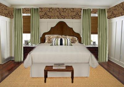
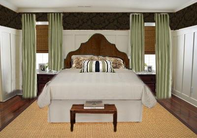
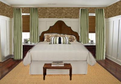
First, let me remind you of the look I’m going for–kind of an east coast, casual, country, coastal…. Heck, I don’t know what you’d call it, but you can see more details here.
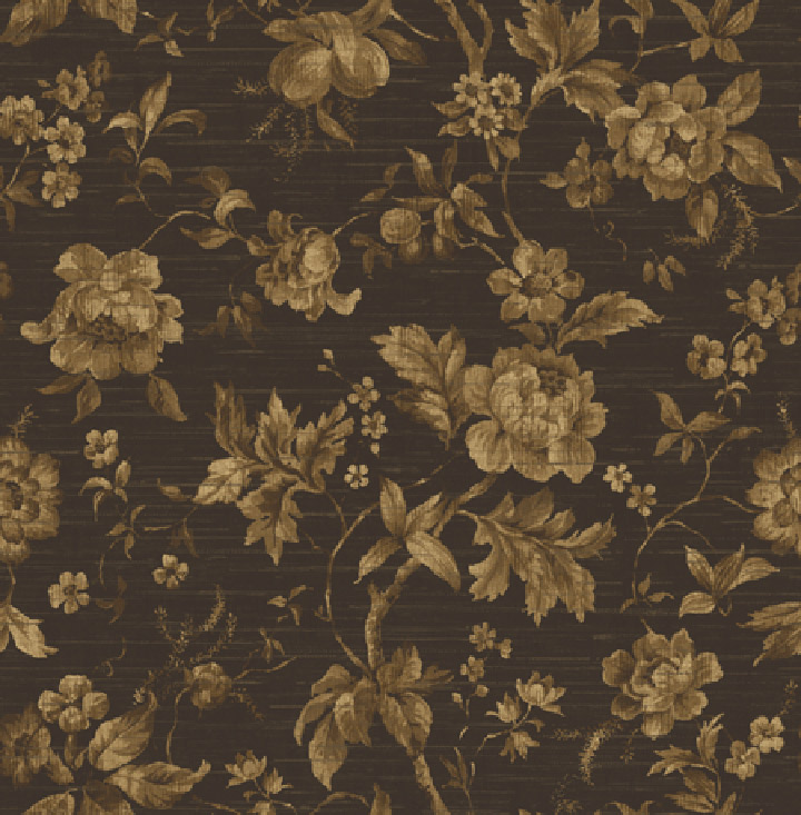
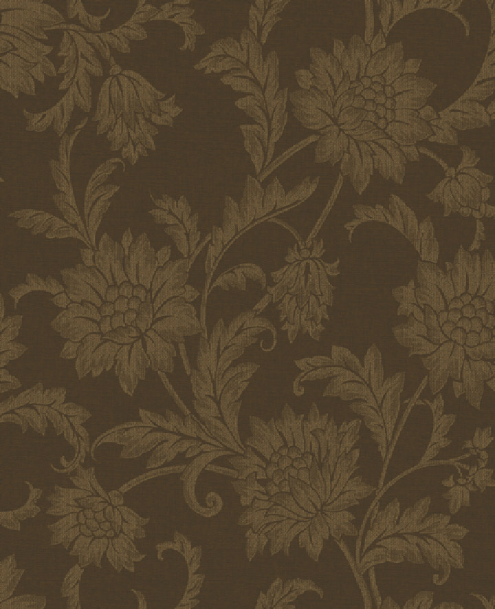
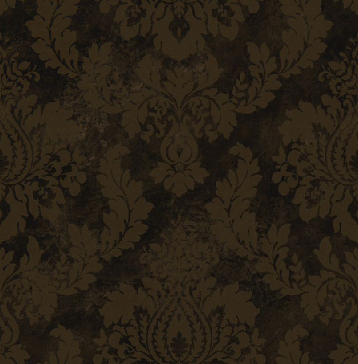
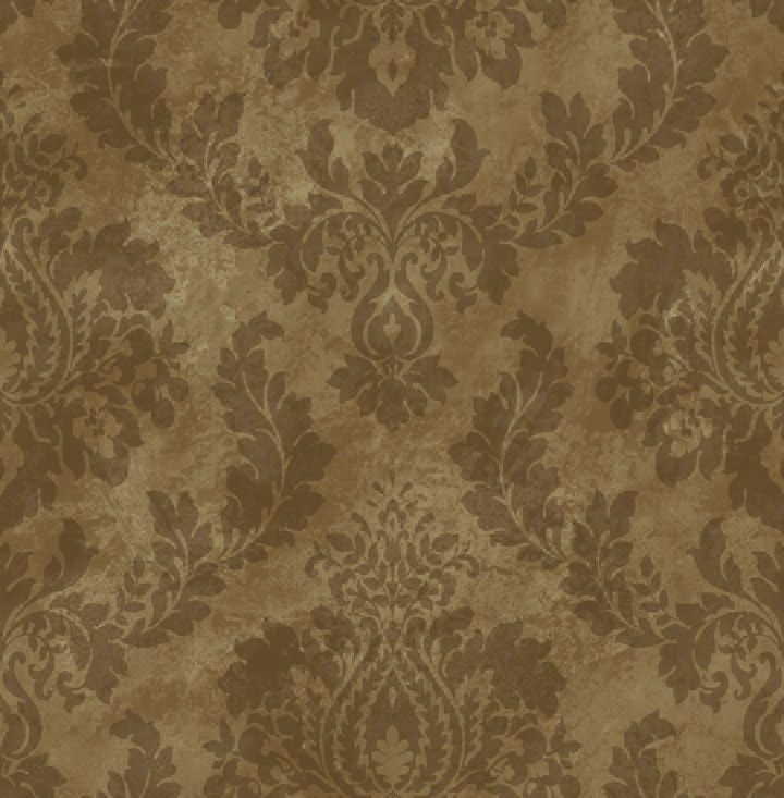
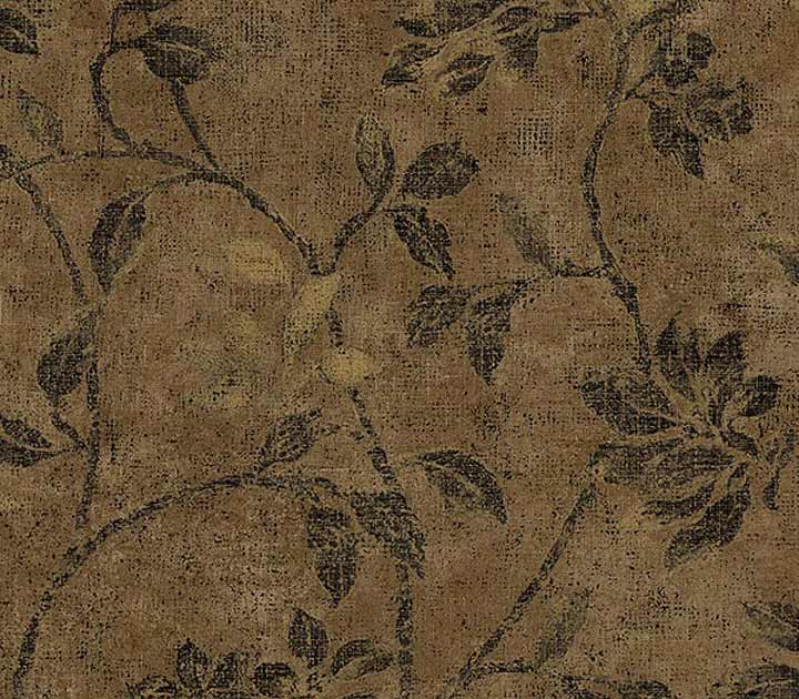
Now I’ll show you the options. Just keep in mind. FIVE…HOURS. When I had looked through everything there was to look through (at Sherwin Williams and Lowe’s), I couldn’t see straight. So please, don’t judge me if a couple of these are absolutely hideous. 😀
After each option, I’ve included the above photo showing that particular wallpaper. Now of course, I can’t guarantee that they’re to scale, but at least it gives a general idea of what each one will look like.
So here are the options:


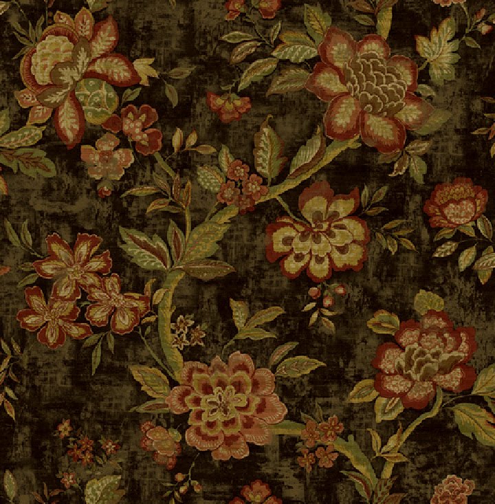

I know some of you probably think I’m crazy with that last one. But there’s something about that print that I love. It looks like a vintage linen fabric.
So let me know what you think!
And if you have anything additional thoughts, I’d love to hear them! And just so we’re clear, “no wallpaper” isn’t an option. 😀

Addicted 2 Decorating is where I share my DIY and decorating journey as I remodel and decorate the 1948 fixer upper that my husband, Matt, and I bought in 2013. Matt has M.S. and is unable to do physical work, so I do the majority of the work on the house by myself. You can learn more about me here.
I vote for #4!
I voted for option #6, the wallpaper color follows the cuteness of the room without generating a big noise, and the combination of light brown and blue just look awesome to me. Hope it helps
I would normally go for the damask, but I really like the richness and warmth in #2, but I also like the vintage-ness of #7…I think I just made up a new word…vintageness!!!!
Laurie Moss
I'm partial to damasks so I'm voting on no. 4. It also does a great job at complementing the dark color stain from the bed frame.
I know you said you are going to stain the headboard, but I have to say that I'm really liking the rustic blue color shown in these pictures. 🙂
I voted for number 6, what great graphics to illustrate the options!
I really liked #6 too but voted for #2. Surprised so many liked #5 but what do I know lol.
Hi Kristi, I liked option # 4 because, as Nora said, it complements the brown stain that will be used for the headboard. Also, it repeats the shape of the headboard and it provides a nice contrast to the lighter window panels, rug, white board & batten, bedding, etc. I think it balances the wood floors, too. 🙂 I love the direction you are taking with this room –just gorgeous!
Sindy
PS I think you should get a medal or something for looking at the wallpaper books for five hours–I would have zonked out after 15 minutes!
Voted for 5 because it is the lightest and to me best fit the east coast, casual, country, coastal vibe. Also think the lighter based paper looks better with the white wall treatment below. Well that, and I'm sorta allergic to dark flowery wall paper. 🙂
Allergic…lol. I realized yesterday that I'm allergic to any wallpaper that has realistic-looking roses on it. I just can't stand roses. I can somewhat tolerate real roses, but pictures of roses on wallpaper or anything else is just too much for me.
Thanks so much for your input, everyone!! I think I've narrowed it down to two now. I'm going to take those two over to the house and see if I can make the final selection.
I really like both 4 and 5. I voted for 4 because it seemed more dramatic and if there's one place where drama is needed, it's the bedroom!
Option 5 is great. Looks classy, and it keeps the room nice an light. Hope it works out well.
i agree and i also think i might have some items that will spice up your home at my store
http://www.ktdiscountsuperstore.com come check us out
Can you do option #5 and rub a glaze over it to give it a little more depth?? Not that I know what I'm talking about or anything, it just seems like it might give it more personality and make it a little more dark and rich (but not as dark as #4!).
Erin
I would ask the client.
My favorite damask is Schumacher Valette Strie. It comes in a brown, called Mahogany. The way the damask works in birds is so awesome.
Denise, that's a beautiful damask! But even my wholesale price is about two times what I'm wanting to spend on wallpaper for this room. Oh well.
And I did ask the client if she wanted to help select wallpaper. She said she'd leave it to me. 🙂
I vote for #5! The room looks more lighted with a lighter-colored wallpaper.
I voted option 5. It just stands oiut and blends best in my opinion.
Wow how interesting. The one I liked the least is the most popular so far. I like more contrast, but some were too dark.
If you are looking for coastal Country…#2 lighter color,neutral and floral all at the same time……I would add some nice baskets, white bedding and some light gray blue on bed….like a pillow or a blanket…something to bring out the coastal side….use clear glass….natural elements….
you are doing great!!Love the idea!!
I vote for #5! The room looks more lighted with a lighter-colored wallpaper.