Bedroom Area Rugs, Round 3
Okay, y’all. This is round 3 of my search for an area rug for our bedroom. I know some of you said I should just wait, but I’m like a dog with a bone now. If I have a few minutes of extra time, and I sit down at my computer, I immediately start searching for area rugs. Plus, I spent a ridiculous amount of time and effort yesterday wrestling with the previous four 9 x 12 area rugs to get them packed up and ready to return. All of them are going back. I’m not going to try to make myself like a rug, or live with a rug just because it’s more convenient to keep it than it is to return it and keep searching.
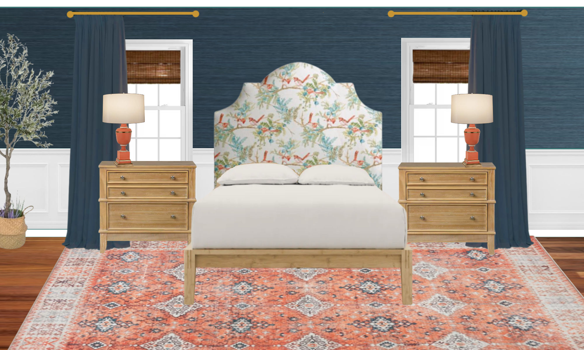
Anyway, I read your comments. I looked at all of your links. I considered your suggestions. And the suggestions that stood out to me the most were to lean more into the orange/coral color in the headboard fabric. I did consider other suggestions, though, like to maybe go in the direction of a sisal rug or a sisal-look rug. I did consider that option very seriously, but being the lover of color that I am, the idea of leaning more into the orange/coral seemed more appealing to me.
The main thing I noticed about my previous attempt was that the background color of the headboard fabric is going to be a problem if I keep trying to pair it with a rug that has a predominantly cream, beige, or off-white background. The background of the fabric has a tinge of yellow to it. It’s not a standard off-white or cream color. So if I try to pair it with a rug with a cream background, it’s always going to clash, which was my main problem with the last rug.

The rug just reads too light and bright compared to the yellow beige background of the fabric. So I decided to lean into the orange/coral color and see what I could find. I think I’ve found some viable options, all of which would give me the color I so desire, while none of them lean heavily into the off-white, beige, or cream that would clash with the fabric. Interestingly, every single one of these can be found at this link (affiliate link).
This first one leans more towards a reddish coral, but I think it would work.


This one definitely leans more towards the orange side, which I love. It also bring in some of the light teal color from the headboard.


This one is somewhere in between the reddish coral of the first one, and the more orange color of the second one. It’s like those two colors were mixed together to give us this color.


This one is heavier towards the light teal color, but it does have quite a bit of orange/coral in it as well.


And this one is another one that has a good deal of a blue-green color, but also with plenty of coral/orange.


And finally, there was this one. I wanted to try it out, but I think the blue in this one is too much of a true blue rather than a blue-green. So it probably won’t work in our room with all of the teal.


I really do think one of these might work. Of course, the headboard fabric won’t be right up against the rug like it is in these pictures.
Anyway, I don’t want to purchase all of these to try them, but I’d be up for purchasing up to three of them to test them out. I’m really leaning towards the third one, but I also like the second one. Which ones (if any) do you think I should buy and test out?


Addicted 2 Decorating is where I share my DIY and decorating journey as I remodel and decorate the 1948 fixer upper that my husband, Matt, and I bought in 2013. Matt has M.S. and is unable to do physical work, so I do the majority of the work on the house by myself. You can learn more about me here.


I like #2 best.
Oh love LOVE the second one!!
How does one pack up an area rug to return? I’ve bought large area rugs online and was always worried about returning them.
I like #2 the best. Because I hate returning things, I’d probably just buy that one and if it didn’t work I’d buy 1 and 3. I think the last two have blues that would be a non-starter.
Of those four options, I definitely like #2 the best.
Three and five are my favorites. I like two, but think the orange is a bit loud for a rug and might compete with the headboard for attention. Just my two cents!
I thought exactly the same. Three and five are great, two is very loud with all the other colorful elements.
The second one. The middle has some white-ish in it that reads cold. I also like the first one but I don’t think it’s Kristi enoughz
I like #1 best. The color is softer as is the backround of the fabric. The coral birds are the focal point. All of the coral rugs look lovely. I do not think the teal rugs will work here. Also remembering that the bed will cover a good portion of the rug makes me feel the coral rugs will just be a pop of coral. The teal will be plenty visible with your lovely grass cloth.
Sheila F.
I like #1.
I like the organic pattern of #1 the best, I do like the color but it is more red than coral, not sure how that will play with your other choices for the room. I think #2 or 3 could work as well. Not a fan at all of #4 or #5.
I agree, I like the style and colors of #1 the best. The others seem to have such a different style to me that doesn’t blend with the birds.
1, 3, 4 are the ones I believe look best.
Consider painting your room first with its final color and installing your grass cloth. Then bring in the rugs to pick the one you like best. Put the headboard fabric up vertically as well, and the bedding colors laying horizontal. I think you need to see all these fabrics with all the colors as they will be, in the natural daylight of the room, during different times of day, and then using lamps at night. The right one will make itself easy to pick!
I thought – from the top going down – #4 or #5 (I liked 5 the best) were the best because they didn’t scream any one color but went with everything you have in your room and in a soft, faded look.
Rug #2! Love the coral idea, it works so well!
I LOVE the coral/orange idea!! My votes would be 2 and 3. My favorite, based on these photos, is 2 but you never know how things will look in person. The blue/teal ones don’t look right to my eye…not sure if it’s that the color looks too heavy or something?? Can’t wait to see what you decide 🙂
I like 2 and 3 the best, far more than the more pale or teal/bluer ones.
Me, I would go with 3 because I like the brightness but maybe the oranger tone will not match the fabric in real life. In that case, definitely 2, again to bring some brightness in but more subdued than 3.
I totally agree with Koneko. I’m so glad your bringing in the orange/coral tones. I love #3, brings in excitement, but won’t cause a loss of sleep. Good luck deciding.
I love the first
and second one.
1 and 2 are my favorite 🙂
Number 2.
I have been following you for years, however I am not a DIY person. Every once in a while I pick up a thing or 2. However I do want to put this out there as you are open to stuff. The electrical box you posted about before I think you are overthinking that way too much. I also have a question about the rugs. Isn’t that hard too traffic for your husband Thank you for the creativity Jo
Had a similar concern with Matt and a rug. If he transfers from bed to chair (manually or with lift) would the rug be in his way or of concern. You are so devoted to Matt that i know you have considered that, but those of us that you have invited into your home and life don’t understand how a rug would affect him. Thanks!
You may notice that I only ever consider the cheap polyester rugs, and that’s because they’re only 1/4-inch thick. People often suggest that I look into other types of rugs — wool, braided, etc. — but those are too thick and would make things difficult. But as long as I stick with the 1/4-inch polyester rugs, they’re not only very easy to clean, but they’re also thin enough that Matt’s wheelchair and Hoyer lift can easily roll on them. They may need a bit of carpet tape at the point where he rolls onto the rug to keep it from bunching up under the wheels, but the tape keeps it in place.
I really like 3 and 4.
Oh, you probably know this, but I often glean color info from reviews. People often say stuff like, it was a lot more red on person… etc.
Good luck!
I almost always try to read reviews, but I find the reviews/customer photos on this listing to be almost worthless. The photos are pretty much always awful, but on this one, the listing has about 20 different rugs, and the reviews don’t say which rug the person is reviewing, so I’m left making my best guess based on their (generally awful and dark) photos. So even after looking at all of those photos and reviews, I feel like it’s still a gamble.
To save yourself the aggravation (and expense) of returning a 9×12 rug, consider purchasing a smaller size (like 2×3) first. You will still be able to see if the colors are a match even with the smaller size. Once your decision is made, return the smaller rug and order the correct size. Of the options in this post, I think #2 or #3 would work best with your chosen fabrics.
Well duh?? This is the best idea ever!!
Quite honestly, I never would have thought of that. 😀 That goes against my “make everything as difficult as possible” philosophy. 😀 But seriously, what a great idea!
I came here to say just that!! Buy them in a small size to try out, and use your imagination to scale up the pattern as it will typically get bigger (they usually just blow it up to fit the larger rug sizes) and the blocks of color will be larger/less visually blended. I said this in a previous rug post but it got missed 🙂
I totally agree with Koneko. I’m so glad your bringing in the orange/coral tones. I love #3, brings in excitement, but won’t cause a loss of sleep. Good luck deciding.
Have you considered ordering the smallest size available so you can see the actual colors and then easily ship them back? You can then order your final choice in the correct size.
I like #2 the best but I’m wondering how will it look against the tone of your wood floors. It seems the orange might not have enough contrast with the floors. That said, I think the colors are wonder with the headboard.
I only like #3.
No. 2 then no. 3 are my favorites but seriously consider waiting till you’re further down the line. Put the obsession for a rug now to rest and revisit.
Rug #2 gets my vote.
I love the third one!
So many chose #2. Guess I’m odd man out because I would choose 1or 3. I love the headboard fabric and would prefer these rugs since I don’t think they would detract from the headboard but compliment it.
1, 2, and 3. I do like 5 also, but I think leaning more into the orange and coral is a better idea than more teal. I also think the geometry on all of the teal rugs looks too southwest.
I like 3 and 1. My opinion is 2 is a bit too dark.
Ahhh, when I put up two fingers to separate the rug and headboard fabric, rug 2 started looking real good to me too. And maybe 1 became a little boring?
So maybe I’m now teams 2 and 3.
Number 3!!
I like 3 best. Second choice 2. Wondering how wallpaper and curtains hold up with those. The coral color way is the better choice. Thanks for showing.
Since most of the rug will be under the bed, I started focusing on the rug border with the headboard fabric. I like both #2 and #5.
I agree. Christy, didn’t you say that only the outer edge will be showing and the rest will be under the bed?
It’ll be a little more than just the edges. The rug is 12′ wide, and our bed is 5′ wide (queen size), so 3.5 feet of rug will show on either side of the bed.
Number 2- I love the orange and turquoise blue
When I saw the first one I thought that is perfect! When I looked at all of them together, I still like the first one the best, but the fourth one also looks nice. I think heading towards the coral was the ticket to finding a good option. Glad you steered away from the first round.
Definitely #2 – it’s brighter than the others, so you’ll probably be happier with it long term than the other options (which I’m surprised you’re considering as they are all rather drab).
To my subjective eye, number two is the clear winner. It has the quiet vibe you favor so it doesn’t steal the thunder, but it has enough life to be in company with the other lively elements in the room. Even though the bed will cover a lot of it, I think the orange/teal combo holds its own. (Okay, so I don’t like wimpy rugs.)
Could you order the smallest size possible to test it in a daylight and after dark, assuming you turn on a lamp. 🙂
So, Ms Doggie, lick your chops and enjoy your bone.
I’m normally not an orange lover, but with your choices, the one that appeals to me is no 1. In some of the others, the pattern is too mexican for my liking and the combo of blue and orange feels a bit too overpowering for my liking and the other patterns in the room.
I do have a question that already popped up in my head with the previous rugs: Why do they all look like they’ve been worn out for months or years already? Isn’t that something that happens with wear and tear over time rather than as a starting point? I do not like distressed jeans so it might be something similar I simply don’t get 🙂
I’m curious what your final pairing is going to be – I’m pretty sure it’ll be great but still expect some surprise new item coming up…
I think a lot of rugs today are made to look as if they’re antique Turkish rugs. I personally like the look, but I can understand why that doesn’t appeal to some people.
#3 is my favorite.
#1 second favorite.
1 and 3. 2 looks a little too orange
Personally my favs are 2 and 4.
As you contemplate which ones to order, I’d encourage you to make a mood board that includes your wood floor.
I like 3, 2, and 1 better, in that order of best to least. Of those, #3 seems like the best match with the birds in your fabric, but maybe not enough teal in it? The center of 2 seems more orangey than the colors in your fabric, but could be covered up more by your bed and also that rug also seems more vibrant. A good thing? Would like to see these 3 against the grasscloth and other fabrics you picked. Getting closer!
Three would be my first pick then number one would be my second choice
#2 then #3
LOVE #2!!
#1 & #3
Wow, so much better, well done! I think all of these would work but my favorites are 5 and 3, with 2 as a possible runner-up.
I like the 2nd and the 3rd too.
I like #3 and #5
totally agree 3 and 5
#1 or #3 for me. They both would make the birds on your headboard fabric stand out. I feel like #1 is a nice “color neutral” that would be a great foundation for all the other saturated colors you have going on. #3 is a little busier but not bad. Rug #2 is quite bright and orange but would work with the headboard fabric. It might compete with other items for your attention.
I would go for one or three, but given your love of color, I think you would be happier with three. I like these a lot better than the last lot.
I love number 2 option!
1, 2, or 3. In the others, most of that beautiful color will be under the bed.
I like 3 the best, with 2 as a close second:)
I like the 2nd one too but I feel it’s too vibrant. I love the 3rd one best if I had to choose immediately
Love the first three. Favorite is #2 with the darker border
Really like the new focus on the coral
I vote #2. Also buy the smaller versions so it’s easier to return!
Oh I am definitely Team #2 …. all.the.way!!
I’m Team 3! I think it’s perfect. Second choice is 5. Not to badmouth anyone(thing), but I think:
6 reads too purple (and too “southwestern”);
4 reads too blue;
1 doesn’t connect to any of the teal; and
2 is too orange.
2,3&5
I really like #2. It is sort of in your face with color, but most of the rug will be under the bed. I like the brightness of that rug. It looks like a new rug, not an old worn out one. I know you like that old look, but for your lovely new bedroom, get something “new”.
All the others are just sort of blah after seeing #2. I’d go with #2.
#1 for sure. It’s a good background for your head board and all your other more prominent colors.
#1 for sure. It’s a good background for your head board.
The #3 is my favorite the scale of the design and the color. This rug will be under the bed and much of the central design will be under the bed so the #2 with it’s distinctive
blue border, while attractive, that border will dominate the look of the rug because the
central portion of the coral will be under the bed. Also the #3 design has blue scattered
throughout the pattern with the coral, I think this blends and will unify the colors in the
room without being dominant.
#3, first place, #2 second place and #5 for third place. Don’t really care for the rest.
Now you are looking at some rugs that go well with the fabric. I like the third one best Wow what a difference the background color made!
These are perfect! I like 2 & 3! I don’t think you can go wrong with either of them!
The #3 is my favorite the scale of the design and the color. This rug will be under the bed and much of the central design will be hidden. The #2 with it’s distinctive
blue border, while attractive, the border will dominate the look of the rug. Placed beneath the bed the border will be showing at the sides and foot of the bed.
The #3 design has blue scattered throughout the pattern with the coral background I think this gives a cohesive look and will unify the colors in the
room without being dominant.
Order the first 3. I’d pick number 2.
I love #2
I’m on Team 2. The colors are brighter and go very well with the headboard. #3 looks great in the middle but the border is washed out and doesn’t have anywhere near the saturation of color that the middle does, or for that matter, the headboard. Remember, it’s primarily the border that will be showing.
The last 3 are a hard no for me. I love color and pattern but not when it looks like it is worn out.
1000% The third one!
Number two is perfect! It brings out all the right colors and would look stunning in your new room.
First and third
I like number 3. BUT I am wondering what color you are going to use the orange on that I see with your other samples for curtains and other item in the room. Would that make a difference?
Second from the top should be a winner; the colors the patterns, etc.
#2, 4, and 5 would be my choices in the order you have them laid out on bottom of your post. I would also double check the grasspaper color with them though. Jmho
Often you can order a small scatter rug size to just check color, avoid return shipping charge. Often they don’t want small size returned
Ooh! I love these! One of the things I’ve noticed when I purchase textiles online is that they seem to use very very bright lights when taking their product photos, so they always seem a bit darker in person. In these pictures the third one is my favorite, but the second one might actually be the best if it is a bit darker in person. The 4th and 5th ones I’m torn on, because I am having trouble picturing how much of them would be covered by the bed, but if you got three to try, I would suggest 2, 3, and 5. I am so excited to see how this continues to progress!
I don’t think the image of the fabric you are using in selecting rugs is particularly true to its real life color. The image lacks the yellowish tone that you note is what makes it hard to match. Of these choices, I think only 4 has the yellow tone in it, the others are just repeating the issue of having their lightest shade being close to cream, grey, or off-white that clashes with the fabric background color.
Why not a solid or tonal coral rug instead?
Love the second one
Runner up rug is the third one
#2 and 3. #3 Has more of the teal in the border that will show, being as the bed will cover a lot. I love both of those, and agree that using the coral is the best idea!
I would pick the third one to try out.
Third one, good match.
Another thought here. If you are making your breakfast room into a kitchen and who knows where the elements in the breakfast room may end up later…..would the colors in the breakfast room rug work in here or is the bit of purple in it going to throw things off? It would be a great way to use that rug if it worked and if you weren’t for sure going to use it again when you make a new TV sitting room, dining room, or family room. I just can’t tell from looking at it online if something in it clashes.
I love this idea if it worked. I remember loving the breakfast room rug and just went back to re-look. Hard to tell, but what a great idea to consider.
For me it’s #4
Numbah 3!
I like one and three. I think they have the right color of coral and it will balance with the teal wallpaper. I think those also look the best with your headboard fabric.
Second or third for sure, and maybe the first. Definitely think orange/coral is the right direction!!
Numbers 2 & 3 are both great
I agree, I lean toward the third one. The first one is too dull, the second one is too orange in my opinion but I know you like bold color so it may be a contender, the rest are just too blue for my taste but if I had to choose one of the blue ones it would be rug # 5. Good luck!
Concerns over the coral color that is AWESOME in #2 and #3, is that both are in center of rug. How much will show with the bed sitting in center of rug? Would a rug with the band being coral work better?
1 &3
Number 3!
When I saw the second one, I loved it. Then I saw the third one… and thought, no, that’s the one. But when you have them all side by side below, the second one really stands out from the rest and looks great. My vote is #2!
I like 2, 3, and 5 best, but these are all really pretty rugs! Get small size rugs as testers so you’re not lugging around huge returns and spending thousands.
1 and 3 are my favorites
My vote is for #2!
My top 3 are 2, 3 & 5.
My vote is #2. Beautiful, rich color. Even though it is more on the orange side, won’t your bedroom furniture cover much of it? This rug makes the headboard colors pop. 🙂
# 3 is perfect !!!
I’m inclined toward #3 but can’t remember what you’re thinking for your bed covers.
Number 2 for the win!
5, 1, 3 in that order look best to me
2, 3, 1, Maybe 6.
4&5 – no.
I like #3 as first option; followed by #2 as 2nd option.
#4 and #5 are my favorites!
#5
I think the second one is best. All the others look somewhat washed-out to my eye. You want color, and the second one has enough depth of color to balance the rich colors of the wallcovering and drapery.
#2 is a clear winner to me from the photos. #3 is a close second. I think these are great options – kudos to those with the idea going more coral!
I like the first three!
For me, hands down #3. Really makes the coral/orange color of the birds pop.
#3
2
I like #3. It sits between the softer-colored #1 and the too-orangey #2.
Hi Kristi,
I’m wondering if you might be better off using a solid color on your headboard and using the bird fabric as the bedding. That way you can change to a different look very easily, and you can choose a beautiful solid coral/orange color for the headboard. The bird fabric is beautiful but I wonder if it looks like kind of a dated style to cover the headboard with a print. You may be happier I the long run not being tied into a print on the headboard. Whatever you do, I know will be beautiful when finished!
I like #1 best and think it might play better with the colors of your mural in the adjacent bathroom. However it’s hard to judge without seeing the rugs in context with the color of the grass cloth and other fabrics.
Also the reviews usually list the color they purchased just below the title of the review.
1st and 4th are my faves
I just came across a great tip for rug shoipng om A Nesting Place. She said buy a rug in the smallest size possible, like a 2X3 first befo youre buy it in a larger size so that easier to send back if you don’t like it. Good luck!
The bed will cover most of the rug up, won’t it? So you’re really looking for a border that works with the room and the center will be a less dominant color than it currently looks on the pictures.
Maybe it’ll be easier to narrow down if you edit the pictures with the bed/sheets color where the bed will be, so that the border becomes the more dominant color in the comparison.
They are all beautiful rugs but my favorites are #3 and #5. They just seem to coordinate with the headboard fabric better in the side by side pictures. Good luck! I understand the struggle to purchase rugs online.
I really like 2,3, and 4 each of them seem to have color that pops which I think you will be happiest with in the long run. My favorite of those is number 2 because of the border. Most of the rug is under the bed so the border is going to be super important.
1,2 and 3!!!
#1!
I work with a designer and one thing we often do to check colors is order a small 3×5 – easier to return and still accurate to check colors.
I like the first and third ones the best. Liking the move towards the coral!
I like 2 best, then 3, and really don’t like any of the others.
#2 is my first choice but #1 would let the rug be more in the background I think. I have a rug with a black border under our bed and even my husband immediately noticed it and liked it. So I guess you need to decide if the rug is to standout or blend in more.
#1 is my favorite with your other colors/patterns
No question for me: Definitely # 2!
I’m late to the commenting game on this, but think the orangey ones without any (or very little) blue or teal will work best.