Bedroom French Doors Progress And Closet Paint Color Options
I finally got started on our bedroom suite yesterday! As in, I did more than just plan and dream. I actually got to work and got stuff done.
The project I worked on yesterday was getting the French doors to fit into the cased opening. If you’ll remember, I’m working with an opening that’s 45.75″ wide, and I didn’t want to have to reframe this opening and take a chance of messing up the music room walls. So I decided to buy two 24″-wide doors and cut them down. So the doors have looked like this ever since I installed them, with the doors overlapping and not being able to close…

So yesterday, I took the doors off and cut them down so that they actually fit. They won’t stay closed because I don’t have ball catches on either door yet, but you can at least tell that they fit now.
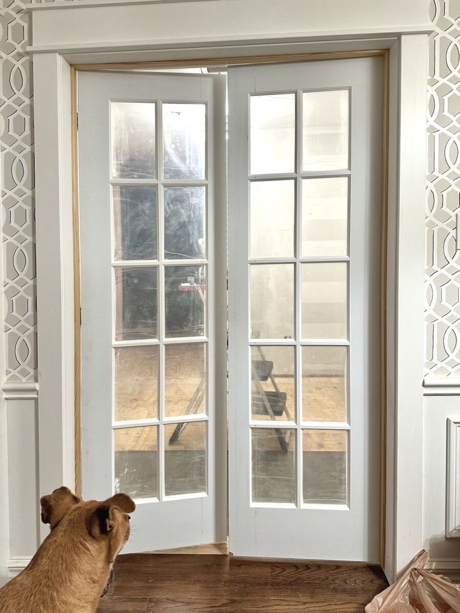
That was a bigger job than I thought it was going to be. Of course, it didn’t help that when I went to re-install the door on the right, I fought with that door for a long time, trying to get it back on the hinges, before I realized that I was trying to install it upside down. 😀 So by the time I got those down, cut, and re-installed, it took way more time that I thought it would. I hope to get them finished today, but then the door pulls I ordered won’t be in until next Tuesday. So it’ll be next week before we have fully functioning French doors on our bedroom suite.
But while I was at Home Depot getting the supplies I needed to finish the doors, I walked by the paint aisle and decided on a whim to grab every paint color they had in the orange/coral section to start narrowing down paint colors for the closet. I came home with quite a stack of colors.

I was really hopeful that with such a big stack of colors, I’d have plenty of options to choose from, but almost all of them were duds. I realized really quickly that (1) the fluorescent lighting at Home Depot really distorts the colors, and (2) both Behr and Glidden have a real gap in their colors when it comes to anything in the coral range. Most of the colors, once I got them home, looked way too yellow or burnt orange, and those just won’t do. I was certain that some of these would work when looking at them under those fluorescent lights, but they were a big disappointment once I got them home.

Almost every single one looked way more yellow once I got them home. And I don’t need yellow. I need the perfect mix of orange and pink.

So finding a color that has that perfect ratio of orange and pink is probably going to be way more difficult than I had anticipated.
Another issue that I knew I was going to have is finding the perfect color that gives me that perfect ratio of orange and pink that also looks good with the area rug that I bought for the bedroom. I don’t need them to match, but I also can’t have them clash. The good thing is that all of the oranges looked terrible with the rug, so it has a lot more red in it than I remembered. The rug has been boxed up in the studio since I bought it, so when I pulled it out yesterday, I was kind of relieved to see how much red it has in it. Here’s an example of a truer orange against the rug. You can see how they clash because the rug has way more red in it.

So that was a relief, because I really don’t want an orange closet. It has to be coral. I don’t mind a coral that leans more towards orange than pink, but there has to be some hint of pink in it, at least. While the wallpaper some very bold orange in it, I just can’t imagine having an orange closet.
In that whole stack, I did find three colors that may work. These two are Glidden colors. The darker one is called Coral Serenade. I think the actual paint swatch looks a little brighter than it’s showing in this picture. The lighter color is called Sweet Angel, and it was the color right above Coral Serenade on the paint strip. It also reads slightly brighter and pinker in person than it’s showing here.

I think both complement the rug nicely. Here’s Coral Serenade against the rug. Of course, these will actually be in different rooms, but they’ll both be seen from the bedroom foyer, so they need to at least complement each other.

I googled these paint color names to see the photos of the colors, and I found this one of Coral Serenade…

And this is Sweet Angel.

I think Coral Serenade might be a bit too saturated/dark for a closet. I was really hoping for something in the Sweet Angel hue to cover such a large amount of cabinets.
And then there were two Behr colors that were more in the coral range. The one on the left is Watermelon Punch, and the one on the right is Indian Sunset. I like the Watermelon Punch better because it has more pink in it.

But I’m afraid that both of these colors are too saturated as well. I was really hoping for a lighter hue for the closet.
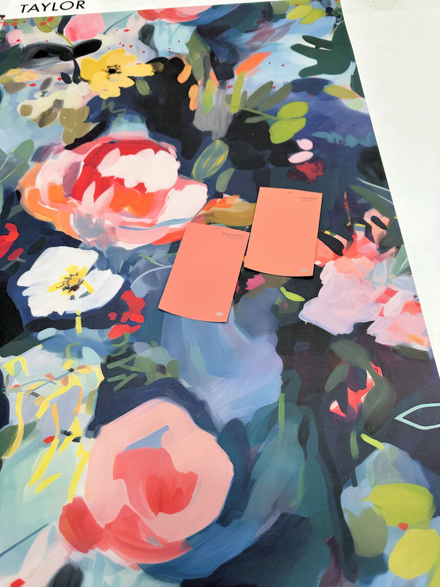
Here’s one of the pictures from Behr of Watermelon Punch.

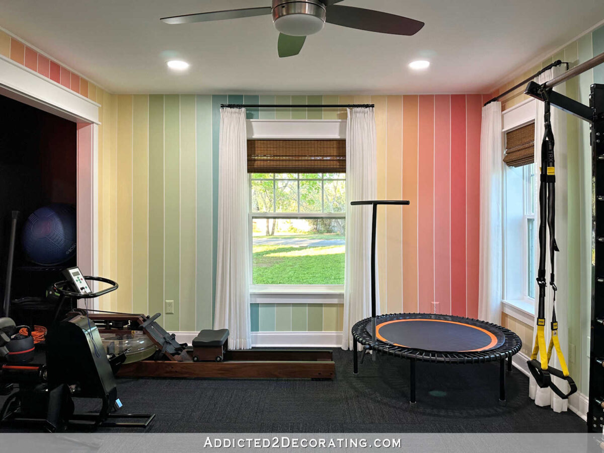
I’ve actually used that color before. It was the darkest/boldest reddish coral stripe on our home gym walls, and it looked way more saturated in that room than it does in the photo above.
Even as much as I love color, I might be a bit intimidated to paint an entire closet that color since there won’t be a whole lot of white in the room to tame that color.
So of the three from that huge stack that I think would work, Sweet Angel seems to be the frontrunner.
I’m going to look at other brands, but this is the hue I had in mind for my closet. I’m not sure if this is the one. I do think it’s close, though. Or maybe I should just go bold and do Watermelon Punch! 😀
UPDATE: I just googled “walk-in closet with colorful cabinets” and I found this. Y’all, I’m so tempted to GO BOLD!!! 😀 But I also really love this one in the mid-range hue. That actually looks similar in hue to the Sweet Angel color from Glidden.
More About My Walk-In Closet/Laundry Room
see all walk-in closet/laundry
room diy projects
read all walk-in closet/laundry
room blog posts

Addicted 2 Decorating is where I share my DIY and decorating journey as I remodel and decorate the 1948 fixer upper that my husband, Matt, and I bought in 2013. Matt has M.S. and is unable to do physical work, so I do the majority of the work on the house by myself. You can learn more about me here.

I like Watermelon Punch because it holds its own against the wallpaper.
I love that one too!
P.S. from me.
I visited the U.S. last year (I live in Ecuador) and I intended to purchase a paint deck at Sherwin Williams. I have used my Benjamin Moore for years, since I did interior decorating before I moved to Ecuador.
I can purchase S.W. products here. Before I said anything, much to my delight, the salesperson asked me if I would like to have a paint deck. They were giving them out so my friend got one too. Maybe they are still doing that. The color selection is the best!
I usually find what I want in the Benjamin Moore fan deck. I don’t use their paint but the colours never disappoint.
I love Benjamin Moore colors and paint bases—but since we’ve moved to Texas it doesn’t seem to be a big brand here. In the Midwest it was the most popular brand. And their color fans are so helpful to have at home where you can see the colors in the correct light.
Benjamin Moore is my absolute favorite paint! I love the colors, and the paint finish is superb. I’m never disappointed like I have been with Behr, Valspar and Sherwin Williams.
Would a Watermelon Punch with white added to it work? Like if you got a small jar and lightened samples of it until it was perfect, then had them color match to that?
I also love the watermelon punch. I love coral (the coral color on your front door is my favorite!) but the lighter colors might be more flesh-colored than coral.
That’s my exact concern about a light coral. I don’t want a flesh-colored closet. 😬
Any paint department can tone down the saturation in any color you desire.
You could ask for a sample of the watermelon punch with a 25% less saturation to see if that is closer to what you are wanting for the closet.
Normally they add more white or a gray to reduce the saturation. Then you can get just what you want without compromising.
I like the watermelon punch. Very pretty.
A interior designer told me that Sherwin Williams has the most future-forward colors, ie. they’re least likely to go out of style. I also look at Benjamin Moore.
You could take Watermelon Punch and have them mix at 75% intensity or 50% intensity if it works otherwise! I’ve had good success doing that.
I do like the mid-hue from your update.
Don’t forget you can lighten a color you like by 25-50-75%.
Have you taken a piece of the wallpaper with you when looking at pant samples? You’ll be looking at both together under those dreadful fluorescent lights.
I haven’t done that yet. I’ll probably take it to Benjamin Moore or Sherwin-Williams. I wasn’t even planning on looking at paint samples yesterday. I just got sidetracked with the paints. 😃
My office is painted Rosettee by Sherwin Williams. It is a lovely color! SW 7581
Sweet Angel – fits with everything else. Especially your bathroom – the bold closet doesn’t have the same feel.
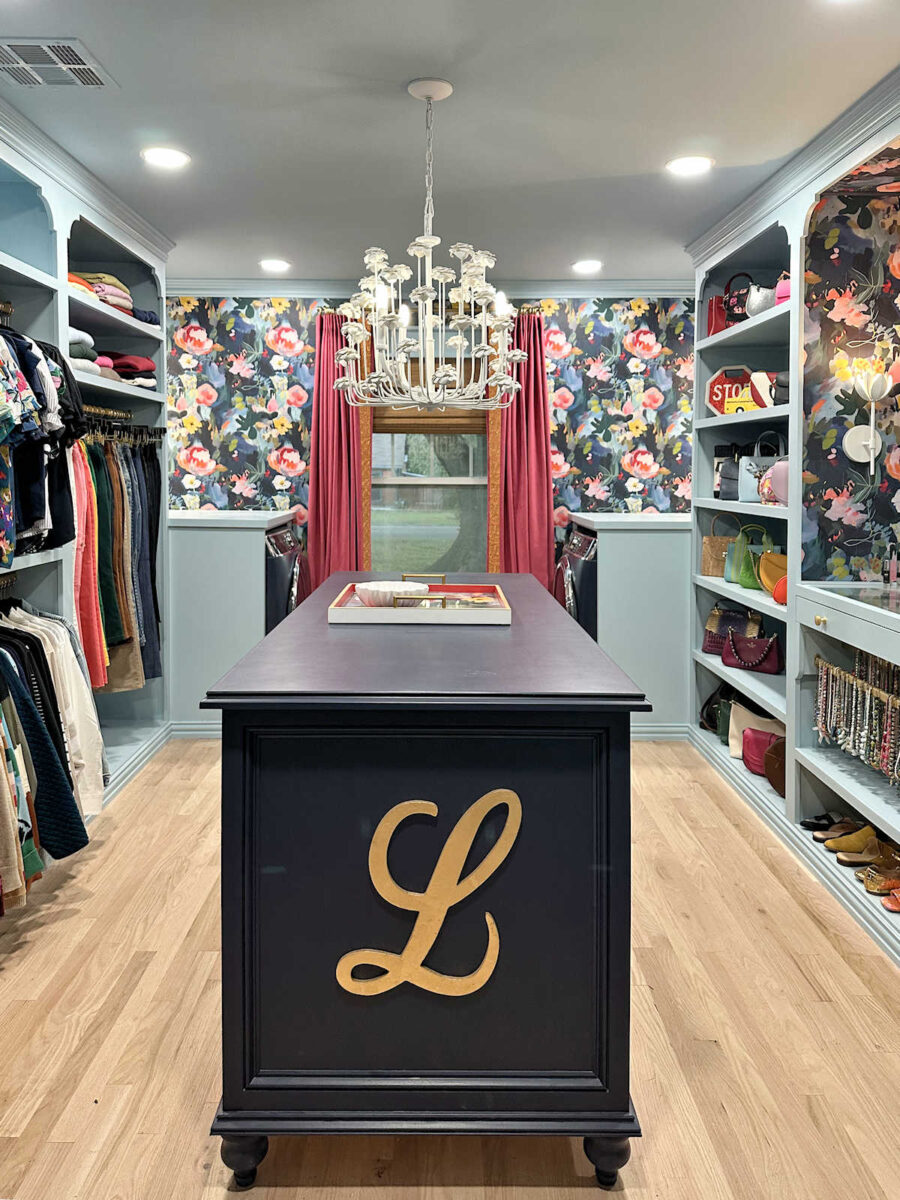
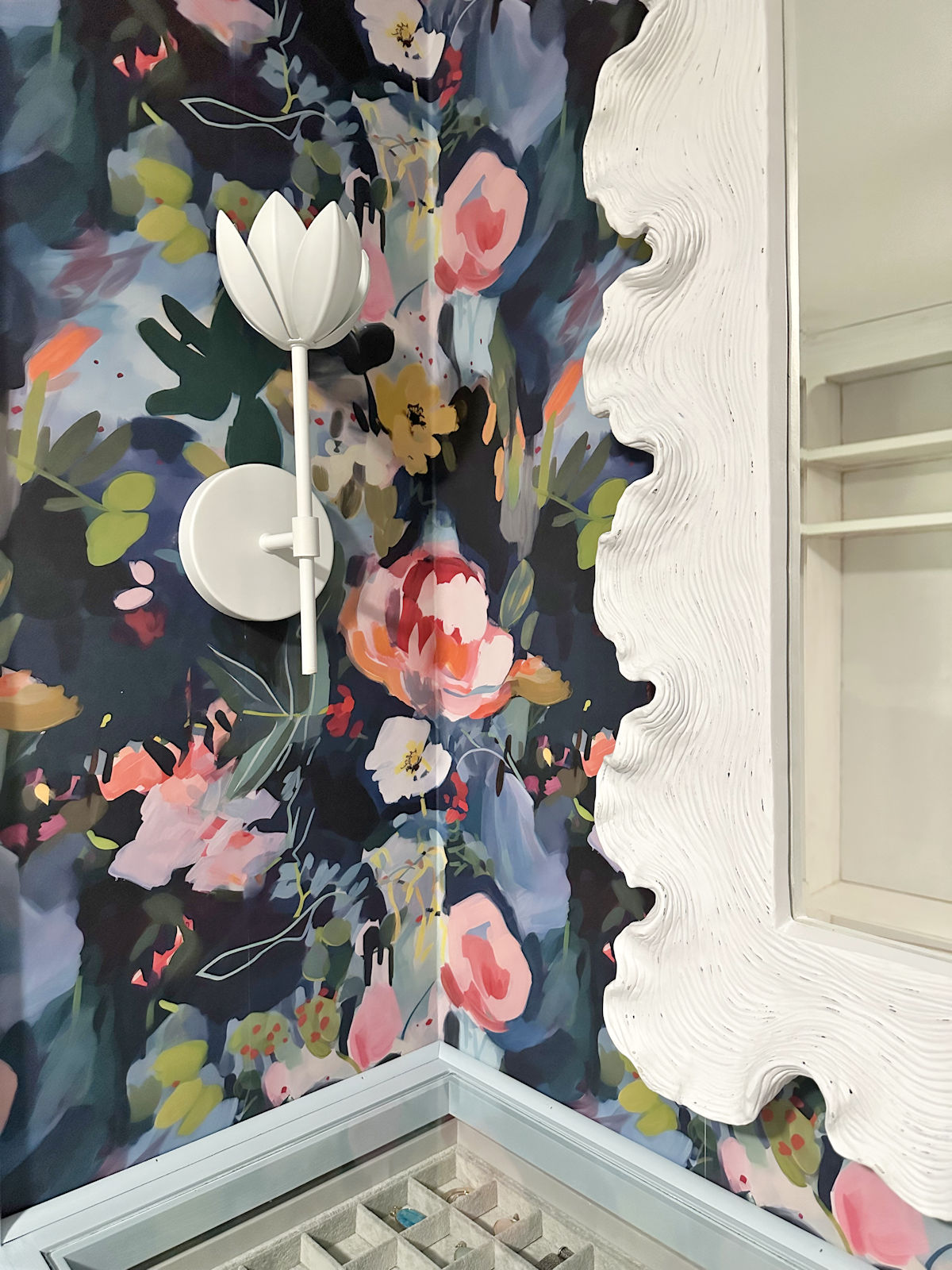
I’ve seen the bold colored closet before, what fun! One thing is they have staged it so the clothing matches and coordinates. That being said, your clothes, shoes, etc…will have an effect on the color you pick. I think it might not be as saturating as you think, especially with the windows/light from the laundry area. You can also balance the color with the island, flooring/rugs, like the mirror will do against the dark wallpaper. Can’t wait to see what you pick!
I love both of them, but the first one has your name written all over it. Just remember it’s your closet; go any which way you want. Have fun with the colors, it is not my favorite part of the job, for me, once I pick a color that’s it, I don’t get to change my mind, so I had better be right. Only once did I get the opportunity to redo a bedroom when we were stationed at West Point, the color I chose was a lovely cool green, what appeared on the walls was pretty much Atomic Lime. It was a Glidden paint, and for whatever reason, it was not what was on the swatch or in the can. My husband happily took me to another paint store to get something more calming because you did not need a nightlight in this bedroom with the lights off, you needed eye patches so you could sleep. Have fun. I did like that hot orange and pink closet; you only live once.
Cheers!
Sherwin Williams could color match and then tell you which of their standard colors is closest to the color match so you have a reference point? Might be worth it.
Go bold!!
Coral serenade is beautiful!!
It won’t look so saturated if you use it everywhere, sounds mad, but if it’s all over it loses its strength a bit.
Plus the wallpaper needs something strong to balance it.
If you compare your colour palette in the studio and kitchen, they are strong colours which you love, the pastel just isn’t saying Kristi to me.
Be brave go bold like you! 🙂
Oh my! Color picking is where I fail! Whatever you choose, I know it is going to be perfect – you do know your colors!
You might try those Behr colors at 50% saturation.
I think my eyes fell out when I opened the “GO BOLD” one. that sure smacks you in the face. I say no to go bold.
I wish there was a Like or Upvote button so I could apply it to your comment. I felt the same way about the Go Bold image, though it is a pretty closet. I, personally, could not deal with it in real life, though it looks striking in online photos.
I really like the Watermelon Punch and I agree with other commenters who mentioned reducing the saturation.
Ditto! OMG that was a shock! Whatever Kristi chooses will be awesome, not shocking!
You do love color!
That bright hit you in the face orange would drive you crazy. Oh my gosh. I did like the rug in that picture. The Sweet Angel is very “sweet”. Calming, actually. It would also look good with the color of your washer and dryer. You will find just the perfect color for you. You have gone bold in other places in your house, so I recommend something calmer Anyway, I had a pink bedroom before, and I loved it. Black wallpaper with a tiny little pink flower in it. The shelves at the end of the upstairs room were built around the window. The walls were angled like an a-frame because it was even with the attic upstairs. All the wood was painted pink. About the color pink in the picture you showed us. Boy I wish I had a color picture of that room.
I love the more saturated color. I think it will tone down when you’re finished and have all your clothes and washer/dryer in there. But I’m not too much of a fan of pastels when the other colors in your house aren’t either. JMHO
At Home Depot, you can have any color made any percentage less pigmented
than the paint chip original…you might try a sample of the watermelon taken down by 50%…
Watermelon Punch all the way, or at least a version of it. Sherwin Williams can adjust the saturation or you can take a sample of the wallpaper and do a color match. Sweet Angel is just to pastel, you are playing it safe with that color and that is not your style. You will end up repainting. I can’t wait to see this closet, it is going to be incredible.
Can you have the more saturated ones mixed as samples at 75% and 50% and see if you like that look? I love the watermelon color!
Go bold!! I love your style and watching you transform your home 😊
Personally, I luv the Watermelon Punch and think it is a great compliment to each of your other color items. I’m certain you’ll find exactly what makes your creative heart pitter-patter.
I luv the GO BOLD! color, too, but not in the small space of the closet where it is shown. It makes that small space feel very claustrophobic, to me.
Ooo exciting. The closet you linked in your update is stunning, but I think the reason it works so well is that the clothes and accessories within in match it in intensity. I believe your clothes are more mid-tone? So a mid-tone may look more cohesive with them? With there being no doors your clothes are the equivalent of curtains, cushions, shelf decorations etc. How do the colours look with your clothing? Whatever you do it is going to be stunning and an inspiring start to your morning each day.
What if you mix in some white with one of the more saturated colors you like?
You do like bold colors so I can see you selecting Watermelon Punch over Sweet Angel. I prefer softer colors so Sweet Angel would be my preference. The orange closet with lavender ceiling you provided the link to would give me a headache! I’d definitely buy a sample jar of each color and paint a large sample board that you could place in your closet along side the wallpaper to get a better idea what each one would look like in that space. It will be fun seeing what you do in there!
Can you do the Watermelon Punch in half strength? That could work perhaps.