Bedroom Grasscloth Wallpaper Installation — It’s Not Going Great, But It’s Not Going Terribly
I made some progress on the grasscloth wallpaper installation in the bedroom yesterday, and if it’s at all possible, I’m both pleased and disappointed. 😀
Let me just explain from the outset that I know it’s strange that a person who is as much as a perfectionist as I am loves grasscloth wallpaper as much as I do. Grasscloth wallpaper is one of the most imperfect finishes you can put in your home. You can’t match seams. Colors vary from piece to piece, and from roll to roll, even if they’re in the same dye lot. I knew all of that going into this, and I tried to prepare myself as much as possible. I tried to tell myself that no matter what the pieces looked like, or how much one piece varied from the next, I’d be happy with it because grasscloth adds such a beautiful depth and texture that can’t be achieved with any other finish.
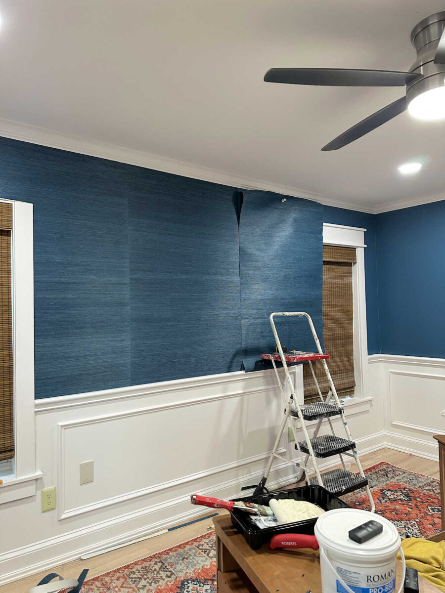
So with that said, I jumped right in two days ago an installed that first piece, which I already showed you.
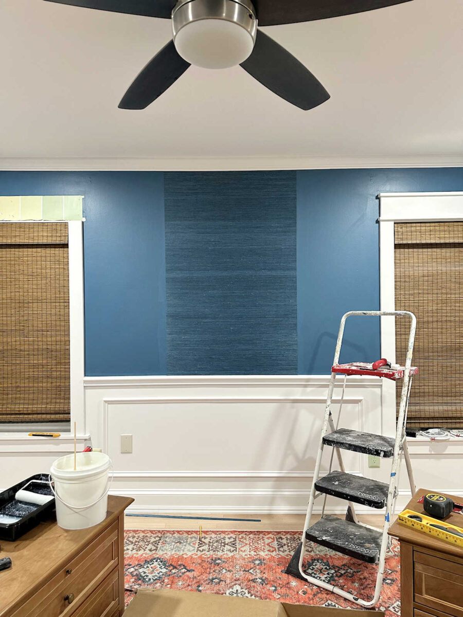
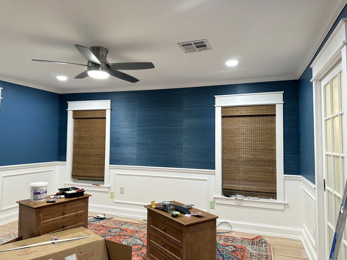
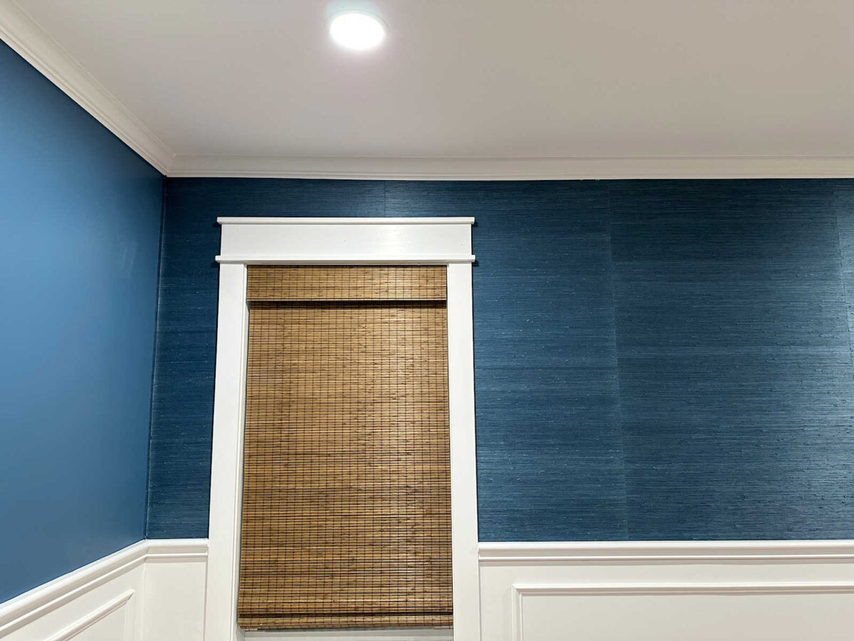
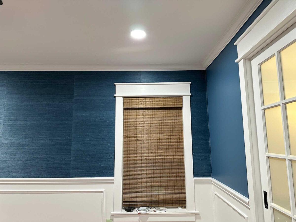
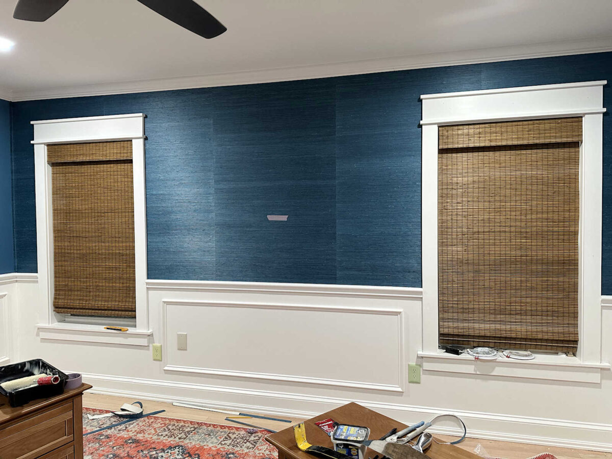
I was off to a good start and feeling pretty confident. This wall required five pieces, and I had cut all five pieces from the same roll and numbered them so that I could put them on the wall in order. So yesterday, I worked from that piece in the middle (piece #3), and worked towards the left corner, first installing piece #2, and then piece #1. And then I stood back and looked, and that center piece was very obviously darker than the other two.
I panicked a little bit and thought that I had messed up. Perhaps I had gotten bad advice from the videos I watched. Maybe I actually shouldn’t have flipped the pieces. Maybe grasscloth wallpaper (or this grasscloth specifically) has some sort of nap to it, like velvet, where it looks dark from one direction and light from the opposite direction.
But that couldn’t be it because I installed piece #3 in the middle of the wall going up, piece #2 going down, and piece #1 going up. Pieces #1 and #2 looked fine next to each other. But that middle piece was definitely darker.
So when I was ready to work the opposite direction, I had to make a choice. Do I stick with the same process of flipping every other piece (called reverse hanging)? Or should I install them all going the same direction? I was still unsure about the possibility of the grasscloth having a nap to it, and if that’s what was causing that middle piece to look darker. So I tried tacking the next piece (piece #4) to the wall going both directions to see if I could detect a difference.
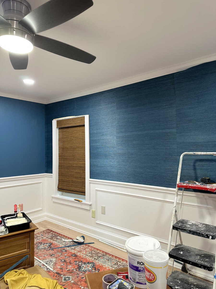
And no, I couldn’t. I ended up installing that piece going the same direction as the center piece, and even with them going the same direction, that center piece still looks darker.
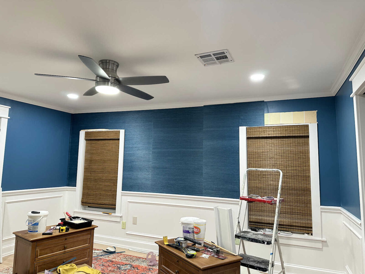
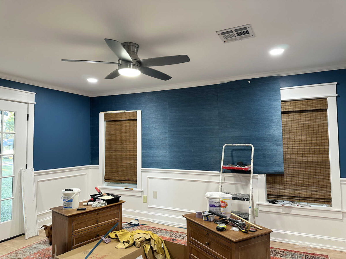
I went ahead and finished that wall and reinstalled the top trim above the windows. But it is a complete mystery to me why that center piece of grasscloth looks darker than the rest. Is it just because of the placement of the lights on the ceiling? Or is that piece that came out of the middle of that roll of grasscloth wallpaper truly dyed darker than the rest? That doesn’t make any sense to me.
So now, I don’t know what to do going forward. Should I continue to reverse hang the rest of the wallpaper? Because the reverse hanging is clearly not what’s causing that one piece to look darker since pieces #3, #4, and #5 are all hung the same direction, but it’s only #3 that looks darker. So it’s 100% NOT a nap issue.
Or should I just hang all of the rest of the pieces going the same direction? Ugh. I genuinely don’t know what to do here.
I’m not going to freak out about it. I’m going to move forward and get this done. And if I happen to have one piece of wallpaper left over when it’s all done, I might come back and redo this middle piece. But it just makes no sense to me why this piece appears darker in the first place. I really think it might be a lighting issue, in which case, I’ll be wasting my time replacing it since a new piece of wallpaper won’t change the lighting in the room.
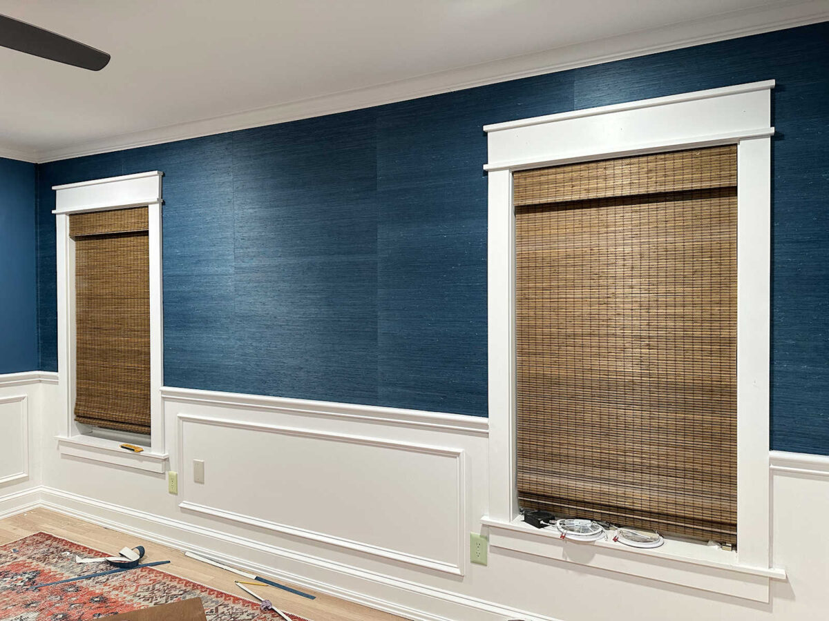
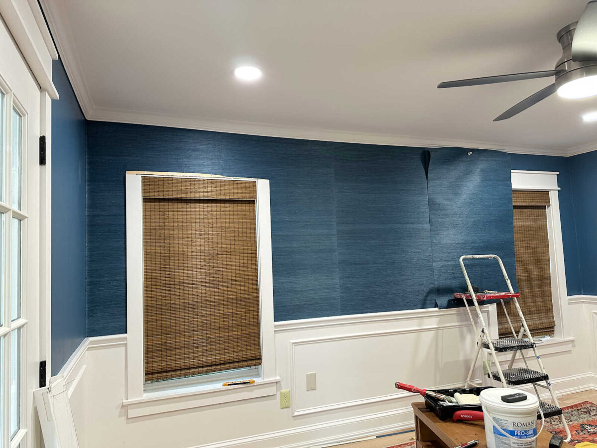
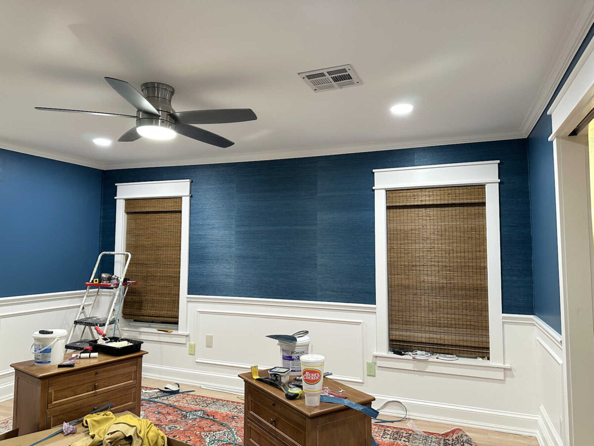
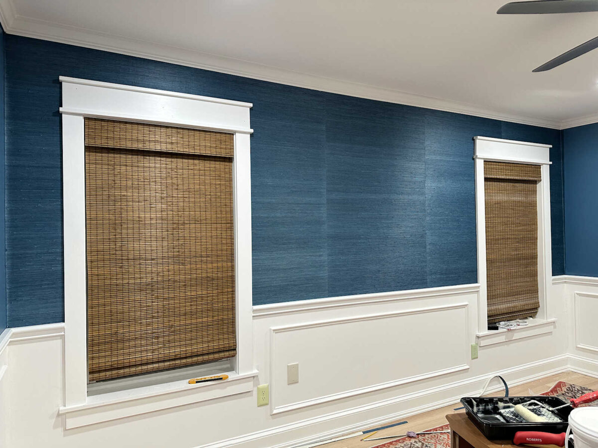
But you can see that these pieces look just fine next to each other, even though they’re hanging in the opposite direction.
And these pieces look fine next to each other even though they’re hanging in the same direction.
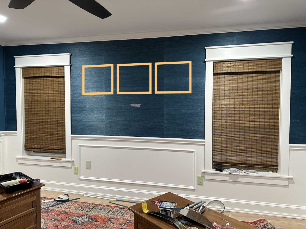
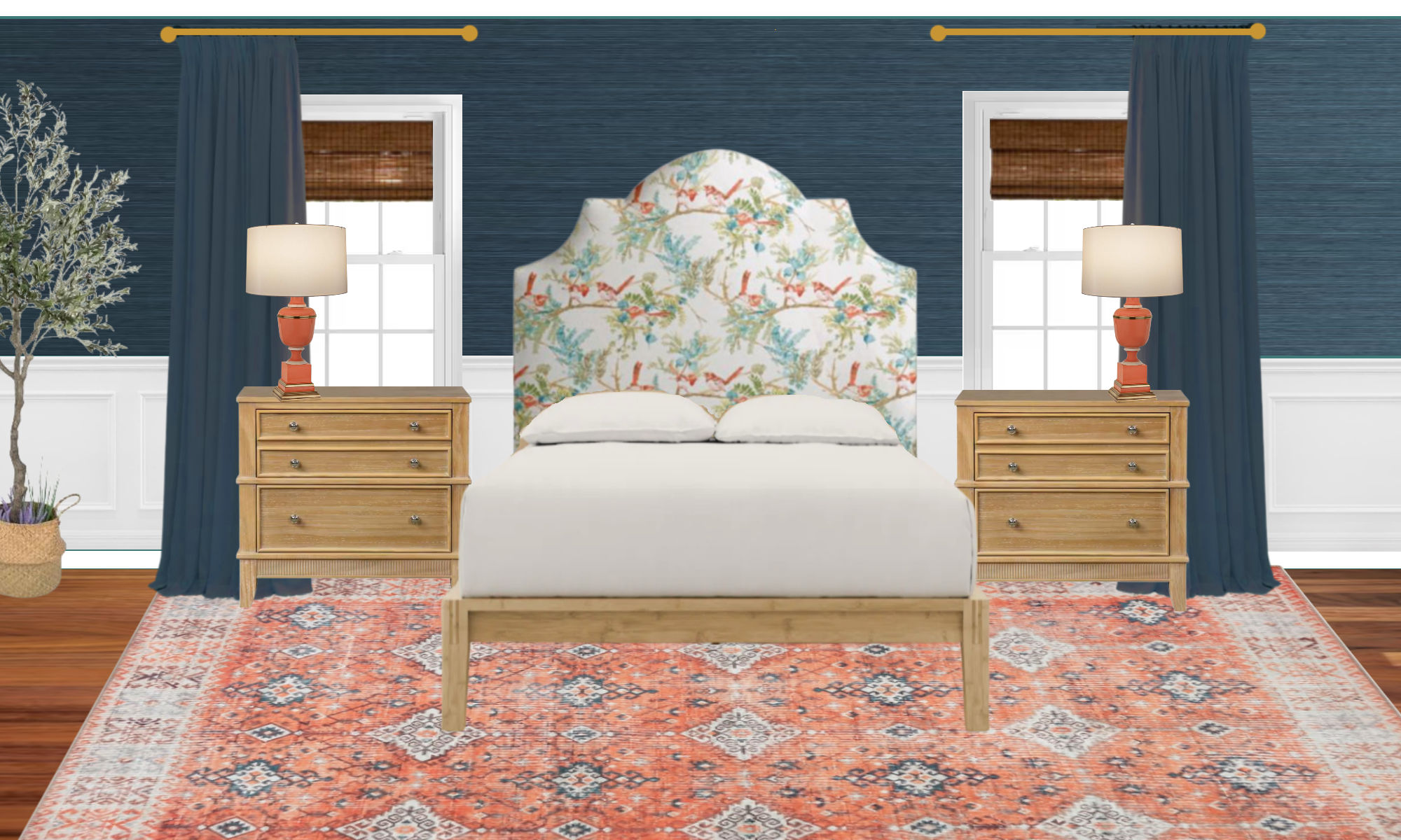
The good news is that a lot of this wall will be covered anyway. So even if I have to live with this one piece appearing darker than the others, I think it’ll be fine. I marked the height of the headboard with a piece of tape, which you can see here.
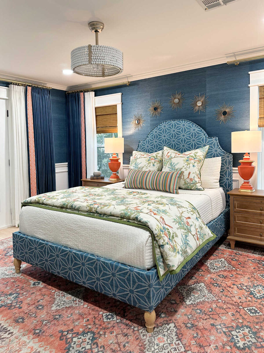
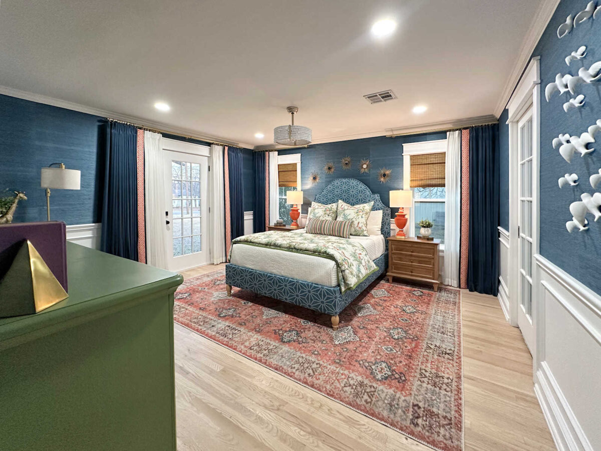
And then I can use some artwork above the headboard, like a series of three framed pictures, that can disguise a lot of those seams in those three pieces. It won’t cover all of the seams, obviously, but it’ll take some of the focus off of the seams and put the focus on the headboard and artwork.
So overall, I’m not feeling discouraged or defeated. The actual process of installing the wallpaper has gone very well. I went back to using the Roman Pro-555 Extreme Tack since that’s what I’m used to, and I think it’s so much easier. The extreme tack holds that heavy grasscloth in place so much better than the other one I tried. And it really holds down the seams very well.
I also stuck with the “paste the wall” method. I’m just being super careful when applying the adhesive right next to the previously installed grasscloth. I’m using a 2-inch Purdy sash brush (an angled paint brush) to very carefully apply the adhesive at the seam, and so far, I haven’t had any issues with the adhesive squishing out through the seam and getting onto the face of the grasscloth.
So I really have my method down, and I’m feeling pretty confident about the actual process of installing grasscloth wallpaper. Although, I’m still unsure about that reverse hanging method. It’s what the pros say to do, and yet, I’m just not sure about it. Even though I know 100% that the reverse hanging method isn’t what caused that center piece to appear darker than the rest, I’m still not sure if I trust it. So I might do a bit more reading and find a few more videos to watch before I move on to the other walls.
More About Our Master Bedroom
see all master
bedroom diy projects
read all master
bedroom blog posts

Addicted 2 Decorating is where I share my DIY and decorating journey as I remodel and decorate the 1948 fixer upper that my husband, Matt, and I bought in 2013. Matt has M.S. and is unable to do physical work, so I do the majority of the work on the house by myself. You can learn more about me here.


I have literally 0 experience with wallpaper, but maybe as the paste dries, it causes a slight darkening of the color? Hopefully at least.
That’s what I was thinking. Wet paste, dries darker.
I think it’s the angle and the lighting. With the headboard and the art it should fade in the background. You know you, though. Give it a few days and look at it during different times of the day and different angles.
What she ^ said!
This certainly is baffling. Before you mentioned the lighting I was wondering if the recessed lighting was the cause. Have you tried turning those lights off? Maybe try another source of lighting further away from the wall such as spotlights or lamps. I think once the headboard is in place with pretty pillows on the bed you won’t notice the difference in the darkness/lightness of the grasscloth.
When I saw the first pic I just assumed it was the light placement. If you do have a leftover panel maybe pin tack it up there to verify before going to the trouble of replacing. Either way it looks fabulous and seems pretty common for grasscloth.
This.
Hi Kristi!
I’m a huge fan of your work! let me ask about the light on the wall… Doesn’t it make diference on the pieces? The center looks like more shaded than the others…in the photos… In loco, does it look the same?
Hugs!
Patricia from Brazil
As others have said, it could be the lighting, and/or could be the center piece has had longer to ‘cure’. Either way it looks great and likely will not show at all once everything else is done. I’m looking forward to seeing it all done!
Is it possible that this piece is darker because it is the only piece that had the glue placed on the wall?
No, I stuck with the “paste the wall” process on all of them.
Didn’t you use a different kind of paste on this piece?
Is it possible because that piece is dryer it might be the cause?
Maybe it is the paste? You said you switched to a different type on other pieces.
It’s going great and I believe you have thought through every possibility that is within your control. Except the paste. Is the darker one with the other paste?
But I truly don’t think that’s the issue. The center panel simple has less light lines and that’s the “beauty” of grass cloth. As you’ve shown, the furniture and artwork will distract. Whether to flip or not, is a guessing game. I’d probably stick with reversing the strips since you’ve started with that, but I personally haven’t done that. However, I’ve never hung such an intense color. From my viewpoint, you’re doing fabulous.
Did you shine a light directly on the wall to check if it’s your light fixture?
You’ll also have the side table lamps that will change your lighting.
Reflective light : the nature of the beast in decorating. Walk through a home and on one painted wall the can have six different tones of color due to light angles, shading, natural light, overhead lighting etc. we are always hyper critical during going into a project. Don’t doubt your self, look at the room as a whole, but trust your instincts.
You got it, Marla.
I know this doesn’t matter because you’re the one that has to live with it but I honestly don’t see any major difference in the colors of the panels. Also, maybe the lights have something to do with the difference you’re seeing (1 panel doesn’t seem to have a can light in front of it)?
I think it’s gorgeous regardless and will disappear into the background. I also suspect it is the lighting. The wall really looks amazing so far. I was doubting the grasscloth and now I am not!
It looks beautiful, don’t overthink it. When the room is done you won’t even notice it.
Maybe it’s just because it’s been on the wall longer.
(Love the Chernobyl reference)
The grasscloth has striations of dark and light areas. It looks to me like that first piece has fewer light striations through it than the other two. I wonder if there’s a “whitewash” or something that you could do to add a tad more lightness to different levels of it and have it blend better. It will definitely be less visible once you get the bed and headboard in.
I see what you mean about the unique character that grasscloth brings to a space. Thanks for explaining that.
This is a dilemma, I see, but whatever the reason for the difference between panels, once the room is done no one but you will be the wiser. Well, we’ll know, but our fingers will keep the secret. Hang in there. 🙂
This will be a a fabulous room. Kudos to you.
I think it’s a lighting issue and would continue to hang them with the reverse method. It looks great!
I absolutely think it’s the lights. The cans are in front of the lighter pieces and there is no can light in front of the darker piece. I still think it looks lovely!
I came here to say exactly that. The puck lights are making the difference. Try opening all blinds and the door so you have plenty of light. Leave the lights off and see how it looks. Also, the light in the fan can cause some issues. I rarely use my fan lights. Just want the breeze.
You would think that if it’s the wallpaper, it would continue, at least a bit, onto the second strip you cut. So at the top or bottom of the second piece, it would somewhat match, don’t you think? So my guess is, it is the lighting or the fact that the paste has dampened it. Maybe as it dries, it will lighten. It was a different paste, so maybe it “plays” different, or it’s drying time is longer? I agree with leaving it until all the wallpapering is finished, and if you have enough to replace it, first put the new piece up with tacks to see if it will be better, before taking down that first strip! (And you will want to clean off the wall surface of the paste before hanging the replacement strip!)
I wonder if it’s because the adhesive has had time to set and it is drying??
It very much seems to be because of the lights. Compare that piece to the grass cloth in the corners. You could consider an uplight behind your bed to point up to that center piece so it won’t look so dark. Even if it’s actually a darker piece of grass cloth, that might help. Like these maybe https://a.co/d/fwc399W
That’s the beauty of grass cloth! Embrace it! And reverse it going forward as it’s meant to be hung!
It’s beautiful! Have you looked at it in all natural light? Open as many blinds and doors as possible to see the paper in natural light. It seems it really could be the ceiling lighting, as others have suggested.
Also, if the pros do a reverse hang, you should too.
It’s gorgeous! Please don’t overthink this. You are so close to this installation that I think its appearing more different than it really is. Finish up and continue on. I LOVE IT!
Get a big light/lamp/high beam and shine at that wall! That will show you if it is the lighting. And then you can cross examine it while it is blinded by the light, if all else fails.
Dear Kristi,
Wait the weekend and see if the side grass cloth pieces don’t darken up a bit as they thoroughly dry. You’ve probably got other projects that you might work on instead.
I wouldn’t spend a lot of mental energy trying to hide the darker panel just yet. If it comes to that, I’m sure you’ll figure out the perfect solution.
Have a great weekend!
YHWH Bless You : )
Imperfection is a sign authenticity. A painted wall has no imperfection, but a grass cloth wall will show it’s nap and texture. This all adds to the richness of the material. Finish the room and don’t worry about that variation in the pattern.
Myself, I would cut the next piece and btack it over the middle piece and see if that one looks dark too. I dont suppose you can remove any strips without ruining them if that was the case right?
I think grasscloth wallpaper is inherently different piece to piece. It’s an organic product so differences should be expected. In this case it could have been dyed incorrectly or and more probable it’s the lighting. I really hope your perfectionist tendencies don’t cause you to take it all down “because you just can’t live with the imperfections.” It really is beautiful and you’re doing g a fabulous job— it’s not easy I know.
Have you considered contacting the company that manufactures your grasscloth and ask them for specifics about its installation? I would expect they could give you the very best information for your particular wall paper.
Wait until all the paste is dry and see it that’s the difference
I 100% believe it is a lighting issue making the middle look darker. This was confirmed after I finished reading this post and there was a photo of the painted wall advertising “See All Master Bedroom DIY Projects”—the center of your painted wall looks darker! I say continue on and enjoy the nuances of the grasscloth😊
To me, some of the pieces do look as dark as 3 (1 in the corner for instance). It may be variance in the dye/color due to how dark the teal is and the saturation on natural fiber. If it were me (and you don’t find another answer) I would continue th reverse hang even though you can’t tell a difference. For some reason, I’m thinking exposure from being hung eearlier may have affected the color, but I don’t know. It will be interesting to hear what you find out. It’s really beautiful though.
It looks gorgeous!
That center piece appears darker because of the lighting shining on the strips to the left and right. If you didn’t have the lighting illuminating those places, perhaps shining on the center strip instead, the 3 strips would look closer together in shading.
But, I like the variations, even the dark and light. I’d leave it alone. You’re doing a wonderful job.
The headboard in your mockup seems to be taller than where you marked the top with a piece of tape. What is up with that? The three pictures about the headboard look good. No one but you will even notice the slighter darker grasscloth in the center. Honestly it looks just like grasscloth wallpaper looks……very textured…..lovely.
I’m looking at your post on my huge computer screen. I’m a perfectionist too and honestly, I don’t see what you are seeing. I think when the headboard is in place and the pictures are up, you won’t see it either. I think it may just be the lighting in the room. It looks beautiful.
Reversing looks much better to me.
Looks like it’s just lighting. I wouldn’t worry about it – it’s grasscloth!
I’ve never INSTALLED grasscloth, but I did “inherit” it in a house I bought. There were two areas that wasn’t comfortable with the color match, and another artist friend of mine suggested trying to touch it up with watercolor paint using a damp brush followed by a short shot with a hair dryer set on low. We tried it first in a hidden area and it worked like a charm! There was no appearance of alteration, and I ended up with nearly perfect grasscloth walls! Something to keep in mind, because of the inevitable shade variations.