
Choosing And Designing The Other Dining Room Fabrics (I’m Having Trouble With This)
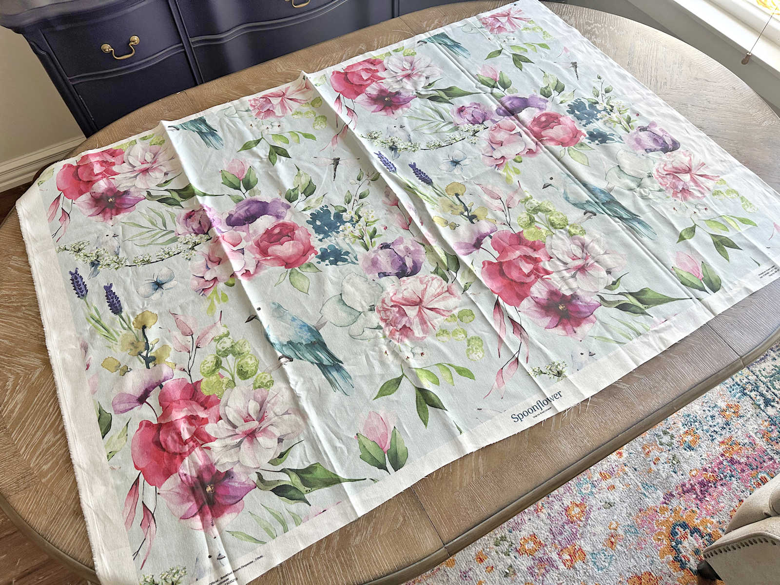
I’m having trouble figuring out the fabrics for the dining room. So far, the only one I have is the floral/bird fabric for the curtains and the backs of the dining chairs. The rest is presenting a challenge for me.
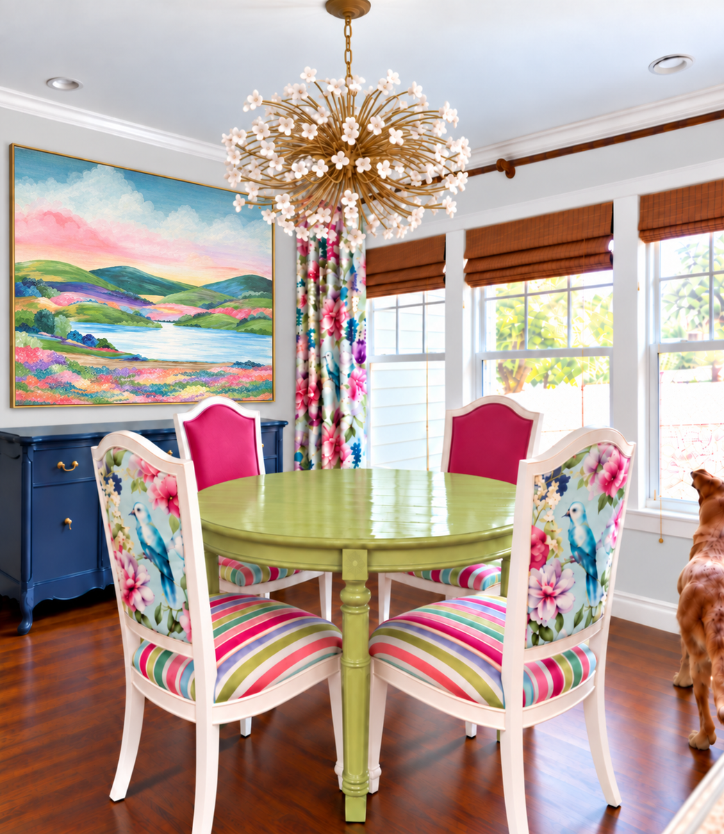
Here’s the vision. I had ChatGPT update the picture with my new landscape painting. I’m not quite sure why it made it rectangle instead of square, but it is what it is. I’m still working on framing the real one.
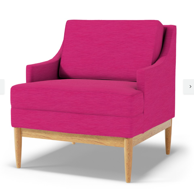
I found this solid magenta fabric that might work for the seat backs. I might order a sample of this one, or I might just create my own from a color directly from the curtain fabric. I think this one might be just a touch too purple, and I really want it to be more on the pink side. But when I compare this to the picture above, it looks really close.
Where I’m running into trouble is with the striped fabric. I like the striped fabric in the mockup, but when I start designing the fabric, I want to add more colors. But when I add more colors, it leaves less room for the white. So I’m not sure if I should use fewer colors to leave more room for white, or if I should stick with more colors and less white. Here’s what I’ve come up with so far. The scale is obviously not right. These striped are way too wide. But right now, I’m just trying to get the colors right.
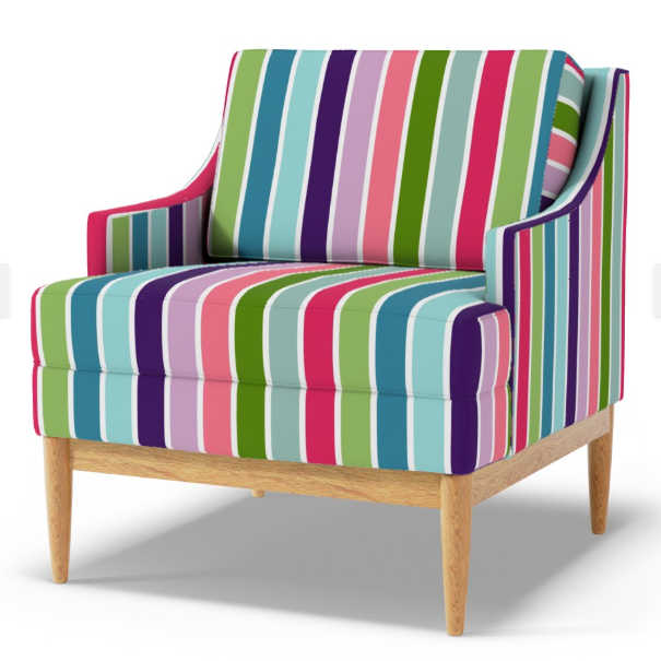
I took the colors for the stripes directly from the drapery fabric, so I know the two coordinate as far as the colors go.
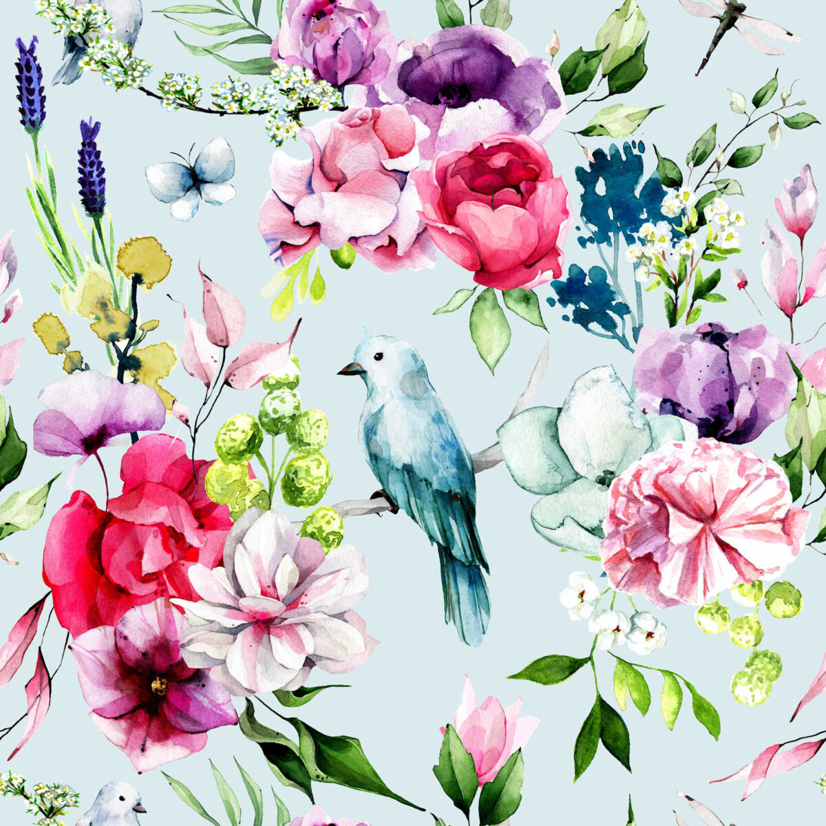
But I’m stlll wondering if I’m trying to put too many colors into a fabric that will just be used to cover dining room chair seats. They’re only 18 inches wide, so if I go with more colors and less white, it’s possible that the colors won’t repeat.
I’m also trying to figure out what fabric I should use on the new benches that I’m going to build to flank the pantry doorway. I can’t remember if I even shared this, but I’ve decided to go wtih the scalloped bench.
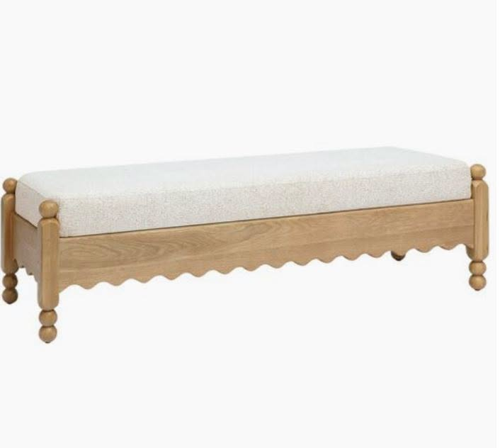
If I keep the cushion neutral, I already have fabric for that. I bought about 13 yards of Krypton fabric in a neutral color to reupholster a sofa many years ago, but then I never reupholstered the sofa (I painted it instead 😀 ) and then I got rid of the sofa. So I still have most of that fabric left over.
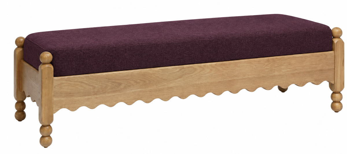
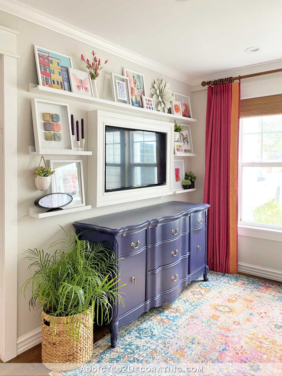
But I kind of feel like using a neutral color in a room that I want to be really colorful and fun is a lost opportunity. But I have no clue which direction to go with the color. I’m considering going with a dark purple color that brings the buffet color to the pantry wall, but I’d make it maybe a shade or two lighter than the buffet. This isn’t exactly right, but it gives us an idea of what a dark purple might look like on that bench. The dark purple would kind of ground the benches and give me a good foundation for some bright, colorful pillows.
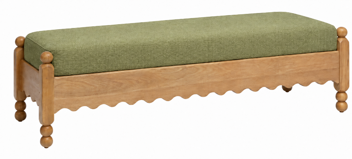
Or I could go with a green that’s a couple of shades darker than the dining table.
But I’ll probably go with one of those solid colors — neutral, dark purple, or green. And then I’ll use pillows to bring in the other colors that I want on that wall. The bottom line is that I’m feeling stuck with the fabrics for this room. I know I’ll figure it out, but the process isn’t going as smoothly as I had hoped.
More About Our Breakfast Room
see all breakfast
room diy projects
read all breakfast
room blog posts

Addicted 2 Decorating is where I share my DIY and decorating journey as I remodel and decorate the 1948 fixer upper that my husband, Matt, and I bought in 2013. Matt has M.S. and is unable to do physical work, so I do the majority of the work on the house by myself. You can learn more about me here.
How about using the same striped fabric on the chair and bench
The first thing I thought of when I saw the stripes was old fashioned stick candy! Maybe try making stripes of different widths? The colors look great!
Maybe try narrower stripes further apart, with more white (or wall color) in between?
It never goes as smoothly as we hope :). All the mockups in the world just cannot replicate a real space. I vote fewer colors and more white in the stripes. Actually, a lot more white, with narrower stripes. That would be refreshing, pull your chandelier into the mix better, and show off the pistachio green of the table. And it won’t compete so hard with the birds on the curtains and chair backs. I think what you’re struggling with here is balance. I vote purple on the benches to pull some of that color across the space.
I like the mockup of the upholstered club chair but I prefer the more painterly stripes that ChatGPT used on the table chairs. I also would prefer that maybe 3 of the colors have an opportunity to repeat. As to more white, if you look at the ChatGPT image, there is an artifact. The white is much wider on the sides of the chairs than on the center of the seat in case that helps you decide. I’m sure i will be lovely no matter what you go with.
I think the colors are correct, they are just to vibrant and compete with the beautiful fabric of the chair back. They need to be muted to allow the bird fabric to shine. Can you select paler colors in the same tone?
I LOVE that dark purple on the bench. As soon as I saw it.
The striped fabric–in the mock up the stripes don’t look to be a single toned solid. That might just be a ChatGPT thing…but I think I like it. Try the stripes with a mottled or watercolor look to them to give more dimension/interest. And I’d keep less colors. There’s a LOT going on in this room, the stripes could easily go from coordinating to circus.
Neutral on the benches feels like the least Kristi decision ever to me! Given that both color options are more muted solids they feel grounding and don’t scream for attention while still adding a splash of color. I really like the purple, but go for whatever you think the room needs after you sort the chairs.
For some reason I just wasn’t sold on the stripes. Then I read Bonnie’s comment and she hit the nail on the head for me. The stripes are competing with the lovely bird fabric.
Let’s see what a toned down version would look like.
Do you need narrower stripes? Like a LOT narrower? Maybe varying widths?
If you know the piece that you’ll be using for the chair back, I’d take my cues from that. I honestly think you should NOT use all the colors, just a select amount that coordinate with the chair back. I’m sure you’ll land on the right ones that suit you.
You could always dye the fabric you have. Sounds like you have enough to test it out a bit first.
For the bench: I agree a solid color seems good. The lighter colors seem to fit best. Dark ones read as moody vs bright contrast for me.
Pinks: The seat in the music room? That pink is one you have BIG and can see if it works in the rooms light. Repeat for other pink upholstery you have. You’ve used a saturated pink and have samples to pull from. Then match that with your sample from spoonflower.
Seats: The stripes shown are impossible to replicate, it changes the pattern at each opening. You did a custom striped fabric for the pillow on your bed, so I figured it was similar to that.
There are some excellent comments here already, but I will add my two cents. First, I would opt for more white with fewer colors. It will tie in better with the white chair frames, as well as with the chandelier. It also works better with the lightness of drapes. The fabric-of-many-colors is heavy looking as well as very matchy-matchy. I would also guess that you are more likely to change out your artwork than you are your drapes.
I liked the suggestion that you upholster the benches with the same striped fabric of the chairs, but only if it coordinates well with those incredible pantry tiles.