
My Finished Landscape Painting For The Dining Room (Plus Framing Options)
Yesterday, I showed you the progress that I had made on the landscape painting for the dining room, but I mentioned that it may or may not have been finished. I wanted to take some time away from it and then come back and see if there were any changes I wanted to make. And of course, there were plenty of changes and additions I wanted to make once I came back to it.
Here’s what the painting looked like yesterday…
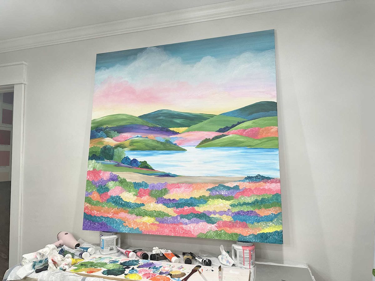
I thought it was a good start, but I wasn’t really pleased with the flowers in the foreground. Plus, there were a few details I wanted to add.

So after spending yesterday afternoon working more on the foreground flowers and adding more details and color, this is what the finished painting looks like.
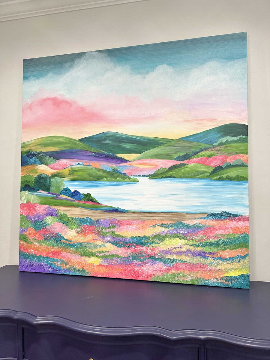
There are still a few tweaks I’d love to make to it, but I decided to stop and walk away. One thing I’ve realized is that I can get completely lost in painting, obsessing about details and making tweaks and additions. When I started yesterday afternoon, I thought I’d spend about an hour on it and move on to another project. But I put my headphones on, turned on a podcast, and got lost in the project with my tunnel vision. There’s something so relaxing and immersive about the process. The next thing I knew, it was four hours later, so I just had to force myself to stop.
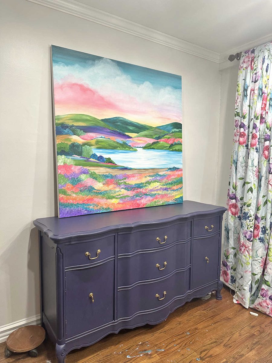
Even though there are more tweaks I could make to it, I have to say that I’m very pleased with how this turned out. It’s not the first landscape I’ve ever painted, but at 48″ square, it’s definitely the biggest landscape I’ve ever painted. The sheer size alone felt a little intimidating before I started, so I’m pretty proud of myself for jumping right in and tackling this project.

Here’s a side-by-side comparison of the almost-finished painting that I shared yesterday and the finished painting today. It’s like one of those “spot the ten differences” challenges. 😀
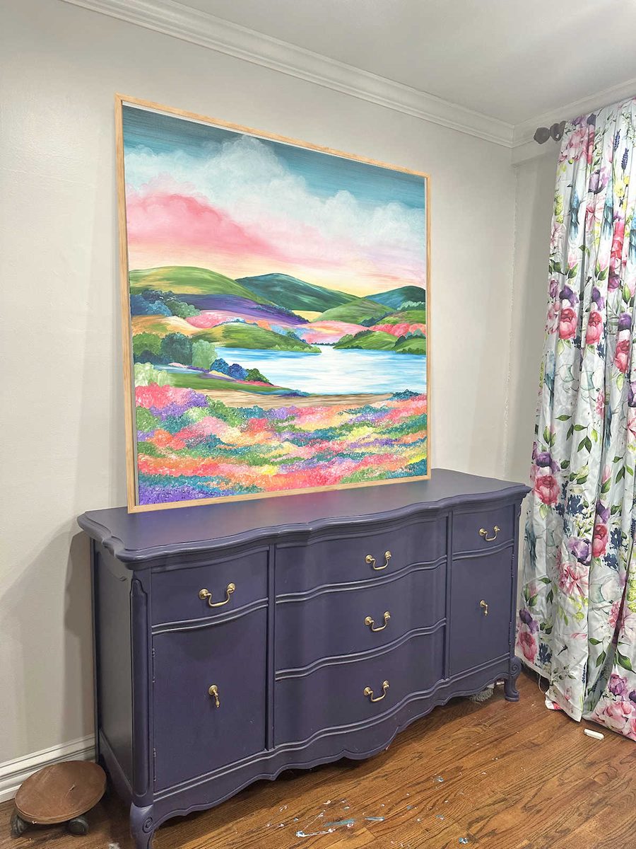
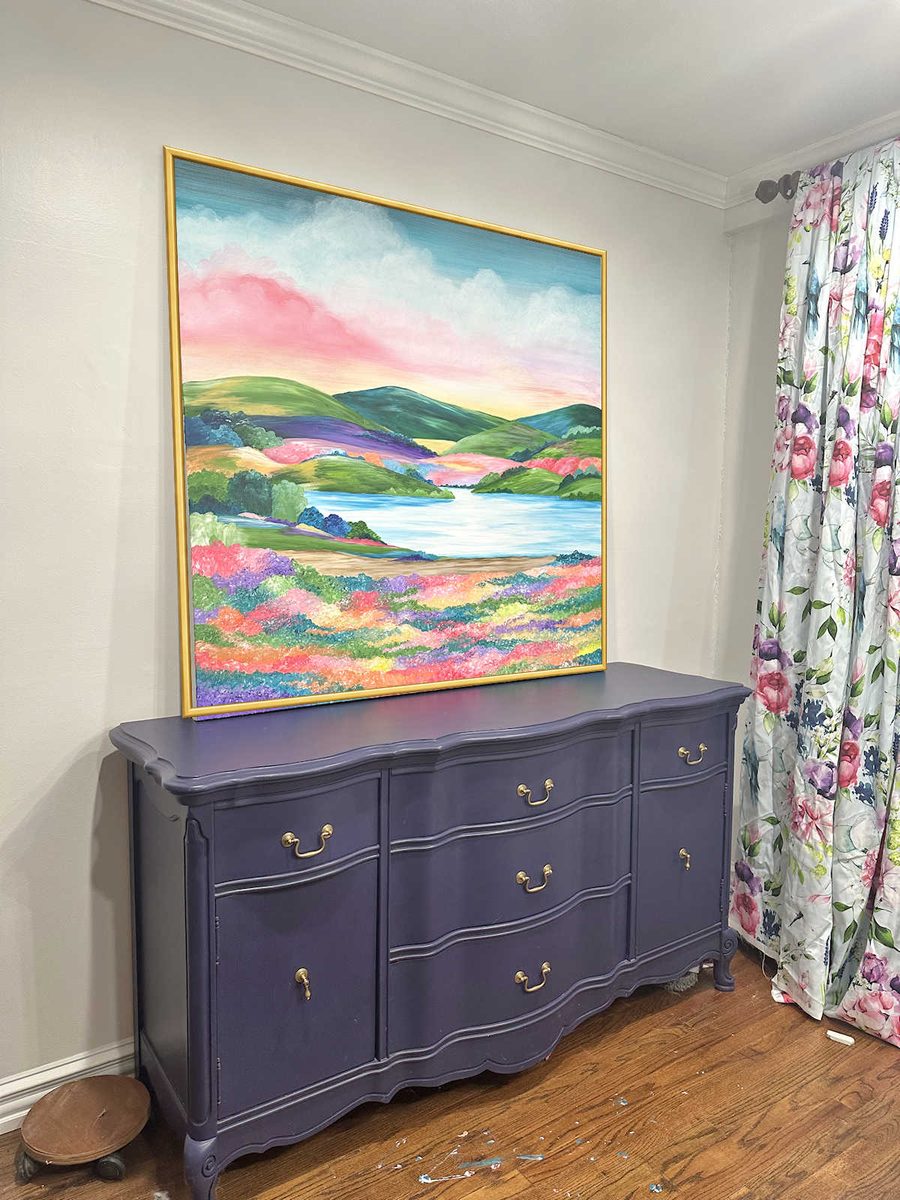
My goal today is to get it framed, but I’m not quite sure what color the frame needs to be. The three obvious options are white, gold, or natural wood. I’ll be making the frame myself, and I don’t want anything fancy. I want it to be very simple and thin.
These mockups aren’t perfect, but they demonstrate the ideas. Of course, the painting will be hung on the wall, but I don’t have a picture of the painting hung on the wall to work with yet. But here’s what it would look like with a thin natural wood frame. You’ll just have to imagine that it’s hung on the wall.
Here’s what it might look like with a thin gold frame.
And here’s what it might look like with a thin white frame.
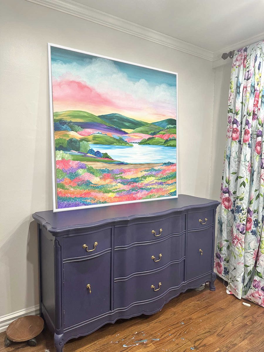
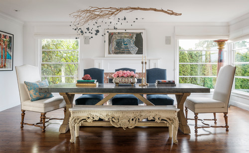
At the moment, I’m leaning towards gold, but you can tell me what you think. Natural wood, gold, or white? I like all three, but they each give it a different look to the whole room. Natural wood is pretty and I like the idea of every room having some natural wood tones. The gold makes the room feel more elevated and fancy. And the white gives a more casual look but would match the white dining chairs.
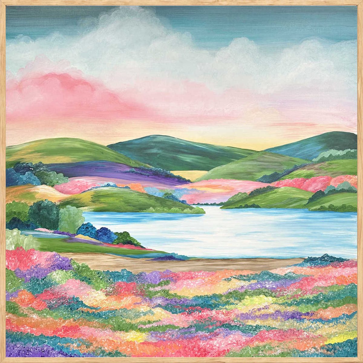

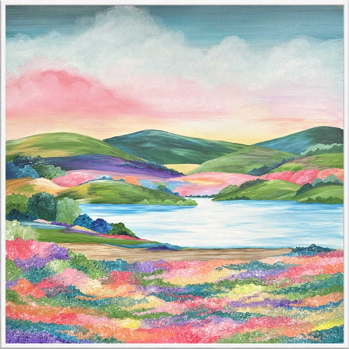
I’m just not sure about the frame. At the moment, I think the gold is my favorite, but I keep waffling back and forth between the white and the gold. I really like that the white adds more lightness and brightness and would look great with the dining chairs. And I think my style is more casual than elegant anyway. But I do love a simple gold frame.
More About Our Breakfast Room
see all breakfast
room diy projects
read all breakfast
room blog posts

Addicted 2 Decorating is where I share my DIY and decorating journey as I remodel and decorate the 1948 fixer upper that my husband, Matt, and I bought in 2013. Matt has M.S. and is unable to do physical work, so I do the majority of the work on the house by myself. You can learn more about me here.
gold
Gold
Gold
Thin wood frame. And I spotted several differences immediately. Well done!!
Your painting is lovely. ☺️ I think the gold frame suits the room and painting best. ☺️
Definitely the gold! It not only truly “frames” your beautiful painting, it also brings out the pulls on the buffet!
Definitely agree! If the buffet is staying, then a gold frame looks best to my eye.
Nice job! Love the extra touches. I like the white or gold. I’m just having a problem picturing it on the wall with the rest. I guess you would see the lamp above it toward that wall, and you have both colors in the lamp. I think either would look great.
Gold
I love the gold. It’s elevated but still simple. The white cheapens the painting in my opinion. It turned out so beautiful!
Love the tweaking, it looks amazing. I like the gold frame the best, but they all look great.
Cheers to you, Matt, and the Fur Babies!
I like the gold.
White
I’m liking the white frame.
gold, but a floating frame.
Gold for sure!
Gold!
I love the gold frame – I think it makes the painting look more special, if that makes sense.
Wow! The blending and adding of defnition sure changed the landscape. I LOVE it! Gold frame, definitely.
My first choice is gold, second choice white. I think the natural frame looks “unfinished” – like someone tacked raw wood together.
Beautiful landscape painting, though! I like the changes you made from yesterday to today. I’m so impressed with your talent and skills.
Gold!
My vote is wood or gold. White makes it look too casual and less custom.
I like the idea of a floating frame also, dressed in a gold frame, which would really bring the yellows out. Don’t forget your signature or initials, and the year you made your beautiful painting.
Brava, well done! I didn’t comment yesterday because I figured your mom would tell you that you need to add depth, especially to the foreground, with highlights and shadow. The update is much better and looks more professional. I like the gold frame which pops the yellows a bit and give the painting even more dimension. I think it’s thin enough that it doesn’t make it too elegant but adds a bit of contrast to the chairs.
That is absolutely lovely! I like the gold frame the best.
I have always wanted to try my hand at a triptych, but I feel like I would be in over my head. This gives me motivation to try it!
Not sure about the gold with the handles on the buffet. If they match, ok, if not, tone the frame down. Otherwise I like white and natural. In my house, I’d probably slap a thin black frame around it. I like using black as an accent.
Frequently can’t tell about colors not next to each other, i.e. the gold. Just seems a bit too bright in the picture compared to the handles.
Awaiting your choice M’Lady!
I don’t feel like the white frame adds anything, but to me the gold seems to be just the right touch!
Im on the white team. Lol love it.