Reader Question: How Do I Decorate Walls With Really High Ceilings?
Today’s reader question is from Laura, and she needs help with decorating walls with vaulted ceilings in her kitchen and entryway. Here’s what she has to say…
Laura’s Question:
I have high ceilings throughout the main living area and kitchen, and I am at a loss as to what to do with them in the kitchen and entry. The kitchen cupboards only go half way up. What should I do with the expanse of wall above the cupboards?
Nothing can be hung on either side of the front door because artwork rattles and fall off. I did stencil around the door but it seems pretty unsophisticated. Any thoughts?
(In a follow up emails, Laura sent this additional information)
In my previous email, I realized I was asking your advice about two areas – the kitchen and the entry. I should have broken those down into two different emails and provided you with additional photos so you could see the entire living area. So, please let me try again!
The main floor of our house has high ceilings which I love. However, I don’t know how to decorate the entry wall. Unfortunately, I can’t hang anything there as that is a high traffic area, the wall gets bumped and artwork falls off. I finally gave up and stenciled the wall. Would you please give me advice? I’d appreciate any thoughts you have regarding the entire living room area. (Also, I’d love hardwood floors throughout the area but I am afraid it would sound echoey.)
Laura’s Kitchen, Dining Room, Entryway, and Living Room:
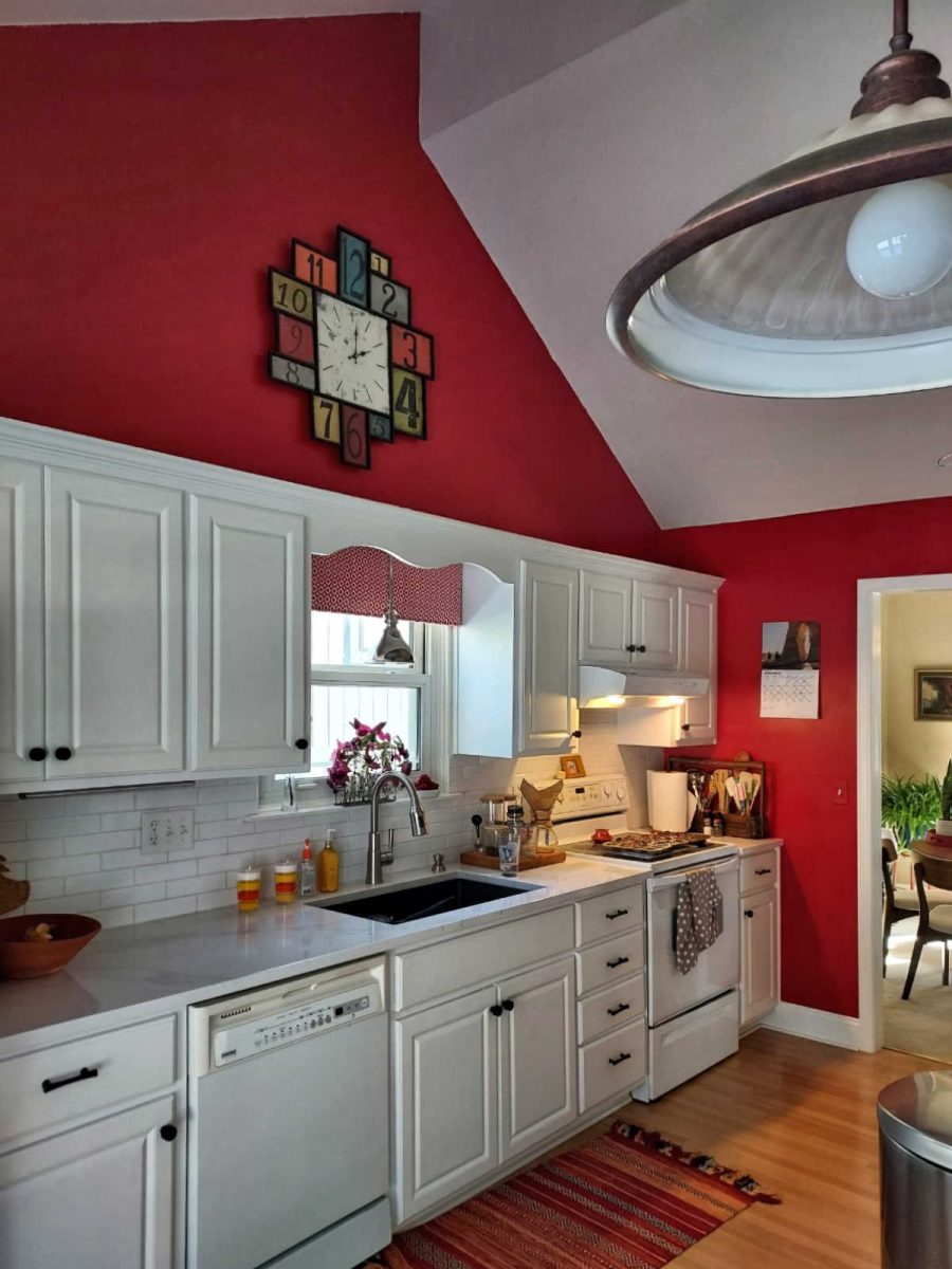
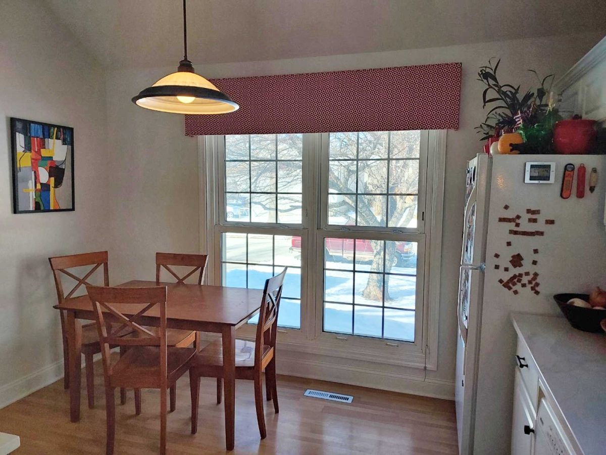
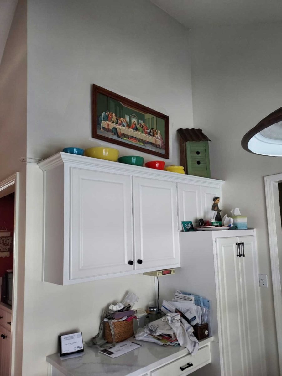
Here’s Laura’s kitchen with the problem wall. The kitchen cabinets are standard height, which leaves this large expanse of wall above the cabinets. She’s struggling with decorating walls with vaulted ceilings in her kitchen.
On the other side is this cabinet area with the same expanse of wall above the cabinets.
To the left side of the red wall with the cabinets is this breakfast area.
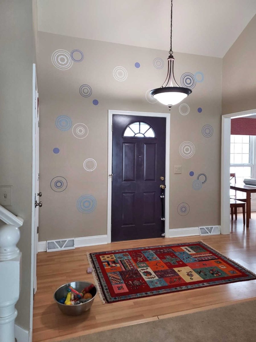
This is Laura’s problem entryway where she originally tried hanging artwork, but gave up on that idea when things would fall off when the door was closed. So instead, she went with a stenciled design.
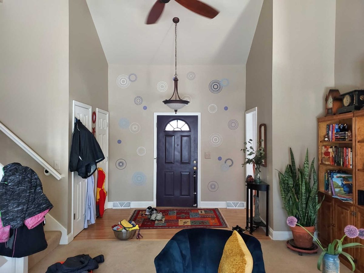
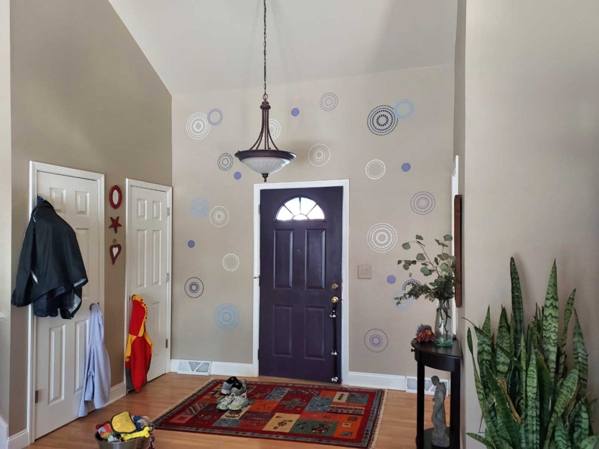
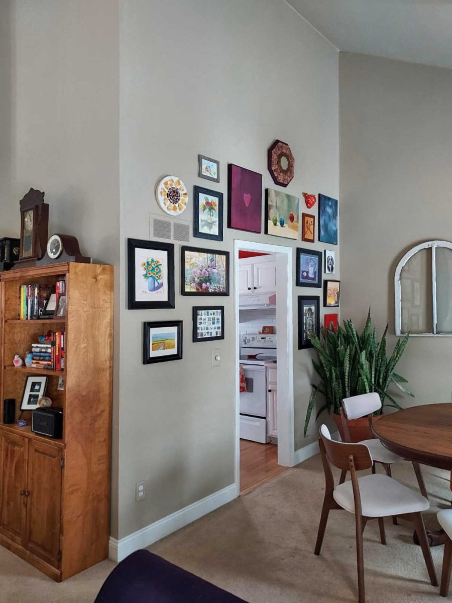
And you can see that to the right of the entryway is the breakfast area in the kitchen, which means that the red wall of the kitchen is seen from the entryway.
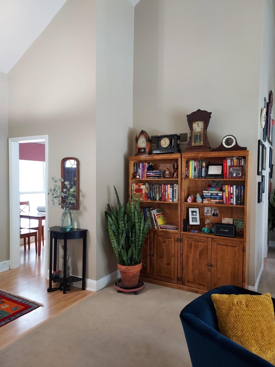
Laura has these tall walls and soaring ceilings throughout the whole main living area.
And here we can see where the doorway to the right of the red wall in the kitchen leads. It leads to the dining room.
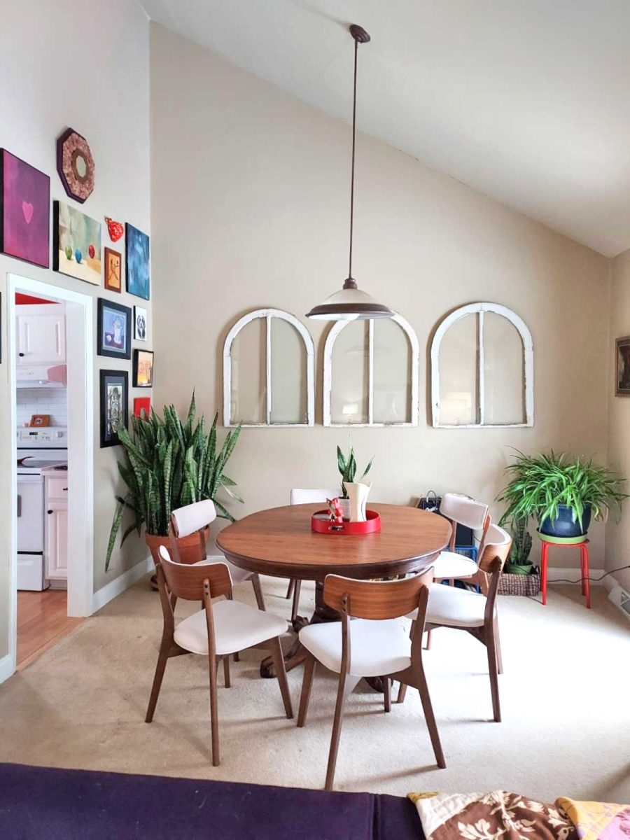
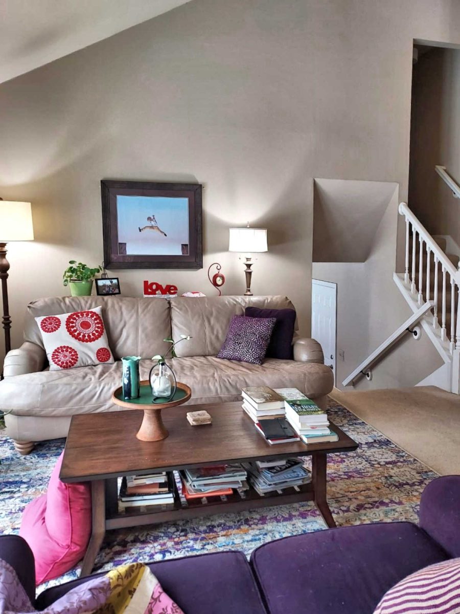
And the dining room and living room are open to each other, with the far wall of the living room being a standard height (looks to be 8 feet to me).
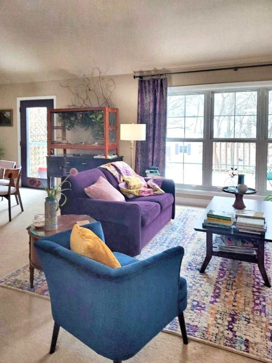
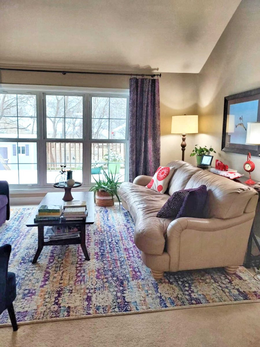
So the high walls in this area are on this wall of the living room, the opposite wall in the dining room, and the entire side with the entryway.
My Suggestions:
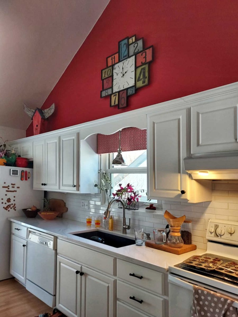
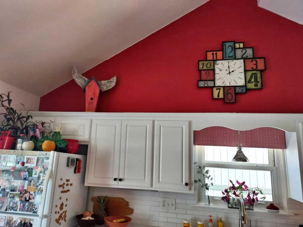
I agree that decorating walls with vaulted ceilings can be very challenging, especially in areas like this one above the kitchen cabinets. So as far as the kitchen goes, I don’t think that the problem is that you need to find a way to decorate the expanse of wall above the kitchen cabinets. I think the problem is the wall color. Because that wall has such a soaring ceiling, and it has such a bold, eye-catching color on it, that wall space above the cabinets automatically becomes the focal point of the kitchen. And because that’s what your eye is immediately drawn to, and it’s a bare wall except for a clock, you feel obligated to decorate it so that when your eye is drawn up there, you’ll have something interesting and decorative to look at.

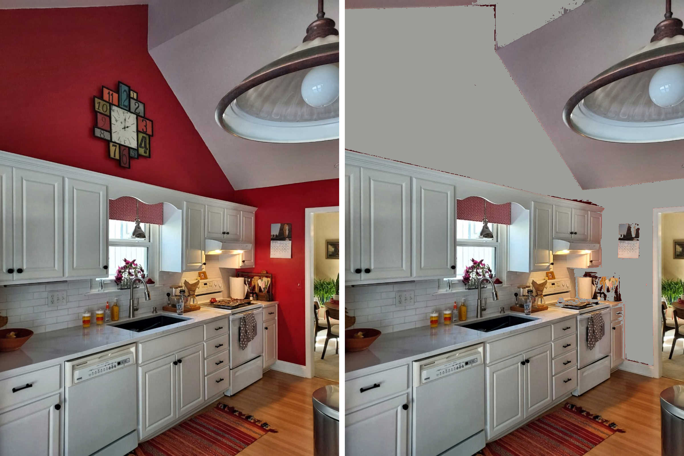
But I personally think that’s the wrong approach. If this were my project, I would paint over the red with the same neutral color that’s on the other walls, and that way your eye will be brought back down to the kitchen cabinets, which are generally the focal point of a kitchen.
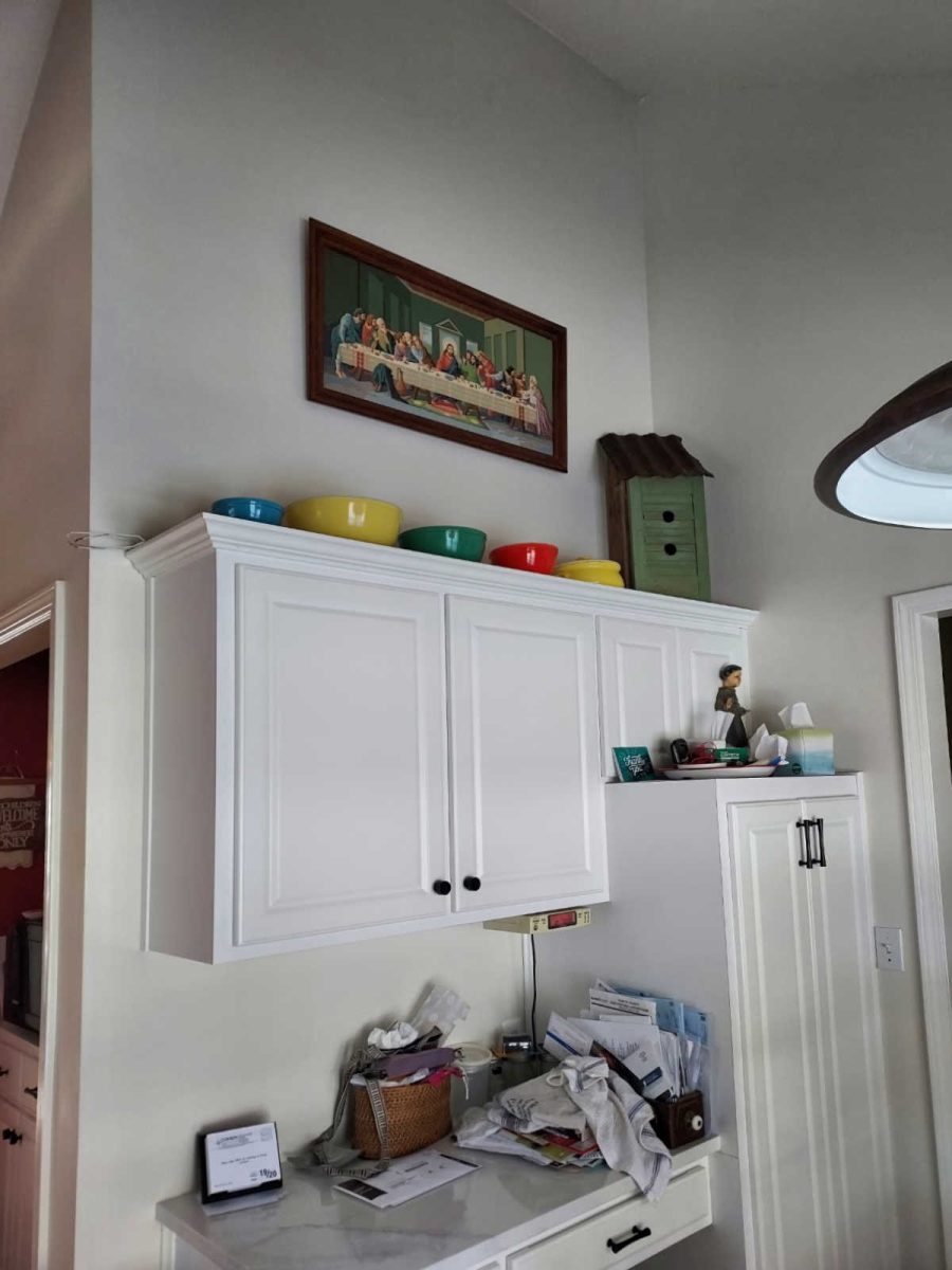
You can see how vastly different this red wall with the cabinets looks from this opposite neutral wall with the cabinets.
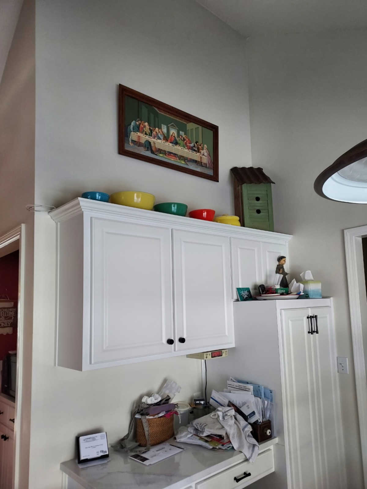
On that wall, because there’s no red that goes all the way up to the ceiling, your eye isn’t drawn up to the ceiling to highlight the expanse of wall. Instead, the eye is focused on the cabinets and the artwork above. I don’t really think it’s necessary to fill up space on top of kitchen cabinets, but I realize that some people do like to decorate up there. So after the wall is neutral, and if you still want stuff up there, keep your decorating more in relation to the cabinets (i.e., keep things on top of and close to the top of the cabinets) rather than feeling the need to fill up as much space as possible.
Just as an example, if you want to keep the decor that you have on top of the cabinets in the picture above, I think that the horizontal artwork needs to be brought down a little bit so that all of the items up there look like a composition, rather than the framed artwork floating on its own, looking like you’re trying to take up space.
Anyway, this is a really bad photo editing job, but you can see how the red draws your eye up, while a neutral would allow you to focus on the cabinets.
And if you want to take it even further to make the kitchen cabinets the draw the eye, you could do two things. And if this were my home, I would do both of them, but I realize they’re both projects that many people would find overwhelming, so it’s certainly not required. 😀
First, I would extend the tops of the cabinets so that they terminate with the top of the lowest parts of the wall.

That project would require (1) removing the existing top crown molding, (2) adding a board horizontally across the top up to that point on the side wall, (3) add a small trim to cover the joint where the original top of the cabinet face meets the new board, and (4) reattach the crown molding. That was one of the first projects I remember seeing Layla and Kevin at The Lettered Cottage do in their first home. This was many years ago, and I’ll never forget the difference it made. I can’t find the tutorial they did, but you can see the before and after here.
And secondly, you could paint your kitchen cabinets a color other than white. And you know if this were my kitchen, I’d do that in a heartbeat. 🙂 It’s a big job, but done right, it only needs to be done once. And it would certainly make the cabinets the focal point of that kitchen, and no one would give a thought to that expanse of wall above. But of course, it’s certainly not necessary.
Now on to the entryway. If this were mine, I’d make that entryway wall a massive gallery wall. I mean, “go big or go home” kind of mindset. And I suggest that simply because I can see in the photo of the doorway that leads from your dining room to your kitchen that you obviously like gallery walls, so this entryway seems like the natural place for it, in my opinion.
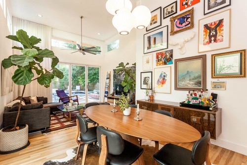
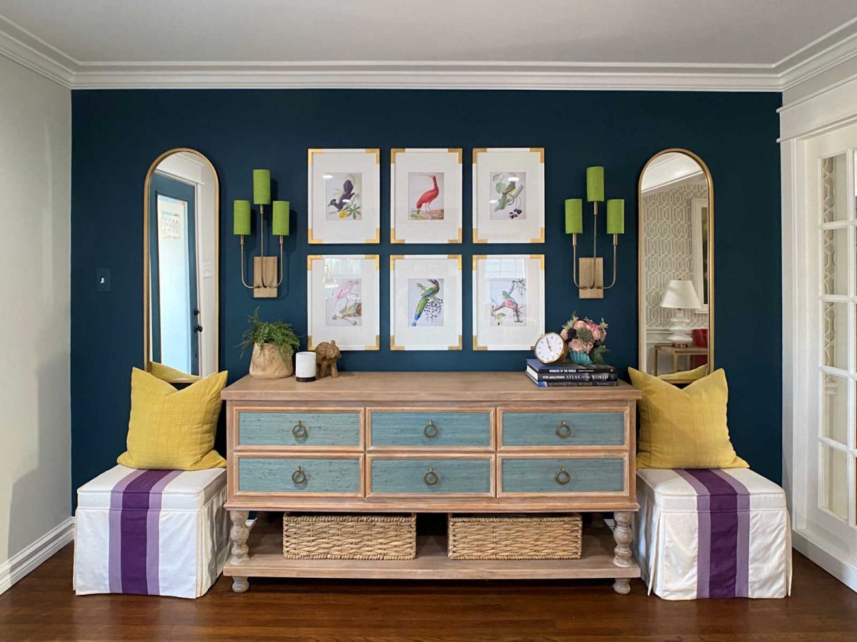
This isn’t exactly your situation since it’s not on a wall with a door, but it is an example of a gallery wall that takes up most of the vertical space. And it’s awesome. 😀
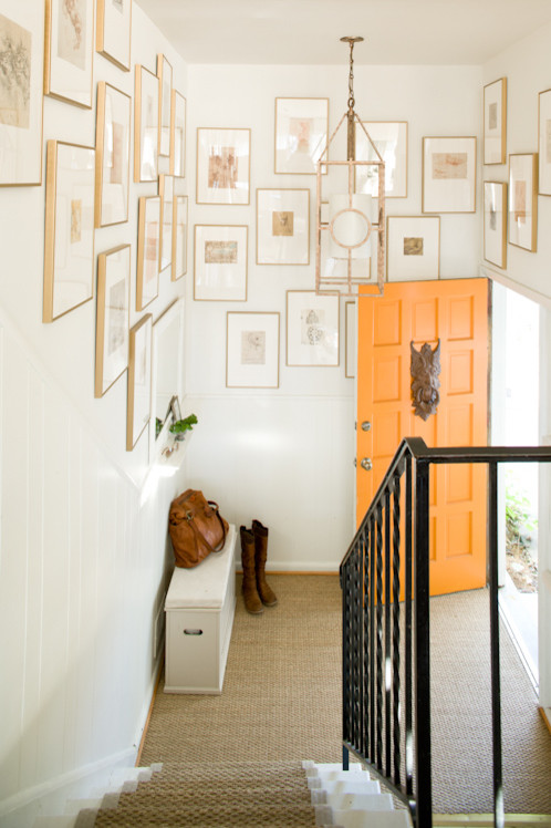
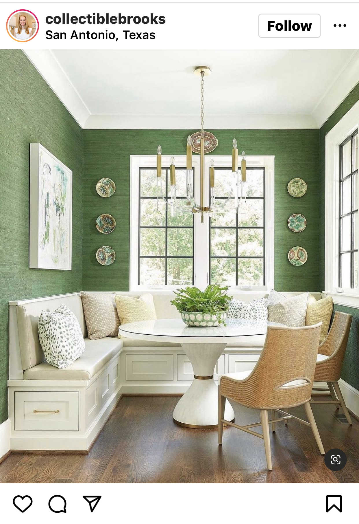
And this one is definitely not your particular situation either, but it’s definitely a “go big or go home” mindset with a gallery wall near a front door. And I think it looks amazing.
Now I know right now you’re probably thinking, “But I told you I couldn’t do artwork on that wall! It’ll fall off!” But I assure you that you can. You just need the correct picture hanging tools. And in this case, hanging artwork on a wall where it needs to stay put requires 3M Picture Hanging Strips. It’s a two-piece system that’s almost like works kind of like Velcro, but these strips are covered in tiny plastic grabby things that “snap” together more securely than Velcro does. You place one part on the back of the picture, and one part on the wall, and after waiting the requisite amount of time (check the directions), you “snap” them together, and the artwork won’t budge.
These are what I used to hang the artwork on my entry wall, and those things stay put. And while they’re not on the same wall as my front door, I do live in a house with a pier and beam foundation, so someone just walking through the house makes the floor shake. But I’m not a gentle person, and I’ve slammed that door more times that I could count, and my pictures stay put. I could intentionally stand there and open and close my front door 30 times, slamming it as hard as I could each time, and those pictures won’t even budge a hair, much less fall off of the wall.
But I do agree that the wall stencil probably isn’t the best choice for that wall. Actual artwork would be preferable. And I hope you’ll give those 3M strips a try because they’re amazing! I use them on literally every piece of artwork I hang on my walls, and nothing ever moves, regardless of how many times I bump into them or slam my front door. I never have to go through my house straightening frames on my walls because everything on my walls stays perfectly in place.
So that is my input on the specific two areas you asked about.
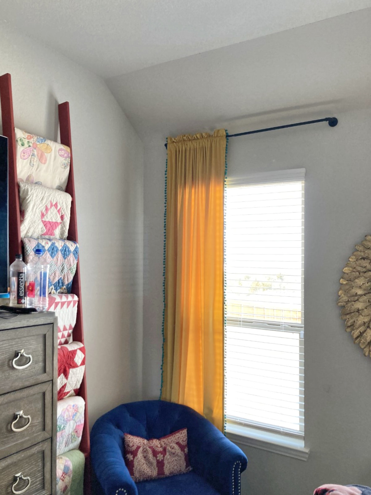
As far as the rest, I think that you’ve done well in handling the high ceilings. On the back wall (i.e., the lowest wall) with the curtains, you did a great job at hanging those high. So those looks great.

And as far as the rest of the area, I don’t think there’s any need to focus on the ceiling height or do anything specifically for the purpose of filling up space. Just because you have high ceilings, that doesn’t mean that you’re required to fill up wall space. In fact, outside of one very particularly chosen feature wall to make a real splash (like the entryway wall), my own personal preference is to keep everything down at a standard height, as if you were decorating in a room with 8- or 9-foot ceilings, and just kind of forget the rest of the expanse of wall above that.
One last thing…
If you do decide to create a feature gallery wall on the entryway wall to make a big splash, it might not work to keep this gallery wall also. I think that might create a very busy look, and take away from the one feature wall.
Of course, another idea is to forgo the “big splash” feature gallery wall on the entryway wall, and just stick with some simple artwork/wall decor there flanking the door. And then make your dining room walls your “big splash” feature wall(s).
The one thing that would keep me from going with that option is simply my obsessive need for symmetry, and the fact that the obvious feature wall in the dining room isn’t square at the top because it’s slanted. The side wall in the dining room is the one that has the squared top where it meets the ceiling, but that’s not the natural “focal point” wall of the dining room. But my obsessive need for symmetry is my stupid problem, and it may not be yours. 😀 If not, then that main wall of the dining room would be a very good spot for that “big splash” feature gallery wall, while keeping the rest of the walls in this area pretty tame (not necessarily boring, just not busy) and decorated more like a wall in a room with 8- or 9-foot ceilings, ignoring the big expanses of wall above.
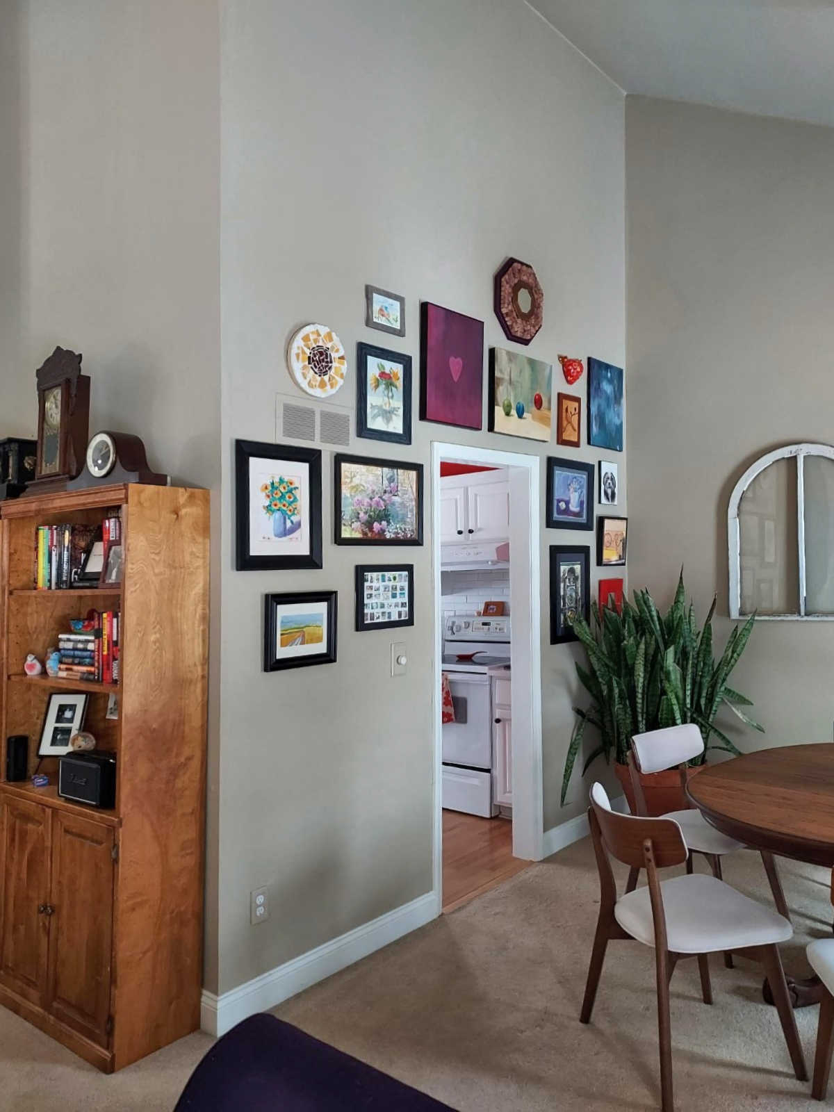
This is a good example of what I’m talking about. Even though this ceiling is very high, they kept the artwork down lower in relation to the height of the doors and windows. And really, there’s no need for the artwork to even be this big or hung that high.

One decorating rule that I have for myself is that I don’t hang wall art or decor higher than the trim on my doors. That’s an easy rule for me to keep since I only have 8-foot ceilings, and there’s not really much room between the top of my door trim and the crown molding in my rooms. But I do like to keep my doors (and windows, actually) as a guide for where wall art and decor need to be contained.
It’s not a hard and fast rule, and I’m pretty sure I broke that rule with the picture ledge shelves in our sitting room. That would be an example of a “big splash” feature wall that could break my rule, even though I can only go up above the door trim so far since I have 8-foot ceilings. So just like any rule, there are times when it’s broken. It’s just a very general guideline that I try to follow, but naturally, a big feature wall on a wall with soaring ceilings would be one of those times to break the rule, for sure. But I personally would keep those instances of breaking that rule (i.e., keeping the artwork and wall decor in relation to your doors and windows and not to the height of the ceiling) to a minimum. Again, it’s my own personal rule, but one that has generally served me well over the years.
So applying that rule in a practical way, even in that picture that I added just above, I would have chosen a piece of artwork (or a grouping) that was just a bit smaller so that the height was just below the height of the doors in the room, rather than being hung at the same height, or even a couple of inches higher than the doors. And I would do that even though the walls are high and the ceiling is soaring.
Alright, folks! What suggestions do YOU have for Laura?
(Are you stuck with a DIY or decorating problem and want input? Click here to submit your question. I post/answer the questions in the order that they’re received, so please don’t send questions if your contractor is on the way to your house right this minute and you need immediate advice. 😀 )

Addicted 2 Decorating is where I share my DIY and decorating journey as I remodel and decorate the 1948 fixer upper that my husband, Matt, and I bought in 2013. Matt has M.S. and is unable to do physical work, so I do the majority of the work on the house by myself. You can learn more about me here.

It’s a minor point, but might be helpful to others…use the Command brand Velcro strips, that adhere to the frame on the back of your picture and you press as you attach to the wall! Voila. Nothing hung with this product will budge. But, super easy to remove as well. And no nail holes on your wall! I use these everywhere, including a large picture right next to door into the garage. Nope, I get nothing, this is just a suggestion of how to solve this problem.
I must be doing something wrong with these strips because I tried to do this with a bunch of 5×7 frames and the strip would NOT stay adhered to the back of the frame.
That’s strange! Are you using the ones that are like really thick double-sided sticky tape? Or are you using the two-part strips that stick together like Velcro? I’ve had the first ones fail on me, but I’ve never had those Velcro-type strips fail on me. Not even once.
No, the Command ones only work for smaller, lightweight art. The 3M Velcro won’t let you down. Right now I have a picture I want to move & I can’t get it off the wall! I’m gonna have to use a knife & pry the hook & loops apart. I’m hoping the side stuck to the wall will come off easily with no damage. If not, patch & paint will fix it. The 3M Velcro REALLY holds the artwork FOREVER! 😄
I use command strips too and have never had a problem. I do agree with you on changing out the red paint but it looks like it may be a fairly new paint job.
A split level house sometimes makes decorating slightly harder. Perhaps other split level home owners could tell us how they handle those situations.
Remove the upper cabinets in the kitchen and put a free standing cabinet for dishes etc in that section with the desk. High ceiling are definitely a plus! Once you find your groove it will all work out.
Kristi, my suggestions line up with yours except for painting the cabinets, lol! For me, I prefer that the upper wall and cabinets blend together with neither being the stand out.
The high contrast with the red walls and the white cabinets accentuates the space and instead of getting an open and airy feeling, it just draws attention to the short cabinets. Change the red wall color to get more flow, regardless of whether the cabinet color is changed. Also could paint the kitchen ceiling a pale blue-green, that corresponds with a more subtle wall color and blends better with the white cabinets.
DO NOT, REPEAT, DO NOT GET RID OF YOUR RED WALLS! The clock is perfect and the birdhouse is good. Something small to medium on the right of the clock would and maybe you could put it in the corner to cover where the cabinets don’t go all the way up. Do lose the stencils. Big art. Move the Last Supper to the space over the arched frames in the dining room. Remember Go Big.
FOR LAURA
What about some bold wallpaper in the entry way?
That was my thought – it seems an ideal spot for it.
I really hope the people that send these questions in follow up with you after they’ve tackled their projects! I would love to see what they did in the end 😊 (And we all love a good before+after)
Same! I’d love to see what everyone decided to do!
Sighhhh I absolutely love the red…I don’t like white cabinets but this is beautiful to me. I would put a plant in the corner to diffuse the crisp triangle. Just my thoughts.
Kristi, your solution to the kitchen is brilliant! And your other suggestions are very helpful also. In fact, reading your responses to tricky reader challenges has really impressed me. I am so glad you are doing this. Have a lovely day.
This may be nothing, but I notice in the entry area, there are coats everywhere hanging…maybe put some cute and functional hooks on the wall and a basket near the entry door to have a specific place for the coats and shoes, and that may help that area a bit. Does that make sense? 🙂
Kristi, great suggestions, as always.
One additional one: Paint the ceiling in those vaulted rooms the same color as the wall. This way, the different surfaces, vertical and angled, all look of a piece,
I hired a very talented staging decorator to select paint colors to repaint our 20 year old house. That was her advice for our daughter’s room with a vaulted ceiling and for our master bedroom ceiling, which is chamfered with a tray. This way, the eye concentrates on the focal points instead of the odd angles.
I love the red and hope you don’t get rid of it. I agree with another commenter- put a plant in to cut the corner. This area is great.
i think that giant white ceiling is the biggest problem. I love your color choices throughout. you seem to like bold colors. so paint the kitchen ceiling a sassy gold or blue. you could pull a color from that beautiful clock.
Hi everyone! I have a question about the Command hanging strips for pictures. Have they ever failed you? I’ve used the regular Command strips with hooks on my interior doors to hang wreaths for Christmas. I’ve had instances year after year when the wreaths fell because the hooks pulled away from the door. I follow the directions carefully and the weight of the wreaths is within the recommended limits. What am I doing wrong? I would love to use the picture hanging strips, but I’m afraid of my pictures falling off the wall. Ideas?
Same. Mine never stay up! I have the worst luck with them. I’ve also had them pull the paint off my wall when removing them!
I like the red but I don’t see how it relates to the colors in the adjacent rooms. Also I’m dying to know what lives in that cage between the dining and living areas!
If she likes the red I’d paint the ceiling in it too (or change the wall and ceiling to another bold colour, purple appears in various ways in the other photos). It disguises the huge number of funny angles and will make the room feel more cohesive. It can also make the ceiling feel slightly lower so you won’t feel the absence of artwork.
I agree with Kristi. Painting the red in the same color as the other walls makes the height fall away. I do also agree to expanding the top of the cabinets to give them more prominence and remove the awkward space at the junction of ceiling/wall. I also would have suggested possibly adding a series of small, square windows (maybe 1 ft. square each) centered on the sink wall above the cabinets, but thought that could be costly! But it would look cute! As for the wall above the desk area, I would leave it empty. It doesn’t warrant emphasis. The entry wall I would give a “library wall” of bookshelves, attached to studs, or a bold wallpaper. It might bear considering removing the door to the closet next to the door (I’m assuming one of those is a closet) and turning it into a small “drop zone” with a small seat inset, and coat hooks with an upper shelf for storage baskets for hats, gloves, etc. It seems as though family wants an easy place to hang coats, and taking the door off instantly makes a closet makes it redily available! Dining area screams for a server under those cute salvaged windows! (Those birds, if alive, shouldn’t be near an eating area! They need a new home.) Move the blue server to the focal wall under the windows. Then, bring the clock collection from top of bookshelves onto the server. Tighten up the art wall by bringing the art closer together. Don’t fixate on the soaring walls, there is no need to highlight them.
Love all the suggestions! The red is too do overwhelming. It can still be used by way of accessories or even bottom cabinets if you love it.
Could you make the trim around the front door larger with a header or something.
I would extend the upper cabinets like Kristi suggested, paint the walls a neutral color, maybe paint the bottom cabinets a color if you want more color in there. The uppers would blend more into the wall just making the room look bigger with the high ceilings. I would make your door mouldings bigger. If your budget is up for it a new front door with side light panels would fill up that space and bring in more light. I don’t think you need to hang anything up in the cathedral ceiling space, just enjoy the clean open space. Not every space needs something on it, less is more sometimes.
I agree with Kristi. I would definitely repaint the red wall the neutral color. I would then go with a dark blue on the cabinets. The room is large enough for that color, adjacent room rug has what looks like dark blue in it and the counter tops would work great. I’m thinking match the lovely blue in that buffet in the dining room (with the brown cage? on it).
This will bring the focus down to the cabinets. If red is a favorite color- use it as accent in kitchen accessories.
If you decide on doing the focal wall may I suggest a rug or a tapestry for the wall. Rugs set at an angle can really fill in that empty space!
I’m a day late, but hoping the OP still sees this – YOUR PLANTS ARE AMAZING! Those snake plants insert *chefs kiss* insert heart eyes emoji. So seeing that you are a plant person, in the kitchen on top of the cabinets, I’d do a whole row of pothos plants with some cool bamboo towers in the mix that you start to train up. This requires that you’ll have to get up there every now and then for watering, but the beautiful thing about pothos is you don’t have to do this super regularly. Like, I have one way high up and it’s happy with a once/month water, I think because the kitchen is generally a more humid area of the house. Basically I’d lean full in to my Hilton Carter wild at home aspirations and make a pothos jungle up there. You can do the other stuff Kristi mentions too…:D but I really hope you do that!