Reader Decorating Question: How Do I Decorate And Accessorize This Bedroom?
Today, I want to see if we can help Julie with her master bedroom. She has a colorful pillow that she’d like to use as a jumping off point for the bedroom decor, but she’s having a hard time doing that with the rug she chose. Here’s what she wrote:
Julie’s Question:
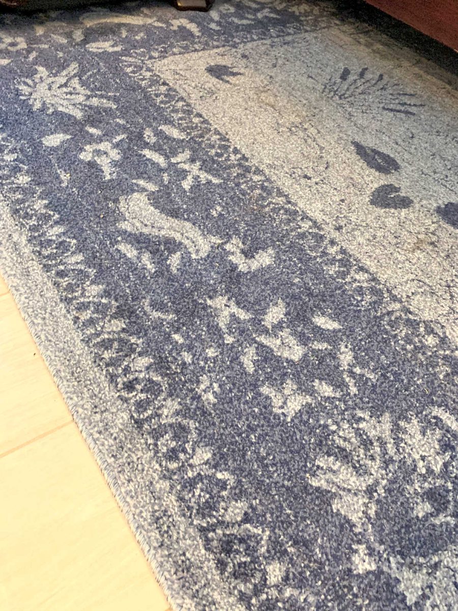
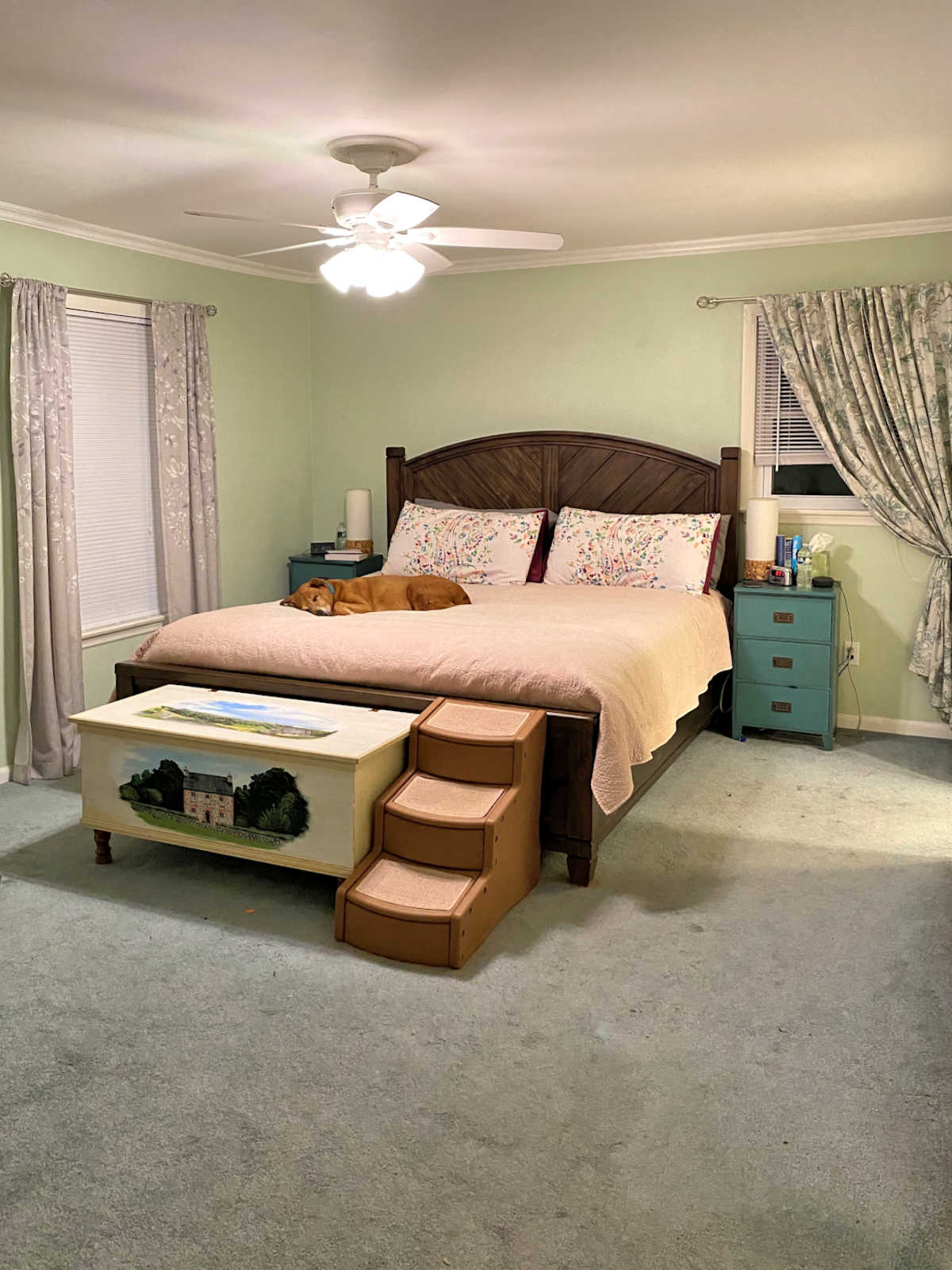
My issue is finding pillows/window treatments/possible artwork that match the rug in the master bedroom. You’ll see that the furniture is dark and fairly ornate and I have chosen a rug of dark and light blue.
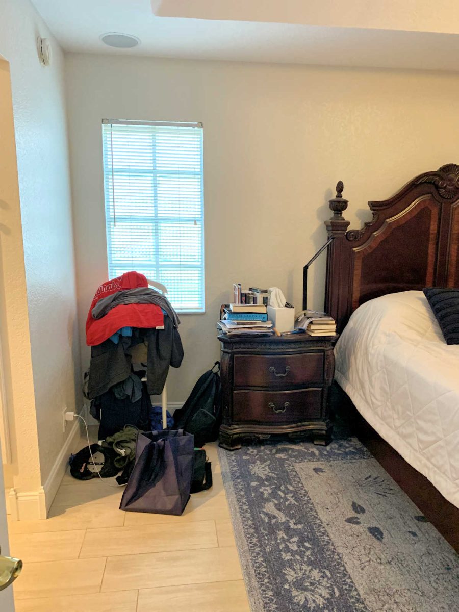
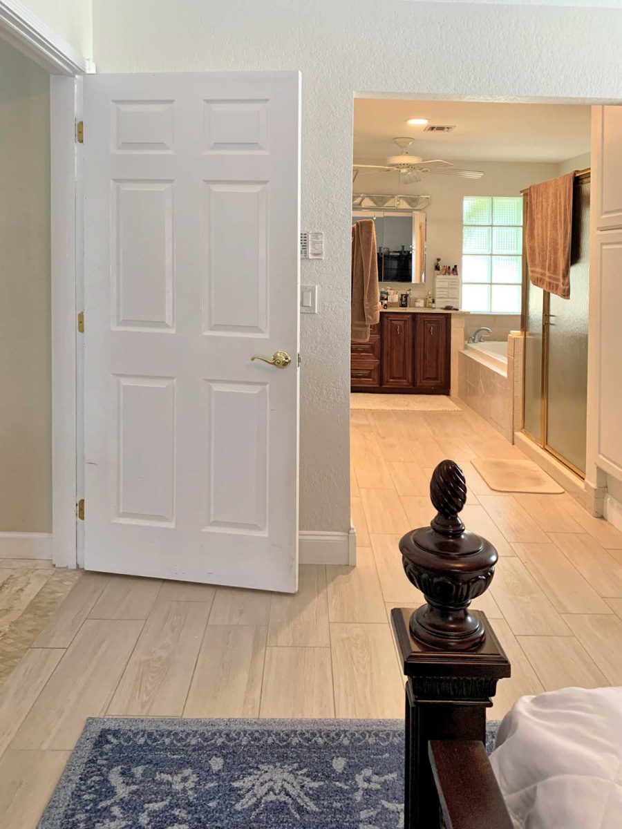
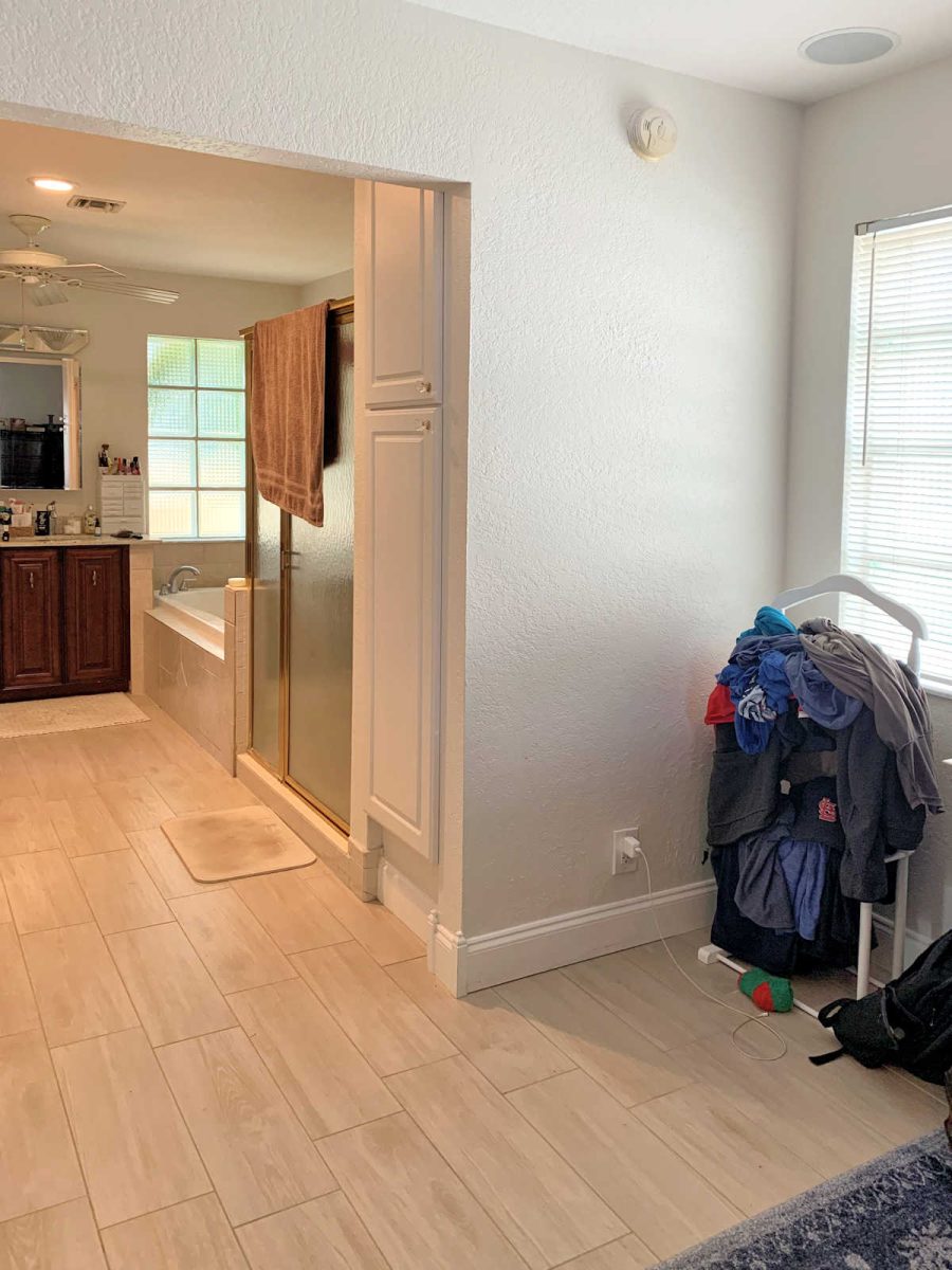
First, some orientation: when you walk into the bedroom, the office space is on the far right, separated by a half (?) wall, ending in French doors that lead to the screened-in pool; the bathroom/shower/closet is on the left. There is no door to the bathroom area proper, only a closet door and one to the actual toilet space.
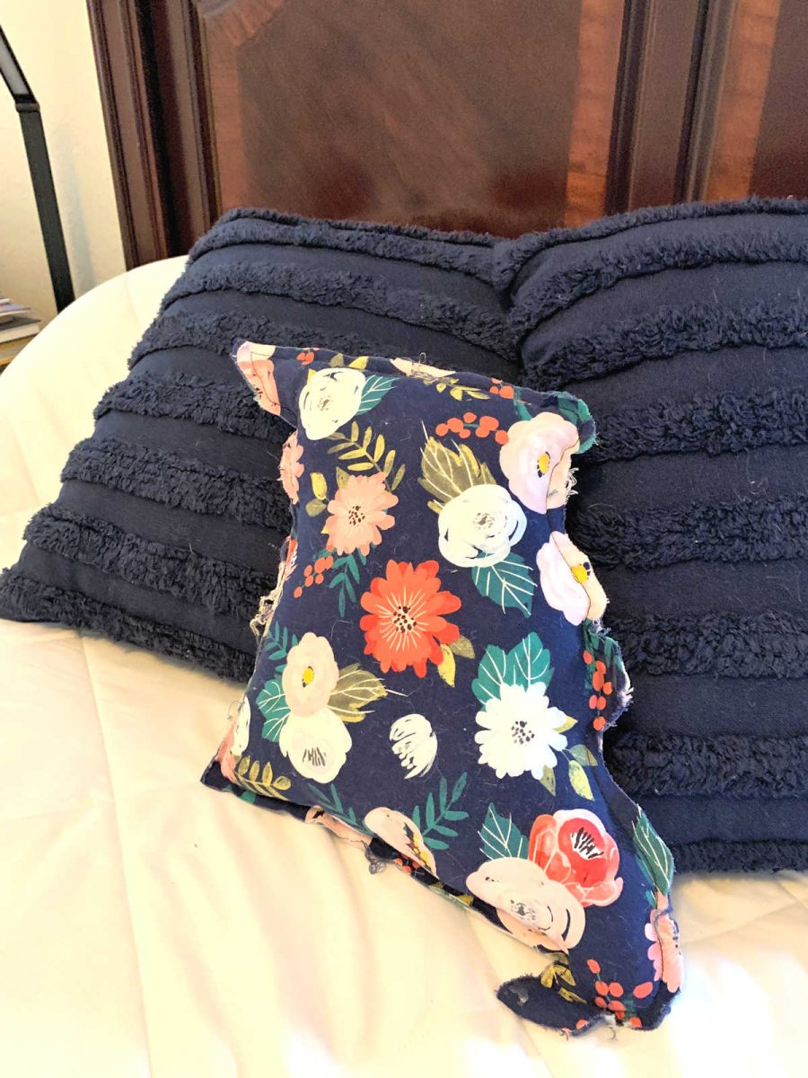
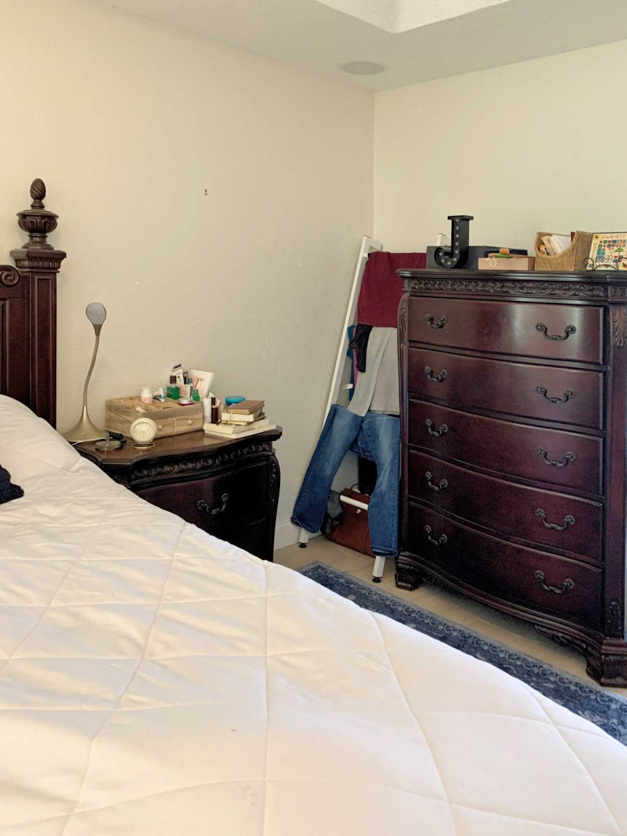
Here is the sticking point….notice the floral pillow on the bed….(it’s in the shape of the state of Missouri, where my husband is from). It was a gift–I love the colors, and would love to use those colors as a starting point for decorating the room. BUT….the navy in the pillow is much darker and….crisper (?) than the blue in the rug. The blues of the rug seem “dusty” when compared to the pillow.
I bought the larger square bed pillows to go with the floral pillow, but I need to somehow bridge the blue gap between the bed pillows and the rug. Can it be done?
As for the rest of the room, I plan to put something on the window to the left of the bed. That’s the only window in the room, if you don’t count the adjacent bathroom (glass block) and office (French doors). I was thinking of a faux Roman shade valance alone (which I’ve done in the family room), but I have a feeling you will recommend drapes, which I am open to. There also seems to be room on either side of the headboard for narrow framed artwork.
Yes, the comforter is bright white–perhaps it’s too bright? I do like the crisp contrast of white against the dark furniture. The walls are off-white or cream (they were like that when we moved in, just over a year ago), but there are other white elements in the space (bathroom cabinets, baseboards, clock above entrance to office). For what it’s worth, the bedsheets match the lighter blue of the rug beautifully, but you don’t see the sheets when the bed is made. I actually really love the look when I can see the sheets (bed unmade and messy LOL) against the white comforter and the dark wood. I didn’t have a picture of that, but I will take one now and add it to the second email. So now you will have 15 photos ![]() .
.
Julie’s Current Bedroom:
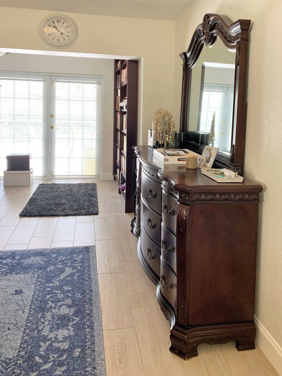
Her furniture is dark stained wood in a very traditional style. The floral pillow on the bed is the one that she’d like to use as a jumping off point for the colors in the room.

Here’s a look at the rug that she bought for the room, but now she’s wondering how to blend the rug with the pillow(s).
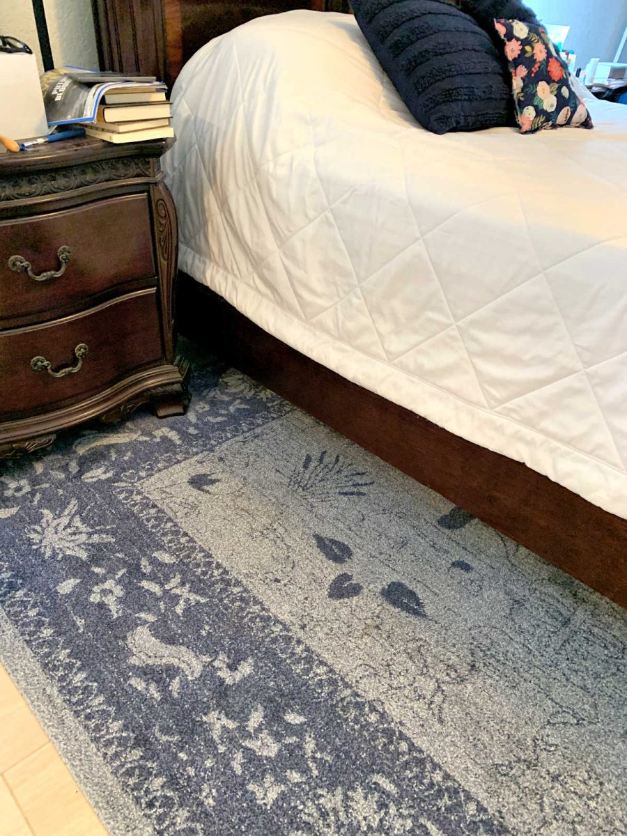
She found sheets that coordinate perfectly with the rug…

To the left of the bed is the one single window in the room.

Connected to the bedroom is a smaller area which is used as an office, and that room has French doors.

And then opposite the French doors is the bathroom…

My Suggestions:
A few things stand out to me in this bedroom.
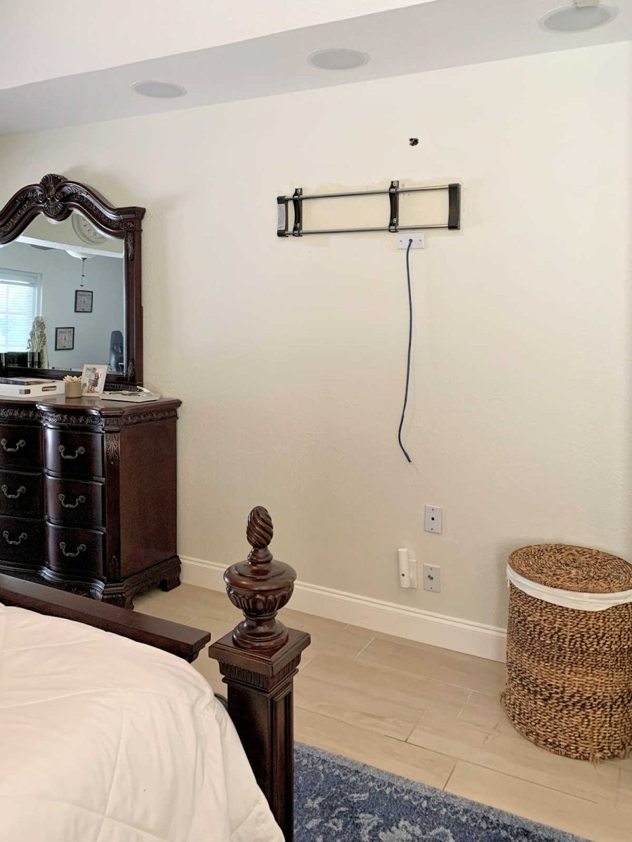
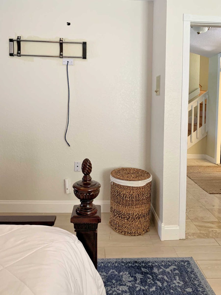
1. Placement of the bed
First, I can’t help but wonder if the bed is on the wrong wall. It seems strange to put a bed on a wall that has one window off to the side. It’s a strange arrangement that will always feel unbalanced, especially if you put draperies on that one window.
If this were my bedroom, I’d put the bed on the wall where the dresser currently sits.
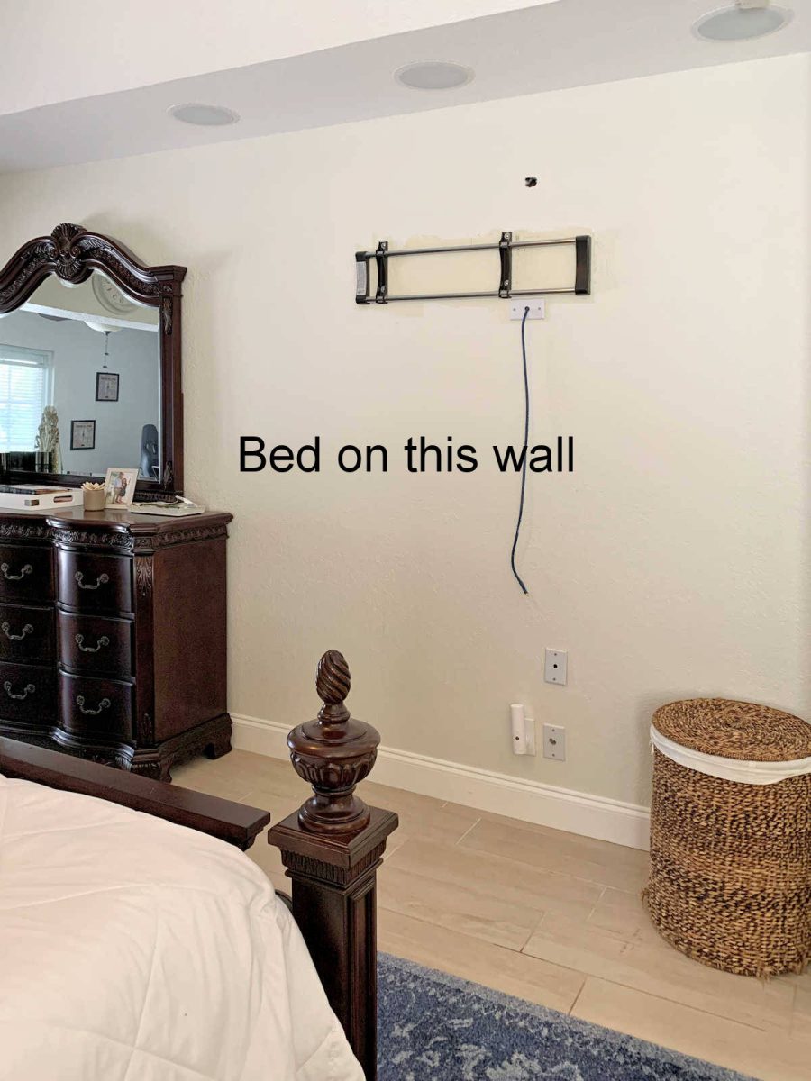
While I don’t have measurements, it looks like there would still be plenty of room for the bed and two side tables on that wall. And because there’s no window requiring a window treatment of any kind on that wall, the whole look could be more balanced.
With this arrangement, the one, single, offset window won’t be an issue.
You could create a reading area around that window. Hang curtains, bring in a comfy chair, floor lamp, small cocktail table just big enough to hold your book and cup of coffee.
2. The matching set of furniture.
Your furniture is lovely, but it’s very dark and heavy. I wonder if you might be willing to swap out one or two pieces for something else to create a more collected look rather than an all matching look. This will give you an opportunity to bring in other colors and textures, and to lighten the look of the remaining dark furniture.
If this were my bedroom, and I were trying to break up the look of the set of furniture, I’d do it one of two ways. Either (1) I’d keep the headboard and replace the existing bedside tables, or (2) I’d keep the existing bedside tables and replace the headboard with a large, diamond-tufted upholstered headboard. And then the piece(s) you decide not to use in here could always be used in a guest bedroom. But just because you have them all doesn’t mean that they all have to be used in the same room.
Again, the whole purpose of that is simply to break up the look of the five matching pieces of furniture, and to bring in some additional color and texture.
3. The rug and accessories.
So regarding accessorizing in a way that will bridge the current rug with the other colors on the pillow that you would like to use as a starting point, you asked, “Can it be done?” To be quite honest, I don’t think it can. You specifically mentioned that you love the colors in that pillow and wanted to use those as a jumping off point, so I think you should stick with that. Those are very strong, bold colors, and to try to marry that dusty blue rug with those bold colors, especially on something so front-and-center as a large area rug, would seem unintentional and forced.
I think if you love the colors of the floral pillow, and want to use those as a jumping off point, then you would be much better off sticking with that. You can move the rug into a guest bedroom as well (it’s a very nice rug, and would actually make a good starting point for a guest bedroom), and then bring things into this room that you don’t have to fight with or force them to work when they don’t want to play nicely with the colors you want to use.
Here’s what that may look like.
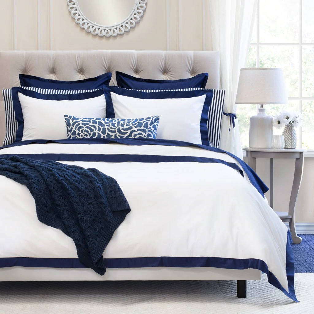
Your current white bedding is perfect, and I agree that the strong contrast looks good with the dark headboard. So maybe add in some shams in a white and navy blue. This bedding is from Crane & Canopy.
Then I would anchor the bed with a large rug in navy and white (cream), like this navy Turnstone Rug from Serena & Lily. You could then pull out a color from the pillow, and select draperies in that color for the one bedroom window, as well as the office area French doors. I chose the terra cotta color and found these cotton velvet terracotta curtains from West Elm. To lighten up the look of the other dark wood furniture pieces in the room, I would add some light wood bedside tables that also bring in some natural texture, like these Sausalito nightstands from Pottery Barn. And then to bring it all together, I found these coordinating pieces of artwork– Coral Sky 1 and Coral Sky 2 in coral, navy and gray by artist Jennifer Goldberger — that could hang over the nightstands. And finally, you could bring that terracotta color onto the bed with some pretty pillows, like these from Target.

So if this were my room, that’s how I would tackle this. I do think that the dusty blue rug that you currently have is holding you back from envisioning how the room could be decorated using the colors in that pillow as your jumping off point. Once you allow yourself to move that rug into another area of the house, and bring in a rug that is more in line with the color palette that you’ve stated you want to use, I think that will free you up to decorate the room in the colors you want, and just using that pillow to guide you on colors will make the process much easier.
Alright, folks! What suggestions do YOU have for Julie?
(Are you stuck with a DIY or decorating problem and want input? Click here to submit your question. I post/answer the questions in the order that they’re received, so please don’t send questions if your contractor is on the way to your house right this minute and you need immediate advice. 😀 )

Addicted 2 Decorating is where I share my DIY and decorating journey as I remodel and decorate the 1948 fixer upper that my husband, Matt, and I bought in 2013. Matt has M.S. and is unable to do physical work, so I do the majority of the work on the house by myself. You can learn more about me here.
Don’t miss these suggestions on the Facebook post: https://www.facebook.com/Addicted2Decorating/posts/10159198738317607
Something that jumped out to me is that the navy pillows are much too small for the bed. Larger pillows with maybe a cording using a color from the smaller pillow? I like the navy with the dusty blue rug and white bedspread. Maybe a new wall color also?
I can’t believe I chose most of what Kristi did. Immediately I felt the bed was on the wrong wall and I also wonder…what are builders thinking putting such a tiny window ( and only one!) in a room? My “sets my teeth on edge” thing is forcing a comforter to be a bedspread, draped over the pillows. Pillows go on top in my opinion. All this is to say, follow what Kristi says, you’ll be happy with your room!
I was thinking the same thing about the bedding. Pull the comforter off the pillows; stand the pillows up and place the smaller pillows in front of the bed pillows to make it look decorative. You can pull the comforter and sheets down and fold them to the front of the pillows so that you see the light blue sheets which you are picking up in your rug.
Kristi, you gave great advice.
hi,
I’d like to suggest you get coral decor pillows and make the bed with the white coverlet under your blue bed pillows to see if you like the co-ordination of the great color match of bedding to the rug any better. If you really prefer the flow of the furniture placement as is instead of the great suggestions made by Kristi (for function of office path access vs esthetics) hang coral curtains on the window and make a “fake” window on the other side- hang curtains where a window does not exist to create symmetry.
First of all thank you Julie for numerous photos because that gives us a much better understanding of what you are working with. Let me say from the get go that I am a blue person.
I have four shades of blues in my house not counting my lower kitchen cabinets that are also in blue. That being said I love your rug. I am wondering if you replaced the navy blue pillows with a dusty pink and put a dusty pink curtain ( or whatever the pinks are in your Missouri pillow) if it would all flow better with the rug.
Would you be willing to paint the nightstands? Perhaps leave the drawers as is but paint the rest in a blue. I did this with an older dresser so it would go better with the blues in my bedroom. Then your artwork could have more blue in it or the blush pink.
I like coastal art so that is what I have but you could go with whatever you and your husband are drawn to. I hope you find what you need to get to keep that rug in your room.
I wonder if she would consider painting the furniture? I belong to a page (Fusion) that has some remarkable posting showing dark furniture painted. They have some absolutely beautiful colours.
Yes, my thoughts exactly! Cheaper to repaint than buy new!
Could you ask your readers to send after photos so we can all see what they ended up doing? … I keep recalling the fireplace that was not centered and stuck out into the room…anyway, before/after pics would be fun to see!
I agree! I keep thinking about the fireplace room too and wonder what she did or is doing.
Why do builders think it is a good idea to have a bedroom and bathroom connected in such a way that there is no privacy for a person using the shower or tub? Hotel rooms have more privacy than that. I once lived in a house where the bath vanity and bedroom were built like Julie’s — with just a wide, cased opening. I used a curtain across the entire opening so the room felt more like a bedroom instead of a cheap studio apartment, which it wasn’t! But I love Kristi’s suggestions for lightening the furniture look, moving the bed, and changing the rug. But perhaps the pillow could just be put to better use in another room, simplifying things.
I love these ideas, except I could never, ever, evvvv-vvver break up that beautiful, beyond beautiful, bedroom set.
Is it antique? Is it walnut?
Mass marketed, modern pieces would be horrible mixed in with those real furniture pieces.
I love the idea of getting a different rug, making a reading nook, and dressing the window.
Same here!!!!👍👍
I love your ideas!
When I walk into a room, I want to see the headboard of the bed. I feel she has the bed on the correct wall. Her arrangement also keeps her from needing to walk all the way around the bed to go into the office. And when I look into the room from the hall, I wouldn’t want to be looking at a TV.
I love the shapes of the 3 pieces of coordinating furniture, but they are way too dark. I would paint and glaze them. If she doesn’t want to paint them, I’d change the wall color to a light grayish-green.
She should consider putting her clothes racks that are on either side of the bed into the corner of the office where they cannot be easily seen. Maybe behind a divider?
I agree with the bed placement and seeing the prominent headboard when entering the room. My first thought about Kristi’s suggestion to move the bed is that it would put a big block in the traffic flow to the office area, forcing Julie walk all the way around the bed to get to her office. I know if I used an office in that traffic pattern every day, I’d be cursing the bed by day 3.
I suggest keeping the bed where it is, but using a mirror to simulate a window on the other side of the bed. Cover that with the same window treatments as the true window. The mirror will reflect light to give the illusion of a window, but the curtain treatment will give symmetry to that wall.
I also have the challenge of a large, dark matching bedroom set. I can’t justify replacing it as it’s in excellent condition. I’ve learned to work with it by incorporating colors that are complimentary to the brown in the furniture.
Different opinion here: I think you can totally make that rug work with that pillow! They have something in common, and that’s shades of blue. All you need to do is incorporate more accessories with different shades of blue that pull from both the rug and pillow colors to make it look like an intentional monochromatic-lite color scheme. If it were my room (and you decide to keep the bed on the wall where it currently is), I’d paint a big canvas painting the same size as the window and hang it opposite. I’d make it an abstract painting incorporating shades of blue, and maybe some of the coral/pink colors from the pillow as well. That should add some visual balance to the asymmetry. If it still doesn’t feel visually weighty enough, add a couple small art pieces next to it to create a mini gallery. The current wall color is nice enough as a neutral, but if you’re feeling especially bold, you could paint the walls a light shade of coral, and then all you’re blue art/accents would pop off of it! Or maybe just one accent wall (the headboard wall, maybe?) in a light shade of coral. Anyway, just my thoughts.
Heck, it would be a LOT cheaper to change a pillow cover to match a rug, than to buy a new rug to match a pillow cover. What if you started by looking for a fabric with dusty blues and other colors you loved and sewed a new, generously-sized Wisconsin? You might not miss the navy blue in that room, a dark color which competes a bit with the dark furniture. Once you get all the colors harmonized, you might not mind the matching furniture, either, thus eliminating the need to paint or buy new.
The furniture is lovely! I think the design on the floral pillow is too cute and modern in style to use with the furniture. Search for traditional bedrooms on Pinterest to get ideas on what kinds of bedding and pillows will complement your furniture. If you like blue, I’d select a lighter blue or gray-blue to contrast with the dark finish on the furniture. Sage green would would also be lovely with the finish on your furniture. I’d de-clutter the room to make a more peaceful space. Remove the racks draped with clothing and most everything on top of the nightstands and dressers. Happy decorating!
Well!!! You’ve done it again!!! You’ve masterfully weaved together the look that neither the author nor I could see. Now it seems obvious. And beautiful!!! Good job!!!!!!!! 😻
My first thought was move the bed on the wall where the television used to be and add 2 smaller nightstands in a lighter color, possibly one of the flower colors in the pillow. I like the idea of a colorful drape. I love the rug you chose but agree with Kristi that it would be better in a guest room. Something in a navy would be a good rug choice. Last comment: a vase of flowers on your dresser would look pretty.
I have no clue how to help her really. I have nothing. I personally don’t care for dark furniture, (just my opinion) so I’m out from the beginning. I do love her rug though. My favorite is blue anything 😋
To me, walking into the room I see an elegant traditional rug and furniture with a small colorful pillow that doesn’t belong. The pillow is of a different fun modern style. If you love the pillow change everything in the room or keep the room and put the pillow elsewhere. It could be on a chair as a minor art piece. I like the idea if art on the windowless side of the bed to balance the window. I think the furniture style dominates the accessories..
I like the bed where it is at since the flow between the 3 areas works well. I would move the tall dresser next to the low dresser under the tv bracket covering the cords and to form a grouping. Paint the wall behind the bed the pale blue as the sheets. Keep the rug as is. I like the roman shade on the window in the same pale blue as the wall neutralizing the window. Add some beautiful lamps on the 2 side tables and leave the wall above the bed empty. On the 2 side walls maybe 2 benches, probably painted a soft color (coral, green?) with large prints (available on Etsy, frames at pictureframes.com) above the benches pulling in some pale to rich colors as in the pillow. On the dresser wall, remove the mirror and maybe use in the bathroom. Remove the clock above the doorway and place in office area. Remove the basket that is on the floor. Then on the low dresser add a small table clock and a group of pics there in soft vintage florals. You can find these at Etsy. Also I would add dark curtain rods with some light sheers to both doorways to soften both areas. Add some more bed pillows with colors pulled from prints. Have fun and good luck!
So many wonderful ideas Kristi! I think the suggestion of coral in the room is iffy. You are the only person I’ve seen who can make coral look like coral. I painted my bedroom coral and got creamsicle. I wonder if you could share some paint brands/colors with us?
Also, is that a tray ceiling in the room? Maybe that’s the wrong term, but it looks like two different levels. Maybe using paint to accentuate the blues there would be a good idea. I love the room and the furniture but it does seem to have a lot of hard shiny surfaces. That rug is soft and beautiful but I would re-think the gray rug in the office. It doesn’t bring anything to the table.
And in the end, I would do everything Kristi suggests because she is a genius when it comes to decorating.
Julie says that she loves the look when the light blue sheets and pillowcases show but that she feels it looks messy and unmade. The picture with the sheets showing still looks like the bed is made, but is turned down to feel more homey and welcoming. If you look at most sites with recommendations on bed styling, they will say to put the pillows on top like in the example image Kristie posted of new bedding. The pillows are on the top as a focal point. The reason the throw pillows look awkward and throw off the color scheme is because you can’t see the regular bed pillows hidden beneath the white comforter. Simply embracing a new way of styling the bed could help a lot.
Kristi – gotta say I love your thoughtful and imaginative advice to these queries, complete with specific suggestions. Really nice!
Love the idea of a reading corner by that window but I’m not a fan of having my bed on the wall with the door. That’s a personal preferences so it’s easy enough to try it out. If the color scheme must be restricted to the pillow colors, then yeah, the dusty blues of the rug aren’t there. On the other hand, I think the dusty blue of the sheets is a great bridge and you could still pull out the peachy pink, coral and navy for other accessories. The goldish/greenish tones could be picked up in metal accents. The lamp on one of the bedside table does this but is a bit too petite with the big furniture. I love Kristi’s idea of breaking up the matching furniture and I think a large upholstered bed in one of those dusty blue shades from the rug would soften and lighten the look. You can keep the crisp white comforter but style it so the pillows are visible. A long, coral lumbar pillow with your floral pillow in front would be pretty and easy to make up in the morning. Looks like there may not be enough storage in the closets and existing furniture so a storage bench, maybe upholstered and styled as a setee with a pillow or two could go under the TV or along that wall between the window and bathroom entry.
I like the suggestions that Kristi said but the costs could really add up. I also agreed that the messed up bed looked good so why not use the sheets to make a duvet to cover the white comforter. Then you can keep the beautiful rug. Get some new sheets in white or pull a color from the pillow you love. Then for a small cost you can cover the dark blue pillows with a color from the Minnesota pillow maybe matching the sheet color.
Oops! Missouri pillow. Sorry.