
Dining Room Sconce Makeover, Bench Color Options, and Artwork Inspiration Mockup
The dining room projects are coming along, but I’m still waiting for fabric to arrive so that I can finish up the main projects. In the meantime, I did finally get my wall sconce makeovers finished.
I started painting these sconces last week, but then I had an issue with the gold spray paint leaving horrible streaks in the finish that felt smooth but looked like the paint had been applied too thick and had run down the side of the shade.
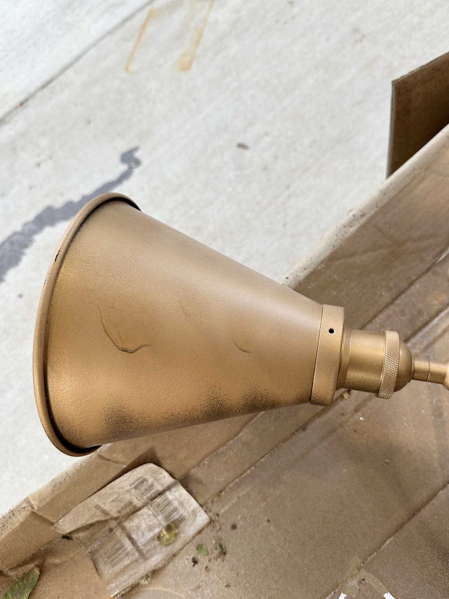
Then I started gold leafing the base on one of them only to realize that the gold leaf finish would clash with the antique gold finish on the other sconces and the chandelier in the room.
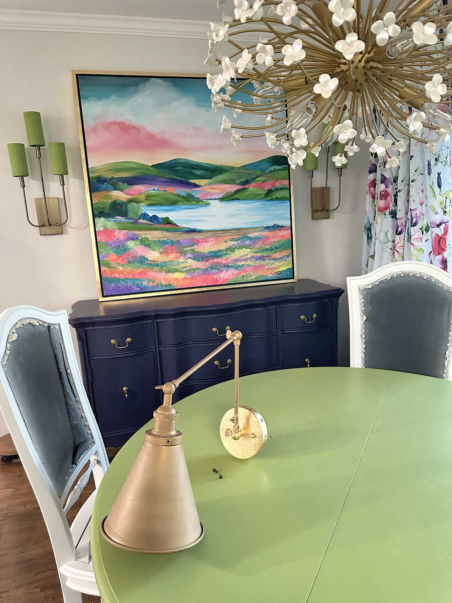
So I went back to spray paint, and this time it worked out. In my effort to finish this room while trying to use what I already have on hand when possible, I decided to keep the sconces that have been in this room for years. But the black finish that was on them didn’t go with the new selections for the room.

After giving the sconces a good sanding with 220-grit sandpaper, I used the following sprays in this order — B-I-N shellac-based primer (my favorite primer), Behr Metallic Gold spray paint, Krylon Metallic Gold spray paint, and Rust-Oleum matte clear coat.
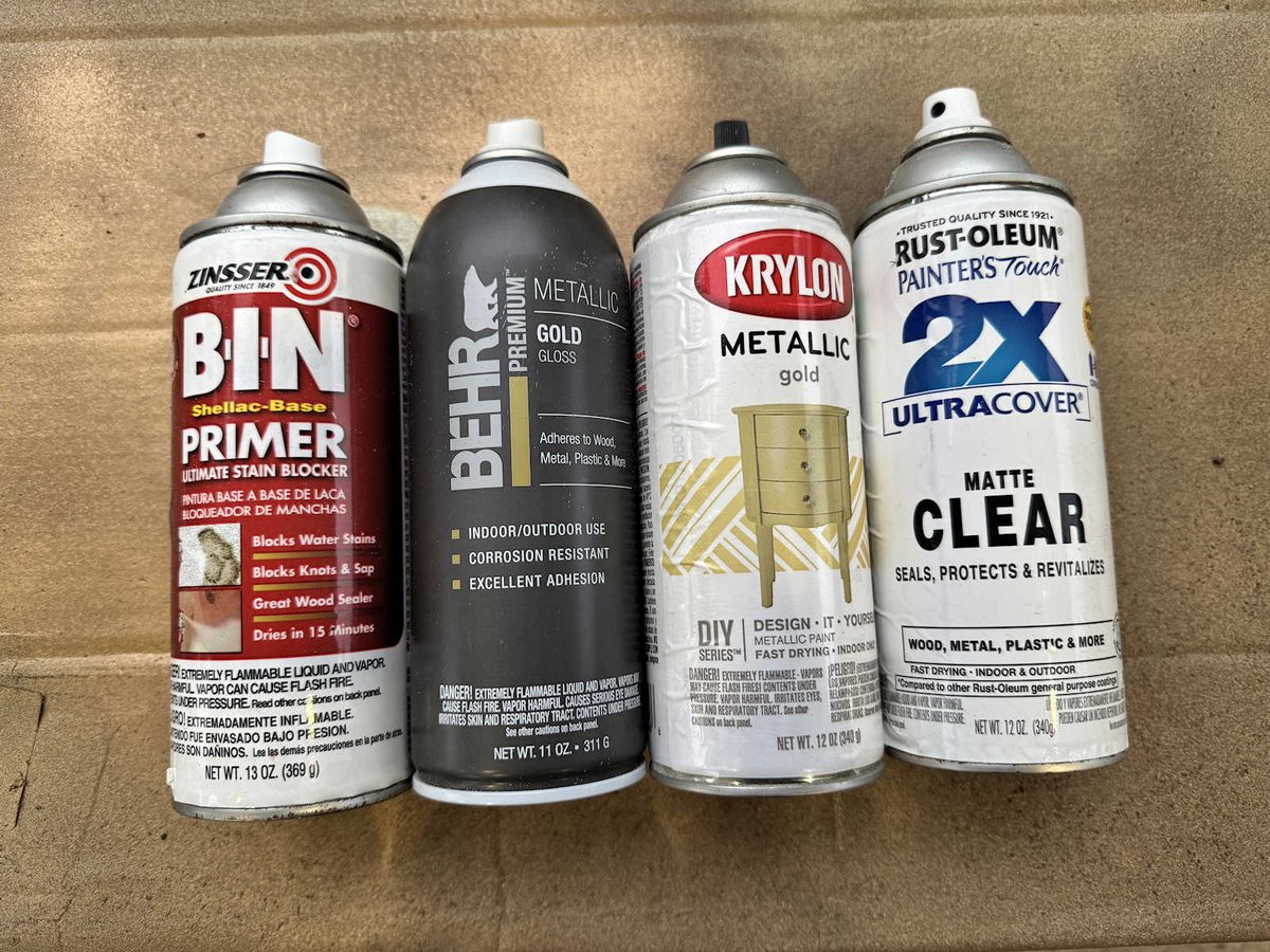
The reason I used two different golds is because, once again, I’m trying to use what I have on hand, and I didn’t have enough of either one to spray several thin coats with only one color. So I got both sconces coated as well as I could with the Behr gold, which was too light of a color to go in the room and coordinate with the other fixtures, and then I followed up with a light coat of the Krylon gold, which was a much better match to the other fixtures. It worked out perfectly.
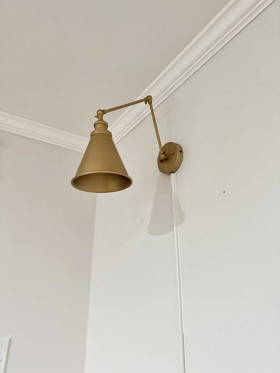
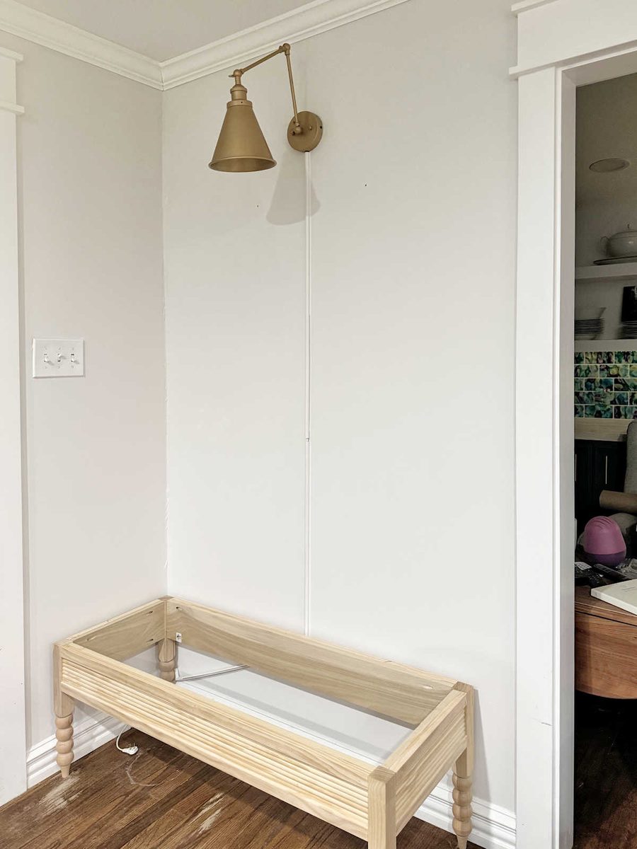
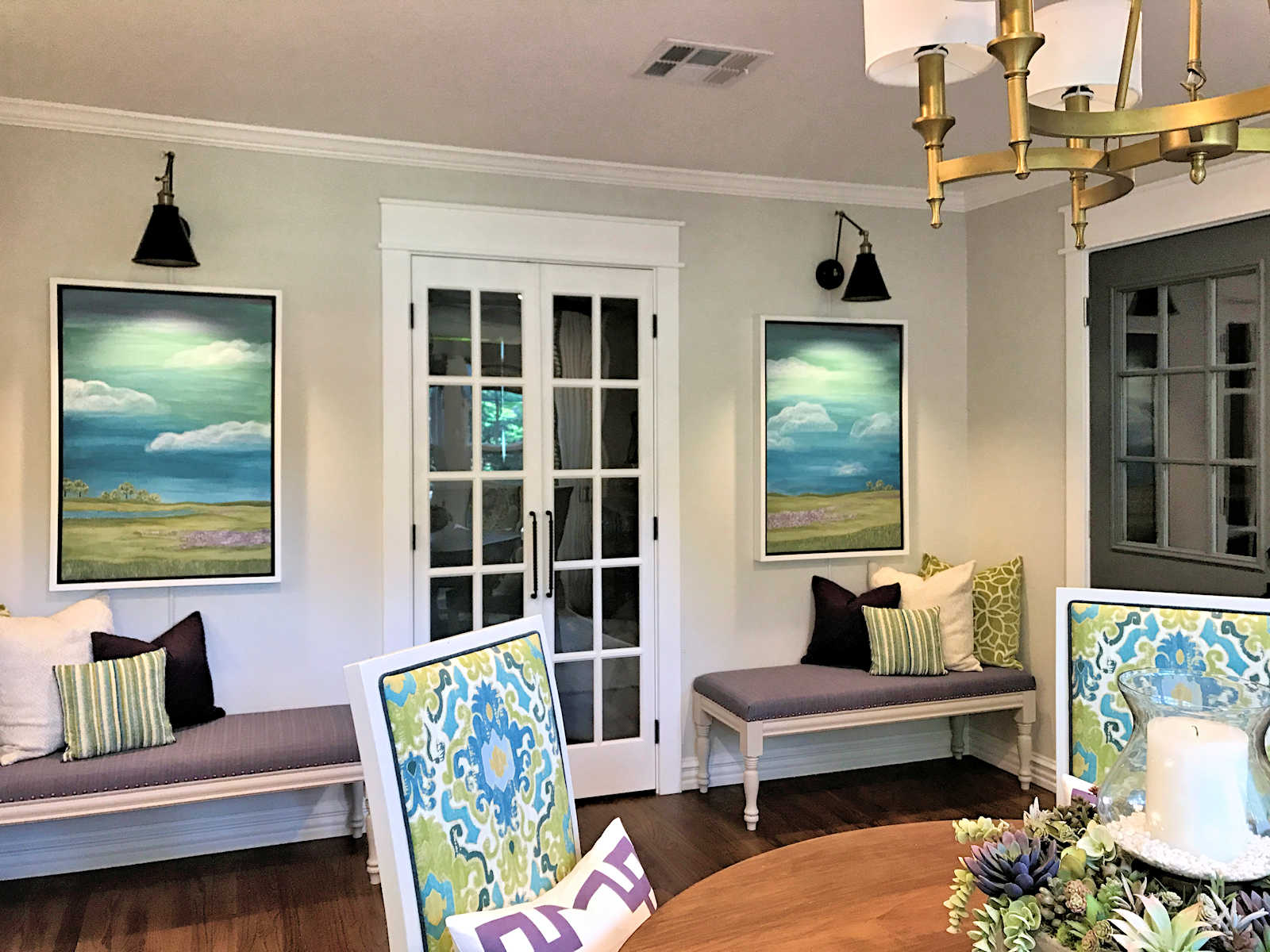
I think this will look great above the artwork and the bench with the dark pink fabric, and the color goes great with the other sconces and the chandelier. This time, I made sure to shake the can constantly as I was spraying to keep the paint mixed well, and I did very thin coats.
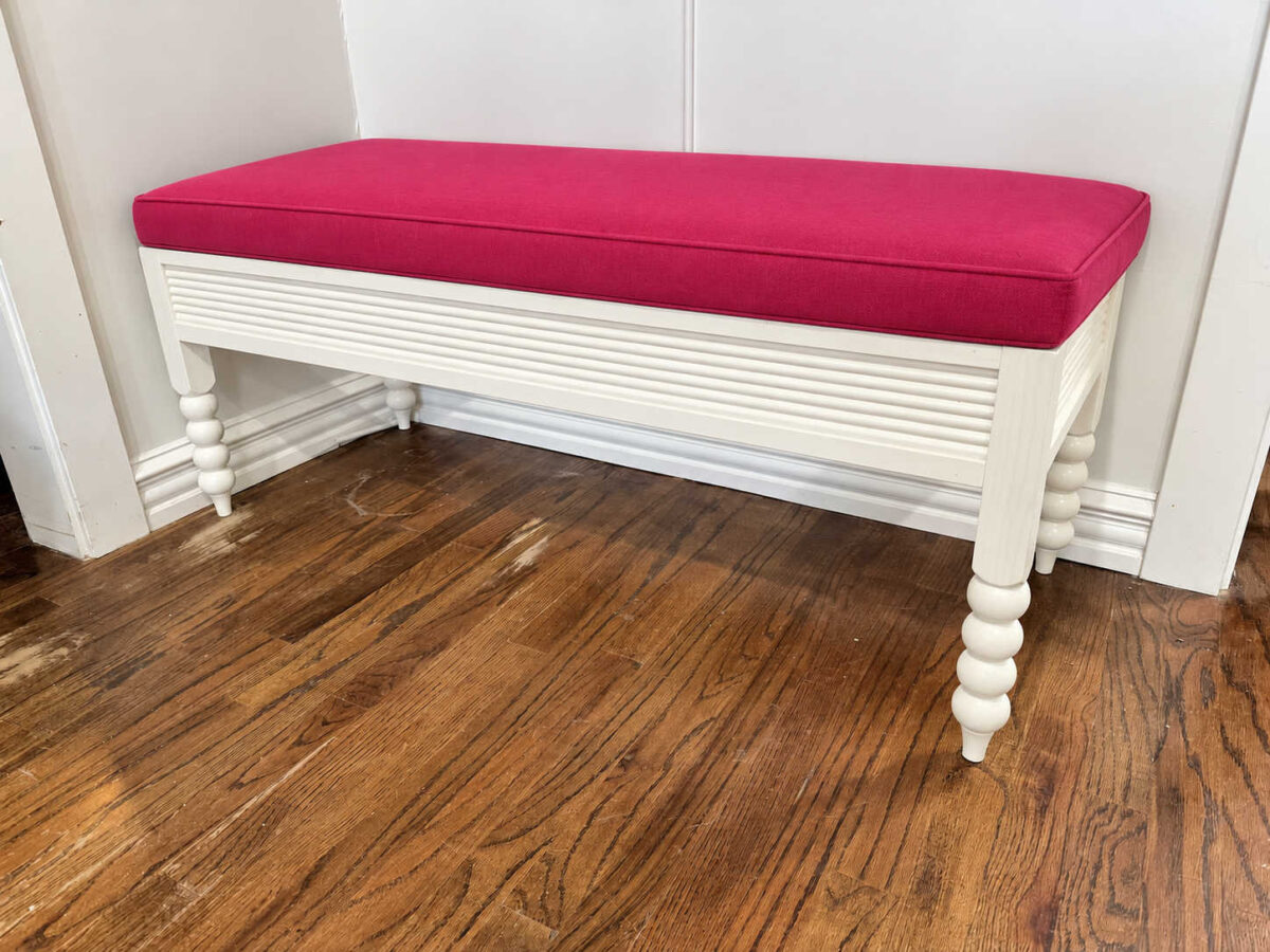
And speaking of the bench, I’m still unsure what color to do the base, so I did three mockups with different colors and the dark pink upholstered top. Here’s what it would look like with a white base.
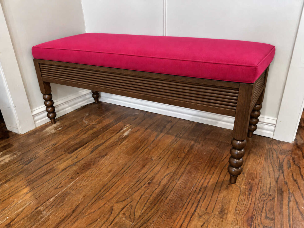
Here’s what it might look like with a stained base. I don’t love this heavy look or the way it looks with the pink fabric.
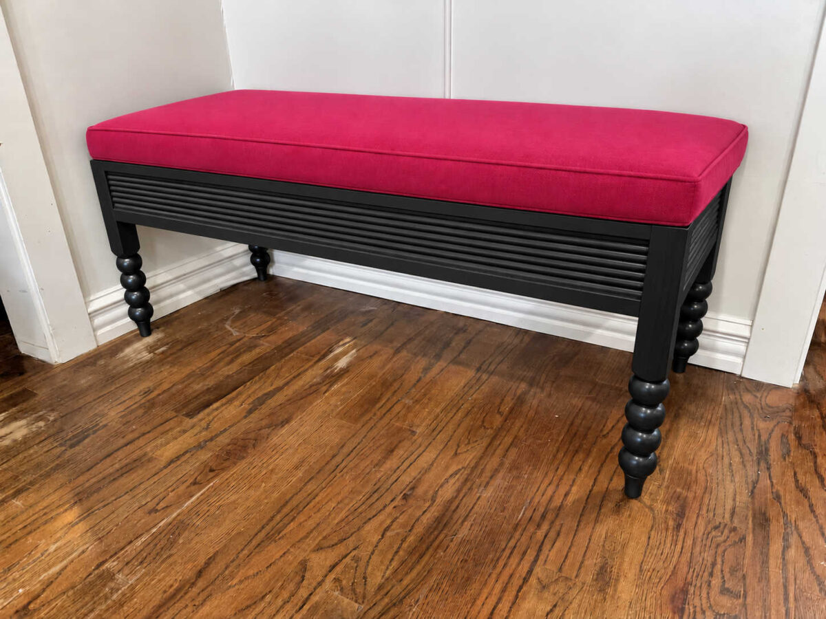
And for something a little out of the norm for me, I also tried a black base. I like small touches of black in a room (as you can see from the previous black sconces and black framed artwork), but I think this is way too much for me.
The winner for me is the white base. My upholstered top won’t look quite like this. This one looks too thick, and it looks like a separate cushion. Mine will actually be upholstered so that it’s attached to the base. It won’t be thinner and it won’t have cording around the top edge. It will be done more like the previous benches I had here.

For a moment, I actually considered doing the sconces in a green color. I even had the green spray paint in hand and was about to start spraying the freshly primed sconces green when I decided to pause and do a couple of mockups to see what these walls might look like with green sconces and gold sconces along with the other elements I plan to have here. I haven’t made the artwork for these walls yet, but I did do this mockup of a green sconce, textural and colorful artwork, and the pink and white bench, just to see what it would look like.
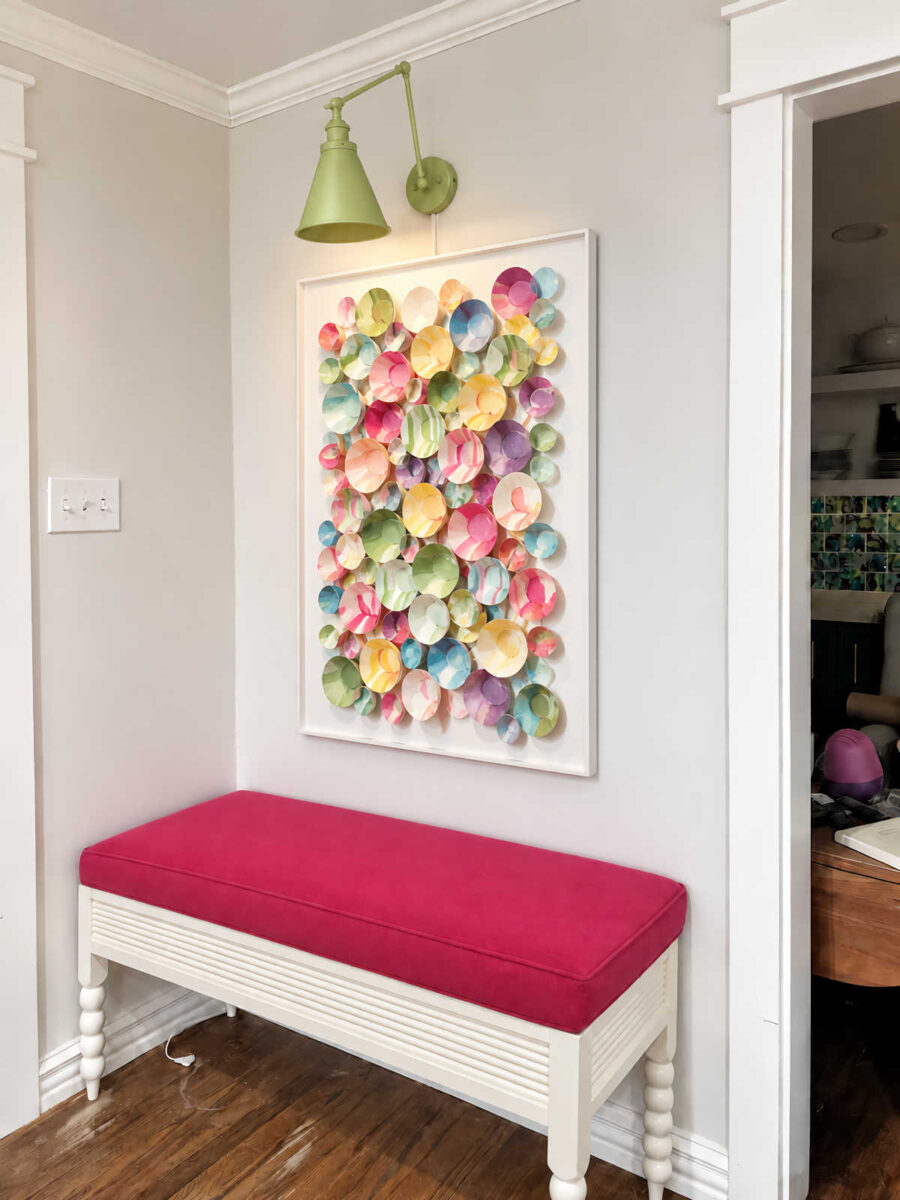
It’s fun, and I did like it, but I’m really trying to elevate the look of this room while keeping it colorful and fun. To me, the green sconces were a little over the top. So in the end, I decided to stick with the gold. It’ll still be fun and colorful, though!
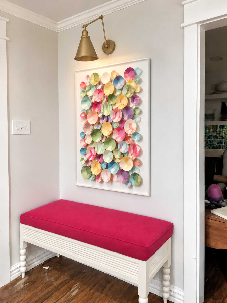
Now I just have to figure out how to make that artwork! 😀 I uploaded three of the artwork inspiration pictures that I shared with y’all in this post and asked ChatGPT to create a piece of colorful and textural artwork inspired by those images but using colors that coordinate with my striped fabric that I made for my dining chairs, and that’s what it gave me. I love it!! But as of this moment, I have no idea how I’m going to make it. I’ll figure out a way, though!

Addicted 2 Decorating is where I share my DIY and decorating journey as I remodel and decorate the 1948 fixer upper that my husband, Matt, and I bought in 2013. Matt has M.S. and is unable to do physical work, so I do the majority of the work on the house by myself. You can learn more about me here.
Hey Kristi,
The gold is great, and so is the white bench. The artwork inspo makes me think it is a mix between airdry clay that is sealed the your alcohol ink like you did with your tiles might be able to become that! Maybe I’m wrong, but that was my first thought.
Stained bench. The white blends in with the trim/wall color. The other furniture in the room is painted, a stained bench would add a depth to the room that paint doesn’t.
I agree.
Same here, but not the dark stain. A much lighter stain.
The white blends into the walls and woodwork. I didn’t think I would like black but it stands out against the walls and floor showing off the turned legs. Black looks striking with the hot pink upholstery. The gold looks great on the sconces.
The art work looks like spray painted muffin baking cups of various sizes.
I think the benches would look better stained light but I know that’s the future plan for the hardwood floors. Trying to see the white benches sitting on light stained hardwood and my sleepy brain cant get there.
But I am 100% sure the outcome will be 100% gorgeous.
I’m probably way off base, but the artwork screams various sizes of paper cups cut down and spread out. Too country bumpkin?
Is this the full circle to the chrysanthemum mirror moment?? 😁 they look like paper bowls, cupcake cups and soufflé/sauce cups all painted! You’ll find a way!
I think the white base is a great choice! This might seem silly, but with the dark based and raspberry top, those mockups felt very much like the bench that would belong by the organ in a dark wood old school catholic church. Nothing wrong with that vibe, but it doesn’t feel like the vibe you are going for in that room.
Disposable plastic bowls! Amazon, of course!
Tinybee 30 Pack Clear Plastic Bowls – Clear Disposable Bowls for Party
Gold Rim, 16-20oz Premium Hammered
50 Pack 12 Ounce Clear Plastic Bowls Hammered with Gold Rimmed, Heavy Duty Disposable
R-Kay 6 Oz Clear Plastic Small Bowls – 50 Pack Disposable Heavy Duty Dessert Bowls With Ice Cream
Lots of options. Paint a solid color, Then we marble them! And get a large tube of E6000! Some have texture, some are smooth. Can’t wait to see what you do!
Suspect the interior is smooth and outside is textured. Paint one side or both? Plenty of options to choose from!
I like the light wood base for the variation in the wood, but my next preference is white, too. The dark stain looks, as somebody already observed, very old school or churchlike… I love the colourful artwork and thought of cupcake papercups immediately, which would be easy to assemble but a horror to clean. So the idea of plastic cups might be the solution – but please make sure that they are firmly attached so that you can use a handheld vaccum on them?!
What if you used coffee filters. They come in different sizes.
The white is the winner along with the gold scones.
What if the bench bases were green? 🤔🫣🤭
What if you put the art in shadow box frame so it would protect it from some of our Texas dust. It would be hard to dust otherwise.
What if you painted the base of the bench that beautiful green color?