Home Gym Lighting Options (Five Black Semi-Flush Lights Under $200)
Have you ever needed an item for your home, started shopping for that item, and found the perfect item almost immediately, only for that item to be unavailable with no indication as to when (or if) it would be back in stock? Of course you have. We all have. Isn’t that frustrating? Because then when you start your search again, nothing seems to measure up to that first perfect product.
*This post contains affiliate links.
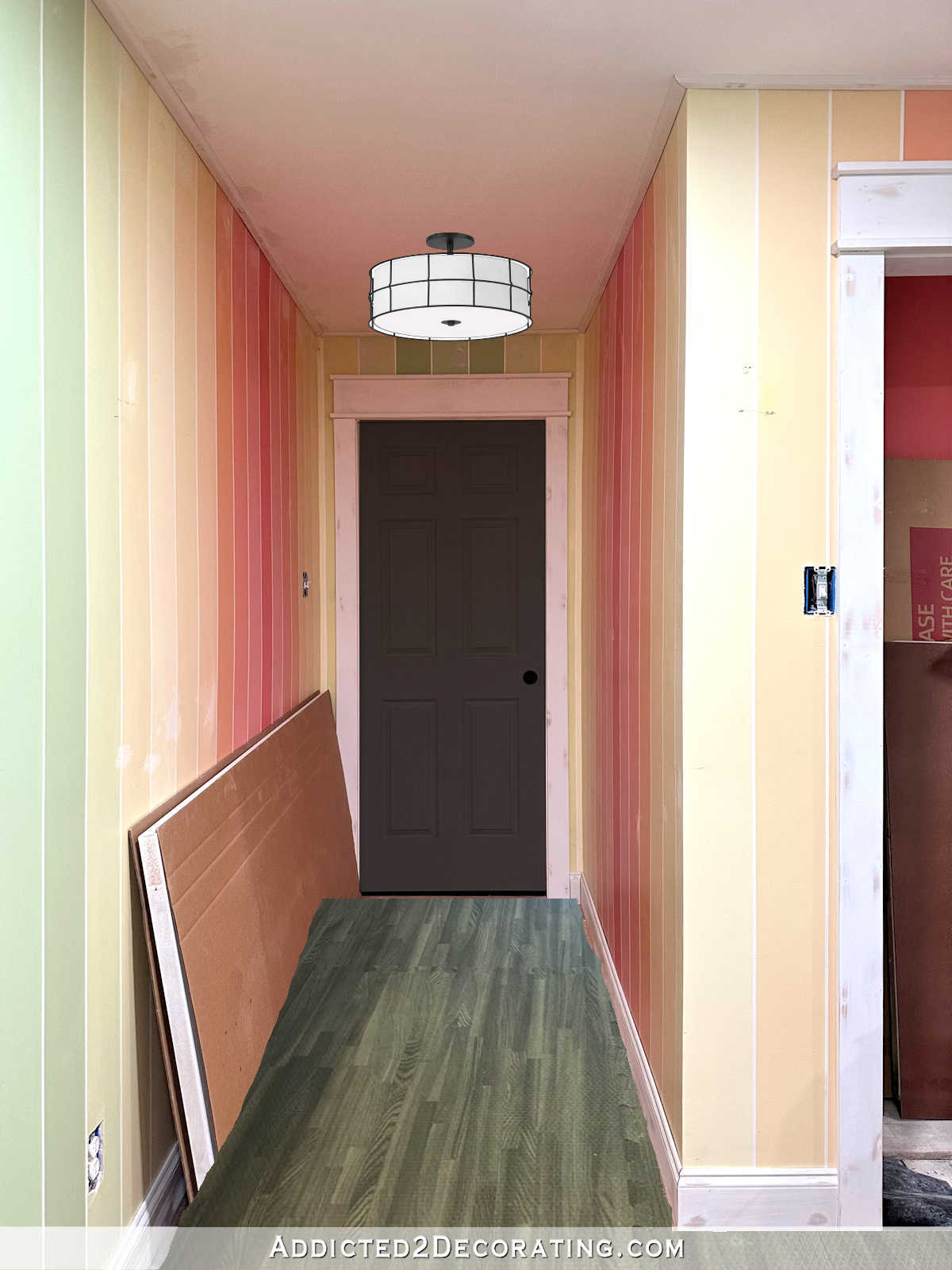
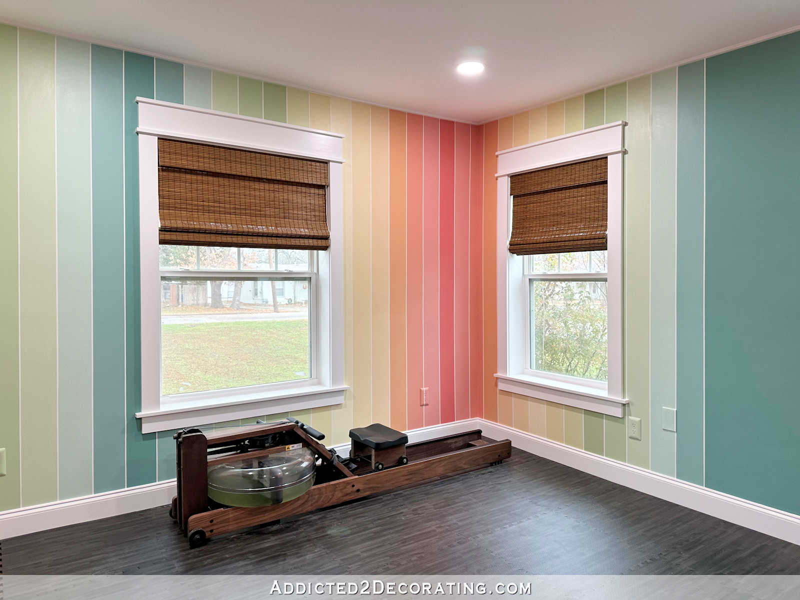
Well, that’s what happened with my search for the perfect black semi-flush mount ceiling light for the long entrance into our home gym. The absolute perfect light was this black and gold semi-flush light from Target. And it’s only $90!
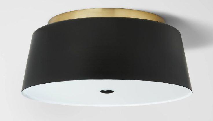
But it’s unavailable, and there’s no indication when it’ll be back in stock. As perfect as that light is, I’m too impatient to wait around for it to be restocked (especially considering how long stuff like that is taking these days), so I begrudgingly began my search for another light.
I didn’t want to drag out my search, as I have a tendency to do, so I went to Amazon, put in my search parameters (black, under $200, less than 12 inches high), and then selected my top five favorites out of those results. Here are those five.
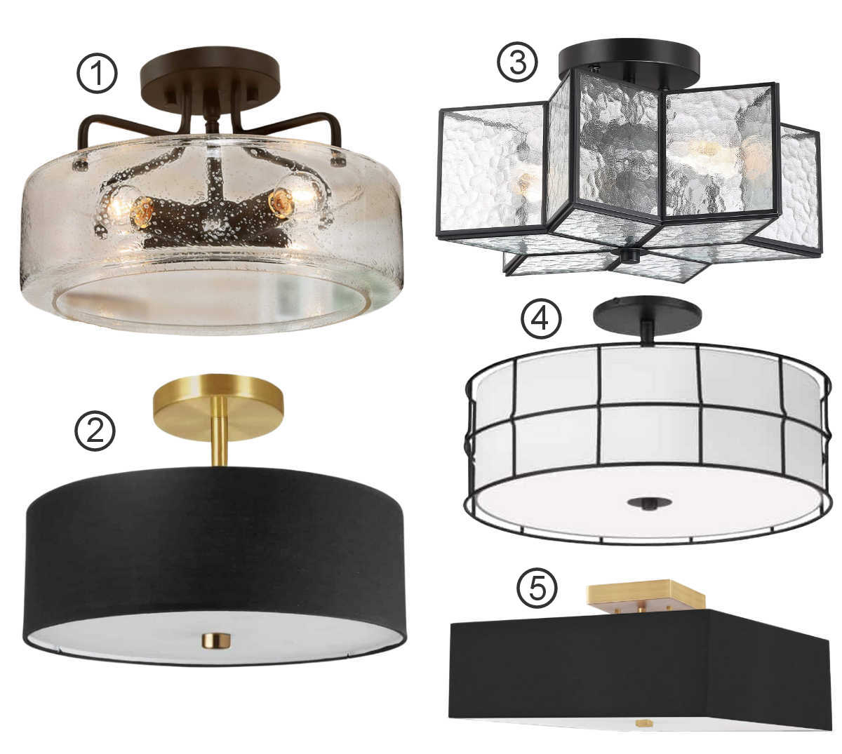
- Log Barn semi-flush ceiling light with seeded glass, $149
- Dainolite semi-flush 3-light with black shade, $120
- Vanity Art 2-light star semi-flush light, $179
- Dainolite matte black semi-flush light, $170
- Dainolite 3-light aged brass with black shade, $140
So I did some mock ups of those lights in the home gym, along with the black door, and a copy and paste of the flooring that I’ll be using. It’s far from perfect, but you can at least get an idea of what it will look like. And there’s no way that these lights are to scale, but we’re mostly looking at the style.
Here’s the first Log Barn semi-flush light with the seeded glass.
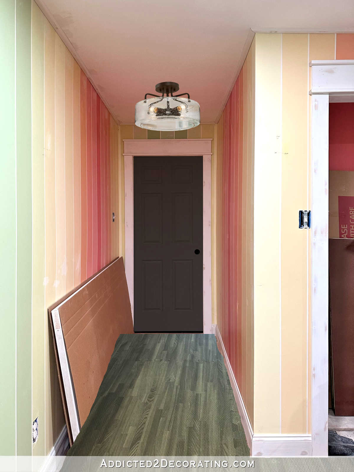
I’m generally not a huge fan of seeded glass simply because I don’t like exposed bulbs (with very few exceptions), and seeded glass doesn’t obscure the bulbs quite enough for my taste. But I do think that’s a very pretty light fixture, and it was in my top five.
Next up is the Dainolite semi-flush with black shade.
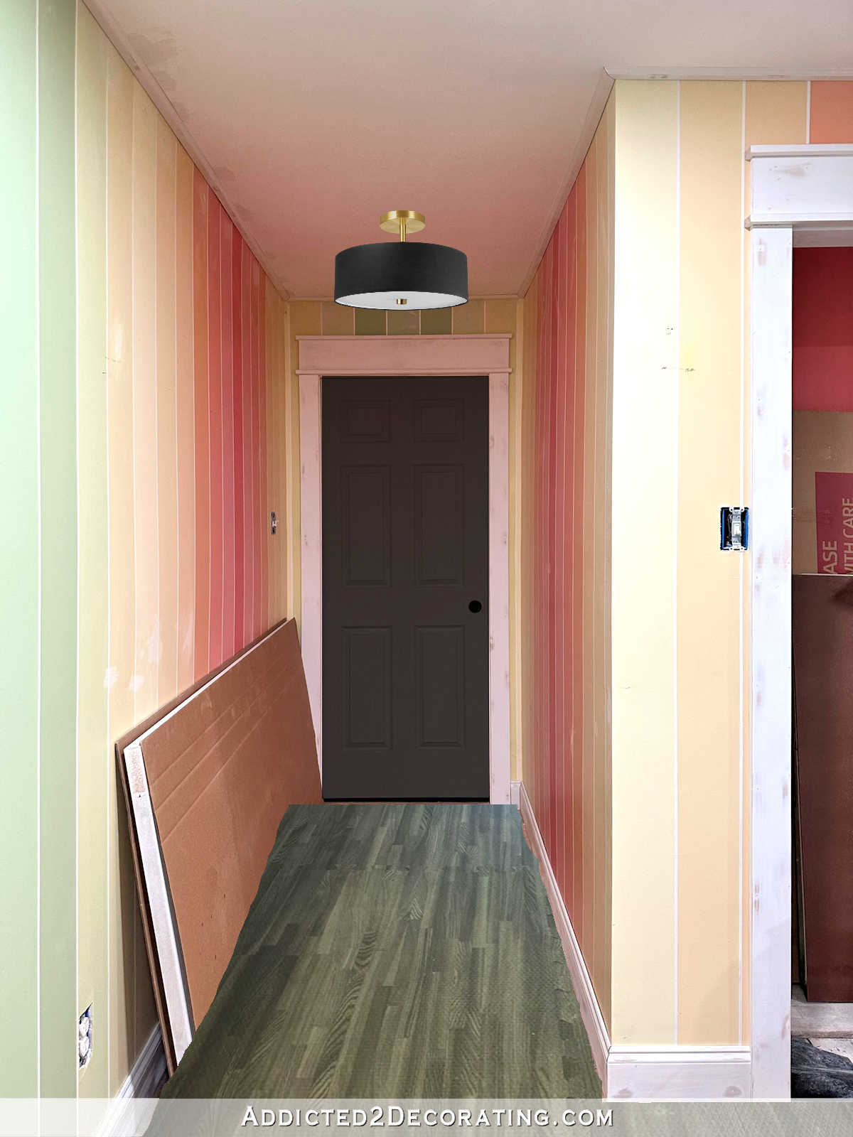
I love the clean look of this one. It’s simple and modern with clean lines and no frills. That seems perfect for a home gym.
Here’s a look at the Vanity Art star semi-flush light.

I have to admit that I LOVE star lights, and I’ve been on the lookout for the perfect star light (one that doesn’t have clear glass that expose the bulbs, and this one fits the bill), and the perfect place in our home to put a star light. Could this be it?
Next, let’s take a look at the Dainolite matte black semi-flush light.
I’m not sure how I feel about the lines on the light with the strips on the wall. It may be too visually busy. But I do like the light!
And finally, we have the Dainolite aged brass fixture with black shade.

That mock up looks funny because it’s a square light, but the only picture available was taken from an angle. Obviously, if I used this light, the square shade would be squared up with the walls. 😀 My perfectionism with slight OCD tendencies would make me cringe every time I saw this light if it weren’t squared up perfectly with the walls.
Doing these mock ups really helps to narrow down the selection. As I was doing them this morning, one light stood out to me as the best option for this area. I won’t tell you which one stood out to me, because I want to see if it stands out to all of you as well. Which one would you choose, and why?

Addicted 2 Decorating is where I share my DIY and decorating journey as I remodel and decorate the 1948 fixer upper that my husband, Matt, and I bought in 2013. Matt has M.S. and is unable to do physical work, so I do the majority of the work on the house by myself. You can learn more about me here.

#2!
The square shaded light just repeats the angularity of virtually ALL the other motifs in the room – especially in the long hall – it cries out for round to soften it! 😉
In addition, your eye for perfection would, no doubt, be ruffled no matter how perfectly you lined it up with the walls – since viewing it from any angle other than straight-on 90° with the door wall, it might appear off alignment…lol
#2
I like #2 & #5.
I really like the gold and black with your wall colors.
2 shows more gold, but it will get dusty on top!
5 – the square design is consistent with your lined walls but if its tilted even a bit it might drive you crazy. I personally didn’t like any of the other lights.
#4 IS round and sheds a lot of light…
The lines are delicate enough to not interfere much pattern-wise with the striped wall treatment that’s in a much larger scale (fits in with the rules of pattern mixing!)…
I don’t see it as ‘farmhouse’ as much as I see ‘industrial’. The ‘caged’ light idea fits the purpose of protecting it from random sport equipment (namely, rogue basket balls and the like) – which definitely fits the ‘gym’ theme…
IMO though, this is no highschool gym!
This is a ‘home’ gym – with curtains! 😉
It’s Kristi and Matt’s home gym!
You have already established classic elegance elsewhere in the room (ie. curtains, vertical stripes, roman shades, classic millwork) – as well as throughout your home – so #2 is still my favorite! 😁
I personally like number 2. I think the others are too busy with the stripe walls. The square is nice also with black shade.
#2
I love number one, but I think number 2 is closest to your original preference. You also get that lovely gold metal with it.
Personally, I like 2, and then 3.
Number two because the round balances all the angles and lines of the hallway. Number three because it’s artsy—but, will that artsy be wasted in a hallway?
Agree. #2 is clean and ROUND, no getting off skew.
I agree. #2 is my favorite.
Ditto!!!
LOVE your blog but, as I get older, I go for lights that are easier to change the bulbs! Standing on ladders and unscrewing the bottom GLASS plate are not for me anymore, although all the fixtures you showed were lovely, just not user friendly IMO!!! Keep going, you are getting there!!!!!
#2!!! The round shade softens all the surrounding rectangular shapes. Gives a more “relaxed” look. Doesn’t make it look any less symmetrical.
#2. If you love the Target light, you could shorten the shaft on 2 by getting a shorter rod and substitute it for the long one.
Alternatively, I would go back to the Target light and see if you can get a name/manufacturer and do some online searches.
I agree. We recently built a home and I found the same lights that I thought were unique to one brand at several places on the internet with another brand name. Same thing with several items such as mirrors, rugs etc. That light you loved is more than likely available for you somewhere. The other thing I did was at lighting places online or in person such as Ferguson’s you can show or send them a picture of the light you like and they can tell you very quickly whether they can get it for you or not. Don’t give up on what you love unless you have to. But I found lighting professionals very helpful and really not more expensive.
Number 2
I like the Dainolite semi-flush with black shade. I think it works well for a home gym room. While the star light is gorgeous I feel like it’s a bit out of place here?
Ooops! I guess that is Option #2
I like No. 2 for all the reasons you mentioned – “the clean look… simple and modern with clean lines and no frills. That seems perfect for a home gym.”
I believe all the black n brass ones are too formal for a gym. I think that number 4 is my favorite.
#2
Fave: Dainolite semi-flush with ROUND black shade.
I like the square light. #5.
I like #2 for a home gym.
I love the star light. The first one is okay I guess. You didn’t ask my opinion I know, but the floor wrecks it for me every time I see it. Maybe the mockup makes it look off?
#2 made me do a small happy-gasp.
#2 Dainolite semi-flush with black shade looks very much like the vibe of the rest of the house. It’s clean, simple, and I think the room could use a rounded corner here or there without being too much of its own thing or competing with the stripes. Also that block of black would tie in well with the black door without being too much.
The STAR!!!!
A star light of that size deserves to be in a space large enough to allow the light pattern to play out in all its glory…
And, any light ‘pattern’ IMO interferes with the stripe pattern on the walls…
I love mixing patterns, but there’s a place for that – and IMO, this isn’t the optimal place for doing that…
#5 is my favorite
#3
I surprised myself since I though the seeded glass would be my favorite but I really liked number 2 the semi flush black light.
Number 2. It looks so close to the one that you really liked.
Dainolite semi-flush 3-light with black shade, $120
Hands down!
I would choose #3 the star light. 2& 5 with the black shades seem kinda boring to me. I know the fixture isn’t the focus of the room, but those are just TOO boring. I also didn’t like the blob of black near the ceiling. #4 seems very farmhouse to me, which is not your style. I really liked #1 but #3 is just the best! Can’t wait to see what you pick.
#2 because yep I love the Target one
#2 or #5 clean lines and pulls the black accent.
Sheila F.
#2!!!!!
I love the uniqueness of the star! It is beautiful and it’s an opportunity to add a bit of whimsy. Goes well with the cloud light in bathroom. 😉
#2 Hands down! Round, simple and black! Softens the angularity of most of the items and motifs in the room!
Black- high contrast defines that hallway and relates to your other black accents-to-be (like the black door! Wink, wink!)
Simple – nothing about it adds more design distraction – just a direct statement of sublime sophistication!
Not too femme, rustic, or industrial!
Perfection!
I love the one you popped into the hallway in your last post as well for the same reasons – however, it might have been too tall for your ceiling height…?
I like the stronger statement of #2 better, though!
I should have mentioned that. The light I used in the initial mockup turned out to be 17.25 inches high. That wouldn’t work with my 8-foot ceilings. That was disappointing, because I loved the look of that one.
Here’s a similar flush mount https://amzn.to/3XWVoMu
#2 or #5 for the win!
#1 looks “empty “.
#3 is stunning! But it deserves to be
somewhere that it’s the ‘star’ of the show.
#4 I do not like cage lights.
Did you see the “Julie 2-light 12” flush mount” on Wayfair? I think it might be what you’re looking for, and a great price point.
LOVE the Julie two-light!
However, a semi-flush will bounce more light – as in, bouncing it up to the ceiling, to the walls and down to the floor to combine with the down light direction of the light…
But, in this hallway, no tasks will be performed – no pressing need for MAXIMUM light, just passage light…
So, I think this flush mount does the trick quite well! A bit less formal than #2…and doesn’t introduce the brass finish that #2 does (but, the bit of brass is always a plus for me!)…
I think this is a great option for the gym hallway!
Are you allowed to use a 6 pointed star in Texas?????????
I’ll have to check our state constitution, but I think it’s okay as long as it’s not displayed on the exterior of a home. 😀
Kristi, how many ceiling lights have you made?! You can easily make the Target light. It really is the best. Otherwise #5. One reason is I like square and it compliment the hall bathroom light which is square. If you choose #2 I would adjust it so it hangs closer to the ceiling. Can’t wait to find out which one you chose
A star light of that size deserves to be in a space large enough to allow the light pattern to play out in all its glory…
And, any light ‘pattern’ IMO interferes with the stripe pattern on the walls…
I love mixing patterns, but there’s a place for that – and IMO, this isn’t the optimal place for doing that…
#2 Looks better to me…
I like 5 the best. The clean, simple and contemporary design. It looks close to the ceiling taking up less space visually in the narrow hallway. Second choice would be 2. Number 4 reminds me of a locker room (with accompanying odor). Number 1 and 3 seem too fussy for a gym.
I think the Dainolite semi flush looks the best. I think it would be my pick ,but I do also like the Dainolite aged brass. Seems like the square on the shade goes with the stripes.
My favorite is #2 with #5 coming in second
Hi Kristi:
I vote for # 4 – Dainolite Black Matt Semi-Flush Mount.
In looking at the initial close-up that was not my pick because it looked a little too far-house and the round black shade semi-mount appeals to me, overall. Also, I am like you and farmhouse is not a preferred style; however, when I saw your mock-up of the area, I changed my mind for the following reasons:
* The two light with black shades and the light with the star-glass are too formal for a gym.
* That recessed area is really dark and the white siding will provide more illumination for that area.
* It seems to co-ordinate better with your curtain rods you have chosen for your gym.
* It also is a good transition to the gorgeous lighting above you bath-tub in that they both have a white translucent shade.
I look forward to seeing what you decide! It’s coming along nicely!!
#2! I immediately said “that’s the one” when I saw it.
Hi Kristi, do you ever use Google lens? A nice flush mount came up that is the matte black with gold, smaller profile like your preferred light. Turns out it’s at Lowes. Maybe worth looking at, but it’s $299.
Generation Lighting ED Ellen DeGeneres Asher 1-Light 14.5-in Midnight Black Incandescent Semi-flush Mount Light
#2
#2 for sure
I like #5. The angles of the light fixture play well with the angles of the door and the stripes on the walls.
#2.
#4 IS round and sheds a lot of light…
The lines are delicate enough to not interfere much pattern-wise with the striped wall treatment that’s in a much larger scale (fits in with the rules of pattern mixing!)…
I don’t see it as ‘farmhouse’ as much as I see ‘industrial’. The ‘caged’ light idea fits the purpose of protecting it from random sport equipment (namely, rogue basket balls and the like) – which definitely fits the ‘gym’ theme…
IMO though, this is no highschool gym!
This is a ‘home’ gym – with curtains! 😉
It’s Kristi and Matt’s home gym!
You have already established classic elegance elsewhere in the room (ie. curtains, vertical stripes, roman shades, classic millwork) – as well as throughout your home – so #2 is still my favorite! 😁
The star shape is pretty and fun. Those black shades look far too serious for a workout/gaming room.
#2 is the only one I like.
I love the Vanity Art Star. It’s a little funky, has touched of black and will put out good light. I don’t like the two with the black shades. Too much black with the black door. Don’t like #4 because of the strippy wire; you don’t need stripes on the ceiling and the walls. I’m not fond of #1 because for some reason the black accents look like crab legs hanging from the ceiling. All that to say I love the Star and don’t care for any of the others. But your house, your decision. It will be fun to see what you decide.
#2 period.
No to #1 and #5 as they’re too formal for the room. Any of the others would be great.
How about this Quoizel light, $129 at Lowe’s
https://www.lowes.com/pd/Quoizel/5013551843
Great light!
I actually like this one the best! Very reminiscent of her original pick, only better (in my opinion).
I like the star light! And perfect inspiration for workouts!
The seeded glass ‘rustic’ IMO #1, obviously, isn’t your fave – am I right?
So, though it is round (#1 priority IMO), and sheds a lot of light – it doesn’t follow with the aesthetic you’ve already established in your home and in this room…it is an interpretation of trad that borders on farmhouse…
Okay! I think I’ve effectively eliminated every light choice except #2 – my personal favorite for this hallway! Lol
I like 2. I like the look of more black vs the glass ones. A little more simple as well for a gym.
#2
Semi-flush round with black shade #1. Star light #2. Is the flooring going to be gray? doesn’t seem like you.
The floor is various shades of really dark (charcoal) and black. Overall, the flooring will read black, not gray.
I like #2 for all the same reasons as in all the comments 🤷 hands down it’s the only one for me.
#3 starlight.. that light just screamed at me, Pick Me, Pick Me. So, it is my choice. I do hope it remains one of yours.
I love all the work you have done on yours and Matt’s home.
I like # 2 the best for your project. But I’d find a place to put #1 as it’s gorgeous!
#2 is my winner and gets the most votes!!! Yeah.
Definitely #2
#2 my fav by a long shot. And I don’t care for #3 or #5–I just think too many straight lines already… a round option seems best.
I like the second pic, the Dainloite round. Reasons-round shape contrast the rectangular hall, black shade pops beautifully with the walls. Like you, I don’t care for clear glass fixtures. You inspire me and I really enjoy watch your progress and hearing your thought process. I also love color so in the world of white, black, and gray, your house is lovely and welcoming!
#2
Number 2 is best.
Looking at just the lights, I thought 3 or 5. But in the mock-ups, definitely the Star, it just fits.
🤦2 or 5.
Before you give up try lampsplus.com I’d given up on finding my lamp and discovered it at that site.
Dianolite with black shade (#2)
2!
#3. I liked it right away before I even saw it in the mock up. Really pretty. It outshines the other ones hahahaha
Definitely #2! The round shape offsets the vertical stripes on the wall, and ticks the gold and black theme boxes. It also looks best with the black door
#2
I like the star light but not for this room. I’d find another room to put it in.
For the gym I like the Dainotite light.
I like the idea of the floor to with the black door. I’d never paint a door black but it looks really good here.
Keep up the good work.
I like #2 because of its style, but I think number 3 (star) is good for functionality, I e. plenty of light dispersion all around, and the star shape is a bit of fun.
Number 2 is my favorite. One caution: The plastic, beige-ish round insert that hides the bulbs will also dim the light that gets through appreciably. If the hall is pretty dark already, you might want to consider something that allows more bright light to enter that space.
#2. The color, with no angles is perfect with the door and the stripes of the wall.
#2 is about the same “feeling” as the Target light.
Gotta go along with the #2 round light.
#2
I like the fist one with the seeded glass. I have a very similar fixture in my pantry. Same style, only in brushed gold and clear glass. I get the most compliments on that light!
My vote is #2.
Which is weird for me because when I like something it usually ends up being the most expensive choice, not the cheapest.
The star light would be my second choice but I also agree with others that have said a light like that deserves to be in a place where it’s noticed.
#2
So similar to the one you wanted, but could you really be happy with ‘second best’ for almost twice the cost?
I like # 2 and #5 but like #2 best in your moc up pics.
Soooo… it just occurred to me that you have this issue often and a different approach well, never occurred to me before! lol But instead of trying words, in amazon, why don’t you do a google search with the IMAGE to give you similar ones? It works pretty well actually! You can probably use the advanced search filters to restrict regions etc, though I haven’t checked that. But searching with your image gave me VERY similar lights.
For example: https://www.cb2.com/bell-black-flush-mount-light/s439202
https://www.ebay.co.uk/itm/403736224402
https://static1.squarespace.com/static/59921c1849fc2bb2215284d1/t/5abf2282f950b77ed2361de8/1522475652010/BC500-038+website+spec+sheet.pdf
https://www.homedepot.com/p/Globe-Electric-Stanley-6-3-in-1-Light-Matte-Black-Semi-Flush-Mount-Ceiling-Light-with-Antique-Brass-Accents-61106/316134720
https://www.savoyhouse.com/meridian/m60067mbknb_1-light_ceiling_light_in_matte_black_with_natural_brass (and a lot of other similar ones in the same list)
Google returns images that are all variations on the same theme, rather than “black/metal/whatever” which is more general. (Ofc, I know because I’m usually trying to find a specific picture and it gets on my nerves, but for your needs it should be great! loo)
Number 2 for sure, it’s the right combo of stunning, no bulbs showing and I would hope plenty of light shining down. I think I need to show my Fella this one.
#2 or #5 They are the closest style and color to the one you originally chose. They both look great in the mock ups, but I would choose #5 because it accents the stripes on the walls and the floor.
I vote for light number 2. It has clean lines and the round light makes a nice contrast with the linearity of the striped walls.
Kristi,
I google the light
https://www.google.com/search?q=semi+flush+mount+ceiling+light+black%2Fgold+-+pillowfort&ie=UTF-8&oe=UTF-8&hl=en-us&client=safari
And your light popped up like at houzz etc.
I like #2 or #5, with #5 square being my favorite. It matches the unavailable Target light best and goes with the square corners of the door.
Love # 2.
Number two looks the most like the one you first wanted and it is really nice. But there is something about that star that is special.
No 2 softens the angular lines of the room and balances the door.
#2 because it’s the closest to the perfect unobtainable one that you first found, and I like it’s simple shape against your colors the best
Don’t know why you’d look on Amazon.
Wayfair is the place for lighting.
A! It has a wow factor!
I like the square one because it is smaller and blends in that narrow hall. Plus the straight lines of the shade go along with the stripes on the walls.
Number 2 is my favorite.
Either one with the black shade….I think my favorite would be the square one but I would be like gou…it would have to square up with the walls…lol
#2. If you love the Target light, you could shorten the shaft on 2 by getting a shorter rod and substitute it for the long one.
Alternatively, I would go back to the Target light and see if you can get a name/manufacturer and do some online searches.
Number 2 is my absolute favorite. I like the way it looks with the door and flooring, and it doesn’t compete with the colorful striped walls.
Star light!!!
The Star light fits the best it looks very classy.
#2 It’s perfect.
Keep checking Target as I just clicked on it and it was “one left in stock.” Doesn’t mean it will still be there or even still shit but it’s worth a try.
“Or even SHIP . . . .” Oops, where is the spellchecker when you need it.
I’m seeing the Target one available when I click on the link – so maybe its back?
Kristi! The one from Target is back in stock. Get it quick!!
I like 1 and 2 best and it seems to me that the black one is closes to what you were looking for to begin with.
#2
What about this one?
https://www.bellacor.com/productdetail/quoizel-bsm1714-balsam-four-light-semi-flush-mount-2398678.html?dwvar_2398678_variant_finish1=Matte%20Black%20And%20Aged%20Brass&quantity=1
Number 2 is the only one that truly works. (Dainolite semi-flush with black shade)
# 2 as it does not jar your eye. It looks so good in the room and I do not think you would like to have to constantly clean a glass light.