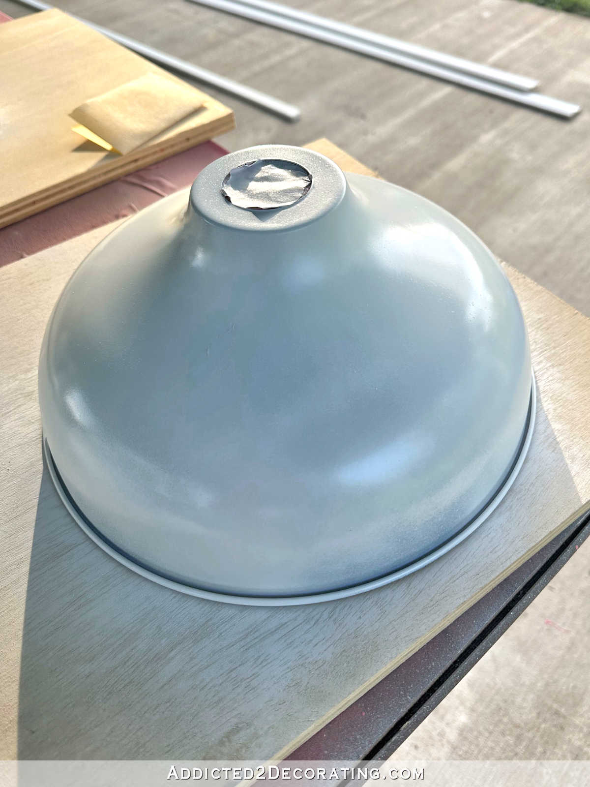
Minor Studio Cabinet Changes With Big Potential Impact (Tell Me Your Thoughts On These Changes)
A couple of days ago, I shared how I’ve reached the point in the studio project where I start to second-guess some decisions. By the end of that post, I had convinced myself to just press forward with my vision, and not make any decisions about changes right now.
On Tuesday evening, my mom came over, and while she was here, I showed her my progress on the studio and we talked through the rest of the plans. One thing that shocked her was how HUGE the office area cabinets were. She hadn’t realized how massive those were just from looking at pictures online, so seeing them in person helped to put them into perspective for her. But as we talked, she also suggested that I press forward and not make any changes to the plan. But then she went home and started reading all of your comments on Tuesday’s post.
Note: If you missed that post, you can see it here: This is the point where I second guess my decisions.
Anyway, as she read the comments, she decided to do a mock up of one of the main suggestions that seemed to be repeated in the comments. So yesterday when my mom, brother, and I met for lunch (as we do every Wednesday), she had two printed photos with her — one photo of how the cabinets look now, and one photo with the suggested changes. And then I combined the photos (by doing a little ripping and “pasting” at the table) to come up with a third option.
There seemed to be one standout option that the three of us really liked. But before I start making changes, I want to share the three options with y’all to get your input. This isn’t necessarily a “majority rules” type of thing. This is more the type of decision in which a well-reasoned argument would sway me more than a “majority rules” type of thing. But I’m just curious to see if the crowd favorite at our lunch table yesterday holds its forerunner status in a larger poll.
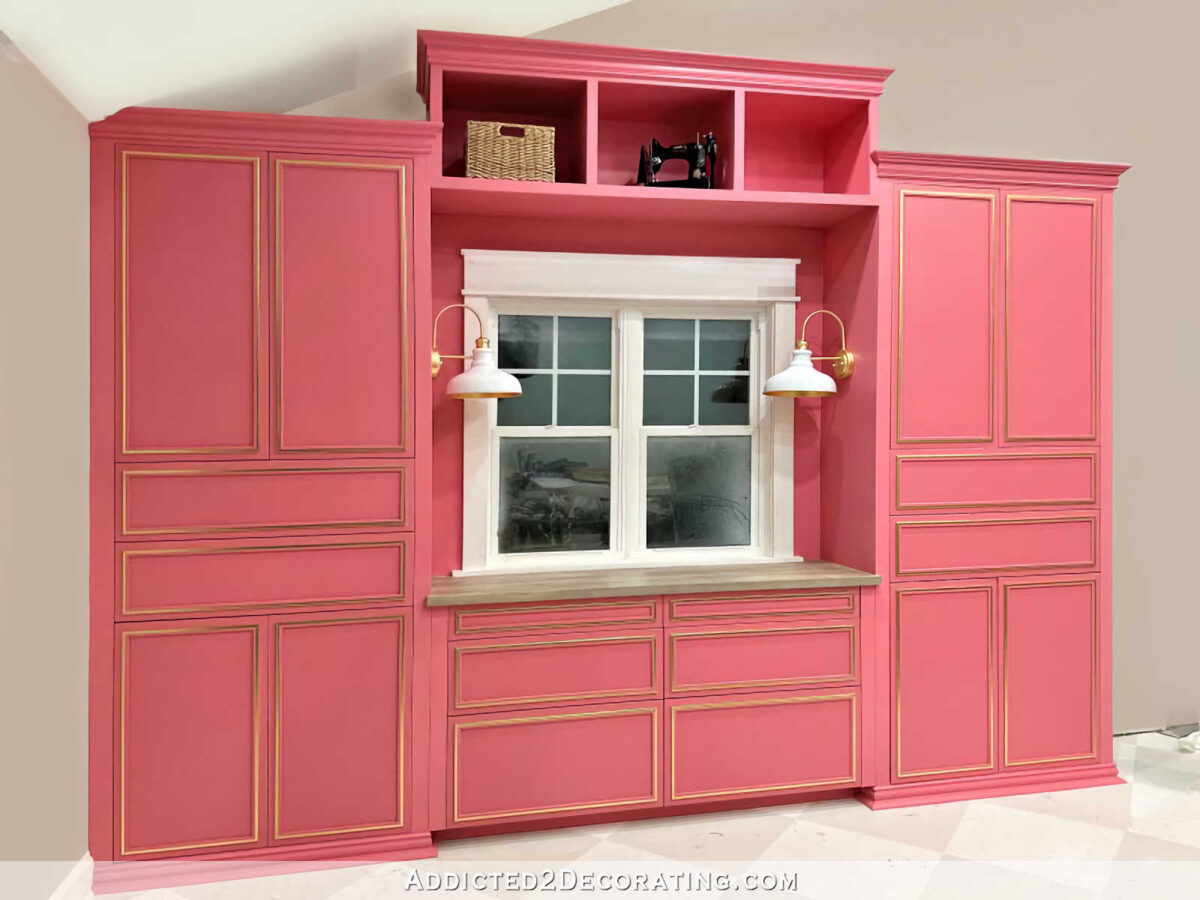
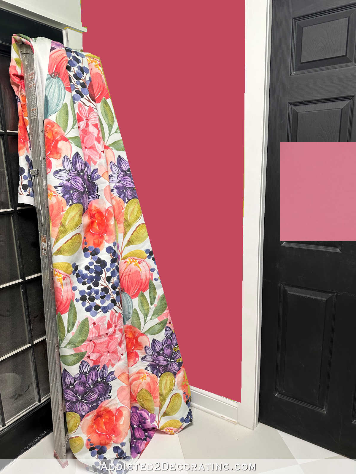
Okay, so here’s Option 1, which is to keep it just as it is right now. (To clear some of the visual confusion, my mom used Photoshop to “paint” the walls and ceiling around the cabinets. 😀 ) So here’s how the cabinets actually look as of this moment. I painted the wall around the window the same color as the cabinets in order to make the whole area look like one cohesive unit.
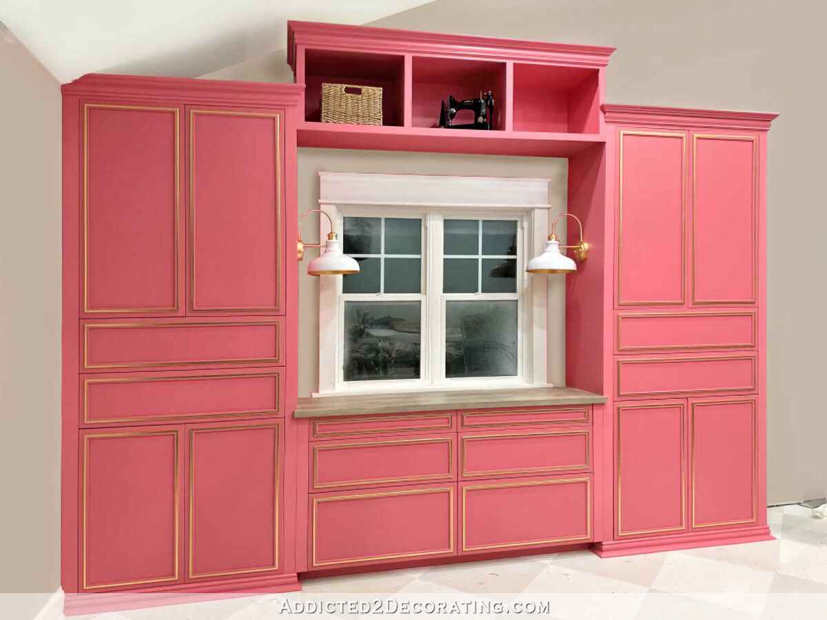
Here’s option 2, with the wall around the window painted the wall color, which is Benjamin Moore Classic Gray. This option keeps the whole bridge the cabinet color so that all of the cabinets, including the bridge, looks like one cohesive unit built around the window with a little bit of wall showing around the window.
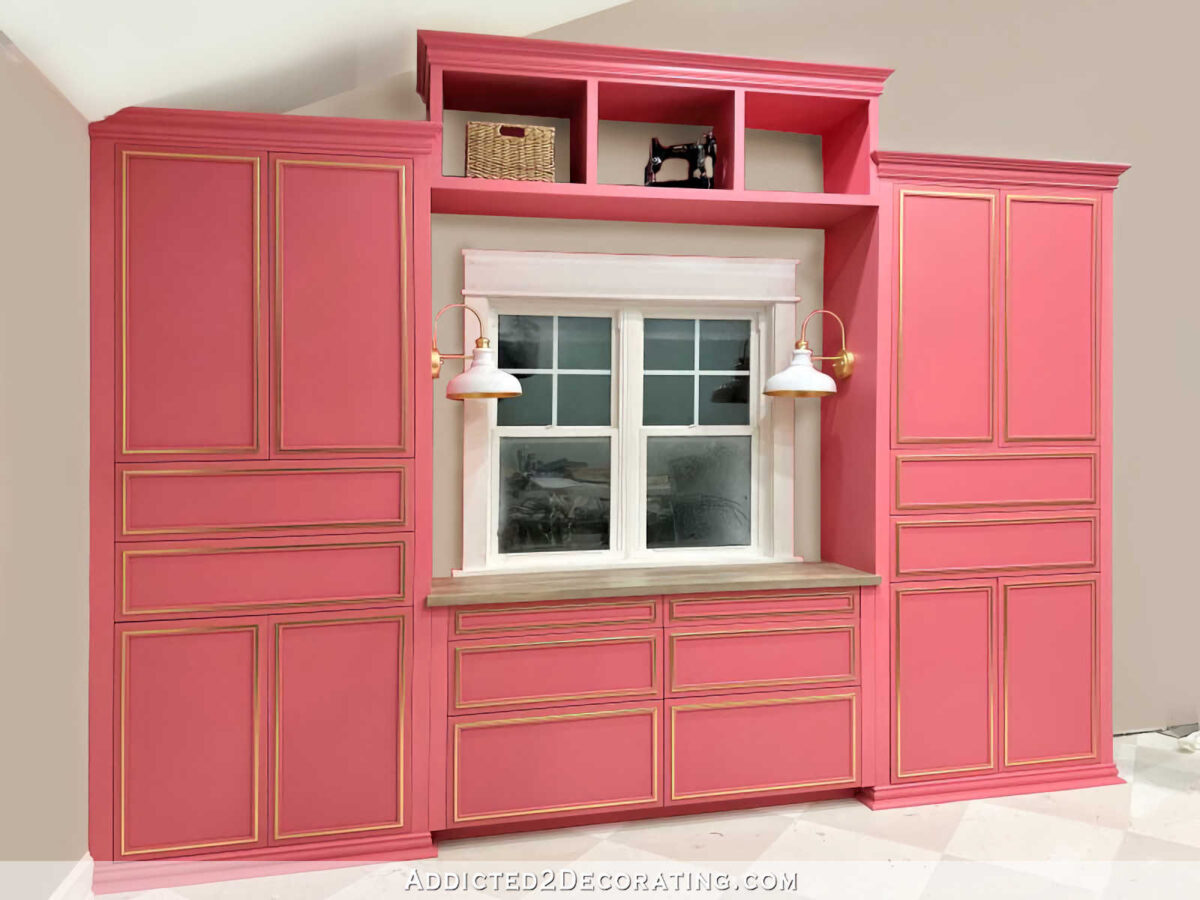
And finally, here’s Option 3, which not only has the wall color around the window, but also had the wall color at the back of the cubby bridge section. This option still has that cohesive look with the majority of the cubby bridge being pink, but also opens up and lightens the look of the bridge by giving the illusion that the back is open (which it’s really not) with the wall showing through (which it really doesn’t).
So those are the three options I’ll consider. I know there were some who suggested using the floral wallpaper mural from the mural wall in those sections around the window and at the backs of the cubbies, but the three of us yesterday agreed that that wouldn’t work because (1) the pattern is simply way too large, and in those small areas, it wouldn’t even be obvious that the pattern is flowers. It would just look like random bits of color, and (2) the pendant light that I’m making to go over my desk is going to be incredibly colorful and large, so I don’t think there’s any need to add more variety of color to the wall behind it.
With that said, just sticking with the three options presented above, tell me your thoughts. Which one stands out the most to you? I’m so curious to see if the table favorite yesterday is the crowd favorite today.
Here’s a look at all three together…
Option 1:
Option 2:
Option 3:

Addicted 2 Decorating is where I share my DIY and decorating journey as I remodel and decorate the 1948 fixer upper that my husband, Matt, and I bought in 2013. Matt has M.S. and is unable to do physical work, so I do the majority of the work on the house by myself. You can learn more about me here.
Option #3 or option#1. This is very clear to me. I didn’t even have to think about it.
#1 makes the sconces pop
I agree…option 1 is the only one that shows off your sconces.
Agreed! I vote for # 1.
I think option #1 is my favorite and then #2. I don’t like #2 at all.
Option 2! That little bit of wall color around the window is enough to break up the pink so the large cabinet doesn’t feel so overwhelming.
Definitely Option 3
Option 3
Option 3 gives you a neutral background for anything you might set in the cubbies.
3 makes is look not so heavy and imposing
I like 3 best. They all look nice, though.
Oh, wow. Option 3 seems like a no brainer. It seriously cuts back the mass, which seems to be the issue in real life.
My favorite is option 3 but all are beautiful
Option #3
#2 appeals to me the most.
me too! Yet it is not very heavily favored. 😉
Option 3.
I vote 3!
#3 for sure.
I vote option #3. It opens it up, makes it feel less imposing. I liked it as soon as I saw it, but hadn’t thought of it as a possibility before.
#3
I like option 3. It lightens up the space just enough. The cabinet is still impressively large but not quite so oversized in effect.
I like 3
I really like option #3
Option 3! Lightens up that area!
I like 1 or 3 but not 2.
#1!!!
To me it looks more finished.
Definitely #3! It looks lighter all around and not so massive
Option 1 by a million miles
Two or three
Number 3. It seems more pleading to the eye. I thought about putting the wallpaper on the back of the top boxes. But I thought it would not look right. Good luck with your decision.
#3. That light color surrounding the window breaks up the mass of pink a 100%! (Also works in #2.) When you add the woodtone blinds I think it will be even more dramatic. Also, the lighter background in #3 showcases the different things you plan to put in the overhead cubbies. Those small cubbies look very uniform in pink but do lean dark in such small spaces. The different objects you plan to put in them will stand out more against a lighter background, I think.
#3 for me, I agree with everything Robin says.
I’m in the minority here so far, but I like option 1 the best. It feels the most cohesive to me. My eye goes straight to the bit of wall color around the window in the other options vs. seeing the cabinets as a whole. If not option 1 though, I vote option 3 – the open cabinets give a bit of symmetry.
Option 1 really makes the window pop.
I like option three the best. It gives the area a lighter look and the cabinets don’t look quite as massive. It just seems to add balance to the area.
Option 3
They are all great, but when I got to number 3, BINGO, looks fabulous for some reason, almost like the room got larger. Cheers.
I like Option 3.
I love option 3 because it gives the appearance of being open to the wall, and the wall and cabinet paint now relate in all the spaces. Both option 1 and 2 make the window look stark in comparison, but by adding the wall color in both the bridge shelf back and around the window it adds some airiness/lightness that takes the heavyness out of the cabinetry. In other words, the pink is gorgeous but it needs something to play off of to really shine
Option 3! Using all pink or some pink makes the whole unit look a little overwhelming. Breaking it up with the wall color looks great.
Option 3
Option one absolutely! All pink looks so much better than the wall color and shows off the sconces best. The other two options make the window just look odd for some reason, breaking the pink up for no reason. I don’t think the cabinets are overwhelming in this space at all. My own esthetic is quite different so it’s not because I can’t get enough pink, but I think what you’ve done is gorgeous.
I agree with the comment on the sconces. When I read the original post, I commented to paint the area, but then when I read yesterday’s post and saw the sconces in place, I thought they would disappear with a lighter wall color. Maybe wait until you see it with the shades.
I agree totally with this.
Option #3. It decreases the mass of the cabinets.
My immediate response is for option #3 – it makes the unit look like a complete freestanding unit without being overpowering.
I like #3 the best because I think it makes the cabinets appear to not be as massive.
I vote for option #3. It lightens the wall both color wise and “weight” wise.
I agree! Definitely #3. The whole area looks balanced colorwise and weight wise.
Definitely 3. It lightens up the cubbies and makes it look like a bridge and less like a bookcase laying on it’s side. It also breaks up the pink. I like the pink/gold but with the other cabinets too, I think you are getting close to pink overload. The gray wall gives it some breathing room and makes it look more like a beautiful piece of furniture.
I prefer option 3. I agree that the wall around the window would look better if it is not the same color as the cabinets (there’s no fooling the eye with that anyway since that area is recessed). And I think if that area is going to be painted the wall color, it looks better with the backs of the cubbies also painted to match.
Definitely option #3. It lightens the whole structure—gives it a little room to breathe. And it’s a little change for a big bang!
Option 3!!!
I still prefer the original. Option 1 for me! And, I LOVE that your mom and brother are so supportive!
Option 2 for mr – I don’t know how to explain it but the solid pink top brings visual balance to the bottom and sides – I feel like option 3 is nice but the top looks like an add on, like shelves, rather than a whole custom piece
I vote for #1 or #3 – either completely lean into the pink and embrace it all the way (which I absolutely love), or let the “wall” peek through all the way down the middle. In the end, whatever you do will be perfection, so I’m not worried at all! 🙂 And I can’t wait to see it with everything else in place – I think the desk, desk chair, colorful light, etc is really going to change everything anyway, so I’m just excited for the whole process!
I prefer the original. It looks more built in, which it is. When you change the area around the window it looks like it is a piece of furniture against the wall.
Hello – Option 3; I thought it was a great idea from some of the comments in the last post. Looks much more cohesive, restful on the eye, and shows off your items of choice. It just make sense. Thank you for asking us!
I like 2
Option 3!
Remove the bridge and let the pendant shine without any competition!
I agree. While I appreciate your talent and your thought of tying the two cabinets together, my eye has always viewed that bridge as being awkward – almost like an afterthought – and it doesn’t feel congruent with the rest of the space.
Absolutely not an option.
Option #3. It provides just enough gray to keep the pink from taking over.
I would have used shorter cabinets so the upper left corner wasn’t cut off by the sloped ceiling. I would have eliminated the bridge and the two sconces to open up the space which feels a bit cramped. I also would have lowered the countertop so there could be a moulding below the window. I know that’s not want you wanted to hear and it is your room not mine. I do think option three is the best as it lightens up the wall of cabinets.
Option 1
I like both 1 and 3, giving a slight edge to 3. 2 has a sort of not quite finished look to me.
Option one is my favorite. Simple and cohesive. There will enough eye candy in other parts of the studio
Option 3
Option 3
I like Option Three – having the paint show around the window and behind the bridge makes the whole thing look less massive. It still makes a statement but it’s more David instead of Goliath.
Option 3. Looks much lighter and nowhere near as heavy.
Oh, option 3 is perfect. Makes the cabinet not as imposing, and will highlight the cubby items much better. Just a little respite from pink, and lets other things shine better as well. I think you inherited some of your amazing instincts from you mom. She comes up with great solutions…and she is on site, so she can see it all better than us. I think I love how this is all coming together!
Well, at first I liked option one, but the more I look at the pictures, I definitely on option three! I’ll be interested in what you pick! Love how the room is coming together!
I really like option 2 and I can’t even tell you, why. 😊
Beautiful work as always, # 3 seems restful and sets off anything placed in cubby.
Option 3!!!!
Option 3. Breaks up the area and makes it not quite so massive.
I think #3 is the best choice, although all are beautiful!
Option 1, for sure! To me, sconces get lost without the pink around the window. If you want anything lighter, only the back of cubbies but not necessary since they will be filled or styled with whatever.
I’m Team 3.
I initially considered being Team 1, but upon further contemplation, I’ve decided it looks like you built a window into a giant piece of furniture, which feels weird. Strangely, my first thought at seeing #2 was “Hard no,” but as I’m writing this comment I’ve gone back to look, and I now feel like I could get on board with Team 2. I remain, however…
Team 3!
Option 3
Option 3!!!
I prefer option 3. It really lightens the look and has a great balance to the other things existing in the room instead of being so bossy.
#3
I would go with option 3, so the cabinets don’t look so monolithic.
Option #3 Hands Down!
I like a combo of 1 and 3. Pink all over the lower part and gray on top making the bridge look more open.
#3 seems like the perfect solution to me.
Option 3 is the easiest on my eyes
Option 3 is the most symmetrical with all the background walls being the same color. Just my humble opion 😉
When I saw the your post earlier this week, my thoughts were, “That’s a lot of pink and it’s huge!” I like Option 3 because the pink as well as the size aren’t so visually overwhelming.
Number three looks more open, thats what I would do.
I probably missed the answer to this question, but have to ask…
Is this office cabinet where you will sit and work? I’m asking because there is no opening under the counter for your legs. What are your ideas for a place you can sit and work?
I wish I had an ounce of the talent you have with woodworking.
She has a desk that sits in front of the cabinets, facing into the room…
I surprise myself but I’m all-in for the pink (#1). I like that it gives the illusion that the window is part of the unit!
Option 3
I love the break in color around the window and especially the top of the cubbies. To me it lightens the heavy look of the cabinets.
Beautiful vision as always!
I propose a 4th option. The back of the cubbies white and the area around the window pink.
Option 3
Option 3
Option 3 definitely reduces the mass of the cabinets the most. It still looks like a cohesive unit, but not quite so imposing. I also think it will make a big difference to have the handles installed (and maybe some gold-leafed objets displayed in the cubbies of the bridge). Other than this change, I hope you’ll finish your major projects and the cleanup before making any other drastic changes. I have a feeling that having a large open space rather than all the project clutter will also affect how this area fits into the whole room.
I like option 1 best. The cubbies will have stuff in them so the wall color won’t really show. I don’t like the break in the middle either as it seems too busy. JMO
Love #3….it looks so beautiful!!!!
Option 1 blows me away! I love it.
Option 3 hands down for me! It’s perfect! Honestly l felt it was top heavy as you have it now. But l wouldn’t have said that because not seeing it in person is always not how it actually looks.
#3
Option 3.
Option 3
I prefer #3. The room is spectacular btw!
Option 3
Option 3!
Options 3. Lightens the load considerably!!!
I think I like option# 3 the best, as it offers the most negative space perception that ends up giving better balance to such large cabinetry within the whole of all the rest of the room’s furnishings and design.
Option 3 is so much brighter and less shadowy, but that might be the photoshopping. But I still think it is my fave. Is there enough of a lip at that top front that you could run one of those strip LED lights up there without it being seen? It would really provide some more brightness up there!
I’ve been following you for many, many years at this point. I always enjoy following along and watching your process unfold!
Another vote for #3. I love how it looks!
I love option 3!
Option 3 as it makes the window look larger.
I was expecting that I would vote for paint around the window but I will go with option 1. The chair and light will change things. I like seeing a huge cabinet all tied together with no break up. It is a huge room after all. I think option 2 does not allow me to enjoy the beautiful framework of the window as much.
Option 3 definitely makes the piece look lighter. I was shocked at how much better #2 was but #3 brought it across the finish line. I might have hung the sconces higher too.
Option 3~
Option #3!
Option 3 looks best in my opinion.
3 for me!
Option #1, without question.
Option 3
I’m not positive why, but it is more balanced, more calming, to my eye.
But I love your style so I know I will adore your final choice.
I still like#1 the best. I feel like even though it is clearly large, painting the wall makes it feel unified and not like a mistake or any afterthought.
I vote option #1
3 looks fantastic.
Option 3 really stands out to me.
Definitely option 3. I didn’t realize how large the whole unit looked until you pointed it out. I can’t put into words why I prefer 3 it just looks so much better overall
I love 3!
Option 3 Minimizes the overall bulky look of the unit. I like it best. Great job and you’ll love all this storage!
#3
I’m surprised, but I like option 1 best – surprised, because for me that would be way too much pink for one room 😉 But the window looks so beautiful against the pink wall around, and that goes for the sconces, so I would stick with the pink wall.
It’s so great to accompany you on your journey and I think it’s fantastic that your mum is getting creative and helping you, too. Have a blessed Easter weekend!
#3
Option 3. It just seems lighter, brighter and less heavy/imposing.
I like Option 3 the best because it breaks up the largeness.
Add me to the Option 3 pile. It lightens and breaks up that monolithic feel you experienced
Option 3! It provided the perception that the large pink cabinets are not so overwhelming and visually heavy. For me, the beauty of the cabinets is more apparent
#1 is the most cohesive without breaking up the cabinets. Lots of beautiful things going on in that room. No need to make things a little choppy. Keep it simple and beautiful.
Option 3 draws the eye and does invite a bit of airiness.
#3 It opens up the cbridge and makes it look airy. With the back pink it looks closed. I love the whole studio and all the colors, so whatever you decide of course will be perfect!
I like option 3 the best.
Option2! 🙋🏻♀️
I vote for option 2!
Number 3, I think, which surprises me because I liked the idea of painting the area around the window to match the cabinets. With the 3 images together, I immediately see how the bridge seems less bulky with the back sections painted.
Option 3 is my favorite.
Definitely option 3. It is what it would look like if you had purchased the cabinets as a diy project or custom made. The first one is overwhelmingly pink, the second makes the window section stand out too much. The third looks natural.
three for sure! But I know which ever one you pick will look great!
#3….helps define what’s in the cubbies.
Looks very nice. You’re very talented. 🙂
Addendum to my earlier #3 vote. Looking at the options again (this time after reading everyone else’s comments), I’d like to see a rendering of #3 with the backs of the bridge cubbies painted white, as someone suggested, instead of Classic Gray. The white would take the eye upward from the window and might provide a pleasing break from just gray and pink at the uppermost part of the built-in.
I’m leaning toward 3 but I also really like 1. 2 I didn’t like at all.
Without looking at anyone else’s replies, what looks better to my eye is #3
I like #3. It is not as heavy looking as the first two. The wall color really lightens it up. 👍🏻
I love no. 1 but the items in the cubbies don’t show up as well. If you had lighter color objects, perhaps they would pop more. Nos. 2 and 3 are beautiful, but the window/wall looks plain to me with the white wall, white trim, and white sconces. The window shade might make a huge difference, but it’s hard for me to imagine what that would look like without the shade photoshopped in. Whatever you do, though, always looks beautiful!!
I like Option 3. I lightens the look of the cabinet.
Option 3 looks the best
I know I’m in the minority, but I don’t like #3. The wall color behind the bridge looks like a bookcase without the back and it cheapens the look of those gorgeous cabinets.
#2 Adds scale to the window, so it isn’t dwarfed by the large cabinets.
So, 1 or 2 would be my pick, but 1 is my favorite
I love Option 3.
Option #3 is by far, my favorite. It breaks up the weight of that wall being ALL pink. I love that. It doesn’t look so heavy to me now.
I like option number three. The tan background around the window and behind the top shelves cool down or lighten up the saturated pink/Carl color on those big cabinets. It makes the cabinets not so looming.
Plus when you put objects on the top shelves or on the shelf under the window your eye won’t be so stressed looking between the objects and all that pink. Don’t get me wrong I like that pink.
I like option #3
Option three looks the best to my eye. It draws the eye up and integrates the whole unit with the wall, and looks lighter in the bargain.
I guess I’m in the minority here, but I really dislike option 3. I feel like it muddies it up, if that makes sense. I would stick with #1
When I look at option 3, my eyes are drawn to the window right away and then upward to the cubbies. The rest aren’t as noticeable which you want to see because they are so pretty. Not sure I explained that very well. Option 2 with the wall painted gray breaks up the space somewhat, but my eyes aren’t automatically drawn to the cubbies. The rest looks like one built in cabinet. So my vote is for #2.
I like the pink included in the back of the cubbies and around the window, it looks more inclusive with the cabinets. Option 2 looks nice as well with only the cubbies painted. The thing that is throwing me off is the size of the sconces, they are very pretty, but just seem too large for that space.
I would go with option #1 and leave it all pink. The other too options are pretty but the all pink makes the gorgeous scones pop! I would hate to see them just blend into the wall. Also with the added wall color I feel like instead of simplifying it’s almost making it too busy, as if there are too many things to look at not one beautiful focal point that it is now. With your colorful chandelier it will be just stunning! I love your work it’s absolutely lovely.🩷
Option 3, option 1 was overwhelming to me!
Oh wow! What a difference it makes to have some wall color over there.
Option 3 for me!
I think I’m a team #1. It’s just more pleasing to my eye without the white kind of stuck in the middle
I was always in favor of the wall around the window being painted the wall color but never even thought about the cubby backs being painted the wall color. I like 2 or 3. Maybe 3 a little more. But that is me.
3 is probably my preference, but I’m good with 2. I understood your plan, but never really like painting the wall around the window. It just looked off somehow. Maybe because it is not part of the unit, the unit is obviously the furniture around the window?
2 or 3….can’t decide 🙂
#3 looks less bulky. Beautiful!
Option3. Visually makes sense to me.
Option 2! 😊
Option 3, though I also really like option 2. Option 2 will “hide” what you have in the cubbies a bit more, so I would especially do option 3 if you plan to decorate those cubbies, and perhaps 2 if you want the contents of the cubbies to not be a focus.
3
Option 3
Option#1 for SURE!.
Option three lightens the massiveness a great deal – i was overwhelmed by the entire unit being pink – i mentioned before my concern that it would be a rather unbalanced wall with all that pink en masse on the one side and added height to boot.
Keeping the back of the open shelving as well as the area around the window in the wall color keeps that wall light and airy like I believe you have been going for with the floral mural, etc.
Adding more % wall color to the unit gives more visual balance to the wall.
torn between option 2 and 3, but leaning towards 3. Both take care of your eye going to that weird trianage in option one. I think I prefer 3, makes the cabinets a little less massive.
Option #3!
Number 2
Hands down..1. All that pretty pink showcases the white with one, big, beautiful “pop”!
I prefer Option #3 – it lightens up the the pink cabinets and makes them not so ‘heavy’. Amazing how a little paint can visually change things so much!
Kristi,
I like option #1 best just as it is. The massive (I really don’t like that word to describe your beautiful cabinet) cabinet just looks so right, being there doing what it was created for….lots of storage. The entire cabinet and wall color all together looks so pleasing to the eye.
Option #2 does give the pink a break, and I like the look of it somewhat.
Option #3 just takes too much of the originality out of it. Makes the whole cabinet look like several pieces of storage furniture all pushed together to make a storage area. The cubbies look like they were just placed up there as an after thought for more storage.
Whatever option you choose will be for YOU to look at with pride, enjoy it for the storage you built it for, and know there is not another one like it anywhere in the world.
Not sure if I prefer option 2 or 3, but I know I hate option #1. It just doesn’t make sense to my brain… a cabinet with a window in it? My brain refuses to process it, and the illusion is lost. And ofc, the “too much pink” that bothers you.
Now between #2 and #3, I can’t decide. I do like how option 3 makes the unit lighter; but on the other hand, it creates the illusion of shelves over the cabinets, and it kind of ruins the cohesiveness of the unit. So there’s a plus and a minus for both. Cohesiveness of a cabinet unit, vs breaking the pink and making things a bit lighter. Not sure which one is better – I think that’s a call to make based on the real life feeling when you are in the room (and probably when everything else is in place).
Oh, and on an irrelevant note, I love that you will be painting the swatch cabinets white, I was thinking of white for them ever since you made them! 😀
Option 3
Definitely the third option. I like pink, (especially with the gold leaf) but the third option breaks it up enough that I am not overwhelmed as I am in option 1.
For me, it’s option 3. Significantly lightens the massiveness of the cabinets and the pink color. On your other front wall of cabinets, you have the wallpaper with lighter colors and white background to desaturate the strong pink of the lower cabinets. This room is gonna be fabulous however you do it!
No doubt about it for me; number 3.
Option 1. I can’t explain why, except that but it reads as the one with the least visual noise.
out of those 3 options, I like 2 and 3. But option 3 is my favorite. It breaks up all the pink (which I love) but the cabinet is huge! (which I also love!) I like the wall color around the window and in the back of the cubbies. It breaks up all the pink!
Option 1. The rest are too busy.
Option 3
I like option one. It looks more cohesive with the small back areas painted pink and not so broken up. It’s also difficult to envision everything because I know you will be adding other elements, etc which will change the dynamic as well. It’s really beautiful, whatever you choose.
In order of my preference:
3,2,1
I feel like the 3 keeps the height of the room, and makes it feel more airy. The closer to 1 you go, the cabinet feels heavy and drags the ceiling down.
I think option #1 is my favorite.
I haven’t read any other comments yet, but I think all pink makes it look more built in. There is no getting around it being a massive statement in the room – but that’s YOU! You’re always bold in your design and color choices. I think you should celebrate that.
Tuesday’s post stood out to me not because of the large pink built ins, but seeing those in context with the also massive paint swatch cabinet. Love it though I do, THAT is what feels overwhelming and out of place to me. Maybe it’s the black trim, maybe it’s the size, maybe it’s the busy-ness of it, I’m not sure. But looking at the room as a whole, 2/3 of it is cohesive and 1/3 of it is a departure.
Option 1!! The cohesive look is less confusing to the eye and highlights both your window and the sconces. 😊
#3
Much to my surprise, I really like #2.
I like option 1 around the window but option 3 for the bridge section. This is coming from the woman who created her wedding dress from 5 different sewing patterns, I’m just a cut-and-paste kinda gal!
I’m voting for Option 3. I thought it should be #2 before I saw the mock-ups, but I really love #3. Gotta love your mom!
Option 3 for me!
I like the third option.
Option 1. The way you’ve done it makes it seem built-in…think manor house libraries. Adding wall color makes it seem like bookshelves placed against a wall. How massive can it really be? Your studio is enormous. I think it is perfect this way. Another thought, the sconces stand out against the pink better than the wall color.
YES…. #3!!
Option 2
#3 Balance!
1 or 3. That being said, it would be nice if everything was in place and finished before you move forward. Would you feel the cabinet was overwhelming in color/size if everything else was finished and in place—including the finished chair, desk, work tables, painting walls and ceiling? 🤷♀️
Ok, I like #1 and I like #3. I do not care for #2. However, deciding between #1 & #3 would be more up to you since it is your studio. Either way, the big pink piece of furniture is big and pink. With the wall color around the window and the back of the cubbies, makes it look like its own space and that the big pink thing didn’t eat the wall.
I have talked myself into voting for #3. Again, keep the chair green or at least solid. It doesn’t need to be striped or flowers or polka dots or plaid. Just green or eggplant or purple. No gold. An idea: Have your mom paint the ceiling for real!!
Option 3 makes your cabinets less imposing and the wall colour paint around the windows brightens the area above the bench. The bridge cabinets look less heavy and the lighter paint may make it easier to see any objects you place in them. The pink background made them look heavy and dark.
Option 3 is my choice. Can’t say why…only that it’s the one that looks best to me.
Version three for me. Gives the area a feeling of airiness and relieves the “blockiness” of the cabinets. It somehow makes the entire wall feel more cohesive to me. Looking great Kristi – as always.
#3 It isn’t that the piece is so massive, it’s that it’s so heavily pink. However, #3 doesn’t show off the sconces.
I love #1 as you’ve been building/painting, BUT, then seeing your three new options and BAM option #3 is the winner IMHO.
I think #3 makes the overall unit look lighter and not so heavy and imposing. Also, love the wall sconces; they look amazing.
I like option 1.
Option 3 for me.
Not so heavy, but still gives a cohesive look to the complete unit.
Looks classy
My preference is option three.
Option 3 no question. It lightens things up and keeps the unit from seeming so massive.
Definitely Option 1. Looks more seamless and neater. The pink actually recedes more when it’s not broken up by the wall color. And your sconces look wonderful against the pink
# 3
Option 2 or 3 with 3 being my favorite. What a big difference having that small amount of wall color show.
All three look exactly the same to me. For real.
I vote for option 3. The beige separates the cabinetry from the walls and defines the cabinetry.
Goodness my tablet is driving me crazy! My favorite is option #1 and then #3. I don’t like #2 at all.
It’s 3 for me!
I like #3
Option 1, looks more cohesive/less stop and starts to the eye.
I pick 3. I like the wall color around windows and in cubbies. Makes it not so heavy
I vote for #3
Option #3
3 or 2.
Not having seen the cabinets or the room in person, even when I mock in the shade I prefer option 1 where it is all a cohesive pink except the window and lights. That said, you mother has excellent taste and an artistic eye so I must assume that if she feels it looks massive then it must. In that case, I think option 3 lightens things up and makes the cabinets appear less dominant.
#3
I like Option 3. I am looking at the options on a very small phone screen, which may or may not be influencing my preference.
I think the wall color showing around the window and at the back of the bridge above helps the cabinets look less massive.
What she said!
I like option 3. I’ve assumed all along that the long wallpaper wall was to be center of interest. I love all of your other pieces (glad you’re painting swatch cabinet white), but they are attention grabbing. As much as I like the piece behind your desk I think it would have been more unassuming in this room without bridge.
Wow, option #3 seems to lighten up the weighty look of the whole unit
Number three! ♥️♥️♥️Kathie
Option 3.
1 is like those meals that are great, but a little “heavy”. And 2 is just a tad bit odd, good, but odd. 3 sings!!!!
Option 3 ALL THE WAY! It really lightens the weight of those cabinets.
I voted for 3 originally and stand by that thought. I want to add that I think you need some gold on the bridge. Maybe a thin piece of trim across the bottom of the bridge like you have on the cabinets would do the trick. Without any gold at all on that one piece, it seems odd to my eye. Hard to explain but my brain keeps trying to marry the bridge to the cabinets and it screams at me “Where is the gold?” 🙂
Also, someone in the comments mentioned painting the backs of the cubbies white. I think white may be too harsh, but I think an off white or ivory would look better than the grey so it looks as solid and custom as it actually is. Though the grey is better than the pink to lighten the weight of the cabinets.
Whatever you do will be fabulous, as usual!
I feel like Option 1 is the best because there is less visual clutter in my mind…. the others feel a bit choppy to me. I’m not worried about the cabinet and bridge being a monolith, because it’s a large room and can handle some strong accents like that.
I like#2. I agree that the sconces pop more on#1 but there are so many sconces in the room and while they are gorgeous, they don’t all have to “pop.” They are a supporting feature and you’ll have the statement piece in your pendant light. You’ll also have the shades, which I think will look better with the wall color and less like “I hung shades on a cabinet.”
I agree that the things in the cubby area are more visible with the wall color, but I think it throws the balance out of whack. I just painted the backs of my built-ins a berry color and all the things that stood out against a light background fade in the deep color and vice versa. It just took playing around to make it work. Also, I think the pendant will look better against that section being all one color and less busy.
Whatever you do will be beautiful. There isn’t a bad option – all are fun and show your personality.
option 2
Option #3. Hands down.
Kristi, Wow, so many opinions! I have enjoyed vicariously decorating with you for years! Your blog is one of a handful that I still follow and it is my favorite! You are extremely talented and I suggest that you follow your heart. This is your home, your canvas and I say go with whatever makes your heart sing! After all, it’s just paint and you can always change your mind!
3
I like option 2.
Definitely #3. The cabinets are overwhelming, and the neutral calm of the wall color gives the place for the eye to rest.
Going for option 3
Option 3 is my favorite, it lightens the space and draws the eye up.
I prefer the way option #1 looks in the photo, but I believe you that it is too massive for the room. For that reason, I think option #3 is the way to go. I am amazed at how much it lightens up the visual weight of the piece. This is a brilliant solution! Option 3 all the way.
Love #1. My immediate reaction to #3 was that it looked unfinished.
Option 2. It retains the cohesiveness of the entire built-in but gives the window some breathing space.
In Option 1, the window looks smothered. In Option 3, the upper cubbies look disconnected, like an afterthought.
I love the cabinets and the color and which ever wall color you choose. The problem I have is the area around the window. I feel like it’s too busy, especially with your paint color on your cabinets. I think take down the wall lights and just have a couple small ceiling lights at the top would be sufficient and that will clean the whole area up. Another thing is the window needs some type of covering. I think just a plain window shade will work nicely.
I think option 3
Option 3 is my favorite. The comment about the window looking like it was built into a piece of furniture (Photo 1), solidified it for me. I just don’t see the window area the same way anymore. I agree with others who say the painted wall in the top cubbies lightens it up. Whatever you decide will be beautiful when its finished.
Are you committed to the bridge over the window? Maybe try a mock-up with that removed?
There’s not even a slight chance that I’ll remove it. 🙂
I like option 3. The cabinets are amazing and I love your work. The third option makes the cabinets less imposing but cohesive.
Number 3 for me
Option 3 doesn’t make sense to me because you want the entire cubby to look like a piece of cabinetry. Option 1 is my favorite and really makes your pendant lights look so much better than the gray wall being behind them.
I like Option 3 because the wall color around the window and behind the cubbies gives the eye something to focus on other than all the pink.. It gives the eye a break, or pause, before moving to the next section- sort of like a period at the end of a sentence or a rest when playing music. A period serves as a separator, or a break for the eye before the next sentence and that’s what the wall color does around the window between the two larger pink cabinets as well as between each cubbie. The wall color helps everything not run together into one huge piece. Hope this makes sense!
Still like the original. It just looks “more” with that color choice in my opinion.
option #1