Music Room Bookcases – Three Options (Opinions, Please!)
As you know, I’ve been COPing the heck out of my house this week. (If you have no idea what I’m talking about, you can read more here and here.) And during this process, I’ve uncovered many books and decorative items that have been packed away for a while now.
Well, one of the items on this year’s house goals list is to finally decorate my music room bookshelves. And since I was unboxing all of this stuff, it seemed like it would be an easy task, and something I could quickly cross off of my list.
But I didn’t get it done. The reason? I’m still not sold on color. And the color of the bookcases will most definitely determine how I decorate them.
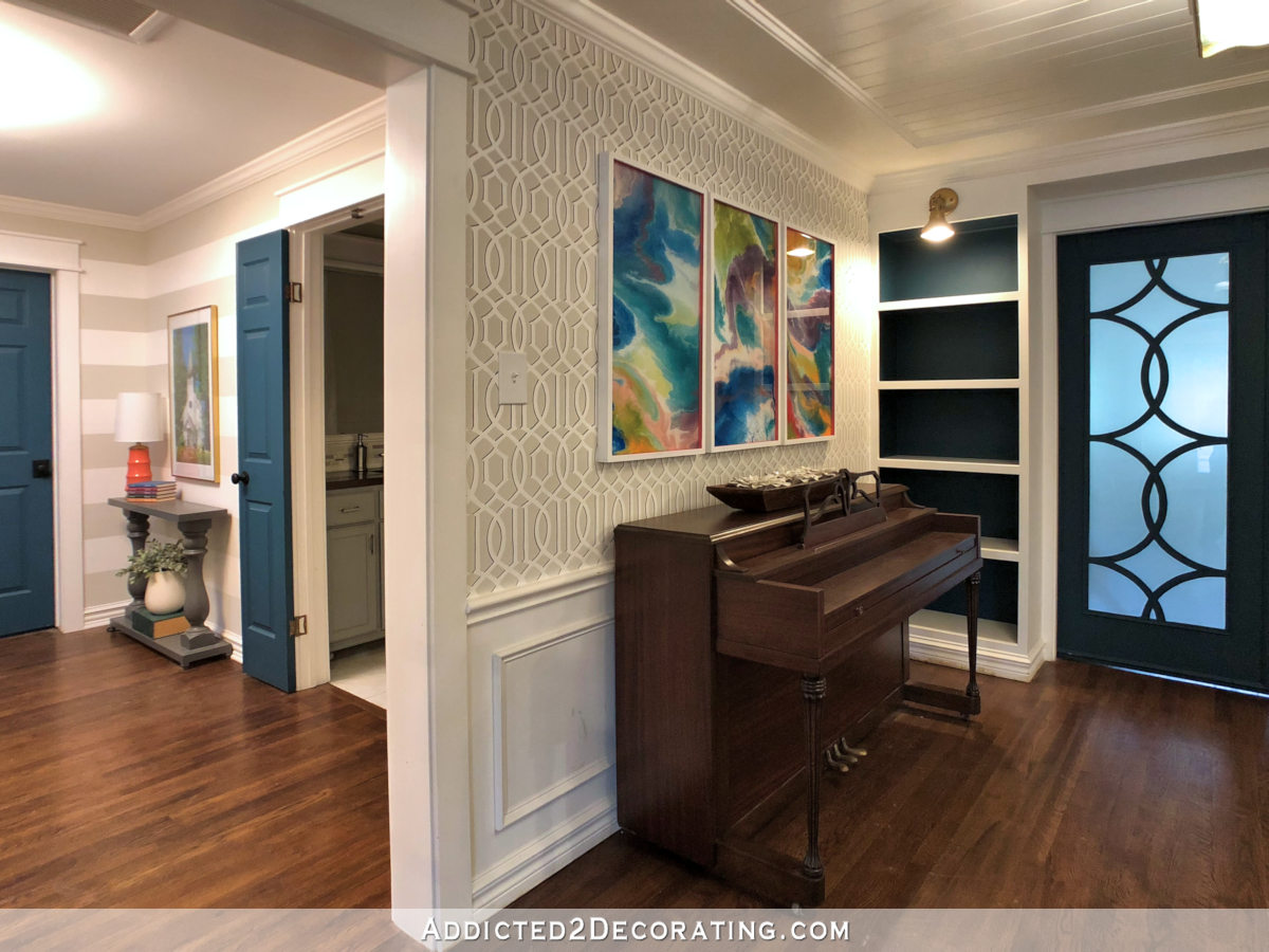
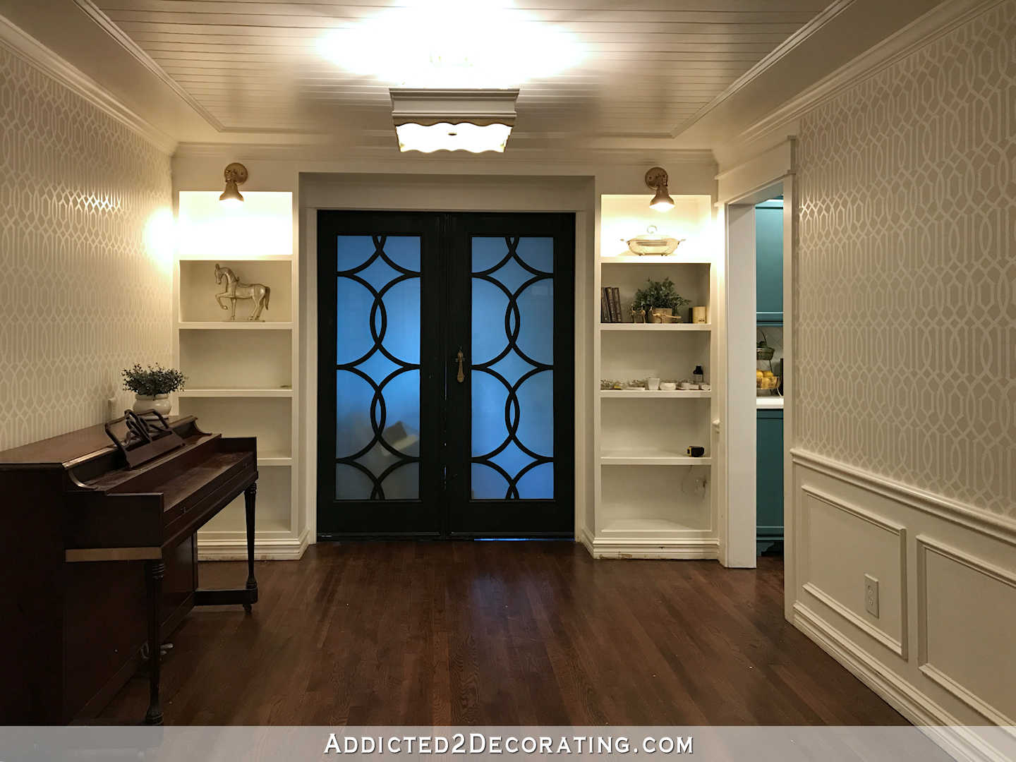
When I first built the bookcases to flank the doors that I made (yes, I made those doors, and you can click here to see how), I painted the bookcases all white, and painted the doors black. This is how that looked…
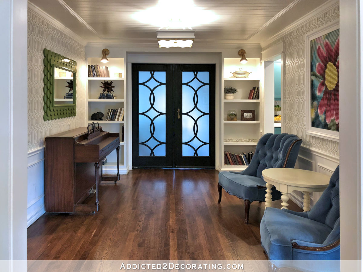
Then after I finished the entryway wall, which I painted dark teal, I decided to paint the doors dark teal as well. Then I was inspired to paint the backs of the bookcases dark teal. This is a fairly recent picture of how that looks…
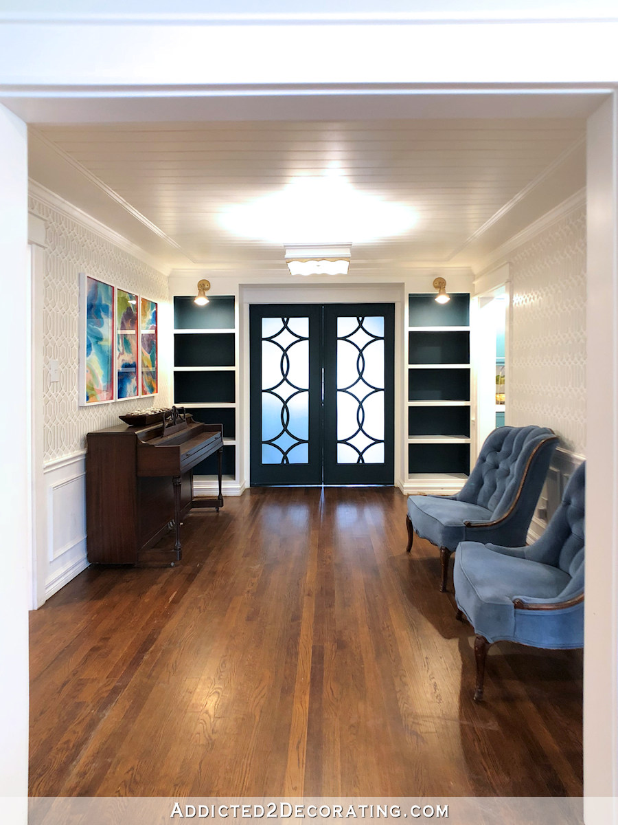
So I want your opinion, and as far as I can see, I have three options. I didn’t love the white, and I’m not sold on teal for the backs of the bookcases, either. But there’s a third option.
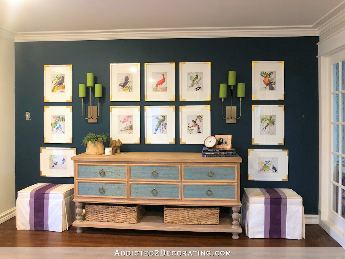
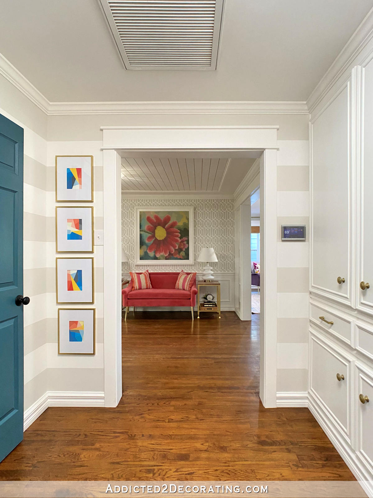
Before we consider the options, let’s review what’s in the immediate area. First, when you walk through my front door, this is the wall to the left. This is the wall I call my “entryway” even though it’s part of one big room with my living room, and the wall is a dark teal.
I just wired my sconces and haven’t had time to paint the paintable switch plate that I bought for the switch. 🙂 It’ll blend in a lot more once I get that done.
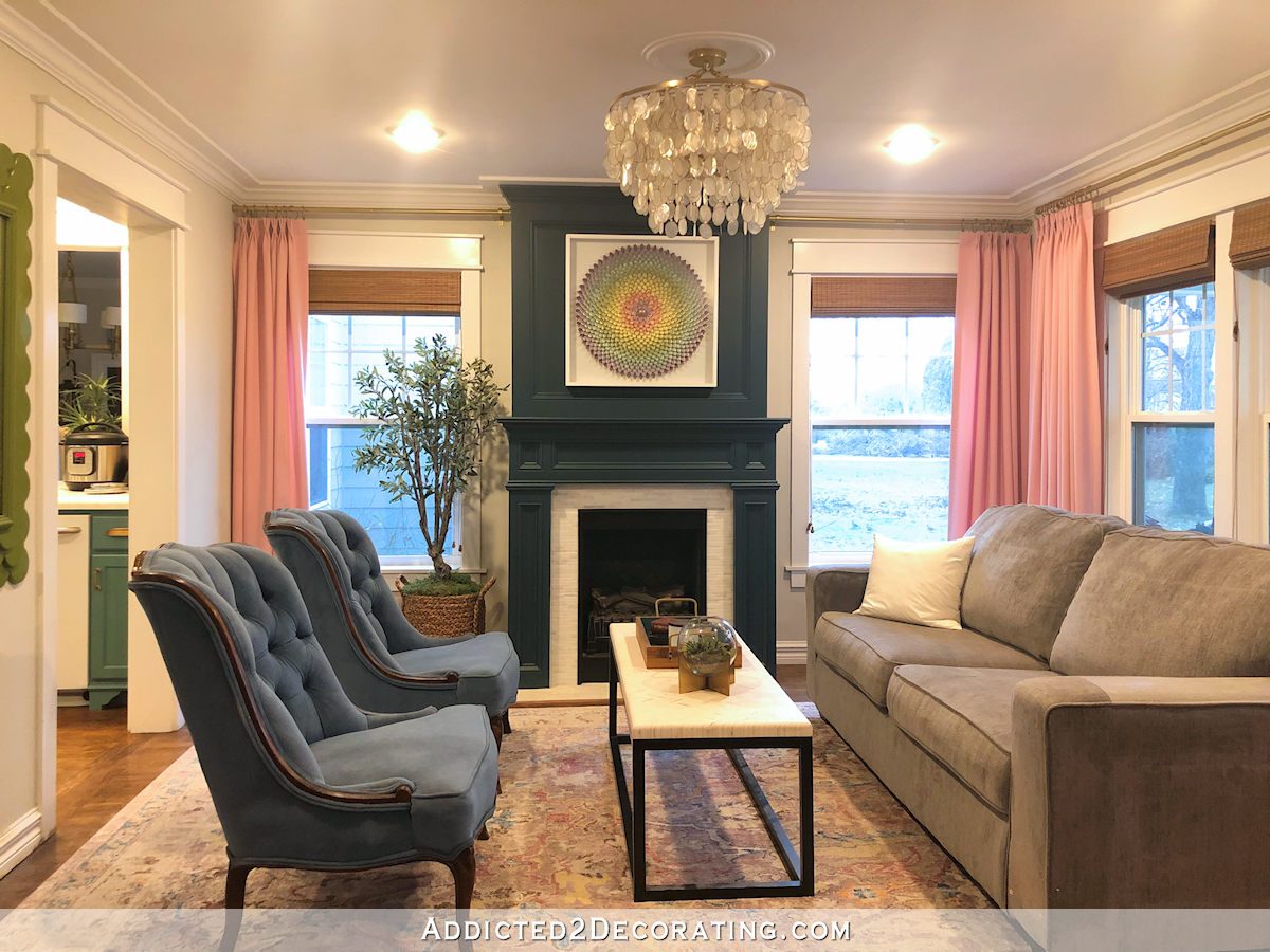
From the front door and to the right (and directly opposite the entryway wall) is the living room with the teal fireplace. This is the exact same teal that’s on the opposite entryway wall. This room isn’t finished (hello, blue chairs that clash with my kitchen!), but the teal fireplace is staying.
And from the front door, this is the view directly ahead. The exact same dark teal that’s on the entryway wall and the fireplace is on the doors and the backs of the bookcase shelves.
FYI, the final destination for those chairs will be the music room. I will be reupholstering them, because they clash horribly with my kitchen.
So here are my thoughts:
- The white bookcases just seem blah to me, but maybe that’s because I never really decorated them. I mean, I put stuff on them, but not in any thoughtful kind of way. Maybe once they’re actually decorated, the white will be fine.
- The bookcases with the inside painted dark teal almost seem too choppy to me. It just seems like a lot going on where I don’t really want a whole lot going on because that detracts from the doors.
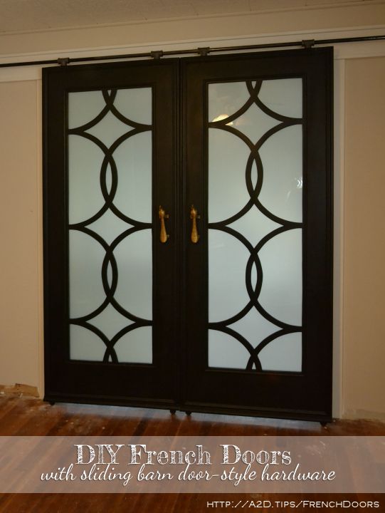
- I still wonder if painting that entire wall — bookcases, trim, doors, everything — a dark teal would be the best option. At first I thought this would definitely detract from the doors, but then I got to thinking. It’s not really the doors themselves that make the doors special. It’s really the sunlight coming through the glass and showing off the design that makes the doors special. And that will be front and center on a solid wall of dark teal. Right?
Obviously, since I’ve never tried option 3, I don’t have an actual photo of that option. I did try my best at editing a photo to see what it would look like. I’m terrible at this kind of editing, but it does give some idea of what it may look like. (Please try to ignore those clashing blue chairs.)
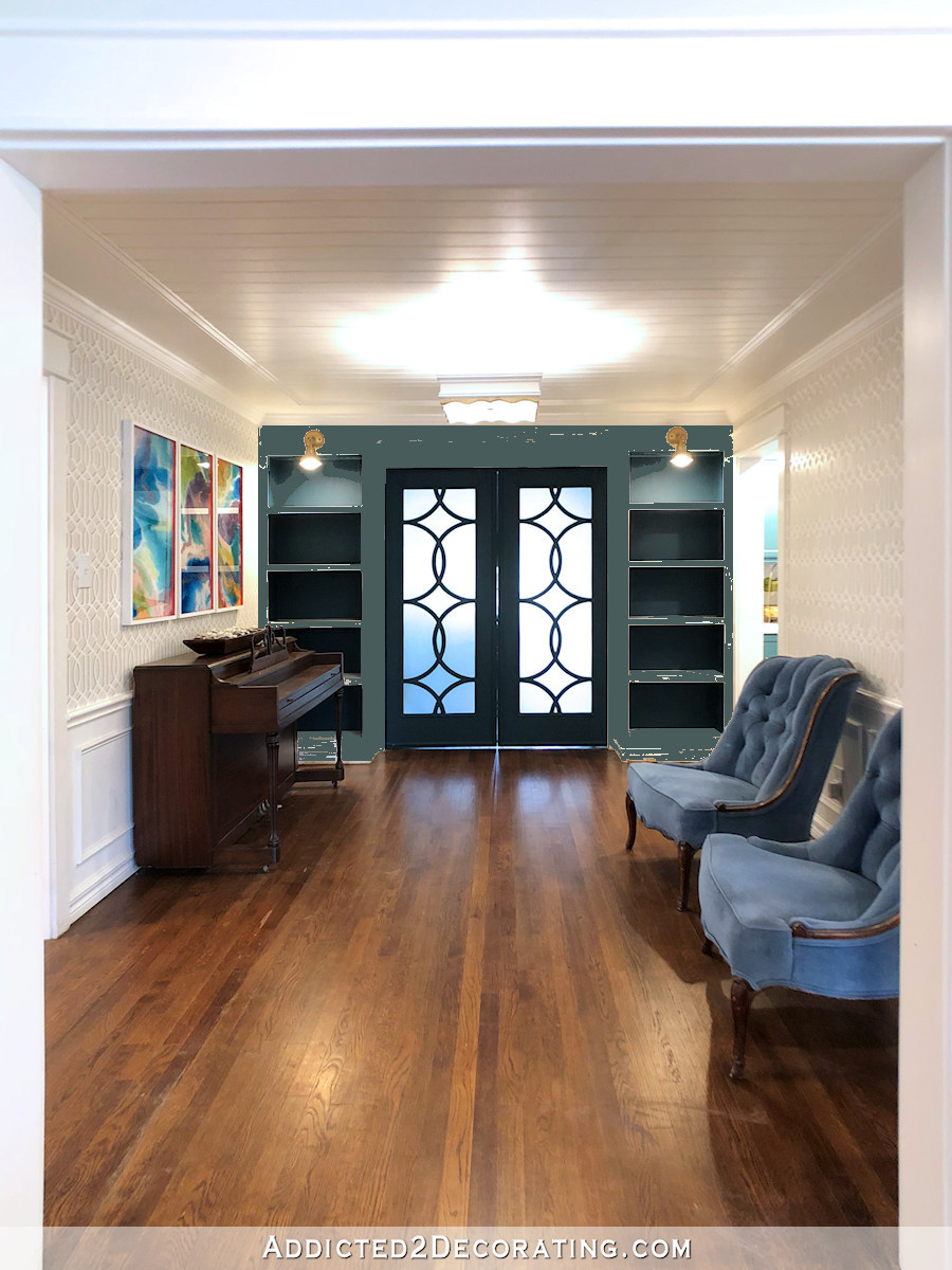
I have to say, that option really appeals to me. And I think it definitely makes the design of the doors the feature again, as opposed to my current bookcases with the teal just on the backs that creates a choppy and busy appearance.
Also, I keep going back to a couple of inspiration pictures. First, this amazing dark gray bookcase and fireplace living room wall from Lucy at Craftberry Bush.
And then this not-quite-so-dark bookcase wall from
So what do you think? Go back to all white bookcases? Keep them like they are — white bookcases with the backs painted teal? Or go for it and paint the entire wall teal?
EDIT:
For those of you thinking, “Why is she even thinking about this right now when she and Matt are still sleeping in the breakfast room. Doesn’t she need to work on other more important things right now?“
Y’all, I can’t stress this enough. I have a plan for the things that need to get done ASAP. I know what’s important to both Matt and me right now. At the same time, I can’t be “go! go! go!” all the time, from daylight until midnight, every single day, on the big stuff. I need downtime. And for me, often that downtime is working on a fun project. Painting is one of those mindless, relaxing downtime projects that I thoroughly enjoy. So if the mood strikes (and I sense that it will), I need a direction for these bookcases. I’m not procrastinating! I just simply can’t be 16 hours a day about the big, daunting projects.

Addicted 2 Decorating is where I share my DIY and decorating journey as I remodel and decorate the 1948 fixer upper that my husband, Matt, and I bought in 2013. Matt has M.S. and is unable to do physical work, so I do the majority of the work on the house by myself. You can learn more about me here.

All teal!!
I like them as is. I like your entryway wall too. I just don’t care for the purple footstools , though I know you didn’t ask. It’s too much.
I enjoy your sharing and your talents. Thank you.
I think it depends on what you plan to put on the bookcases. Are you filling them to the brim with music books, albums, etc or will they be stylized shelves for vases and knickknacks. Are you putting a white vase there that will stand out nicely against the teal or are your pieces going to be a darker color that would get lost with a teL background?
I was thinking the same thing. What goes on the shelves, especially the amount of books, will make a big difference as to the color the background should be. I don’t really like the all-teal option because I don’t like the teal wall here, teal wall there, and teal wall over there spottiness of it. It seems contrived AND seems overpowering for your lovely light walls and dramatic doors.
As for whether you should have white or teal backs for the shelves. you could try out the white again with white paper.
I actually like the white trim around the wall. It seems more congruent with your other teal accents. Perhaps just painting the shelves teal would be an easy fix, though I like the white shelves as a demarcation.
I really like the all teal! I don’t think you’ll ever be happy with the white, and the teal in the back of the shelves is pretty but does chop up everything. I can just picture some of your resin art on the solid teal bookshelves… amazing! GJ o for it – it’s only paint! 😁
Leave the bookcases and go ahead arranging them. Put white covers on any books going to put in there. Steal items from your pantry if needed.
I had all white bookcases, couldn’t see so many items . I covered backs of mine in .grasscloth. I didn’t paste it on just used thumbtacks in case I wanted to remove it later.
Didn’t you have colored grasscloth at your entry?
Lovely doors and the light coming through them exactly- no need to darken that wall. Maybe inside the bookcases could be something gold or goldleaf similar to your wall design to pick up the gold peacocks on that same wall and the gold sconces. Maybe musical symbols with peacocks, who knows?
Paint it all teal. Very appealing!
I am a big, big fan but I agree about the footstools in the entry wall. I’m sorry. I know the entry wall wasn’t in your question but when I look at the picture all I see are the footstools. As to your question I would go all teal.
I like all teal. The light coming through those doors is everything. Once you pain them and put your items in, if it takes away from the impact of the light showcasing the doors, make simple doors painted teal. If it seems too plain, add a cutout that compliments the doors and put glass or whatever medium the doors are with a light feature.
I like the pops of teal everywhere. I don’t find it choppy. I think it suits your style and compliments everything. If you put doors on the shelves, I might paint the back of them pink like your curtains in the living room…would be fun to see when you opened the cabinets.
Um – go back about a year and read Kristis response to people who want to change her design when she hasn’t asked . At that point we need to respect her choices .
I agree! I didnt like the purple stools and she didnt ask!!
Sence she is asking l like the all real look. It. Rings everything together.
Agreed Patricia. Kristi did not ask a question about her stools. She would like input on the bookshelf wall. I happen to love the purple stools against the teal with that gorgeous lime green in the sconces. That color combination is actually very sophisticated. I am a designer and I find that so many people are afraid of color. I think it’s amazing that she is not, and owns it. If YOU are not as bold in your use of color as she is, that does not mean Kristi is not right in her choices.
Now, as for the question you HAVE asked, Kristi, I vote for painting the whole wall teal. You said you would like the door design to be the feature of that wall, and painting the whole wall teal would accomplish that. As you enter the front door, it would also draw the eye back through the rooms, which as you know makes any space appear larger and adds interest. Whatever you do ultimately choose though, I am glad that you design for yourself and no one else. That is how it should be.
I am a purple footstool fan. 🙂 It brings an element of the unexpected-a surprise, a punch of color. As far as the color of shelving etc, I would like to know what they are going to be displaying. But not knowing that, I vote for the all teal. The items will stand out more and it does showcase the door design!
I love all teal. But definitely some pink, white and brass accents with the decor. And I love some decorating slashed in with the building blogs !
I really like the gray. . A little different and not quite as dark as the all teal. Looking forward to what you go with!
I agree. On both comments.
I think it’s obvious you like the dark painted look in your inspiration photos. So go all teal. But I would Consider better light Ing, maybe each section of the bookcases. The way it looks now, it’s choppy I think because the top is bright but the rest are not. If you light the interior and the shelves can pull away from the back so light flows down that illumination might be enough to keep it bright
I was thinking lighting inside cabinets would be nice too! Puck lighting maybe?
I agree about the footstools, even though I like the way they look. Just not crazy about them being in that spot; they are a bit over the top, IMO.. But as Jwill said, you didn’t ask about them, did you? Still, when you say “opinions please,” you might find your readers have opinions about almost everything, whether that’s what you intended or not. 😉
I’ve been following your blog for years, since you and Matt were in the condo, and I’m constantly amazed by how you can combine bright colors with painted furniture, do it mostly by yourself, and still create a very elegant living
space. Bravo!
All teal. It’s dramatic and the doors shine
Have you thought of injecting some pink in here? You have some bright pink fabrics that were laid out in the LR (or did I miss something?). At any rate, I think some of that maybe on the back of the bookcases and on the chairs would really make your doors stand out, Said doors, I might add, I seriously covet…
I love this idea! I think it would look great if she painted the back of the shelves the same pink as the living room drapes!
I totally agree!
I like the teal door but not the teal wall and white shelves (it looks like a paint chip). What art work do you plan on putting on the walls? It looks like you have a couple of really nice pieces. Have you ever considered pulling in your pink? Maybe a soft pink on the backs of the book shelves. Sorry for throwing another option at you. I’m sure whatever you decide on it will look great.
I’m actually considering reupholstering those chairs in pink. 🙂
OMG. That would look awesome. I’m so envious of your design chops and vision.
Chais in pink?! Yes yes yes!!!
Yup, that’s what I imagined when you said “ignore the chairs”. Pink in harmony with the new curtains.
Oh I think that pink on the back of the shelves would be lovely and add a lightness there. All teal seems very dark too me but I guess it does depend on how you plan on styling the bookshelves. Looking forward to seeing the end result whatever you do!
I agree- all teal, but- the lighter teal that you used for the photoshopping. It’s a lighter, brighter color.
My experience w bookshelves is that the bac kground practically disappears when the shelves are arranged w books & sit arounds. I personally like yours white right now. It makes the room feel bigger & bright. The books and accessories will add a lot of detail to the room, so I would arrange everything on the shelves first, take photos and see how I like the balance. The dark bkgd will give the shelves a nice depth you won’t get w a white background. I also like the visual repitition, from the entryway, of your white transition walls into the music room,repeated by the white book shelves in the next transition to the sunroom.
This makes a lot of sense!
I second this option!! It’s super soothing to the eye, and those doors SHINE!
Agree. All teal!
Teal all the way !
All teal too! It is beautiful! 👏🏻👏🏻👏🏻👏🏻
I really like them as they are now. All teal seems overpowering to me. The white around each shelf will frame the items on the shelf.
Also my vote…all teal
I read through some of the comments…so I want to add…if the sunlit design of the doors are the focal point then all teal is the answer and you know how to accessorize for that so what’s the point in talking about that. I also think the teal is a great back drop for the pink/light chairs, if that is what you decide.
I agree all teal focuses on the light from the doors making it the focus
Agree!!
Definitely all teal 🙂
Yep, all teal. 🙂
I love the classic look of the all white shelves. Add pops of color on them.
I agree. I loved the first pic of the room. Use color on the shelves.
At first I thought all teal, but after looking and thinking, I’m back to all white for the shelves. If you add pink chairs, pink and other bright colors from your triptych paintings would look classic and intentional on the shelving.
I like it as is. I think all teal would make it too dark.
🙂
I agree.
I really like the clean, crisp look of the all white bookcase. To my eye, it accents the beautiful doors the best. Dkecorating the white bookshelves will accent and complement the room, not remove the focus of the doors. Just my two cents… less is sometimes more and there is a lot of teal going on close by. I do love that teal color.
I like the white with the teal backs. I think this would highlight whatever you put on the shelves. Also I like that it blends
The white you have on the other walls and still shows off the beautiful doors. Why not try accessorizing what you have before making other changes?
Hi Kristi! I have a couple ideas and likes. The all teal would be very dramatic looking which I love. Also, I liked the idea of obscure glass behind the shelves that someone suggested. I do think you should decorate first to get some kind of idea in the direction you’d like to go. One more thing, have you thought about moving the piano to where the chairs are and vice versa? People sitting in the chairs could see what you’re doing in the kitchen instead of looking into a hallway. Curious to hear what you think. Anyway, I love reading your blog and you amaze me with all that you do. You’re such an inspiration! Thanks… Gayla
Go with your heart. All Teal
Teal it is.
Whole wall teal. Hands down.
I would unpack my things, decorate and live with it a while before deciding on the color. Mostly because my things won’t change (the way they may be organized/displayed could certainly change – but the things would remain more or less constant), but the color choices are infinite, so why not work with what you have, and change the paint color to meet that?
Definitely not back to white. I like the way it is now, but can see the all teal as a great option also.
I agree. Figure what you want to display first and then decide on the color.
Please not more teal….leave the bookcases white.
I 100% think you shouldn’t get distracted by the music room right now. Leave them as is and put stuff on them that you want displayed as you come across it. You can always go back to it at some point this year. But you’ve got a lot of other things on your to-do list that would actually impact your day to day life (like moving your bed out of the breakfast room and into the guest bedroom)!
This! Decorate the shelves and keep focused! Come back later and paint when you are ready to work on music room projects.
I remarked “all teal” but now that I read these two comments, I agree here. Leave it as-is and come back later once you do some of your list 🙂
It is your home. Trust your instincts. You don’t need our input. It’s nice to be asked but you don’t need it. Take the time to rest & do fun things as needed. No one can go go go for 16 hours a day. All that being said, go with the all teal & pink side chairs cause we all know that’s what you want.
Ps: I love that you can do all these things so well.
I have a plan for ALL of those pressing things that need to get done ASAP. But my time can’t be 100% go-go-go on the big stuff. I need downtime to do fun things, and small projects like this are fun for me. So in my downtime, I may pick up a brush and paint. If the mood strikes, I need a direction.
Ya’ll stop telling Kristi to focus! She asked a color question. She didn’t ask what she should be doing right now. She’s a big girl, I’ve been watching her for years. She’s got this. Ya’ll need to focus on what she actually asked!
Totally agree with Brenda !! Kristi didn’t ask for advice on what to do next, she asked about COLOR. To my great surprise, I actually think it looks better all teal…….glad she shared the picture of her inspiration fireplace wall……with lighter baskets, books, etc on the darkers shelves, the items really show nicely.
Wow. I 100% think that it’s nobody’s business when you do whatever project you want in your home. You asked for color opinions, not bossy time management opinions. I like all teal for drama with simpler white and pale accents, plants (fake probably), and natural baskets wood accents.
Keep them as is, and maybe go all teal later. I love a dark backdrop on bookcases, and to decorate with lots of white accessories. But I agree about not getting distracted. Because you have other projects to tackle first. Just decorate them and if they bother you in 3 months, add it to your to-do list.
I didn’t think I would like the all teal option, because I usually prefer all white trim, but I agree that the all white is a little dull, and just having the backs teal doesn’t seem quite right either. After seeing the mock-up, I’m leaning towards the all teal, because it looks more like a cohesive piece of furniture and lets the doors take center stage. It also makes the room look bigger to me.
Another vote for all teal
Teal-tastic! Leave as is.
By the time you put all the books on the shelves, it’s the colour of the book spines that you will see, not the back of the bookcase.
Also, if left with some white, it balances out the opposite wall, as your pictures appear to have a lot of white to them. (that’s if l am understanding your layout….)
Have to say l am loving the stuff you are doing.
All white…as much as you like to change things, use the items on the shelf to make the changes.
I may be in the minority but I really like the white backing of the bookshelves. I like the all white look as in the first picture. Kristi, you do amazing work so I am sure that in the end I will like it no matter what.
Boy, I’m stumped! I love white trim so I’m leaning towards what you have now. But I think you’re leaning towards the all teal look. In the mock up the doors read black to me and I don’t like that combo; I know, it’s the best you could do. I agree with another fan who mentioned that it might depend on the items you display. Good luck with this. Don’t force yourself to go with the ‘popular version’ go with the Kristi version.
Remember, it’s only paint!
I totally agree, all white. It lightens up what appears to me to be becoming a very “heavy” room.
My thoughts exactly. I don’t care for the “all” teal wall. As someone else said, teal here, teal there, it makes it look broken up to me and not cohesive to me! It isn’t my house though so my two cents don’t matter! I liked the lighter to decorate in front of though. JMHO
I think you should go with your gut and paint them all teal. After all, it’s JUST PAINT. 🙂
All teal.
I agree with those who suggest decorating now, living with it, and returning later to make changes, so as not to get sidetracked from more pressing bedroom arrangement issues.😊
Option is ok but I like the white myself
I think all teal will be too dark. The white on the bookcases echos the white in the French doors leading to the room, which I like. I say, fill the bookcases and then live with that awhile before you paint.
I like how it is now, but agree that filling the cases as is now might be a better choice so you can truly decide if the white is best first. If you have a lot of glass the teal would not be as good. You might make a firmer decision when you see things displayed. Either way, the doors are beautiful, and will show up that way.
I never comment … I thought I would hate all teal … it’s all teal all the way!!!!!! So classy looking!!!
I agree. All teal will be too dark, especially with the dark piano in front as you enter. I like it as it is.
My vote is for all teal!!
I think you should style them out while painted white. That way once you see all of your pretties on them and the color they bring it could be enough for you. Then paint it all teal if you don’t like it.
PS: I love the all teal!
I like the all teal wall!
I like the teal backs with white “trim” – gives the wall dimension and definition and not over the top.
LOVE the ALL teal option for ghe wall. It’s dramatic and gorgeous and not choppy. Also, I just have to say for those feeling the need to comment on the order of your projects, it’s really no ones business in what order or when you do your projects. Your home your time your talent. You go girl!!! 🙂
all teal with a slightly lighter shade inside the bookshelves, to make them highlight better. Or LED lighting inside the shelves. Or both.
I don’t personally love the all-teal. I feel like it’s just too much teal. But I’m not sure there is such a thing as too much teal in your preferences. 🙂
I know I generally try to steer you away from neutrals (because I’ve seen you go neutral over and over and you almost always paint over it), but have you considered white with maybe a tinted white or gray-ish on the back? Not so much that it looks Pottery Barn, but just enough that it breaks-up the white and gives the items you put there a background other than white?
I also think that painting the backs the same color as the walls would work well. It is what I have done in my own house, which is small. Having a dark color on the book case backs makes things too choppy.
I would do teal on the doors and the outer wall, but I would make the back/recessed wall of the shelves white– otherwise i fear it’s too dark to see the items that you put on the shelves. This adds dimension with the drama of the teal.
I think I am the second one to say stay with the white and the teal inside …. sometimes , actually in most cases one needs a “rest for the eye” and this middle section hallway , music room really needs to stay as it is ….. do yourself a favor and take a few minutes to sit in one of the chairs looking out at the various rooms and I believe you will see what I am saying … there is such an explosion of color everywhere around this room , so it becomes the type of neutral pass thru that lets the eye see all the color in a fresh light each time you enter into … the entrance, living room , or the kitchen , which is already completely cabinet painted —– just a fyi , what is up with the green mirror frame in the living room sticks out like a sore thumb , also as I look at the picture of the living room the curtain rod to the left , kitchen side is off on the right hand corner — so sorry but I do have an eye for level , oh my poor husband , just thought you would want to know since you are some what of the perfect type , like me .
All teal! #3! It fully captures what we see in those inspiration photos. And I do see the choppiness of how it is now.
I’m loving the all teal. Sounded weird tell I saw your lovely examples. If that’s how you enjoy spending your time go for it. I love those chairs could they be painted? Upholstery work terrifies me and I would rather repaint my kitchen than tackle that tufting ;-). Off to look at your door tute.
All teal. Follow your heart and your passion for color!
Thank you for all you do and share with us, including Keto.
All teal! I’ve done this before with black and it looks fantastic!
For me, the all teal, like the IG examples, makes the wall simply a backdrop, or like a matte in a frame, and object to look at, on display would be what you put on those shelves! So what are you wanting to highlight? Your Knick-knacks…or the door? The craftsmanship? It is hard for me to know My personal preference until your display items are there. Which certainly will be ever changing, but maybe not for long periods of time. I’m into the black doors as opposed to teal, so can’t really help with my tastes. So just trying to ask questions that might help you zero in on a solution! I do agree the teal on back wall of shelves sure broke it up. For me, I want those doors to sing, and not match the surroundings, I want them to be the art that’s framed with the shelves! Love them!
YES! Those doors should be the main focal point.
Agree 100%!
I want to write my opinion before I read all the other comments- ALL TEAL, ALL THE TIME.
I have to agree that the white bookcases with the backs painted teal is a little too choppy. I would either paint the backs white again and add several teal decorations to the shelves to tie it all in, or go for the all teal look. No matter what you do it will turn out fabulous! I’ve learned to just trust your instincts, because it all works out in the end.
Are your doors always closed?
What is your plan for the room beyond that?
That would determine what I’d do with the bookcases.
If they are always closed, ALL TEAL! Or whatever dark color you choose. Love Lucy’s wall❤
I like the white with teal backs. I think all teal makes the room closed in. Your bookcases when filled will add another dimension.
Love the teal accents throughout the house! My concern is the “accent” will overwhelm the house and weigh it down. Then the impact will be lost. I vote with the others to decorate the shelves and do the chairs before changing the entire music room wall with the shelving.
All teal!! If you add decorations, it will be too choppy looking with the teal and the white. Too much stuff and the eye will be jumping all over the place. The solid color will be a background for all your pretty things. And it will provide continuity and balance with the teal in the other rooms.
I like them how they are. All teal makes it look like a dark tunnel at the end of the hall. Use light colored accessories to play off of the current teal.
I agree with this. I think the teal actually draws the eye to the doors and highlights them as a focal point. It looks very polished. The White is too monochromatic and I fear that a whole teal wall would be the same. As is, there is a balance between the white and dark that is pleasant to look at and draws the eye in.
All Teal!!!
all teal. that monochromatic look is timeless, regardless of the color.
Decorate first. It will look totally different when decorated. Also, will you be able to see the decorations with everything dark? If you have things you want to showcase then white would do that. If you would rather have the wall itself showcased, decorate it like it is then add color later if you don’t like it.
This. Decorate it first, THEN decide.
I was set on 2 from the get go until I saw 3. Omg it’s gorgeous all painted. Go for it. Now if I could just get myself to finish a bathroom vanity I started stripping months ago I’d be good
I think that you will be happiest with all teal. I can just see you decorating the shelves with objects you love. Also you can dustcover the books (make label for titles) in colors from pink chairs and artwork etc and make them pop against the teal. All teal brings out the drama of the doors.
I vote all white. I also really like when the green mirror was above the piano. To me those paintings look too busy with the wall stencil but of course, that’s my opinion. Looks like majority rules for teal. Can’t wait to see how it all turns out. Always beautiful no matter what.
All Teal, enjoy the downtime painting as you get other items done. You can always change the paint later. 🙂
Have you considered using obscure glass? Perhaps obscure panels mounted on the back of the shelving units would give you a cohesive look with your door. 🙂
I like it now. The teal/white combo connects to door and entry and also to other white in room. Although teal is one of my favorite colors, all teal is too much contrast-Room looks like a tunnel. I think as they are now accentuates the lovely doors.
All white is fine also, albeit with less pizazz. Of course whatever you do will look great. 😉
All teal. The best choice to avoid a choppy look. Neutral background. Your accessories will add punches of color. and, pink chairs would pull the pink out of the pictures as a plus. An item on the bookshelves of that color would be a third repeat.
Enjoy the fun of pulling it together.
I love the all teal wall by itself, but here’s my question….. I know teal is your favorite color but I feel like it’s taking over your house! There’s big chunks of it in nearly every public room already. You may like it that way, I don’t know. I’m a girl who wants variety! But a monochrome darker color is the right direction I think…
While I get why you love those inspiration photos, keep in mind that those are professional photos of rooms with a lot of natural light and in those rooms the dark accent wall color is carried throughout the room to create balance. So, my 2 concerns are that 1) there is not a lot of natural light in the center of your house (and there will be even less when you do your family room addition) and 2) I get that there is teal on the entryway wall and fireplace, but from the angle of the pictures that your are showing us, unless you plan to put a big blog of teal on the wall above the chairs (in your artwork) and put teal on the piano bench, I have a hard time seeing how the weight of the teal will be balanced within the music room itself.
My recommendation would be to put an even softer shade of your light pink on the backs of the shelves and let the teal of the doors stand out alone.
But, I do tend to like neutrals more than you! 🙂
Yes, and I’m not sure anyone has pointed out yet how close in saturation the dark teal and the piano color are. If there’s not going to be more lighting, I’m concerned that the piano will disappear into a dark background – the inspiration pictures have more difference in saturation between their dark backgrounds and the foreground objects.
Wow, lots of all teal votes. I think it will make that wall/bookcase very heavy. I love the way it is.
Display your treasures before you do all the work painting. Think you too will love it. Great backdrop that pulls all your teal together. Then after you see the big picture then decide if you want to do all teal.
Your home is beautiful and unique. I would love to have it. You have a great imagination.
Have you thought of mirroring the backs of the shelves? That would work whether you leave the bookcases white or paint everything on this wall teal.
I like them as they are, white bookcases with teal backs. All teal weighs down that side of the room, imho. The white ties the bookcases into the room, white the teal backs give a little weight but not too much. Once you get the shelves accessorized, they will look more complete. That’s my 2 cents worth!
Love the all teal if your decor is mostly light. Try removing the green mirror I think it gets in the way of your decision The other collage over the piano works better Also when you bring in the decor add some brass to connect the bookcase lights Theresa is correct about the balance
I’m torn between all teal and all white, but definitely don’t leave them the way they are now. My husband and I actually built a built-in with cupboards and drawers on the bottom and shelves above, as well as a couple of built- in bookshelves and went with a dark grey off the same colour card as our light grey walls. Now I wish that I had gone to the very darkest shade on the card, but I’ve never wished I had gone white, so I guess I lean toward the dark teal for yours. I think I’m just a little thrown off by your photoshop and the clashing chairs. 😂
I like lots of color, so it’s not an aversion to color that leads me to say ALL WHITE.
I just like that version. Plus, as you said, once they’re filled up the shelves will no longer read white.
And for the record, I did love the inspiration photos you linked.
I love the way they look right now but that is because of their current status: empty. I would have to break out the stuff that I plan to put on the bookcases and see if I still liked the teal backs or not. At least you would then have a definite idea then and could start ruling out some options. Regardless, they will be beautiful in the end.
I really like the dark grey. might be a nice contrast to the grey pattern on the walls in that room. I’m sure it will great with which ever you choose! Cant wait to see what you decide.
Why not try staging them with white objects? That would be amazing ❤️
I like them as is or all white….a place to rest the eye and feature the doors…. Any of the options would be lovely, yet I wonder if that teal color In so many places would result be too dark?
I like it the way it is. I don’t like the entire wall painted teal. It looks very heavy. What if you painted the bookcase backs black to go with the doors? I agree with the post above about the ottomans in the entryway. It looks like too much and the wrong color. But I know you love them. so……my two cents.
I love all teal.
I vote all teal 🙂
When you mentioned all teal (before I saw the pic) I thought to myself – no way! But with the mock up I love it! – I say Teal all the way!
Doors teal, bookcases white. I think once you decorate the shelves, that will be enough color.
OK, here goes. I think that the bookcases should echo the two colors that are already on the wall. I just love that stenciling! But just the colors, (white, beige and black) not the stencil. Too hard! I get that you can see the wall from the entry, but from anywhere in the music room, you can also see into the kitchen, and I’m not sure how the two different teals look together. But plain white by itself is pretty blah. Let me qualify this by saying I’m really terrible with colors, and have a hard time telling Navy blue from Black. So you do what you do so well – it’s only paint. Sometimes you can’t know until it’s on the wall with the light and surroundings specific to the space. Aloha.
I hadn’t even considered the gray from the walls on the bookcases! I love that idea!
I like this gray idea. The inspiration photos of one solid color are lovely, but both photos appear to have natural light shining directly on the featured wall. I believe that your music room is an interior room without windows, so I think it would not have the same effect there.
Gray can be light without the extreme neutral of white.
See, I forgot that color is not beige, it’s gray! I’m thrilled that you liked my comment, even if you went with the teal. I love the new location for the chandelier, and look forward to seeing what you put up in the living room. Thanks!
Love this idea. None of the three options were quite working in my head, but this is great.
If you are going to fill your bookcases with books (and you said you have a lot), it really won’t matter what color.
WOW! So many thoughts and ideas! Here’s one more… I like the original because it feels more cohesive to the rest of the room and I personally like the black doors in that situation best. I think that the white gives your decor more opportunity to shine. Recently I bought a beautiful dark blue hutch for my dining area and I had the hardest time decorating it it for Christmas and now I’m trying to figure it out again as the darkness swallows up decor other than silver and whites. That experience causes me to say NO! please don’t frustrate your decorating efforts by painting the units teal. I recently chatted with Lucy and she may not keep her bookcases that dark green… she’s not sure. They’re beautiful and moody… but they also weigh heavy in the space.
P.S. You are so smart to have some ‘fun’ plans in place when the hard works gets, well, hard.
I don’t like the all teal idea at all. It makes that whole side of the room feel super heavy and sucks all the energy out of the room. With all you have going on in the room with the trellis painted walls, and the artwork that has so much going on in it, I would try to restrain somewhat here. This wall is the first thing people look at being directly across from your front door. You don’t want to overwhelm them before they’ve even had a chance to let their eyes travel around the room. The brain likes to see no more than 3 dominant colors at any given glimpse, more than that and the brain reads it as clutter or chaos. Hope that helps.
Yes that’s what I am thinking too.
I’m joining the bandwagon for ❄️all white ❄️bookcases. Decorate/design your shelving displays and live with it for a time before doing anything. I believe the teal is too dark and heavy for the room with no windows.
The doors are gorgeous and should be the focal point. I’m sure whatever you choose for YOUR home will be lovely!
All teal. I love your inspiration photos of all dark!
Would it be wrong to suggest stained shelves? I think I would like the teal with stained shelves instead of painted. Just a suggestion. I’m sure whatever you do will look great.
All teal. Then you’d have a triangle, of sorts, of the 3 areas and it’s all about that odd number.
Since you asked for opinions, (and boy, you’ve got them), I like them the way they are now. I think you should decorate them the way you want to and take a picture. Then photoshop that picture and make it all teal. Only then will you really know what you should do.
I think it’s beautiful as is. But since you have the talent for really polishing every single room, which means finding all the possible visual flaws, subjective or not.
I think my first knee jerk reaction is… as is- The scale of the shelving and the rectangular-ness and it’s contrasting white/teal is too similar visually to the scale of the door and all it’s glorious roundness with the light coming through also competing with similar contrast-y light/dark. Despite the delicious symmetry involved, it feels “off”. But aside from that- I don’t really know why or if my assessment makes any since.
Whether or not accessorizing the shelving would help? Easy fix to test that perhaps? I dunno. I think if your main focus is the door itself with the light coming through then i think painting it solid would be fine. Perhaps in reverse? I mean test it with accessories. Then Paint it all… Worse case scenario- you could add back in lighter colored panels to the backing in the shelves.
It’s still pretty. 😀
Your inspiration photos both have amazing light- which I don’t think you have 😁
If the way it looks now isn’t doing it for you, then obviously you are not 100% happy with it and it needs a tweak. My two cents would be to start small and maybe paint the shelves themselves teal and see how that looks before committing to a full teal wall, which to me seems a bit heavy. I like the white trim and the pop it gives the wall.
I love your teal, and your black doors are stunning!
Option #4. Paint the bookcases all white and then do a insert (I did mine with foam board and fabric just taped on the backside) in a fabulous fabric/wallpaper which allows not only color, but also allows you to change things up when you get tired of one design or another instead of having to keep changing paint colors.
here is an example of what I was talking about http://paintedroom.com/2012/04/marika-meyer-at-the-dc-design-house-2012/
DISCLAIMER: the opinions below represent my feelings only & should not be heeded as a “do it MY way” demand, because in the end, Kristi will do what appeals to her alone & it will be awesome! 😉 😁
Love this idea, but instead of wallpaper or fabric, how about using your stencil from the walls on foam board?! Is it possible to photoshop the stencil onto the back of the bookcases, just for a look-see? Leave the door black since it’s the showstopper, demands your attention & should shine with its own color! I think teal bookcases (with possible stencils) & wall would frame the black door perfectly, but all teal would make it disappear. I love that door!
AND PINK CHAIRS?!! Oh, be still my heart. I can’t wait to see them!!
Here’s another vote for all teal! I thought the white shelves were my first choice, but after seeing your all teal, I really fell in love with it!
Three options? Why box yourself in like that?? (Triangle yourself in?) seriously, though, when you get to the point you are taking polls, it usually means you aren’t satisfied with what you’ve come up with thus far. A different “neutral”, besides white? A different teal? Not teal at all? Good luck, I enjoy watching you trial-and-error through the process, because how I work,too!
I like the all teal. I worry it might feel too dark, but I think you need to try it or you will always wonder. Hey, it’s just paint! 😃
Ok, since you enjoy painting so much, go for it. However if it was me (who is not as keen on painting) I would style the shelves first. That is what your goal is. See what you think then. And if you want to paint the rest of the wall and doors still it will be styled already. I think the white option is a no go.
I try not to comment but I read the comments. I may have missed it, but I would have a hard time deciding on the color of the wall, shelves and doors at the end of this beautiful room without some idea of what those doors will be opening into color wise and light wise. Solid white cabinets or white with teal backs may make for more future color choice options in both rooms without another do-over. Love the pink upholstery idea! Brightens the whole room!
BALANCE. Kristi, you’re all about balance! When I look at your music room, I don’t see the balance that you thrive on. The piano seems too dark and heavy against that wall, and painting the shelves all teal, may just create a dark cave/tunnel , regardless of the colour of the chairs. I do like the idea of them being pink to coordinate with the drapes.
Someone else suggested trading the piano and chairs position, might be worth a try. I also think you have to consider how that whole area will look when the sliding doors open to the room beyond, that’s going to present even more possibilities and options. Having said all that, I’m a traditionalist and loved the black doors with white bookshelves. One last thought, when you unpack your more precious objects for the shelves, I think their colors will give you guidance on how the shelves should look.
Sorry, one more thought, you’ve changed the entryway and front room colors, furniture and set up a few times in the past year or two: you have a wonderful artistic “eye” for detail, color and balance. When you step back towards your front door and take in the three areas together, your vision is going to fall into place. Trust your own instincts.
I like it the way it is now.
The all teal is striking. The doors come to life and the room doesn’t look as long and skinny. It also makes the colors in the paintings above the piano stand out more. Otherwise they get kinda lost from all the choppy shelves taking center stage.
The all teal is striking. The doors come to life and the room doesn’t look as long and skinny. It also makes the colors in the paintings above the piano stand out more. Otherwise they get kinda lost from all the choppy shelves taking center stage. L
I think if the bookshelves are all white, you’ve got more options for decorating, including decorating with a variety of colorful things. I’d worry that the teal on the bookshelves would limit your decorating items for the shelves. But I don’t dislike any of the options.
I suggest either leaving them as they are and decorate OR
Reverse……..teal ‘trim’ and paint the backs white. The teal will make the wall cohesive, and white backs will make whatever trinkets you use pop and easier to see when you look at that end of the room.
I vote white.
I would love the all teal look, but I think that for your space the all white with teal doors works best. The teal option with very little space between that and the kitchen which is a lighter color doesn’t work as well as the white. The white gives it a buffer similar to what is in the living room between the fireplace and the kitchen cabinets. Also, having the doors as a “column” in the middle will mimic the fireplace as well. And, I think keeping it white will look better with the glass panels on the other side of the room as well as the chair rail in this room.
I think that the built ins in the guest bedroom might do well with a color paint since they will be clearly divided off from the other factors.
Option 3 showcases the doors best.
I vote all teal if you are opposed to all white. I’ve never cared for the door painted teal and that continued to the multi-color bookcase, but when you showed the edited photo it stopped me in my tracks. In a good way. 🙂 Admittedly, I don’t have your eye for color. I read your posts and think, “What is she doing”, and then I see your vision completed and I’m wowed.
I agree that the teal backs in the bookcases seem “choppy” against the white shelves. But I think the pink of of your draperies as the bookcase background would be lovely. It would carry that color from the living room, not be jarring next to the white like the teal is, and be so fun! I painted my entire bathroom (door, trim, everything) a beautiful pink and I’m dying to use it elsewhere in my house (perhaps an armoire) because it is so lovely.
I also vote for all teal.. Seems to “deepen” the room, adds more depth. Everything you do is wonderful! I really laugh when you doubt yourself! DON’T YOU KNOW YOU HAVE A GIFTED EYE! ☺️
When I shoot back and forth between pics of the bookcases now and when they were all white, the all white seems a little boring. So, as they are now is great, and I think all teal would also look great. But I’d eliminate the all white option.
Why do some readers think they have the right to comment on something completely different? Who cares if you don’t like her footstools or you’re not a fan of “pink”. She’s asking about the color of her bookcases, that’s all. Stop the critique on things she’s not even talking about!
I vote all teal!
I like the bookcases as they are. Just perfect to me. I also have loved the pink drapes in the living room. I am not a fan of pink, but I really love those drapes.
Much to my surprise, I like the all teal…it really makes the door stand out. I also like the white with teal behind the shelves. For me, I’d try it out with all the ideas I had….it is just paint and I could rest and relax by painting them over if necessary…or not…no timetable…just fun. I’m glad you are taking time to do the shelves; you were so close to burnout awhile back and I would hate to see that happen. The balance between ‘must do’ and ‘fun to do’ seems to work wonders for you. Great work…Happy New Year Kristi and Matt…and Kristi, your vision now is 2020 (sorry, couldn’t resist.) God bless.
I dont know how you plan to accessorize the shelving and that to me would help make the decision. I’d probably go with a fun print on the back of the shelves yo bring in some of the pinks and teals then accessorize simply.
I like the teal and white – I think it fits nicely with the other elements in your home .
As has been said , it depends on what’s going on the shelves . If the items are mostly dark I think they’ll get lost with the teal – if they are lighter and brighter and maybe some gold , the white and teal or all teal if that’s what you decide , will pop .
Why don’t you dress them the way they are and see what you think before painting ?
White cabinets with teal background.
I agree that the all white is too blah. But the all teal option is too heavy (intimidating?).
Keeping that wall basically white with pops of color (teal) coordinates with the art wall. My gut tells me the art would lose significance, if the far wall is all teal.
And I love the purple striped ottomans. 🙂
Okay, so I know that last photo where you added all teal was done real quick and on the computer. Is the teal supposed to match the teal in the bookcases backs and door? I feel like maybe you should choose a slightly lighter shade of that same teal like how the computer image looks? So it’s not too intimidating but does still draw your eye to the doors. =) Also the chairs in pink, coral or even floral would be so pretty! thanks for all your sharing! Makes me want to color my house but im so scared!
I like the way they are now with the teal doors and the teal on the backs of the shelves. The pics that you show of the dark walls are beautiful, BUT they both have lots of sun light on them to show off the details. IMO if you paint the entire wall you won’t get the same look without leaving all your lights on since you don’t have a window in that room. Light shining through the doors from the back of the house won’t have the same impact. It might just look like a dark hole. I do love this room though!
I think either is going to look good. It all depends on what you put on the shelves. If your items are dark colored, I would stay with the white with teal background. If they are lighter colored, then all teal would look good. Why not pick out what you want to display and place them on the shelves and see what you think? If you don’t like it, then paint all teal. I think that’s the only way to see what is going to look best to your eye. Seeing it on a monitor is not the same as seeing it in front of you. Whatever you choose, it’s your home, your choice and will be perfect for you!
I like it as is. How about putting some items on the shelves and see if it changes your mind. Sounds the easiest option. It looks pretty sharp as is.
All teal, even the crown moulding.
May I take a moment to say once more how much I absolutely LOVE the ceiling in this room??
Perhaps you should ask yourself if you’re more interested in the basic paint color or the actual items. If you have a pretty firm plan for what items you’re using, then I think it would help dictate your decision. Many smaller items would call for #1 or #3. Large, singular items would be fine with any of the options. If it’s all about the basic architecture, then go with what speaks to you and accessorize accordingly. The advice about lighting of the room does strike a chord with me. Although there are sconces, solid shelves could benefit from some undershelf lighting and would help with the “heaviness” that some have alluded to with option #3. The idea of using your gray from the stencil is very appealing also. Honestly, I think all the options have merit, but personally I’d eliminate #2.
Please leave the white cabinets and white backs. Looks so clean. Whatever you put in the shelves will make all the difference.
I know you didn’t ask, but the foyer wall seems too business and the purple stools don’t fit. Just my opinion.
I like that wall just like it is. It’s my favorite part of my house. I do realize it’s too busy for some people’s taste, but it suits my taste perfectly.
All Teal – I love it!
I usually read all the comments but there are too many, so this may be a repeat. I like the white bookcases. You can decorate them any way you want to and they will pop. The back of my bookcases is a dark red/maroon color. It limits what I can put in them.
All teal or all white. Either way will be beautiful, especially when you have staged them
All teal or all white. Either way will be beautiful, especially when you have staged them.
I think it would look nice to continue the stencil on the walls behind white shelves…or just use the soft gray paint…not so much contrast (like white and teal) and the doors are still the main attraction
Maybe consider white bookcases with the backs in an antique brass/gold color might look very appealing–an antique brass color that matches closely with your antique brass light fixtures. Just a thought. Everything looks so beautiful in your home that I know whatever you decided with look exquisite.
I have to vote all teal, it appears more balanced with the entryway and fireplace. Committed is the best word I can think of to describe the appearance. Whatever you do will look fantastic.
I think the all-teal idea makes that wall look too heavy and dark, makes the room look smaller, and also detracts from the other beautiful things in the room. Your eye goes straight back to the darkness of the rear wall.
I really like the teal doors. I also understand your need for contrast with the bookcases. I didn’t read all the the other comments, so perhaps someone else already had this idea … how about painting the rear panels of the bookcase in the same “tan” color that you’ve painted the background of your other walls in the room? It would tie everything together and offer contrast without being too dark. Paint a few back panels and see what you think.
I also wanted to add that if you want the focus to be the beautiful doors, I believe the all-teal option detracts from that goal. The doors are beautifully highlighted with the white surrounding trim and bookcases; my eye goes straight to the doors. With the all-teal option, my eyes just go to the back wall as a whole and not the doors in particular.
For me, your inspiration picture of the dark gray bookcase wall illustrates the issue I have with the all-dark theme. Absolutely none of the beautiful woodwork in that bookcase wall stands out for me because it’s hidden by all dark paint. All of the items on the bookshelves and the wall are vying for my attention, so I don’t find it particularly relaxing.
Just my two cents since you asked us, but anything you’re happy with will be the right choice 🙂
Yes – what she said.
I see 3 issues.
What do you want to put on your shelves? Will your stuff pop against the dark teal or will it fade in? Or are you me and going to cram every bit of space with books? (and have you tried a mirror back to see if you like it?) (And as a wild hair, have you tried your studio wallpaper?)
To make an image really pop against a background, you outline it in black. It gives visual definition. If you paint it all one color, the glass will be lacking that visual separation. Even your “one color” image had the doors darker. Have you considered painting the doors darker, or black, or adding a thin outline around the glass?
Lighting is the last thing. The bottom shelves are going to be light gobbling black holes. Do you have things to display/store there where it won’t matter?
I think all one dark color would be great. Dark teal, dark grey, or black would look fabulous. Personally, I think the black would tie in beautifully with the stencil in the music room. You put the edging in black all over the stencil and it’s gorgeous. The entire wall in black or dark grey would look beautiful with it
Happy New Year Kristi and Mat,
I like the 3rd option the best. You are right the light shining through those doors shows them off beautifully. You could make your display items a feature by using white or some of those bright colours in the artwork above the piano. I have some of those little down lights from Ikea which I switch on whenever we have visitors to highlight things under my wooden shelves. I would love to see those blue chairs upholstered in a velvet mirroring those gorgeous colours in your artwork. I just like you love colour, just incase you have’nt guessed. I like your idea of just dressing your shelves first to see how they look. Well done with the decluttering. You have inspired me. Most of my house is perfectly tidy but my sewing craft room is overflowing with stuff. I promise I will get stuck into it. Love your posts Kristi you are my favourite designer and allround talented lady. Sending a hug from Australia.
I think I most prefer all white, both on cabinet external surfaces and on the interior. That said, all-white might not showcase items very well, so the contrast of the darker rear panels would be beneficial, but also lend the “fancy” feel of a museum showcase. If all you will be putting in the cabinets are books, etc., then go all-white. If you have some fancy glass things or other art that you really want to showcase, then go with the darker rear panels. Painting the external cabinet surfaces dark as well would be a mistake in my opinion, as the room would be severely unbalanced with that one end so dark. One other thought, to make the rear cabinet panels perhaps a bit “warmer” but still serve the purpose of providing contrast to showcase whatever items are sitting on the shelves would be to line those back surfaces with the leftover teal grasscloth wallpaper that you have?
Thanks for suggesting Dana’s book in your last post. I downloaded it and didn’t even finish reading it before I hopped up to start the process. I find myself walking through a room and if I spot something that should be in another room I just pick it up and take it there. That is amazing to me. Who knew I needed to “deslobify”. This thing resonates with my mindset and I am so grateful that I finally see a light at the end of this art and craft supplies hoarder.
I agree with you Kristi that the white shelves fight with the doors but painting them out completely with teal will frame the doors and make the doors the focal point IMO. I also like the continuity of all teal walls to the right, left and straight ahead. Feels comfortable to my eye to repeat those large blocks of color. It will be relaxing and fun for you to style the shelves with your new found treasures and I’d do some white objects on them to repeat the surrounding white of the glass doors and your other molding in the space. And for pity’s sake, leave the lavender stools alone! rooms don’t feel completely pulled together until the artwork and accessories go in. I also love that shot of chartreuse on the sconce shades, would love to see that on the shelves too.
I really like the all teal wall, BUT, I don’t like how the piano blends into the wall. I’m not certain how (if) that would be fixed, or even if it matters to you at all. My second option would be the bookcases all white and styled then they serve as a backdrop to the piano and the doors stand out even more so.
#2
All teal, all the way.
I like the look as is. It kind of helps to pull all 4 rooms together and yet each has its own personality. Instead of other paint options, I’d like to see what you have for the shelves before you switch colors. That may will help you determine if a color change is needed or if you have the ‘right’ one already.
Definitely all teal. It looks so classy and really makes your doors pop!
Well I’m late to this party, and am not going to read all of the posts, so forgive me if it’s been said already!
I love the “all teal” Normally I would say that is my choice.
HOWEVER, you lose the piano in the darkness from that view/angle. So unless you’re planning on painting the piano, I’d go with all white in this case, to show off the piano. In my opinion the music room should showcase the piano, not upstage it.
However you do what speaks to your heart and it will be lovely!
I like them white because my most favorite part, the doors, stand out when the bookcases are all white.
I just REALLY REALLY love those doors!! Definitely one of my favorite things you’ve done. (and I love them in the dark color)
That’s all. Lol, Sorry
Everything is so beautiful! I’m late to this party, but I like the white/teal mix that you have. It will have a nice play with whatever you put on the shelves. All one color shelves don’t maximize the depth and dimensions of the shelf, and all dark color will just swallow up the visuals like big black hole. That’s my opinion. You did such a fine job painting the contrasting back- crisp edges! I love your bold colors and the life and energy you inject into the spaces you create!