Music Room Walls – Trellis Or Zebra? (You Decide, I Paint)
I’ve been doing better with keeping forward momentum this year, but I do still get bogged down with indecision on occasion. One of those occasions occurred yesterday.
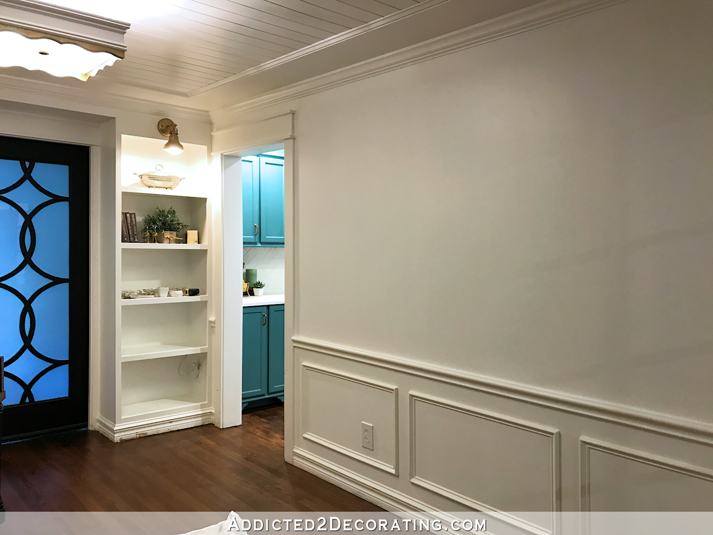
I finally painted over the black walls in the music room. Now they’re bright white (Behr Polar Bear)…
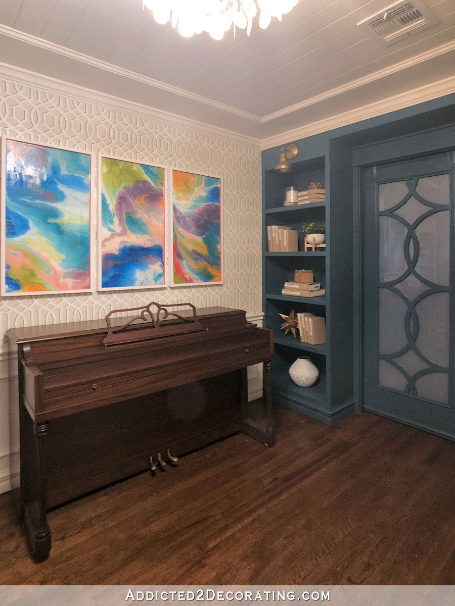
…and they’re ready and waiting for whatever pattern I choose to put on them. And that pattern will be done in Polar Bear and the same Classic Gray that I’ve now used in the living room and breakfast room, so it’ll be pretty subtle.
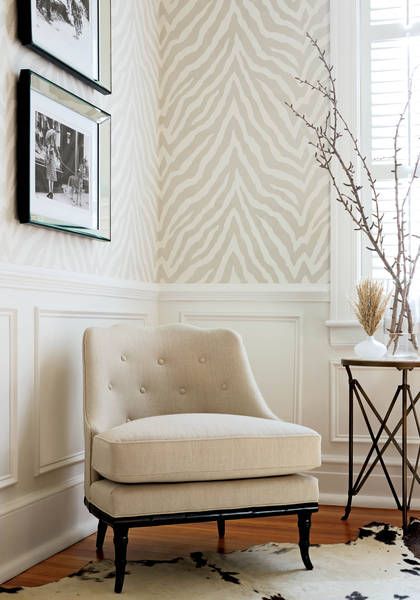
I was planning on doing the zebra print, inspired by Thibault’s Etosha wallpaper…
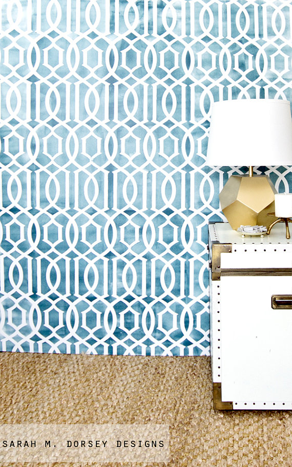
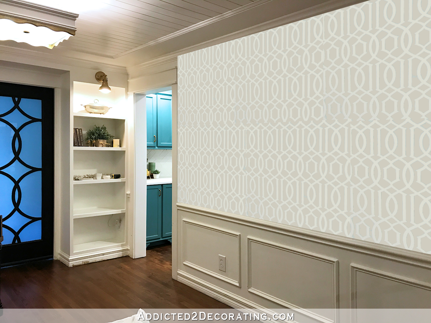
But as I was looking for the pattern that I made several months ago with that design, I also came across the trellis stencil that I purchased a long time ago, which looks like this…
I love that trellis design, and I’ve considered it for several projects in the past (breakfast room walls, curtains, etc.), but have still never used it. I’d love to find a place for it, so I can’t help but wonder if the music room is the right place for it. And again, whichever design I go with, it will be subtle and painted in Polar Bear and Classic Gray. There won’t be any crazy, bright, bold patterns painted on my music room walls.
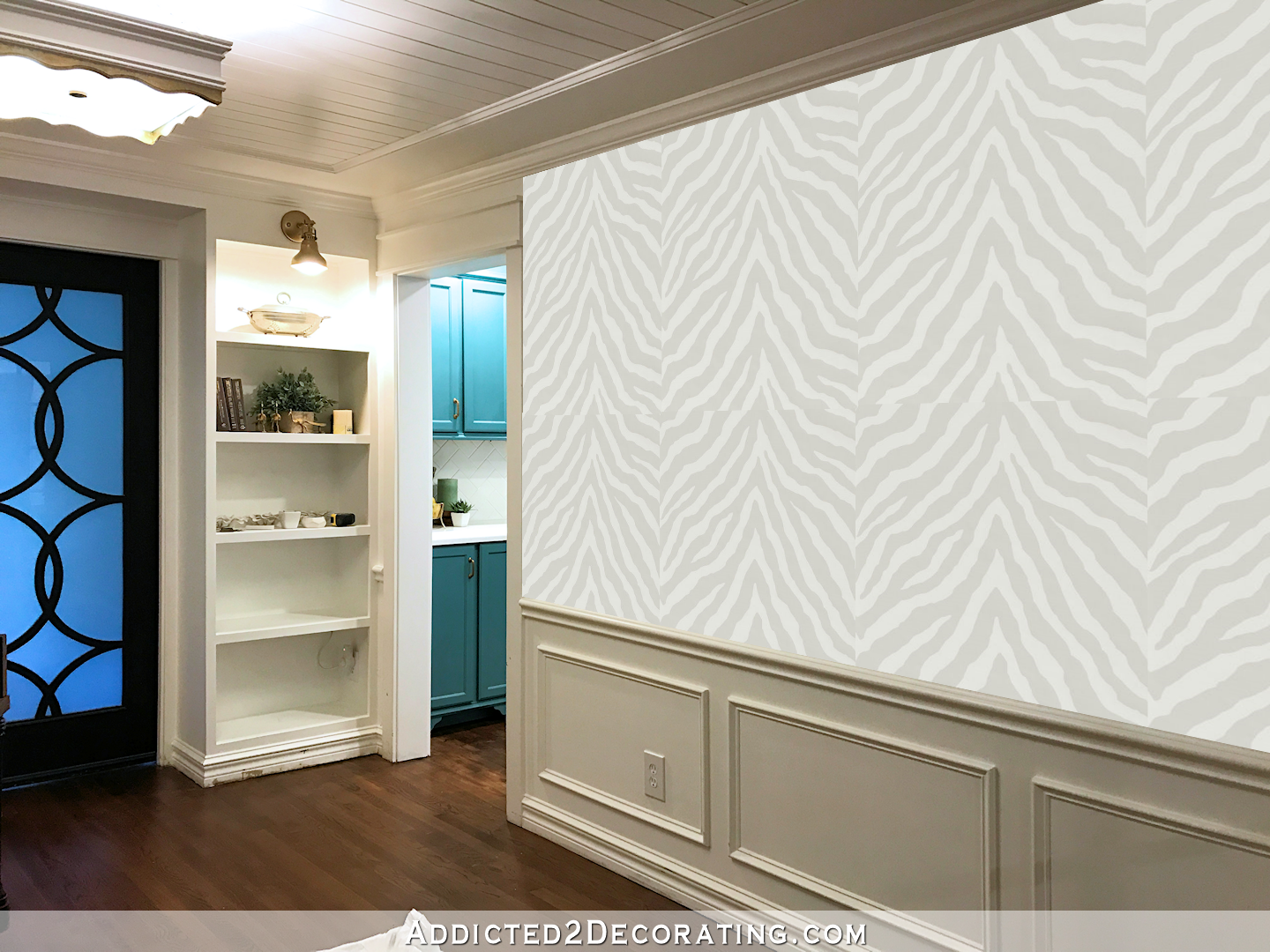
So I did a couple of (very bad) photo edits to see which design I liked better. Of course, I can’t get the colors just right, and neither of these patterns is actually to scale (especially that zebra pattern, which is smaller than this mock up), but we can all use our imaginations.
Ugh. I have no idea. I like both of them.
So which would you choose? Trellis or zebra? I’ll go with the consensus on this one because I want these walls done by the end of the weekend.
On another note, I did try out the two options that I already had on hand for the entryway — the console table that I made and the credenza that I refinished. You can check out my Instagram account to see those options, and to see what I ended up choosing for the entryway. (Click here to find me on Instagram.)


Trellis is my vote…Can’t wait to see what you do regardless of the choice, because I love your blog! Have a great weekend!!!
Trellis here too. I agree that it compliments the doors without competing with them. I just think zebra doesn’t fit as well especially large scale like that. An accent pillow, sure but an entire wall is kind of in your face. Love both but prefer the trellis.
Ditto
I agree completely. Trellis looks classic and trendy at the same time. The zebra was almost hurting my eyes!
Me too! Trellis!
Trellis here to just don’t feel the animal print is the look you are going for overall
I like the Trellis design. Wall is too big for the Zebra, need a smaller space for that, like in your example for trellis
design. The trellis is lovely in the shades you will be using.
Trellis! It compliments your stunning doors
AGREE 100% ! The trellis compliments the doors beautifully!!!
Ditto to what Kathy said.
Trellis! I would bring in the zebra stripe in a pillow or throw.
Definitely agree on trellis, and adding the zebra stripe in a pillow or throw. Funny–from the initial photos, I thought zebra, but in your room, trellis was the one which complimented the room.
My thoughts exactly! So glad you did the mock-up. I would have voted Zebra all the way–until I saw the trellis complimented the doors rather than competed with them. It looks much better and I tend to be the dissenting vote!
Exactly! Barb is right on. Both patterns are great and wouldn’t want to give one up so this is a perfect solution.
Exactly what I was gonna say!
I agree. It works with it without being too similar.
Couldn’t agree more!!
Trellis. So timeless.
I agree too, with the trellis. It looks great with the doors!
Exactly! Trellis echoes the doors without matching, making the space feel cohesive and peaceful.
That is exactly what I was thinking. The trellis pattern mimics the door pattern.
Completely agree. Trellis scale and design work much better with your doors.
Agreed.
Ditto x 3 🙂
I love the trellis design. It’s classic and beautiful.
Zebra print!
Trellis. Zebra doesn’t quite feel like it fits with the rest of your house aesthetic.
This is exactly what I was going to say. I love the zebra but I wouldn’t use it in my own space for the same reason – it just doesn’t fit.
The trellis works better with the rest of your aesthetic.
Trellis. I feel like it fits the direction of your design choices more.
I truly love both and thought I was team zebra until I saw the mockups, but now I’m voting trellis.
I felt the same way… I thought the trellis might compete with the doors too much.
Then I saw the mock up and it actually complements them versus competes.
Either one looks great, Kristi!
What does Matt like?
Agreed, thought I’d be for the zebra until I saw the mockup. Definitely trellis. It fits the doors and the surrounding decor style.
One feels very formal to me (trellis) and one feels fun and light-hearted (zebra). So if it were me, I’d have to decide which feel I wanted in the room. The wainscoting already feels formal, so I feel like the zebra is a good balance for it and keep it in line with your personality. It was your gut reaction to redoing that room and I think you need to go for it and not feel like you have to use that stencil just because you have it and like it. There is a place for that somewhere in your house, and when it’s right, you’ll know.
I agree. The trellis seems to emphasize or fatten up what’s already going on, which is formal and angular. The zebra counters it all, balances it, to me. Softens the angles. Just my thoughts, but I’m no good at envisioning. If it were me I would have to make a couple of sample boards using the exact paint and patterns and set them up to look at for a day or two. Then I would know. With examples of the actual designs and colors, I might know immediately even.
This pretty much sums it up for me, too.
My thoughts exactly!
I agree …Zebra!
Yes, I agree with all of Molly’s points!
I agree with this group. When I thought the trellis was going to be in the teal color, I thought OH NO! TOO MUCH! But then I saw you were using the neutral and was so happy with the edge/difference/excitement the Zebra gives, given the colors! ZE-BRA! ZE-BRA! ZE-BRA! : )
I agree about going with the zebra print. In these colours it’s timeless and classic while remaining fun. There’s a balance created that I like. There’s a similarity in the “points” shapes of both the zebra print and the doors without them being practically identical.
I like trellis. Can’t wait to see what you do!
Good luck deciding as they are both great choices. If I had to choose, I would lean towards the trellis. I feel like it compliments the doors. I can’t wait to see the reveal once you decide.
Ditto
Never commented before….but TRELLIS! Can’t wait to see it!
ditto!!
Ditto
Kristi now that your asking……😀 I would like to see the zebra print in the music room. This print screams I live at Kristi & Matt’s music room. Choose the zebra 😇
Perfectly said! I really hope she uses the Zebra , especially because it is a music room, it’s gorgeous, and I am so sick of the trellis look.. it seems to say Kristi to me, but ,alas, I think we are out voted!
I also vote Zebra!! The trellis is more formal and draws attention away from the doors, since it makes them a repeated accent rather than the stand out feature that they are. I think the color tones will be soft enough for the zebra too – just a faint difference, not as contrasted as they appear in the mockup.
Trellis is my vote … it goes so nicely with the beautiful doors you made for that room!! Love your blog and the work you do – I wait patiently for your postings!!
Trellis. It goes well with the doors.
zebra
fun and quirky
love it
These were my thoughts exactly. Both would work but the trellis seems old hat … the zebra, fresh and unexpected.
I think the trellis design fits your house better but maybe that makes me vote for the zebra because its more unexpected…so, I’m sure that’s super helpful, lol.
They both look great, so I don’t really think you can go wrong.
Not an impartial judge for this, I tend love geometric stuff, then avoid animal prints at all costs. Trellis. My bit of over-thinking, try one wall, make sure it isn’t too busy or too bold, A subtle pattern that makes you smile is the name of the game.
I like the trellis.
Zebra all the way!
I think the trellis is the one God this room, love the zebra but maybe for another room, possibly the master or your new studio.
My vote is for the trellis pattern. The zebra pattern just doesn’t seem to compliment those beautiful doors but competes with it.
Ditto!
Trellis is my vote…it’s beautiful.
Trellis! I love how it looks with the doors!
Really like the trellis
I want to say zebra so much, but there’s no denying how beautifully the trellis goes with the doors.
My initial reaction to the mock-ups was trellis, but after giving it a second look I think that I responded that way because the trellis mock-up is more to scale. I think that if the zebra mock-up were to scale I would love both and really have no idea what to recommend. Seems like the folks that know you well are saying zebra. What does Matt think?
Also, did you try your green table in front of the grasscloth?
I tried out the green table, as well as the credenza that I refinished a while back. I put pictures of each on my Instagram, and then also shared what I ended up going with for the entryway. You can click here to find me on Instagram.
Hi Kristi!
I love everything you’ve done so far. I would go with the trellis, which is suprising because intially I though the zebra, but your trellis mock up really struck me.
I don’t think either choice in front of the grass cloth wall work. I see something larger in that space.
UPDATE: Just saw what you chose! Perfect!!!!
Thats a tough one! But in my opinion I like the zebra better. The trellis seems to mimic your door design too much. The zebra seems to enhance it.
Trellis please! 🙂
Zebra for sure. With the subtle colors it can add a little fun to the room without being in your face. Since it is subtle and you will have artwork on the walls i think it will be a good layering pattern that you can compliment with other fun or traditional decor.
Love both. Actually like the zebra better, but on large scale I think the trellis blends better. Which makes me sad because I really, really like the zebra.
Well, this is rough. I prefer the zebra because I’m not a fan of the stencil…but seriously, not there. The trellis just seems perfect for the room and the zebra is a bit off for the space. How about using the zebra in your workroom where the subtle whimsy will lighten the mood when you’re working? Much as it pains me to opt for “normal”, I’m afraid I have to join the majority on this one.
Yes, I was thinking this same thing – zebra print could go in a bedroom or the office/workroom. Or somewhere else. It’s gorgeous but the trellis print seems to be more suited to the space.
I think the Trellis design would be fun in a bathroom 🙂 🙂
Trellis for much the same reasons .
Yeah, this is exactly my thought. Trellis for the music room and zebra somewhere else that is not part of the open concept area.
I agree–I wanted to like the zebra, but the mock-up sold me. Trellis!
I really like the zebra print, but I think the trellis is going better compliment this space. Maybe you could sneak the zebra print into the master redo.
Trellis..without a doubt!
Trellis!
I like the trellis. Looking at your mock up photo I just feel that it will work with your doors.
Trellis 🙂
Trellis!
Trellis…goes with doors better than zebra.
Trellis: it fits with the doors and also picks up design in wainscoting. The zebra seems jarring and out of sinc with those designs. Just my thoughts. You’ll make the best decision either way.
Do the trellis. The zebra is cool looking but I think zebra is best left for another space…maybe office?
Zebra! The trellis is too much repeating, and while it does compliment your doors, you’ve said you wanted them to be a special one-of-a-kind item, and matchy matchy makes them seem less “special”.
I completely agree! The trellis pattern is so busy that it would be hard to hang artwork without it feeling overwhelmingly busy. The zebra is subtle and will really let the doors shine!
The trellis looks like it just goes with the entire room and matches the doors. It is soft and easy on the eye.
Trellis, I agree that it is the best complement to the doors.
I think trellis. It compliments those beautiful doors.
Trellis! So much prettier!
I vote 100% Trellis in the music room. I think the zebra in a tone on tone lavender that you’re looking at for the studio would be fun and stunning, a balance out always seem to find.
Trellis–it’s more classy and less trendy and fits better with the designs in the breakfast room and living room. I think the zebra would be something you would tire of after a short while.
Trellis. As so many others have said – it compliments the doors.
Trellis initially but now zebra after much thought! I think because the trellis pattern ties in too much with the door and seems too ‘matching’. Especially if the zebra pattern is smaller than your mock up I think this will create a bit more visual interest. Plus you can still see a pattern resemblance anyway in the peaks of the zebra pattern with the ‘peaks’ in the door pattern.
Good luck, can’t wait to see the result!
Trellis.
Trellis – love it with the doors! love your choice of entryway furniture piece too.
It has to be the zebra! You = zebra. The zebra is a Thibault, and it might not be a traditional classis, but it’s classic just the same. I love the light color palette as well.
zebra
Trellis! it perfectly compliments your doors!
I love any animal print, but think the trellis definitely fits the style of your house better. Looking great!!!
Trellis for all of the above reasons. It’s a subtle echo of the doors.
Zebra!! Love it!
I vote trellis, because of the doors. But I LOVE the zebra! Maybe save that for the master bedroom?
I don’t know if I’ve ever liked anything animal printed, though zebra doesn’t seem as obnoxious as cheetah or giraffe for some reason, but I have to go with the trellis.
Trellis……..and then green dresser is fun next to the cloth😍,!!!!!!
Of course, it is my favorite piece of all time, so would like it ANYWHERE! LOL
Oh my goodness, typos much?!?! Haha
Trellis. It goes well with the pattern from the doors.
Trellis for sure. It has a similar tone/tenor to your overall design, but that zebra is so unexpected and lovely.
Trellis! It compliments your doors perfectly!
Trellis please 😍
Personally, I vote for the trellis for the music room and your current design plans. The zebra print reminds me of your earlier iterations of the room and I could definitely imagine a glossy zebra print over the matte black walls with the yellow piano and the old green kitchen – but it doesn’t say “Kristi” to me. The trellis seems much more in keeping with the current look and feel of the breakfast room, kitchen, entry way, etc. and I think it is beautiful with the doors.
The trellis really goes well with the doors!
For some reason, I’ve never been a big fan of that trellis pattern, so I was prepared to prefer the zebra, but I actually really like the trellis here. The zebra and the doors are fighting my eye for attention in a distracting way, it seems. The trellis is adding interest but still letting the doors shine.
My thoughts exactly
I like the trellis better. I think it suits your home better with the feel of the colors and designs you already have going
I like them both, but I don’t care for the Zebra in that room. The trellis is a better compliment.
Trellis all the way! As far as the furniture in the entry way….the table is a good size but, personally, I don’t like the scroll work on it and it may be too long if you are going to use chairs there also. The chest appears to be a good size with chairs. Can’t reallly tell.
I chose trellis immediately, then changed my mind to zebra and then back to trellis etc 🙂 That just confirms you have selected two great options. One of the things I love about your decorating style is I see things I never would have thought of. The zebra print definitely falls into that category. Good luck with this one, I can’t decide so I can’t help! btw… do the frosted doors actually appear blue in “real life” or is it just the lighting?
They’re not blue at all in person. Must just be the photo. 🙂
The Trellis compliments the doors and looks more pleasing to the eye, pattern wise.
The Zebra, no matter what the scale does not match the doors at all.
Neither. Let your doors and molding be the stars in that room. There is enough texture and pattern in those two things, that you don’t need to put another layer on the upper walls. My humble opinion 🙂
Yes, I agree with Mara
My sentiments exactly, Mara. I vote neutral walls, no pattern. 🙂
My thoughts exactly! Having a pattern on that will makes for a busy room.
Trellis! No doubt about it. Very classy. The zebra print clashes with the doors. By the way…that blue light showing through the door is quite lovely with a calming effect.
Trellis!!!
Zebra! So classic and classy 🙂 I actually did that down my stairs with wainscoting above in a similar white and subtle gray/beige color. It is so gorgeous and I get compliments all the time!
Just to clarify, I did the zebra pattern above wainscoting, not the other way around. Haha:) My hubby is a professional artist and hand painted it for me. Is that how you plan to create the trellis or zebra pattern, or will you utilize a stencil?
I would freehand the zebra print, but use the stencil for the trellis.
Trellis is my vote, I think the zebra is too “busy” for that small room
Trellis!
Definitely not the trellis….but, in my opinion, even the zebra is too ‘busy’….it takes away from the beautiful doors and the feeling of ‘peace’. That being said, from past experience I know whatever you decide, you will make it beautiful.
I LOVE the zebra, but it feels out of place. I wonder if it would be better suited in your design studio.
Trellis!! It mirrors the design of the doors and is a very timeless look.
zebra
Trellis.
I love both, because the colours are so neutral, but I think if it were me, I would go with Trellis. Personally, I would tire of the zebra really quickly. Trellis is classic, complements your lovely doors and goes with the fell of the room, IMHO.
Trellis, 100%.
I prefer the trellis as well. I think it compliments your overall design.
Trellis is formal, a bit trendy for last year and expected. You’ve mentioned wanting to mix styles. I think the zebra in such subtle color contrast will be exactly the subtle, yet unexpected style you’ve been wanting. Good luck either way!
Trellis! But this design seems a little busy. Would it be possible to just use the curved part of the design and leave out the more angular, boxy part? I think that would complement the doors without copying them and be less busy.S
I vote zebra. I believe the consensus will be trellis. People like how it it matches and is classic. That’s is why I say no. A music room should depict creativity and art and expression and thinking outside the box. The zebra is fun and unexpected, yet subtle.
Trellis, but everything you do looks beautiful, so you can’t go wrong. I love your console table in front of the grass cloth. The length is just right.
Kristi, i love the trellis!
2 Votes for the Zebra pattern (mine and my daughter’s). My eye is just naturally drawn to that print.
I love the trellis, it seems to fit in that room a lot better.
I personally like the trellis more, but both are fun! However, in the many years I’ve been following your blog, I can’t remember seeing you decorate with anything animal print. Which leads me to think that you like geometric patterns with clean lines better. Which makes the trellis the better option for what you seem to like.
It feels like a better match for the space. You could always give zebra stripes a try in your office/studio space!
Zebra! I think trellis is too similar in feel and scale to the fabric chairs in the breakfast room. The zebra seems more airy and less formal. To make it even more subtle, you might consider lightening the gray. Another very subtle effect is to use the same color but use matte finish and glossy finish so the only contrast between the stripes is the glossiness.
trellis seems like the the best choice for this classic room with all your trim mouldings
Zebra gets my vote. Table version #1 gets my vote. You can put ottoman underneath it. The other table, Version #2, is too heavy, thick and chunky for the space.
Not sure you need yet another vote for TRELLIS, but here is one anyway!~love your blog Kristi!
While I love the trellis pattern – it has become a classic design – I find that it kind of competes with the doors, even in a very subdued palette. The zebra pattern is more cutting edge, and yet I think would be a calmer background for the furnishings.
Trellis
Trellis, I like both, but the trellis seems more refined and soothing.
Trellis!
I was sure I was going to like the zebra better, but when I saw the photoshop pics on your wall, trellis is it. It’s just way more you. And compliments your gorgeous doors. So trellis all the way!
Zebra!
Oh my goodness. I like them both, but my vote goes to the trellis…
Loved your mockups, and I get why it’s so hard to choose. Both striking, but I’m trellis all the way! A better fit with the traditional feel of the kitchen cabinetry and breakfast room You are creating a space that flows, and I think that’s important.
However, will there be enough contrast for the trellis stenciling? One thing I love about your example photo is the variation in color saturation of the blue that is supposed to be the ‘background’. Can you mock up a board to test this out with the gray?
Zebra print is too busy with the doors. I vote trellis also, but…….can you make a stencil to match y our doors???? That would look awesome!
Trellis all the way…. it won’t fight against your gorgeous music room doors.
Trellis!
No time to read all the comments, but I say neither. The trellis, at least in the mockup, seems to shorten the wall while the zebra expands it. But the zebra doesn’t really fit either. Maybe a rounder pattern that ties into the doors a little more than the trellis does (too rectangular for me).
But Kristi, are you wandering down the wrong path? Remember how you got off track last year listening to someone’s opinion about the direction to go in? I think if you are undecided, it’s because though you like them both, neither is the true answer. Keep looking? Good luck!
I love a nice sophisticated looking zebra, and I’m not particulary crazy about that trellis on it’s own, BUT I think the trellis enhances the door design where in my opinion the zebra distracts and competes with it.
While both are great, I think the trellis is more in keeping with the style you have in your kitchen and breakfast room. And it’ll look good with your doors.
Trellis…BUT…not on the scale shown as it seems too busy / too much.
Trellis. It as an immediate gut reaction for me.
I vote plain gray walls. The doors are the showstopper.
But if I had to choose, I would choose the trellis. From what I have seen of your design, you aren’t much of an animal prints person and the trellis is more classic.
Trellis, for sure. The zebra is pretty, but it gives a vibe that just doesn’t seem to fit with the calm of the colors and design elements in the other rooms. The zebra is a little more “jungle edgy” and the trellis is more “garden room calm”…
My two cents! I’m sure if you don’t love what you choose the first time, you’ll feel o.k. with working until you do–and it will be beautifully you. 🙂
I think that the trellis design works better with the door pattern.
I vote zebra
I just think trellis is a little boring and not you.
I like the trellis and compliments the door design. I wasn’t sure I would like it but once I saw the photoshop pic, I knew that was the winner.
Neither is my vote. I think they both “clash” or “fight” with your door pattern
I tend to agree although I voted for trellis.
I like the trellis in a subtle color. Looks beautiful. To me, the zebra print is too much in large scale- perfect for a pillow, though. I can’t wait to see the finished room! 🙂
The trellis drew my eyes back to the doors, and just seemed to compliment them so well!
I vote trellis! matches better with your sliding doors.
Trellis….. I love how it goes with the doors! Zebra looks amazing too but I love the trellis a little more:)
Kristi, I love, love, love the zebra… and I did not like the trellis in blue at all. THEN I saw your mock up of the trellis in the neutral colors and I have to say… it is absolutely gorgeous. And it goes so well with other decor/colors you have chosen for your house! So now I’m trellis all the way!!
Yes! My thoughts exactly! Trellis in blue was way too strong but the muted color makes it perfect. Plus the Trellis is so elegant.
Zebra! Trellis is just too busy, IMHO!!
Personally I think there is already enough pattern in that room (ceiling, wainscoting, shelves that will be filled with decor, and etc) but if the choices are trellis or zebra then ZEBRA is the winner in my book. It is much more fluid and less restrained, trellis is too restricted and predictable.
Trellis gets my vote. It just works better with the doors, and complements the rest of the house without competing. Use the zebra in accents.
I love the trellis!
I like the trellis pattern. But then I am a gardener and have never been too much into an animal print. Can’t wait to see!
🙂 gwingal
Trellis. Definitely trellis.
I really like the trellis pattern!
Most definitely the trellis. It compliments the doors and every thing in your house without over powering anything. It will be perfect in there.
The zebra looks too busy. Trellis or a soft stripe.
Trellis. Trellis. TRELLIS!! SO PRETTY!!
I think I like zebra, especially if it will be slightly smaller scale than the mock up! Can’t wait to see what you decide!
I vote for trellis! 🙂
Love trellis!!!
Trellis! I think it reminds me of those beautiful doors you made.
My gut says Trellis all the way.
BUT — if the Zebra was very very subtle. Talking like 50% lighter than the mock up, I could probably get on board with that!
I vote trellis, although I will love whatever you do. Love your choice for the entryway!
I am a big fan of always using some animal print somewhere. Usually a pillow. I love that zebra print but for the wall I would vote TRELLIS. It will be beautiful.
Trellis for sure! I like the way it echos the curves on the pocket doors.
The trellis is the safe choice but the zebra is unexpected and therefore, the winner in my book. You really can’t go wrong either way though because both are lovely.
Trellis is my vote! It compliments the doors beautifully. Love everything you do, though. 🙂
I like both, but I think the trellis design work better with the circular shapes on the doors. I think the zebra would take more work to make them complement each other, than the trellis.
TRELLIS!!! It seems to blend and fit so much nicer with everything in your home so far. I also think that if you do end up doing that beautiful bird in the trees look someplace else, jungle (zebra) might not “go”. Where as the trellis will be more apt to blend and be cohesive!
Is this the wall opposite the grasscloth? If it is, I wouldn’t do anything too gimicky like the zebra print. I vote trellis.
I love the Zebra but for this room my vote is on the trellis. I think it goes better with the doors.
Trellis!
I would tire of the trellis design very quickly. IMHO trellis (and quatrefoil) are overdone.
I generally don’t like animal prints but I’ve loved that wallpaper since you first posted it. That would be my choice between the two.
Zebra – the muted colors you are choosing are going to be beautiful. Something like an animal print done sophisticated in the neutrals is just beautiful. I cant wait to see
While I like them both, I do like the way the trellis pattern looks with your sliding doors. It’s perfect. I also think it will make a nice transition into the kitchen or living room areas. Perhaps you could make a couple of zebra pillows (for whimsy) for the chairs in your music room?
I prefer the zebra. Less final and more fun for a music room.
Zebra. I love the subtlety of the pattern.
Zebra. Trellis competes with doors and I think a juxtaposition to all of the more structured traditional elements would offer whimsy.
There is a movement in that zebra pattern which mimics notes on sheet music. The trellis feels too “staccato”, if you can understand what I’m trying to say. The zebra complements the door pattern without being to matchy…. I know what ever you decide it will be beautiful!
Both options are far too busy for that room. I think if you like patterns, incorporate them into the room another way – pillows or fabrics. I think you should continue the serene look of your kitchen/breakfast room and go more basic on the walls and just accessorize.
Maybe if you absolutely love either of the wallpapers enough, put them in another room altogether like a bedroom, or in your shop when it’s done.
Trellis. The zebra, although gorgeous, would suit another setting better.
Of those 2, I prefer the trellis. It fits better with your overall decor in that area, but I’m not sure it’s the best choice, either. It seems a bit overwhelming/overdone/overpowering/over competing–not quite sure exactly which word best describes what I mean. It just feels like a little too much of a good thing. Zebra seems to fit your personality, so definitely use it in another area. For me, it just doesn’t “work” in this area. Just found your blog and am really enjoying it, and I love, love, love the teal kitchen; it makes me want a sea green one more than ever. Won’t happen because I rent, but I can dream!
I’m a lover of all things geometric so have to go with the trellis 🙂
Trellis!!!!!!!! I actually thought I’d be on team zebra, until I saw your mock up pic……definitely on team trellis now. I could see the zebra in your office, or your new studio, it would look awesome in either room.
Hi – I love both, but like trellis for music room, would love the zebra in like a bedroom grrrrr LOL
Trellis, because it mimics the design in your doors.
Sorry but i feel trellis is boring and overdone. The zebra feels more fun but classy in your color choices. I see all the trellis votes on here and if you truly go with majority I’m sure it will win but I vote ZEBRA!:)
Zebra!! It has such soft movement and is so timeless. The trellis pattern, I feel, has been done to death and the pattern is very tight and in my opinion is not very “relaxing” to look at.
Are you going neutral on me, Kristi? 😉 white and pale grey walls… I can’t wait to see how you incorporate lots of color in the new spaces. 🙂
I don’t have an opinion about wal treatment. I’m sure you’ll make it pretty.
I agree that the trellis design goes better with your doors, but honestly I think it’s too busy and would give me a headache looking at it. The zebra just seems totally out of place given your other choices.
I asked my 91 yr old mom what she liked. Trellis ☺️ I liked the zebra….but next to your amazing doors, trellis!
I just finished my dining room redo……and I used your colors, which are me too, and painted my side table purple and one old chair the same. I don’t want to leave he room now…..in love!!!!!!
As a person who hates animal print…I prefer the zebra. To me it looks more like an organic chevron pattern inspired by zebra stripes. The trellis seems too matchy with the doors.
Trellis – love the look of it and who knows how long animal prints will be in.
I’m going to vote zebra, and I’m also not an animal print person. I think it’s just subtle enough with the two-tone neutral. The trellis seems a little too busy.
That trellis might look nice on the front of a painted buffet or dresser, though.
In the examples I liked the subtle whimsy of the zebra, and in the examples with the example colors the trellis seemed a bit too stiff. But in your mock-ups, all of a sudden the zebra seemed like too much zebra (maybe b/c the scale was off as you mentioned?) and the trellis seemed to go better with the peek into your kitchen. Sorry to say it, but could you do a small area of each??
Never ever have posted before…and I see why people like the trellis because it speaks to the doors, but if you imagine the zebra a little smaller I see it reading more classic like a neutral. Like it better with the flow of the rest of the house.
Trellis!
I love how everything is coming together and your new color scheme is great! While the Kelly Green kitchen was cool, the teal one is far more you and “fun” and the teal/greens/purples/greys/whites scheme is refreshing, soothing, and lively all at the same time. Trellis because it echos the circle shape in your barn doors and the “garden/nature” theme feel I’m getting from your colors.
I’m a color addict too. It comes out in a more eclectic/retro/boho vintage vibe with me. I appreciate your eye for color and pattern too!
Trellis.
I like the zebra but trellis complements your music room better. I find it looks better with your doors. The curvy motion kinda continues onto the walls…
team zebra all the way!
not wild about either. if you are going to keep the wainscoting, I would go with the soft grey and one or more of your original large painting. make the painting dominate. more upscale and in keeping with your piano.
Definitely Trellis!! I think the zebra feels dated with the other things going on in your house. I also think it pigeon holes you into a look that won’t work with other things you might like down the road. The trellis is classic and mimics your doors. I think the zebra would look cheap next to teal. It’s a definite no for me!!!!
Wow, this is a tough choice! They’re both equally attractive.
I think I prefer Zebra, though it would definitely need to be scaled somewhat smaller (as you said it was). I think with the subtle colors and smaller scale it will have an organic chevron appearance, which will go nicely with the doors and your light fixture.
I know you get flack about changes (sigh), but remember… it’s only paint. If you try it and don’t like it you can change it!
My vote would be zebra, but there is so much beautiful texture and design (doors, wainscoting, and ceiling) going on in the room already I would tone it down a bit more to a tone on tone with the contrast being the gloss and matte paint instead of the two different colors. I think this allows for more options for decor and wall art. Can’t wait to see what you choose!
Trellis goes well with the doors
Zebra
I can’t read all the comments like I usually do before adding my own. Too many! My opinion: I prefer the zebra. Why? It reads more artistic to me, and it’s a music room. The trellis is nice but imo, too much of a good thing.
….in conjunction with the doors, I mean.
Absolutely trellis! The zebra competes with the doors. I’m sure you can fine another place for it. Can’t wait to see how it turns out!
If the pattern is indeed very subtle I think the trellis would be beautiful. The actually accents the pattern in the doors. In my humble opinion.
OK, I am going to be the odd (wo)man out here and say neither, because I think it makes the space too busy if you are going white and grey, but if they are done in a damask style, same color, just flat and gloss, they would both look great and not be too much. I don’t particularly like animal prints anywhere,lol. But that is my two cents for whatever it is worth.
TRELLIS ……….PLEASE!! For the love of all that is good and right in the universe………….
TRELLIS!!
Please! For all reasons stated above.
Liked the zebra till i saw the trellis. So classy. If you do the zebra I will cry. Do you want to go to sleep after putting up the zebra, knowing your making an old lady cry! 😉
The trellis looks less busy and makes the doors and shelf accessories stand out. The zebra does not seem subtle enough in this room. It looks like it’s trying to take center stage.
Trellis works better with the doors. You could also leave it as is and used a large piece of artwork which is probably what I would do. Someone suggested the zebra for your studio, which sounds like a cool artsy idea.
Trellis!
Trellis
I vote trellis. Maybe do a wall with zebra in your craft room.
Trellis!
I feel like the trellis is too ‘done’ – it’s been everywhere for years.
That said, I may be incredibly biased towards the Etosha wallpaper as I have it in my bedroom: http://eamonnandjack.com/2014/11/one-room-challenge-bedroom-week-six-reveal/ so, maybe take my opinion with a grain of salt?? 🙂
trellis – love how it relates to your doors
Like so many others have said, I was going to say zebra until I saw the mock-up. I also think the trellis compliments your beautiful doors.
Gee, I just don’t know how you’ll ever decide, Kristi. What with all your loyal followers being so reticent to share their opinions and there not being a clear favorite! 🙂 Hahahaha!
You are great and I’m sure it will look lovely either way. I could go for the zebra if it was tone on tone with just different sheen say gloss over satin. But if it will be subtly different in color as you’ve suggested then I vote for trellis.
Linda
Trellis for sure!
Trellis. It will complement your beautiful doors.
I like the plain wall. It highlights your beautiful doors.
Zebra….more fun for a music room…well, I guess it depends on what type of music you listen to…Mozart might match the trellis better. Make it match the music- whatever your music is! And put a little shade of blue on that wall somewhere to match the blue in the kitchen and glass of that beautiful door….that will bring it together whether it’s a zebra or trellis wall.
Zebra has my vote 🙂
Trellis……….it compliments the doors you made!
Love your inspiration and DIY spirit!
Trellis
Trellis.
Trellis
Trellis. And the console table that you made from scratch is more proportionate for the entrance wall. Why not just keep it there while you do the rest of the room and once the room is done, you’ll be able to decide better. And those faux tile lamps would be perfect with the grasscloth.
Zebra gets my vote!
1. Animal prints are timeless; trellis is trendy
2. Trellis is too geometric for a music room
3. Zebra, especially in subtle colors, brings movement to the room–perfect backdrop for music!
I completely agree with you!!
They are both lovely, but the trellis definitely compliments your beautiful doors! 😊
I NEVER like animal prints for anything. Ever. Until your mockup!
Totally go with the zebra! The pattern makes it whimsical and the color makes it sophisticated. Best of both worlds!
ZEBRA!
Trellis would be my choice between the two. But I do think both of them are a bit busy with the doors.
Trellis.
And let the upholsterers do the sofa while you do other stuff.
$.02 🙂
If you’re set on one of these, trellis would be my choice because the pattern reflects the door. I’d go even more subtle however by choosing one paint color and doing it in two different sheens. I always find that a more elegant look with stencil. I might also go one shade darker than Classic Gray just for a little differentiation from the other room. That said, with no windows in the music room, Classic Gray may wind up looking a shade darker anyway. It’s hard to tell from photos.
I love the Zebra print. It’s edgy and fun!
Definitely TRELLIS! It really compliments your doors.
100% trellis. The zebra really
Doesn’t like right at all.
Trellis wins my vote, as I love how it compliments your doors. Very classy and classic. I’m sure it will be beautiful, whichever way you go! Can’t wait to see the finished project.
Trellis
Hi Kristi!
I love everything you’ve done so far. I would go with the trellis, which is suprising because intially I though the zebra, but your trellis mock up really struck me.
I don’t think either choice in front of the grass cloth wall work. I see something larger in that space.
I’d have thought zebra, and I’d always found that trellis print too busy, but somehow in the mock up, it works. I’d say it depends on whether you’d like to have it be reflective of other patterns in your music room/breakfast room (your door, the upholstery in your breakfast room chairs), or whether you’d like to have a little contrast. It’s funny – when I look at the mock ups, I see your door different ways. With the zebra, I’m drawn to the points of the design; with the trellis, I’m drawn to the interlocking loops.
If you have to pick between the zebra and the trellis, I say go with the trellis. I love the pattern and it goes with your doors and it just seems to fit in to the workings of your home rather than the zebra pattern. There’s something just classic about the trellis pattern that I like better than the zebra pattern.
I’m another vote for the trellis, and agree they talk to the doors well.
For a music room, I would vote for zebra. The trellis design looks overwhelming while the zebra looks fun or playful. But if this were a living room or dining, I would vote for the trellis. Nevertheless, can’t wait to see the outcome.
Zebra! I love that with all the angles in the room, wainscoting, doors, one more strong angled graphic element would make the room feel stilted. You have talked about wanting a more fun and whimsical feel to that space (am I correct?) and the zebra pattern does that. I’m all for repetition in design… but sometimes we have to live outside the “box” and you do that quite naturally.
Have a great weekend, Kristi!
Personally, I would be totally outrageous and choose polka-dots. 😉 That would fit me. 😉
I LOVE the zebra!!! But of course the trellis is nice too! Either will turn out perfectly! 🙂
Absolutely trellis. It looks so good with the design in the doors.
Trellis works with the music room doors. The zebra would be fun in another spot, but I feel it competes with the doors which are the focal point of the room.
I like how the trellis seems to accentuate the design of your doors
I love the zebra. It makes a great statement……….fun!!!
Trellis. No doubt
I already voted but have changed my mind a dozen times while reading all the comments. I’m wondering if others struggle as i do with creating a “focal point” — is it possible to have more than one in a room?
I wouldn’t call the walls a focal point, but it’s certainly okay to have more than one bold, eye-catching item in a room. It just depends on the style of decorating you like, which is a matter of personal taste. I could live in a room filled with loads of various colors and patterns because those things energize me, but a lot of color and pattern might drive someone else crazy.
Trellis
I think with the pattern on the doors the trellis competes too much. I love the Zebra!
Trellis, definitely!
TRELLIS ALL THE WAY. THE ZEBRA IS TOO MODERN AND DOESN’T MATCH THE REST OF THE HOUSE.
I may not be much help, though the consensus I’m seeing seems to lean towards the trellis design. I love them both for different reasons. The trellis being classic & similar in lines I have to agree is a lovely complement to the doors. However, my eye says the zebra print being smaller than the mock up example wouldn’t compete as much as some might think with those lovely doors, especially one the shelves are accessorized & would be a completely unexpected touch in the home. I have a very special fondness for the unexpected.
I love the zebra on a smaller scale. The trellis is way too busy…….
Love that trellis design! Can’t wait to see what you choose!!
Trellis Complements the doors. The zebra competes with them.