My Failed Marbling Attempt (Plus A Couple Of Finishing Details)
The island top is finished, for the most part. It just needs a clear coat, and then I can move on. But to say that this didn’t go as planned would be an understatement.
I’ve done a faux marble paint technique only once before on our living room coffee table. When I bought it, the top was an antiqued white color, as if it had been painted white and then coated with an oil-based finish that had yellowed over time. I hated it, so I decided to marble it. That process went very well, and I love how it turned out.

If you missed that post, you can find it here: DIY Faux Painted Marble Coffee Table
So when I got started yesterday, I pulled up that post and followed the process that I used before. This time, I didn’t love it. I started off a bit different, by adding small touches of gray paint to the white and blending them together with a big deck staining brush. I wish I had stopped here because I really liked it like this.
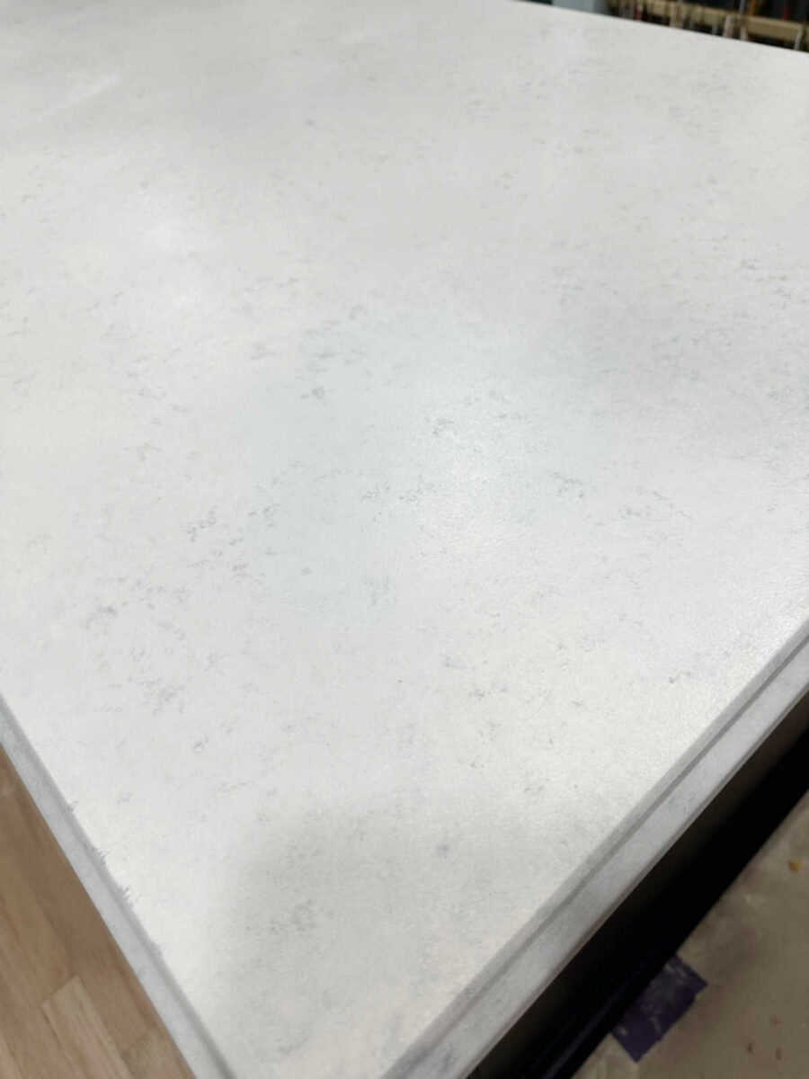
But then I added the gray veins. And as much as I tried to blend it, I hated it.
One problem I had is that the paint was drying way too fast, even though I added Floetrol to it. The only thing I can attribute that to is that we have a dehumidifier now that runs 24/7. But with the paint drying so fast, there was no way to keep it workable and get it to look like I wanted it to look. So I just kept adding white, but it just wasn’t making it better.
So then I just kept adding white with a sponge and pouncing it with the big deck stain brush. Initially, it went from bad to worse…
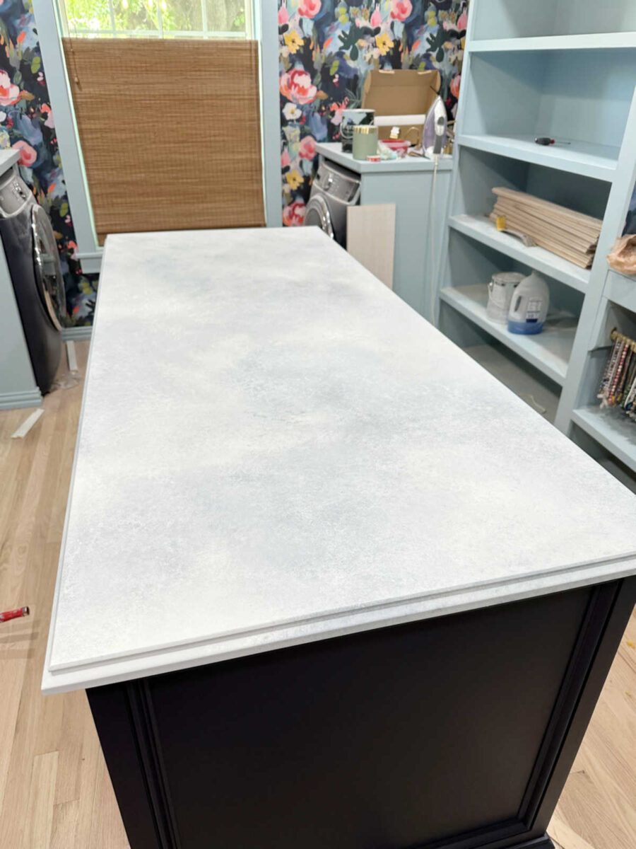
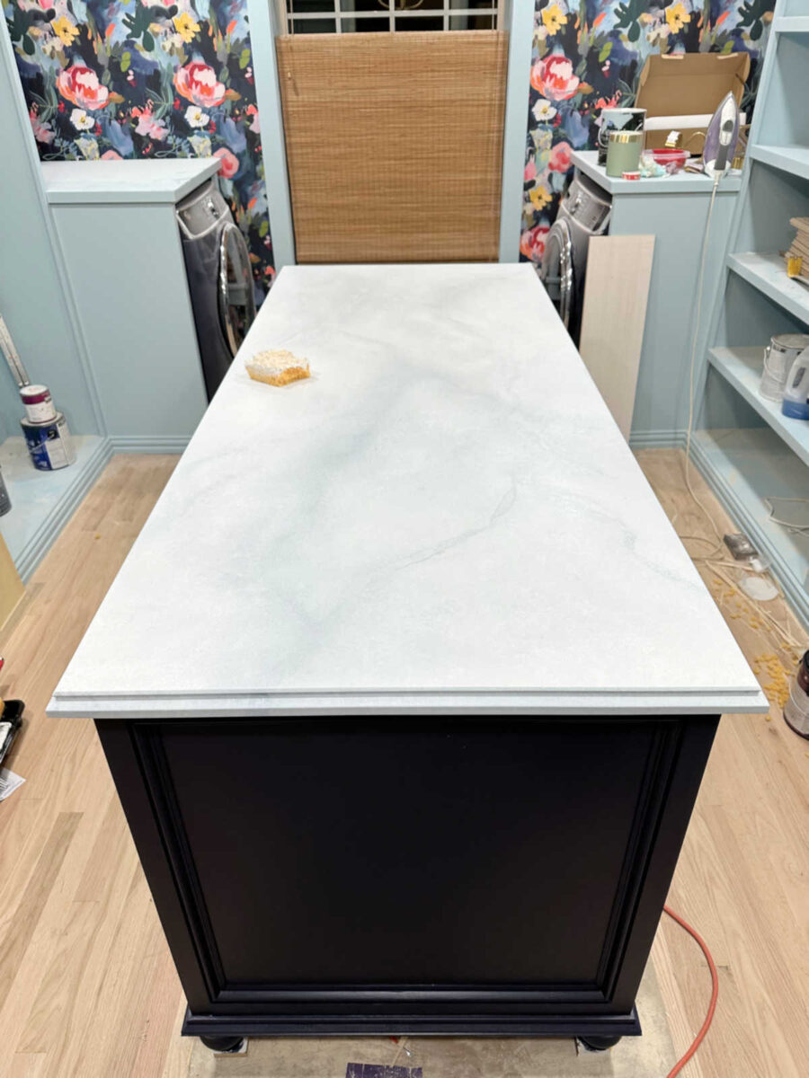
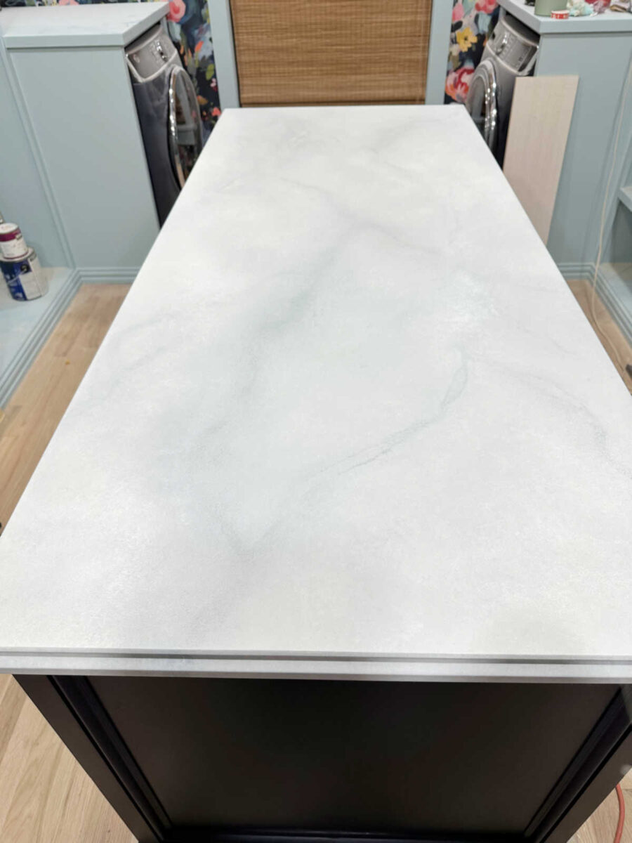
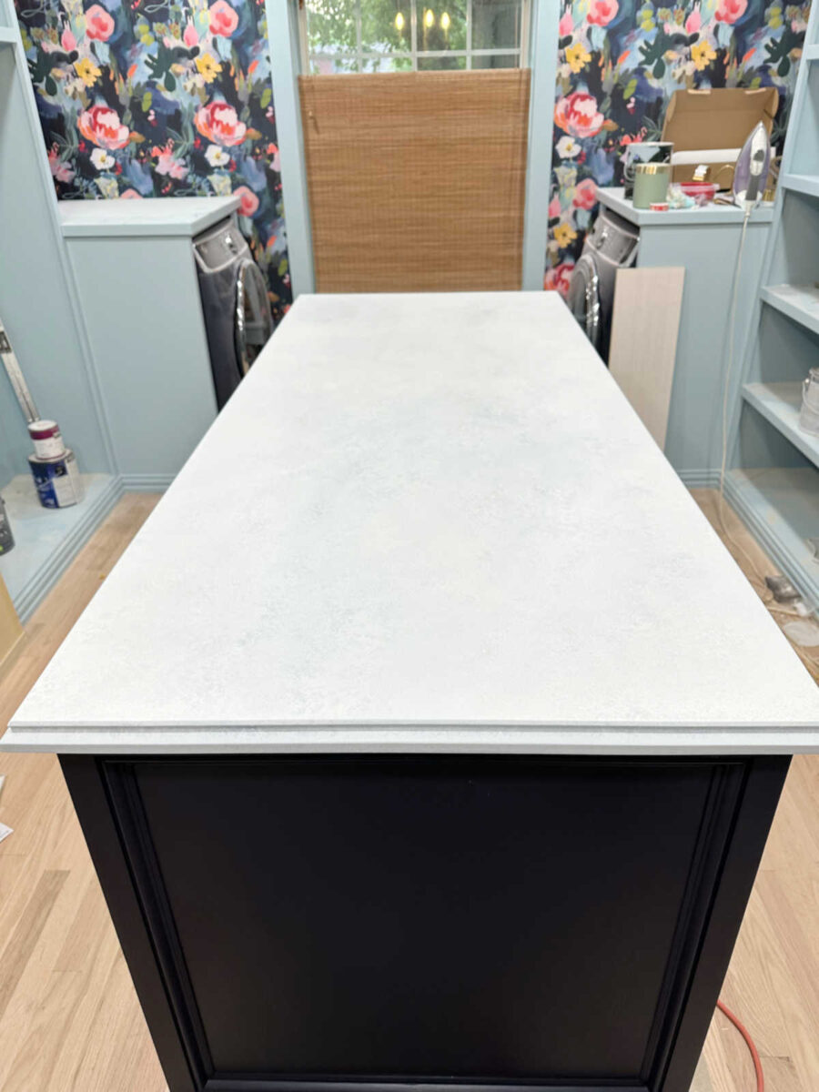
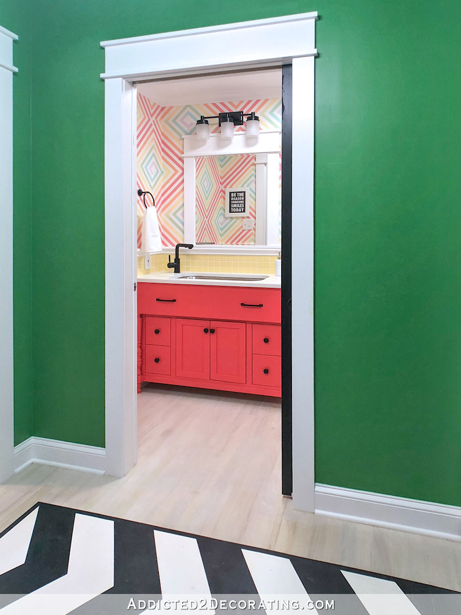
But I finally got it to where it just had a very subtle mottled look to it. And that’s where I decided to leave it. It looks very similar to how I painted our kitchen concrete countertops. It’s not what I had in mind, but it’s fine. I just didn’t want a stark solid white top, and once this is clear coated, it’ll be fine.
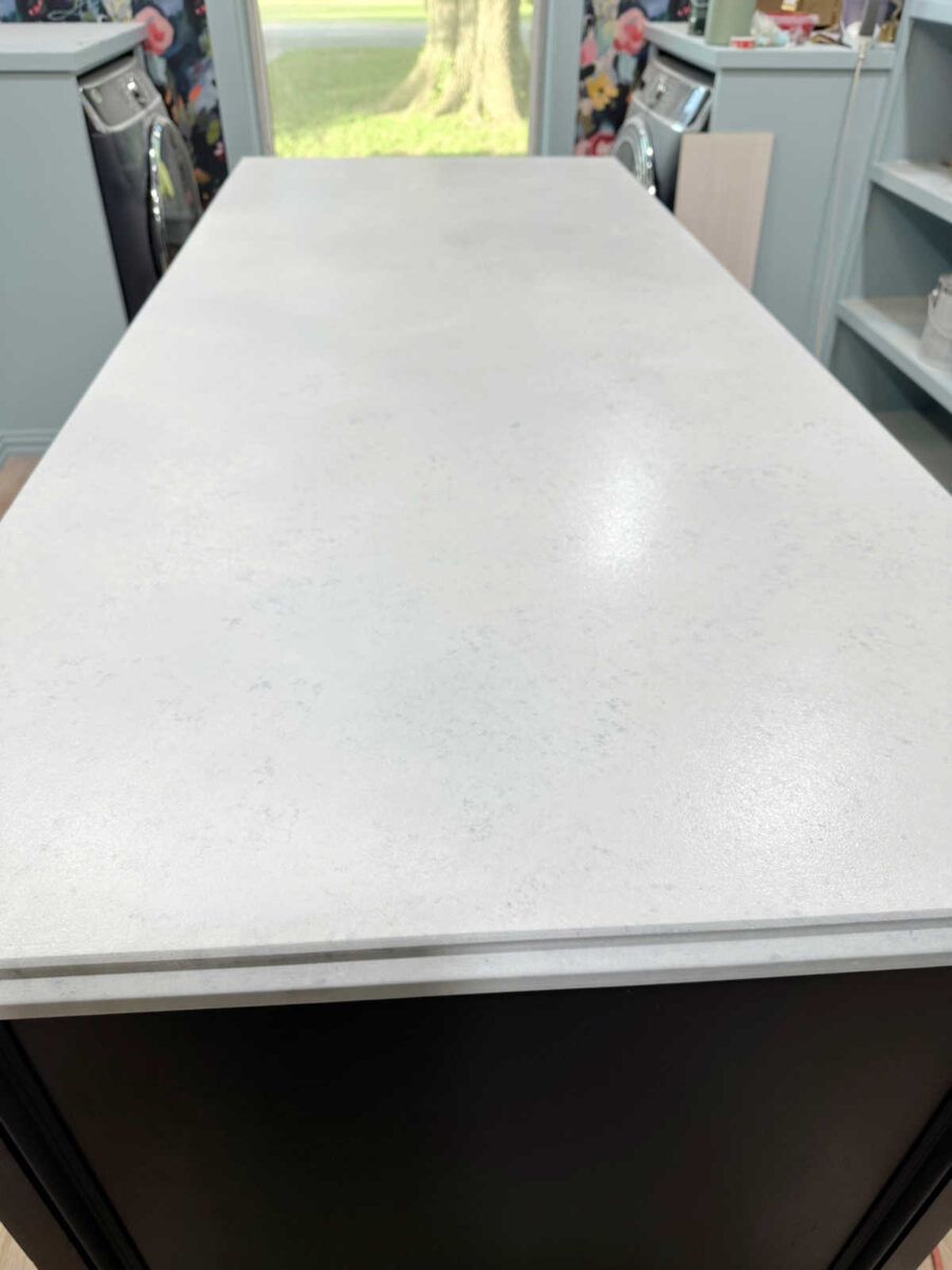
I actually like how subtle it is. Perhaps a marble look with veins and lots of movement would have been too eye-catching anyway, so in the end, this is probably better than my initial goal. But I could have gotten here a heck of a lot faster had this been my goal from the beginning. I could have gotten it done and probably clear coated in an hour had I just done this from the beginning, but of course, I had to take the difficult, scenic route to get here, and wasted a ton of time in the process.
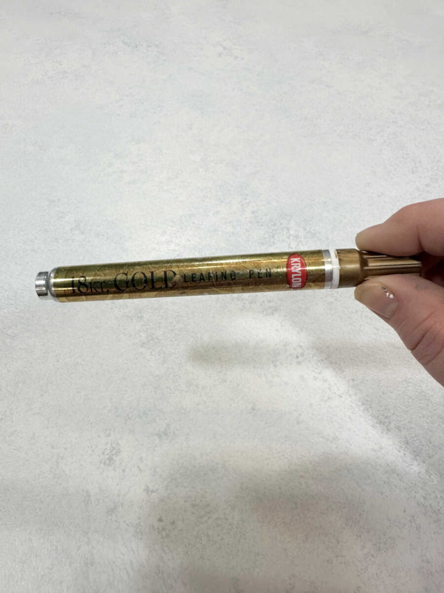
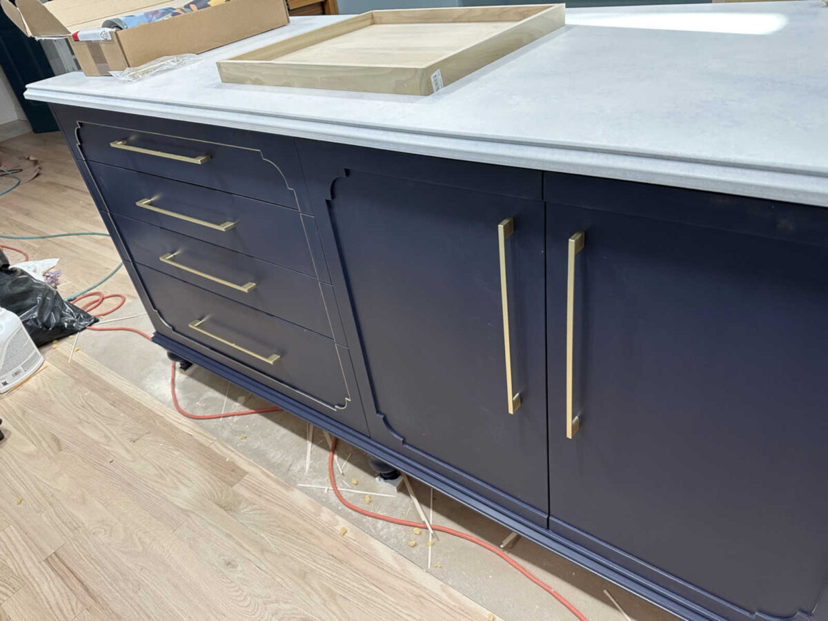
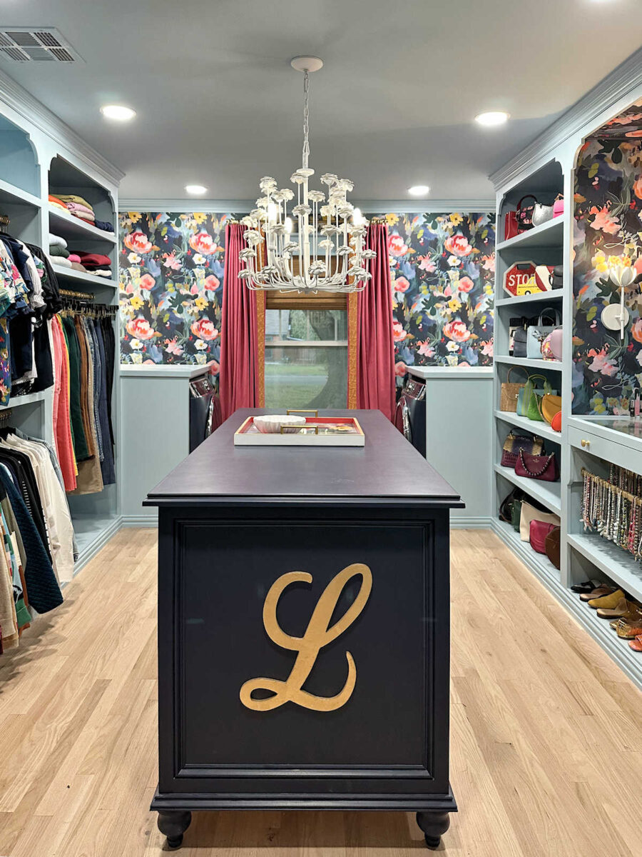
Anyway, moving on. I know that most of you said I should just leave the doors and drawers solid blue and move on. And then maybe I could come back later and add a detail to them later. But the more I looked at it, the more I just wasn’t satisfied with it. And every time I think I’ll come back to something later, I never do. And I just couldn’t get it out of my mind that the trim needed an accent. So I got out my Krylon 18kt Gold paint markers…
And I added gold to one of the sections. And I. LOVE. IT. And best of all, it took less than five minutes.
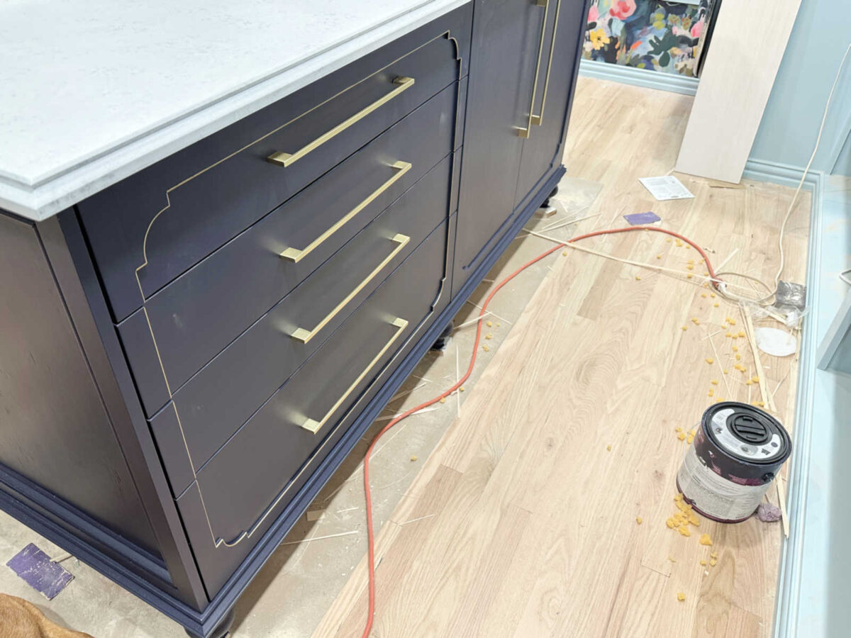
It’s subtle. It doesn’t scream for attention. But now you can actually see the trim details. So I’m going to go against the majority here and go with the gold details. 🙂 And it’ll take me less than 15 minutes to do the other three sections.
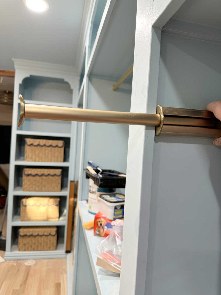
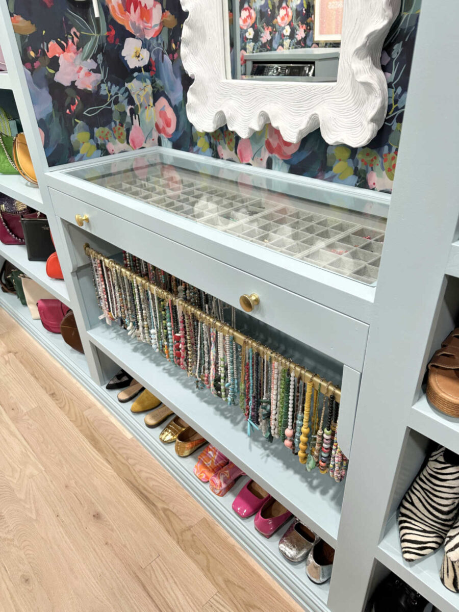
I got another small detail for the closet yesterday. I’ve wanted a valet bar somewhere in the room, so I purchased this one on Amazon. I bought this one because it’s the only one that installed in such a way that the screws are hidden.
The color doesn’t match the closet rods as well as I had hoped, but most of it will be covered with hanging clothes anyway, so I’m not too bothered by it.
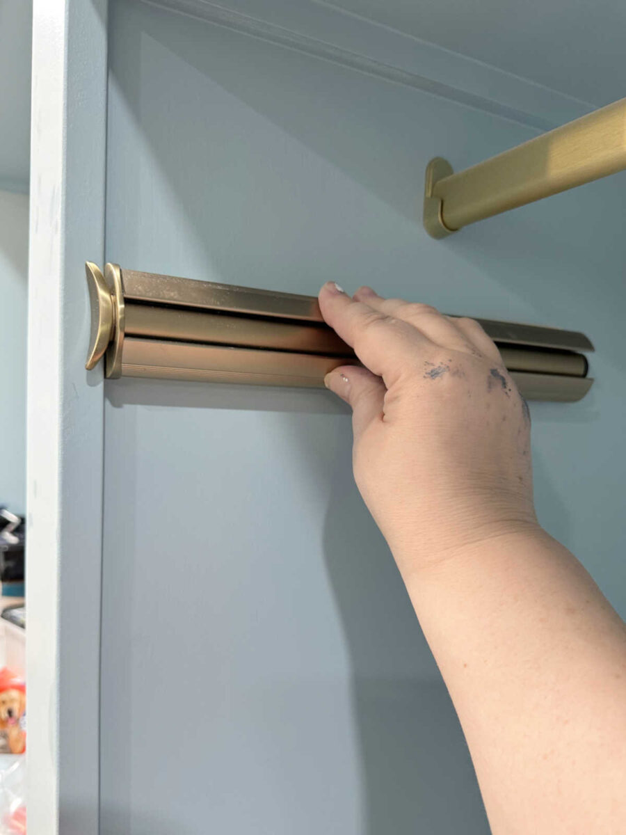
But it’s a really great, solid, sturdy valet bar, so I’m very pleased with it. And it will really come in handy when putting together an outfit.
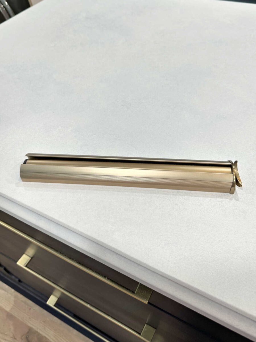
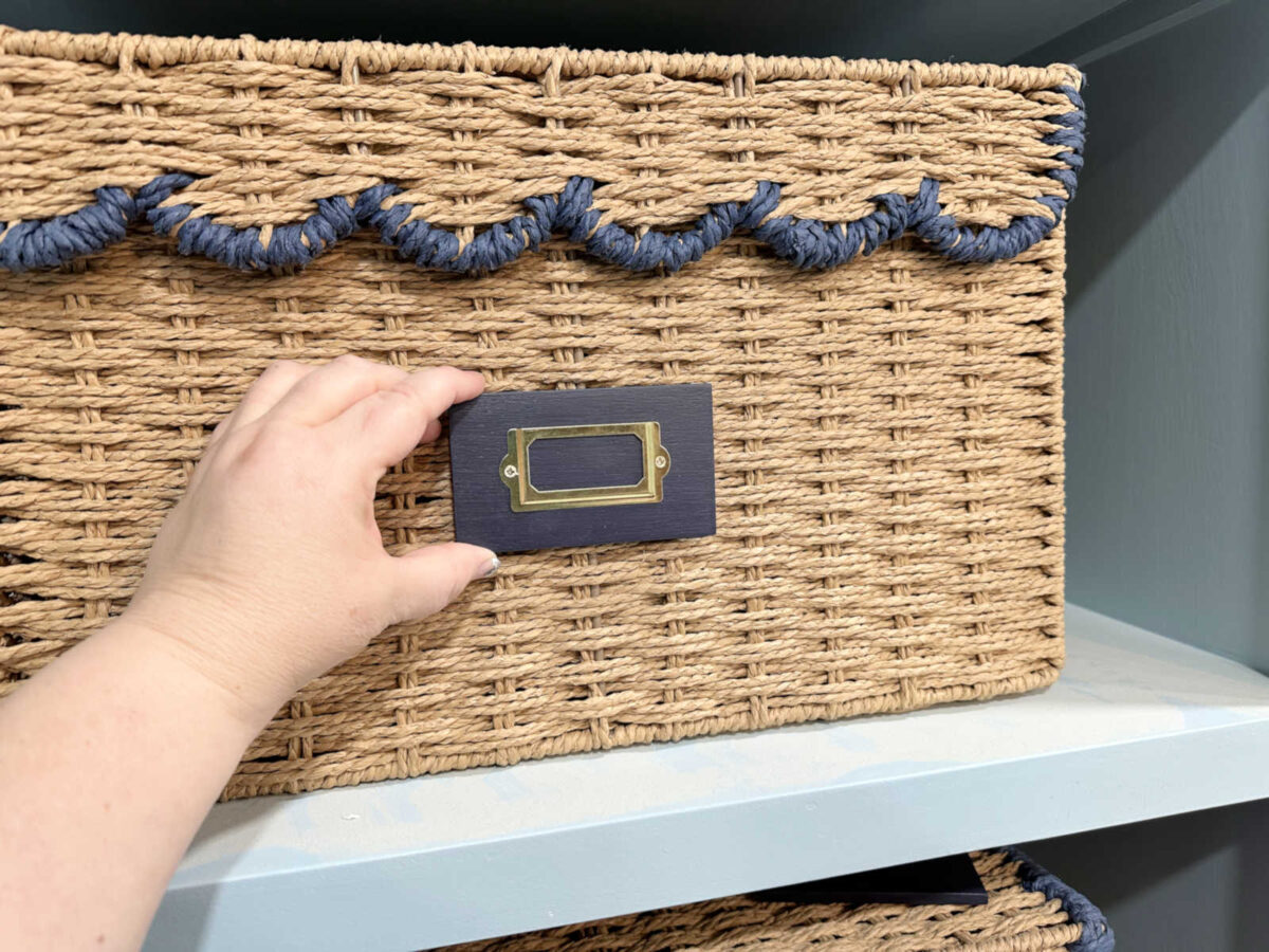
And finally, I got the little label holders done for the baskets. I still need to attach them, but I just used 1/4″ wood for a backing, painted them the same blue as the island, and then screwed the gold label holders to those. I think they’ll look great!
So overall, yesterday was a pretty frustrating day with that countertop nonsense. But I’m done with it. I’m going to do a clear coat this morning and move on to other things. I’m trying not to let perfection be the enemy of good. And if I let myself start trying to make that countertop perfect, I’ll just waste more time and probably end up right back where I am now. So, on to other things! I have a ton of small finishing projects that need my attention.
More About My Walk-In Closet/Laundry Room
see all walk-in closet/laundry
room diy projects
read all walk-in closet/laundry
room blog posts

Addicted 2 Decorating is where I share my DIY and decorating journey as I remodel and decorate the 1948 fixer upper that my husband, Matt, and I bought in 2013. Matt has M.S. and is unable to do physical work, so I do the majority of the work on the house by myself. You can learn more about me here.

That gold adds just the right touch!
I like the gold accent 100%! I would have voted no gold so big change on my part. You have excellent instincts.
I love the gold accent on the trim.
Outdoor made the right decision about the gold on the drawers. I like the island top also. 👏
The countertop is very pretty. no time “wasted.” You just learned more things to share with us.
I knew you would use the gold because that is just you. But it is your closet.
I think the top looks good. Glad you are going to leave it alone. Looks so much better than a solid white top.
You are almost finished! So, are you going to work on the bedroom or the workshop? As you said, you have lots of projects. Don’t we all? I have more projects in my head than I will live to finish. I have many that are being worked on now. I’ll just need to tell you how extremely talented you are and to wish you a good week.
The bedroom and foyer are next. I’ll be tackling those together since there’s so much that will continue from one area to the other — wainscoting, wallpaper.
You were right about the gold accents. Looks great and so does the top.
All looks awesome!! 😍
It’s all in the journey…that is where we dream, do and it happens, or becomes or is finally finished. I think of all the ins and outs of this project, I have learned from you, it is about the final sparkle you put on the finishes…I love the gold that highlights that beautiful trim. Great job!
The gold is just enough. Classy. Good decision.
The top looks good too. Just enough to mellow the white. I like the end result better than marbling.
Valet bar? Never heard of it. How practical. Sure beats laying out clothes on the bed when putting together an outfit.
You have created a lovely space.
Love the gold trim. That is exactly what I pictured when I sent my comment. You are truly so talented.
Ditto!
LOL – I knew you wouldn’t be able to leave those trim details alone. The fine gold outline looks great.
As for the marbled top – it looks great. It looks a lot like my quartz kitchen counters – I sometimes lament the lack of more pronounced veining but given the wallpaper I chose for a backsplash it’s just as well that my counters don’t have it. I’m like you in that I like colour and contrast and it’s hard to go for subtle sometimes.
It’s always a bit of a crap shoot when you are doing the veining in faux marble finishes. I used to do a lot of them back when it was a thing – and I always used a soft feather to draw the vein lines. You have a certain amount of control in terms of direction but the feather means you get enough spontaneous movement and shape to the lines to make the veins look real. It’s always hard to know when to quit and when to go on though, especially when you feel it’s not working the way you envisioned.
Well done. Can’t wait for the big reveal with a filled closet.
I love the little gold accent, and though I didn’t comment before, it was the first thing I thought about when you posed the question. And maybe you will love all these little details more when you are in a better mood; some distance from the project that frustrated us makes all the difference in the world (and yeah, sometimes it’s not a “this is really nice, what was my problem with it?” but it’s instead a “I need to do this exact thing instead”, but distance helps with getting clarity and a clean “emotional” state). Hope you have a lovely Wednesday!
I’d have gone for the gold had I voted. And I didn’t see any problem with the early marbling attempts (before the last picture with the “overblending”). Maybe seeing it in person was different. We once wanted to do a fun kid’s area in our house and bought an old upright piano. We painted it dark green to go with the decor and marbled it. Not nearly as professional-looking as your tabletop, but we liked it for the kids area (threw in some gold veins too). At any rate, the final island top looks marvelous and easier than trying to go back and get the veining the way you wanted it.
I gotta get me one of those pens! That looks awesome.
Love it with the gold!
I was one who thought leaving the drawers as is was the way to go.
That said, I REALLY like the gold you added; classy!
It looks FAB-U-LUS, dahlink! Love the subtle gold accent, and the island top is close enough to perfect for me, lol. You did great, and it wasn’t wasted time, ’cause you learned something. Will you use the gold on the ends of the island as well?
First of all, I love the subtle variation in the top that you decided to stick with. I think it looks really good.
Secondly, I LOVE LOVE LOVE the gold accent! I am so happy you are doing it. I think it looks so good, and it really does bring out those details. With everything else going on in the room, I think the island would have been too plain if you weren’t adding the gold detail.
I am very excited how close you are to having a functioning closet!
OMG the gold paint pen looks amazing!!! I would probably get it all over the place if I tried that.
Never disregard the “scenic route”, it happens that sometimes you find answers to things you didn’t even know you were questioning. I love how it turned out. I love the valet bar, we’ve got two in our closet and several in the laundry room, which in your case is the same space. The gold accents are PERFECT!!! Love the tags for the baskets and I bet you are chomping at the bit to get everything moved into the space. Onwards and upwards, ever forward.
Cheers to you and Matt and your furry helpers!
I love how the gold turned out. I was thinking something much less subtle when I voted for “plain.” You nailed it! (And painted it, and…. 🙂 )
That accent adds a beautiful touch and the top is beautifully done!
The gold trim looks fantastic. And you’re right. It does emphasize the beautiful design feature. I love it.
Is this gold pen the same as in the studio? I thought you did gold leaf in there? Anyway, the blue with the gold looks great, I KNEW you didn’t need to ask! You had made up your mind before we said a word. As for the top, it’s not bad looking, just a shame your veining didn’t work out. Onward and upward! I’ve been trying to figure out how to mount a valet bar in my closet too, but we have the awful wire shelving. The best I came up with was an over the door hanging gadget. I hate that I have no where to mount a bar such as yours. You will surely love that!
It’s the same gold that I tried in my studio, but I ended up doing gold leaf and then gold washi tape on those cabinets.
I really hadn’t made up my mind before I asked. And then when everyone said not to do it, I tried to make myself okay with the plain blue. But after working on the island for hours, and staring at those doors and drawers knowing I wasn’t satisfied, I knew I had to at least try it.
Everything looks fantastic! The gold accents are spot on. I don’t know why, but I keep seeing a beautiful script letter “K” on the end of the island that would be visible as you enter. It would be true customization for you Kristi!
I think that would be perfect!
I thought I loved the plain island, but the gold is PERFECTION. This is almost the color of my DIY kitchen… man… that gold looks good…🤔 Good for you, being willing to keep going and try one more thing!
Looks great! It’s just what the island needed for that finishing touch!
I LOVE the way your dresser turned out! I was one of the people thinking all blue would be enough but the gold just adds a little something extra, and it’s perfect! And I think the top looks great the way it is too. Not stark but it doesn’t compete with anything else in the room either.
The gold pen detail is perfect!
Even your mistakes look great! I love this closet as well as the gold accent on the island trim. I have serious closet envy!
Told ‘ya, go for the Gold.😁😁 It just sets it off for a tiny little bling. I LOVE LOVE it! It all looks so gorgeous, can’t wait for the final finish. Ie; clothes, shoes and purses, etc. Fantastic job well done!
Okay, you were right as always, the gold accent is FABULOUS. I think we were having trouble envisioning what you meant. It’s subtle and classy and beautiful.
I love how the top turned out! It has enough fluidity to make it look more expensive and not draw away from anything else. The touches of gold are also beautiful. I know you will be happy once it is all done and can bring your clothing, etc, in.
I hope you plan to take a bit of time off from your big project once you’re done here. Just a few days to spend with Matt and rejuvenate your body before your next project
I was all for the gold trim and l’m so glad you did it and love it. It really needed that final touch.
I would have voted No Way to the gold. Boy was I wrong. It adds the perfect amount of color. Love it all 🥰
The gold is perfect! Exactly how I pictured it! Your closet is stunning! You should be so proud!
Love, love, love the gold trim. I could never draw a straight line like that!
LOVE the subtle gold trim paint!
Oh dear! Has the 10th basket still not arrived???
Everything is looking so lovely! Wow, wow, wow!!!
It hasn’t, and it won’t. 🙁 They sent me one wrong basket, so my order shows that it’s complete. And now, they’re completely sold out of those baskets.
There are a few random stores that still had it last week. Your could check towns that you have friends by…they could pick up and send it to you? I found two Kohl stores in Chicago that had the large one. If you still think you need another I could try to help…!?
I WAS SOOOOOOOO WRONG!! I voted no gold and thought you needed wood on the top. The island turned out beautifully – and I love the mottled top and the touch of gold! The top is subtle and blends with the closet and the gold is just enough to showcase the detail. I’m happy to be so wrong because what you did looks so fantastic!! Can’t wait to see it all finished!!
Love the gold!! And the basket labels, valet bar and island top. Beautiful!!!!
Love the gold detail. You were right, they needed something.
YES…I was in the subtle gold trim pick, and I love it…exactly what I was thinking…just small and quiet, yet a nice accent to accentuate the trim. YUP. Looks very nice. Nice progress as well.
Kristi ~ you mentioned you had a dehumidifier now. That’s great. Is it for the whole house?
It works for the whole house. I’d love to get one that’s actually attached to our HVAC system, but right now, we just have a freestanding dehumidifier from Lowe’s.