My Utility Closet Has Cabinets! (And I Need Your Input, Please!!)
Okay, I know that just this morning, I said I wouldn’t give you another update on the closet, and I would just wait until it was finished to show you.
Well, to heck with that.
I just got the cabinets installed and I’m so excited! I not only wanted to show you how it looks so far, but I also wanted your input on something.
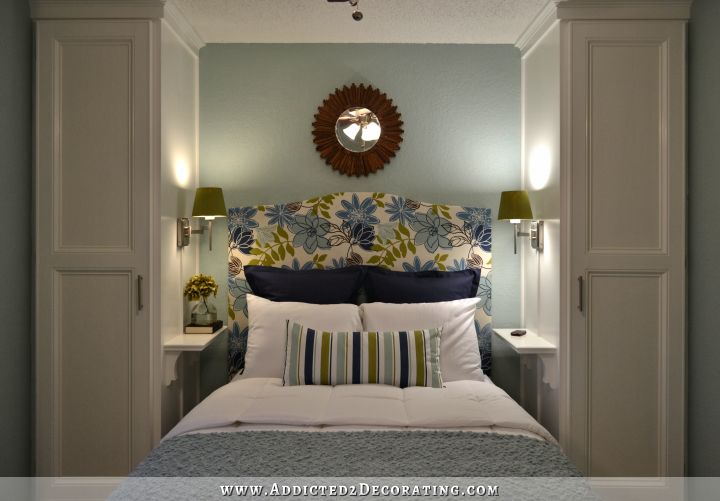
First, the progress. My utility closet with cabinets (the view from the living room/dining area/front door side of the condo)…

This hallway is such a tight fit that it’s hard to get a good picture, but hopefully you can tell what’s going on here!
And here’s a view from the other direction (with me standing in front of my bedroom door)…

I am so unbelievably excited to finally have those upper cabinets installed!!! For a year-and-a-half, they sat there in the closet, just sitting on top of the lower cabinets, virtually unusable. Now they’re installed, and fully functional! Woohoo!!
So now on to the question. I’ve gone back and forth over what color to paint these cabinets. When I first brought home the Behr Grass Cloth to paint the walls of the closet, I had a moment where I though, ‘Hmm…I wonder if this color would look better on the cabinets’. So I tried it out on the front of two doors (which you can see in the picture above).
Then I decided I wanted it on the wall. Yeah…you remember how that turned out, right?

Just awful. (The Grass Cloth is the main wall color in that photo.)
Then I decided to go with the new argyle pattern (much better!!), and I worked the grass cloth into it, along with the turquoise, orange, and yellow, with white pinstriping. With this new design, I had planned to do the cabinets white—the same color as the pinstriping.
Now I’m wondering again if the Grass Cloth might look good. I know it’s really difficult to get a good look at the color in any of the pictures above, but here is the sample from the Home Depot website:

It’s a very fresh and light color. Actually, it’s the same color that I used when I repainted the pet station, but then I distressed and antiqued the pet station, so it looks a bit darker than the plain Grass Cloth…

So what say you? Play it safe with white cabinets? Or have a little fun with a fresh green color?

I still have to prime the cabinets, so I’ve got at least a day to make this decision. But please tell me your thoughts!!
By the way…that Pinterest project I was hoping to accomplish for the Pinterest Challenge? Not gonna happen…at least not before tomorrow. (But I will have you know that I did NOT crawl back into bed this morning!) So instead, I’m going to link this post! Oh sure, it’s not finished. My cabinets are still naked. I have no countertop. I have no baseboards. There are floor tiles missing, and the floor still needs grout.
But what the heck. The argyle is finished, and it WAS inspired by this amazing nursery by Lucy and Company Interior Design in Charlotte, North Carolina, that I found on Pinterest!

So that counts, right? Just overlook all of the unfinished stuff, and check out that fantastic argyle!! After all, it took me about a week to finish!!

Addicted 2 Decorating is where I share my DIY and decorating journey as I remodel and decorate the 1948 fixer upper that my husband, Matt, and I bought in 2013. Matt has M.S. and is unable to do physical work, so I do the majority of the work on the house by myself. You can learn more about me here.

Well, I know you are so delighted with the lightness of this new space with its awesome fixture, but I think the cabinets would look good painted the dark color in your argyle pattern. But what do I know. And normally, I like the sorts of greens like the grasscloth color, but I can't see it here. Just doesn't work for me. But again…what do I know! You say the first view is from the LR side, but what does it look like from farther back, as you stand closer to the front door, as it would look as one enters your condo? BTW, congratulations on the argyle treatment. Man. I could never have stuck with it. You rock.
"awesome fixture"….I mean the light fixture, of course!
I like the grasscloth color. I think if you don't like it, you could always re-paint, right?
I think your argyle treatment is definitely the star in this space. I am totally in love with it. I would love the contrast of plain white cabinets against the dark colors of the argyle. I know what ever you choose will look great. Congrats on all your progress!
I say go with the green! I really like the play on colors and it is definitely a great space to let your creativity shine. I love it so far btw!
I think you have so much going on with the argyle that if you paint the cabinets green it will distract from it. My vote is for white. 🙂
I am so in love with your argyle wall…I want to do that to my laundry closet!!! I vote for grass cloth paint…I think the white will be too bright and take away from your beautiful walls…
My vote is for the white. I LOVE the argyle and the colors in the pattern but I think the white cabinets will POP.
I vote dark – the same as the wall or the green heavily distressed. White will be too stark I think.
I agree! the darker color would make the wonderful argyle pattern pop!
I'm not so sure about the green, although it does look awesome on the pet station, but I am not fully able to "see" it here. I was going to suggest the dark color (is it brown or is it black?) in the argyle, but that may make it look too dark. I think the white would be way too light though. What about going with the blue? Maybe some dark chalkboard type paint on the side of the cabinet too!?!?!?!
Go green. I love the argyle!!!
Ok first, that looks AMAZING! You have so much patience to do that pattern! Second, YES GREEN! Go have fun 🙂
I vote for brown…the argyle is the star of this show! Love it!
I think white would look amazing, and then you can possibly glaze the cabinets, or rub the edges in the grasscloth green color. I like the idea of the green, but it might be too much for that area. And I'm loving the argyle even more now that you have cabinets in too! =)
I was thinking of blue, maybe the same blue as your entry bookcase/pantry.
I think the awesome argyle pattern will stand out if you paint/stain the cabinets a dark color or use the green and stain the inside edge of the molding with a dark brown.
I say white. I think it will make the walls pop more =)
Are you kidding…of course you have to go with the green! It will be fantasticly YOU! Great work!
Yes your exactly right about the off-gas issue….the majority of
older, used furniture will have already off-gassed. Yet another benefit
of vintage furnishings!
Office Furniture
Definitely go with the color!! Anybody can have white cabinets =) And I LOVE the argyle!! Great job!
I think you should go with the green!!!! Awesome job with the argyle! I'm so loving it!!!
I say go with the green. You sound excited about it, it goes with the argyle, and you've used it before. Good luck with your decision. The cabinets look great BTW.
I would go with one or two darker shades of yellow/gold that the hallway is painted to unify the space and so the eye rests on the argyle and doesn't bounce all over.
I've gotta vote for white. I think the argyle is GORGEOUS and I'd be afraid that adding more color will make the space feel cramped and closed in. The white cabinets will pop and make the space feel fresh as well as provide a visually clean stage on which to showcase the walls. Happy painting – whatever you do! 🙂
Go with a darker color , NO on the green .
The argyle turned out perfectly! The hardwork and restart paid off! My vote is for the same treatment as the pet station, the green – distressed and antiqued. I think that the dark of the antiquing will pull the darkness from the argyle. Can't wait to see what you decide on!
I think the green would look awesome. Brown or something similar would be too dark, and white would be too stark. I think the green is perfect!
I loved it as It is..
I would keep the cabinets simple and forgo the green paint.
Great painting- absolutely love it!
For sure a nice crisp WHITE!
Personally, and everyone's views are unique, but because the argyle is so strong, I would go with a black cabinet, (gloss or matte?). I think it would let the pattern pop out and be strong and bold without the cabinets competing for attention.
I am totally in love with it. I would love the contrast of plain white cabinets against the dark colors of the argyle.
Dog Canine Training
I would definitely suggest white for contrast to help make the argyle really stand out. With another color, I think it will become way too "busy" of a space.
I think you should use the color of the wall next to the space…. the light yellow. I think it would pick up the yellow in the argyle but not so matchy-matchy and it would tie your space together. I also think if you did dark it would be way TOO dark in a narrow space. I love your ideas keep them coming!
or Go with the green and continue that on the wall…. I just think it would make the argyle stand out!
I think the argyle wall is the star of the show and should not compete with the cabinets, therefore, I think a dark color or white might be best. I feel the grasscloth color would be competing with the wall. Just my thought.
I'm with the others on the dark color to make the argyle really pop. That would depend of course if you have enough light or can handle a darker area. That argyle is amazing. You have mastered patience I would say. The results will be fabulous no matter what you choose.
I would say I like pure white over the color. You are super talented Kristi! Thanks for a great blog..